Are you ready to stand out in your next interview? Understanding and preparing for Perspective and Composition interview questions is a game-changer. In this blog, we’ve compiled key questions and expert advice to help you showcase your skills with confidence and precision. Let’s get started on your journey to acing the interview.
Questions Asked in Perspective and Composition Interview
Q 1. Explain the difference between first-person, second-person, and third-person perspective.
Perspective in storytelling refers to the viewpoint from which a narrative is told. It significantly impacts the reader’s understanding and emotional connection to the story.
- First-person perspective: The narrator is a character within the story, using ‘I’ and ‘me’. This offers intimacy and immediacy, allowing the reader access to the narrator’s thoughts and feelings directly. Think of the immediacy in The Hunger Games, told from Katniss’s perspective. However, it’s limited to what that one character experiences and knows.
- Second-person perspective: The narrator addresses the reader directly using ‘you’. This is less common but can create a highly immersive and engaging experience, as if the reader is the protagonist. Think of interactive fiction games that address the player using ‘you’. It risks alienating readers if the ‘you’ doesn’t feel like a natural fit.
- Third-person perspective: The narrator is outside the story, referring to characters as ‘he,’ ‘she,’ or ‘they’. This offers greater flexibility. Third-person omniscient allows the narrator to access the thoughts and feelings of multiple characters, while third-person limited restricts the narration to the experiences and thoughts of a single character, similar to first-person but with more authorial control. To Kill a Mockingbird uses third-person limited, focusing primarily on Scout’s perspective.
Q 2. Describe the rule of thirds and its application in visual composition.
The rule of thirds is a fundamental guideline in visual composition. It suggests dividing an image into nine equal parts using two equally-spaced horizontal lines and two equally-spaced vertical lines. Important elements should be placed along these lines or at their intersections to create a more visually appealing and balanced composition.
Imagine a photograph of a landscape. Instead of centering the mountain peak, placing it along one of the horizontal lines creates a more dynamic and visually interesting image. Similarly, placing the horizon along the top or bottom horizontal line, rather than dead center, can dramatically affect the mood and balance of the photograph. These intersections also act as strong focal points, naturally drawing the eye to the subject.
Q 3. How does perspective affect the emotional impact of a visual or written piece?
Perspective profoundly shapes the emotional impact of both visual and written pieces. In visual art, the perspective chosen can significantly affect the viewer’s emotional response. A high angle shot can make a subject appear vulnerable or insignificant, while a low angle shot can make them appear powerful or intimidating. In writing, perspective directly influences the reader’s empathy and understanding of the characters and events. A first-person narrative from the villain’s perspective, for instance, might evoke sympathy or understanding rather than outright condemnation.
Consider a painting depicting a war scene. A wide shot showing the vastness of the battlefield and the smallness of the soldiers creates a sense of scale and loss. In contrast, a close-up on a single soldier’s anguished face evokes a powerful sense of empathy and personal suffering.
Q 4. Explain the concept of leading lines in composition.
Leading lines are compositional elements that guide the viewer’s eye through an image. These lines can be actual lines, such as roads, fences, or rivers, or implied lines created by the arrangement of objects. Effective use of leading lines creates visual flow and directs attention to the main subject of the image.
Think of a photograph of a winding road leading towards a distant mountain. The road acts as a leading line, drawing the viewer’s gaze from the foreground to the background and highlighting the mountain as the focal point. Similarly, a series of strategically placed trees or buildings can create implied lines that guide the eye toward the main subject.
Q 5. How do you use visual hierarchy to guide the viewer’s eye?
Visual hierarchy is the arrangement of elements in a design to guide the viewer’s eye in a specific order. This is achieved through the use of size, color, contrast, and placement. Larger, brighter, and more centrally located elements typically draw the eye first, followed by elements with less visual weight. By strategically organizing elements, you can control the flow of information and ensure that the most important information is seen first.
For example, a website’s homepage might feature a large headline and a captivating image above the fold to grab attention. Smaller text and less prominent elements might provide supporting information further down the page. The use of contrasting colors, bold fonts and clear spacing all contribute to this visual hierarchy.
Q 6. Discuss the impact of color theory on composition and perspective.
Color theory plays a crucial role in both composition and perspective. The use of warm colors (reds, oranges, yellows) tends to bring elements forward, creating a sense of proximity and immediacy. Cool colors (blues, greens, purples), on the other hand, often recede, creating depth and distance. Contrast between colors can also be used to draw attention to certain elements and create a sense of visual hierarchy.
Imagine a landscape painting. The use of warm colors in the foreground, such as a vibrant red flower, might draw the eye forward, while cooler colors in the background, such as a hazy blue mountain range, create a sense of depth and distance. The use of complementary colors, such as red and green, can also create visual excitement and draw attention to particular areas of the composition.
Q 7. How can you create a sense of depth in a two-dimensional image?
Creating depth in a two-dimensional image involves using techniques that mimic the way our eyes perceive depth in three-dimensional space. These techniques include:
- Linear perspective: Parallel lines converging towards a vanishing point create the illusion of depth. Think of railroad tracks vanishing into the distance.
- Atmospheric perspective: Objects further away appear less detailed and lighter in color due to atmospheric haze. Mountains in the distance appear less defined and bluer than those nearby.
- Overlapping: Placing objects in front of others creates a sense of depth by suggesting that the object in front is closer.
- Size variation: Objects further away appear smaller than those closer to the viewer.
- Shadowing and lighting: Using light and shadow can create a sense of volume and depth, making objects appear three-dimensional.
By skillfully employing a combination of these techniques, even a flat surface can be made to appear three-dimensional and evoke a strong sense of depth and space.
Q 8. Explain the concept of negative space and its importance in design.
Negative space, also known as white space, is the area around and between the subjects of an image. It’s not empty; it’s an active element that significantly impacts the overall design. Think of it as the silent partner in a conversation – it allows the focal points to breathe and prevents visual clutter.
Its importance lies in its ability to:
- Improve readability and clarity: Too much information crammed together creates visual chaos. Negative space provides visual breathing room, making it easier for the viewer to process information.
- Create emphasis and focus: By strategically placing negative space around a subject, you draw the viewer’s eye directly to it. The empty space contrasts with the filled space, making the subject pop.
- Convey emotion and mood: The amount and placement of negative space can impact the feeling of the design. Lots of white space can feel serene and minimalist, while less space might feel more energetic and crowded.
Example: Consider a minimalist logo. The logo itself might be small, but the surrounding negative space is crucial in defining its shape and conveying its message. A poorly designed logo with insufficient negative space would feel cluttered and confusing.
Q 9. Describe different types of perspective (e.g., linear, atmospheric).
Perspective is the technique artists use to create the illusion of depth and three-dimensionality on a two-dimensional surface. Several types exist:
- Linear Perspective: This is the most common type. It uses converging lines to create the illusion of depth. Parallel lines appear to meet at a vanishing point on the horizon line. Think of railroad tracks disappearing into the distance.
- Atmospheric Perspective (Aerial Perspective): This technique uses variations in color and value to create depth. Objects farther away appear lighter, less saturated in color, and hazier due to atmospheric particles. Imagine a landscape where distant mountains are bluish-grey and less detailed than those in the foreground.
- One-Point Perspective: Uses one vanishing point on the horizon line. All lines recede towards this single point.
- Two-Point Perspective: Employs two vanishing points on the horizon line. This gives a more dynamic view, often used for depicting corners of buildings or intersecting streets.
- Three-Point Perspective: Includes a third vanishing point above or below the horizon line, creating a dramatic perspective often used for looking up at tall buildings or down from a great height.
Each type serves different purposes and is suited to different subjects and narratives.
Q 10. How do you balance symmetry and asymmetry in composition?
Balancing symmetry and asymmetry is a key aspect of creating visually appealing compositions. Symmetry creates a sense of order, stability, and formality, while asymmetry offers dynamism, energy, and visual interest.
The key is to find a harmonious balance. Pure symmetry can sometimes feel static, while pure asymmetry can feel chaotic. Effective compositions often incorporate elements of both.
Strategies for balancing symmetry and asymmetry:
- Symmetrical balance: Mirror-image elements on either side of a central axis. Think of a classic portrait with the subject perfectly centered.
- Asymmetrical balance: Achieve balance through visual weight. A larger, darker object can balance several smaller, lighter objects. The visual weight needs to be distributed thoughtfully.
- Radial balance: Elements arranged around a central point, creating a sense of movement and energy. Consider a mandala or a flower with petals radiating outwards.
- Combining approaches: Use symmetrical elements as a foundation, and then introduce asymmetrical elements to add visual interest without disrupting the overall balance.
The best approach depends on the desired mood and message of the piece.
Q 11. What are some common mistakes to avoid when composing a visual piece?
Common mistakes to avoid when composing a visual piece include:
- Ignoring the rule of thirds: Placing key elements off-center, at the intersections of the rule of thirds grid, often creates a more engaging composition than centering.
- Poor visual hierarchy: Failing to establish a clear order of importance among elements. The most important elements should be the most prominent.
- Overcrowding: Including too many elements without sufficient negative space leads to visual clutter and confusion.
- Neglecting visual flow: The viewer’s eye should be guided smoothly through the composition. Use leading lines and other compositional elements to create a visual path.
- Ignoring color harmony and contrast: Inconsistent or jarring color choices can distract from the overall message.
- Lack of focal point: A composition needs a clear center of interest to draw the viewer in.
Careful planning and thoughtful consideration of these aspects is crucial for creating a strong and impactful composition.
Q 12. How would you choose the appropriate perspective for a particular narrative?
Choosing the appropriate perspective depends entirely on the narrative you want to tell. Consider these factors:
- Power dynamics: A high angle (looking down) can convey power and dominance, while a low angle (looking up) can convey weakness or awe. Think of a superhero looking down at a villain versus a person gazing up at a towering skyscraper.
- Emotional impact: A close-up shot is intimate and personal, while a wide shot establishes context and provides a broader view. A wide shot might showcase the isolation of a character in a vast landscape.
- Focus and emphasis: One-point perspective can direct the viewer’s eye to a specific point in the scene, while two-point or three-point perspectives can create a more dynamic and immersive experience. A one-point perspective might be ideal for showcasing a grand building.
- Scale and size: Perspective helps portray the size and scale of objects relative to each other and to the viewer. A forced perspective can create illusions of size and scale.
The best way to choose is to sketch out different perspectives and consider how each affects the story’s impact.
Q 13. Explain the importance of visual balance in design.
Visual balance is crucial in design because it contributes to a sense of harmony, stability, and visual appeal. An unbalanced design feels unsettling and distracting. The eye seeks equilibrium, and a well-balanced design provides that satisfaction.
Balance contributes to:
- Readability and clarity: A balanced layout ensures that all elements receive appropriate visual weight and attention, preventing one part from overwhelming the others.
- Visual harmony: Elements that work together visually create a cohesive and pleasing effect.
- Emotional impact: The type of balance used can influence the emotional response. Symmetry can convey stability and formality, while asymmetry can convey dynamism and energy.
Understanding and implementing visual balance techniques is essential for creating effective and visually engaging designs across various media, from websites to posters to logos.
Q 14. Describe your process for analyzing and improving a piece of writing or design.
My process for analyzing and improving a piece of writing or design involves a systematic approach focusing on both macro and micro elements.
Step 1: Initial Assessment: I begin by gaining a holistic understanding. What is the purpose? What is the intended audience? What is the current impact?
Step 2: Micro-Analysis: This involves breaking down the piece into individual components. In design, this could be examining color palettes, typography, layout, and visual hierarchy. In writing, this could involve sentence structure, word choice, flow, and tone.
Step 3: Macro-Analysis: I then step back to assess the overall composition, looking for inconsistencies, weaknesses, and missed opportunities. Does the visual hierarchy effectively communicate the intended message? Does the writing engage the reader and achieve its purpose?
Step 4: Identifying Areas for Improvement: Based on my analysis, I pinpoint specific areas needing attention. Are there visual elements that are competing for attention? Is there a lack of clarity or coherence in the writing?
Step 5: Iteration and Refinement: I make targeted adjustments based on my findings. This might involve reorganizing elements, refining the color scheme, adjusting typography, or rewriting sections of text. This is an iterative process, revisiting and refining until I’m satisfied.
Step 6: Seeking Feedback: Finally, I seek feedback from others to obtain diverse perspectives and identify potential blind spots.
This structured approach ensures a thorough review and allows for systematic improvement.
Q 15. How do you ensure your work is accessible to diverse audiences?
Accessibility in visual design means creating work that’s understandable and usable by people with diverse needs and backgrounds. This encompasses a wide range of considerations, including visual impairments, cognitive differences, and cultural sensitivity.
- Color Contrast: Ensuring sufficient contrast between text and background colors is crucial for readability, particularly for people with low vision. I use tools like WebAIM’s contrast checker to verify compliance with WCAG guidelines.
- Font Selection: Choosing clear, legible fonts with appropriate sizing is vital. Sans-serif fonts often offer better readability for those with dyslexia.
- Alternative Text for Images: Providing descriptive alt text for images ensures that screen readers can convey the image’s content to visually impaired users. I make sure alt text is concise, accurate, and avoids redundancy.
- Cultural Sensitivity: I carefully consider the cultural connotations and interpretations of imagery and symbolism. What might be perfectly acceptable in one culture could be offensive or confusing in another.
- Simplicity and Clarity: Avoid overly complex layouts or design choices. The goal is clear communication, and less is often more, especially for those with cognitive differences.
For example, when designing a website, I’d use a high-contrast color scheme, legible fonts, descriptive alt text for images, and a clean, intuitive layout. This ensures the website is accessible and easy to navigate for everyone, regardless of their abilities or background.
Career Expert Tips:
- Ace those interviews! Prepare effectively by reviewing the Top 50 Most Common Interview Questions on ResumeGemini.
- Navigate your job search with confidence! Explore a wide range of Career Tips on ResumeGemini. Learn about common challenges and recommendations to overcome them.
- Craft the perfect resume! Master the Art of Resume Writing with ResumeGemini’s guide. Showcase your unique qualifications and achievements effectively.
- Don’t miss out on holiday savings! Build your dream resume with ResumeGemini’s ATS optimized templates.
Q 16. How do you use contrast to create visual interest?
Contrast is the difference in value, hue, or saturation between elements in a composition. It’s a fundamental tool for creating visual interest and guiding the viewer’s eye.
- Value Contrast: The difference in lightness and darkness creates strong visual hierarchy. A dark element against a light background will immediately grab attention. Think of a bold headline on a clean white page.
- Color Contrast: Using complementary colors (those opposite each other on the color wheel) or analogous colors (those next to each other) can create contrasting yet harmonious effects. A vibrant red title against a cool blue background offers a visually appealing contrast.
- Saturation Contrast: Combining highly saturated colors with muted tones creates visual tension and depth. A bright, highly saturated floral image contrasted with a muted, desaturated background will make the flowers ‘pop’.
I often employ a combination of these contrast techniques. For instance, a design might utilize value contrast for hierarchy (dark text on light background), color contrast for visual excitement (complementary color palette), and saturation contrast to highlight key elements. The key is balance; too much contrast can be jarring, while too little can make the composition monotonous.
Q 17. Explain how framing affects the viewer’s perception.
Framing, in composition, refers to how elements are arranged within the boundaries of the image or design. It significantly influences the viewer’s perception and focuses their attention.
- Selective Focus: By strategically positioning elements within the frame, you can draw attention to a specific subject, making it the focal point. A portrait photograph where the subject is centered and sharply in focus will instantly direct the viewer’s gaze.
- Leading Lines: Lines within the frame can subtly guide the viewer’s eye towards the main subject. Think of a road that visually leads to a distant building.
- Perspective and Depth: Framing can create a sense of perspective and depth, allowing the viewer to experience the space depicted in the image more fully. Wide shots emphasize the environment, whereas close-ups emphasize details and emotion.
- Rule of Thirds: Placing key elements along these imaginary lines and intersections creates a more dynamic and visually interesting composition than simply centering the subject.
For example, a tightly framed portrait creates intimacy, while a wide shot of the same subject in a landscape emphasizes their place within a larger context. The choice of framing dramatically affects the narrative and the emotional impact on the viewer.
Q 18. How do you incorporate different viewpoints within a single composition?
Incorporating multiple viewpoints within a single composition adds depth and complexity to the narrative. This can be achieved through several techniques:
- Multiple Subjects: Showing multiple people interacting or reacting differently to the same event can create a dynamic and layered scene. Think of a photojournalistic image capturing reactions to a big announcement.
- Perspective Shifts: Changing the perspective of the camera or viewpoint can show the same subject or scene from contrasting angles, revealing different aspects and emotions. This is frequently used in film to convey character development.
- Overlapping Elements: Partially obscuring elements in the foreground or background can lead the eye and create a sense of depth and multiple layers of visual information.
- Montage or Collage: Combining diverse elements and views creates a narrative with a fragmented, multifaceted perspective. This method is common in abstract or conceptually driven art.
For example, a painting of a city street could show the hustle and bustle of people going about their daily lives, with different character perspectives depicted through their poses and expressions, showcasing a multitude of individual stories within a singular composition.
Q 19. What are some techniques for creating visual flow and rhythm?
Visual flow and rhythm are essential for guiding the viewer’s eye through a composition. Techniques include:
- Leading Lines: Lines, whether real or implied, naturally guide the eye from one element to another. This could be a road, fence, or even a series of visual elements arranged in a line.
- Repetition and Patterns: Repeating shapes, colors, or textures establishes a visual rhythm and creates a sense of unity. Consider the repeating arches in a Roman aqueduct.
- Color Progression: Using a gradual change in color saturation or hue can create a visual flow. For instance, fading from a bright color to a muted tone.
- Shape and Form Relationships: The arrangement of shapes and forms can create a sense of movement and rhythm. Think of the interplay between negative and positive space in abstract paintings.
- Whitespace (Negative Space): Strategic use of whitespace around elements provides breathing room and guides the eye, preventing visual clutter.
A well-designed website uses visual flow to guide the user through different sections. This could involve using color progressions, leading lines, or a clear visual hierarchy to draw attention to key elements and encourage user interaction.
Q 20. How do you evaluate the effectiveness of your composition?
Evaluating the effectiveness of a composition is a crucial part of the design process. I use a multifaceted approach:
- Purpose and Message: Does the composition effectively convey the intended message? Is the core concept clear and easily understood?
- Visual Hierarchy: Is there a clear visual hierarchy guiding the viewer’s attention to the most important elements? Are the elements appropriately sized and positioned?
- Balance and Harmony: Does the composition feel balanced and harmonious, or does it appear cluttered or unbalanced?
- Emotional Impact: Does the composition evoke the intended emotional response? Does it create the desired mood or atmosphere?
- Feedback and Testing: Gathering feedback from diverse audiences is crucial. I often conduct user testing to gauge comprehension and assess the overall impact of the composition.
I constantly iterate and refine my designs based on this evaluation, using feedback and testing to improve the overall effectiveness of the composition. For instance, if user testing reveals that a key element is being overlooked, I might reposition it or improve its visual prominence.
Q 21. How do you use typography to enhance visual composition?
Typography plays a significant role in visual composition. It’s not just about readability; it’s about conveying meaning, establishing mood, and creating visual interest.
- Font Selection: Different fonts convey different personalities and moods. Serif fonts often feel traditional and authoritative, while sans-serif fonts can feel modern and clean.
- Hierarchy and Emphasis: Using varying font sizes, weights, and styles creates a clear visual hierarchy. Larger, bolder fonts highlight important information, while smaller, lighter fonts are used for supporting text.
- Spacing and Kerning: Careful attention to letter spacing (kerning) and line spacing (leading) ensures readability and visual appeal. Incorrect spacing can make text look cramped or uneven.
- Alignment and Layout: Proper alignment and layout of text blocks contribute to overall balance and clarity. Consider using justified, left-aligned, or centered text based on the design context.
- Color and Contrast: Text color must have sufficient contrast with the background to ensure readability. Color also contributes to the overall mood and aesthetic.
For example, a website might use a bold, sans-serif font for headings to create a modern and impactful feel, while using a more delicate serif font for body text to ensure readability. Effective typography creates a harmonious and visually appealing composition, improving the overall user experience.
Q 22. How do you adapt your perspective based on the target audience?
Adapting perspective to the target audience is crucial for effective communication. Consider your audience’s age, cultural background, level of expertise, and emotional state. For example, a children’s book will employ a simpler perspective, perhaps from a child’s eye-level, using bright colors and straightforward imagery. In contrast, a technical manual requires a more objective, detailed perspective, possibly with diagrams and precise terminology. A marketing campaign targeting young adults might adopt a dynamic, fast-paced perspective, while one for senior citizens might favor a calmer, more traditional approach. Understanding your audience’s needs and expectations allows you to tailor your perspective to maximize impact and engagement.
Q 23. Explain the use of scale and proportion in creating effective compositions.
Scale and proportion are fundamental to composition. Scale refers to the size of objects relative to each other and to the viewer, while proportion relates to the size relationships between parts of a whole. Effective use creates visual hierarchy and guides the viewer’s eye. For instance, making a specific element significantly larger than others immediately draws attention, establishing it as the focal point. Conversely, using similar proportions within a group of objects creates harmony and a sense of balance. Think of a classical painting: a human figure might be rendered at a larger scale than surrounding objects to emphasize its importance in the narrative. Conversely, a carefully proportioned architectural drawing conveys a sense of order and precision. Mastering scale and proportion helps you control visual weight and achieve a balanced, aesthetically pleasing composition.
Q 24. How do you use visual cues to direct attention to key elements?
Visual cues are essential for directing attention. These include: leading lines (roads, fences converging towards a point), color contrast (a vibrant object against a muted background), size and placement (placing the key element prominently in the composition), and light and shadow (highlighting the subject using dramatic lighting). For example, using a series of converging lines leads the viewer’s eye towards the subject. Using a bright color or high contrast can also work effectively. Consider a photograph: A photographer might use shallow depth of field to blur the background, making the sharply focused subject stand out. Strategic use of these cues ensures the viewer engages with the most important elements first, leading them through the composition in a controlled manner.
Q 25. How do you create a sense of unity and coherence in your compositions?
Unity and coherence are achieved through visual consistency and repetition. This involves using a unified color palette, consistent style of lines, repetition of shapes or patterns, and a cohesive visual theme. For example, using a limited color palette, say shades of blue and green, can create a feeling of calmness and unity in a landscape painting. Repeating a specific shape throughout a design reinforces a visual motif. A strong underlying grid or framework can also unite diverse elements. Even in abstract works, a sense of unity might be achieved by consistent brushstrokes or textures. Creating unity and coherence makes the composition feel complete and satisfying to the viewer; it avoids a chaotic or disjointed appearance.
Q 26. Discuss the importance of considering the context when choosing a perspective.
Context is paramount when choosing a perspective. The intended message and emotional impact are deeply intertwined with the viewpoint. For example, a low-angle perspective can make a building look powerful and imposing, while a high-angle perspective can make it appear vulnerable or insignificant. A photograph of a person from a worm’s-eye view can make them seem larger than life, while a bird’s-eye view can suggest objectivity and overview. The context also dictates the appropriateness of certain perspectives. A formal portrait will typically use a straightforward eye-level perspective, while an action shot might demand a dynamic, moving perspective. The environment, subject matter, and the desired narrative all play a crucial role in determining the most appropriate perspective.
Q 27. How do you maintain consistency in perspective throughout a large project?
Maintaining perspective consistency in large projects requires meticulous planning and execution. One effective approach is to use a consistent grid or framework as a base. This framework provides a structural reference point that helps maintain a uniform perspective across various elements. Utilizing digital tools, such as 3D modeling software or CAD, can help enormously. These programs provide tools for creating and maintaining perspective consistency by setting up vanishing points and ensuring that all elements are accurately positioned within a 3D space. Creating comprehensive guidelines and style guides, defining clear visual parameters like vanishing points and camera angles can help ensure consistency across different sections of a project or different team members’ contributions. Regular reviews and quality control checkpoints help identify and address any deviations from the established perspective.
Q 28. Describe a time when you had to revise a composition to improve its effectiveness.
In a recent project designing a website layout, the initial composition felt cluttered and lacked focus. The initial design used too many elements of similar size and weight, creating visual chaos. To resolve this, I systematically analyzed the visual hierarchy. I increased the scale of the most important elements and used whitespace more strategically. I simplified the color palette, reducing the visual noise. I also used leading lines to guide the user’s eye towards the main call to action. After these revisions, the composition became significantly more user-friendly and effective, receiving positive feedback from usability testing.
Key Topics to Learn for Perspective and Composition Interview
- Understanding Perspective: Explore different types of perspective (one-point, two-point, three-point) and their effective use in visual communication. Consider how perspective creates depth and realism.
- Compositional Principles: Master the rules of thirds, leading lines, symmetry, and asymmetry. Understand how these principles guide the viewer’s eye and create visual impact.
- Visual Balance and Harmony: Learn how to achieve visual equilibrium in your compositions, considering elements like weight, color, and texture. Practice identifying and correcting imbalances.
- Practical Application in Design: Develop your ability to apply these principles to various design projects, including photography, graphic design, illustration, or even user interface design. Consider case studies of successful compositions.
- Problem-Solving through Composition: Practice analyzing existing compositions, identifying their strengths and weaknesses, and proposing improvements. Consider how to solve compositional challenges in different contexts.
- Depth of Field and Focus: Understand how to control depth of field to highlight specific elements and create a sense of focus within a composition.
- Color Theory and its Impact on Composition: Explore how color choices influence mood, emotion, and the overall message of a composition.
Next Steps
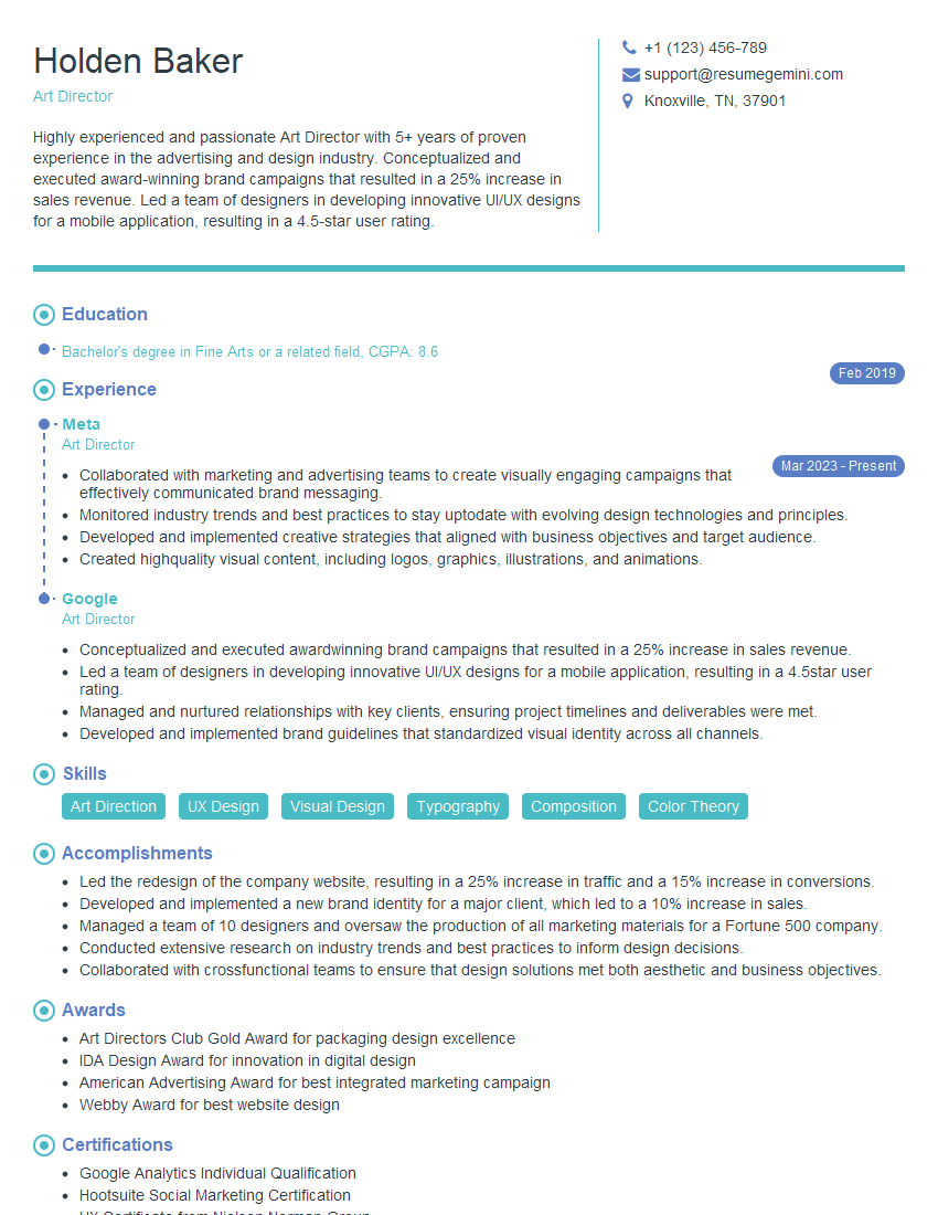
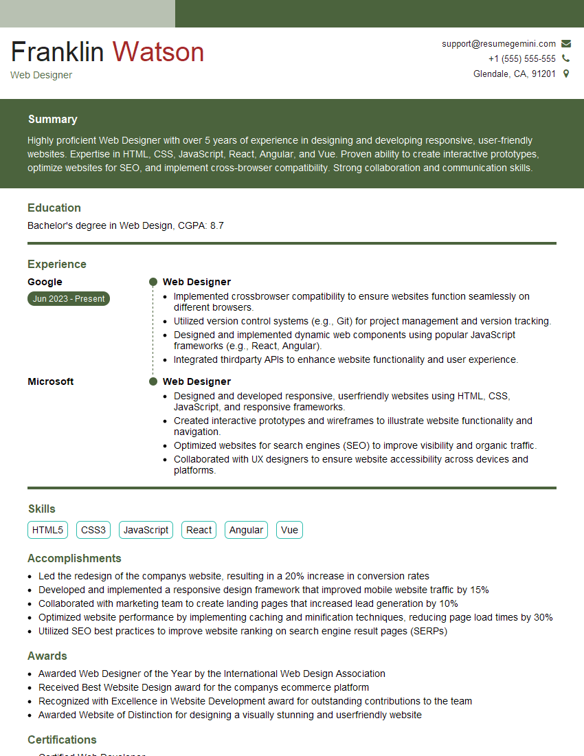
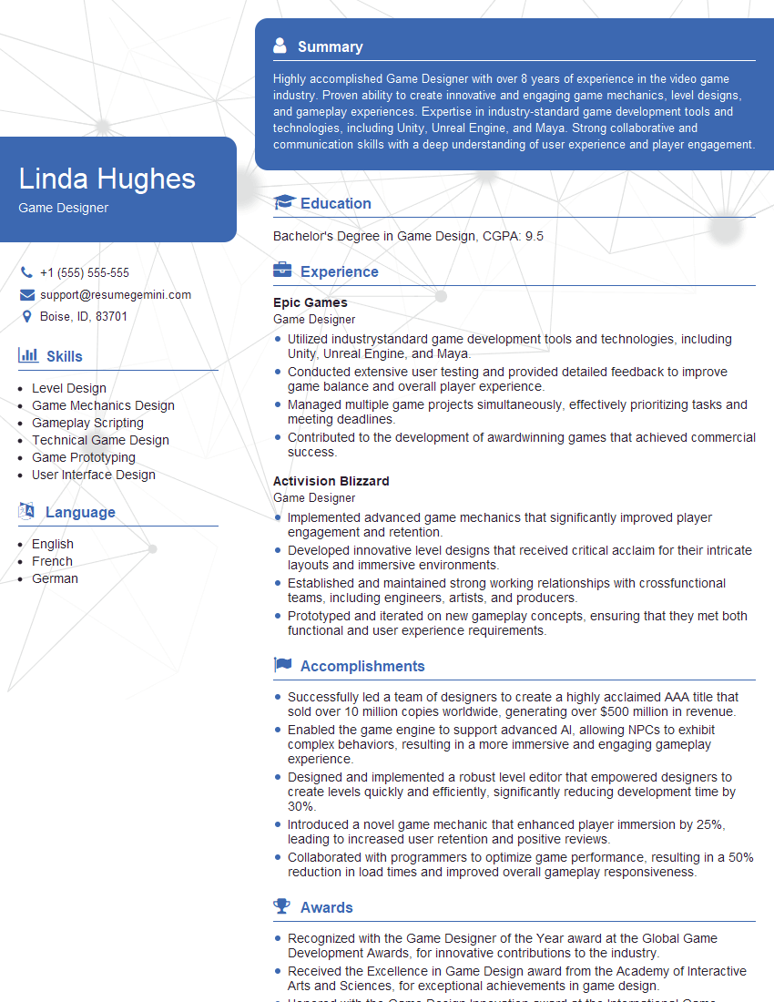
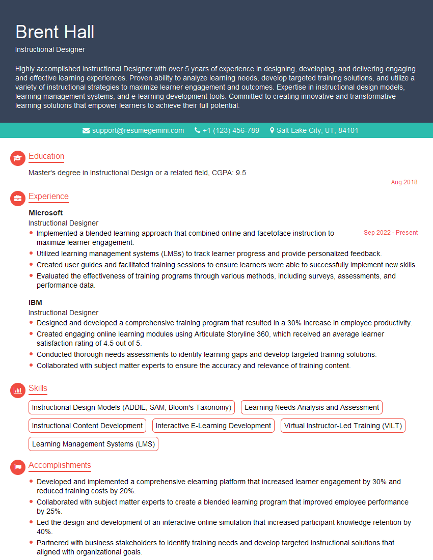
Mastering perspective and composition is crucial for success in many creative fields, enhancing your ability to communicate visually and create impactful work. A strong understanding of these principles will significantly improve your portfolio and make you a more competitive candidate. To further strengthen your job prospects, focus on creating an ATS-friendly resume that highlights your skills and experience effectively. ResumeGemini is a trusted resource to help you build a professional resume that truly showcases your talents. Examples of resumes tailored to highlight expertise in Perspective and Composition are available to help guide you.
Explore more articles
Users Rating of Our Blogs
Share Your Experience
We value your feedback! Please rate our content and share your thoughts (optional).
What Readers Say About Our Blog
Very informative content, great job.
good
