Preparation is the key to success in any interview. In this post, we’ll explore crucial Proficient in image editing and manipulation interview questions and equip you with strategies to craft impactful answers. Whether you’re a beginner or a pro, these tips will elevate your preparation.
Questions Asked in Proficient in image editing and manipulation Interview
Q 1. Explain your experience with Adobe Photoshop.
My experience with Adobe Photoshop spans over eight years, encompassing a wide range of applications from basic image enhancements to complex compositing and retouching. I’ve used it extensively for projects ranging from e-commerce product photography to high-end advertising campaigns. I’m proficient in utilizing its various tools, including the pen tool for precise selections, layer masks for non-destructive editing, adjustment layers for color correction and grading, and various filter effects for creative manipulation. For example, I recently used Photoshop to retouch a series of product shots for an online retailer, removing blemishes, adjusting lighting, and ensuring consistent branding across all images. This involved intricate masking techniques to preserve product details while enhancing the overall quality.
My skillset also includes advanced techniques such as creating photorealistic composites, using actions for automation, and working with high-resolution images efficiently. I understand the importance of non-destructive editing workflows to maintain image integrity and allow for easy revisions. I’m comfortable working with RAW files and utilizing advanced color management for optimal print and web output.
Q 2. Describe your proficiency in Adobe Illustrator.
My proficiency in Adobe Illustrator centers around vector graphics creation and manipulation. I utilize it primarily for logo design, creating illustrations for marketing materials, and preparing artwork for print. I’m adept at using the pen tool to create precise vector shapes, mastering the Pathfinder panel for complex shape manipulation, and employing various color palettes and styles for consistent branding. For instance, I designed a logo for a startup company using Illustrator, ensuring scalability for various applications from business cards to billboards. This involved understanding vector principles to create a clean, sharp logo that wouldn’t pixelate when resized.
Beyond logo design, I frequently use Illustrator to create vector-based illustrations and infographics. My understanding of typography and layout is also a significant asset in this process. I’m proficient in exporting artwork in various formats suitable for different platforms, including SVG, EPS, and PDF.
Q 3. What are your preferred image formats and why?
My preferred image formats depend heavily on the project’s requirements. For high-quality images that need to retain maximum detail and allow for non-destructive editing, I prefer TIFF or RAW (depending on the camera). TIFF provides excellent quality without compression artifacts, making it ideal for archiving and high-resolution printing. RAW files offer the greatest flexibility for post-processing, allowing for maximum control over image parameters.
For web use, where file size is crucial, I predominantly use JPEG for photographs and PNG for images with sharp lines and transparent backgrounds. JPEG offers a good balance between image quality and file size through lossy compression, while PNG provides lossless compression, preserving image quality without introducing artifacts, ideal for logos or illustrations with crisp lines.
For vector graphics, SVG (Scalable Vector Graphics) is the preferred format due to its scalability and ability to retain quality at any size.
Q 4. How do you handle large image files for efficient editing?
Handling large image files efficiently requires a strategic approach that combines software techniques and hardware considerations. Firstly, I always work with the lowest resolution necessary for the task at hand, scaling down images only when needed. Opening and editing massive, uncompressed files directly can cripple even the most powerful machines.
Within Photoshop, I utilize features like ‘Open as Smart Object’ which allows for non-destructive scaling and editing without compromising the original image quality. This is crucial for preserving detail while efficiently managing file size. Secondly, I make liberal use of memory management tools within Photoshop, adjusting the performance settings for optimized RAM utilization. I also frequently utilize layers and layer masks, allowing for selective editing without the need to alter the entire image, significantly improving workflow speed and efficiency.
Finally, in cases of exceptionally large files, I might consider using specialized software designed for handling images with extensive dimensions or explore techniques like image tiling to reduce the demand on system resources.
Q 5. Explain your process for retouching images.
My retouching process is iterative and non-destructive. I begin with a thorough assessment of the image, identifying areas needing attention. This might include removing blemishes, smoothing skin tones, correcting lighting inconsistencies, and removing distracting elements. I always start by making duplicate layers and using Adjustment Layers to tackle global issues like color balance and contrast. This allows for easy adjustment and reverting changes.
For more localized retouching, I heavily rely on the healing brush tool, clone stamp tool, and the patch tool, always paying close attention to blending and maintaining realistic textures. I often use layer masks to selectively apply retouching, ensuring I only impact specific areas. My aim isn’t to create an unrealistic image but rather to subtly enhance and improve the photo’s overall aesthetic quality while maintaining a natural look. Finally, I carefully review the retouched image, ensuring there are no visible artifacts or inconsistencies.
Q 6. How do you ensure color consistency across different images?
Maintaining color consistency across different images is crucial, particularly in projects with multiple photos. I use several methods to achieve this. Firstly, I shoot in RAW format whenever possible to give me maximum control over color adjustments in post-processing. Secondly, I carefully calibrate my monitor to ensure accurate color representation on screen. This minimizes discrepancies between my editing workflow and the final output.
Within Photoshop, I utilize adjustment layers for global color corrections, applying these consistently across all images using layer groups to apply the same adjustments to multiple images at once. Additionally, I might use tools like the color sampler to compare and match colors across different images. A technique I regularly employ is creating a reference image with a defined color palette and using it to guide color correction in the rest of the images.
Q 7. Describe your experience with color correction techniques.
My experience encompasses a wide range of color correction techniques, both global and localized. I’m proficient in using adjustment layers such as Levels, Curves, and Color Balance to make overall adjustments to brightness, contrast, and color hue and saturation. For more precise adjustments, I use tools like the selective color adjustment layer to target specific color ranges.
Beyond global adjustments, I understand the importance of localized color correction, using tools like the brush tool with color adjustment layers to selectively adjust colors within specific areas of an image. For example, I might use this to correct a color cast on a person’s face without affecting the rest of the image. I also understand the principles of white balance correction and often use dedicated tools for this to ensure realistic color representation, especially in images taken under varied lighting conditions. I regularly use before-and-after comparisons to ensure the corrections look natural and enhance the image without making it appear artificial.
Q 8. How familiar are you with RAW image editing?
RAW image editing is crucial for professional photography because it allows for non-destructive editing of images captured in their uncompressed, unprocessed format. Think of a RAW file as a digital negative; it contains far more image data than a JPEG or PNG. This means you have significantly more flexibility in post-processing, adjusting settings like white balance, exposure, contrast, and sharpening without losing image quality. I’m highly proficient in working with RAW files in Adobe Camera Raw (ACR) and Lightroom, leveraging their powerful tools for detail adjustments.
For example, I might shoot a landscape photograph where the sky is overexposed and the foreground is underexposed. In a JPEG, recovering detail in both areas would be difficult and result in significant noise and artifacting. However, with a RAW file in ACR, I can selectively adjust exposure, highlights, shadows, and whites/blacks to achieve a perfectly balanced image without degrading the quality.
Q 9. What methods do you use for image resizing without quality loss?
Resizing images without quality loss is all about using the right techniques. Simply enlarging an image using basic resizing algorithms will lead to pixelation and blurring. Instead, I utilize sophisticated resampling methods. Bicubic Smoother (or Bicubic) is my go-to for enlarging images, as it creates smoother transitions between pixels, minimizing artifacts. For reducing size, I often employ Bicubic Sharper to retain sharpness and detail.
These methods are available in most image editing software, including Photoshop. The key is to always work with the highest resolution source image possible and to understand that some quality loss is inherent in resizing, especially when significantly reducing the image dimensions. I always prefer to start with the largest file size and work my way down to the desired size for specific outputs, rather than starting with a small image and upscaling it later.
Q 10. How do you create and use layer masks in Photoshop?
Layer masks are an indispensable feature in Photoshop, enabling non-destructive editing. They allow you to selectively apply edits to specific parts of a layer without permanently altering the underlying image data. Imagine it as a stencil – you can paint on the stencil, and only the areas revealed by the stencil are affected. This is in stark contrast to using the Eraser tool, which deletes pixels permanently.
To create a layer mask, you simply click the ‘Add layer mask’ button at the bottom of the Layers panel. A white mask appears, representing full opacity (the entire layer is visible). You then use a brush tool with black to hide parts of the layer or white to reveal them. I frequently use layer masks for retouching, compositing, and color grading to achieve precise control and maintain flexibility throughout my workflow.
For instance, if I’m removing blemishes from a portrait, I’d use a layer mask to carefully paint away the blemishes without affecting the surrounding skin tone. This allows me to easily adjust the opacity or refine the mask later if needed, maintaining control and flexibility throughout the editing process.
Q 11. Explain your understanding of image resolution and its importance.
Image resolution refers to the number of pixels in an image, usually expressed as width x height (e.g., 1920 x 1080 pixels). Higher resolution means more pixels, resulting in a sharper, more detailed image. Understanding resolution is critical, especially for print projects.
For instance, a low-resolution image (e.g., 72 dpi) might look fine on a screen, but when printed it will appear blurry and pixelated. A high-resolution image (e.g., 300 dpi or higher) is necessary for crisp, professional print quality. I always consider the final output when choosing the appropriate resolution. For web images, a resolution of 72 dpi is generally sufficient, while print work may require 300 dpi or even higher, depending on the size and printing method.
Q 12. How do you manage and organize your image assets?
Organizing image assets is essential for efficiency and sanity. My system revolves around a hierarchical folder structure based on project, date, and image type (RAW, JPEG, TIFF, etc.). I use descriptive file names that include keywords for easy searching (e.g., Project_Name_Date_Description.jpg). I often employ metadata embedding to further organize and categorize images within the file itself.
In addition to folder structure, I use keywording and rating systems within Lightroom and Bridge to further organize and quickly locate specific images. This allows me to streamline my workflow and easily retrieve specific images based on various criteria, saving valuable time and preventing disorganization.
Q 13. Describe your experience with vector graphics versus raster graphics.
Raster graphics (like JPEGs and PNGs) are made up of pixels, while vector graphics (like SVGs and AI files) are composed of mathematical equations defining lines and curves. This fundamental difference impacts their scalability and editing capabilities.
Raster graphics lose quality when scaled up; enlarging them results in pixelation. They are ideal for photorealistic images and are easy to manipulate for color and tone adjustments. Vector graphics, however, can be scaled infinitely without losing quality, making them perfect for logos, illustrations, and designs that require sharp, clean lines at any size. I often use vector graphics for creating designs for branding and web graphics, while raster graphics are my go-to for photographs and photorealistic images.
Q 14. What are the differences between destructive and non-destructive editing?
Destructive editing permanently alters the original image data, while non-destructive editing allows modifications without affecting the source file. Think of it like writing in pen versus writing in pencil – you can erase pencil marks, but pen marks are permanent.
Examples of destructive editing include cropping directly on the original image or using the Eraser tool. Non-destructive methods include using adjustment layers, layer masks, and smart objects. I always prioritize non-destructive editing techniques to ensure maximum flexibility and control during the entire editing process and to protect the original image quality.
Q 15. How do you create a photo collage?
Creating a photo collage involves assembling multiple images into a single, unified composition. Think of it like creating a visual story or a scrapbook, but with more refined control and aesthetic appeal. The process depends heavily on the desired outcome and the software used. In Photoshop, for example, you might use the following steps:
- Gather your images: Choose photos of consistent quality and similar color palettes for a cohesive look. Experiment with different sizes and orientations.
- Choose a layout: Decide on the arrangement of the photos – a grid, a freeform layout, or something more artistic. Sketching this out beforehand can be helpful.
- Prepare the canvas: Create a new document in Photoshop with dimensions large enough to accommodate all images. Set the resolution appropriately for your intended use (print or web).
- Import and place images: Open each image in Photoshop separately. Use the ‘Move Tool’ (V) to drag and drop each image onto the main collage canvas. Resize and reposition them as needed. Consider using layer masks to blend edges seamlessly.
- Add decorative elements: Enhance the collage with borders, textures, text overlays, or other decorative elements to enhance the visual narrative and tie the images together. Experiment with different blending modes for creative effects.
- Refine and export: Adjust overall brightness, contrast, and saturation to maintain consistency across the collage. Finally, save the collage in the appropriate file format (JPEG for web, TIFF for print) and resolution.
For a simpler approach, many online tools and apps offer drag-and-drop collage creation with pre-designed templates. The key is to find a method that best suits your technical skills and creative vision.
Career Expert Tips:
- Ace those interviews! Prepare effectively by reviewing the Top 50 Most Common Interview Questions on ResumeGemini.
- Navigate your job search with confidence! Explore a wide range of Career Tips on ResumeGemini. Learn about common challenges and recommendations to overcome them.
- Craft the perfect resume! Master the Art of Resume Writing with ResumeGemini’s guide. Showcase your unique qualifications and achievements effectively.
- Don’t miss out on holiday savings! Build your dream resume with ResumeGemini’s ATS optimized templates.
Q 16. How do you remove unwanted objects from an image?
Removing unwanted objects from an image is a common task in photo editing, often referred to as ‘retouching’. The best technique depends on the complexity and size of the object. For small objects, the Spot Healing Brush Tool in Photoshop is often sufficient. This tool intelligently samples surrounding pixels to seamlessly fill the area. For larger or more complex objects, the Clone Stamp Tool provides more control, allowing you to manually sample and copy textures from another area of the image to cover the unwanted object. The Patch Tool offers another option; select the unwanted area and then select a clean area to patch it with. Finally, the Content-Aware Fill option (found under Edit > Fill) is a powerful tool that uses AI to intelligently fill the selected area based on the surrounding content, often producing very natural results.
For instance, removing a person from a landscape photo might involve using a combination of the Clone Stamp Tool and Content-Aware Fill. Carefully cloning the background texture around the person, and then using Content-Aware Fill to seamlessly blend the remaining areas, can yield professional results. The key is to pay close attention to detail and match textures and lighting meticulously to ensure a believable outcome.
Q 17. Explain your experience with image sharpening techniques.
Image sharpening techniques aim to enhance the detail and clarity of an image, making it appear crisper and more defined. Over-sharpening can lead to artifacts, so a nuanced approach is crucial. Several techniques exist:
- Unsharp Mask: A classic sharpening filter that adjusts the amount, radius, and threshold of sharpening. The radius controls the size of the area affected, the amount controls the intensity, and the threshold defines the contrast difference required to apply sharpening.
- High Pass Filter: This filter isolates the high-frequency details, which are then layered on top of the original image to enhance sharpness. Adjusting the layer opacity controls the intensity of the sharpening effect.
- Smart Sharpen: Photoshop’s Smart Sharpen filter offers advanced controls, allowing you to choose between different sharpening algorithms (Gaussian Blur, Lens Blur) and fine-tune the radius, amount, and reduce noise simultaneously. This gives more control and frequently provides better results.
- Local Sharpening: This involves selectively sharpening specific areas of an image, using tools like the Sharpen Tool or applying sharpening filters only to selected layers or areas using masking techniques. This is particularly useful when needing to sharpen only certain elements within a composition.
My approach always involves experimenting with different techniques and carefully evaluating the results at different zoom levels to avoid introducing artifacts or unnatural-looking edges. The best technique depends greatly on the original image quality and the desired outcome.
Q 18. How do you adjust brightness, contrast, and saturation effectively?
Adjusting brightness, contrast, and saturation is fundamental to image editing. These adjustments affect the overall tonal range and color intensity of an image. Think of brightness as the overall lightness or darkness, contrast as the difference between the lightest and darkest areas, and saturation as the intensity of the colors.
In Photoshop, these adjustments are easily made using the Levels or Curves tools for precise control, or the simpler Brightness/Contrast adjustment layer. The Hue/Saturation adjustment layer is ideal for managing color intensity. Using adjustment layers allows for non-destructive editing, allowing changes to be easily modified or removed later.
For instance, a poorly lit image might benefit from increasing brightness and contrast to improve visibility, while an image with washed-out colors might require saturation enhancement. However, it’s essential to avoid over-adjusting, as this can lead to unnatural-looking results or loss of detail. Careful observation and iterative refinement are key to achieving a balanced and aesthetically pleasing outcome.
Q 19. Describe your understanding of different file compression techniques.
File compression techniques reduce the file size of an image without significant loss of quality (lossless) or with some acceptable loss of quality (lossy). Understanding the trade-offs between file size and quality is vital.
- Lossless Compression: Techniques like PNG and TIFF retain all image data, ensuring no information is lost during compression. PNG is generally preferred for images with sharp lines and text, while TIFF is often used for high-resolution images intended for print.
- Lossy Compression: JPEG is the most common lossy compression format. It discards some image data during compression, reducing file size but potentially affecting image quality. The degree of compression (and therefore the quality loss) is adjustable. JPEG is well-suited for photographs where minor quality loss is often acceptable to achieve a significantly smaller file size.
- WebP: A newer format offering both lossy and lossless compression, often achieving better compression ratios than JPEG or PNG, with comparable or better image quality.
Choosing the appropriate compression technique and level depends heavily on the image content and intended use. For web use, smaller file sizes are crucial for faster loading times, so lossy compression is often preferred. For print or archival purposes, lossless compression is essential to preserve image fidelity.
Q 20. How familiar are you with using actions and presets in Photoshop?
Actions and presets in Photoshop are powerful tools for automating repetitive tasks and applying consistent styles to multiple images. Actions record a sequence of editing steps, allowing you to replay them on other images, while presets offer pre-defined settings for various adjustments (e.g., filters, styles).
I’m highly proficient in creating and utilizing both actions and presets. For example, I often create actions for batch-processing images: resizing, sharpening, and watermarking hundreds of photos for a client’s website. Presets are helpful for quickly applying a consistent look and feel to a series of images, maintaining brand consistency across a marketing campaign. Furthermore, understanding how to customize existing presets or create my own from scratch enables me to tailor the editing process to meet specific client requirements.
Q 21. How do you handle client feedback on image edits?
Handling client feedback on image edits is crucial for delivering satisfactory results. My approach involves:
- Active Listening: Carefully listening to the client’s concerns and understanding their vision.
- Clarification: Asking clarifying questions to ensure I understand their feedback accurately.
- Demonstration: Showing the client the edits made, explaining the rationale behind each adjustment.
- Iteration: Making the necessary revisions based on the feedback, providing updates and demonstrating the improvements.
- Professionalism: Maintaining a professional and courteous demeanor, even when faced with challenging feedback.
I always aim for a collaborative approach, viewing feedback as an opportunity to refine the final product and meet the client’s expectations. Documenting all changes and keeping clients informed throughout the revision process ensures a smooth and productive workflow.
Q 22. Describe your experience with creating different image effects (e.g., HDR, vintage).
Creating image effects like HDR and vintage involves a blend of technical skills and artistic vision. HDR (High Dynamic Range) imaging aims to capture a wider range of tones than a standard photo, resulting in images with more detail in both shadows and highlights. This often involves combining multiple exposures of the same scene, or using software tools to simulate the effect. I’ve extensively used techniques like tone mapping in Adobe Photoshop and Lightroom to achieve realistic HDR looks, carefully adjusting the luminosity and contrast to avoid unnatural results. For instance, I once enhanced a landscape photograph taken in challenging lighting conditions by merging three bracketed exposures, resulting in a breathtaking image with vivid colors and deep shadows.
Vintage effects, on the other hand, are about creating a nostalgic feel. This can involve adjusting color balance to create a faded or sepia tone, adding textures like scratches or grain to simulate age, and applying subtle vignette effects to darken the corners. I often use layer masks and adjustment layers in Photoshop to non-destructively apply these effects, allowing for precise control and easy adjustments. For example, I recently created a vintage-style poster for a client by applying a custom grunge texture, adjusting the color saturation, and adding a subtle vignette. The key is understanding how these effects impact the mood and overall message of the image.
Q 23. Explain your knowledge of different image manipulation software beyond Adobe products.
While I’m highly proficient in Adobe Photoshop and Lightroom, my experience extends beyond the Adobe ecosystem. I’ve worked extensively with GIMP (GNU Image Manipulation Program), a powerful free and open-source alternative to Photoshop. GIMP offers a comprehensive set of tools for image manipulation, comparable in many ways to Photoshop, making it a valuable tool for budget-conscious projects or situations where proprietary software isn’t readily available. I’ve also used Affinity Photo, a strong competitor to Photoshop known for its speed and affordability. Its user interface is intuitive, and its features, including RAW processing capabilities and layer styles, are comparable to industry standards. Furthermore, I have experience with specialized software like Capture One for professional RAW image processing and its advanced tethering capabilities. Each software has its strengths and weaknesses. The choice depends on the project’s requirements, budget, and my personal preference for the specific workflow.
Q 24. How do you ensure images are optimized for web use?
Optimizing images for web use is crucial for fast loading times and a positive user experience. This primarily involves reducing file size without significantly impacting image quality. My process involves several key steps: First, I choose the right file format – JPEG for photographs and PNG for graphics with sharp lines and transparency. Next, I carefully adjust the image dimensions to match the intended display area, avoiding unnecessarily large files. I then utilize lossy compression techniques for JPEGs, carefully balancing file size and visual quality. I usually aim for a file size under 100KB for smaller images and under 500KB for larger ones, although the ideal size will depend on the specific needs of the project. Tools such as Photoshop’s ‘Save for Web’ feature or online compression tools are invaluable for this process. I also use progressive JPEGs, which allow the image to gradually load, improving the user experience, especially on slower connections. Finally, I always test the optimized images on various devices and browsers to ensure they display correctly and load quickly.
Q 25. Describe your experience with creating graphics for print media.
My experience with print media graphics involves a deep understanding of color spaces, resolution, and print-specific considerations. Unlike web graphics, print requires significantly higher resolutions (typically 300 DPI or higher) to avoid pixelation. I’ve worked on various print projects, including brochures, posters, and marketing materials. For instance, I designed a high-resolution brochure for a local business, carefully ensuring that all elements – text, images, and logos – were sharp and clear at the required print resolution. I always work in CMYK color mode for print projects and convert the final images to the appropriate CMYK profile used by the printing service to ensure accurate color reproduction. The process also requires a thorough understanding of bleed and margins to ensure that designs align correctly when printed. Understanding pre-press procedures and effectively communicating with printers are essential aspects of this process, ensuring a smooth and professional outcome.
Q 26. How do you work with different color profiles (e.g., sRGB, Adobe RGB)?
Color profiles, such as sRGB and Adobe RGB, define the range of colors that a device can display or a file can store. sRGB is the standard for web and most monitors, while Adobe RGB offers a wider gamut, suitable for professional printing. I meticulously manage color profiles throughout my workflow to ensure color accuracy. When working on images intended for the web, I use the sRGB profile. For print projects, I typically start with Adobe RGB to maintain the widest possible color range and then convert to the appropriate CMYK profile specified by the printer. Incorrect color profile management can lead to significant color shifts between the screen and the final print. Therefore, I always convert images to the correct profile only at the very final stage of preparation for output to avoid color degradation caused by multiple conversions. Software like Photoshop allows for precise color profile management through its color settings and allows for viewing the image in simulated color spaces to predict how it will appear in different outputs.
Q 27. Explain your workflow for a typical image editing project.
My workflow for a typical image editing project is iterative and organized. It usually begins with a thorough understanding of the project’s requirements and goals. This includes determining the intended use (web, print, etc.), desired aesthetic, and technical specifications. Then, I carefully assess the source images, identifying areas needing improvement or enhancement. My editing process typically involves non-destructive techniques, using adjustment layers and masks whenever possible. This approach allows for flexibility and easy revisions. I usually start with basic adjustments like cropping, straightening, and color correction before moving on to more advanced techniques like retouching, compositing, or applying special effects. Throughout the process, I regularly save versions of my work, ensuring that I can revert to previous steps if needed. Finally, I optimize the image according to the intended output and thoroughly review the final product before delivery. This structured approach ensures efficiency, quality, and effective client communication throughout the project.
Key Topics to Learn for Proficient in Image Editing and Manipulation Interview
- Image Formats and Properties: Understanding file types (JPEG, PNG, GIF, TIFF, etc.), their characteristics, and optimal uses for different applications. Consider the implications of lossy vs. lossless compression.
- Color Theory and Correction: Mastering color modes (RGB, CMYK), color spaces, and applying color correction techniques like white balance, levels, and curves. Be prepared to discuss color management workflows.
- Image Manipulation Techniques: Demonstrate proficiency in techniques such as cropping, resizing, retouching, sharpening, and blending. Be ready to discuss your experience with various tools and methods.
- Layer Management and Masking: Explain your understanding of layers, layer masks, adjustment layers, and how these are used to achieve complex edits non-destructively. Practical examples are key here.
- Software Proficiency: Showcase your expertise in industry-standard software like Photoshop, GIMP, or other relevant applications. Highlight specific tools and features you’ve mastered within your chosen software.
- Workflow and Efficiency: Discuss your approach to organizing files, managing projects, and optimizing your workflow for efficiency and quality control. Explain how you ensure consistency and accuracy in your work.
- Image Resolution and DPI: Demonstrate a clear understanding of resolution, DPI, and their importance for print versus web applications. Explain how to optimize images for different output mediums.
- Problem-Solving and Troubleshooting: Be ready to discuss how you approach common image editing challenges, such as fixing artifacts, correcting distortions, or dealing with difficult file formats.
Next Steps
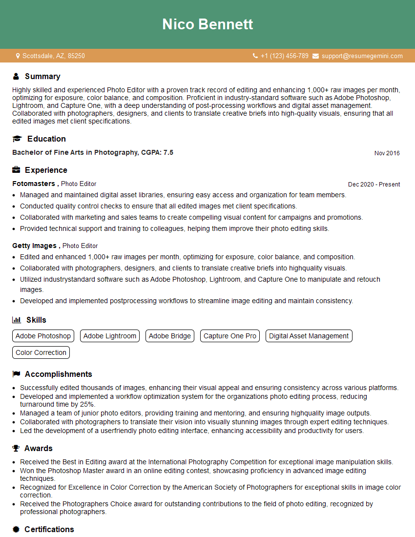
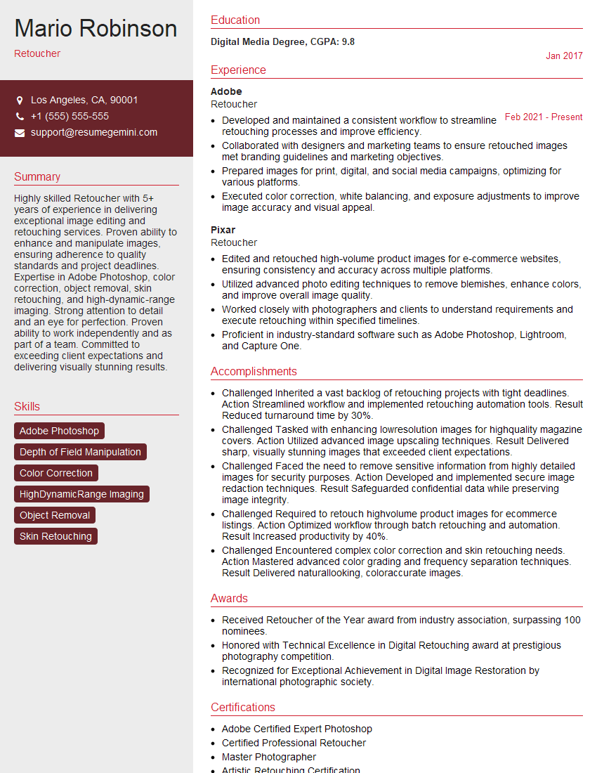
Mastering image editing and manipulation is crucial for a successful career in many creative fields, opening doors to exciting opportunities in design, photography, advertising, and more. To maximize your job prospects, creating an ATS-friendly resume is essential. ResumeGemini can help you build a professional and effective resume that highlights your skills and experience in image editing and manipulation. ResumeGemini provides examples of resumes tailored to this specific skillset, guiding you to create a document that truly showcases your capabilities. Invest time in crafting a strong resume – it’s your first impression to potential employers.
Explore more articles
Users Rating of Our Blogs
Share Your Experience
We value your feedback! Please rate our content and share your thoughts (optional).
What Readers Say About Our Blog
Very informative content, great job.
good
