Feeling uncertain about what to expect in your upcoming interview? We’ve got you covered! This blog highlights the most important Graphic Design Software (e.g., Photoshop, Illustrator, After Effects) interview questions and provides actionable advice to help you stand out as the ideal candidate. Let’s pave the way for your success.
Questions Asked in Graphic Design Software (e.g., Photoshop, Illustrator, After Effects) Interview
Q 1. Explain your workflow for retouching images in Photoshop.
My image retouching workflow in Photoshop is highly systematic, focusing on non-destructive editing whenever possible. It begins with a thorough assessment of the image – identifying areas needing attention like blemishes, wrinkles, unwanted objects, or color inconsistencies. I always start by making a backup copy of the original image to preserve the original data. Then, I proceed step-by-step:
- Opening and Assessing: I open the image in Photoshop and create a new layer. This ensures that my edits are non-destructive.
- Spot Healing: I use the Spot Healing Brush Tool to remove minor blemishes and imperfections. I choose the appropriate brush size and hardness based on the area being worked on. For larger areas, I may use the Clone Stamp Tool or Patch Tool, carefully selecting a source area for blending.
- Frequency Separation: For more advanced retouching, I often employ frequency separation. This technique separates the image into texture and color layers, allowing for precise editing of each. This prevents smearing or losing fine details during color correction.
- Dodge & Burn: Subtle adjustments to highlight and shadow areas are made using the Dodge and Burn tools, again working on separate layers to maintain non-destructive workflow. I prefer using the tools in mid-tones to obtain the most natural results.
- Color Correction: I use adjustment layers like Curves and Levels to fine-tune the overall color balance and contrast. I carefully adjust RGB channels, aiming for a natural and appealing look, avoiding over-saturation or unrealistic skin tones.
- Sharpening: Finally, I subtly sharpen the image using techniques like Unsharp Mask or Smart Sharpen, paying close attention to details to avoid haloing effects. I often use this as the last step to finalise the image.
This organized approach ensures efficient and high-quality retouching, maintaining the integrity of the original image while achieving a polished result. For example, once I retouched a product image for an e-commerce client, using frequency separation saved me considerable time and produced a more professional result than traditional methods, ensuring that the product looked stunning without being unrealistic.
Q 2. How do you manage layers effectively in Photoshop?
Effective layer management in Photoshop is crucial for a streamlined and organized workflow. Think of layers as transparent sheets stacked on top of each other. Each layer contains its own edits, allowing for flexibility and non-destructive editing. My strategies include:
- Naming Conventions: I use descriptive names for each layer (e.g., “Skin Retouching,” “Background,” “Text Overlay”). This instantly clarifies the layer’s purpose, preventing confusion during complex projects.
- Grouping Layers: For complex images with numerous layers, grouping related layers using folders is essential. This helps maintain organization and allows for easy selection and manipulation of multiple layers simultaneously.
- Color-Coding: I use color-coded layer folders to further enhance organization. For example, I might assign blue to background layers, green to retouching layers, and red to text layers. This visual cue speeds up the workflow significantly.
- Layer Styles: Using layer styles (drop shadows, inner shadows, bevels, etc.) helps in creating complex effects without adding extra layers. This keeps the layer count down and the project clean.
- Layer Masks: Layer masks are invaluable for making precise non-destructive edits. Instead of erasing parts of a layer, you mask out portions, allowing you to easily reveal or hide parts of a layer later.
For example, when designing a complex poster with multiple elements, effective layer management ensures I can easily tweak individual elements without affecting others. It’s like working with building blocks where each block has its own function and can be easily rearranged or modified.
Q 3. Describe your experience with Photoshop’s adjustment layers.
Photoshop’s adjustment layers are my go-to tools for non-destructive color correction and image enhancements. They act like filters that sit above the image layers, allowing you to modify the appearance of underlying layers without directly altering the pixel data. This allows for flexibility and easy adjustments later in the process.
- Levels: I frequently use Levels to adjust the contrast and tonal range of the image, bringing out details in shadows and highlights. It offers precise control over the input and output levels.
- Curves: Curves provide more granular control over tonal adjustments compared to Levels. It allows me to create custom curves to shape the tonal range precisely, adding dramatic contrasts or subtler enhancements.
- Hue/Saturation: This adjustment layer lets me fine-tune the hue, saturation, and lightness of specific colors or the entire image, creating harmonious color palettes or adjusting color balance effectively.
- Color Balance: I use Color Balance to shift the overall color temperature (warmth or coolness) of the image, correcting color casts and creating desired moods.
- Black & White: This layer is particularly useful for converting color images into monochromatic images with precise control over individual color channel conversions.
For instance, when enhancing a portrait photograph, I would use adjustment layers to achieve a more natural skin tone, refine the highlights and shadows, and create a balanced and vibrant image without affecting the original pixel data. The non-destructive nature makes it easier to experiment and iterate.
Q 4. What are some advanced techniques you use in Photoshop for image manipulation?
Beyond the basics, my advanced Photoshop techniques include:
- Content-Aware Fill: This powerful tool intelligently fills selected areas by analyzing the surrounding pixels, making it easy to remove unwanted objects or seamlessly fill gaps in an image.
- Liquify Filter: I use the Liquify filter for subtle or dramatic warp and distortion effects. It helps in correcting minor imperfections, sculpting body shapes, or creating artistic effects.
- Camera Raw Filter: Even if not shooting in RAW format, the Camera Raw filter provides advanced tools for adjustments like lens correction, noise reduction, and detail enhancement.
- Actions: Automation through Actions allows me to streamline repetitive tasks, saving time and ensuring consistency across multiple images. This is invaluable for batch processing and repetitive editing tasks.
- Smart Objects: Working with Smart Objects provides non-destructive editing capabilities for images and vector graphics, allowing for scaling and transformations without loss of quality.
For example, when working on a promotional banner for a client, I used Content-Aware Fill to remove an unwanted power line in a cityscape photograph, saving hours of painstaking manual retouching. Similarly, creating multiple versions of a logo with varying text and color schemes was streamlined significantly by using Actions, ensuring consistent style across the different designs.
Q 5. How would you create a vector illustration in Illustrator using the Pen Tool?
Creating vector illustrations in Illustrator with the Pen Tool requires precision and understanding of vector paths. The Pen Tool allows for the creation of precise curves and lines, forming the basic building blocks of any vector image. My approach is as follows:
- Planning: Before starting, I sketch out my illustration on paper to outline the general shape and flow. This helps streamline the process in Illustrator.
- Creating Paths: Using the Pen Tool, I click to create anchor points and drag to create curves, forming the outlines of my shapes. Accurate placement of anchor points and precise control of curve handles is key.
- Adjusting Paths: After creating a path, I may refine the curves by adjusting the anchor points and curve handles using the Direct Selection Tool. This allows for the creation of smooth and precise lines.
- Adding Color and Detail: Once the outlines are complete, I add colors and details using various tools like the Fill and Stroke panels. Color choices are strategic, and I usually maintain consistency in the color palette for a uniform look.
- Saving the File: I always save my Illustrator file in the AI format to maintain editability and scalability. For web use, I export the file in SVG or PNG format, depending on the requirements.
For example, when designing a complex character illustration, meticulous use of the Pen Tool enabled me to create smooth and expressive curves, capturing every nuance of the character’s features. The vector nature of the illustration ensures scalability without loss of quality, ensuring it looks great on any platform, from a business card to a billboard.
Q 6. Explain your process for creating a complex logo in Illustrator.
Designing a complex logo in Illustrator involves a strategic process that combines creativity with technical precision. My process is structured as follows:
- Concept Development: I begin by thoroughly understanding the client’s brand identity, target audience, and business goals. I brainstorm several logo concepts, sketching them out to explore different visual directions.
- Vector Creation: Once I have a finalized sketch, I use Illustrator’s tools (Pen Tool, Shape tools, Type Tool) to recreate it as a vector-based design. For complex shapes, the Pen Tool reigns supreme.
- Refinement and Iteration: I refine the logo by adjusting shapes, colors, and typography. This often involves multiple iterations, constantly evaluating the design’s effectiveness and visual appeal. Feedback from the client is crucial at this stage.
- Color Palette Selection: I carefully choose a color palette that aligns with the brand’s personality and target audience. Consideration of color psychology is crucial in this step.
- Typography Selection: I choose a typeface that reflects the brand’s identity – whether it’s modern, classic, playful, or serious. Typography plays a key role in overall logo aesthetics.
- Testing and Revisions: The final logo is tested on various backgrounds and in different sizes to check its scalability and visual impact. Revisions are made based on testing feedback.
- Finalization: Once the client approves the final logo, it is prepared for different formats (vector and raster) for various applications—web, print, etc.
For instance, I recently designed a logo for a tech startup. The process involved multiple iterations, starting with initial sketches, refining the vector illustration, experimenting with different typefaces and color palettes, and ultimately resulting in a modern and impactful logo that effectively communicates the company’s innovative nature. The vector format ensured its scalability for all applications.
Q 7. How do you use Illustrator’s Pathfinder panel?
Illustrator’s Pathfinder panel is a powerful tool for combining, subtracting, and manipulating shapes in a vector illustration. It allows for complex shapes to be created from simpler ones without manually redrawing every path. I regularly use the Pathfinder panel for:
- Unite: Combines multiple shapes into a single, unified shape.
- Minus Front: Subtracts the topmost shape from the shape beneath it.
- Intersect: Creates a new shape that represents the overlapping areas of multiple shapes.
- Exclude: Creates a shape that’s the opposite of the intersection of multiple shapes.
- Divide: Splits overlapping shapes into individual pieces.
It’s like having a digital set of cookie cutters. For example, when creating a complex logo design with overlapping shapes, I use the Pathfinder panel’s ‘Minus Front’ option to cut out sections of one shape from another, creating precise details without having to manually trace paths. This significantly speeds up the design process and improves precision.
Q 8. Describe your experience with creating and manipulating gradients in Illustrator.
Creating and manipulating gradients in Illustrator is a fundamental skill for any graphic designer. Illustrator offers a variety of gradient types, each with its own unique properties and applications. The most common are linear, radial, and freeform gradients.
A linear gradient transitions smoothly between two or more colors along a straight line. Think of a sunset, where the colors blend seamlessly from one hue to another. To create one, you select the gradient tool, click and drag to define the direction and length of the gradient, and then adjust the color stops in the Gradient panel to fine-tune the transition. You can control the position, color, and opacity of each color stop for precise control.
A radial gradient transitions from a central point outwards, creating a circular or elliptical effect. Imagine a spotlight; its intensity is highest at the center and fades towards the edges. Its creation is similar to linear gradients; you just choose the radial gradient type and adjust the color stops accordingly. You can also control the gradient’s shape and size.
A freeform gradient gives you complete freedom to define the gradient’s shape and direction by dragging and manipulating points. This is perfect for achieving organic and irregular transitions. It’s a more advanced technique, best used when you need more creative control over the gradient.
Beyond these types, you can further refine gradients by adjusting their transparency, adding more color stops for smoother transitions, and experimenting with different blending modes to achieve various effects. For example, using a gradient overlay as a layer style can subtly enhance the appearance of an image, adding depth and visual interest.
Q 9. How would you create a simple animation in After Effects?
Creating a simple animation in After Effects is surprisingly straightforward. Let’s say we want to animate a simple square moving across the screen. First, you create a square shape layer using the rectangle tool. Next, you’ll open the Timeline panel, where the magic happens.
The core concept is using keyframes. A keyframe marks a specific point in time in your animation, defining a property’s value at that instant. To animate the square’s position, you’ll first set a keyframe at the beginning of your animation by clicking the stopwatch icon next to the ‘Position’ property in the Timeline. This creates a keyframe at the current position of the square. Then, you advance the playhead to a later point in time, move the square to a new location, and another keyframe will automatically be created.
After Effects will smoothly interpolate (blend) between these keyframes, creating the animation. You can add more keyframes to create complex movements and adjust the speed and timing of the animation in the graph editor. You can also animate other properties, like opacity, scale, and rotation, using the same keyframe technique.
For a complete beginner, I often recommend starting with this simple example: create a solid-color layer, animate its position, and then experiment with opacity to create a fade-in or fade-out effect.
Q 10. Explain your understanding of keyframes in After Effects.
Keyframes in After Effects are the cornerstone of animation. Think of them as snapshots of a property’s value at a specific point in time. Every animation in After Effects relies on keyframes to define how a property changes over time.
For example, if you’re animating the position of a layer, each keyframe specifies the layer’s x and y coordinates at a particular frame. After Effects then automatically interpolates (smoothly transitions) between these keyframes to create the movement. You can have as many keyframes as you need for complex animations; more keyframes mean more control over the animation’s details and timing.
Keyframes aren’t limited to position; you can use them to animate almost any property, including opacity, scale, rotation, color, and even more complex attributes like audio levels or effects parameters. By manipulating keyframes, we can create all kinds of animated effects such as bouncing balls, smooth camera movements, or subtle transitions between scenes. This level of control allows for both precise technical animation and creative stylistic choices.
Q 11. How do you use masks in After Effects for compositing?
Masks in After Effects are incredibly powerful tools for isolating and manipulating specific portions of a layer or composition. They act like stencils, allowing only certain areas of a layer to be visible or to be affected by effects. This is fundamental for compositing, where you combine multiple layers to create a single image or video.
In compositing, masks are used to seamlessly integrate elements. For example, imagine you’re adding a person into a scene. You would mask the person’s layer to isolate them from their original background. This allows you to place them onto your desired background without the original background interfering.
After Effects offers various mask shapes (rectangle, ellipse, polygon, and even freehand shapes). You can adjust the mask’s shape, feather its edges for soft transitions, and animate its position and shape over time to create dynamic effects. Masks also work with effect parameters and can be used to apply an effect only to a selected part of a layer, while leaving the rest unaffected.
For instance, you might use a mask to apply a blur effect only to the background around a person, keeping the person sharp and in focus. Masking is also crucial for keying (removing backgrounds) and other advanced compositing techniques.
Q 12. Describe your experience with rotoscoping in After Effects.
Rotoscoping in After Effects is a technique used to trace over live footage, frame by frame, to create animation. It’s a time-consuming process, but it can produce incredibly realistic and nuanced results, often used for complex visual effects or creating animated characters from live-action footage.
Traditionally, rotoscoping involved tracing each frame onto a sheet of paper. In After Effects, the process is streamlined through the use of the Roto Brush tool. This tool allows you to semi-automatically trace around an object, frame by frame. After Effects helps by using AI to aid in the process, significantly speeding up the workflow.
The effectiveness of rotoscoping depends on many factors, such as the contrast between subject and background, camera movement, and the complexity of the subject. The quality of the final rotoscope depends heavily on the artist’s skill and attention to detail. Once the rotoscoping is complete, the resulting mask can be used to isolate the subject, allowing for further effects, compositing, or animation.
Rotoscoping can be used in various scenarios: replacing a background, isolating a moving object, and creating special effects. While complex, mastered rotoscoping allows for extremely high-quality and realistic results not easily achieved through other techniques.
Q 13. What is your preferred method for exporting files from Photoshop for web use?
My preferred method for exporting files from Photoshop for web use is to save them as JPEGs or PNGs, depending on the image’s content. JPEGs are great for photographic images because they offer good compression, resulting in smaller file sizes. However, they use lossy compression meaning some image quality will be lost, so they are not suitable for images with sharp lines or text.
PNGs, on the other hand, are better for images with sharp lines, text, or transparent backgrounds because they use lossless compression, preserving image quality, even with significant editing. They are generally larger than JPEGs, which should be considered for web use.
Before exporting, I always optimize the image for web use by reducing its file size without significantly sacrificing quality. Photoshop offers tools and options to control compression levels, image dimensions, and color profiles to help achieve this. The goal is to find the optimal balance between file size and image quality for fast loading times on the web without compromising visual appeal.
For example, if I have a logo, I’d use a PNG to preserve sharp edges and potentially transparency. But for a background image, a well-compressed JPEG will often suffice.
Q 14. What file formats are best suited for print and web design?
The best file formats for print and web design differ due to their respective requirements.
For print design, the most common formats are:
- TIFF (Tagged Image File Format): Lossless, excellent for high-quality images and allows for layering and color space adjustments.
- EPS (Encapsulated PostScript): Vector format, ideal for illustrations and logos that need to be scaled without loss of quality.
- PDF (Portable Document Format): Versatile format supporting both vector and raster images, ideal for final print-ready files that retain all design elements.
For web design, the most common formats are:
- JPEG (Joint Photographic Experts Group): Lossy compression, suitable for photographs and images where some quality loss is acceptable for smaller file sizes.
- PNG (Portable Network Graphics): Lossless compression, great for graphics with sharp lines, text, or transparent backgrounds. Offers better quality than JPEG for images with sharp lines and text.
- GIF (Graphics Interchange Format): Supports animation and lossless compression, but limited color palette; typically reserved for simple animated images and icons.
- SVG (Scalable Vector Graphics): Vector format, ideal for logos, illustrations, and graphics that need to scale without loss of quality. Used for responsive web design elements.
Choosing the right format depends on the specific needs of the project and the intended medium. Understanding the strengths and weaknesses of each format allows for efficient and high-quality outputs.
Q 15. How do you ensure color consistency across different projects?
Maintaining color consistency across projects is crucial for brand recognition and a professional look. I achieve this through several key strategies. Firstly, I utilize a centralized color palette, often defined in a design system or style guide (more on this later). This palette might be stored as a .ACO file in Photoshop, a library in Illustrator, or even a simple spreadsheet with hex codes and their corresponding names (e.g., ‘Brand Primary Blue’, ‘Accent Green’). Secondly, I use color management tools within the software. This involves setting up color profiles (like sRGB for web and CMYK for print) to ensure colors translate accurately across different mediums. Finally, I always double-check colors on various devices and in different viewing environments to catch any unexpected variations. Think of it like a painter carefully matching paint shades – it’s a meticulous process!
Career Expert Tips:
- Ace those interviews! Prepare effectively by reviewing the Top 50 Most Common Interview Questions on ResumeGemini.
- Navigate your job search with confidence! Explore a wide range of Career Tips on ResumeGemini. Learn about common challenges and recommendations to overcome them.
- Craft the perfect resume! Master the Art of Resume Writing with ResumeGemini’s guide. Showcase your unique qualifications and achievements effectively.
- Don’t miss out on holiday savings! Build your dream resume with ResumeGemini’s ATS optimized templates.
Q 16. Describe your experience working with CMYK and RGB color spaces.
CMYK (Cyan, Magenta, Yellow, Key/Black) and RGB (Red, Green, Blue) are the two primary color models used in graphic design. RGB is an additive color model used for screens, where colors are created by combining light. CMYK, conversely, is a subtractive model for print, where colors are created by subtracting light from white. I have extensive experience working with both. When designing for web, I always work in RGB, ensuring the images are optimized for screen display. For print projects, I convert my designs to CMYK, paying close attention to color profiles and ensuring that the colors translate accurately during the printing process. One common challenge is that some colors may not translate perfectly between these two spaces. For instance, a vibrant RGB blue might look duller in CMYK. Therefore, I always perform color proofing before sending files to print to avoid unpleasant surprises.
Q 17. How do you optimize images for web performance?
Optimizing images for web performance is critical for fast loading times and a positive user experience. My approach involves several steps. Firstly, I choose the right file format. JPEGs are suitable for photographs, while PNGs are better for images with sharp lines and transparency. WebP is a newer format that offers superior compression. Next, I use image editing software to reduce file size without significant quality loss. This might involve reducing image dimensions, compressing the file using ‘Save for Web’ (in Photoshop) or similar export settings, and selectively reducing the number of colors in a palette. Finally, I use responsive image techniques, employing srcset attributes in HTML to provide different image sizes depending on the screen resolution. For instance, 
Q 18. What are your preferred techniques for creating responsive designs?
Creating responsive designs is fundamental in today’s multi-device world. My go-to techniques rely on flexible grids, responsive images (as described above), and fluid layouts. I avoid fixed pixel dimensions and instead use percentages and relative units (like ’em’ and ‘rem’) to allow elements to scale proportionally across different screen sizes. I utilize CSS media queries to apply style adjustments based on screen width, viewport height, and orientation. For example, @media (max-width: 768px) { .sidebar { display: none; } } hides the sidebar on smaller screens, improving usability. I also leverage frameworks like Bootstrap or Tailwind CSS, which simplify the process by offering pre-built responsive components. I approach responsive design like building a house with adaptable foundations – making it able to seamlessly adjust to various landscapes.
Q 19. Describe your experience with using design systems or style guides.
I have extensive experience utilizing design systems and style guides. These are invaluable for maintaining brand consistency and efficiency. They provide a centralized repository of design assets, including color palettes, typography styles, component libraries, and usage guidelines. I’ve used design systems in various contexts, from large-scale corporate branding to smaller-scale website redesigns. In one project, I created a style guide for a startup, meticulously documenting every aspect of their visual identity. This included the logo variations, typography specs (font families, sizes, weights), button styles, spacing guidelines, and color palette – all in an accessible and well-organized style guide. This ensured seamless collaboration among the team and maintained visual consistency throughout all their marketing materials and website.
Q 20. How do you handle feedback and revisions on design projects?
Handling feedback and revisions is a crucial aspect of any design project. I believe in clear and open communication. I actively solicit feedback throughout the design process, not just at the end. I use collaborative tools like Figma or Adobe XD to facilitate feedback exchange, allowing clients and stakeholders to directly comment and annotate designs. I then carefully review this feedback, prioritizing constructive criticism and understanding the underlying concerns. I address each point thoroughly and provide clear explanations for my design choices. If revisions are needed, I meticulously track changes and version control (using the version history features in my design software). I always aim to create a collaborative and iterative process where feedback is viewed as an opportunity for improvement, not a criticism.
Q 21. How do you stay updated on the latest trends and technologies in graphic design?
Staying updated in the fast-paced world of graphic design is essential. I dedicate time to continuous learning through various avenues. I regularly follow industry blogs, publications, and online communities, such as Awwwards, Behance, and Dribbble, to track emerging trends. I attend design conferences and workshops whenever possible, absorbing new techniques and tools from experts in the field. I actively participate in online courses and tutorials on platforms like Skillshare and Udemy to hone my skills in specific areas. Additionally, I experiment with new software and tools, pushing my creative boundaries. It’s a commitment to lifelong learning – constantly evolving and refining my skills to remain competitive and innovative.
Q 22. Explain your understanding of typography and its importance in design.
Typography is the art and technique of arranging type to make written language legible, readable, and appealing. It’s far more than just choosing a font; it encompasses the selection of typefaces, point size, line spacing (leading), letter spacing (tracking), kerning (adjusting space between individual letter pairs), and the overall arrangement of text on a page or screen. Think of it as the visual language of your design.
Its importance in design is paramount. Effective typography greatly influences readability and comprehension. A poorly chosen typeface can strain the reader’s eyes and make the content difficult to understand, while well-chosen typography can enhance the message and create a specific mood or feeling. For example, a serif typeface like Times New Roman might be ideal for a formal document, conveying professionalism and trustworthiness, whereas a sans-serif typeface like Helvetica could better suit a modern, minimalist website, conveying simplicity and clarity. In short, typography is a crucial element that directly impacts a design’s success in communicating its intended message.
Q 23. What is your experience with designing for accessibility?
Designing for accessibility is a core principle in my workflow. It ensures that my designs are usable and enjoyable for everyone, including people with disabilities. This involves considering various factors like color contrast, font size and weight, sufficient spacing, alternative text for images, keyboard navigation, and screen reader compatibility.
I regularly use tools like color contrast checkers to ensure sufficient contrast ratios between text and background colors, adhering to WCAG (Web Content Accessibility Guidelines) standards. I choose fonts that are legible at various sizes and use sufficient spacing to avoid visual clutter. For images, I always provide detailed alt text that describes the visual content for screen readers. I also ensure that all interactive elements are accessible via keyboard navigation, and I test my designs thoroughly using assistive technologies. For example, in a recent project designing a website for a museum, I prioritized large, clear fonts, high color contrast, and comprehensive alt text for images to make the site accessible to visitors with visual impairments.
Q 24. Describe a time you had to solve a complex design problem.
In a recent project designing marketing materials for a new sustainable clothing brand, I faced the challenge of balancing the brand’s commitment to environmental consciousness with the need for visually appealing and high-impact marketing. The initial designs, while aesthetically pleasing, used a lot of intricate imagery and textures that were both time-consuming to produce and not easily scalable for different print and digital media.
To solve this, I implemented a modular design system. I created a set of reusable design elements – icons, patterns, and color palettes – that could be easily combined and rearranged for different applications. This allowed for a consistent brand identity across all platforms while reducing production time and ensuring scalability. I also opted for more simplified, vector-based illustrations that were more environmentally friendly to print and easily adaptable to various sizes. This resulted in a more efficient and sustainable design process, and the final product effectively communicated the brand’s message.
Q 25. How do you use vector graphics versus raster graphics?
Vector graphics are composed of mathematical equations that define lines, curves, and shapes. They’re resolution-independent, meaning they can be scaled to any size without losing quality. Raster graphics, on the other hand, are made up of a grid of pixels, and their quality degrades when scaled up.
I use vector graphics (like in Illustrator) for logos, illustrations that need to be scaled for various uses (web, print, etc.), and typography because they maintain crispness at any size. I use raster graphics (like in Photoshop) for photo editing, realistic textures, and anything requiring photorealistic rendering because they offer more control over color blending and subtle details. Choosing between vector and raster depends heavily on the project’s specific needs and the desired final outcome.
Q 26. What are the advantages and disadvantages of using smart objects?
Smart Objects in Photoshop are essentially containers that hold raster or vector data, allowing you to edit the original content non-destructively. This means you can modify the source file, and the changes will automatically update in all instances of the Smart Object within your document.
Advantages: Non-destructive editing (preserve original quality), easy scaling without quality loss, efficient file management (one source file for multiple instances), easier organization in complex projects.
Disadvantages: Increased file size (especially with many linked Smart Objects), potential compatibility issues if linked files are moved or renamed, can be slightly slower to work with than directly editing layers.
Q 27. Describe your experience with using actions and presets in Photoshop.
Actions and presets in Photoshop are invaluable for streamlining repetitive tasks. Actions automate a series of steps, while presets save settings for various tools and effects.
I frequently use actions to automate tasks like batch image resizing, applying consistent color corrections, or adding watermarks. This saves significant time, especially when working on large projects or with numerous files. I also utilize presets for things like brush settings, layer styles, and color grading. Having a library of custom presets allows me to maintain a consistent style throughout my projects and ensures efficiency by reducing repetitive setup time. For instance, I have created actions to automate the process of creating social media posts with a specific brand style guide, including resizing, applying color corrections, and adding the company logo.
Q 28. How do you maintain organized file structures in your design projects?
Maintaining organized file structures is crucial for efficient workflow and collaboration. I use a consistent naming convention for all my files and folders, typically using a combination of project name, date, and file type.
My typical project structure includes a main project folder containing subfolders for different elements like ‘Images,’ ‘Illustrations,’ ‘Fonts,’ ‘Documents,’ and ‘Final Files.’ Within each subfolder, I further organize files chronologically or by type. I also use version control by saving regular backups and adding a date/version number to file names when significant changes are made. This ensures that I can easily locate any asset, track changes, and collaborate effectively with other team members. Cloud storage services further enhance organization and access.
Key Topics to Learn for Graphic Design Software (e.g., Photoshop, Illustrator, After Effects) Interview
- Image Manipulation in Photoshop: Mastering layers, masks, selections, adjustment layers, and blending modes for image retouching, compositing, and manipulation. Understand non-destructive editing workflows.
- Vector Graphics in Illustrator: Creating and manipulating vector shapes, using the pen tool effectively, working with type, understanding color modes (CMYK vs. RGB), and preparing artwork for print and web.
- Motion Graphics in After Effects: Keyframing, animation principles, working with layers and compositions, using effects and pre-sets, and understanding basic compositing techniques for video and animation.
- Workflow and File Management: Efficient file organization, understanding different file formats (PSD, AI, EPS, SVG, MOV, etc.), and optimizing files for various platforms.
- Color Theory and Design Principles: Understanding color harmonies, typography, layout, and visual hierarchy to create effective and aesthetically pleasing designs. Be prepared to discuss your design process and choices.
- Practical Application: Be ready to discuss specific projects where you’ve utilized these software programs, highlighting your problem-solving skills and creative solutions. Prepare examples to showcase your abilities.
- Troubleshooting and Problem Solving: Discuss instances where you encountered technical challenges and how you overcame them. Demonstrate your ability to think critically and find solutions efficiently.
Next Steps
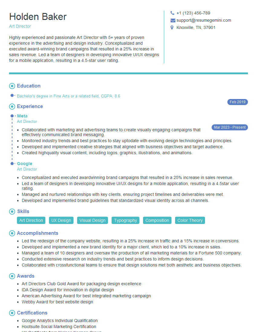
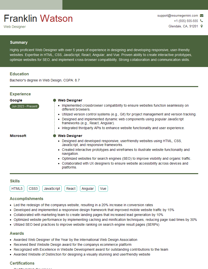
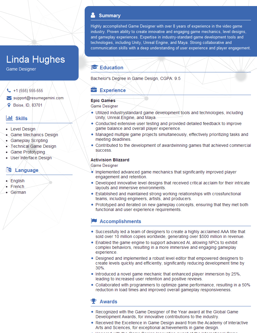
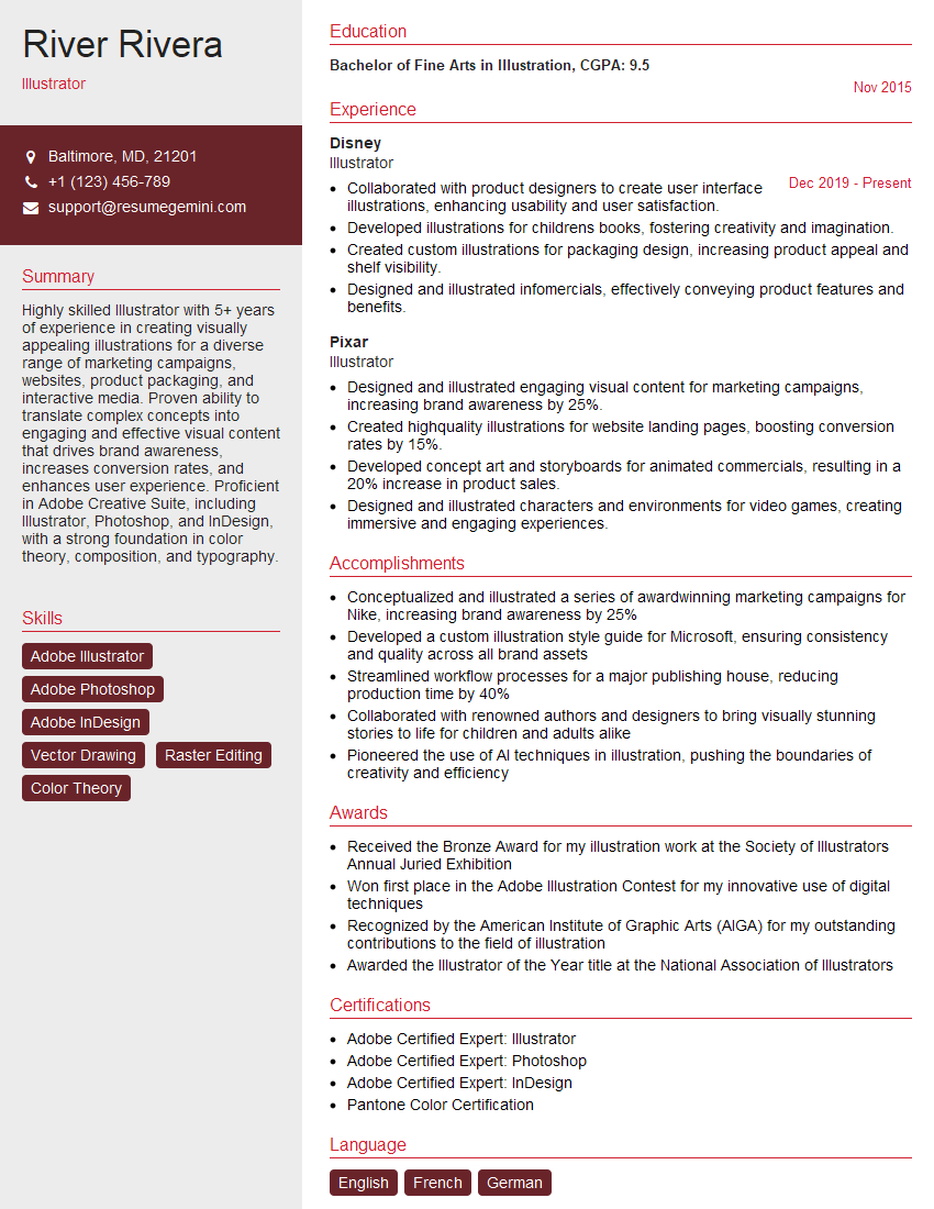
Mastering graphic design software like Photoshop, Illustrator, and After Effects is crucial for a successful career in the visual communication industry. These tools are fundamental to many design roles and showcasing proficiency is key to landing your dream job. To maximize your chances, creating a strong, ATS-friendly resume is essential. ResumeGemini can help you build a professional resume that highlights your skills and experience effectively. ResumeGemini provides examples of resumes tailored to roles utilizing Photoshop, Illustrator, and After Effects, helping you craft a compelling application that stands out.
Explore more articles
Users Rating of Our Blogs
Share Your Experience
We value your feedback! Please rate our content and share your thoughts (optional).
What Readers Say About Our Blog
Attention music lovers!
Wow, All the best Sax Summer music !!!
Spotify: https://open.spotify.com/artist/6ShcdIT7rPVVaFEpgZQbUk
Apple Music: https://music.apple.com/fr/artist/jimmy-sax-black/1530501936
YouTube: https://music.youtube.com/browse/VLOLAK5uy_noClmC7abM6YpZsnySxRqt3LoalPf88No
Other Platforms and Free Downloads : https://fanlink.tv/jimmysaxblack
on google : https://www.google.com/search?q=22+AND+22+AND+22
on ChatGPT : https://chat.openai.com?q=who20jlJimmy20Black20Sax20Producer
Get back into the groove with Jimmy sax Black
Best regards,
Jimmy sax Black
www.jimmysaxblack.com
Hi I am a troller at The aquatic interview center and I suddenly went so fast in Roblox and it was gone when I reset.
Hi,
Business owners spend hours every week worrying about their website—or avoiding it because it feels overwhelming.
We’d like to take that off your plate:
$69/month. Everything handled.
Our team will:
Design a custom website—or completely overhaul your current one
Take care of hosting as an option
Handle edits and improvements—up to 60 minutes of work included every month
No setup fees, no annual commitments. Just a site that makes a strong first impression.
Find out if it’s right for you:
https://websolutionsgenius.com/awardwinningwebsites
Hello,
we currently offer a complimentary backlink and URL indexing test for search engine optimization professionals.
You can get complimentary indexing credits to test how link discovery works in practice.
No credit card is required and there is no recurring fee.
You can find details here:
https://wikipedia-backlinks.com/indexing/
Regards
NICE RESPONSE TO Q & A
hi
The aim of this message is regarding an unclaimed deposit of a deceased nationale that bears the same name as you. You are not relate to him as there are millions of people answering the names across around the world. But i will use my position to influence the release of the deposit to you for our mutual benefit.
Respond for full details and how to claim the deposit. This is 100% risk free. Send hello to my email id: lukachachibaialuka@gmail.com
Luka Chachibaialuka
Hey interviewgemini.com, just wanted to follow up on my last email.
We just launched Call the Monster, an parenting app that lets you summon friendly ‘monsters’ kids actually listen to.
We’re also running a giveaway for everyone who downloads the app. Since it’s brand new, there aren’t many users yet, which means you’ve got a much better chance of winning some great prizes.
You can check it out here: https://bit.ly/callamonsterapp
Or follow us on Instagram: https://www.instagram.com/callamonsterapp
Thanks,
Ryan
CEO – Call the Monster App
Hey interviewgemini.com, I saw your website and love your approach.
I just want this to look like spam email, but want to share something important to you. We just launched Call the Monster, a parenting app that lets you summon friendly ‘monsters’ kids actually listen to.
Parents are loving it for calming chaos before bedtime. Thought you might want to try it: https://bit.ly/callamonsterapp or just follow our fun monster lore on Instagram: https://www.instagram.com/callamonsterapp
Thanks,
Ryan
CEO – Call A Monster APP
To the interviewgemini.com Owner.
Dear interviewgemini.com Webmaster!
Hi interviewgemini.com Webmaster!
Dear interviewgemini.com Webmaster!
excellent
Hello,
We found issues with your domain’s email setup that may be sending your messages to spam or blocking them completely. InboxShield Mini shows you how to fix it in minutes — no tech skills required.
Scan your domain now for details: https://inboxshield-mini.com/
— Adam @ InboxShield Mini
support@inboxshield-mini.com
Reply STOP to unsubscribe
Hi, are you owner of interviewgemini.com? What if I told you I could help you find extra time in your schedule, reconnect with leads you didn’t even realize you missed, and bring in more “I want to work with you” conversations, without increasing your ad spend or hiring a full-time employee?
All with a flexible, budget-friendly service that could easily pay for itself. Sounds good?
Would it be nice to jump on a quick 10-minute call so I can show you exactly how we make this work?
Best,
Hapei
Marketing Director
Hey, I know you’re the owner of interviewgemini.com. I’ll be quick.
Fundraising for your business is tough and time-consuming. We make it easier by guaranteeing two private investor meetings each month, for six months. No demos, no pitch events – just direct introductions to active investors matched to your startup.
If youR17;re raising, this could help you build real momentum. Want me to send more info?
Hi, I represent an SEO company that specialises in getting you AI citations and higher rankings on Google. I’d like to offer you a 100% free SEO audit for your website. Would you be interested?
Hi, I represent an SEO company that specialises in getting you AI citations and higher rankings on Google. I’d like to offer you a 100% free SEO audit for your website. Would you be interested?
