Unlock your full potential by mastering the most common Adobe Creative Suite (Photoshop, Illustrator, Premiere Pro, After Effects) interview questions. This blog offers a deep dive into the critical topics, ensuring you’re not only prepared to answer but to excel. With these insights, you’ll approach your interview with clarity and confidence.
Questions Asked in Adobe Creative Suite (Photoshop, Illustrator, Premiere Pro, After Effects) Interview
Q 1. Explain the difference between raster and vector graphics.
Raster and vector graphics are fundamentally different ways of representing images. Think of it like this: raster is like a mosaic, made up of tiny squares (pixels), while vector is like a blueprint, made up of mathematical equations defining lines and curves.
- Raster Graphics (e.g., JPEG, PNG, TIFF): These images are resolution-dependent. Zooming in makes them pixelated and blurry because you’re enlarging those individual squares. They are ideal for photographs and photorealistic illustrations where smooth gradients and subtle details are crucial. Photoshop primarily works with raster graphics.
- Vector Graphics (e.g., SVG, AI): These images are resolution-independent. You can scale them to any size without losing quality because the computer redraws the image based on its mathematical definition. They’re perfect for logos, illustrations, and typography where clean lines and scalability are essential. Illustrator excels in creating vector graphics.
For example, a photo of a landscape would be a raster image, while a company logo would be a vector image. The choice between raster and vector depends entirely on the project’s needs and the desired outcome.
Q 2. Describe your workflow for creating a marketing banner in Photoshop.
My workflow for creating a marketing banner in Photoshop typically involves these steps:
- Planning & Research: I start by understanding the client’s needs – target audience, message, call to action, brand guidelines, and dimensions. I might sketch ideas beforehand.
- Gathering Assets: I collect all necessary images, fonts, and other elements. High-resolution images are crucial for a professional look.
- Setting up the Canvas: I create a new document in Photoshop with the correct dimensions for the banner (e.g., 728×90 pixels for a standard leaderboard ad). I choose a resolution of 72 DPI for web use.
- Layout and Composition: I arrange the elements on the canvas, paying close attention to visual hierarchy and balance. I use guides and layers to maintain organization.
- Image Editing & Enhancement: I retouch images, adjust colors, contrast, and sharpness using tools like Levels, Curves, and the Healing Brush.
- Text & Typography: I add text using appropriate fonts and styles that align with the brand’s voice. I ensure readability and visual appeal.
- Adding Effects: I might add subtle effects like drop shadows, glows, or bevels to enhance the banner’s visual impact, using layer styles.
- Saving & Exporting: Finally, I save the banner in the appropriate format (usually JPEG or PNG for web) at the optimal compression level to balance file size and quality.
For instance, I once created a banner for a coffee shop. I used high-quality images of their coffee and pastries, paired with a stylish font and a clear call to action, and finished with a subtle shadow effect to make the text pop.
Q 3. How would you retouch a product image in Photoshop for an e-commerce website?
Retouching a product image for an e-commerce website requires careful attention to detail to ensure it’s visually appealing and accurately represents the product. Here’s my approach:
- Dust and Spot Removal: I use the Spot Healing Brush or Clone Stamp tool to remove blemishes, dust spots, and other imperfections.
- Color Correction: I adjust the white balance, brightness, and contrast to make the colors consistent and vibrant, ensuring the product looks its best. I might utilize tools like Levels and Curves for precise control.
- Background Removal: If needed, I use the Pen tool, Quick Selection tool, or a combination of both to carefully cut out the product from its background and place it on a clean, neutral backdrop. This ensures the product stands out.
- Sharpening and Detail Enhancement: I subtly sharpen the image using the Unsharp Mask filter to enhance details and clarity, making sure not to oversharpen, which can cause artifacts.
- Lighting and Shadow Adjustments: Depending on the image, I might subtly adjust shadows and highlights using Dodge and Burn tools to add depth and realism, making the product appear more three-dimensional.
- Final Adjustments and Saving: I make any final color adjustments and save the image in a format suitable for web use (JPEG is usually preferred for its smaller file size while maintaining good quality).
For example, when retouching jewelry images, I would pay particular attention to highlight the sparkle and reflectivity, using tools to bring out the shine and making sure the image is sharp enough to showcase the product’s intricate details.
Q 4. What are the advantages of using Smart Objects in Photoshop?
Smart Objects in Photoshop are incredibly powerful because they allow for non-destructive editing. This means you can make changes without permanently altering the original image data.
- Non-destructive editing: You can scale, transform, and apply filters to Smart Objects without losing quality. Changes are stored as metadata, allowing for easy reversions.
- Organization and Efficiency: Smart Objects help keep projects organized, especially when dealing with multiple versions or iterations. They are particularly useful in collaborative projects.
- Reusability: You can reuse Smart Objects across multiple documents without creating multiple copies. If you edit one instance, all others are updated automatically.
- High-Resolution Editing: Working with Smart Objects at their full resolution significantly reduces the risk of quality loss during scaling or transformation.
Imagine working on a website banner containing a logo. By making the logo a Smart Object, I can easily change its appearance (size, color, style) across all instances on the banner without degrading the quality. This is a huge time saver and keeps the project organized.
Q 5. Explain your process for creating a logo in Illustrator.
Creating a logo in Illustrator follows a structured process:
- Concept & Sketching: I start with brainstorming and sketching ideas, considering the client’s brand identity and target audience. This lays the foundation for the logo design.
- Vectorization: I use Illustrator’s tools, primarily the Pen tool, to create clean, scalable vector shapes. I ensure precision and attention to detail.
- Typography: I carefully select fonts that reflect the brand’s personality and ensure readability at various sizes. I utilize kerning and tracking to refine spacing and visual harmony.
- Color Palette: I choose a limited color palette that is consistent with the brand’s identity and evokes the desired feelings.
- Refinement and Iteration: I refine the logo’s design through multiple iterations, experimenting with different shapes, colors, and typography until it meets the client’s expectations and effectively conveys the brand’s message.
- Exporting: I export the logo in various formats (e.g., AI, EPS, SVG, PNG) to ensure compatibility across different platforms.
For example, when designing a logo for a tech startup, I might use sharp, geometric shapes and a modern sans-serif font to convey innovation and efficiency.
Q 6. How do you use layers and layer styles effectively in Illustrator?
Layers and layer styles in Illustrator are fundamental for creating complex and organized artwork. Layers act as containers for objects, providing control over their individual visibility, position, and attributes. Layer styles allow you to add various effects to layers without affecting the original artwork.
- Organization: Layers allow you to keep different elements of your design separated and easily manageable. This is essential when working on complex illustrations with numerous objects. Grouping related elements in layers also makes editing much easier.
- Non-destructive editing: Applying layer styles (like drop shadows, gradients, or inner glows) allows you to modify their properties without altering the original object’s appearance. This makes experimenting and refining designs much easier.
- Control and Flexibility: You can change the order of layers to control which elements appear on top and adjust the opacity of individual layers for visual effects.
- Isolation Mode: Working in isolation mode allows you to focus on a specific layer without affecting others, a particularly useful feature for intricate designs.
For example, when designing a poster, I might have separate layers for the background, illustrations, text, and logo, making it easy to adjust individual elements without affecting others. I might then use layer styles to add subtle effects to improve the visual hierarchy.
Q 7. How would you create a complex illustration using the Pen tool in Illustrator?
The Pen tool in Illustrator is the cornerstone for creating precise vector illustrations. Mastering it unlocks the ability to create incredibly complex and detailed artwork.
- Understanding the Pen Tool’s Functionality: The Pen tool creates smooth curves and straight lines by strategically placing anchor points and adjusting their handles. Understanding how anchor point handles affect curve direction and tension is vital.
- Planning and Sketching: Before diving into the Pen tool, it’s essential to have a clear plan and sketch. This prevents unnecessary frustration and ensures a smoother workflow.
- Strategic Anchor Point Placement: Anchor points are placed strategically to define the shape’s outline. More anchor points provide more control, while fewer anchor points simplify the design.
- Handle Manipulation: Adjusting anchor point handles controls the curve’s shape. Practice manipulating handles to achieve desired curvatures and angles.
- Path Editing: The Pen tool allows you to select, edit, and add anchor points after a path has been created, providing flexibility during the design process.
- Combining Shapes: Once the individual components of the illustration are complete, I use the Pathfinder panel to combine, subtract, or intersect paths to create complex, composite shapes. This allows for efficient creation of advanced forms.
For instance, to create a complex floral illustration, I would carefully create the petals, leaves, and stem with the Pen tool, paying close attention to the natural curves and variations in each element. I would then use Pathfinder to combine the different elements seamlessly.
Q 8. Describe your experience with different Illustrator brushes and their applications.
Illustrator’s brush engine is incredibly versatile, offering a vast array of tools beyond simple painting. Understanding their nuances is key to efficient and expressive artwork. My experience spans various brush types, each serving distinct purposes.
- Basic Brushes: These form the foundation. I utilize them for quick sketches, line art, and simple fills. Their size, hardness, and opacity are easily adjustable for different effects. For example, a hard-edged brush is perfect for crisp lines in a logo, while a soft brush creates softer transitions in a watercolor-style painting.
- Scatter Brushes: These create interesting textures by scattering copies of a chosen shape along your stroke. I use these for creating grass, fur, or even stylized firework effects. Controlling the scatter, density, and shape is crucial to achieving the desired look. Imagine creating realistic-looking foliage—scatter brushes are invaluable for that.
- Art Brushes: These simulate real-world painting tools like calligraphy pens or pencils. They offer complex pressure sensitivity, allowing for dynamic line weight variations. I’ve used art brushes extensively for creating expressive lettering, detailed illustrations, and texture work in logos. Think of a hand-drawn font—art brushes allow for that organic feel.
- Pattern Brushes: These use a pre-defined pattern to create repeating textures. They’re incredibly helpful for efficiently creating complex background patterns or fabric textures. Instead of drawing every single element, I simply apply a pattern brush to achieve the repetitive effect.
- Calligraphic Brushes: These are especially useful for lettering projects. They automatically adjust the stroke thickness based on the angle and pressure of your stylus, mimicking the organic movements of a traditional calligraphy pen. Using these brushes significantly enhances the flow and consistency of hand-lettered pieces.
Mastering these brushes, along with experimenting with their settings, allows for a vast range of creative outcomes, significantly boosting both efficiency and artistic expression in my workflow.
Q 9. What are your preferred methods for color correction in Premiere Pro?
Color correction in Premiere Pro is crucial for achieving a consistent and visually appealing final product. My preferred methods involve a combination of tools within the Lumetri Color panel, prioritizing a non-destructive workflow.
- Color Wheels: These allow for precise adjustments to hue, saturation, and luminance. I often start by using the ‘Basic Correction’ wheel to address overall balance, targeting any color casts or inconsistencies.
- Curves: For more refined control, curves are invaluable. They enable precise adjustments to specific color ranges, perfect for fine-tuning shadows, mid-tones, and highlights. A slight ‘S’ curve can dramatically enhance contrast and vibrancy.
- Color Match: If I have multiple clips requiring consistent color, Premiere Pro’s ‘Color Match’ function is incredible. It intelligently analyzes reference footage and applies the necessary corrections to other clips, streamlining the process considerably.
- Lumetri Color Panel: It’s the core of my color grading workflow. I utilize its various panels—including the ‘Creative’ panel for stylistic color grading—to achieve both color correction and grading simultaneously. It allows for selective color adjustments across different areas of the frame.
My approach is always iterative. I might start with basic corrections, then fine-tune with curves, and potentially utilize the ‘Color Match’ to unify shots. I preview my changes on various displays and assess the impact of my edits in different lighting conditions.
Q 10. Explain your approach to video editing, from initial import to final export.
My video editing process is structured and meticulous, ensuring a high-quality final product. It’s broken down into several key stages:
- Import and Organization: I begin by importing all footage and audio files, meticulously organizing them into labeled bins within Premiere Pro’s project panel. This is paramount for efficiency and maintaining clarity throughout the editing process. I usually create bins for each scene or sequence, keeping related clips together.
- Rough Cut: I assemble a rough cut of the video, focusing on the narrative flow and pacing. This is a fluid process, and I might adjust the order of clips or make significant changes as I review the assembly.
- Fine Cut: Once the rough cut is complete, I meticulously refine the editing, tightening transitions, trimming clips, and adding or removing sections to perfect the narrative. This stage involves paying close attention to details, such as removing unwanted audio or fixing jump cuts.
- Color Grading and Audio Mixing: Next, I perform color grading and audio mixing, ensuring consistency and enhancing the overall quality of the video. This typically involves using the Lumetri Color panel and Premiere Pro’s audio mixer. I might utilize plugins for advanced color grading or audio mastering.
- Effects and Titles: I add any visual effects or titles needed, using Premiere Pro’s built-in tools or external plugins. Keeping this stage concise is crucial. Unnecessary effects can distract from the story.
- Review and Export: Finally, I review the completed video several times, checking for any errors or issues before exporting it in the appropriate format and resolution. I’ll usually perform a final color and audio check before the final export. This final review is non-negotiable.
This structured approach ensures a clean, efficient, and professional workflow. Consistency in these stages helps maintain high-quality output.
Q 11. How do you handle audio in Premiere Pro?
Audio is just as important as video, and often overlooked. My audio handling process in Premiere Pro is multi-faceted:
- Import and Organization: Similar to video, I meticulously organize audio tracks, often creating separate tracks for dialogue, sound effects, and music. This helps maintain clarity and control.
- Level Adjustment: I adjust audio levels to ensure a consistent and balanced sound throughout. I pay careful attention to dialogue levels, ensuring clarity and minimizing clipping (distortion from sound levels being too high).
- Noise Reduction: I often use noise reduction tools to eliminate background noise or hum, significantly improving audio quality. Premiere Pro offers basic tools, but I sometimes incorporate third-party plugins for more advanced noise reduction.
- EQ and Compression: For further enhancement, I might apply equalization (EQ) to adjust frequencies and compression to control the dynamic range. This can improve clarity and make the audio sound more polished.
- Audio Effects: I might add creative audio effects like reverb or delay for specific sounds or to enhance the overall atmosphere of the video. However, effects should enhance the video without drawing undue attention to themselves.
A well-balanced, clean audio track is essential to a professional-looking video. I ensure clarity, consistency, and use of effects only when necessary.
Q 12. Describe your experience with keyframing in Premiere Pro.
Keyframing in Premiere Pro is essential for creating smooth animations, transitions, and manipulating effects over time. It allows for precise control over changes in various properties of clips and effects.
My approach involves:
- Understanding the Properties: First, I identify the property I want to animate (e.g., opacity, position, scale). Each property can be keyframed to create gradual changes over time.
- Setting Keyframes: I strategically place keyframes at specific points within the timeline. The fewer keyframes the smoother the animation, but too few can appear unnatural. This requires experience and finesse.
- Easing Curves: I often use easing curves to fine-tune how the property transitions between keyframes. For example, an ease-in-out curve creates a smooth acceleration and deceleration, making the animation appear more natural. Linear curves are generally unsuitable for most animations as they appear abrupt.
- Previewing: Regularly previewing my keyframe animations in real-time is crucial to identifying and fixing any abruptness or unwanted effects. This iterative process is important for achieving the desired result.
For example, imagine a logo fading in: I’d place keyframes at the start (0% opacity) and end (100% opacity) points, and adjust the curve for a smooth fade. A more complex example would be creating a camera pan – using keyframes to control the position changes throughout the clip.
Q 13. What are some common color grading techniques you utilize in Premiere Pro?
Color grading in Premiere Pro goes beyond simple color correction; it’s about establishing a mood and visual style. Here are some techniques I often use:
- LUTs (Look-Up Tables): These pre-designed color profiles offer a quick way to apply a specific look to your footage. They can provide a starting point for further refinement, offering quick access to a variety of styles.
- Lifting Shadows and Crushing Highlights: This involves adjusting the shadows and highlights to create more contrast and detail. It helps to enhance the overall image without overexposing brighter areas or obscuring details in darker regions. I carefully evaluate to ensure it doesn’t diminish important details.
- Split Toning: This allows for separate control over the color of the highlights and shadows. It’s fantastic for creating a distinct mood and enhancing the overall aesthetic of the video.
- Color Grading Wheels and Curves: The use of the Lumetri Color panel, color wheels, and curves provide nuanced control over individual colors or color ranges. I often blend these methods for precise control.
- Selective Color Grading: Often I use masks or rotoscoping to apply color adjustments only to specific areas of the frame. This could be used to highlight a specific subject or isolate a color in post-production.
The best techniques depend on the project’s style and intended mood. My approach is always iterative—I experiment and refine until I achieve the desired aesthetic.
Q 14. Explain the difference between motion tracking and stabilization in After Effects.
Both motion tracking and stabilization are crucial in After Effects, but they serve different purposes:
- Motion Tracking: This analyzes a video clip to identify and track the movement of a specific object or point. The result is a series of data points that can then be used to anchor other elements (text, images, or other videos) to the tracked object, making them appear as if they are attached to or interacting with the moving object. This is frequently used in creating visual effects, adding graphics to moving vehicles, or tracking specific points within a scene.
- Stabilization: This analyzes the overall movement of the camera or footage to reduce unwanted shakes, wobbles, and jitters. The result is smoother, more professional-looking footage. It works by analyzing the footage and applying corrections to stabilize the entire image, making it suitable for shaky hand-held footage. It helps prevent motion sickness and enhances clarity.
Imagine a scene where text needs to appear as if it’s glued to a moving car. Motion tracking is used to track the car’s movement, and that data is used to ensure the text stays on the car throughout the shot. Conversely, stabilization might be applied to footage shot from a drone in windy conditions to smooth out the footage.
Q 15. How do you create a simple animation using keyframes in After Effects?
Creating animations in After Effects using keyframes is fundamental. A keyframe marks a specific point in time where a property’s value changes. By setting keyframes for different properties, you create changes over time, resulting in animation. Think of it like drawing a series of still images; After Effects smoothly transitions between them.
Example: Let’s animate a ball moving across the screen. You would first create a layer with the ball image. Then, you’d select the ‘Position’ property in the Timeline panel. At the beginning of your timeline (say, frame 0), you’d set the ball’s position. Then, let’s say at frame 30, you’d move the ball to a new position. After Effects automatically interpolates (smoothly transitions) between these two keyframes, creating the illusion of movement. You can add more keyframes to create complex movement paths.
Steps:
- Create a new composition.
- Import your asset (e.g., ball image).
- Add the asset to the composition.
- Select the layer in the Timeline panel.
- Select the property you want to animate (Position, Scale, Opacity, etc.).
- Set a keyframe by clicking the stopwatch icon next to the property.
- Move the playhead to a later frame.
- Change the value of the property.
- Another keyframe is automatically created. Adjust the animation using the graph editor for finer control.
Career Expert Tips:
- Ace those interviews! Prepare effectively by reviewing the Top 50 Most Common Interview Questions on ResumeGemini.
- Navigate your job search with confidence! Explore a wide range of Career Tips on ResumeGemini. Learn about common challenges and recommendations to overcome them.
- Craft the perfect resume! Master the Art of Resume Writing with ResumeGemini’s guide. Showcase your unique qualifications and achievements effectively.
- Don’t miss out on holiday savings! Build your dream resume with ResumeGemini’s ATS optimized templates.
Q 16. Describe your experience working with masks and mattes in After Effects.
Masks and mattes are powerful tools for isolating and manipulating specific areas of a layer. Masks allow you to shape a layer’s visibility, while mattes use one layer to define the visible area of another. Think of a mask as a cookie cutter; it shapes what’s visible, while a matte acts as a stencil, only allowing light through selected areas.
Masks: I frequently use masks to isolate subjects from backgrounds (e.g., removing a green screen) or to create complex shape animations. In one project, I used rotoscoping—manually outlining a moving subject frame-by-frame—to create a mask, allowing me to easily replace the background. This is often preferred over automatic keying for highly detailed or complex backgrounds.
Mattes: Mattes are useful for creating more complex effects. For instance, I used a luma matte (based on brightness) to reveal a layer only in the brightest parts of another layer, simulating light reflecting on a surface. I’ve also utilized alpha mattes (transparency information) extensively for seamless compositing of elements.
My experience with both extends to using various mask and matte modes (like subtract, add, intersect), using shape layers for more intricate masks, and animating masks for dynamic effects.
Q 17. How do you composite multiple video clips in After Effects?
Compositing multiple video clips involves layering them and adjusting their properties to create a cohesive visual. After Effects excels at this.
Process: You import your video clips, place them on separate layers in your composition, and then adjust their position, opacity, and blending modes to achieve the desired effect. Think of it like layering transparencies; you see through the less opaque layers to those below.
Example: For a recent project that involved creating a montage sequence, I imported all the video clips and arranged them in chronological order on different layers in my composition. To transition between clips, I used the opacity property to fade one clip out while simultaneously fading another clip in. I used adjustment layers to apply color grading and other global effects that maintained visual consistency across all clips.
Techniques: Beyond simple layering, I also use techniques like pre-composing (grouping multiple layers for easier management), masking to isolate specific portions of clips, and using track matte for intricate layering.
Q 18. What are some common effects used in After Effects and their applications?
After Effects boasts a vast library of effects. Some of the most common and useful include:
- Adjustment Layers: These modify the properties of layers below without affecting individual layers directly. Perfect for global color correction or effects.
- Keying: Used to separate subjects from their backgrounds (like chroma key for green screen removal). More advanced keying can isolate intricate subjects.
- Particle Systems: Used to create realistic effects like rain, snow, or explosions. Highly customizable to achieve diverse results.
- Blur and Sharpen: These effects are essential for creating depth of field and enhancing details. Gaussian blur is a commonly used blur effect.
- Distortion effects: Effects such as wave warp, lens distortion, and displacement map are very useful to create creative and artistic results. These are excellent for creating unique styles in video work.
- Text effects: Using effects like bevel and emboss, stroke, or drop shadow can improve the readability and aesthetic appeal of any text-based visual design.
The application of these effects depends heavily on the project’s needs. For example, a blur effect might be used to simulate depth of field in a film, while a particle system might be used to create a magical, otherworldly effect in a fantasy film.
Q 19. Explain your process for creating a visual effects shot in After Effects.
My process for creating a visual effects shot begins with careful planning and ends with meticulous rendering. It usually involves these steps:
- Concept & Planning: Understanding the desired outcome is paramount. I’ll work closely with the director or client to define the shot’s purpose, mood, and technical requirements.
- Asset Acquisition: This could involve shooting footage specifically for the VFX, or sourcing existing assets. Often, I’ll need to combine elements and materials from different sources.
- Pre-composition: I’ll often organize elements into pre-comps for better management and readability. This is essential for large, complex shots.
- Tracking and Stabilization: This is crucial if the elements need to be composited over moving footage. After Effects offers robust tracking tools to ensure seamless integration.
- Compositing: This step involves carefully layering and manipulating assets using masks, mattes, and blending modes. It’s iterative; it might involve several rounds of adjustment to find the right combination.
- Color Correction and Grading: Ensuring consistent color across the different elements and with the surrounding scene is vital.
- Rendering and Exporting: I’ll choose the appropriate settings based on the final output resolution and delivery format. Testing multiple render settings is common to ensure the best balance between quality and rendering time.
Q 20. How do you optimize After Effects compositions for performance?
Optimizing After Effects compositions for performance is vital, especially for complex projects. Here’s how I approach it:
- Pre-composing: Grouping related elements into pre-compositions reduces the workload on the main composition, improving render times.
- Using Proxies: Replacing high-resolution assets with low-resolution proxies during editing speeds up the workflow significantly. The high-resolution assets are swapped back in for final rendering.
- Minimizing Effects: Unnecessary effects increase render times. I’ll critically evaluate each effect to ensure it’s essential and use the most efficient effect possible. I always look for alternative solutions that provide similar visual results with less processing power.
- Layer Management: Keeping the composition organized and eliminating unused layers helps the software handle the project more efficiently.
- RAM Previews: Enabling RAM previews for frequently used portions of the composition significantly speeds up playback.
- Choosing the right render settings: Choosing the right codec and output settings reduces render time and file size.
Q 21. What are your preferred methods for exporting video in After Effects?
My preferred methods for exporting video in After Effects depend on the final destination and quality requirements. Here are some common choices:
- H.264 (MP4): Widely compatible, good balance of quality and file size, suitable for web and many other uses. I often use this for online videos and client deliveries where file size is an important factor.
- ProRes (MOV): Lossless codec, maintains maximum quality, great for intermediate files and projects requiring high visual fidelity (often used for further editing in other applications). This is particularly important for projects with significant visual effects.
- Apple ProRes 422 or 4444: Offers best quality and is ideal for delivering master files to clients that can then create a final delivery that caters to their requirements.
- Cineform (AVI): High-quality codec, better compression than ProRes, widely used for professional workflows, suitable for scenarios where file size is a concern, but ProRes file sizes are too large.
For each, I carefully consider the resolution, frame rate, bitrate and appropriate settings to match the requirements of the delivery platform or client specifications. Testing different settings is key to achieving optimal results.
Q 22. How do you handle resolution and scaling in your Adobe Creative Suite projects?
Resolution and scaling are crucial in Adobe Creative Suite for maintaining image quality and ensuring projects look sharp across different platforms. Think of resolution as the number of pixels in an image – a higher resolution means more detail. Scaling involves changing the dimensions of an image. In Photoshop, for example, scaling up a low-resolution image will result in pixelation, while scaling down a high-resolution image might be less problematic but can still lead to loss of detail.
My approach depends on the project’s purpose. For print projects, I always start with high-resolution images (at least 300 DPI) to ensure crisp details. For web, 72 DPI is typically sufficient. When scaling, I prefer to work with vector graphics in Illustrator whenever possible, as they can be scaled infinitely without loss of quality. If I must scale raster images (like photos in Photoshop), I use techniques like smart objects to preserve quality or carefully downsample to minimize artifacting. In Premiere Pro and After Effects, I focus on maintaining the native resolution of imported footage for the best results, adjusting only when necessary for specific effects or output requirements. I always preview my work at the intended final resolution to check for any issues.
Q 23. What are some common file formats used in Adobe Creative Suite and their pros/cons?
Adobe Creative Suite utilizes various file formats, each with its strengths and weaknesses. Choosing the right format depends heavily on the project’s needs and intended use.
- PSD (Photoshop Document): A native Photoshop file format that preserves layers, adjustments, and other editing data. Pro: non-destructive editing. Con: large file size, can only be fully edited in Photoshop.
- AI (Adobe Illustrator): Native format for Illustrator, storing vector graphics. Pro: scalable without quality loss. Con: not suitable for raster images, large file size for complex illustrations.
- JPEG (Joint Photographic Experts Group): A widely used compressed raster format. Pro: good compression, widely compatible. Con: lossy compression, can result in artifacts with repeated saving.
- PNG (Portable Network Graphics): Lossless raster format, supports transparency. Pro: great for web graphics with transparency. Con: larger file size than JPEG.
- TIFF (Tagged Image File Format): Lossless raster format, supports layers. Pro: high quality, suitable for print. Con: very large file size, compatibility issues with some programs.
- MOV and MP4 (QuickTime and MPEG-4): Common video formats for Premiere Pro and After Effects. Choosing between them depends on codec, compression, and compatibility needs.
Understanding these pros and cons allows me to make informed decisions when choosing file formats. For example, I’d use PNG for website icons but JPEG for photos intended for the web. For print, TIFF or PSD are often better choices.
Q 24. Describe your experience working with plugins or extensions in the Adobe Creative Suite.
Plugins and extensions significantly enhance the Adobe Creative Suite by adding functionalities and streamlining workflows. I’ve extensively used various plugins, from automating repetitive tasks to adding unique effects. In Photoshop, I frequently use plugins for noise reduction, sharpening, and advanced masking techniques. In Illustrator, plugins for creating complex patterns or automating vector tasks have been invaluable. After Effects benefits greatly from plugins for advanced compositing, particle effects, and optical flares.
For example, I once used a plugin in After Effects that generated realistic lens flares, saving me significant time compared to manually creating them. I’m careful when selecting plugins, ensuring they’re reputable and compatible with my current Adobe Creative Suite version. I regularly check for updates to maximize their potential and address any compatibility issues.
Q 25. How would you troubleshoot a common error in Photoshop, Illustrator, Premiere Pro, or After Effects?
Troubleshooting in the Adobe Creative Suite often involves a systematic approach. I start by identifying the specific error message, then systematically eliminate potential causes.
- Photoshop: Common issues like “scratch disk full” are addressed by increasing scratch disk space or freeing up hard drive space. Freezing or crashing can indicate memory issues, requiring closing unnecessary programs or upgrading RAM.
- Illustrator: Problems with file corruption can sometimes be solved by opening a previous version or using Illustrator’s file recovery tools. Slow performance might require optimizing the document, reducing the number of complex objects, or upgrading hardware.
- Premiere Pro: Media offline errors require relinking the footage or ensuring it’s accessible. Rendering problems can be due to insufficient processing power or incorrect settings. Checking the render queue and project settings is crucial.
- After Effects: Memory-intensive projects might require optimizing compositions by pre-composing layers or using proxies. Render errors often involve checking the render settings, RAM usage, and the composition’s structure.
I always consult Adobe’s help documentation and online forums for solutions to specific error messages and seek solutions from other creative professionals if needed. A methodical approach and awareness of common issues helps ensure efficient troubleshooting.
Q 26. What are some tips for maintaining file organization when working on large projects?
File organization is paramount, especially with large projects. Chaos can lead to wasted time and potential data loss. My approach utilizes a structured folder system.
Firstly, I create a main project folder, then subfolders for different aspects – assets (images, fonts, videos), source files (raw images, footage), project files (PSD, AI, PRPROJ, AEP), and final outputs. Secondly, I use descriptive and consistent file naming conventions – dates, project names, and version numbers to easily identify files. For example, a file might be named ProjectX_Logo_V3_20240308.ai. Thirdly, regular backups are crucial; I use external drives and cloud storage to prevent data loss.
Within each software, I utilize organizational features like layers, layer sets, and groups to keep elements neatly arranged. In After Effects, pre-composing elements simplifies complex compositions. This multi-layered approach helps maintain order and facilitates easy collaboration on large projects.
Q 27. How do you stay updated with the latest features and trends in Adobe Creative Suite?
Staying current with Adobe Creative Suite is crucial for professional development. I follow several strategies:
- Adobe’s official website and blogs: These offer news about updates, new features, and tutorials.
- Industry publications and websites: Websites and magazines focused on graphic design, video editing, and motion graphics often cover new features and trends.
- Online communities and forums: Platforms like Reddit and specialized forums provide opportunities to learn from other professionals and get insights into new techniques.
- Adobe Creative Cloud webinars and tutorials: Adobe provides extensive tutorials and webinars to stay informed about new features and best practices.
- Experimentation: I actively experiment with new features and tools in my personal projects to gain practical experience.
Staying updated doesn’t mean learning every new feature at once; it’s about continually expanding my knowledge and adapting my workflow to optimize my creative process.
Q 28. Describe a time you had to solve a complex design problem using Adobe Creative Suite.
I once had to create a complex animated logo for a client that involved intricate details, smooth transitions, and brand consistency across various platforms. The initial concept required many individual elements, making it difficult to manage. The challenge was to balance visual appeal with efficient workflow. My solution involved a multi-phase approach.
First, I used Illustrator to create clean vector graphics for each component, ensuring scalability and high resolution. Then, I brought these assets into After Effects, organizing them in a well-structured composition with pre-compositions for each segment of the animation. This significantly simplified the editing process. I used keyframes and expressions to create smooth transitions and fine-tune details. Finally, I rendered the animation in multiple formats – high-resolution for print and web-optimized versions for online use. Through careful planning and leveraging the strengths of each Adobe Creative Suite application, I delivered a high-quality result on time and within budget.
Key Topics to Learn for Adobe Creative Suite (Photoshop, Illustrator, Premiere Pro, After Effects) Interview
- Photoshop:
- Layer management and blending modes: Understanding how to efficiently organize and manipulate layers for complex compositions.
- Image retouching and manipulation: Mastering techniques for cleaning up images, removing blemishes, and enhancing details.
- Advanced selections and masking: Proficiency in using various selection tools and masks for precise editing and compositing.
- Illustrator:
- Vector graphics principles: Understanding the difference between raster and vector graphics and their applications.
- Working with paths and shapes: Creating and manipulating complex shapes using the Pen tool and other path-related tools.
- Typography and layout: Designing effective layouts and using typography to enhance visual communication.
- Premiere Pro:
- Non-linear editing techniques: Understanding the basics of video editing, including cuts, transitions, and effects.
- Audio mixing and mastering: Balancing audio levels and adding effects to enhance the audio quality of a video project.
- Exporting and rendering: Preparing videos for various platforms and optimizing for different resolutions and codecs.
- After Effects:
- Motion graphics and animation: Creating animated elements and visual effects using keyframes and expressions.
- Compositing and visual effects: Combining multiple video and image layers to create complex visual effects.
- Working with masks and shape layers: Using masks and shape layers to create precise animations and effects.
- General Concepts:
- Workflow optimization: Developing efficient workflows for various creative tasks.
- Color theory and color management: Understanding and applying color theory principles for visually appealing results.
- Problem-solving and troubleshooting: Identifying and resolving technical issues that arise during the creative process.
Next Steps
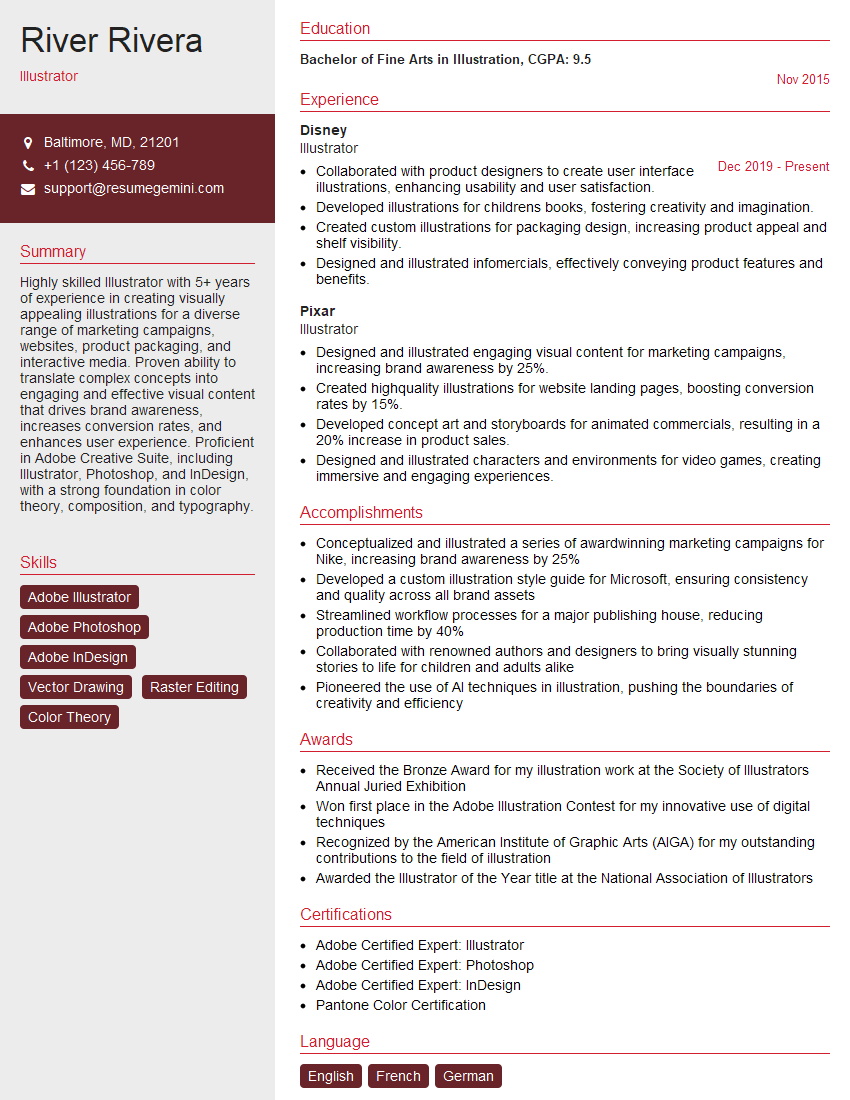
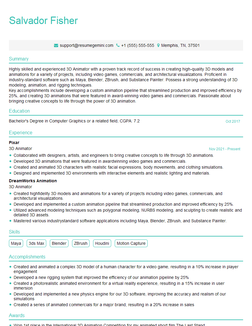
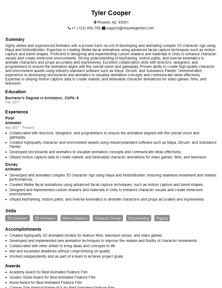
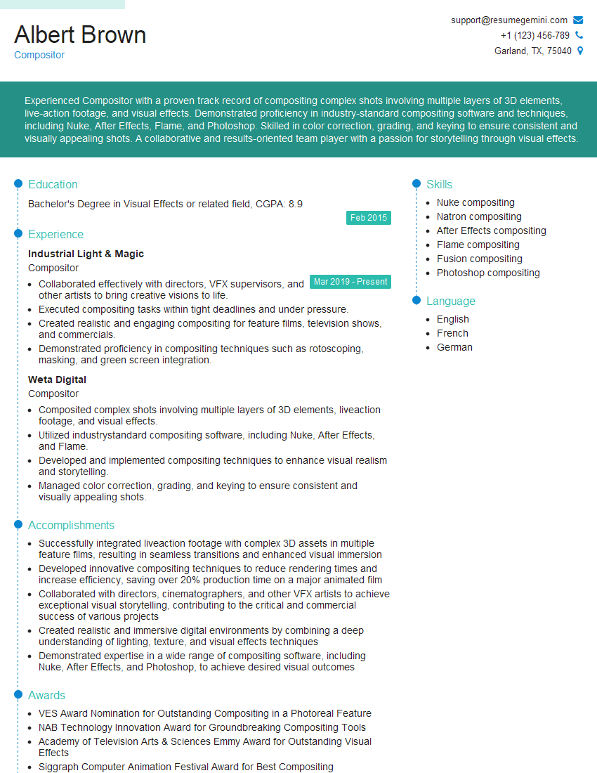
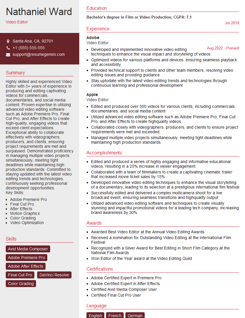
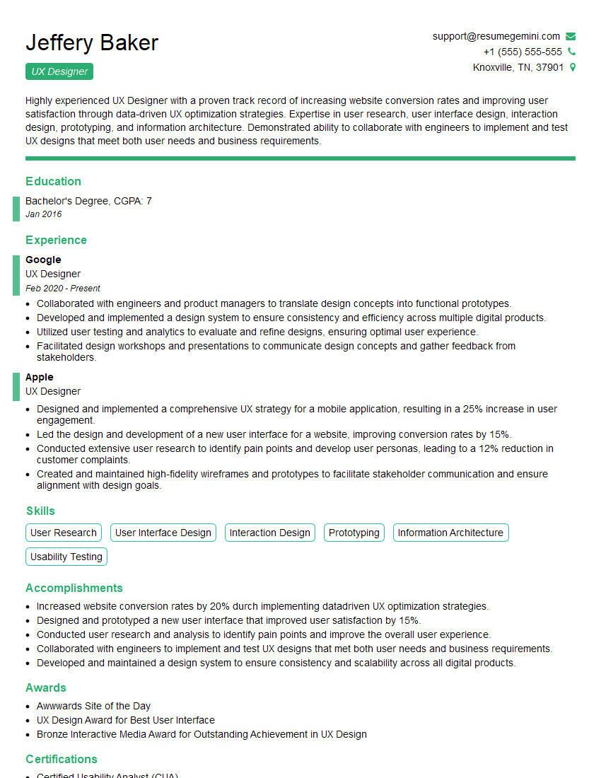
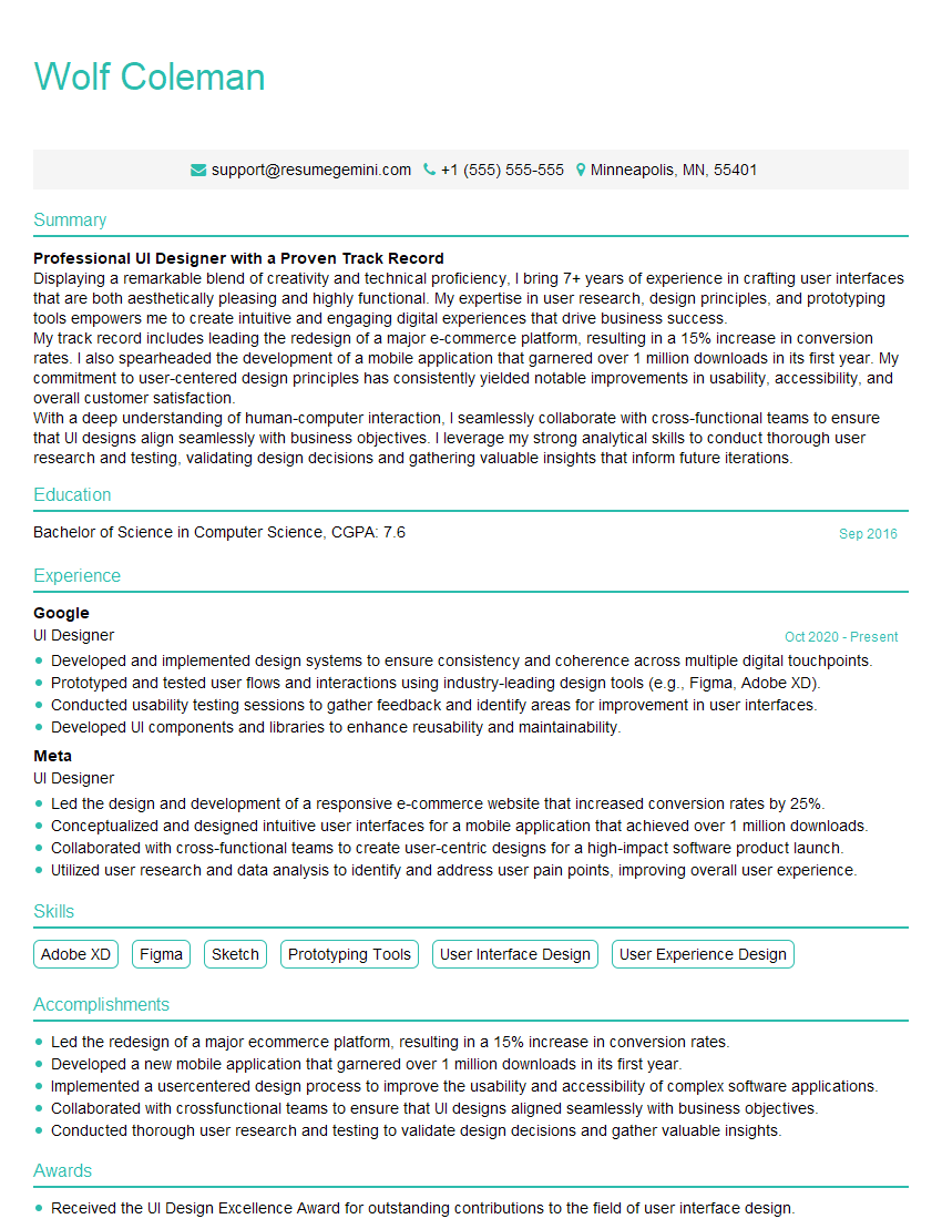
Mastering the Adobe Creative Suite is crucial for a successful career in design, video production, or related fields. It opens doors to exciting opportunities and allows you to showcase your creative talents. To maximize your job prospects, create an ATS-friendly resume that highlights your skills and experience effectively. ResumeGemini is a trusted resource to help you build a professional and impactful resume. Examples of resumes tailored to Adobe Creative Suite expertise are available to guide you, making your job search more efficient and successful.
Explore more articles
Users Rating of Our Blogs
Share Your Experience
We value your feedback! Please rate our content and share your thoughts (optional).
What Readers Say About Our Blog
Very informative content, great job.
good
