Preparation is the key to success in any interview. In this post, we’ll explore crucial SPC Charting and Analysis interview questions and equip you with strategies to craft impactful answers. Whether you’re a beginner or a pro, these tips will elevate your preparation.
Questions Asked in SPC Charting and Analysis Interview
Q 1. Explain the purpose of Statistical Process Control (SPC).
Statistical Process Control (SPC) is a powerful methodology used to monitor and improve processes by identifying and reducing variation. Think of it like a doctor’s regular check-up for your manufacturing process – it helps detect potential problems before they become major issues, saving time, money, and resources. Instead of reacting to problems, SPC allows for proactive monitoring and prevention.
SPC uses control charts to graphically display data collected from a process over time. By analyzing these charts, we can distinguish between normal (common cause) variation and abnormal (special cause) variation. This distinction is crucial because it allows us to determine whether process improvements are needed or if the variation is simply inherent to the process.
Q 2. What are the different types of control charts and when would you use each?
Several types of control charts exist, each designed for a specific type of data. The choice depends on what you’re measuring:
- X-bar and R chart: Used for continuous data (e.g., weight, length, temperature) where you’re measuring the average (X-bar) and range (R) of subgroups of samples. Imagine monitoring the average weight of bags of chips filled by a machine, and also tracking the variation in weight within each batch of bags. This combination gives a complete picture of process consistency.
- X-bar and s chart: Similar to X-bar and R, but uses the standard deviation (s) instead of the range. Standard deviation provides a more statistically robust measure of variation, especially for larger subgroups.
- Individuals and Moving Range (I-MR) chart: Used when individual measurements are taken rather than subgroups. For example, monitoring the diameter of a wire as it’s produced continuously. The moving range helps estimate variability.
- p-chart: Used for attribute data representing the proportion of nonconforming units in a sample (e.g., the percentage of defective items in a batch). Useful when inspecting for defects in a production line.
- c-chart: Used for attribute data representing the number of defects per unit (e.g., the number of scratches on a painted surface). Good for tracking defects on a consistent unit.
- u-chart: Similar to the c-chart but the number of defects is measured per unit of area or volume. For example, the number of flaws in a given length of fabric.
The choice of chart depends entirely on the type of data and the goal of the analysis. Incorrect chart selection can lead to misleading interpretations.
Q 3. Describe the components of a typical control chart (e.g., centerline, control limits).
A typical control chart comprises several key components:
- Centerline: Represents the average of the process data. It’s the central tendency of your measurements and serves as a benchmark.
- Upper Control Limit (UCL): The upper boundary of acceptable variation. Data points consistently above this limit suggest a problem with the process.
- Lower Control Limit (LCL): The lower boundary of acceptable variation. Data points consistently below this limit also signal a process issue.
- Data Points: Individual measurements or subgroup averages plotted on the chart. These show the process behavior over time.
- Subgroup Information (optional): Often included to show subgroup size and time.
The control limits are usually calculated based on the process data and the desired confidence level (commonly 99.7%). These limits define the range of natural variation for the process when it’s stable.
Q 4. How do you interpret control chart patterns (e.g., shifts, trends, runs)?
Control chart patterns can reveal important information about process stability. Understanding these patterns is critical for effective process improvement:
- Shifts: A sudden jump or drop in the process average. This often indicates a special cause variation, like a machine malfunction or a change in raw materials.
- Trends: A gradual upward or downward movement of the data points over time. Suggests a slow change in the process, perhaps due to tool wear or environmental factors.
- Runs: A sequence of consecutive points above or below the centerline. A long run (more than 7 or 8 consecutive points) can signal that the process is no longer behaving as expected.
- Cycles: Repetitive patterns in the data, often indicating periodic influences like daily temperature fluctuations or operator shifts.
- Stratification: Data points clustered into distinct groups or layers, indicating the presence of different subgroups within the overall data.
These patterns shouldn’t be interpreted in isolation. Multiple patterns together provide stronger evidence of special cause variation. Westgard rules and other statistical tests can be applied for more objective pattern analysis.
Q 5. Explain the difference between common cause and special cause variation.
The difference between common cause and special cause variation is fundamental to SPC. Imagine a dartboard:
- Common cause variation represents the inherent variability of the process itself when it’s running normally. It’s the ‘noise’ in the system – the slight variations that are always present, like the natural inconsistencies in a dart player’s throw when aiming for the bullseye.
- Special cause variation represents unusual or unexpected events that disrupt the process and cause significant deviation from the norm. It’s the outlier, the dart that lands far from the others, such as a sudden gust of wind affecting the dart throw.
Common cause variation is predictable and inherent, while special cause variation is unpredictable and often indicates a problem requiring attention.
Q 6. How do you identify special cause variation on a control chart?
Identifying special cause variation on a control chart involves looking for the patterns described earlier (shifts, trends, runs, etc.). A single point outside the control limits is strong evidence of special cause variation. However, patterns within the control limits (e.g., a long run) also indicate the need for investigation. Formal rules, such as Western Electric rules, offer a systematic approach to identifying unusual patterns. These rules define specific sequences of data points that suggest special cause variation. For example, one rule might signal a problem if eight consecutive points are all above or below the centerline.
Q 7. What actions should be taken when special cause variation is detected?
When special cause variation is detected, immediate action is critical. This involves a structured approach:
- Investigate the cause: Don’t assume you know the reason. Conduct a thorough investigation to identify the root cause of the variation. This might involve interviewing operators, reviewing maintenance logs, checking raw material quality, or even performing experiments.
- Eliminate the special cause: Once the root cause is identified, take corrective action to eliminate it. This may involve fixing a faulty machine, improving operator training, changing suppliers, or adjusting process parameters.
- Monitor the process: After corrective action, continue monitoring the process using the control chart to ensure the special cause has been successfully eliminated and the process is back in control. If the problem recurs, further investigation is necessary.
- Document findings: Record all aspects of the investigation, corrective action, and monitoring, so that lessons learned can be applied in the future.
Ignoring special cause variation can lead to increased defects, wasted resources, and dissatisfied customers. Prompt and effective action is vital.
Q 8. Explain the concept of process capability and its importance.
Process capability refers to a process’s ability to consistently produce output within predefined specifications. Imagine a machine producing bolts: its process capability describes how often those bolts fall within the acceptable diameter range. A high process capability means the process consistently produces products meeting requirements, minimizing defects and waste. A low capability indicates frequent out-of-spec products, leading to rework, scrap, and customer dissatisfaction. It’s crucial for maintaining quality, reducing costs, and meeting customer expectations.
In essence, process capability helps us understand if our processes are up to the task. For example, a manufacturing plant producing car parts needs high process capability to ensure all parts meet safety and performance standards. Similarly, a call center needs high process capability to handle customer calls efficiently and resolve issues promptly. Without understanding and improving process capability, businesses risk significant financial and reputational damage.
Q 9. What are Cp and Cpk, and how are they calculated and interpreted?
Cp and Cpk are two key process capability indices. Cp measures the potential capability of a process, assuming the process is centered on the target value. Cpk, on the other hand, considers both the potential and the actual capability, taking into account the process mean’s deviation from the target. Think of it like this: Cp is how well your dart throws are clustered *if* you’re aiming at the bullseye, while Cpk measures how well your throws are clustered considering where you actually aim.
Cp Calculation: Cp = (USL – LSL) / (6σ), where USL is the Upper Specification Limit, LSL is the Lower Specification Limit, and σ is the process standard deviation.
Cpk Calculation: Cpk = MIN[(USL – μ) / (3σ), (μ – LSL) / (3σ)], where μ is the process mean.
Interpretation: Both Cp and Cpk values are generally interpreted as follows:
- Cp/Cpk < 1: The process is incapable; a significant portion of the output falls outside the specifications.
- 1 ≤ Cp/Cpk < 1.33: The process is marginally capable; improvements are needed.
- 1.33 ≤ Cp/Cpk < 1.67: The process is moderately capable.
- Cp/Cpk ≥ 1.67: The process is highly capable.
For instance, a Cp of 1.5 indicates that the process has the *potential* to produce 99.73% of its output within specifications if it were perfectly centered. However, a low Cpk might reveal that the process mean is significantly off-center, even if the variability is low. This emphasizes the importance of considering both indices.
Q 10. How do you determine the appropriate sample size for SPC charting?
Determining the appropriate sample size for SPC charting depends on several factors:
- Process Variability: Higher variability necessitates larger sample sizes to accurately estimate the process parameters.
- Frequency of Sampling: More frequent sampling can use smaller sample sizes.
- Cost of Sampling: Balancing the cost of sampling against the need for accurate data is crucial.
- Desired Sensitivity: Detecting small shifts in the process requires larger sample sizes.
There’s no one-size-fits-all answer. However, a common approach is to use statistical methods like power analysis to determine the optimal sample size for a given level of sensitivity and confidence. Generally, smaller samples (e.g., 4-5) are sufficient for processes with low variability and frequent monitoring, while larger samples (e.g., 20-50 or more) might be needed for processes with high variability or less frequent monitoring. It’s also crucial to remember that samples should be representative of the process being monitored.
Q 11. Describe the process of creating a control chart from raw data.
Creating a control chart involves these steps:
- Gather Data: Collect a set of sequential data points from the process, ensuring consistent measurement methods.
- Calculate Statistics: Compute the mean (x̄) and standard deviation (σ) of the data.
- Establish Control Limits: For X-bar and R charts (commonly used for variable data), calculate the control limits using formulas based on the mean and standard deviation. These formulas vary slightly depending on the chart type (e.g., X-bar and R chart, X-bar and s chart, Individual and Moving Range chart (I-MR) etc.).
- Plot Data: Plot the data points on a graph, with the mean represented by a center line and the upper and lower control limits as horizontal lines.
- Analyze Chart: Check for points outside the control limits, patterns (e.g., trends, cycles), or unusual behavior indicating process instability.
- Interpret Results: Use the chart to identify sources of variation and implement improvements to stabilize the process.
For example, let’s say you’re monitoring the weight of a product. You collect 25 samples, calculate the mean weight (x̄), and the range (R) or standard deviation (s), depending on which control chart you choose to create. Then you use the appropriate formulas to calculate the control limits and plot the data, allowing you to visualize the process stability.
Q 12. Explain the importance of data integrity in SPC.
Data integrity is paramount in SPC. Inaccurate, incomplete, or inconsistently collected data leads to misleading conclusions and ineffective process improvements. Imagine using a faulty scale to weigh the products mentioned before: your control chart would reflect inaccurate weights, resulting in incorrect inferences about the process. Inaccurate data can lead to wasted resources, incorrect decisions, and potential safety hazards.
Maintaining data integrity requires:
- Accurate Measurement Systems: Using calibrated instruments and reliable measurement methods.
- Consistent Data Collection: Following established procedures and using standardized data collection forms.
- Data Verification: Checking for errors and inconsistencies before analyzing the data.
- Data Management: Properly storing and managing data to prevent loss or alteration.
A robust data integrity system ensures that the insights derived from SPC are accurate and actionable, supporting effective decision-making and process optimization.
Q 13. How do you handle missing data in SPC analysis?
Handling missing data in SPC analysis depends on the extent and nature of the missingness. Small amounts of missing data might be handled by simple imputation methods such as replacing missing values with the mean or median. However, these methods might distort the data and should only be used cautiously. More sophisticated imputation techniques, such as multiple imputation, generate multiple plausible datasets to account for the uncertainty introduced by missing data. A better approach is often to investigate why the data is missing. Is there a systematic reason (e.g., the machine broke down during a particular shift)? If the reason is systematic, ignoring the missing data or naively imputing it could lead to highly biased results. In those cases, it is preferable to exclude the affected data from the analysis or to consider collecting new data if possible. If the reason for missingness is random, multiple imputation could be an option.
Q 14. What are the limitations of SPC?
While SPC is a powerful tool, it has limitations:
- Assumes Stable Processes: SPC is most effective for processes that are in a state of statistical control. It struggles to analyze processes undergoing significant changes or exhibiting high levels of instability.
- Focus on Common Cause Variation: SPC primarily focuses on identifying and reducing common cause variation (inherent variability in the process). It may not effectively detect or address special cause variation (external factors causing sudden shifts).
- Requires Sufficient Data: Accurate analysis requires a sufficient amount of data to reliably estimate process parameters and control limits.
- Does not Guarantee Perfection: Even a capable process will occasionally produce nonconforming units. SPC doesn’t guarantee zero defects but aims to reduce the frequency of defects to acceptable levels.
- Subjectivity in Interpretation: Interpreting control charts can sometimes involve subjective judgment, especially when dealing with unusual patterns or borderline cases.
Understanding these limitations helps in using SPC appropriately and interpreting the results cautiously. SPC is most effective when used as part of a broader quality management system that addresses root causes of variation and actively seeks process improvement.
Q 15. How does SPC relate to other quality improvement methodologies (e.g., Six Sigma, Lean)?
SPC (Statistical Process Control) is deeply intertwined with other quality improvement methodologies like Six Sigma and Lean. Think of it as a crucial tool within a larger quality management system. Six Sigma, with its focus on reducing variation and defects to achieve near-perfection (six standard deviations from the mean), heavily relies on SPC charts to monitor process performance and identify sources of variation. Lean, aiming for waste reduction and efficiency, uses SPC to identify and eliminate variation that leads to unnecessary rework, inventory, and delays. In essence, SPC provides the data-driven insights that support both Six Sigma’s rigorous defect reduction and Lean’s streamlined process optimization.
For example, in a Six Sigma DMAIC (Define, Measure, Analyze, Improve, Control) project, SPC charts are essential during the Measure and Control phases. During the Measure phase, control charts help define the current process performance and identify sources of variation. During the Control phase, SPC charts track the effectiveness of implemented improvements and ensure the process remains stable and within specified limits. Similarly, in a Lean environment, SPC charts can visually highlight variations in cycle times, defect rates, or other key process metrics, helping teams identify areas for improvement and track the effectiveness of implemented Kaizen events.
Career Expert Tips:
- Ace those interviews! Prepare effectively by reviewing the Top 50 Most Common Interview Questions on ResumeGemini.
- Navigate your job search with confidence! Explore a wide range of Career Tips on ResumeGemini. Learn about common challenges and recommendations to overcome them.
- Craft the perfect resume! Master the Art of Resume Writing with ResumeGemini’s guide. Showcase your unique qualifications and achievements effectively.
- Don’t miss out on holiday savings! Build your dream resume with ResumeGemini’s ATS optimized templates.
Q 16. Describe your experience with different software packages used for SPC analysis (e.g., Minitab, JMP).
Throughout my career, I’ve extensively used several software packages for SPC analysis. Minitab is a robust and widely accepted industry standard, particularly appreciated for its user-friendly interface and comprehensive statistical capabilities. I’m proficient in creating various control charts (X-bar and R, X-bar and s, individuals and moving range, p, np, c, u), performing capability analysis, and utilizing Minitab’s advanced features for data transformation and outlier detection. JMP, another powerful statistical software package, offers a more visually oriented approach with interactive dashboards and dynamic visualizations. I’ve utilized JMP’s capabilities for exploring complex datasets, building interactive control charts, and conducting more advanced analyses such as multivariate control charts. My experience also includes using specialized software embedded within manufacturing execution systems (MES) for real-time SPC monitoring and alerts. Each software offers its strengths – Minitab for its widespread acceptance and comprehensive features, JMP for interactive visualizations and data exploration, and MES-integrated software for real-time process monitoring.
Q 17. How do you interpret a control chart with non-normal data?
Interpreting control charts with non-normal data requires careful consideration. The standard rules for interpreting control charts (e.g., points outside control limits, runs of points above or below the central line) are based on the assumption of normality. With non-normal data, these rules may lead to incorrect conclusions. There are several strategies to handle this:
- Transform the data: Transforming the data using methods like logarithmic, square root, or Box-Cox transformations can often normalize the data. This allows for the application of standard control chart interpretation rules.
- Use non-parametric control charts: These charts are designed for non-normal data and don’t rely on assumptions about data distribution. Examples include moving range charts for individual observations or rank-based control charts.
- Assess the impact of non-normality: If the deviation from normality is minor, the standard rules might still provide a reasonable approximation. A robust approach involves examining the potential impact of non-normality through simulations or bootstrapping methods, estimating the robustness of the standard control chart interpretation.
- Consider the nature of the non-normality: If the data exhibit skewed distribution due to measurement limitations or other factors, it may be more appropriate to focus on the median or other robust measures of central tendency rather than the mean and use the associated control charts accordingly.
Choosing the appropriate method depends on the severity of non-normality and the specific context of the process.
Q 18. What are some common mistakes made when using SPC?
Several common mistakes can hinder the effectiveness of SPC implementation. These include:
- Ignoring the assumptions of the chosen control chart: Applying control charts inappropriately, without considering the underlying assumptions, for example using a mean-based chart on data that are clearly not normally distributed.
- Over-reliance on control limits without considering process context: Simply reacting to points outside control limits without investigating the root causes or understanding the context of process variations.
- Incorrect sample selection: Taking samples that aren’t representative of the process, leading to biased results and misleading conclusions.
- Failing to account for assignable causes: Failing to investigate and address special causes of variation that are identified by the control chart.
- Treating control charts as solely reactive tools: Only reacting to problems identified by control charts, instead of using them proactively to improve and monitor process performance.
- Lack of training and understanding: Implementing SPC without proper training for operators and managers, resulting in misinterpretations and inefficient use of the data.
To prevent these errors, thorough training, proper chart selection, and continuous monitoring and improvement are crucial.
Q 19. Explain the concept of a moving average.
A moving average is a technique used to smooth out fluctuations in a time series data. It involves calculating the average of a specific number of consecutive data points. This average is then plotted against the time period. The number of data points included in the average is known as the ‘window’ size or period. For example, a 3-period moving average would average the current data point with the two preceding data points. This process is repeated for each data point in the series, creating a smoothed trend. Imagine trying to see the overall trend of the stock market. Day-to-day fluctuations can be distracting, so a moving average provides a clearer picture of the long-term trend. A larger window size (e.g., a 10-period moving average) will produce a smoother trend line but will be less responsive to recent changes. A smaller window (e.g., a 2-period moving average) will be more sensitive to short-term changes but will be more susceptible to noise.
The moving average is used in various SPC applications, such as identifying trends, forecasting future values, and improving signal-to-noise ratio in control charts. It provides a filtered view, helping focus on the underlying patterns of variation.
Q 20. How do you calculate and interpret a process capability index?
Process capability indices (Cp, Cpk, Pp, Ppk) quantify how well a process performs relative to its specifications. Cp and Cpk measure the inherent capability of a process (assuming it’s stable and in control), while Pp and Ppk assess the actual performance over a specific period, whether the process is in control or not. They are all based on the process spread (standard deviation) and the specification limits (USL – Upper Specification Limit, LSL – Lower Specification Limit).
Cp (Process Capability Index): Cp = (USL - LSL) / 6σ where σ is the process standard deviation. Cp simply compares the spread of the process to the tolerance range (USL-LSL). A Cp of 1 means the process spread is equal to the tolerance, while values greater than 1 indicate greater capability.
Cpk (Process Capability Index): Cpk = min[(USL - μ) / 3σ, (μ - LSL) / 3σ] where μ is the process mean. Cpk accounts for both process spread and its centering relative to the target. It’s a more realistic measure since processes are rarely perfectly centered.
Pp and Ppk: These are similar to Cp and Cpk but use the overall sample standard deviation instead of the within-subgroup standard deviation. They reflect the total variation, including both common and special causes of variation. They are useful for short-term assessments or when detailed within-subgroup data isn’t available.
Interpretation: Values of Cp and Cpk greater than 1 are generally considered acceptable. However, the required capability index depends on the specific industry and product requirements. Values below 1 indicate the process is incapable of meeting the specifications consistently.
Q 21. Describe your experience with implementing SPC in a manufacturing environment.
In a previous role at a medical device manufacturing facility, I led the implementation of an SPC program across several production lines. We started by identifying key quality characteristics and selecting appropriate control charts for each characteristic. For example, we used X-bar and R charts for monitoring the diameter of precision components, and p-charts for tracking the defect rate in assembly processes. The initial challenge was gaining buy-in from operators and supervisors. I addressed this through comprehensive training sessions focusing on the practical application of SPC, emphasizing how it could improve their daily work and prevent defects rather than making them feel blamed for any issues. We implemented real-time data collection through MES, generating automated control charts and alerts.
Once the system was in place, we utilized the data to identify and address root causes of process variation. For instance, a systematic analysis of the X-bar and R chart revealed a pattern of increasing variation during a specific shift, which ultimately pinpointed a machine needing calibration. By addressing these problems, we observed a significant reduction in defect rates, improved process consistency, and reduced costs associated with rework and scrap. The successful implementation demonstrated the value of a well-structured SPC program and its positive impact on both product quality and overall operational efficiency.
Q 22. How would you address a situation where a process is consistently exceeding control limits?
Consistently exceeding control limits on an SPC chart signals a significant problem: the process is out of statistical control. This means assignable causes are affecting the process, leading to unacceptable variation and likely non-conforming products or services. We can’t simply ignore this; we must investigate and correct the root cause.
Addressing this requires a systematic approach:
- Identify the specific process: Pinpoint precisely which aspect of the process is consistently exceeding the limits (e.g., weight of a product, diameter of a part, customer satisfaction scores).
- Investigate potential causes: Brainstorm all possible sources of variation. This could involve reviewing machine settings, raw material characteristics, operator skill levels, environmental factors (temperature, humidity), or even changes in the process itself.
- Data collection and analysis: Gather additional data around the time the excursions occurred, focusing on potential contributing factors. This might involve checking machine logs, reviewing operator notes, or analyzing raw material test results.
- Root cause analysis: Employ techniques such as the 5 Whys, Fishbone diagrams, or Pareto charts to systematically determine the root cause(s) of the problem. The goal is to identify the underlying issue rather than just treating symptoms.
- Corrective actions: Implement changes to eliminate the root cause. This might include recalibrating equipment, changing suppliers, retraining operators, modifying the process, or improving environmental controls.
- Verification: Monitor the process closely after implementing corrective actions to ensure the problem is resolved and the process is back in statistical control. New control charts should be established to track ongoing performance.
Example: Imagine a bottling plant where the fill volume consistently exceeds the upper control limit. Investigation might reveal a faulty filling machine, leading to its recalibration and solving the issue.
Q 23. Explain the difference between X-bar and R charts and X-bar and s charts.
Both X-bar and R charts and X-bar and s charts are used for monitoring the central tendency and variability of a process, but they differ in how they measure variability.
X-bar and R charts: These charts use the range (R) of values within each subgroup to estimate process variability. The range is the difference between the largest and smallest values in a subgroup. R charts are simpler to calculate and understand, making them ideal for smaller subgroups (typically 2-10 observations).
X-bar and s charts: These charts use the standard deviation (s) of values within each subgroup to estimate variability. The standard deviation provides a more precise measure of variability, especially for larger subgroups (10 or more observations). They’re statistically more efficient but require slightly more complex calculations.
In summary:
- X-bar chart: Monitors the process average (central tendency) in both chart types.
- R chart: Monitors the process range (simpler, for smaller subgroups).
- s chart: Monitors the process standard deviation (more precise, for larger subgroups).
Choosing between them depends on subgroup size and the desired level of precision in estimating variability. For larger subgroups, the X-bar and s chart is preferred for its statistical efficiency. For smaller subgroups, the simplicity of the X-bar and R chart is often more practical.
Q 24. What are the assumptions underlying the use of control charts?
Several key assumptions underpin the effective use of control charts:
- Data independence: The observations within a subgroup should be independent of each other. This means that one observation shouldn’t influence another.
- Constant process parameters: The process mean and variability should remain constant over time when the process is in control. Significant shifts or drifts in these parameters indicate an out-of-control state.
- Normality of data: While not strictly required for all control charts, the assumption of normally distributed data is important for certain calculations and interpretations, especially for constructing control limits. Transformations can be applied if data is heavily skewed.
- Random sampling: The data should be collected using a random sampling method to ensure a representative sample of the process.
- Rational subgroups: Data is grouped into subgroups in a meaningful way that captures variation within a reasonable time frame and helps identify sources of variation.
Violating these assumptions can lead to inaccurate interpretations of the control chart and potentially incorrect conclusions about process stability.
Q 25. How do you ensure that the chosen control chart is appropriate for the data?
Choosing the appropriate control chart hinges on the type of data and the objective of the analysis. This involves understanding the data’s characteristics:
- Variable data (continuous): If you’re measuring continuous variables like weight, length, or temperature, X-bar and R or X-bar and s charts are appropriate. The choice between R and s depends on subgroup size as previously discussed.
- Attribute data (discrete): If you’re counting defects or nonconformities, p-charts (proportion of defects), np-charts (number of defects), c-charts (count of defects per unit), or u-charts (count of defects per unit of opportunity) would be more suitable.
- Individual measurements: For individual measurements without subgroups, an XmR chart (individual and moving range) is used.
Consider the type of data (variable or attribute), subgroup size, and the goal of the analysis when selecting the appropriate chart. A poorly chosen chart can lead to misinterpretations and ineffective process improvement efforts.
Q 26. How do you communicate SPC results to non-technical audiences?
Communicating SPC results to non-technical audiences requires translating technical jargon into plain language and using visualizations effectively.
Effective strategies include:
- Visual aids: Use charts and graphs to showcase key findings rather than relying solely on numerical data. Focus on the most important trends and patterns.
- Simple language: Avoid technical terms like ‘standard deviation’ or ‘control limits’ unless necessary. Replace them with simpler terms like ‘typical variation’ or ‘acceptable range’.
- Focus on the story: Frame the results in a narrative that explains the process improvement story, highlighting key achievements and areas needing attention.
- Analogies: Use relatable examples or analogies to simplify complex concepts. For example, explaining control limits using a target range for a golfer’s shots.
- Key takeaways: Summarize the main findings and recommendations in bullet points for easy comprehension.
- Interactive dashboards: Consider using interactive dashboards that allow users to explore the data at their own pace and gain a better understanding of the process.
The goal is to ensure the audience grasps the key insights and the implications for their work, regardless of their technical background.
Q 27. What are some advanced SPC techniques you are familiar with (e.g., multivariate control charts)?
Beyond the basic control charts, several advanced techniques are valuable for comprehensive process monitoring:
- Multivariate control charts: These charts are used to simultaneously monitor multiple quality characteristics. Examples include T2 charts and MEWMA charts, which are particularly useful when quality characteristics are correlated. They are helpful in identifying interactions between variables impacting the quality.
- Time series analysis: Techniques like ARIMA modeling can help predict future process behavior and identify potential problems before they occur. This is particularly valuable for processes with strong temporal dependencies.
- Capability analysis: This extends control charts by assessing the process’s ability to meet specified requirements. It calculates metrics such as Cp, Cpk, and Pp, which quantify process capability relative to specification limits.
- EWMA and CUSUM charts: Exponentially Weighted Moving Average (EWMA) and Cumulative Sum (CUSUM) charts are more sensitive to small shifts in the process mean than traditional Shewhart charts, offering earlier detection of subtle changes.
These advanced techniques provide a more comprehensive and nuanced view of process behavior, leading to more effective problem solving and quality improvements.
Q 28. Describe a time you had to troubleshoot a process based on SPC data.
In a previous role, we were experiencing unusually high defect rates in a semiconductor manufacturing process. The X-bar and R charts showed consistent out-of-control points. Initial investigations focused on machine settings and operator training, but those didn’t fully resolve the issue.
Using advanced SPC techniques, we performed a detailed analysis of the process parameters over time, creating a scatter plot matrix and correlation analysis to identify potential interactions between variables. We discovered a strong positive correlation between ambient temperature in the cleanroom and the defect rate. While previously unnoticed, higher temperatures impacted the chemical reactions during the manufacturing process, leading to increased defects.
The solution was straightforward yet impactful: We implemented a better temperature control system in the cleanroom. After implementing this fix and monitoring the process with updated control charts, the defect rate dramatically decreased, demonstrating the success of the corrective action and highlighting the importance of a systematic root cause analysis backed by robust data analysis techniques.
Key Topics to Learn for SPC Charting and Analysis Interview
- Control Charts: Understanding the different types of control charts (X-bar and R, X-bar and s, p, np, c, u) and their applications in various industries. This includes knowing when to use each chart type and interpreting the results.
- Process Capability Analysis: Calculating Cp, Cpk, Pp, and Ppk indices to assess process capability and identify areas for improvement. Be prepared to discuss the implications of these indices and how they relate to customer specifications.
- Data Collection and Analysis: Mastering data collection methods, ensuring data accuracy and reliability, and applying statistical techniques to analyze data patterns. This includes understanding potential biases and sources of error.
- Interpretation of Control Charts: Identifying patterns (trends, shifts, cycles) within control charts, differentiating between common cause and special cause variation, and using this information to make data-driven decisions.
- Process Improvement Strategies: Applying SPC principles to drive continuous improvement efforts, such as using DMAIC (Define, Measure, Analyze, Improve, Control) or other methodologies.
- Software Proficiency: Demonstrate familiarity with statistical software packages commonly used for SPC analysis (e.g., Minitab, JMP). Be ready to discuss your experience with data entry, analysis, and report generation.
- Understanding of Statistical Concepts: A strong grasp of fundamental statistical concepts such as standard deviation, mean, variance, and probability distributions is crucial.
Next Steps
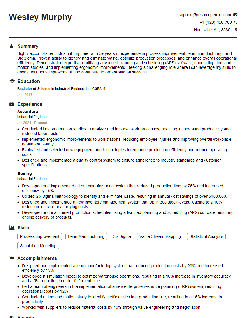
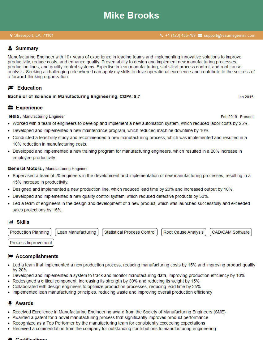
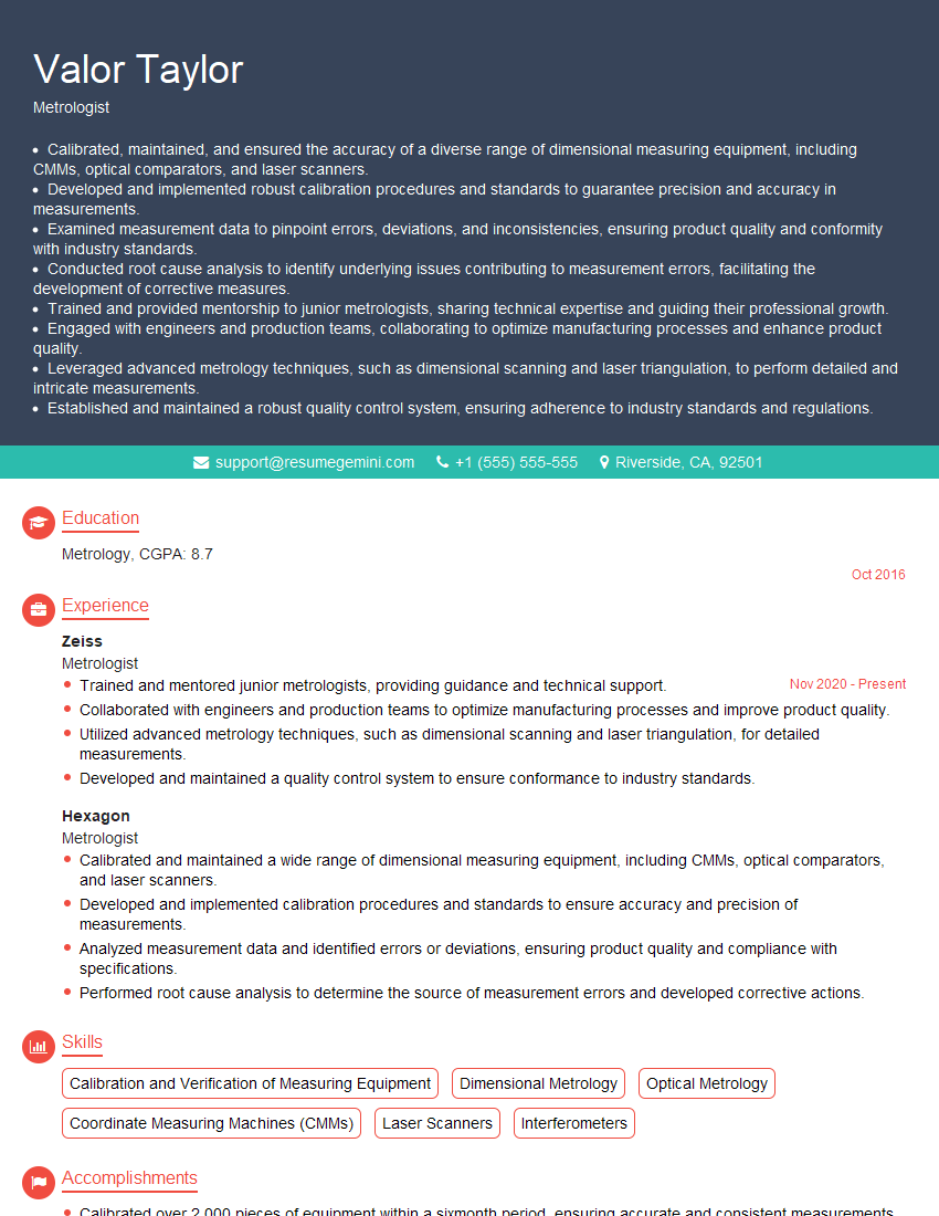
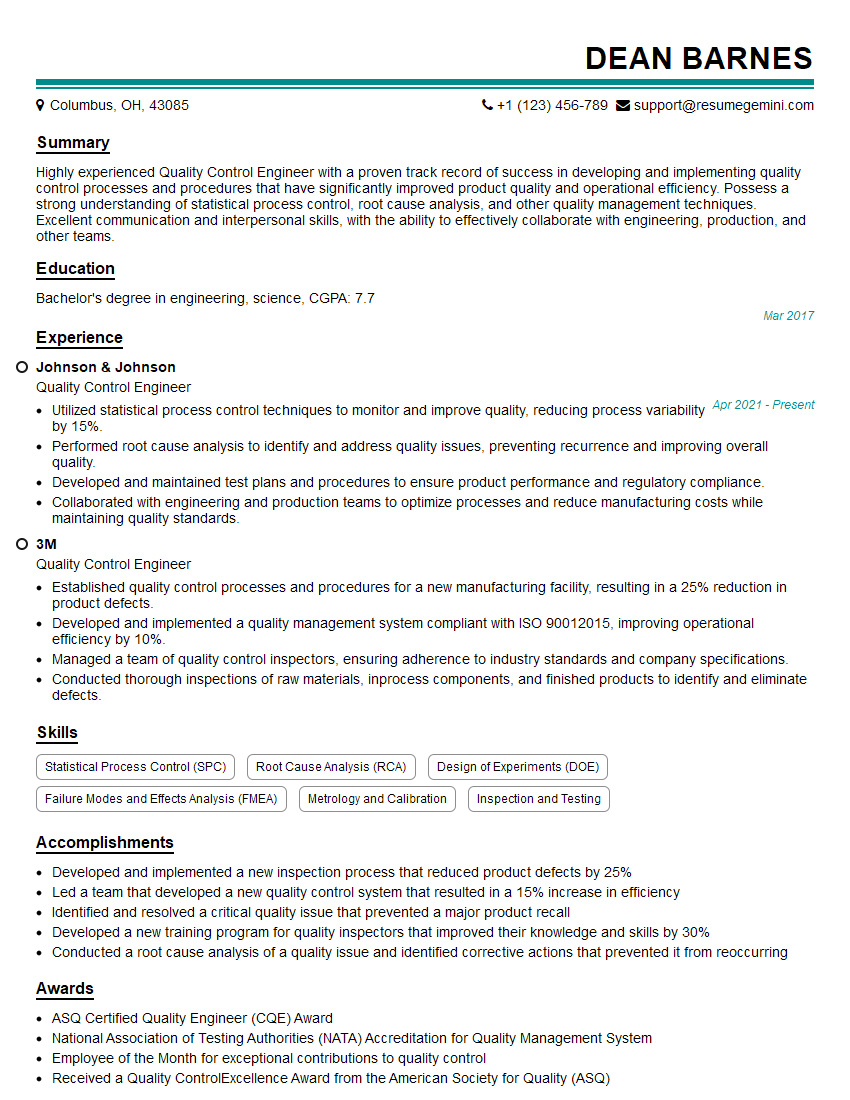
Mastering SPC Charting and Analysis significantly enhances your career prospects in quality control, manufacturing, and data analysis roles. It demonstrates a valuable skillset highly sought after by employers. To maximize your job search success, focus on creating a strong, ATS-friendly resume that highlights your skills and experience effectively. ResumeGemini is a trusted resource to help you build a professional and impactful resume. Examples of resumes tailored to SPC Charting and Analysis expertise are available to guide you. Invest time in crafting a compelling resume to showcase your capabilities and land your dream job.
Explore more articles
Users Rating of Our Blogs
Share Your Experience
We value your feedback! Please rate our content and share your thoughts (optional).
What Readers Say About Our Blog
Hello,
We found issues with your domain’s email setup that may be sending your messages to spam or blocking them completely. InboxShield Mini shows you how to fix it in minutes — no tech skills required.
Scan your domain now for details: https://inboxshield-mini.com/
— Adam @ InboxShield Mini
Reply STOP to unsubscribe
Hi, are you owner of interviewgemini.com? What if I told you I could help you find extra time in your schedule, reconnect with leads you didn’t even realize you missed, and bring in more “I want to work with you” conversations, without increasing your ad spend or hiring a full-time employee?
All with a flexible, budget-friendly service that could easily pay for itself. Sounds good?
Would it be nice to jump on a quick 10-minute call so I can show you exactly how we make this work?
Best,
Hapei
Marketing Director
Hey, I know you’re the owner of interviewgemini.com. I’ll be quick.
Fundraising for your business is tough and time-consuming. We make it easier by guaranteeing two private investor meetings each month, for six months. No demos, no pitch events – just direct introductions to active investors matched to your startup.
If youR17;re raising, this could help you build real momentum. Want me to send more info?
Hi, I represent an SEO company that specialises in getting you AI citations and higher rankings on Google. I’d like to offer you a 100% free SEO audit for your website. Would you be interested?
Hi, I represent an SEO company that specialises in getting you AI citations and higher rankings on Google. I’d like to offer you a 100% free SEO audit for your website. Would you be interested?
good
