Cracking a skill-specific interview, like one for Adobe Creative Suite (e.g., Photoshop, Illustrator), requires understanding the nuances of the role. In this blog, we present the questions you’re most likely to encounter, along with insights into how to answer them effectively. Let’s ensure you’re ready to make a strong impression.
Questions Asked in Adobe Creative Suite (e.g., Photoshop, Illustrator) Interview
Q 1. Explain the difference between raster and vector graphics.
Raster and vector graphics are fundamentally different ways of representing images. Think of it like this: raster is like a mosaic, made of tiny squares (pixels), while vector is like a blueprint, made of mathematical equations describing lines and curves.
- Raster Graphics (e.g., JPEG, PNG, TIFF): These are resolution-dependent. Zooming in makes the pixels become larger and blurry. They are ideal for photographs and complex artwork where subtle color gradations are important. Photoshop primarily works with raster images.
- Vector Graphics (e.g., SVG, AI): These are resolution-independent. They can be scaled to any size without losing quality because they’re defined by mathematical formulas, not pixels. They are perfect for logos, illustrations, and typography where crisp lines and clean scaling are crucial. Illustrator is the go-to tool for vector graphics.
For example, a photo of a landscape would be a raster image, while a company logo would typically be a vector image.
Q 2. Describe your experience with Photoshop’s layer masks.
Layer masks in Photoshop are one of my most frequently used tools. They allow non-destructive editing, meaning you can hide or reveal portions of a layer without permanently altering the image data. It’s like having a stencil over your layer.
I use them extensively for things like compositing images (e.g., seamlessly integrating a person into a different background), retouching (e.g., removing blemishes without affecting the surrounding skin), and creating special effects (e.g., selectively applying a filter).
My workflow typically involves creating a mask (either by drawing with black and white on a mask layer or using selections to automatically generate one), then adjusting the mask’s opacity and feathering to achieve a natural-looking blend. I often use quick masks for intricate selections.
Q 3. How do you optimize images for web and print?
Optimizing images for web and print requires vastly different approaches due to the different output methods and resolutions.
- Web Optimization: The goal is to reduce file size for faster loading without significant loss of quality. This involves using lossy compression (like JPEG for photographs), choosing the right file format (PNG for graphics with sharp lines and transparency), and reducing the image dimensions to the appropriate size for your webpage. I use tools like Photoshop’s ‘Save for Web (Legacy)’ to precisely control these parameters and preview the file size and quality.
- Print Optimization: Print requires high resolution to avoid pixelation. I typically use TIFF or high-quality JPEGs with a resolution of at least 300 DPI (dots per inch). Color profiles are crucial here; I ensure that the image is in the correct color space (CMYK for most print jobs) to match the printer’s capabilities. Sharpening is also applied carefully to compensate for the slight loss of detail during the printing process.
Q 4. What are your preferred methods for color correction in Photoshop?
My approach to color correction depends on the image and the desired outcome, but I often combine several methods for a holistic approach.
- Levels and Curves: These are my go-to tools for adjusting overall brightness, contrast, and tonal range. Levels is great for quick adjustments, while Curves offers more precise control over individual tones.
- Color Balance: This tool allows me to shift colors towards specific hues (cyan, magenta, yellow, or black). It’s useful for correcting color casts or enhancing specific colors.
- Selective Color: For finer color adjustments, I use Selective Color to target individual colors (e.g., adjusting the saturation or hue of reds or blues).
- Camera Raw Filter: If I’m working with raw files, I use Adobe Camera Raw to make initial adjustments to white balance, exposure, and shadows before moving to Photoshop for detailed work.
I always work non-destructively using adjustment layers so adjustments can be easily reversed or modified later.
Q 5. Explain your workflow for creating a complex illustration in Illustrator.
My workflow for creating a complex illustration in Illustrator generally follows a structured approach:
- Planning and Sketching: I start with sketches (either digital or on paper) to plan the composition, layout, and key elements of the illustration.
- Vector Creation: I create the various elements using Illustrator’s drawing tools (Pen Tool, Pencil Tool, Shape tools). I often use layers to keep different components organized.
- Color and Styling: I add color and styling, experimenting with gradients, patterns, and effects. I maintain a consistent style throughout the illustration.
- Pathfinder Panel: I heavily utilize the Pathfinder panel for combining, subtracting, and manipulating shapes to create complex forms.
- Refinement and Detailing: I add finer details, refining shapes and adding textures. I frequently use the Gradient Mesh tool for intricate shading.
- Final Export: I save the file in the appropriate vector format (AI or SVG) for flexibility and scalability.
For instance, when creating a detailed character design, I might create separate layers for the character’s body, clothes, and hair, then use Pathfinder to combine and refine these layers to create a cohesive image.
Q 6. How do you use blending modes effectively in Photoshop?
Blending modes in Photoshop control how a layer interacts with the layers below. It’s like changing the way different paints mix on a canvas. They offer a wide range of creative possibilities.
I frequently use blending modes such as:
- Overlay: Increases contrast, good for adding highlights and shadows.
- Soft Light: Subtly blends colors, useful for subtle lighting effects.
- Multiply: Darkens the base layer, useful for adding shadows and depth.
- Screen: Lightens the base layer, useful for adding highlights and glows.
- Linear Dodge (Add): Creates a bright effect, often used for highlights and glows.
Understanding how different blending modes affect color and luminosity is key to using them effectively. Experimentation and practice are crucial to mastering them.
Q 7. Describe your experience with Illustrator’s Pathfinder panel.
Illustrator’s Pathfinder panel is a powerful tool for manipulating shapes and paths. It’s essentially a toolbox for vector surgery, allowing you to combine, subtract, intersect, and otherwise modify shapes in precise ways.
I use it regularly for:
- Combining shapes: Create complex shapes from simpler ones using the ‘Unite’ function.
- Subtracting shapes: Cut one shape from another using the ‘Minus Front’ function.
- Creating complex intersections: Obtain the overlapping area of multiple shapes using the ‘Intersect’ function.
- Creating intricate patterns: Combine and subtract shapes to create intricate designs.
For example, to create a design with a star inside a circle, I would first create a star and a circle, then use the Pathfinder panel’s ‘Intersect’ function to carve the star out of the circle, leaving only the overlapping parts.
Q 8. How do you handle high-resolution images in Photoshop?
Handling high-resolution images in Photoshop efficiently involves understanding memory management and workflow optimization. Large files can slow down your system, so it’s crucial to work smartly. Instead of opening the full-resolution image directly, I often use techniques like:
- Opening as a Smart Object: This allows non-destructive editing. Changes are recorded as a layer, preserving the original image quality. This is particularly beneficial when making repeated edits or adjustments that could degrade the image if made directly.
- Using Image Proxy: Photoshop allows you to work with a lower-resolution proxy of the image, speeding up performance. Once editing is complete, you can switch back to the full resolution to finalize and save.
- Managing Memory: Increasing Photoshop’s memory allocation in its preferences can help handle larger files. However, even with increased memory, it’s better to work on sections of the image rather than the entire thing at once. I might use layer masking or cropping to work on smaller areas, rendering them only as necessary.
- Saving as layered PSD: This keeps all the edits and layers intact, allowing for future edits without recompression and loss of quality. If the final output requires a smaller file size, I can then save a copy as a JPG or PNG later.
For example, I recently worked on a large architectural rendering. Using smart objects and image proxies, I was able to smoothly retouch details without significant performance issues. Saving as a layered PSD enabled me to quickly address client feedback without redoing the entire process.
Q 9. What are some common file formats and their uses (e.g., PSD, AI, JPG, PNG, SVG)?
Different file formats serve distinct purposes in the creative process. Here are some common ones and their uses:
- PSD (Photoshop Document): Photoshop’s native format. It preserves layers, effects, and other editable information, making it ideal for ongoing projects and collaboration.
- AI (Adobe Illustrator): Illustrator’s native format. Stores vector graphics, scalable without loss of quality. Perfect for logos, illustrations, and designs intended for various sizes.
- JPG (JPEG): A lossy compressed format commonly used for photographs. Good for web and print, but repeated saving can degrade quality. Generally unsuitable for images requiring editing due to loss of information.
- PNG (Portable Network Graphics): A lossless format supporting transparency. Often preferred for web graphics, logos, and images needing sharp edges and transparency.
- SVG (Scalable Vector Graphics): A vector format that’s easily scalable, perfect for web icons, illustrations, and designs that need to be displayed at different sizes without losing quality. Often used for responsive web design.
Choosing the right format is crucial. For instance, a logo should be saved as an AI or SVG for scalability, whereas a photograph for web use would typically be a JPG.
Q 10. Explain your understanding of color spaces (e.g., RGB, CMYK).
Color spaces define how colors are represented digitally. The main ones are:
- RGB (Red, Green, Blue): An additive color model used for screens (monitors, TVs). It mixes red, green, and blue light to create a wide range of colors. Web design and digital displays typically use RGB.
- CMYK (Cyan, Magenta, Yellow, Black): A subtractive color model used for printing. It works by subtracting colors from white light. The black (K) component is added to improve dark tones and reduce ink usage. Print materials generally use CMYK.
Understanding the differences is key. An image designed in RGB might look different when printed in CMYK because of the different color gamuts (the range of reproducible colors). Knowing this, designers often convert images to CMYK before sending them to print to preview potential color shifts and make necessary adjustments.
For example, vibrant RGB colors might appear duller in CMYK. Proper color management involves converting to CMYK and proofing to ensure color accuracy in the final output.
Q 11. How do you create and use custom brushes in Photoshop?
Creating custom brushes in Photoshop allows you to personalize your workflow and add unique textures and effects. You can create them from scratch or from existing images.
- From Scratch: The Brush panel lets you adjust shape dynamics, scattering, and other properties to create a wide variety of brush effects. This offers maximum control but demands a good understanding of brush properties.
- From an Image: You can create a brush from any image; this is an excellent method for adding textures or patterns. Photoshop converts the image into a brush tip, allowing you to paint with the image’s texture.
For example, I recently created a custom brush from a scanned watercolor texture. This allowed me to paint realistic watercolor effects with high efficiency. Once the custom brush is saved, it is reusable across projects, increasing productivity.
The workflow involves selecting the desired image, going to Edit > Define Brush Preset, and giving it a name. You can then adjust the brush settings within the Brush panel to refine its behavior.
Q 12. Describe your experience with creating and editing type in Illustrator.
Illustrator excels at creating and editing type. Its vector-based nature ensures scalability without loss of quality, making it ideal for logos, branding materials, and any design where precise typography is crucial.
- Creating Type: Illustrator offers various type tools, including point type (for individual characters), paragraph type (for text blocks), and area type (for fitting text within a defined shape). Each tool provides specific control over text formatting and placement.
- Editing Type: Features include kerning (adjusting space between individual characters), tracking (adjusting space between all characters), leading (adjusting space between lines), and a plethora of font options. Illustrator also allows for applying effects like outlines, shadows, and 3D transformations to text.
- Working with Type on Paths: A unique feature lets you create text along a curved path, adding creative flexibility to designs. This is particularly useful for logos and designs where text needs to follow a specific curve or shape.
In my experience, I often use Illustrator’s type features to create intricate logos or branding elements. The ability to manipulate text precisely, combined with vector scaling, ensures consistent quality across multiple applications and sizes.
Q 13. Explain your workflow for designing a responsive website layout.
Designing a responsive website layout requires a workflow focused on adaptability across various screen sizes. My approach involves:
- Mobile-First Approach: I usually start with designing for smaller screens (mobile phones) and then scale up to tablets and desktops. This ensures core content is visible and functional on all devices.
- Using Grid Systems: Employing a grid system (like Bootstrap or a custom grid) provides a structured layout that adapts smoothly across different screen sizes. It helps maintain visual consistency while accommodating varying content widths.
- Fluid Images and Layouts: Images and layout elements should utilize percentages rather than fixed pixel dimensions. This allows them to resize proportionally with the screen.
- Responsive Images: Using
srcsetattributes in HTML allows the browser to select the most appropriate image size based on the screen resolution. This ensures optimal image quality without unnecessary loading of larger files on smaller screens. - Testing Across Devices: Thorough testing on different devices and browsers is essential to ensure functionality and visual appeal on all target platforms.
Recently, I designed a website using a mobile-first approach and a Bootstrap grid. This ensured that the website’s content was easily accessible and well-presented across various devices, from smartphones to large desktop monitors.
Q 14. How do you use smart objects in Photoshop?
Smart Objects in Photoshop are incredibly powerful for non-destructive editing. They essentially act as containers that preserve the original image data and allow for edits without altering the original source.
- Creating Smart Objects: You can convert a layer or a group of layers into a Smart Object by right-clicking and selecting ‘Convert to Smart Object’. Alternatively, you can place an image file (like a JPG or PNG) directly into the document as a Smart Object.
- Editing Smart Objects: Double-clicking a Smart Object opens it in a separate window where you can make changes. These changes are then reflected non-destructively in the main document. You can even replace the contents of a Smart Object with a new image.
- Advantages: Smart Objects maintain image quality even after repeated edits and transformations. They are particularly useful for:
- High-resolution images: Working with smaller proxies and then switching to full resolution when needed.
- Repeated use of elements: Making changes in one Smart Object updates all instances automatically.
- Non-destructive effects: Applying filters and transformations as Smart Filters, retaining the ability to edit or remove the effects later.
For example, I used Smart Objects to manage a client logo across multiple pages of a brochure. This ensured the logo remained consistent in quality and allowed me to quickly make updates to the logo without having to re-edit every instance manually. This saved me considerable time and effort.
Q 15. Describe your experience with vector tracing in Illustrator.
Vector tracing in Illustrator is a powerful tool that converts raster images (like JPGs or PNGs) into editable vector graphics (like AI or SVG files). This is incredibly useful because vector graphics are resolution-independent, meaning they can be scaled to any size without losing quality. Imagine trying to enlarge a pixelated image – it becomes blurry. A vector image, however, will remain crisp and clean.
My experience involves using Illustrator’s Image Trace feature extensively. I typically experiment with different preset options – like ‘high fidelity photo’ for detailed images or ‘line art’ for simpler illustrations – before fine-tuning the settings manually. This often involves adjusting parameters like ‘paths,’ ‘corners,’ and ‘noise’ to achieve the desired level of detail and smoothness. For example, when tracing a complex logo with fine details, I’d prioritize ‘high fidelity photo’ and carefully adjust the noise reduction to preserve the intricate elements. Post-tracing, I meticulously clean up the paths, removing unnecessary anchor points to streamline the artwork and make it easier to edit.
Beyond the Image Trace function, I also understand the importance of preparing the source image for optimal results. A high-resolution image with good contrast generally yields superior tracing results. I often pre-process images in Photoshop, adjusting levels and contrast to enhance clarity before importing them into Illustrator for tracing.
Career Expert Tips:
- Ace those interviews! Prepare effectively by reviewing the Top 50 Most Common Interview Questions on ResumeGemini.
- Navigate your job search with confidence! Explore a wide range of Career Tips on ResumeGemini. Learn about common challenges and recommendations to overcome them.
- Craft the perfect resume! Master the Art of Resume Writing with ResumeGemini’s guide. Showcase your unique qualifications and achievements effectively.
- Don’t miss out on holiday savings! Build your dream resume with ResumeGemini’s ATS optimized templates.
Q 16. How do you ensure color consistency across different projects?
Maintaining color consistency across multiple projects is paramount for brand identity and visual harmony. My approach involves a multi-faceted strategy leveraging Adobe’s color management tools.
- Creating and using custom color palettes: I meticulously build and save custom color palettes in Illustrator’s Swatches panel (or in Photoshop’s color libraries). This allows for easy reuse of consistent colors across various projects related to the same brand or style guide. This is particularly beneficial for large-scale projects or when working with a team.
- Employing color modes effectively: Understanding the differences between RGB (for screen displays) and CMYK (for print) is critical. I ensure that I’m working in the correct color mode from the outset to avoid unexpected color shifts during the final output process. Conversion between color modes can cause variations, so it’s best to plan ahead.
- Utilizing color profiles: Adobe offers robust color profile management. I ensure that my monitors and printers are calibrated properly and that consistent color profiles are applied throughout the workflow. This helps minimize inconsistencies between how a design looks on screen and how it prints.
- Leveraging global color adjustments: Photoshop’s adjustment layers (like Hue/Saturation or Color Balance) allow non-destructive color changes that can be easily updated and applied consistently to all elements of a design, ensuring consistent updates across the project.
For example, I once worked on a branding project with specific corporate color guidelines. Creating a custom swatch palette from those guidelines and using it consistently across all design assets – business cards, website mockups, and social media posts – ensured brand consistency.
Q 17. What are some common keyboard shortcuts you use in Photoshop and Illustrator?
Keyboard shortcuts are essential for boosting efficiency in Adobe Creative Suite. Here are some of my most frequently used shortcuts in Photoshop and Illustrator:
- Photoshop:
Ctrl+S (Cmd+S): SaveCtrl+Z (Cmd+Z): UndoCtrl+J (Cmd+J): Duplicate LayerCtrl+T (Cmd+T): Free TransformCtrl+Alt+Shift+E (Cmd+Option+Shift+E): Stamp Visible
- Illustrator:
Ctrl+S (Cmd+S): SaveCtrl+Z (Cmd+Z): UndoCtrl+C (Cmd+C): CopyCtrl+V (Cmd+V): PasteCtrl+D (Cmd+D): Repeat last actionV: Selection ToolA: Direct Selection ToolP: Pen Tool
I often customize my keyboard shortcuts further, assigning frequently used actions to less common key combinations for a personalized workflow. The more proficient I am with shortcuts, the faster and more efficient my design process becomes.
Q 18. How do you handle large files in Adobe Creative Suite?
Handling large files in Adobe Creative Suite requires a strategic approach to prevent performance issues and maintain workflow efficiency.
- Optimizing file formats: I choose file formats that balance quality and file size. For raster images, using lossy compression (like JPEG) is preferable over lossless compression (like PNG) when appropriate. For vector graphics, Illustrator’s native AI format is usually preferred, but SVGs can be smaller and more web-friendly.
- Managing layers effectively: In Photoshop, merging or flattening layers when possible reduces file size significantly. In Illustrator, using groups instead of many individual objects helps streamline the file structure. I make a habit of deleting unnecessary layers or objects regularly.
- Using external storage and high-performance systems: Having a fast SSD drive makes a huge difference, particularly when working with large layered Photoshop files or high-resolution images. Storing files on a fast external drive can further alleviate the burden on the internal drive.
- Utilizing Adobe Bridge for file management: I extensively use Bridge for previewing and managing large numbers of images before importing them into design projects, helping me to quickly identify the appropriate files and avoiding unnecessary importing of unneeded assets.
- Working in smaller segments: For extremely large projects, I would often break the designs down into smaller, manageable chunks rather than attempting to edit everything at once. This approach improves performance and prevents excessive RAM consumption. I may also utilize proxy files for editing very large images.
For instance, when working on a photo-realistic project with multiple high-resolution images, I utilize proxy files for initial edits and then switch to the full-resolution images for final details and output.
Q 19. Describe your experience with Adobe Bridge.
Adobe Bridge is an invaluable asset in my workflow. It’s more than just a file browser; it’s a powerful tool for organizing, previewing, and managing digital assets.
- File organization and metadata: Bridge allows me to create custom folder structures and apply metadata (keywords, captions, copyright information) to files, ensuring easy searchability and efficient project management. I use this regularly to organize thousands of images for various projects.
- Batch processing: Bridge offers efficient batch processing capabilities. I regularly use this to rename files, convert image formats, or apply image adjustments across large sets of images without manually editing each one. For example, I can batch resize and convert images from RAW to JPEG for web use.
- Image preview and selection: I use Bridge’s preview functionality to quickly browse through images and select the ones needed for a project without opening each file individually. This saves me a considerable amount of time when working with large volumes of assets.
- Integration with other Creative Suite apps: Bridge seamlessly integrates with Photoshop and Illustrator. This means I can open images and documents directly from Bridge, streamlining my workflow and avoiding unnecessary context switching between applications.
For example, recently I was working on a website redesign project, and Bridge proved essential in organizing and preprocessing hundreds of images used across various pages. I used it to sort images by category, apply keywords, and batch resize images for web optimization.
Q 20. Explain your approach to designing for different screen sizes.
Designing for different screen sizes requires a responsive design approach. This means creating designs that adapt seamlessly to various screen resolutions and device types (desktops, tablets, smartphones).
- Responsive web design principles: I leverage techniques such as fluid grids, flexible images, and media queries (CSS) to ensure my designs scale appropriately for different screen sizes. I also work with developers to ensure the back-end implementation aligns with responsive principles.
- Mobile-first approach: Often, I start designing for the smallest screen size (smartphone) first and then progressively add elements and styling for larger screens. This ensures core content is always visible and functional, regardless of screen size.
- Using design tools effectively: In Illustrator, I often create modular designs—breaking down complex layouts into reusable components—that can easily be adapted to different screen sizes. In Photoshop, I use layer comps and slices for creating different versions of a layout for various devices.
- Testing and iteration: Once a design is complete, I meticulously test its responsiveness across multiple devices and browsers to ensure it looks and functions correctly on all platforms. This is crucial for delivering an optimal user experience.
For example, when designing a website, I would create a fluid grid system that adapts the layout based on screen width. Images would be made responsive by using percentage-based widths instead of fixed pixel widths. Media queries would then fine-tune styling for specific screen ranges (e.g., different styles for desktop vs. tablet vs. mobile). This makes the design adaptable to the specific screen or device it’s being viewed on.
Q 21. How do you create a seamless pattern in Illustrator?
Creating a seamless pattern in Illustrator is a straightforward process that involves understanding the concept of repeating elements and using Illustrator’s tools effectively.
- Designing the base motif: Begin by creating a single repeating unit or motif (tile). This can be a simple shape, illustration, or more complex composition. It is important to ensure this tile is properly designed as the final seamless pattern will be built around this unit.
- Creating the pattern swatch: Select the motif and use the `Make Pattern` option (found under the `Object` menu). Choose either a grid or freeform pattern type, depending on the desired layout. This process creates a pattern swatch which can then be further manipulated.
- Adjusting pattern settings: In the pattern options panel, carefully adjust parameters like tile size, overlap, and spacing to achieve a seamlessly repeating pattern. Experiment with different settings to achieve the desired visual effect. Ensure the edges of your tile seamlessly connect with itself.
- Refining and editing: Once a basic pattern is created, you can refine it further by adding elements, changing colors, or adding subtle variations to the motif. Ensure the changes maintain the seamless repetition when previewing.
- Saving the pattern swatch: Once satisfied with the final look, save the pattern swatch to your swatches panel for future use or projects.
For instance, to create a floral seamless pattern, I would first create a single floral element, then use the `Make Pattern` tool to repeat it across a grid. I’d adjust the spacing and overlap until I achieve a visually pleasing and seamless repetition. This pattern could then be applied to various design projects, from textiles to website backgrounds.
Q 22. What are your strategies for maintaining design consistency across various media?
Maintaining design consistency across various media is crucial for brand recognition and a cohesive user experience. My strategy involves creating a comprehensive style guide, a living document that acts as a single source of truth for all design elements. This guide includes:
- Color palettes: Precise hex codes and CMYK/RGB equivalents for print and digital use.
- Typography: Specified fonts, sizes, weights, and line heights for headings, body text, and other textual elements.
- Logo variations: Different versions of the logo (e.g., horizontal, vertical, monochrome) and usage guidelines.
- Imagery style: Guidelines on photography style (e.g., lighting, composition), illustrations, and iconography.
- Spacing and layout: Grid systems, margins, padding, and other layout specifications to ensure visual harmony.
I then rigorously apply this style guide across all projects using Adobe Creative Suite. For instance, in Photoshop, I might use Layer Styles to ensure consistent application of effects and in Illustrator, I leverage Symbols to maintain consistency of logos and icons across various artboards. This ensures a seamless brand experience whether it’s a website banner, a print brochure, or a social media post.
Q 23. How do you use actions in Photoshop to automate tasks?
Photoshop Actions are powerful tools for automating repetitive tasks, saving significant time and increasing efficiency. I use them frequently for batch processing, applying consistent edits, and streamlining workflows. For example, I might create an action for retouching product photos: it would include steps like resizing, adjusting levels, sharpening, and adding a watermark.
The process involves recording a series of actions. Let’s say I want to create an action for applying a specific filter and resizing an image:
- Go to
Window > Actionsto open the Actions panel. - Click the
Create new actionbutton. - Give the action a descriptive name (e.g., “Batch Retouch”).
- Perform the desired actions (e.g., apply a filter, resize using
Image > Image Size). - Stop recording the action by clicking the
Stopbutton.
Now, I can simply select the action and play it on multiple images. This is incredibly helpful when dealing with large volumes of images, drastically reducing manual effort and ensuring consistency in post-processing.
Q 24. How would you solve a design problem involving conflicting design elements?
Conflicting design elements often arise. My approach involves a systematic process focused on understanding the root cause of the conflict and finding a balanced solution that prioritizes visual hierarchy and overall design goals.
- Identify the conflict: What specific elements clash? Is it color, typography, imagery, or layout?
- Analyze the cause: Why are these elements conflicting? Is it a lack of planning, a stylistic mismatch, or a constraint of the project?
- Prioritize elements: Determine which elements are most crucial for conveying the message or achieving the design goal. Often, one element must take precedence.
- Explore solutions: Experiment with different approaches to resolve the conflict. This might involve adjusting colors, modifying typography, simplifying imagery, or rearranging the layout.
- Test and iterate: Evaluate the revised design. Does it work well visually? Does it communicate the message effectively? Iterate until a satisfactory solution is found.
For example, if a vibrant color clashes with a sophisticated typeface, I might either tone down the color or choose a more contemporary font that better complements the color scheme. The key is to maintain a balance and avoid overwhelming the viewer with conflicting elements.
Q 25. What are your preferred techniques for creating realistic textures?
Creating realistic textures involves a combination of techniques within Adobe Photoshop and Illustrator. My preferred methods include:
- Using high-resolution photographs: I often start by sourcing high-quality images of real-world textures (e.g., wood, fabric, metal). These can be edited and manipulated to fit the specific needs of the design.
- Creating textures from scratch: For unique or abstract textures, I can build them using brushes, filters, and layer blending modes. For example, using a combination of
Noisefilters,Motion Blur, andLayer Stylescan generate a convincing aged paper texture. - Combining multiple textures: Layering and blending different textures can produce more complex and realistic results. This might involve using
Overlay,Multiply, orScreenblending modes to create depth and visual interest. - Using 3D rendering software: For particularly intricate textures, I may integrate textures created in 3D modeling software such as Cinema 4D, then importing these into Photoshop for refinement.
Understanding how light interacts with different materials is essential. Experimenting with various lighting effects and adjusting the shadows and highlights within the texture can add depth and realism.
Q 26. Explain your process for designing a logo from concept to final artwork.
My logo design process is iterative and client-focused. It typically involves the following stages:
- Concept Development: This starts with thorough research on the client’s brand, target audience, and competitors. I brainstorm multiple concepts, sketching and refining them until a few promising directions emerge. Client feedback is vital at this stage.
- Sketching and Refinement: I use both paper sketches and digital tools (such as Illustrator) to refine the chosen concepts. This includes experimenting with different typography, shapes, and color palettes.
- Digital Vectorization: Once a preferred concept is selected, I meticulously create a clean and scalable vector version in Illustrator. This ensures high-quality output at any size.
- Color Selection and Refinement: I carefully choose colors that align with the brand identity and evoke the desired emotions. This often involves experimenting with different color schemes and variations.
- Presentation and Feedback: I present the logo designs to the client, incorporating feedback and making adjustments as needed. Often multiple revisions are necessary.
- Final Artwork and File Preparation: The final logo is prepared in various formats (e.g., AI, EPS, PNG, JPG) suitable for different applications (website, print, social media).
Each stage involves rigorous attention to detail, ensuring the final logo is not only visually appealing but also effectively communicates the brand’s message and values.
Q 27. How do you use Adobe libraries to manage assets?
Adobe Libraries are invaluable for managing and sharing design assets across multiple projects and team members. I use them extensively to organize logos, icons, color palettes, and graphic styles, ensuring consistency and efficiency.
To utilize Adobe Libraries, I create a library and add assets to it. These assets can be easily accessed and synced across applications like Photoshop, Illustrator, and InDesign. This streamlined workflow prevents inconsistencies and saves time in retrieving frequently used elements. For instance, updating a logo in the library automatically updates it across all projects where it’s linked. This centralized management promotes a more organized and efficient design workflow, especially in collaborative projects.
Q 28. Describe your experience with working collaboratively on design projects.
Collaborative design projects require clear communication, well-defined roles, and a shared understanding of the design goals. I’ve worked extensively in team settings using collaborative tools such as Adobe Creative Cloud Libraries and cloud-based file-sharing platforms.
My approach involves:
- Regular communication: Frequent meetings and updates to keep everyone informed and aligned.
- Version control: Using version control systems or cloud-based platforms to track changes and revisions.
- Feedback and review: Constructive feedback and regular reviews are integral to ensuring the project stays on track and meets the design goals.
- Clear roles and responsibilities: Well-defined roles help prevent conflicts and ensure efficient workflows.
- Using shared libraries: Using Creative Cloud Libraries ensures consistent branding and asset management.
Through these practices, I’ve consistently delivered successful collaborative design projects, fostering a positive and productive team environment.
Key Topics to Learn for Adobe Creative Suite (e.g., Photoshop, Illustrator) Interview
- Photoshop: Image Manipulation & Retouching: Mastering layers, blending modes, adjustment layers, and various selection tools for efficient image editing and retouching. Understanding non-destructive editing workflows is crucial.
- Photoshop: Workflow & Optimization: Learn to efficiently manage large files, optimize images for web and print, and understand color spaces (RGB, CMYK) and their implications.
- Illustrator: Vector Graphics & Illustration: Deep understanding of vector-based design, working with paths, shapes, and the pen tool for creating scalable graphics. Mastering the use of brushes and effects is important.
- Illustrator: Typography & Layout: Understanding typography principles and applying them effectively within Illustrator. Creating and managing layouts for various applications (e.g., logos, brochures).
- Cross-Application Workflow: Practical experience transferring assets between Photoshop and Illustrator, understanding the advantages and limitations of each program for specific tasks. This demonstrates a holistic understanding of the Creative Suite.
- File Formats & Exporting: Know the differences between various file formats (PSD, AI, JPG, PNG, PDF) and how to export your work correctly for different purposes (web, print, etc.).
- Problem-Solving & Creative Thinking: Be prepared to discuss how you approach creative challenges, troubleshoot technical issues, and adapt your workflow to meet specific project requirements.
Next Steps
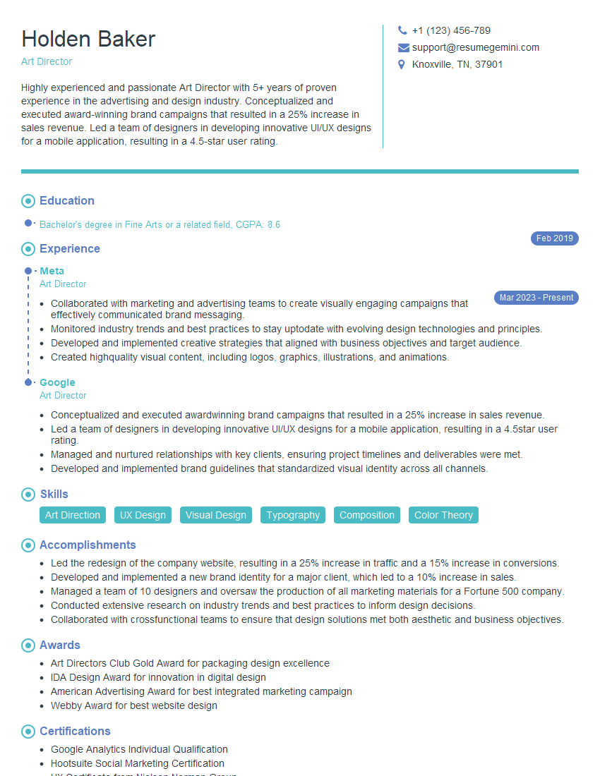
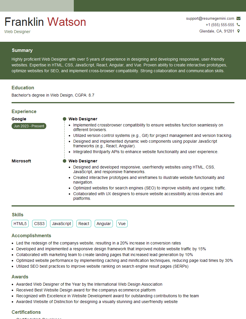
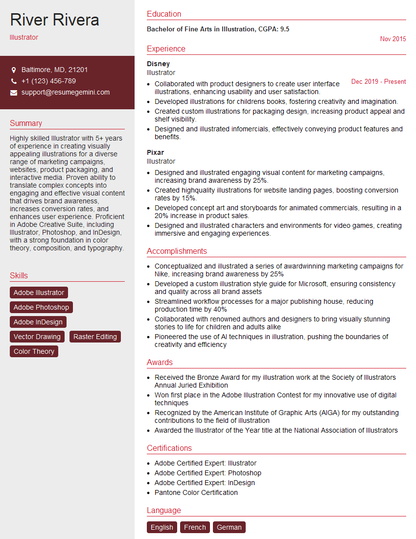
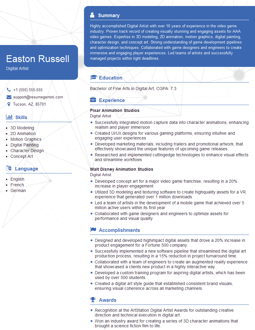
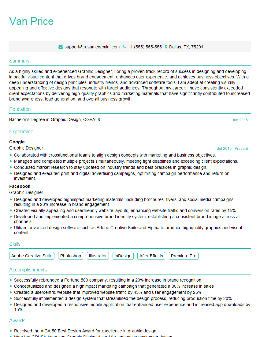
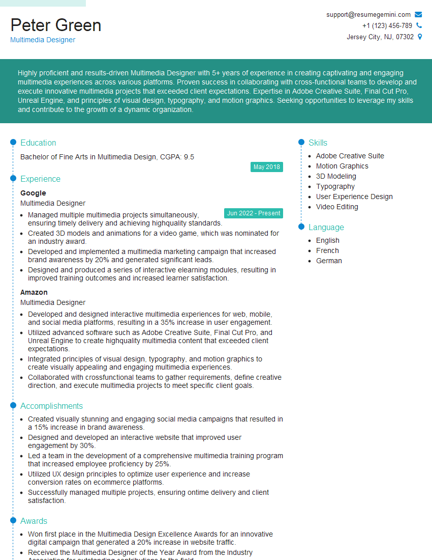
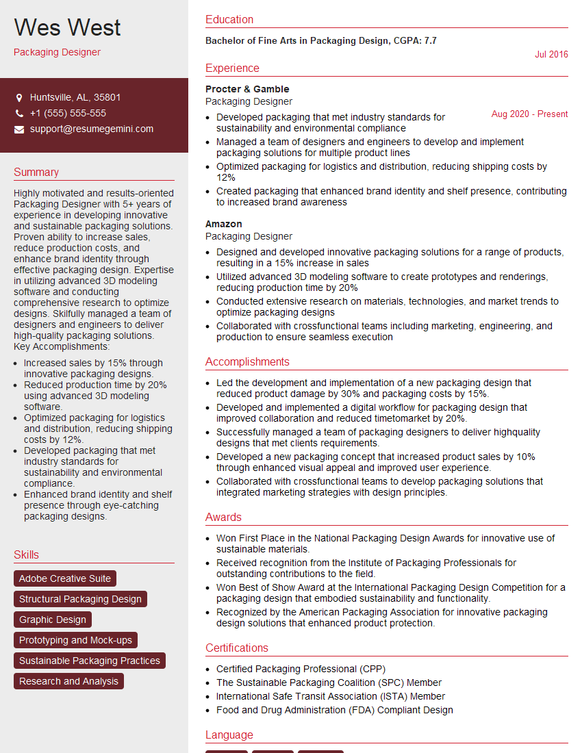
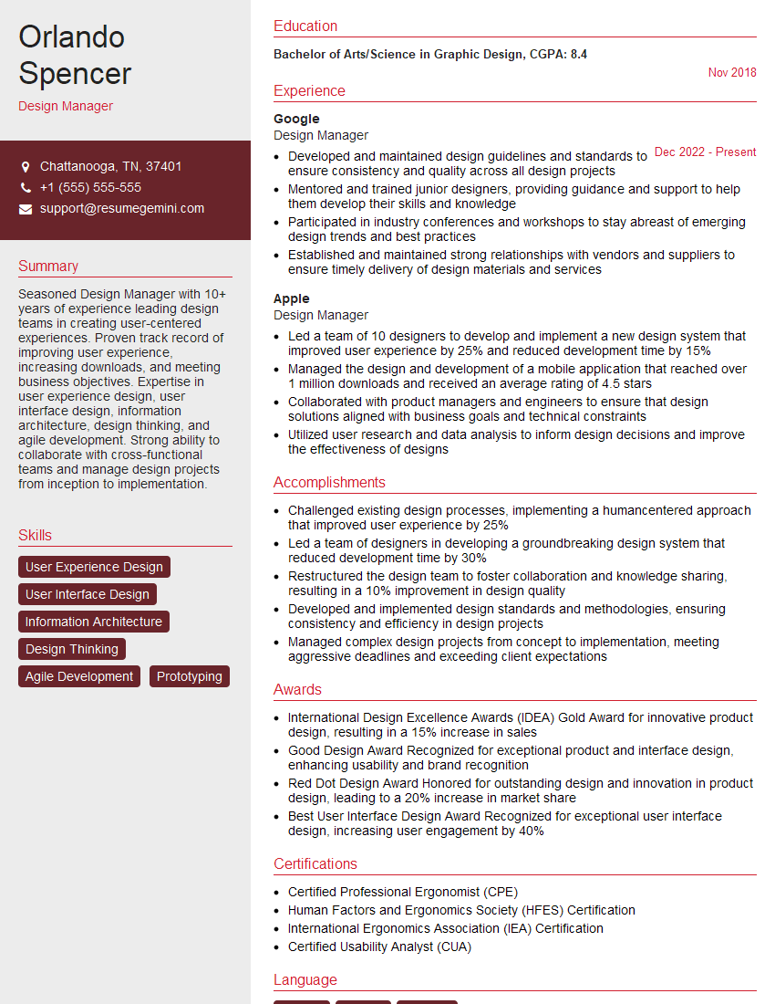
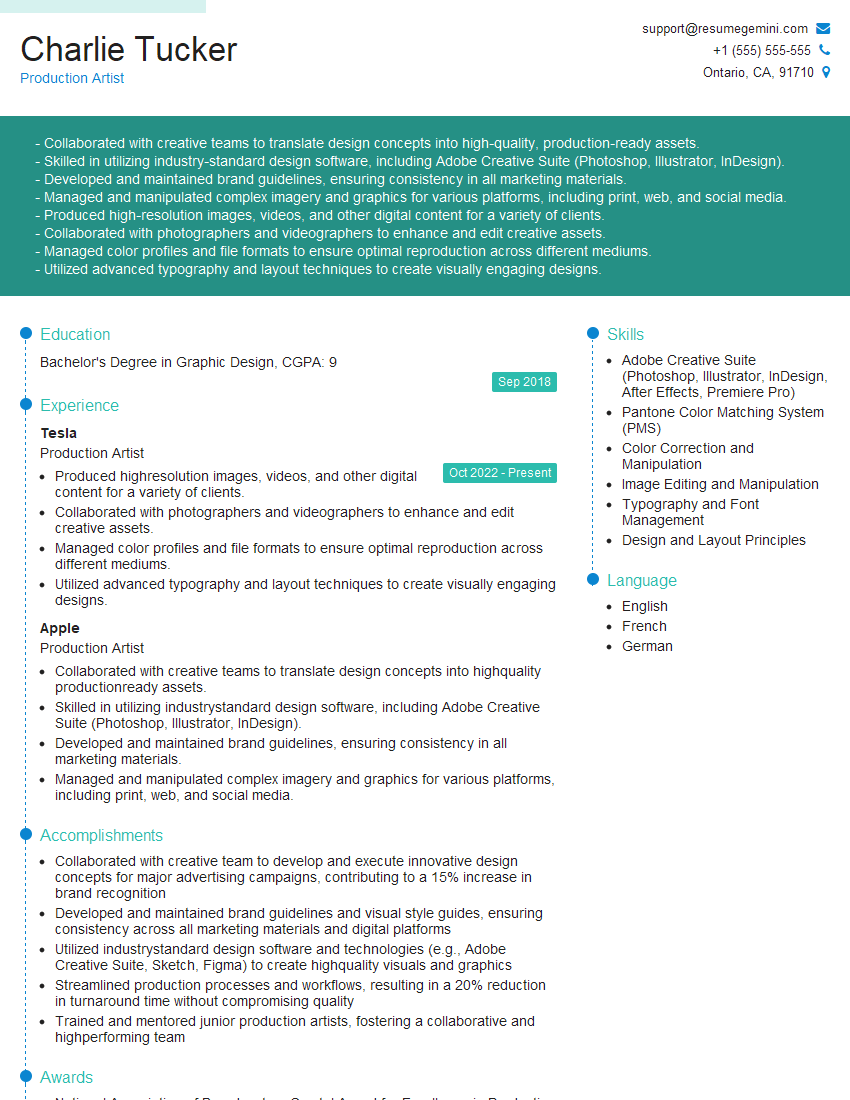
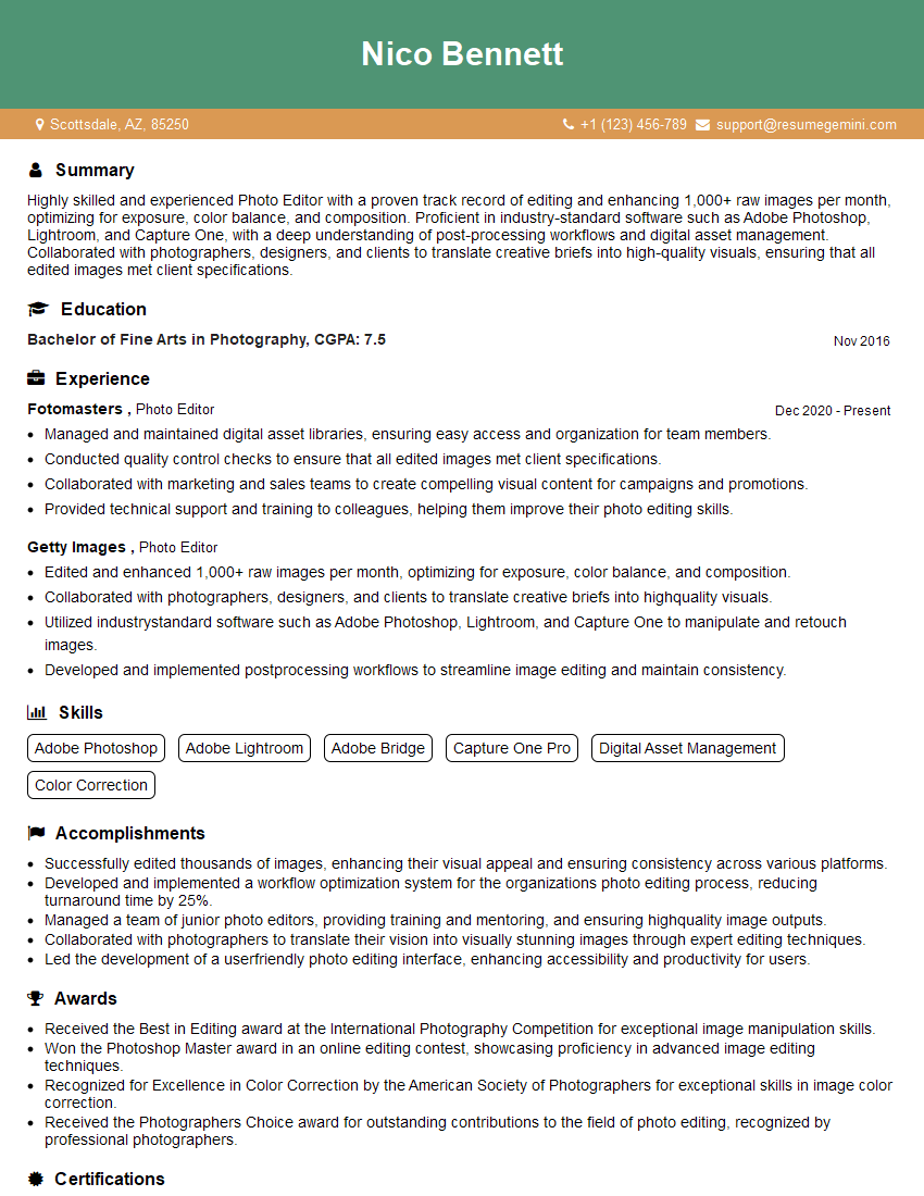
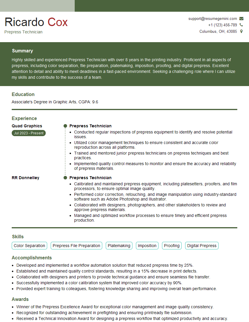
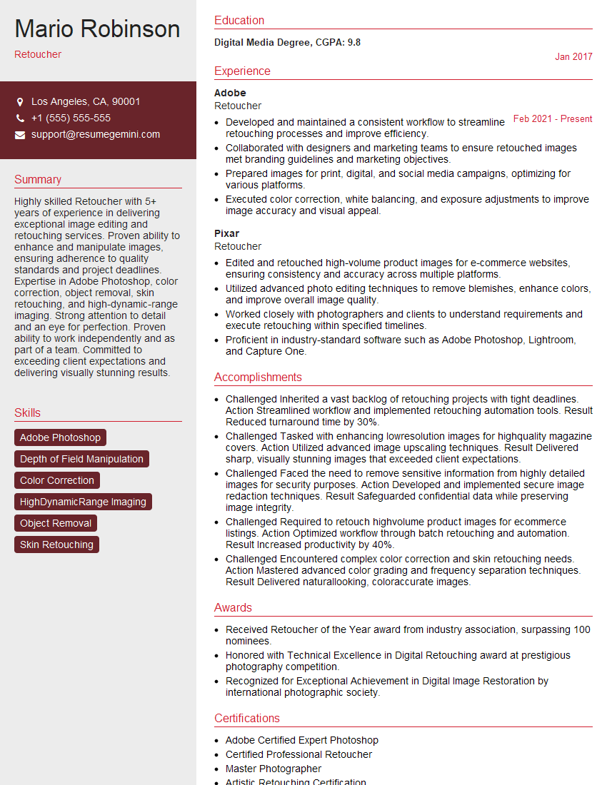
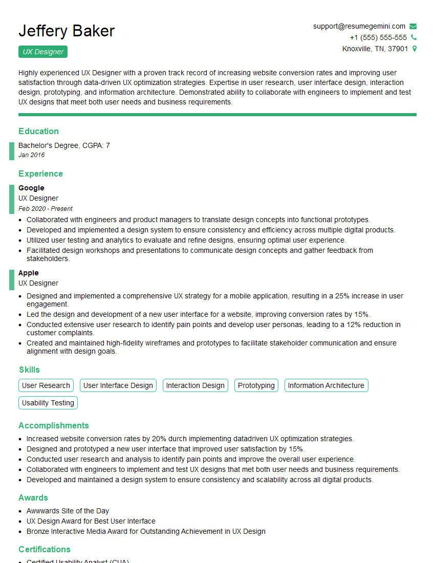
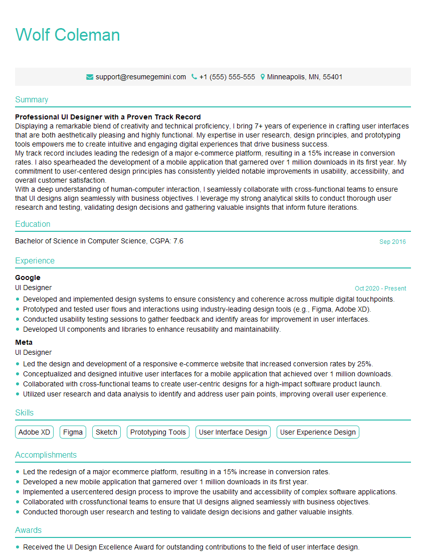
Mastering Adobe Creative Suite applications like Photoshop and Illustrator is essential for career advancement in design and related fields. These skills are highly sought after, opening doors to exciting opportunities. To maximize your job prospects, create an ATS-friendly resume that effectively highlights your skills and experience. ResumeGemini is a trusted resource to help you build a professional and impactful resume that catches the eye of recruiters. Examples of resumes tailored to Adobe Creative Suite expertise, showcasing relevant skills and experience, are available to guide you through the process.
Explore more articles
Users Rating of Our Blogs
Share Your Experience
We value your feedback! Please rate our content and share your thoughts (optional).
What Readers Say About Our Blog
Hello,
We found issues with your domain’s email setup that may be sending your messages to spam or blocking them completely. InboxShield Mini shows you how to fix it in minutes — no tech skills required.
Scan your domain now for details: https://inboxshield-mini.com/
— Adam @ InboxShield Mini
Reply STOP to unsubscribe
Hi, are you owner of interviewgemini.com? What if I told you I could help you find extra time in your schedule, reconnect with leads you didn’t even realize you missed, and bring in more “I want to work with you” conversations, without increasing your ad spend or hiring a full-time employee?
All with a flexible, budget-friendly service that could easily pay for itself. Sounds good?
Would it be nice to jump on a quick 10-minute call so I can show you exactly how we make this work?
Best,
Hapei
Marketing Director
Hey, I know you’re the owner of interviewgemini.com. I’ll be quick.
Fundraising for your business is tough and time-consuming. We make it easier by guaranteeing two private investor meetings each month, for six months. No demos, no pitch events – just direct introductions to active investors matched to your startup.
If youR17;re raising, this could help you build real momentum. Want me to send more info?
Hi, I represent an SEO company that specialises in getting you AI citations and higher rankings on Google. I’d like to offer you a 100% free SEO audit for your website. Would you be interested?
Hi, I represent an SEO company that specialises in getting you AI citations and higher rankings on Google. I’d like to offer you a 100% free SEO audit for your website. Would you be interested?
good
