Are you ready to stand out in your next interview? Understanding and preparing for Photography and Visual Presentation interview questions is a game-changer. In this blog, we’ve compiled key questions and expert advice to help you showcase your skills with confidence and precision. Let’s get started on your journey to acing the interview.
Questions Asked in Photography and Visual Presentation Interview
Q 1. Explain your workflow for a typical photography project.
My photography workflow is a meticulous process, designed for efficiency and consistent high-quality results. It typically involves these key stages:
- Consultation & Planning: This initial phase is crucial. I collaborate closely with clients to understand their vision, target audience, and desired outcome. We discuss style, mood, location, and any specific requirements. This often includes creating a mood board for visual reference.
- Pre-Production: This involves location scouting (if applicable), equipment preparation, and model/talent briefings (if needed). I meticulously plan lighting setups, camera settings, and shot lists to ensure maximum efficiency on the day of the shoot.
- Production (The Shoot): This is where the magic happens! I focus on capturing a variety of shots, ensuring I have sufficient options for post-processing. I constantly monitor composition, lighting, and technical aspects, making adjustments as needed. Communication with the subject (if any) is key to achieving natural and engaging results.
- Post-Production: This is where I meticulously refine the images. I use a combination of software (detailed below) to adjust exposure, contrast, color, and sharpness. I remove blemishes, retouch imperfections, and enhance overall visual appeal. This stage also involves selecting the best images and potentially creating composite images.
- Delivery & Review: Finally, I deliver the final images to the client in the agreed-upon format. I encourage feedback and am always open to making minor adjustments to meet their complete satisfaction.
For example, during a recent product photography project, the planning stage involved detailed discussions about the product’s key features and the desired brand aesthetic. This resulted in a mood board that incorporated specific color palettes and lighting styles, which streamlined the entire process.
Q 2. What software are you proficient in for image editing and retouching?
My image editing and retouching arsenal includes Adobe Photoshop and Lightroom. Photoshop is my primary tool for complex retouching, compositing, and detailed manipulation. Its powerful layer system and extensive toolset allows for precise adjustments and creative flexibility. Lightroom, on the other hand, is ideal for organizing, color grading, and making global adjustments to large batches of images. Its non-destructive editing workflow means I can always revert to the original image if needed. I also have experience with Capture One, known for its superior tethered shooting capabilities.
For instance, in Photoshop, I might use the healing brush tool to remove minor blemishes from a portrait, or the pen tool to create precise selections for complex masking. In Lightroom, I might utilize the graduated filter to adjust the exposure and contrast of a specific area of an image, or the HSL panel for fine-tuned color adjustments.
Q 3. Describe your experience with different photographic lighting techniques.
I’m proficient in a range of lighting techniques, adapting my approach based on the subject, desired mood, and available resources. These include:
- Natural Light: Utilizing ambient light, considering the direction, intensity, and quality of sunlight. This can range from soft, diffused light on an overcast day to the harsh, dramatic light of midday sun.
- Hard Light: Employing a single, focused light source to create strong shadows and high contrast. This technique is often used for dramatic portraits or product photography, emphasizing textures and details.
- Soft Light: Utilizing diffusers or reflectors to soften the light source, creating a gentler, more flattering illumination, ideal for portraits and minimizing harsh shadows.
- Three-Point Lighting: A classic setup involving a key light, fill light, and back light to create depth and dimension. The key light provides the main illumination, the fill light softens shadows, and the backlight separates the subject from the background.
- Rembrandt Lighting: A specific type of lighting characterized by a small triangle of light on the shadowed side of the subject’s face, creating a dramatic and captivating effect.
For example, during a fashion shoot, I might use a combination of soft light from a large softbox and a back light to create a glamorous, ethereal effect. In a product shoot, I might opt for hard light to highlight the product’s texture and form.
Q 4. How do you manage large image files and maintain organizational efficiency?
Managing large image files requires a structured and efficient system. I utilize a combination of strategies:
- Organized File Structure: I create a clear and logical folder structure for each project, using descriptive names and dates. Subfolders are used for raw files, edited images, and final deliverables.
- Hard Drives & Cloud Storage: I use multiple hard drives for backups, ensuring redundancy and protection against data loss. Cloud storage services like Dropbox or Google Drive provide an additional layer of security and accessibility.
- Non-Destructive Editing: Working with RAW files and non-destructive editing workflows in Lightroom minimizes the risk of data degradation and allows for flexibility in post-processing.
- Keywording & Metadata: I meticulously tag images with relevant keywords and metadata to facilitate efficient searching and retrieval.
- Image Compression: I use appropriate compression techniques (like JPEG or WebP) to reduce file sizes for web delivery, while maintaining sufficient image quality.
For instance, a recent wedding project involved over 2,000 images. My system ensured that all images were readily accessible and organized, which allowed for efficient selection and delivery of the final gallery.
Q 5. What is your experience with color correction and color grading?
Color correction and color grading are essential components of my post-processing workflow. Color correction focuses on restoring the natural colors of an image, correcting for imbalances caused by inaccurate white balance or lighting conditions. Color grading, on the other hand, is a more stylistic approach, modifying the colors to achieve a specific mood or aesthetic. I use tools within Lightroom and Photoshop to accomplish both.
In Lightroom, I leverage the white balance tool to correct for color casts. The HSL panel allows for precise adjustments to individual color hues, saturation, and luminance. In Photoshop, I might use curves or color balance adjustments for more targeted color modifications. For instance, a sunset photograph might require color correction to restore accurate colors, while a fashion editorial image might undergo color grading to create a cool, moody vibe.
Q 6. Explain your understanding of composition and its impact on visual storytelling.
Composition is the fundamental building block of visual storytelling. It’s how I arrange elements within the frame to guide the viewer’s eye, create visual interest, and convey a specific message. Understanding composition principles significantly impacts the impact and effectiveness of a photograph.
- Rule of Thirds: Dividing the frame into thirds, both horizontally and vertically, and placing key elements along these lines or at their intersections creates a more balanced and visually appealing image.
- Leading Lines: Utilizing lines within the scene to draw the viewer’s eye towards the main subject. Roads, rivers, fences, or even shadows can serve as effective leading lines.
- Symmetry & Patterns: Creating a sense of balance and harmony through symmetrical arrangements or repeating patterns can create a visually striking effect.
- Framing: Using elements within the scene, like arches or foliage, to frame the main subject and draw attention to it.
- Negative Space: Strategically leaving empty space within the frame to provide visual breathing room and emphasize the subject.
For example, in a landscape photograph, I might use the rule of thirds to position the horizon, placing the main subject off-center for better visual balance. In a portrait, I might use leading lines to draw attention to the subject’s eyes.
Q 7. Describe your experience working with clients to understand their visual needs.
Working with clients to understand their visual needs is a collaborative process that starts with active listening and clear communication. I begin by asking open-ended questions to understand their goals, target audience, and desired message. I encourage them to share examples of images or styles they like, helping me grasp their aesthetic preferences.
I then present my own ideas and expertise, offering suggestions based on my experience and understanding of visual communication. I create mood boards, discuss different approaches to lighting, composition, and post-processing to ensure that we’re on the same page. Throughout the process, I maintain open communication, providing regular updates and seeking feedback to ensure complete client satisfaction. For example, with a client needing images for a new website, I’d discuss their brand identity, target demographics, and the overall style of the website to ensure the photography aligns perfectly with their visual goals.
Q 8. How do you handle constructive criticism and feedback on your work?
Constructive criticism is vital for growth. I approach it as an opportunity for learning and improvement, not as a personal attack. My process involves actively listening to the feedback, asking clarifying questions to fully understand the points raised, and then objectively assessing their validity.
For example, if a client suggests a photograph is too dark, I wouldn’t get defensive. Instead, I’d ask for specifics – “Could you point to the areas that seem particularly dark?” – to understand their perception. Then, I’d examine the image myself, considering lighting, exposure, and post-processing. Based on this analysis, I’d either adjust the image or explain why the current look is intentional and aligns with the overall creative vision. Ultimately, the goal is to find a solution that satisfies both the client’s needs and maintains the artistic integrity of the work.
I maintain a detailed record of all feedback received, using it as a reference point for future projects. This allows me to identify patterns in my work that may need improvement and refine my skills over time. This iterative process is key to continuous professional development.
Q 9. What are your preferred methods for presenting visual work to clients?
Presenting visual work depends on the client and project, but my approach always prioritizes clarity and engagement. I typically start with a curated slideshow showcasing the best images or designs, carefully selecting the sequence to build a narrative. This might involve using software like Adobe Portfolio or creating a simple website for easy sharing.
For more detailed reviews, I prefer in-person meetings (or virtual meetings with high-quality screen sharing) to facilitate immediate feedback and discussion. I often provide printed proofs – particularly for print-based projects – allowing clients a tangible experience. During these presentations, I’ll walk the client through my creative process, explaining the choices made at each stage. This helps clients understand the rationale behind the design and fosters a collaborative approach.
Finally, I always follow up with a detailed email summarizing the meeting, including action items and agreed-upon next steps. This ensures clarity and minimizes misunderstandings. Ultimately, it’s about tailoring the presentation to the client’s communication style and project needs for optimal results.
Q 10. Describe your understanding of different image file formats (e.g., JPEG, TIFF, RAW).
Understanding image file formats is crucial for any photographer or visual artist. Each format has its strengths and weaknesses, making some suitable for specific tasks.
- JPEG (Joint Photographic Experts Group): This is a lossy compression format, meaning some image data is discarded to reduce file size. It’s widely compatible, great for web use and sharing, but repeated editing can degrade image quality. Think of it as a summary – you retain the main idea, but lose some detail.
- TIFF (Tagged Image File Format): A lossless format that preserves all image data. It’s ideal for archiving and high-quality printing, but files are significantly larger than JPEGs. It’s like having a detailed transcript – you have everything, but the file is larger.
- RAW: This format captures the unprocessed sensor data from a camera. It provides the greatest flexibility for editing, allowing extensive adjustments to exposure, white balance, and other parameters. It is lossless, but requires specialized software like Adobe Lightroom for processing. Think of it as the raw ingredients of a dish – you can adjust the seasoning, cooking method, etc., to your liking, creating diverse results.
Choosing the right format depends heavily on the intended use. JPEGs are suitable for web images, TIFFs for high-quality print jobs, and RAW is preferred when extensive editing is required or maximum image quality is paramount.
Q 11. How do you approach resolving a creative conflict with a client or team member?
Creative conflicts are inevitable in collaborative projects. My approach is to prioritize open and respectful communication. I start by actively listening to all parties involved, ensuring everyone feels heard and understood. I then try to reframe the conflict, focusing on the shared goal of creating the best possible outcome.
For example, if there’s a disagreement about the color palette of a design, I’d facilitate a discussion exploring the reasons behind each preference. We might look at mood boards, competitor analyses, or target audience demographics to find common ground. If necessary, I’d present multiple options, allowing everyone to contribute ideas and compromise. My role is not to impose my vision but to guide the process and help find a solution that meets everyone’s needs as best as possible. Sometimes, this involves creating a revised design that incorporates the best elements of all proposals.
If a compromise cannot be reached, I would document the disagreement, ensuring everyone is aware of the final decision and the rationale behind it. This ensures transparency and prevents future misunderstandings.
Q 12. What is your experience with different types of cameras and lenses?
My experience encompasses a wide range of cameras and lenses, from high-end professional systems to more compact mirrorless cameras and smartphones. I’m proficient with DSLR cameras such as Canon EOS series and Nikon D-series, along with mirrorless models like Sony Alpha and Fujifilm X-series cameras.
My lens experience includes various focal lengths, from wide-angle lenses for expansive landscapes to telephoto lenses for capturing distant subjects and macro lenses for extreme close-ups. Understanding the characteristics of each lens – its aperture, focal length, and image stabilization capabilities – is essential for selecting the right tool for the job. For example, a wide-angle lens would be ideal for architectural photography, showcasing the grand scale of a building, while a telephoto lens would be better for wildlife photography, allowing the photographer to capture detailed images from a distance.
Beyond specific camera models and lenses, I am comfortable with different sensor sizes, understanding the impact on image quality and depth of field. This allows me to make informed decisions about equipment selection depending on the specific photographic needs of a project.
Q 13. Explain your familiarity with Adobe Photoshop, Lightroom, or other relevant software.
I’m highly proficient in Adobe Photoshop and Lightroom, using them daily for image editing and post-processing. Photoshop’s robust tools allow for detailed manipulation of individual elements, color correction, compositing, and retouching. Lightroom excels at efficient organization, batch processing, and non-destructive editing of large quantities of images. I’m also experienced with other relevant software including Capture One, which is known for its excellent color management and RAW processing capabilities.
Beyond these industry-standard applications, my skillset extends to other software like Affinity Photo, a cost-effective alternative, demonstrating my adaptability to different tools. My proficiency isn’t just about knowing the features, it’s about using these tools strategically and creatively to achieve specific artistic visions. For instance, I use Photoshop’s layers and masking tools extensively for compositing and retouching, ensuring a natural and seamless blend of different elements.
Moreover, I’m comfortable scripting tasks in Photoshop using actions to streamline repetitive workflows and increase efficiency.
Q 14. How do you incorporate visual hierarchy and balance in your designs?
Visual hierarchy and balance are fundamental principles of effective visual communication. They guide the viewer’s eye through the design, ensuring key elements are noticed and the overall composition is pleasing. Think of it as directing traffic on a visual road map.
Visual Hierarchy involves arranging elements in order of importance. Larger, bolder elements command more attention than smaller, subtler ones. This can be achieved through size, color, contrast, position, and typography. For example, a headline will be larger and bolder than the body text. Images placed centrally are generally given more prominence than those placed in the corners.
Balance refers to the distribution of visual weight in a design. Symmetrical balance creates a sense of order and stability, while asymmetrical balance uses different visual elements to achieve equilibrium. Consider a website layout: A well-balanced design feels harmonious, avoiding a cluttered or imbalanced appearance. For instance, a large image on one side could be balanced by several smaller elements on the other. Finding a balance between visual harmony and dynamic interest is critical to engage viewers effectively.
I use these principles in every design project, consciously considering the placement, size, and visual weight of each element to create a clear and engaging visual narrative for the viewer.
Q 15. What is your experience with creating infographics or data visualizations?
Infographics and data visualizations are crucial for communicating complex information clearly and concisely. My experience encompasses designing various types, from simple bar charts and pie graphs to more complex interactive dashboards. I’m proficient in tools like Adobe Illustrator, Photoshop, and data visualization software such as Tableau and Power BI. I focus on selecting the most appropriate chart type for the data and audience, ensuring readability and visual appeal. For instance, I recently created an infographic explaining the growth of e-commerce in developing nations. This involved sourcing data from reputable sources, cleaning it, and then transforming it into a visually engaging narrative using a combination of charts, maps, and icons. The final product clearly illustrated key trends and insights, making complex data accessible to a broad audience.
Career Expert Tips:
- Ace those interviews! Prepare effectively by reviewing the Top 50 Most Common Interview Questions on ResumeGemini.
- Navigate your job search with confidence! Explore a wide range of Career Tips on ResumeGemini. Learn about common challenges and recommendations to overcome them.
- Craft the perfect resume! Master the Art of Resume Writing with ResumeGemini’s guide. Showcase your unique qualifications and achievements effectively.
- Don’t miss out on holiday savings! Build your dream resume with ResumeGemini’s ATS optimized templates.
Q 16. Describe your process for choosing appropriate imagery for a specific audience.
Selecting appropriate imagery involves a deep understanding of the target audience and the message being conveyed. I begin by defining the audience’s demographics, psychographics, and cultural context. For example, imagery used for a millennial audience will differ significantly from that used for a baby boomer audience. I consider factors like color palettes, composition, and style to ensure resonance. I always strive for authenticity and avoid stereotypes. If the imagery is for a corporate setting, I ensure it aligns with the brand’s identity and values. For instance, if it’s a technology company, I might use clean lines and modern aesthetics, while for an organic food brand, I might use images that convey natural elements and warmth. The process often involves brainstorming, mood boarding, and referencing successful campaigns targeting similar audiences. The goal is always to create a visual language that speaks directly to the target audience, connecting emotionally and intellectually.
Q 17. How do you ensure brand consistency across various visual materials?
Maintaining brand consistency across various visual materials is paramount. I achieve this by creating a comprehensive brand style guide that includes: logo usage, color palettes (primary, secondary, and accent colors), typography, imagery style, and overall visual tone. This style guide serves as a reference point for all visual assets, ensuring uniformity across all platforms – website, social media, marketing collateral, etc. I use the style guide as a template in design software, setting up pre-defined styles and swatches to maintain consistency. For instance, I recently worked with a client to develop their brand style guide and implement it consistently across their website redesign, social media content, and print materials. The result was a cohesive and recognizable brand presence that strengthens their market identity.
Q 18. Describe your understanding of visual design principles (e.g., Gestalt principles).
My understanding of visual design principles, particularly Gestalt principles, is fundamental to my work. These principles describe how humans perceive visual information and group elements together. I apply principles like proximity (grouping nearby elements), similarity (grouping similar elements), closure (perceiving a complete form even with incomplete lines), continuity (following lines or curves), and figure-ground (differentiating between foreground and background) to create visually appealing and intuitive designs. For example, when designing a website layout, I use proximity to group related content blocks, creating a clear hierarchy of information. Similarly, I use similarity in color and font to group related items, making the interface easier to navigate. A strong understanding of these principles allows me to create designs that are not only visually pleasing but also highly effective in communicating the intended message.
Q 19. What is your experience with motion graphics or video editing?
I have significant experience in motion graphics and video editing, primarily using Adobe After Effects and Premiere Pro. My work ranges from short animated explainer videos to promotional clips and social media content. I’m proficient in creating engaging animations, incorporating transitions, and using sound design to enhance storytelling. For example, I recently created a short animated video explaining a complex scientific concept for a university. This involved working closely with the scientists to understand the key information and then translating it into a visually appealing and easily digestible format. The video used a combination of 2D animation, illustrations, and motion graphics to present the information in an engaging way.
Q 20. How do you adapt your style to suit different design briefs or projects?
Adaptability is crucial in design. My approach involves a thorough understanding of the project’s goals, target audience, and brand guidelines. I analyze design briefs carefully, researching and understanding the client’s vision and needs. Then, I tailor my style accordingly, drawing from my repertoire of skills and techniques. I might use a minimalist aesthetic for one project and a more vibrant, maximalist style for another, always focusing on meeting the specific requirements of the brief. For example, a project for a high-end luxury brand would call for a sophisticated and refined aesthetic, while a project for a startup might demand a more playful and vibrant design approach. This involves research, exploration of different styles, and iterative feedback to ensure the final product effectively meets the project goals.
Q 21. Describe a project where you had to solve a creative problem under pressure.
In one project, we had to completely redesign a client’s website in a drastically shortened timeframe due to an unexpected competitor launch. The initial design was flawed and wouldn’t meet the tight deadline. The solution involved a rapid prototyping process, focusing on core functionalities and a minimal design approach. We prioritized user experience and streamlined the design process by breaking down the website into smaller, manageable modules. We streamlined the visual elements, opting for cleaner layouts and a reduced color palette. We implemented agile methodologies, holding daily stand-ups and incorporating client feedback frequently throughout the process. Despite the pressure, we successfully launched the new website within the drastically reduced timeframe, avoiding the negative impact of the competitor’s launch. This experience highlighted the importance of adaptability, effective teamwork, and streamlined design processes in handling critical deadlines and unexpected challenges.
Q 22. What is your approach to managing deadlines and project timelines?
Managing deadlines effectively is crucial in photography and visual presentation. My approach involves a three-pronged strategy: meticulous planning, proactive communication, and flexible adaptation. First, I meticulously break down large projects into smaller, manageable tasks, creating a detailed timeline with specific deadlines for each. This allows for better progress tracking and identification of potential bottlenecks early on. For instance, for a large product photography shoot, I would schedule separate timelines for pre-production (location scouting, model casting, prop sourcing), production (shooting days), and post-production (editing, retouching). Second, I maintain open and transparent communication with clients and team members, providing regular updates on progress and proactively addressing any challenges that may arise. This ensures everyone is on the same page and allows for quick adjustments as needed. Finally, I understand that unforeseen circumstances can occur, so I build in some buffer time into my schedule and remain adaptable to unexpected delays or changes in client requirements. This prevents stressful last-minute rushes and ensures the final product meets the highest standards, even with slight deviations from the initial plan.
Q 23. Explain your familiarity with print vs. digital design considerations.
Print and digital design differ significantly in their technical requirements and aesthetic considerations. Print design demands a deeper understanding of color spaces (CMYK vs. RGB), resolution (DPI), and physical limitations of the printing process. For example, a photograph designed for a high-quality print needs a much higher resolution (e.g., 300 DPI) than one intended for web use (e.g., 72 DPI). Incorrect color profiles can lead to significant discrepancies between the screen preview and the final printed output. Digital design, on the other hand, prioritizes adaptability across various screen sizes and resolutions, often using responsive design techniques. The color space is generally RGB, and the file formats tend to be lighter, prioritizing fast loading times and optimal performance on various devices. I leverage this understanding by carefully selecting file formats, color profiles, and resolutions based on the intended output medium, ensuring optimal visual quality and consistency regardless of the platform.
Q 24. How do you ensure the accessibility of your visual designs?
Accessibility is paramount in visual design. I ensure accessibility through several key strategies. First, I use sufficient color contrast between text and background elements, adhering to WCAG (Web Content Accessibility Guidelines) standards. This makes the content easily readable for individuals with visual impairments. Second, I provide alternative text (alt text) for all images, describing their content and purpose. This is crucial for screen readers used by visually impaired users. Third, I utilize appropriate font sizes and styles, ensuring readability for users with dyslexia or other reading difficulties. For example, using sans-serif fonts with a good level of spacing improves readability. Fourth, I design interactive elements with sufficient size and spacing to allow for easy interaction using various input methods like mouse, keyboard, or touch screens. Finally, I always test my designs using accessibility tools and seek feedback from users with disabilities to identify and address any potential barriers. I believe inclusive design benefits everyone and significantly broadens the reach of the visual message.
Q 25. What are your strategies for maintaining creative inspiration and staying up-to-date with industry trends?
Maintaining creative inspiration and staying updated with industry trends requires a multifaceted approach. I actively engage with online communities, attending webinars, and following leading photographers and designers on social media platforms. This exposes me to a vast array of styles, techniques, and emerging technologies. I also regularly explore art museums, galleries, and design publications both physical and digital, fostering a deeper understanding of visual aesthetics and artistic expression. Moreover, I participate in workshops and conferences, engaging in discussions and collaborating with fellow professionals, which sparks new ideas and perspectives. Finally, I actively seek feedback on my work, both internally and from clients, using constructive criticism to refine my skills and explore new possibilities. This continuous learning and engagement ensures I remain relevant and innovative within the ever-evolving field of visual presentation.
Q 26. Describe your process for gathering inspiration for a design project.
My inspiration gathering process is iterative and multi-sensory. It starts with a thorough understanding of the project’s brief and target audience. I then delve into a variety of sources – mood boards, Pinterest, Instagram, art books, nature, and even everyday observations. For example, if designing for a sustainable fashion brand, I might explore images related to natural textures, earthy tones, and ethical production processes, alongside analyzing competitor’s branding and marketing campaigns. I create mood boards to visually organize my findings and identify recurring themes and styles. I actively experiment with different mediums and techniques, sketching, experimenting with color palettes, and testing various layouts. This brainstorming phase helps solidify the project’s visual identity and direction. I refine the ideas iteratively, discarding elements that don’t resonate and strengthening those that effectively convey the message and align with the project’s goals. The final inspiration translates into a comprehensive design plan, ensuring a cohesive and impactful visual experience.
Q 27. How do you incorporate user feedback into your design process?
User feedback is integral to my design process; it helps refine and optimize the visual presentation. I collect feedback through various channels – surveys, usability testing sessions, focus groups, and direct client interaction. For example, during a website redesign project, I might conduct A/B testing on different layout options, gathering data on user engagement and preference. I carefully analyze this data, identifying areas for improvement and making data-driven decisions. I prioritize constructive feedback, even negative comments, understanding that they offer valuable insights into areas that may need clarification or enhancement. This iterative process ensures that the final design is not only visually appealing but also user-friendly and effectively meets the needs of the intended audience. I treat every piece of feedback as an opportunity for growth, refining my design choices based on real-world user experience.
Q 28. Explain your experience with designing for different screen sizes and devices.
Designing for different screen sizes and devices necessitates a deep understanding of responsive design principles. I employ a variety of techniques to ensure optimal viewing across various platforms, from desktops and laptops to tablets and smartphones. This involves using flexible layouts, fluid grids, and scalable images. I avoid fixed pixel dimensions, instead employing relative units (percentages) that allow the content to adapt dynamically to the screen size. I also test thoroughly across various devices and browsers to identify and resolve any inconsistencies in rendering. Furthermore, I carefully consider the user interface (UI) and user experience (UX) aspects, tailoring the design to the specific capabilities and limitations of each device. For example, a mobile website may prioritize simplicity and ease of navigation, whereas a desktop website can handle more complex layouts and interactive elements. This ensures a consistent and user-friendly experience across all platforms, maximizing accessibility and engagement.
Key Topics to Learn for Photography and Visual Presentation Interview
- Composition and Framing: Understanding the rule of thirds, leading lines, and other compositional techniques to create visually appealing images. Practical application: Analyzing successful photographs and explaining the compositional choices made.
- Lighting Techniques: Mastering natural and artificial lighting, including understanding different lighting setups (e.g., three-point lighting) and their impact on mood and subject. Practical application: Describing how you would light a specific scene for a desired effect.
- Image Editing and Post-Processing: Proficiency in software like Photoshop or Lightroom, including color correction, retouching, and enhancing images. Practical application: Explaining your workflow for editing photos and addressing common post-processing challenges.
- Visual Storytelling: The ability to convey a narrative or message through a series of images or a single powerful photograph. Practical application: Presenting a portfolio and articulating the story behind your chosen images.
- Color Theory and Aesthetics: Understanding color palettes, color harmony, and their impact on visual communication. Practical application: Explaining your color choices in a specific project and justifying their effectiveness.
- Software Proficiency (Specific to the Role): Demonstrate expertise in relevant software (e.g., Adobe Creative Suite, Capture One, specialized design software). Practical application: Showcasing projects where you utilized these programs and their features effectively.
- Client Communication and Collaboration: Articulating your creative vision to clients, understanding their needs, and adapting your style accordingly. Practical application: Describing your approach to client feedback and conflict resolution.
- Trends in Photography and Visual Presentation: Staying up-to-date with current trends and emerging technologies in the field. Practical application: Discussing recent advancements or influential photographers/designers and their impact on the industry.
Next Steps
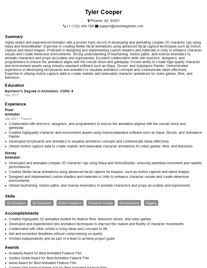
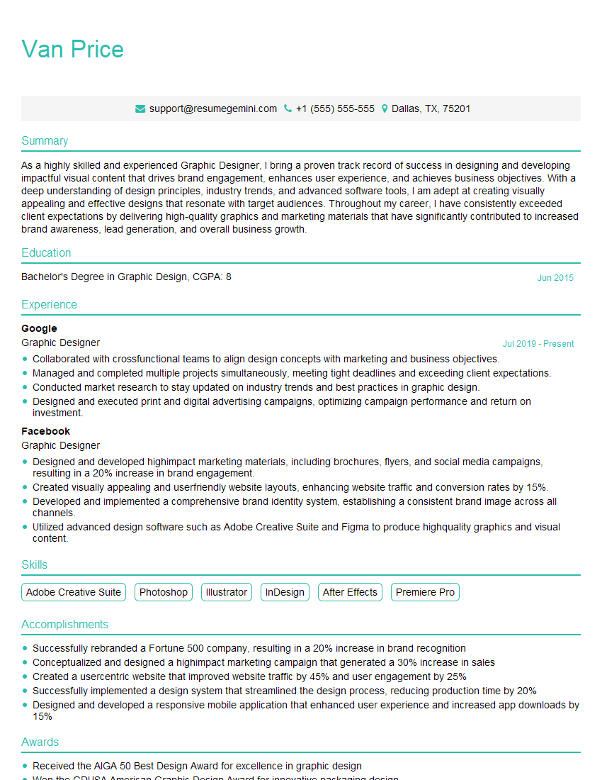
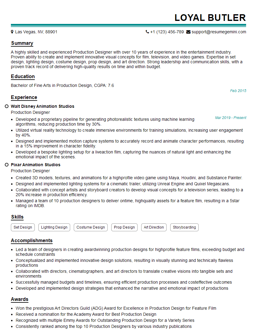
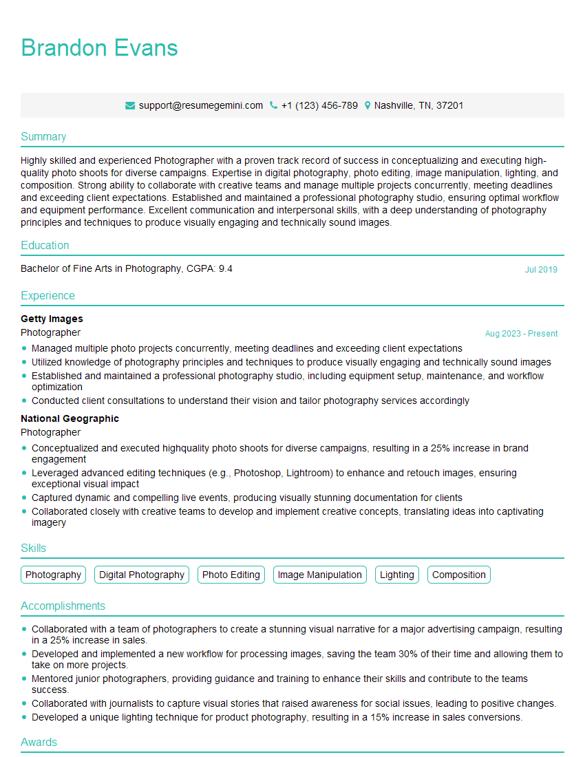
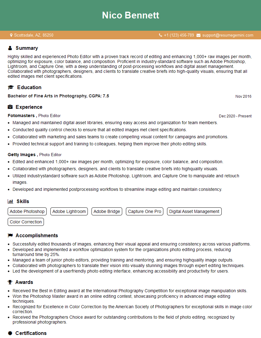
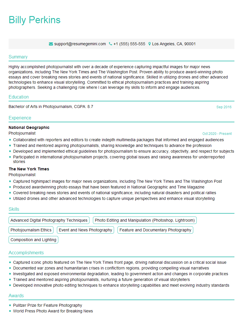
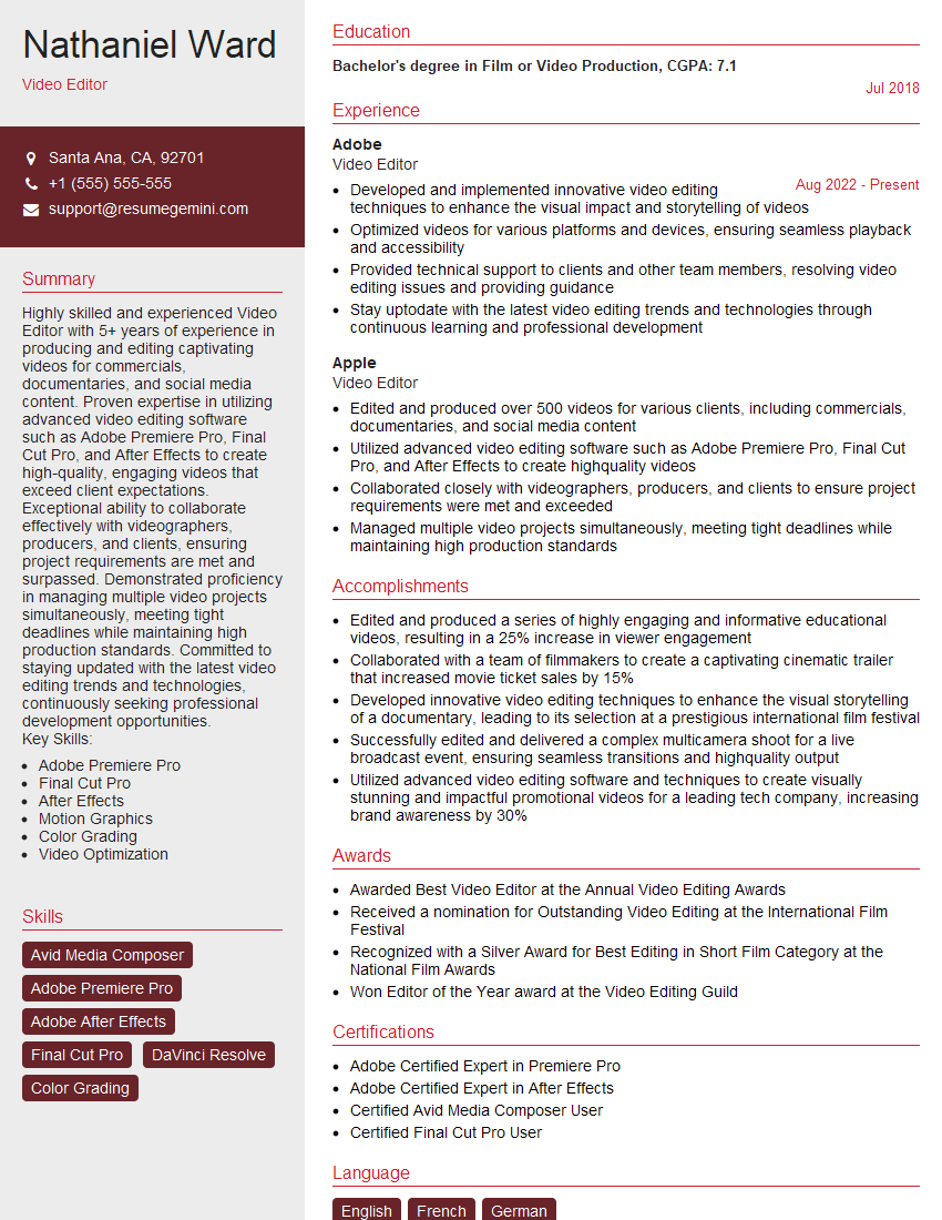
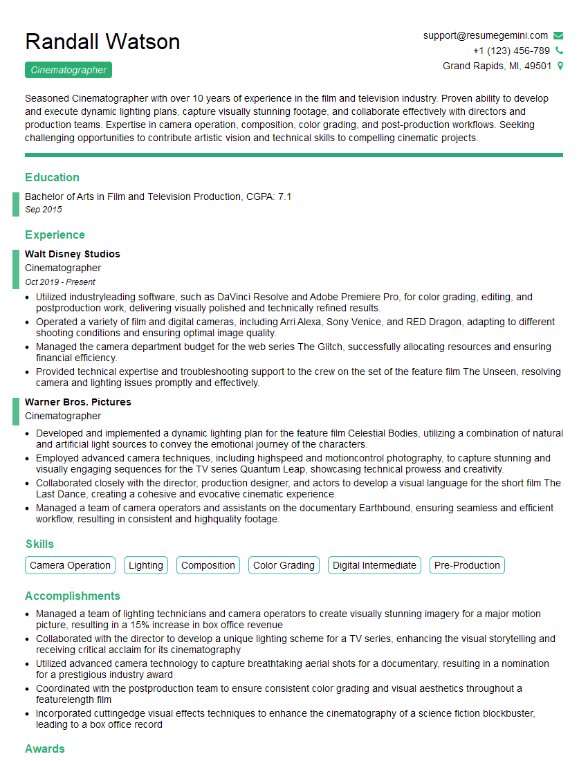
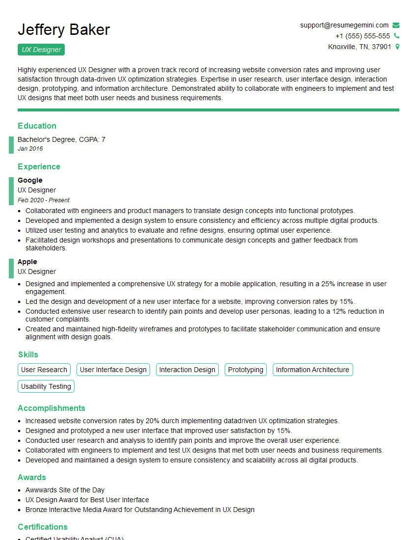
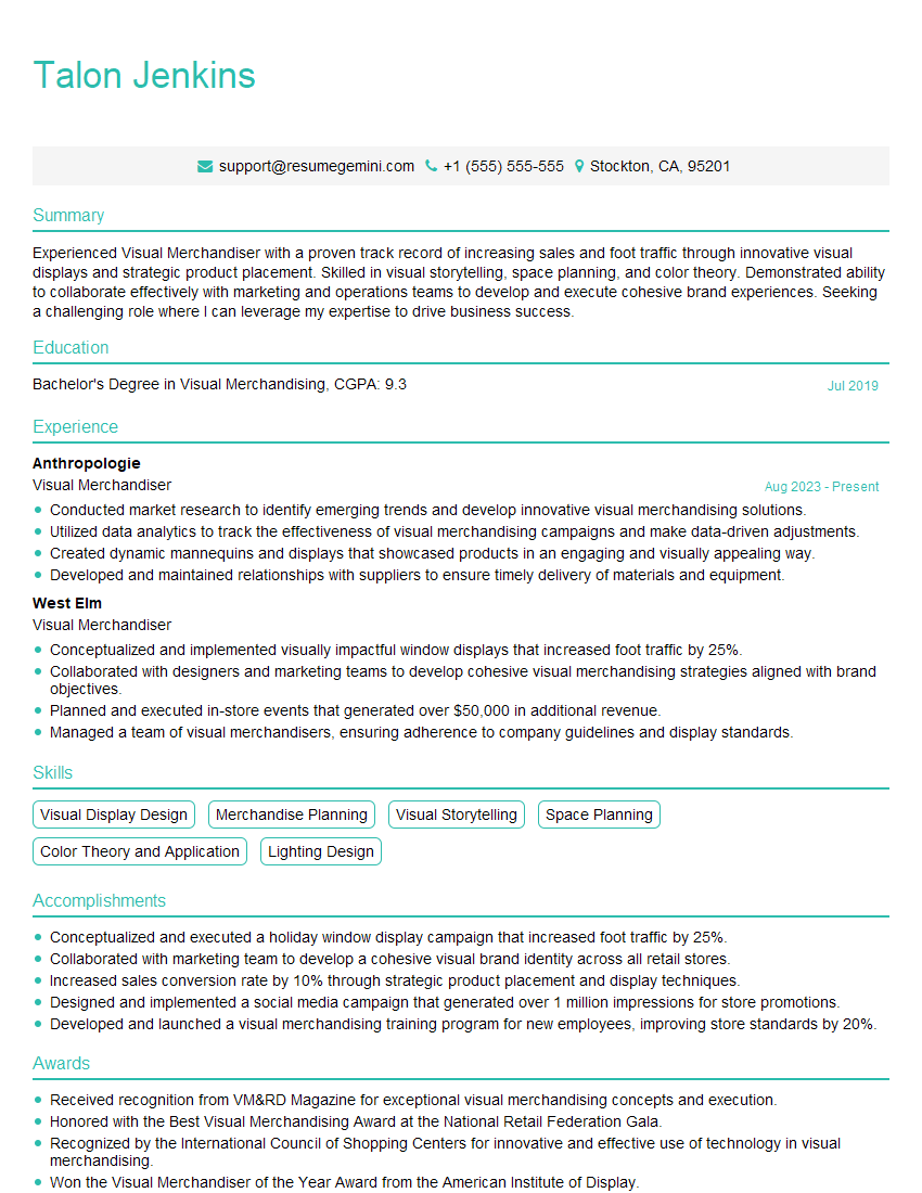
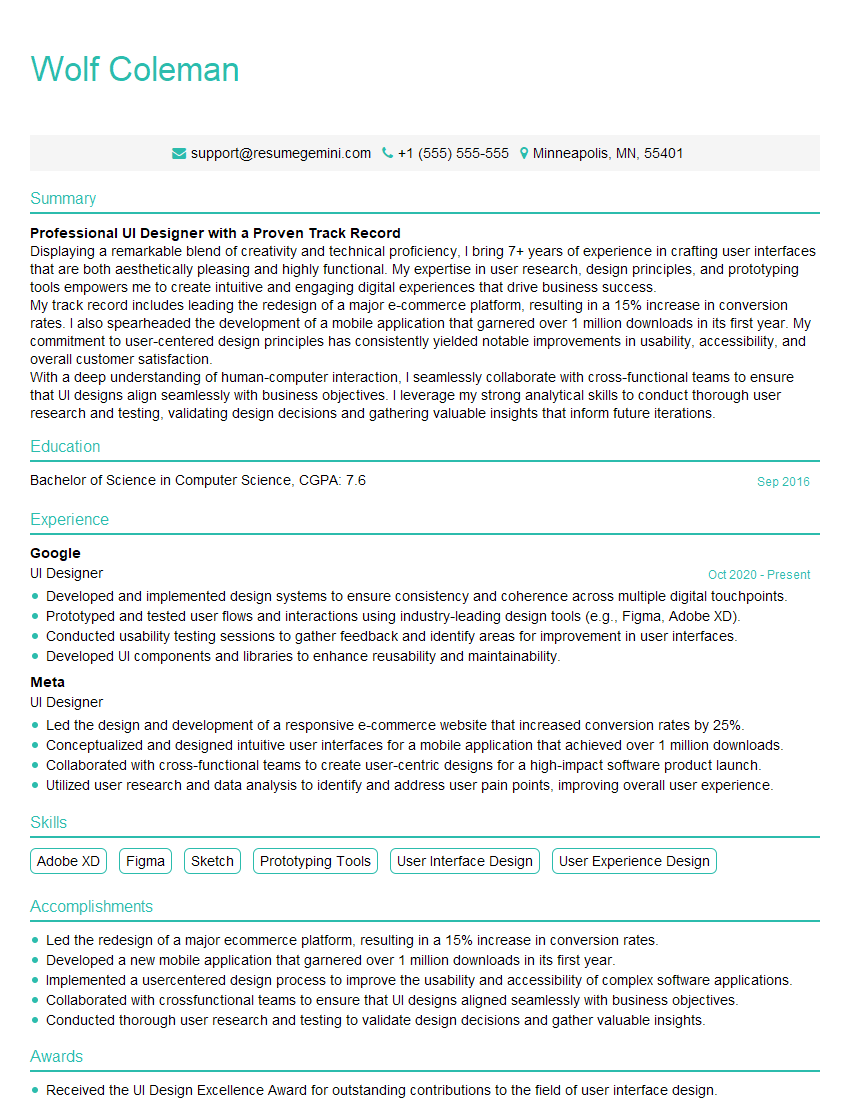
Mastering Photography and Visual Presentation is crucial for career advancement in today’s visually-driven world. A strong portfolio is essential, but a well-crafted resume is your first impression. An ATS-friendly resume significantly increases your chances of getting your application noticed. ResumeGemini is a trusted resource to help you build a professional and impactful resume that highlights your skills and experience effectively. Examples of resumes tailored to Photography and Visual Presentation are available to help you get started.
Explore more articles
Users Rating of Our Blogs
Share Your Experience
We value your feedback! Please rate our content and share your thoughts (optional).
What Readers Say About Our Blog
Hello,
We found issues with your domain’s email setup that may be sending your messages to spam or blocking them completely. InboxShield Mini shows you how to fix it in minutes — no tech skills required.
Scan your domain now for details: https://inboxshield-mini.com/
— Adam @ InboxShield Mini
Reply STOP to unsubscribe
Hi, are you owner of interviewgemini.com? What if I told you I could help you find extra time in your schedule, reconnect with leads you didn’t even realize you missed, and bring in more “I want to work with you” conversations, without increasing your ad spend or hiring a full-time employee?
All with a flexible, budget-friendly service that could easily pay for itself. Sounds good?
Would it be nice to jump on a quick 10-minute call so I can show you exactly how we make this work?
Best,
Hapei
Marketing Director
Hey, I know you’re the owner of interviewgemini.com. I’ll be quick.
Fundraising for your business is tough and time-consuming. We make it easier by guaranteeing two private investor meetings each month, for six months. No demos, no pitch events – just direct introductions to active investors matched to your startup.
If youR17;re raising, this could help you build real momentum. Want me to send more info?
Hi, I represent an SEO company that specialises in getting you AI citations and higher rankings on Google. I’d like to offer you a 100% free SEO audit for your website. Would you be interested?
Hi, I represent an SEO company that specialises in getting you AI citations and higher rankings on Google. I’d like to offer you a 100% free SEO audit for your website. Would you be interested?
good
