The thought of an interview can be nerve-wracking, but the right preparation can make all the difference. Explore this comprehensive guide to Knowledge of Photo Composition and Editing Techniques interview questions and gain the confidence you need to showcase your abilities and secure the role.
Questions Asked in Knowledge of Photo Composition and Editing Techniques Interview
Q 1. Explain the rule of thirds in photo composition.
The rule of thirds is a fundamental guideline in photography composition. Instead of placing your subject in the center of the frame, you imagine the image divided into nine equal parts by two equally-spaced horizontal lines and two equally-spaced vertical lines. The points where these lines intersect are considered the strongest compositional points. Placing your subject or key elements at these intersections creates a more visually appealing and balanced image, leading the viewer’s eye naturally through the scene.
Think of it like this: if you’re photographing a landscape, instead of centering the horizon, place it along one of the horizontal thirds. If you’re photographing a person, position them off-center, perhaps at one of the intersection points. This creates a more dynamic and engaging photograph than simply centering the subject.
For example, in a portrait, placing the eyes at the upper intersection point on the left or right creates a more compelling image than centering the face. Similarly, in a landscape, positioning the horizon along the lower third emphasizes the sky and creates a sense of spaciousness, while positioning it along the upper third emphasizes the foreground and land.
Q 2. Describe the difference between RAW and JPEG image formats.
RAW and JPEG are two common image formats, but they differ significantly in how they store image data. JPEG (Joint Photographic Experts Group) is a lossy format, meaning some image data is discarded during compression to reduce file size. This results in smaller files, but also some loss of image quality, especially noticeable in areas with fine details or sharp contrasts. JPEGs are ideal for sharing images online or printing at smaller sizes where the quality loss is less apparent.
RAW, on the other hand, is a lossless format. It stores the uncompressed or minimally compressed data captured by your camera’s sensor. This means you retain all the image information, providing maximum flexibility during post-processing. RAW files are much larger than JPEGs, but they offer significantly greater control over editing, allowing for more precise adjustments to exposure, white balance, and other aspects without sacrificing image quality. Think of it as having a digital negative – the full potential of the image is preserved.
In professional settings, RAW is almost always preferred because it allows for greater creative control and the ability to recover details that might be lost in a JPEG. However, RAW files require more storage space and powerful software for editing.
Q 3. What are some common techniques for correcting exposure in post-production?
Correcting exposure in post-production involves adjusting the brightness and contrast of your image to achieve a balanced and pleasing look. Several techniques can be used, depending on the software and the extent of the exposure problem.
- Adjusting Exposure and Brightness/Contrast sliders: Most image editing software provides basic sliders for adjusting the overall exposure, brightness, and contrast of the image. These are excellent starting points for minor adjustments.
- Using Curves: The curves tool offers more precise control over tonal adjustments. It allows you to selectively brighten or darken specific parts of the tonal range, creating more refined adjustments. This is particularly useful for correcting highlights and shadows.
- Shadows/Highlights tool: Many programs offer specialized tools to recover details in overexposed highlights or underexposed shadows. These tools help to bring back detail without significantly affecting other parts of the image.
- Levels: The levels tool is similar to curves but utilizes a histogram to visualize the distribution of tones in your image. This allows for targeted adjustments based on the actual distribution of light and dark tones.
The specific method will depend on the software and the image. For example, a slightly underexposed image might only need a brightness adjustment, whereas a severely overexposed image may require a combination of shadow recovery and curve adjustments to regain detail.
Q 4. How do you use leading lines to improve photo composition?
Leading lines are compositional elements that draw the viewer’s eye through the image towards the main subject. These lines can be actual lines, such as roads, fences, or rivers, or implied lines created by a series of objects or shapes. By strategically incorporating leading lines, you create a sense of depth and guide the viewer’s gaze towards the focal point of the image.
For example, a winding road leading towards a distant mountain range effectively uses leading lines to create a sense of journey and perspective. Similarly, a row of trees converging towards a central point can create a powerful leading line effect. The key is to position the lines so they naturally lead the eye toward the subject. Avoid lines that are distracting or lead the eye away from your focal point.
In practice, you can consciously look for leading lines in your environment. If you’re photographing a building, use the lines of the architecture to guide the viewer’s eye towards a detail or a particular aspect. If you’re shooting a street scene, use the road or the sidewalks as leading lines. The strength of the leading line effect depends on its placement and how it interacts with the rest of the composition.
Q 5. Explain your experience with Adobe Photoshop.
I have extensive experience with Adobe Photoshop, having used it professionally for over [Number] years. My skills encompass a wide range of tasks, from basic retouching and color correction to advanced compositing and image manipulation. I am proficient in using all of Photoshop’s core tools and features including layers, masks, adjustment layers, and various filters.
For example, I’ve used Photoshop to extensively retouch portrait photography for clients, removing blemishes, smoothing skin, and enhancing features while maintaining a natural look. I’ve also used Photoshop for advanced compositing tasks, seamlessly combining multiple images to create complex scenes or special effects for advertising campaigns. My expertise also extends to creating custom actions and automating repetitive tasks to streamline my workflow and increase efficiency.
I’m constantly updating my skills by experimenting with new techniques and features. I regularly attend workshops and online courses to stay up-to-date with the latest advancements in image editing technology and best practices. My proficiency in Photoshop extends beyond simple image editing; I understand the technical nuances of image processing and color management which ensures high-quality and consistent results.
Q 6. What is color grading and how do you achieve different moods using it?
Color grading is the process of adjusting the colors in an image or video to achieve a specific look or mood. It’s different from color correction, which aims to accurately represent the colors as they were in reality. Color grading is a stylistic choice used to create a particular emotional response or enhance the narrative.
Different moods can be achieved through various color grading techniques. For example, cool colors like blues and greens tend to evoke feelings of calmness, serenity, or sadness. Warm colors like oranges, yellows, and reds tend to evoke feelings of warmth, happiness, or excitement. Desaturated colors create a moody or nostalgic atmosphere, while vibrant, saturated colors can create energy and excitement.
To achieve these moods, I utilize tools such as color balance, curves, and selective color adjustments. For example, to create a cinematic, moody look, I might decrease the overall saturation slightly and increase the blues and greens in the shadows. Conversely, to create a bright, sunny feel, I might increase the overall saturation and boost the yellows and oranges in the highlights. The specific techniques used will depend on the desired effect and the image itself. It’s often an iterative process, experimenting with different adjustments until the desired mood is achieved.
Q 7. Describe your process for retouching portraits.
My portrait retouching process is meticulous and focuses on enhancing the subject’s natural beauty without making them look artificial. It starts with a careful assessment of the image to identify areas needing attention. This includes assessing skin tone, lighting, and overall composition. I typically begin by using frequency separation to retouch skin, allowing me to work on texture (e.g., pores, wrinkles) separately from color (e.g., blemishes, redness).
Then I address blemishes and imperfections using tools such as the healing brush, clone stamp, and patch tool. These are carefully applied to maintain natural skin texture and avoid an artificial look. Next, I focus on subtle enhancements. This might include slight adjustments to skin tone using color balance or curves, carefully adjusting the brightness and contrast to enhance features and improve lighting. I may use dodging and burning tools to add subtle highlights and shadows to sculpt the face.
Finally, I review the image, paying close attention to the details and ensuring that the retouching is subtle and natural. It’s crucial to maintain a balance between enhancing the image and preserving the subject’s individual characteristics. The end goal is to create a polished and aesthetically pleasing portrait that looks realistic and natural.
Q 8. How do you handle color correction for different lighting conditions?
Color correction under varying lighting conditions is crucial for achieving a natural and consistent look across a series of photographs. The key is understanding how different light sources affect color temperature and white balance. For instance, sunlight produces a warmer tone, while shade tends to be cooler. Overcast days often result in a flatter, less vibrant image.
My approach involves using tools like Adobe Camera Raw or Lightroom to adjust the white balance. I might use the ‘eyedropper’ tool to sample a neutral area in the image (like a white wall or a grey card) to set a proper baseline. Alternatively, I can adjust the temperature and tint sliders to fine-tune the color cast manually. For more complex scenarios, I might leverage split toning to add warmth to shadows or coolness to highlights, aiming for a balanced and visually appealing image. Each lighting condition presents a unique challenge, and understanding the color temperature spectrum is fundamental to effective correction. For example, a sunset might require lowering the temperature to counteract the warm oranges and reds, preventing an overly saturated final image.
Q 9. What are your preferred methods for removing blemishes and imperfections?
Removing blemishes and imperfections is a common task, and my preferred method depends on the severity and nature of the imperfection. For minor blemishes, I often use the spot healing brush tool in Photoshop. This intelligently samples surrounding pixels to seamlessly blend the imperfection away, preserving texture and detail. For more significant issues like wrinkles or scars, I might use the clone stamp tool with a soft brush, carefully sampling from similar skin tones to create a natural-looking repair. The key here is subtlety; it’s better to under-correct than over-correct, avoiding an unnatural or mask-like appearance.
I avoid harsh, overly-processed results by using a low opacity and working in multiple passes, layering the corrections until a desired result is achieved. Always, the aim is to enhance the image, not to create a flawless, artificial appearance. A slightly imperfect image often feels more real and engaging than an overly smoothed one.
Q 10. Explain your experience with Adobe Lightroom.
Adobe Lightroom is my primary tool for photo editing and organization. I leverage its non-destructive editing capabilities extensively. My workflow typically begins with importing images, applying basic adjustments like white balance and exposure, and using the powerful local adjustment tools like radial filters and graduated filters to refine specific areas of the photograph. For example, I might use a radial filter to brighten a subject’s face, or a graduated filter to darken a bright sky.
Furthermore, I utilize Lightroom’s cataloging system to organize my vast library of images, applying keywords and star ratings to make image retrieval and selection a breeze. Beyond basic adjustments, I frequently use Lightroom’s split toning, sharpening, and noise reduction tools to achieve the desired look and feel. It is also incredibly effective for batch processing, making my workflow much more efficient.
Q 11. How do you create a consistent brand aesthetic through image editing?
Maintaining a consistent brand aesthetic across images is crucial for brand recognition and cohesiveness. This involves establishing a set of editing guidelines, such as specific color palettes, contrast levels, and sharpening techniques. I typically create presets in Lightroom or actions in Photoshop to easily apply these consistent edits to multiple images. These presets or actions should reflect the brand’s identity, conveying its personality and values through visual consistency. For instance, a brand focused on minimalism might use a muted color palette and clean edits, whereas a lifestyle brand could favor warmer tones and a more vibrant aesthetic.
Consistent image composition is also key. This includes adhering to a specific aspect ratio, framing style, and potentially, even incorporating recurring elements within the images themselves. Regular review and refinement of this style guide ensures that all brand images maintain consistency and represent the brand’s visual identity.
Q 12. What is the importance of sharpening images in post-production?
Sharpening in post-production is critical for enhancing image detail and clarity. During the shooting process, some detail is often lost due to sensor limitations and lens imperfections. Sharpening compensates for this, making edges appear crisper and more defined. However, over-sharpening can result in artifacts and a grainy, unnatural look. My approach uses a combination of techniques.
I usually start with a subtle amount of sharpening applied globally using Lightroom or Photoshop’s sharpening tools. Then, I often use local sharpening techniques, selectively applying sharpening to specific areas of the image that need more definition, like eyes or hair. This controlled approach prevents the unwanted halo effect often associated with over sharpening. The type of sharpening used might differ based on the image. For example, a landscape might benefit from more subtle sharpening, while a portrait might require more pronounced sharpening of the subject.
Q 13. Describe your workflow for editing a batch of photos.
Editing a batch of photos efficiently requires a structured workflow. My process begins with initial culling in Lightroom, selecting only the best images. Then, I apply basic adjustments such as white balance and exposure to all selected images simultaneously. Lightroom’s batch processing capabilities make this exceptionally efficient. Next, I perform more detailed edits selectively, focusing on images requiring more attention. During this stage, I often use presets or actions I’ve created to ensure consistency.
Once edits are completed, I export images in the required format and resolution, again using batch processing for automation. This organized approach ensures consistency and maintains high efficiency. Consistency is paramount; by establishing a workflow early on, I can maintain consistency even with large numbers of photographs, maintaining brand aesthetics and avoiding rework.
Q 14. How do you use layers effectively in Photoshop?
Layers in Photoshop are fundamental for non-destructive editing and complex image manipulations. They allow me to work on different aspects of an image independently, without affecting other elements. For example, I might create a layer for color correction, another for retouching, and another for adding text or other graphic elements. This layered approach makes it easy to adjust individual elements without having to redo the entire image.
I use layer masks extensively to selectively apply edits to specific areas. This allows for precise control over the effect of each layer. For instance, I might use a layer mask to apply a vignette only to the corners of an image, or to selectively dodge and burn specific areas. The blending modes also offer incredible control, allowing for creative effects by blending layers in a variety of ways, thereby enhancing the visual appeal of the image.
Q 15. What are some common masking techniques?
Masking is a fundamental technique in photo editing that allows you to isolate specific areas of an image and apply edits selectively. Think of it like using a stencil – you protect certain parts while modifying others. There are several common masking techniques:
- Layer Masks: These are non-destructive edits, meaning you can always go back and change them. You paint black to hide areas and white to reveal them. This is ideal for subtle adjustments or complex selections.
- Selection Masks: These are created using selection tools like the lasso, magic wand, or quick selection. They define an area to be edited and are generally used for more straightforward edits like color correction or object removal.
- Clipping Masks: This allows you to apply the effects of a layer only to the layer directly below it. Imagine you have a texture layer above a photo; clipping it will only apply the texture to the visible parts of the photo below.
- Vector Masks: These use precise vector shapes for masking, making them perfect for sharp edges and repeating patterns. They are scalable without losing quality.
- Luminosity Masks: These are advanced masks that select pixels based on their brightness values. This is exceptionally useful for targeted adjustments to highlights, midtones, or shadows.
For example, I recently used a layer mask to selectively desaturate the background of a portrait to draw more focus to the subject. I painted carefully around the person, leaving their colors vibrant.
Career Expert Tips:
- Ace those interviews! Prepare effectively by reviewing the Top 50 Most Common Interview Questions on ResumeGemini.
- Navigate your job search with confidence! Explore a wide range of Career Tips on ResumeGemini. Learn about common challenges and recommendations to overcome them.
- Craft the perfect resume! Master the Art of Resume Writing with ResumeGemini’s guide. Showcase your unique qualifications and achievements effectively.
- Don’t miss out on holiday savings! Build your dream resume with ResumeGemini’s ATS optimized templates.
Q 16. Explain your understanding of color theory.
Color theory is the foundation of aesthetically pleasing images. It’s about understanding how colors interact, their relationships, and the effect they have on the viewer’s perception. Key aspects include:
- Color Wheel: This is a visual representation of the relationships between colors. Primary colors (red, yellow, blue) form the base, secondary colors (orange, green, violet) are mixes of primaries, and tertiary colors are created by mixing primary and secondary colors.
- Color Harmonies: These are combinations of colors that work well together. Examples include complementary (opposite colors on the wheel), analogous (colors next to each other), triadic (three colors evenly spaced on the wheel), and split-complementary (a color and two adjacent to its complement).
- Hue, Saturation, and Value (HSV): Hue is the pure color, saturation is the intensity or purity of the color, and value is the lightness or darkness. Understanding these allows for precise color adjustments.
- Temperature: Colors can be warm (reds, oranges, yellows) or cool (blues, greens, purples). This impacts mood and atmosphere.
In my work, I often use complementary colors to create visual contrast and vibrancy. For instance, a landscape photograph might benefit from the juxtaposition of warm sunset hues against cool shadows.
Q 17. How do you achieve depth of field in post-production?
Depth of field, the area of an image that’s in sharp focus, is primarily controlled during shooting by aperture and distance to the subject. However, you can simulate or enhance it in post-production using several techniques:
- Focus Stacking: This involves taking multiple shots of the same scene with varying focus points and then combining them in software. This creates a composite with an extended depth of field.
- Using Blur Filters: Software offers filters like Gaussian blur, radial blur, or tilt-shift to selectively blur areas of the image, mimicking a shallow depth of field. You would blur the background to emphasize the subject.
- Selective Sharpening: Sharpening only the in-focus areas while leaving the background relatively soft can emphasize depth.
For example, I once had a photograph of flowers where the focus wasn’t perfect across all layers of petals. I used focus stacking to create a hyper-realistic image with every petal precisely in focus.
Q 18. Describe your experience with other photo editing software (e.g., Capture One, GIMP).
Beyond Adobe Photoshop, I have extensive experience with Capture One and a working familiarity with GIMP. Capture One is a powerful tethered shooting and RAW processing software known for its advanced color adjustments and control. I’ve used it extensively for professional photography projects, particularly for its superior raw processing capabilities. GIMP, while more limited in some aspects, offers a free and open-source alternative with many powerful tools. I find it valuable for quick edits and tasks that don’t require the advanced features of Photoshop or Capture One. I choose the software based on the needs of each specific project and my client’s requirements.
Q 19. How do you optimize images for web use?
Optimizing images for web use is crucial for fast loading times and a positive user experience. The key is to balance image quality with file size. Here’s my process:
- Reduce File Size: Use lossy compression (like JPEG) for photos to dramatically reduce file size without significant quality loss. For images with sharp lines or text, use lossless compression (like PNG).
- Resize Images: Scale images to appropriate dimensions for your website. Avoid uploading excessively large images that will be downscaled by the browser.
- Optimize for Web Formats: Use formats like WebP, which often provides superior compression compared to JPEG or PNG.
- Use Image Optimization Tools: Many online tools and plugins can further compress images without noticeable quality loss.
For example, I might take a high-resolution image (3000px wide) and resize it to 1200px wide for a website banner, then compress it using WebP to significantly reduce its file size while maintaining excellent visual quality.
Q 20. How do you handle client feedback on image editing?
Handling client feedback is an essential aspect of professional image editing. I approach it collaboratively and transparently:
- Active Listening: I listen carefully to understand the client’s concerns and preferences.
- Explain Technical Limitations: If a request is technically impossible or would drastically compromise image quality, I explain this clearly and suggest alternatives.
- Show Revisions: I provide multiple revisions to demonstrate my understanding of the feedback and allow the client to see the effect of different edits.
- Iterative Process: We work together iteratively, refining the image until the client is completely satisfied.
- Maintain Professionalism: Regardless of the client’s feedback, I maintain a respectful and professional demeanor.
Once, a client wanted a significant color change that I knew would look unnatural. I carefully showed them various revisions, explained the impact of their request on the image’s overall aesthetic, and we arrived at a solution that satisfied their requirements without compromising quality.
Q 21. Explain your process for creating photo collages.
Creating photo collages involves careful planning and execution to ensure a cohesive and visually appealing result:
- Concept & Theme: I begin by defining the collage’s purpose and overall theme. What story or message should it convey?
- Image Selection: I carefully choose images that complement each other in terms of color, style, and subject matter. It’s crucial to have a consistent quality across all images.
- Layout & Composition: I consider the arrangement of images to create visual balance and harmony. I might use grids, asymmetrical layouts, or other design principles.
- Software & Tools: I utilize Photoshop or similar software. I might use layer masks to blend images smoothly, or adjust levels and curves to create a unified look.
- Final Touches: I add final touches like borders, text, or other design elements to enhance the collage’s aesthetic appeal.
Recently, I created a travel collage for a client, incorporating images from their various trips. I used a circular layout to create a sense of unity, and adjusted the colors to maintain a consistent tone.
Q 22. What are some common challenges you face in photo editing, and how do you overcome them?
One of the biggest challenges in photo editing is dealing with imperfections. This could range from blemishes on a portrait subject to distracting elements in a landscape. Another common challenge is achieving a consistent look and feel across a series of images, especially when shooting in varying lighting conditions. Finally, time constraints are a significant factor; efficient workflow is crucial for meeting deadlines.
To overcome these, I employ a multi-pronged approach. For imperfections, I use tools like the healing brush and clone stamp in Photoshop meticulously, ensuring a seamless blend with the surrounding area. For consistency, I utilize techniques like color grading and adjusting white balance to unify the images. I often create custom presets to speed up this process. To manage time, I prioritize tasks, utilize keyboard shortcuts extensively, and leverage batch processing where possible. For example, I might batch-resize images before individual editing, saving substantial time. I also leverage non-destructive editing techniques, preserving the original image’s integrity.
Q 23. How do you maintain image quality while reducing file size?
Maintaining image quality while reducing file size is a balancing act. The key is to optimize without sacrificing too much detail. This involves a combination of techniques.
- Compression: Using lossy compression (like JPEG) allows for significant file size reduction, but introduces some data loss. The degree of compression needs careful adjustment; higher compression reduces file size more but increases artifacting. Lossless compression (like PNG) keeps all the image data, resulting in larger file sizes.
- Resizing: Reducing the dimensions of the image drastically lowers file size. However, excessive downsampling can lead to a noticeable loss of sharpness. It’s important to resize proportionally to maintain aspect ratio.
- File Format: Choosing the appropriate file format is crucial. JPEGs are best for photographs, while PNGs are better for images with sharp lines and text. WebP offers good compression for web use.
- Saving for Web: When preparing images for online use, utilize the ‘Save for Web’ (or similar) function in your editing software. This allows for fine-tuned control over compression settings, file size, and quality.
For example, when preparing a high-resolution image for web use, I might resize it to a suitable dimension (considering screen resolutions), select JPEG format with a moderate compression level, and preview the result to ensure an acceptable balance between quality and file size.
Q 24. Describe your experience with high-resolution image editing.
My experience with high-resolution image editing is extensive. I’ve worked with images exceeding 100 megapixels, requiring specific considerations. The primary challenge is managing the immense file sizes, demanding powerful hardware and efficient workflows. I regularly use software like Photoshop with ample RAM to handle such large files. Tools like layers and masks become crucial, allowing for non-destructive editing and preventing the need for excessive re-rendering.
I also employ techniques like zooming and panning within the editor instead of resizing the image. Smart sharpening is vital, as applying traditional sharpening to such large images could easily introduce unwanted noise or artifacts. The whole process necessitates meticulous planning to avoid crashes and data loss. One project involved retouching a large panoramic image for a museum, where maintaining the high level of detail was paramount. This required careful processing to correct minor flaws, and efficient workflow was essential.
Q 25. How do you use different blending modes in Photoshop?
Blending modes in Photoshop are powerful tools that dictate how layers interact. Instead of simply overlaying, they alter how pixels from one layer combine with those below. Each mode has unique properties; some add, subtract, or multiply pixel values while others create special effects.
Normal: The default, simply placing one layer on top of another.Multiply: Darkens the underlying layer.Screen: Brightens the underlying layer.Overlay: Combines the effects of Multiply and Screen, creating a more dramatic effect.Soft Light: Subtly affects the contrast and tones of the underlying layer.Hard Light: A more intense version of Soft Light.
I use blending modes creatively for tasks such as adding light effects, creating realistic shadows, and compositing images. For instance, I might use Screen mode to blend a light source layer over a dark image, creating a realistic lighting effect. Or, I might use Multiply to blend a shadow layer to add depth.
Q 26. How do you ensure color consistency across multiple images?
Ensuring color consistency across multiple images is essential for creating a cohesive set. Inconsistent colors can distract the viewer and make the images look unprofessional. This is particularly important for projects like photo essays or website galleries.
My approach is multi-faceted. Firstly, I aim for consistent shooting conditions whenever possible—using the same camera settings, white balance, and time of day. Secondly, I leverage tools in my editing software to achieve uniformity. This includes using camera raw adjustments (white balance, exposure, contrast) to establish a baseline. After this, I employ tools like curves and color balance to refine the colors and match them more precisely. In some cases, I create custom color profiles for the specific images I’m working with, or utilize third-party plugins to aid color matching and consistency across batches.
For advanced color matching, I sometimes refer to a specific reference image that sets the overall tone and color palette.
Q 27. What are some ethical considerations in photo editing?
Ethical considerations in photo editing are paramount. Manipulation should always be transparent and should not mislead the viewer. It’s crucial to distinguish between enhancing an image and altering its meaning or context.
- Honesty and Transparency: If significant alterations are made, it should be clearly disclosed. Avoid presenting manipulated images as purely factual.
- Respect for the Subject: Avoid manipulating images in a way that might misrepresent or damage the reputation of a person or organization.
- Copyright and Usage Rights: Always ensure that you have the necessary rights to use and manipulate images.
- Avoiding Misinformation: Ensure that image alterations do not spread misinformation or contribute to harmful narratives.
For example, removing blemishes from a portrait is generally acceptable, but digitally adding or removing elements in a news photograph to change its narrative is unethical and potentially illegal. Maintaining ethical standards safeguards credibility and builds trust.
Q 28. Describe your experience with using actions and presets in photo editing software.
Actions and presets are invaluable time-saving tools in photo editing. Actions are essentially recorded sequences of steps that automate repetitive tasks. Presets provide pre-defined settings for adjustments like color grading, sharpening, or noise reduction.
I extensively utilize both. I’ve created custom actions for tasks like batch resizing, watermarking, and applying consistent color grading across a series of images. This helps me maintain efficiency and consistency. I also use pre-made and custom presets for color grading, frequently adjusting and tweaking them to suit individual images while building on a consistent foundation. Presets and actions can be shared and adapted, leading to collaborative workflows. A recent project involved a large-scale product photography shoot; using custom actions drastically reduced the post-processing time, enabling efficient delivery of the final images.
Key Topics to Learn for Knowledge of Photo Composition and Editing Techniques Interview
- Rule of Thirds & Compositional Balance: Understanding and applying the rule of thirds, leading lines, and other compositional techniques to create visually appealing and impactful images. Practical application includes analyzing existing photographs for effective composition and explaining your choices.
- Light & Exposure: Mastering concepts like aperture, shutter speed, ISO, and their interplay in achieving desired exposure and depth of field. Practical application includes discussing how different lighting conditions affect photographic choices and how to adjust settings accordingly.
- Color Theory & Color Correction: Understanding color harmonies, color temperature, and white balance. Practical application includes explaining the process of color correction and grading in post-production, addressing issues like color casts and achieving a consistent look.
- Image Editing Software Proficiency: Demonstrating expertise in at least one major image editing software (e.g., Adobe Photoshop, Lightroom, GIMP). Practical application includes discussing workflow, retouching techniques, and non-destructive editing practices.
- Image Sharpening & Noise Reduction: Understanding techniques for optimizing image sharpness while minimizing noise and artifacts. Practical application includes explaining the different sharpening methods and their appropriate use.
- File Formats & Resolution: Understanding the implications of different file formats (JPEG, TIFF, RAW) and appropriate resolution for various applications (print vs. web). Practical application includes explaining the trade-offs between file size, quality, and editing flexibility.
- Problem-Solving & Troubleshooting: Demonstrating the ability to diagnose and rectify common photographic and editing challenges (e.g., correcting lens distortion, removing blemishes). Practical application includes describing your approach to problem-solving in a real-world scenario.
Next Steps
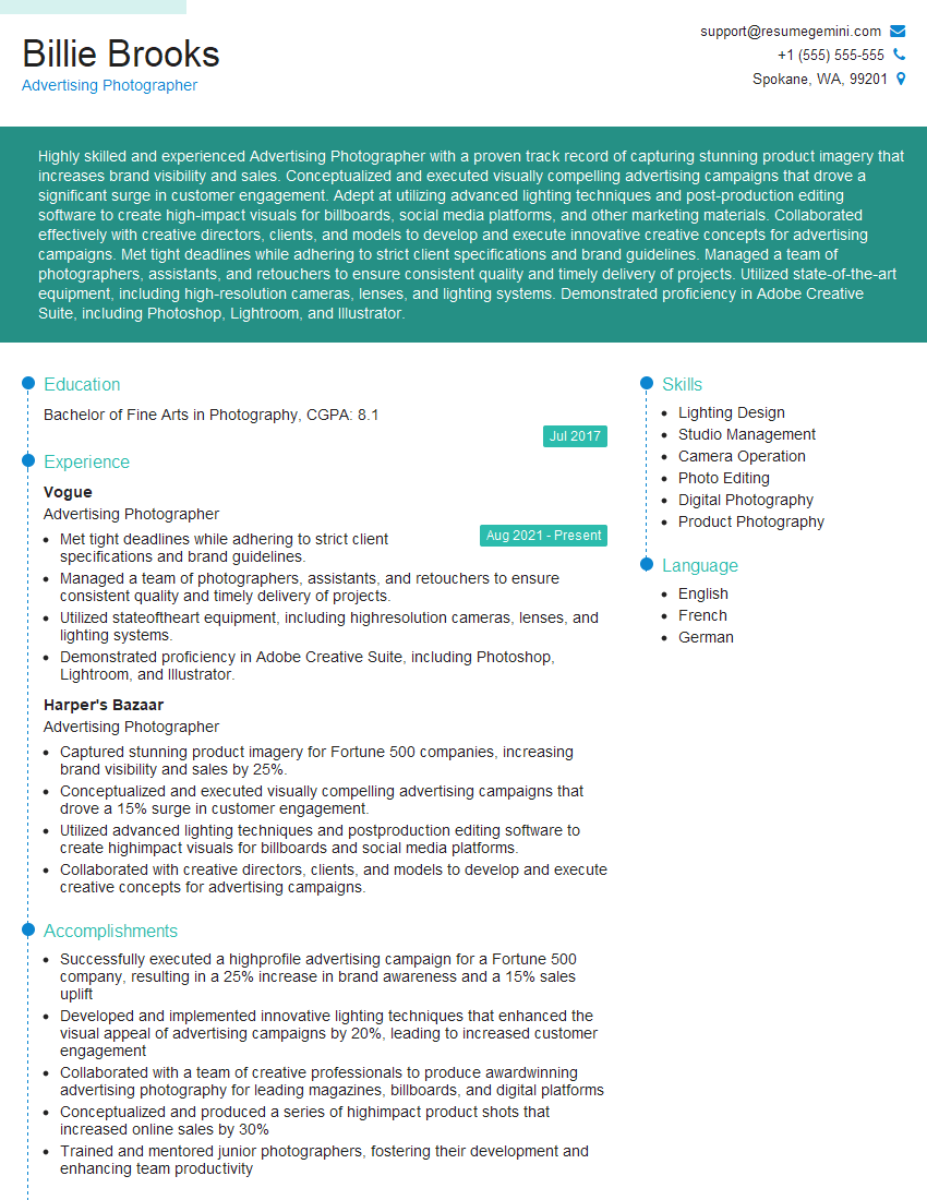
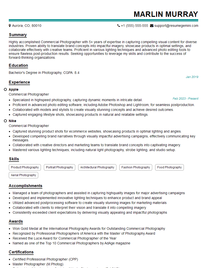
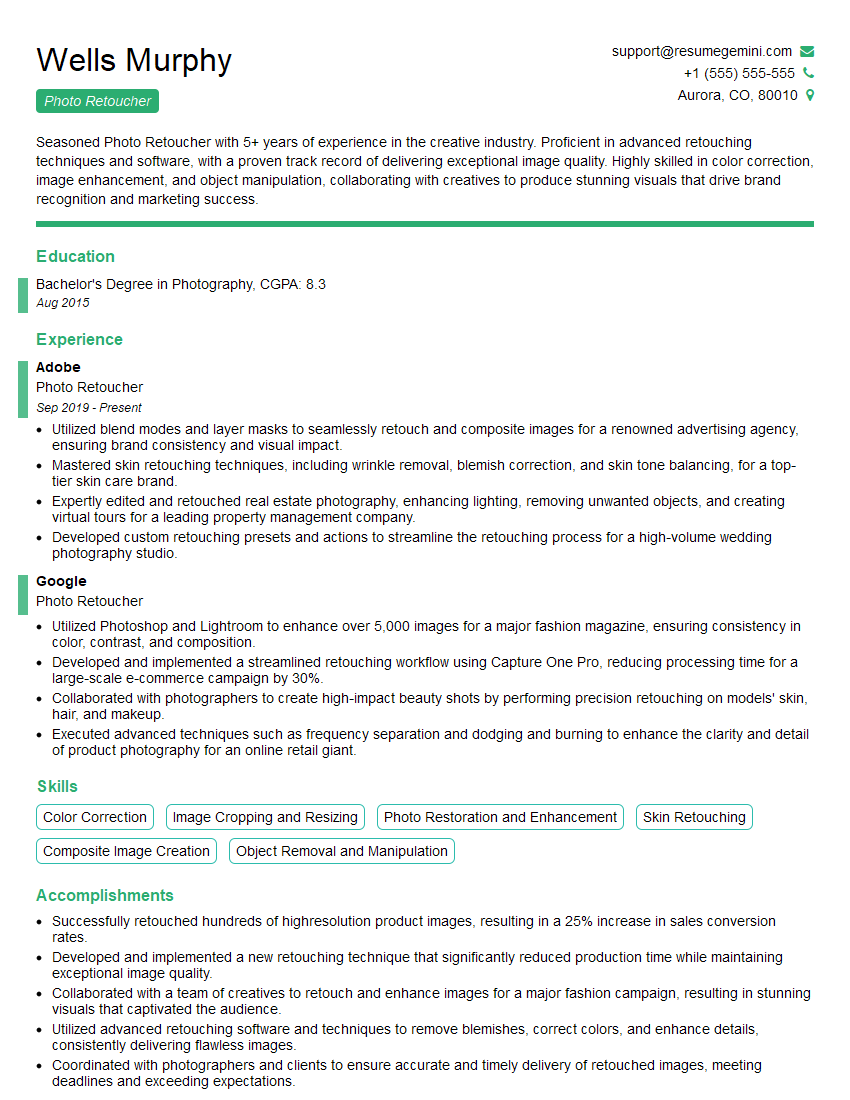
Mastering photo composition and editing techniques is crucial for career advancement in photography, graphic design, marketing, and many other visual-centric fields. A strong understanding of these principles allows you to create compelling visuals, communicate effectively, and stand out from the competition. To maximize your job prospects, create a resume that highlights your skills effectively. An ATS-friendly resume is essential for getting your application noticed. ResumeGemini can help you build a professional and impactful resume tailored to your experience. Examples of resumes specifically designed for candidates with expertise in Knowledge of Photo Composition and Editing Techniques are available to guide you.
Explore more articles
Users Rating of Our Blogs
Share Your Experience
We value your feedback! Please rate our content and share your thoughts (optional).
What Readers Say About Our Blog
Hello,
We found issues with your domain’s email setup that may be sending your messages to spam or blocking them completely. InboxShield Mini shows you how to fix it in minutes — no tech skills required.
Scan your domain now for details: https://inboxshield-mini.com/
— Adam @ InboxShield Mini
Reply STOP to unsubscribe
Hi, are you owner of interviewgemini.com? What if I told you I could help you find extra time in your schedule, reconnect with leads you didn’t even realize you missed, and bring in more “I want to work with you” conversations, without increasing your ad spend or hiring a full-time employee?
All with a flexible, budget-friendly service that could easily pay for itself. Sounds good?
Would it be nice to jump on a quick 10-minute call so I can show you exactly how we make this work?
Best,
Hapei
Marketing Director
Hey, I know you’re the owner of interviewgemini.com. I’ll be quick.
Fundraising for your business is tough and time-consuming. We make it easier by guaranteeing two private investor meetings each month, for six months. No demos, no pitch events – just direct introductions to active investors matched to your startup.
If youR17;re raising, this could help you build real momentum. Want me to send more info?
Hi, I represent an SEO company that specialises in getting you AI citations and higher rankings on Google. I’d like to offer you a 100% free SEO audit for your website. Would you be interested?
Hi, I represent an SEO company that specialises in getting you AI citations and higher rankings on Google. I’d like to offer you a 100% free SEO audit for your website. Would you be interested?
good
