Interviews are more than just a Q&A session—they’re a chance to prove your worth. This blog dives into essential Design and Layout Principles interview questions and expert tips to help you align your answers with what hiring managers are looking for. Start preparing to shine!
Questions Asked in Design and Layout Principles Interview
Q 1. Explain the difference between UI and UX design.
UI (User Interface) and UX (User Experience) design are often confused, but they represent distinct yet interconnected aspects of design. UI design focuses on the look and feel of a product – its visual elements like buttons, typography, and color schemes. Think of it as the surface of the product. UX design, on the other hand, is concerned with the overall user experience, encompassing usability, accessibility, and the entire interaction a user has with the product. It considers the user’s journey, from initial interaction to achieving their goal. A good analogy is a car: UI is the dashboard’s design, while UX encompasses the entire driving experience, including comfort, safety, and ease of navigation.
In short, UI is about aesthetics and functionality of the interface, while UX is about the overall effectiveness and satisfaction of the user’s experience.
Q 2. Describe your process for designing a responsive website layout.
My process for designing a responsive website layout is iterative and user-centered. It begins with understanding the target audience and their needs through user research, which might include surveys, interviews, and competitor analysis. Next, I create wireframes – low-fidelity sketches outlining the structure and layout of the website’s content. These are then transformed into mockups, higher-fidelity visual representations, that show the design’s look and feel. Throughout this process, I consider different screen sizes and devices, ensuring optimal user experience across all platforms. I typically use a mobile-first approach, starting with designing for smaller screens and scaling up for larger ones.
A crucial aspect is using a responsive grid system, like Bootstrap or a custom solution based on CSS Flexbox or Grid. This allows elements to rearrange and reflow seamlessly based on screen size. I’ll conduct thorough testing across various devices and browsers to ensure functionality and visual consistency. Finally, I collaborate closely with developers throughout the entire design process, ensuring a smooth transition from design to development.
Q 3. What are the key principles of Gestalt theory, and how do you apply them in your designs?
Gestalt theory is a set of principles describing how humans visually perceive and organize information. Applying these principles enhances the visual hierarchy and usability of a design. Key principles include:
- Proximity: Elements placed close together are perceived as a group. Think of a gallery wall with closely grouped paintings – we perceive them as related.
- Similarity: Similar elements are perceived as a group. Using the same font style for headings creates a visual connection.
- Closure: We mentally complete incomplete shapes or figures. Think of a logo using negative space to create a recognizable image.
- Continuity: We perceive elements aligned in a line or curve as related. Think of a menu navigation with consistently aligned items.
- Figure/Ground: We distinguish between a figure (the focus) and its background (the context). This plays a vital role in establishing visual hierarchy.
I apply Gestalt principles by strategically grouping related information, using consistent visual styles, and creating clear visual hierarchies to guide users through the design. For example, I might use proximity to group related form fields on a contact page, ensuring the user understands their relationship.
Q 4. How do you ensure accessibility in your design work?
Accessibility is paramount. I incorporate accessibility considerations from the outset, adhering to WCAG (Web Content Accessibility Guidelines) standards. This involves:
- Sufficient color contrast: Using tools to ensure adequate contrast between text and background colors for users with visual impairments.
- Alternative text for images: Providing descriptive text for images, enabling screen readers to convey the image’s meaning to visually impaired users.
- Keyboard navigation: Designing interfaces navigable entirely using a keyboard, essential for users with motor impairments.
- Semantic HTML: Using appropriate HTML elements (e.g.,
<header>,<nav>,<main>) to provide clear structural information for assistive technologies. - Captioning and transcripts for videos and audio: Providing clear captions and transcripts enhances accessibility for users with hearing impairments.
Regularly testing with assistive technologies and seeking feedback from users with disabilities is critical in ensuring a truly accessible design.
Q 5. What are some common layout grids, and when would you use each one?
Several common layout grids exist, each suited for different purposes:
- 12-column grid: A highly popular and flexible grid system (often used with frameworks like Bootstrap) allowing for diverse layouts and responsive design. It provides a structured way to organize content across different screen sizes.
- 9-column grid: A simpler grid system offering good flexibility while potentially being less complex to manage than a 12-column system. Suitable for smaller websites or simpler layouts.
- Golden Ratio grid: Based on the golden ratio (approximately 1:1.618), this grid creates visually appealing proportions and harmonious layouts, but might require more manual calculation.
- Modular grid: A highly customizable grid, allowing designers to create layouts based on a single module that repeats across the design. This creates a cohesive and scalable design.
The choice of grid depends on project complexity, content amount, and design style. For a large e-commerce site, a 12-column grid offers great flexibility. A smaller portfolio site might use a simpler 9-column grid or even a modular grid to achieve a clean, consistent aesthetic.
Q 6. Explain the concept of white space and its importance in design.
Whitespace, or negative space, refers to the empty areas surrounding design elements. It’s not simply empty space; it’s a crucial design element impacting readability, visual hierarchy, and overall aesthetic appeal. Think of it as the breathing room in a design.
Sufficient whitespace prevents a cluttered feel, improves readability by separating elements, and allows users to focus on key information. It enhances visual hierarchy by emphasizing certain elements, creating a sense of balance and calm. Without enough whitespace, a design can feel overwhelming and confusing, making navigation difficult. For instance, a page filled with text blocks without sufficient spacing makes it hard to read and focus.
Q 7. How do you choose a suitable color palette for a project?
Choosing a suitable color palette is crucial for setting the right mood and conveying brand identity. My process involves:
- Understanding the brand and its target audience: The colors should align with the brand’s personality and resonate with the target audience. A children’s toy brand will have a different palette than a corporate law firm.
- Mood board creation: Creating a mood board with images and colors that evoke the desired feeling—calm, energetic, sophisticated, etc.—helps guide the color selection.
- Color theory: Applying color theory principles (complementary, analogous, triadic color schemes) to create visually appealing and harmonious palettes. Tools like Adobe Color or Coolors can be invaluable.
- Accessibility considerations: Ensuring sufficient color contrast between text and background colors is crucial for accessibility.
- Testing and Iteration: Testing the chosen palette with different target audiences and adjusting based on feedback.
For example, I recently selected a calming palette of blues and greens for a mental health website, reflecting tranquility and trust. In contrast, a vibrant palette of oranges and yellows was chosen for a children’s educational app to promote energy and enthusiasm.
Q 8. Describe your experience with typography and selecting appropriate fonts.
Typography is the art and technique of arranging type to make written language legible, readable, and appealing. Selecting the right font is crucial for establishing a design’s tone and conveying its message effectively. My experience involves a deep understanding of font families (serif, sans-serif, script, etc.), their respective characteristics, and their suitability for different contexts.
For example, a serif font like Times New Roman is often preferred for body text due to its readability, while a sans-serif font like Helvetica might be better suited for headlines due to its clean and modern feel. I consider factors like readability, brand identity, and the overall message when choosing fonts. I often explore font pairings, ensuring they complement each other visually and maintain a consistent aesthetic throughout the design. I also meticulously consider kerning (adjusting space between individual letters) and leading (adjusting space between lines) for optimal visual harmony and readability.
In a recent project designing a website for a law firm, I chose a classic serif font for the body copy to convey trustworthiness and authority, paired with a clean sans-serif font for headings to maintain a modern feel. This careful selection of fonts helped establish the firm’s professional image and improved user experience.
Q 9. What are some common design software you’re proficient in?
I’m proficient in a range of design software, including Adobe Creative Suite (Photoshop, Illustrator, InDesign), Figma, and Sketch. My expertise extends beyond simply knowing the software; I understand how to leverage the unique strengths of each program for different design tasks. For example, I use Photoshop for image editing and manipulation, Illustrator for vector graphics and logo design, and InDesign for page layout and publication design. Figma and Sketch are invaluable for collaborative projects and rapid prototyping. My fluency in these tools allows me to adapt seamlessly to different project needs and client preferences.
Q 10. How do you handle design feedback and criticism?
Handling design feedback is a critical part of the design process. I view criticism not as personal attacks but as opportunities for improvement. My approach involves actively listening to feedback, asking clarifying questions to fully understand the concerns, and then thoughtfully considering how to integrate the suggestions into the design. I believe in a collaborative approach, working with clients and stakeholders to reach a consensus that balances aesthetic appeal with functionality and user needs.
Sometimes, feedback might be subjective or even contradictory. In such cases, I present a reasoned argument, backed by design principles and user research data, to explain my design choices. Ultimately, my goal is to create the best possible design, and constructive criticism is an essential tool in achieving that goal. I always strive to maintain a professional and respectful dialogue throughout the feedback process.
Q 11. Describe your workflow from concept to final design.
My design workflow follows a structured process, but it’s adaptable based on the project’s complexity. It typically starts with thorough research and understanding the client’s needs and target audience. This might involve user interviews, competitor analysis, and market research. Next, I create mood boards and sketches to explore various design concepts. These initial concepts are refined through iterative prototyping and testing. I then create high-fidelity mockups using design software. After client feedback and revisions, I deliver final design assets, ready for implementation.
For instance, in a recent app design project, I began with user interviews to understand user needs and pain points. This informed the creation of low-fidelity wireframes, followed by iterative prototyping using Figma. Through A/B testing, we identified the most effective design solutions before moving to high-fidelity mockups. This iterative process ensured the final design met both aesthetic and usability standards.
Q 12. How do you incorporate user research into your design process?
User research is fundamental to my design process. I incorporate it throughout, starting from the initial concept phase to the final testing stage. I utilize various methods, such as user interviews, surveys, and usability testing, to gain a deep understanding of user needs, behaviors, and preferences. This research informs every design decision, ensuring the final product is user-centered and effective. For example, understanding user demographics and psychographics helps tailor the design to the specific audience. By analyzing user journeys and pain points, I can identify opportunities for improvement and create a more intuitive user experience.
Q 13. What are some common usability testing methods you have used?
I’ve used a variety of usability testing methods, including:
- A/B testing: Comparing two different design versions to see which performs better.
- Eye-tracking studies: Analyzing where users focus their attention on a design.
- Think-aloud protocols: Having users verbalize their thoughts as they interact with the design.
- Heuristic evaluations: Experts evaluating the design against established usability principles.
- User surveys: Gathering quantitative and qualitative data about user satisfaction.
These methods provide valuable insights into how users interact with a design, allowing me to identify areas for improvement and create a more effective and user-friendly product.
Q 14. Explain the concept of visual hierarchy and how to achieve it.
Visual hierarchy is the arrangement of elements on a page to guide the user’s eye and emphasize important information. It’s like creating a visual roadmap for the user. Think of a website homepage – you want users to understand the most important information (like the call to action) before anything else. This is achieved through a variety of techniques:
- Size: Larger elements are naturally perceived as more important.
- Color: Bright or contrasting colors draw attention.
- Contrast: Using contrasting colors or shades to make certain elements stand out.
- Placement: Strategically positioning elements on the page (e.g., top-left corner is often considered most important).
- White space: Using blank space effectively to create visual separation and focus.
- Typography: Using different font sizes, weights, and styles to create emphasis.
Mastering visual hierarchy is crucial for effective communication and user experience. A well-organized design with a clear visual hierarchy makes information easy to find and understand, enhancing the overall user experience.
Q 15. How do you balance aesthetics with functionality in your designs?
Balancing aesthetics and functionality is crucial for successful design. It’s about creating something beautiful that also works efficiently and effectively. Think of it like building a beautiful, sturdy house: it needs to look amazing, but also be safe, comfortable, and functional. I achieve this balance through a user-centered design process. First, I thoroughly understand user needs and the purpose of the design. Then, I explore various design options, considering factors like usability, accessibility, and visual appeal. I often use A/B testing during prototyping to compare different iterations and see what performs better. For example, in designing a website, I might test different button placements and colors to see which combination yields the best click-through rate while maintaining a cohesive and pleasing visual design. The key is iterative design: refining the look and feel based on feedback and testing, ensuring the end product is both aesthetically pleasing and highly functional.
Career Expert Tips:
- Ace those interviews! Prepare effectively by reviewing the Top 50 Most Common Interview Questions on ResumeGemini.
- Navigate your job search with confidence! Explore a wide range of Career Tips on ResumeGemini. Learn about common challenges and recommendations to overcome them.
- Craft the perfect resume! Master the Art of Resume Writing with ResumeGemini’s guide. Showcase your unique qualifications and achievements effectively.
- Don’t miss out on holiday savings! Build your dream resume with ResumeGemini’s ATS optimized templates.
Q 16. What are your preferred methods for prototyping designs?
My preferred prototyping methods depend on the project’s complexity and timeline. For quick iterations and low-fidelity prototypes, I often use tools like Figma or Adobe XD to create wireframes and interactive mockups. These allow for rapid experimentation and user feedback. For higher-fidelity prototypes that more closely resemble the final product, I might use tools like InVision Studio or Principle, enabling the creation of realistic animations and transitions. Sometimes, especially for complex interactions, I’ll even build a functional prototype using HTML, CSS, and JavaScript to truly test the functionality and user experience. For instance, when designing a new mobile app, I might start with a low-fidelity wireframe in Figma to map out the user flow, then build a mid-fidelity prototype in InVision to simulate the key interactions before finally creating a high-fidelity prototype in HTML, CSS, and Javascript to showcase the complete user experience.
Q 17. How do you ensure consistency across different design elements?
Consistency is key to a professional and user-friendly design. I ensure consistency across different design elements by creating and adhering to a style guide. This style guide defines things like color palettes, typography, spacing, and the overall visual language of the design. It serves as a single source of truth for all design decisions. I use design systems, which are essentially libraries of reusable components and patterns, to maintain consistency across projects and teams. For example, a button might have a specific style and functionality defined in the style guide that is reused throughout the entire application, ensuring visual uniformity and efficient design workflow. In addition to a style guide, I use tools like design system managers (e.g., Zeroheight) to ensure all designers are working from the same updated version and to help maintain the overall consistency throughout the design.
Q 18. What are some common design patterns, and when would you use them?
Design patterns are pre-designed solutions to recurring design problems. They provide a tested and effective approach to common UI elements and interactions. Some common examples include:
- Navigation patterns: Hamburger menus, tab bars, breadcrumbs—the choice depends on the context and content hierarchy.
- Form patterns: Using clear labels, input validation, and progress indicators ensures ease of use and completion of forms.
- Card patterns: Presenting information in a visually digestible format using cards, commonly found in dashboards or product displays.
- Modal patterns: Overlays that provide additional information or require user interaction without disrupting the main workflow.
Choosing the right pattern is context-dependent. For example, a hamburger menu is suitable for mobile apps with limited screen space, while a tab bar might be better for desktop applications. I select patterns based on their effectiveness in providing a seamless and intuitive user experience within the specific application’s context.
Q 19. How do you stay updated with current design trends?
Staying updated in the ever-evolving world of design requires a proactive approach. I regularly follow influential designers and design blogs on platforms like Dribbble, Behance, and Awwwards to see innovative work and emerging trends. I also attend design conferences and workshops to network with peers and learn from leading experts in the field. In addition to that, I subscribe to newsletters and podcasts focused on design, UX, and UI. Subscribing to these resources keeps me informed on the latest tools, technologies, and design thinking methodologies. Finally, I actively participate in online design communities and forums to discuss ideas, share insights, and learn from the experiences of other designers.
Q 20. Describe a time when you had to solve a challenging design problem.
I once faced a challenge designing a user interface for a complex data visualization tool. The client wanted to display a large amount of intricate data in a way that was both informative and visually appealing, without overwhelming the user. The initial designs were cluttered and difficult to navigate. To overcome this, I used a modular design approach, breaking down the information into smaller, manageable components. I employed interactive elements, allowing users to filter and explore the data at their own pace. I also utilized color-coding and visual hierarchies to guide users through the data effectively. Through iterative prototyping and user testing, we refined the design, making it significantly more user-friendly and efficient. The result was a data visualization tool that effectively presented complex information in a clear, visually engaging, and interactive manner.
Q 21. What is your understanding of design systems?
A design system is a collection of reusable components, guidelines, and documentation that ensures consistency and efficiency in design and development. It acts as a single source of truth for all design elements, including typography, color palettes, spacing, and UI components (buttons, forms, etc.). A well-defined design system accelerates development, improves consistency across different platforms and products, and promotes a unified brand identity. It’s like a style guide on steroids. It not only defines the visual style but also includes the code components, allowing developers to implement the design directly from the system. This streamlined approach saves time, reduces errors, and results in a more cohesive and maintainable product. The ultimate goal is to create a more efficient and enjoyable experience for both the design and development teams, resulting in a superior user experience for the end user.
Q 22. How do you use A/B testing in your design process?
A/B testing is a crucial part of my design process, allowing me to validate design choices with real user data. Instead of relying solely on intuition, I create two versions (A and B) of a design element – be it a button, headline, or entire page layout. These versions differ in one or more key aspects. Then, I present these versions to a sample of users, tracking which version performs better based on pre-defined metrics.
For example, I might test two different call-to-action button colors to see which one drives more clicks. Or, I could test two different page layouts to see which one results in a higher conversion rate. The data gathered informs which version resonates more with the target audience and guides future design decisions.
My typical A/B testing process involves:
- Defining Key Metrics: Clearly identifying the goals – higher click-through rate, increased conversions, lower bounce rate, etc.
- Creating Variations: Designing two or more variations based on hypotheses.
- Implementing the Test: Using A/B testing tools to randomly distribute users to different versions.
- Analyzing Results: Studying the collected data to determine which variation performed better, statistically significantly.
- Iterating: Using the insights to refine the design and potentially run further A/B tests.
Q 23. Explain the importance of user testing in design iteration.
User testing is indispensable for iterative design. It provides invaluable feedback directly from the people who will interact with the design. This feedback helps identify usability issues, areas for improvement, and unexpected user behaviors, ultimately leading to a more user-friendly and effective product.
Imagine designing a website without user testing. You might assume certain features are intuitive, only to discover users struggle with them. User testing allows for early identification of these issues, preventing wasted time and resources on designs that don’t meet user needs. I conduct both usability testing (observing users interacting with the design) and feedback sessions (collecting direct opinions) throughout the design process.
During the iteration phase, I use user testing data to prioritize changes, focusing on areas that caused the most frustration or confusion. I might modify the information architecture, redesign complex flows, or simplify the language based on user feedback. This iterative process ensures that the final design is well-aligned with user expectations and goals.
Q 24. What is your experience with responsive design frameworks (e.g., Bootstrap, Tailwind CSS)?
I have extensive experience using responsive design frameworks like Bootstrap and Tailwind CSS. Bootstrap provides a robust, pre-built grid system and components that accelerate the development process, making it ideal for rapid prototyping and building responsive layouts. Tailwind CSS, on the other hand, offers a more utility-first approach, allowing for highly customized and flexible designs. The choice between them often depends on project requirements and team preferences.
For instance, when rapid development is crucial, I often leverage Bootstrap’s pre-built components and grid system. However, when I need greater design control and customizability, Tailwind CSS’s utility classes provide the necessary flexibility. I am proficient in utilizing both frameworks to create websites that adapt seamlessly to various screen sizes and devices, ensuring a consistent and positive user experience across different platforms.
Q 25. How do you balance creativity with business goals in your designs?
Balancing creativity with business goals is a constant challenge, but a crucial one. It requires a collaborative approach and a clear understanding of both the creative vision and the business objectives. I achieve this balance through a structured process:
- Understanding Business Goals: I start by thoroughly understanding the business objectives – increased conversions, brand awareness, user engagement, etc. This forms the foundation for all design decisions.
- Defining Key Performance Indicators (KPIs): I identify the specific metrics that will measure the success of the design against the business goals. This ensures that creativity is aligned with measurable outcomes.
- Iterative Design Process: I utilize an iterative design process, constantly testing and refining designs based on user feedback and performance data. This allows for creative exploration while maintaining focus on the business objectives.
- Data-Driven Decision Making: I use data analytics to evaluate the effectiveness of design choices, ensuring they are not only aesthetically pleasing but also contribute to the achievement of business goals.
For example, a visually stunning website might be creatively brilliant, but if it doesn’t convert users or engage them effectively, it fails to meet business goals. Therefore, I strive for a solution that’s both aesthetically pleasing and strategically effective.
Q 26. Describe your experience with creating wireframes and mockups.
Wireframes and mockups are integral to my design process. Wireframes provide a low-fidelity representation of the website or application’s structure and layout, focusing on content hierarchy and functionality. They help define the information architecture and user flow before investing time in high-fidelity designs.
Mockups, on the other hand, offer a higher-fidelity representation, incorporating visual elements such as typography, colors, and imagery. They give a more concrete idea of what the final product might look like. I typically use tools like Figma, Sketch, or Adobe XD to create both wireframes and mockups.
I often start with simple pen-and-paper wireframes to quickly brainstorm and iterate on layout ideas. Then, I transition to digital wireframes for better collaboration and precision. Finally, I create mockups to showcase the visual design and receive detailed feedback before development begins. This layered approach allows for efficient iteration and ensures that the final product aligns with both the user experience and the visual aesthetic.
Q 27. How do you measure the success of your design work?
Measuring the success of my design work relies on a combination of qualitative and quantitative data. Quantitative data includes metrics like conversion rates, bounce rates, time on page, click-through rates, and task completion rates. These are measured using analytics tools and A/B testing.
Qualitative data comes from user feedback gathered through surveys, user testing sessions, and usability studies. This data helps understand the user experience beyond the numbers and identify areas where improvements can be made, even if quantitative metrics initially appear positive.
For example, a high conversion rate could be misleading if users report difficulty navigating the website. Therefore, I analyze both quantitative and qualitative data to gain a holistic understanding of the design’s success. This comprehensive approach enables me to identify areas of improvement and deliver designs that are both effective and user-friendly.
Q 28. Explain your approach to designing for different screen sizes and devices.
Designing for different screen sizes and devices is paramount for a successful digital product. My approach involves utilizing responsive design principles and frameworks, employing techniques like fluid grids, flexible images, and media queries.
A fluid grid system ensures that the layout adapts seamlessly to different screen widths. Flexible images scale proportionally without distorting the image quality. Media queries allow for applying different styles based on the device’s screen size, orientation, or capabilities. For instance, a mobile-first approach is often adopted, designing the layout for smaller screens first and then progressively enhancing it for larger screens.
Furthermore, I consider the specific capabilities of different devices. For instance, touch-optimized interactions might be necessary for mobile devices, while higher-resolution images and animations might be appropriate for desktop screens. Thorough testing across various devices and browsers is also crucial to ensure a consistent and optimal user experience regardless of the screen size or device.
Key Topics to Learn for Design and Layout Principles Interview
- Typography: Understanding typefaces, hierarchy, readability, and kerning for effective visual communication. Practical application: Analyze the typography choices in successful websites and explain their impact.
- Color Theory: Mastering color palettes, harmonies, and contrasts to create mood and guide the user experience. Practical application: Design a mock color palette for a specific project and justify your choices.
- Layout Grids and Structure: Using grids (modular, fluid, etc.) to create consistent and responsive designs. Practical application: Explain the benefits of using a grid system in web design and sketch a sample grid layout.
- Whitespace and Proximity: Understanding the effective use of negative space to improve readability and visual hierarchy. Practical application: Analyze the use of whitespace in a design example and explain its impact on visual appeal.
- Visual Hierarchy and Emphasis: Guiding the user’s eye through the design using size, color, and placement. Practical application: Create a mock-up showcasing effective visual hierarchy.
- Responsive Design Principles: Designing for multiple screen sizes and devices. Practical application: Discuss different approaches to responsive design and their implications.
- Accessibility and Inclusive Design: Creating designs that are usable by people with disabilities. Practical application: Explain the importance of ARIA attributes and other accessibility considerations.
- Design Systems and Style Guides: Understanding and applying design systems to ensure consistency across projects. Practical application: Discuss the benefits of using a design system within a larger organization.
Next Steps
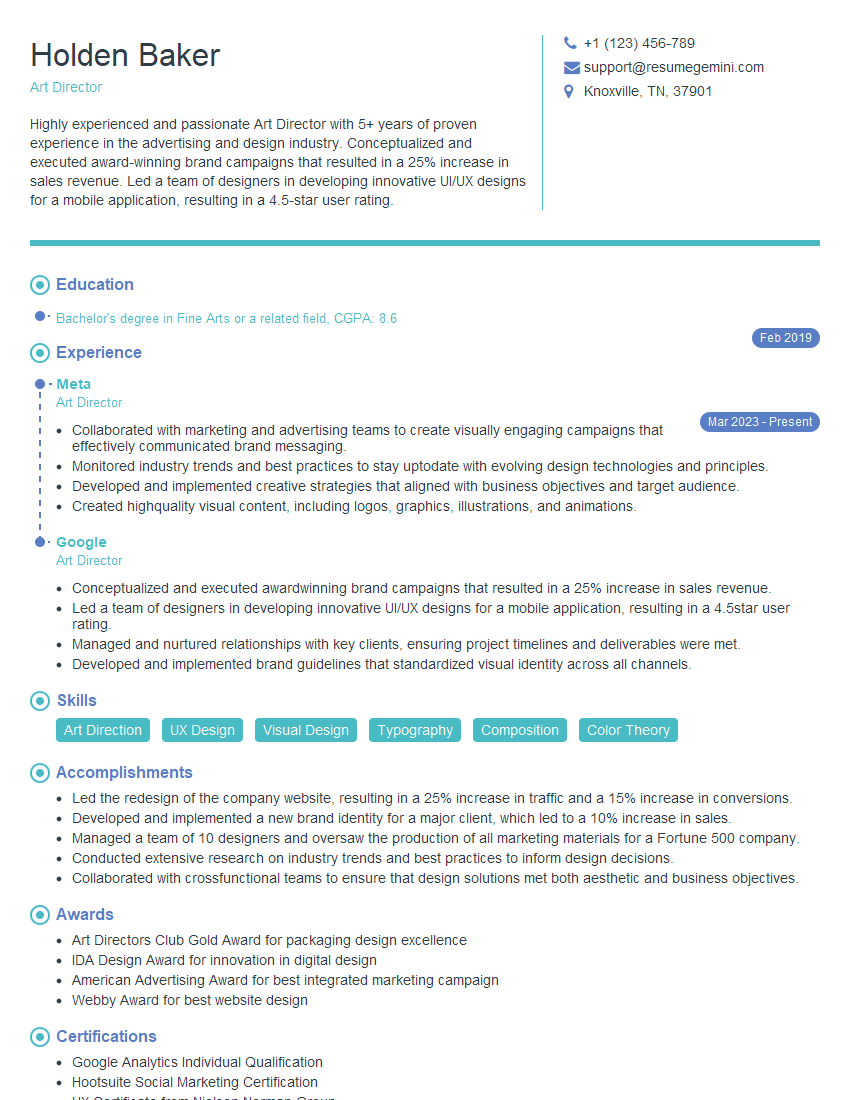
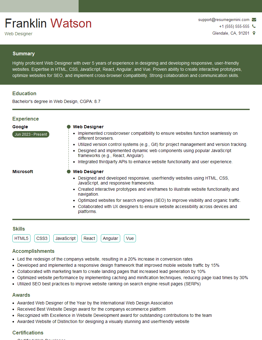
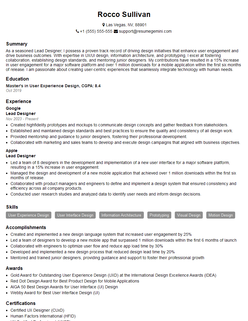
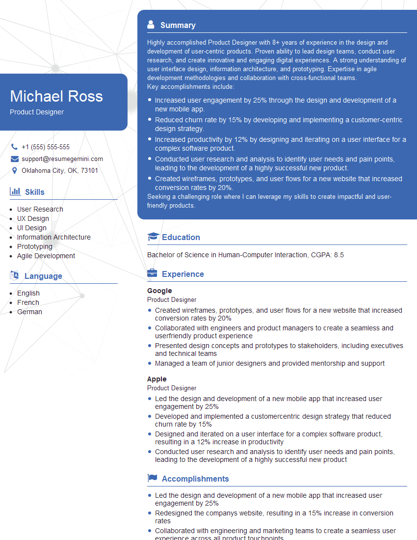
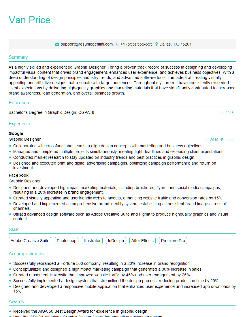
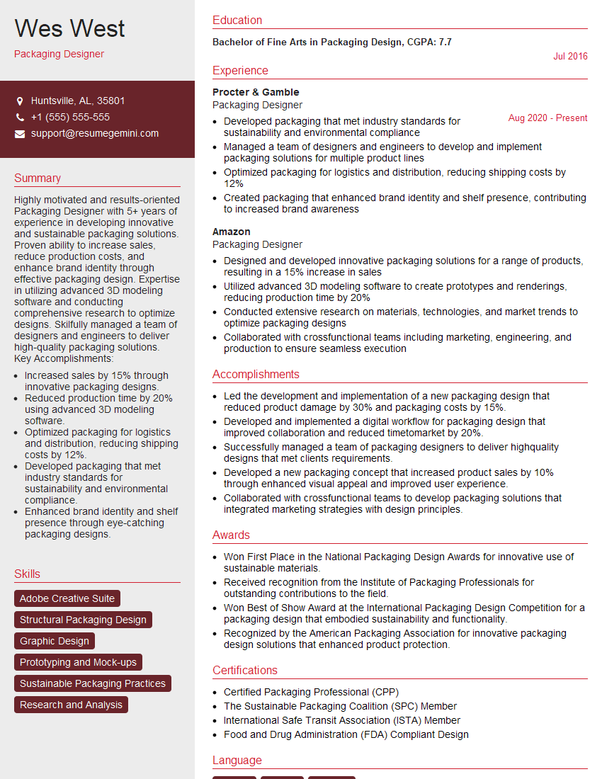
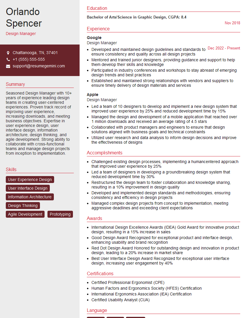
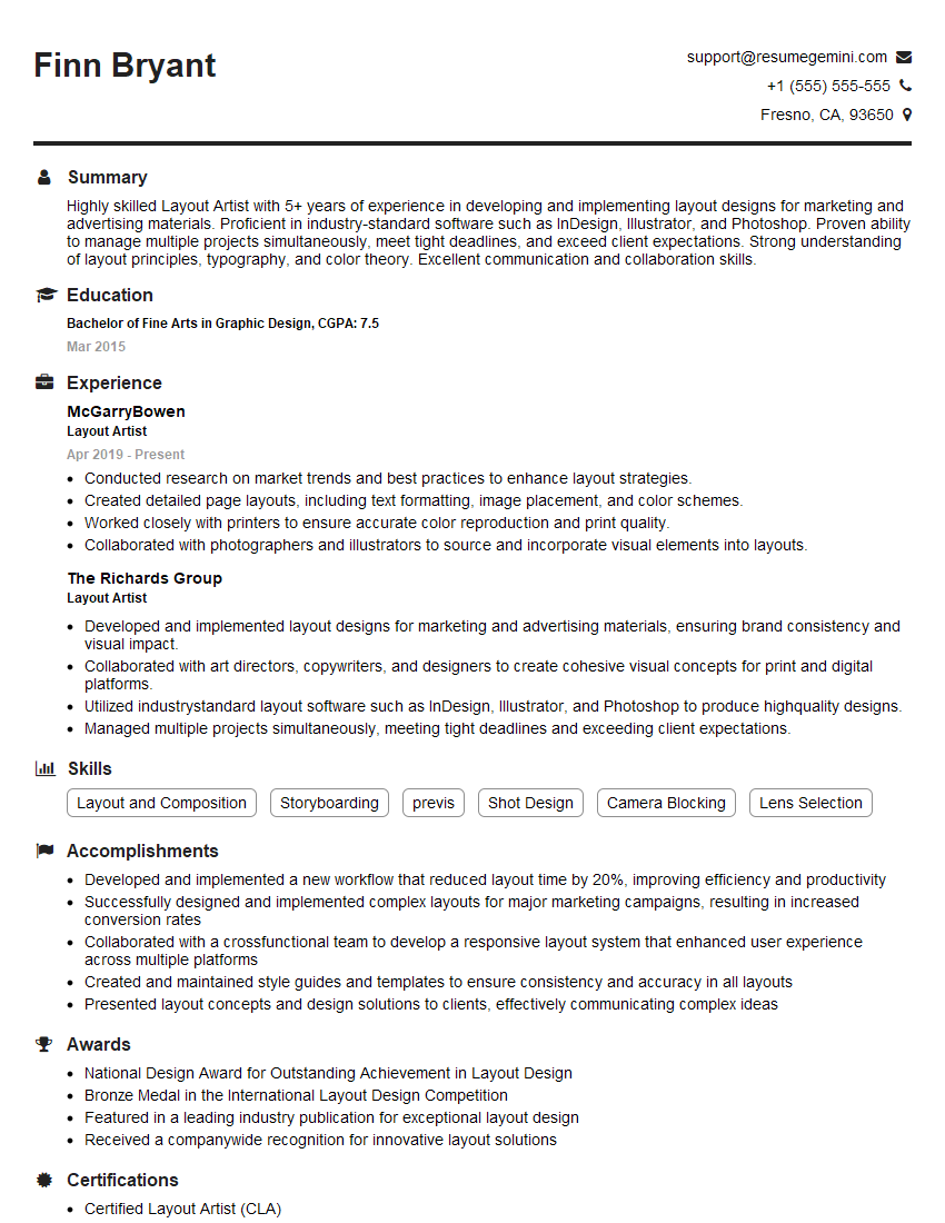
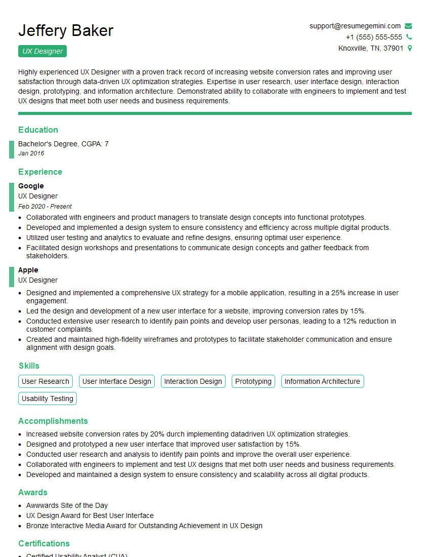
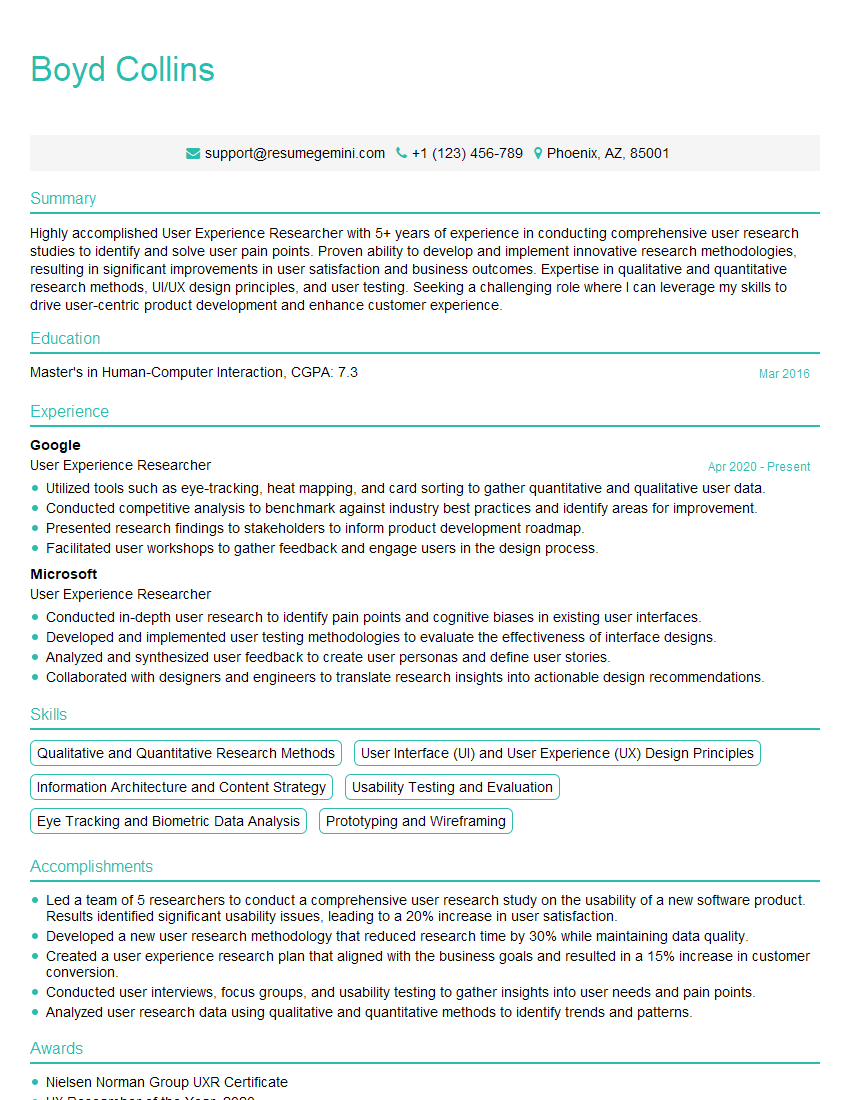
Mastering Design and Layout Principles is crucial for career advancement in the design field. A strong understanding of these principles demonstrates your ability to create effective, user-friendly, and visually appealing designs. To enhance your job prospects, create an ATS-friendly resume that highlights your skills and experience. ResumeGemini is a trusted resource to help you build a professional and impactful resume. Examples of resumes tailored to showcase expertise in Design and Layout Principles are available to guide you.
Explore more articles
Users Rating of Our Blogs
Share Your Experience
We value your feedback! Please rate our content and share your thoughts (optional).
What Readers Say About Our Blog
Hello,
We found issues with your domain’s email setup that may be sending your messages to spam or blocking them completely. InboxShield Mini shows you how to fix it in minutes — no tech skills required.
Scan your domain now for details: https://inboxshield-mini.com/
— Adam @ InboxShield Mini
Reply STOP to unsubscribe
Hi, are you owner of interviewgemini.com? What if I told you I could help you find extra time in your schedule, reconnect with leads you didn’t even realize you missed, and bring in more “I want to work with you” conversations, without increasing your ad spend or hiring a full-time employee?
All with a flexible, budget-friendly service that could easily pay for itself. Sounds good?
Would it be nice to jump on a quick 10-minute call so I can show you exactly how we make this work?
Best,
Hapei
Marketing Director
Hey, I know you’re the owner of interviewgemini.com. I’ll be quick.
Fundraising for your business is tough and time-consuming. We make it easier by guaranteeing two private investor meetings each month, for six months. No demos, no pitch events – just direct introductions to active investors matched to your startup.
If youR17;re raising, this could help you build real momentum. Want me to send more info?
Hi, I represent an SEO company that specialises in getting you AI citations and higher rankings on Google. I’d like to offer you a 100% free SEO audit for your website. Would you be interested?
Hi, I represent an SEO company that specialises in getting you AI citations and higher rankings on Google. I’d like to offer you a 100% free SEO audit for your website. Would you be interested?
good
