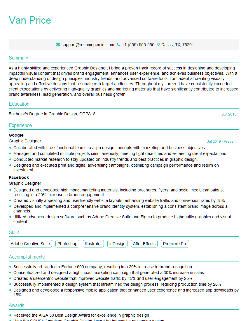
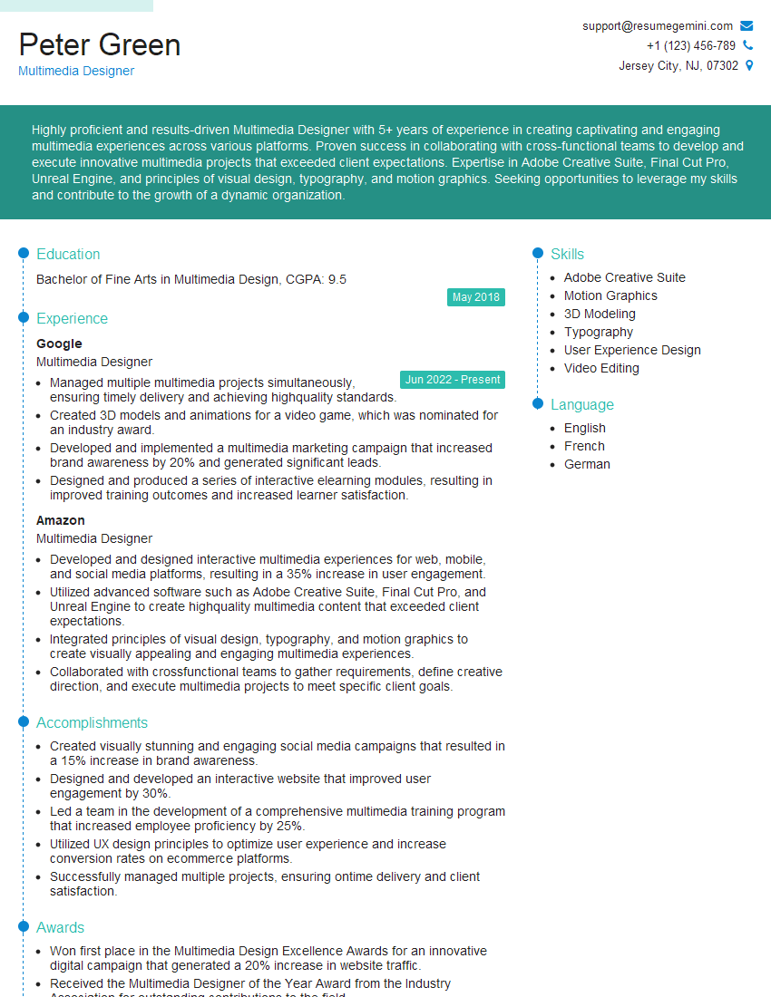
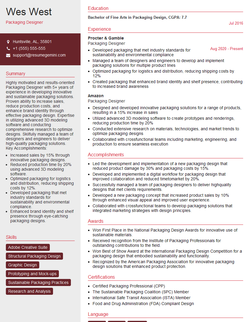
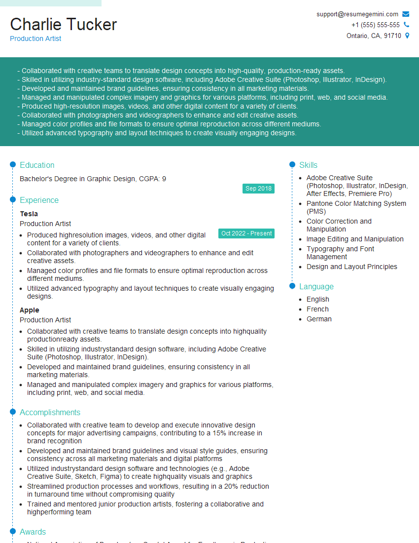
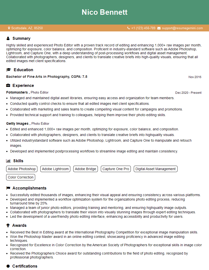
The thought of an interview can be nerve-wracking, but the right preparation can make all the difference. Explore this comprehensive guide to Photoshop and Graphic Design interview questions and gain the confidence you need to showcase your abilities and secure the role.
Questions Asked in Photoshop and Graphic Design Interview
Q 1. Explain your workflow for retouching a product image in Photoshop.
My retouching workflow for product images in Photoshop is meticulous and follows a structured approach. It begins with a thorough assessment of the image, identifying areas requiring attention like blemishes, color inconsistencies, and unwanted elements. I always start with non-destructive editing, utilizing adjustment layers and masks to preserve image quality and allow for easy modifications.
Step 1: Initial Assessment and Preparation – I start by opening the image in Photoshop and assessing its overall quality. This includes checking for dust spots, lighting inconsistencies, and any other imperfections. I often begin by making a backup copy of the original image (duplicate layer) as a safety precaution.
Step 2: Color Correction and Adjustments – Using adjustment layers like Levels, Curves, and Color Balance, I refine the overall color balance, contrast, and exposure to ensure visually appealing results. For example, using a Curves adjustment layer allows precise control over tonal range, lifting shadows and darkening highlights for a more natural look.
Step 3: Spot Healing and Removing Blemishes – I utilize the Spot Healing Brush Tool, Clone Stamp Tool, and Patch Tool, selectively removing blemishes, scratches, and other imperfections. I always work at high magnification to ensure precision and a natural look. The choice of tool depends on the nature of the imperfection. The Patch Tool, for example, is ideal for larger areas needing seamless blending.
Step 4: Refining Details and Enhancing Sharpness – I may use the sharpening tools (Unsharp Mask, Smart Sharpen) to enhance details and improve overall image clarity, carefully adjusting the settings to avoid artifacts or an overly harsh look. This step is crucial for showcasing product details effectively.
Step 5: Final Adjustments and Export – After all the retouching is complete, I perform a final review. I check for any remaining imperfections and make any necessary final adjustments to color balance, brightness, and contrast. Finally, I export the image in the appropriate format and resolution for its intended use, whether it’s for web or print.
Q 2. Describe your experience with different Photoshop blending modes.
Blending modes in Photoshop are powerful tools that control how layers interact with each other. They offer a wide range of creative possibilities, significantly impacting the final image. My experience encompasses using various blending modes for different effects, including achieving realistic compositing, adding creative effects, and manipulating colors.
For example, using Multiply darkens the underlying layer based on the opacity of the top layer, ideal for adding shadows or darkening specific areas. Screen, conversely, brightens the underlying layer, useful for adding highlights or creating a light-over-dark effect. Overlay balances both effects, dynamically adjusting based on the underlying layer’s brightness. I frequently use Soft Light and Hard Light for subtle or dramatic lighting effects respectively, adding depth and realism to the image. Hue, Saturation, and Color modes let you manipulate the color aspects independently, offering non-destructive color adjustments. Understanding the interplay between these modes allows for a vast range of creative control.
I’ve used blending modes extensively in projects requiring image compositing, creating layered textures, and enhancing visual appeal. Experimentation and understanding the effect of each mode on different types of images (like photos, vector art) are essential to using them effectively. I often find myself using blending modes in combination, layering effects to achieve complex and nuanced results.
Q 3. How do you optimize images for web and print?
Optimizing images for web and print requires distinct approaches due to fundamental differences in output devices and file formats. Web images prioritize smaller file sizes for faster loading times, while print images demand high resolution for sharp, detailed output.
Web Optimization: For web images, I typically use a lossy compression format like JPEG. Reducing the image resolution (in pixels) while maintaining visual quality is crucial. I utilize Photoshop’s ‘Save for Web (Legacy)’ or ‘Export As’ functions, experimenting with different compression settings to find the optimal balance between file size and visual quality. I might also consider using PNG-8 or PNG-24 for images with sharp edges, text, or transparency which JPEG struggles to handle.
Print Optimization: Print images require a high resolution (typically 300 DPI or higher) and are usually saved in CMYK color mode for compatibility with printing presses. I always ensure the image size is appropriate for the intended print dimensions and use a lossless format such as TIFF or PSD to preserve maximum image data. Color profiles must be accurately embedded for consistent color reproduction. Over-sharpening should be avoided as it might lead to undesirable artifacts in the print.
The key difference lies in the trade-off between file size and quality. Web prioritizes smaller file sizes for fast downloads, while print prioritizes quality at the expense of file size.
Q 4. What are your preferred methods for creating vector graphics?
My preferred methods for creating vector graphics primarily involve Adobe Illustrator. While Photoshop excels in raster graphics, Illustrator is the go-to tool for scalable vector graphics (SVGs). The advantage of vector graphics is their scalability – they can be enlarged infinitely without loss of quality, unlike raster graphics which are pixel-based.
In Illustrator, I use various tools to create vector graphics such as the Pen Tool for precise path creation, Shape tools for drawing basic shapes, and Type tools for adding text. I also utilize the Pathfinder panel to combine and modify shapes, creating complex illustrations from simple building blocks. For logos and illustrations intended for various sizes and applications (websites, print, merchandise), Illustrator’s vector capabilities are indispensable.
Occasionally, I might import raster graphics into Illustrator to trace them and convert them to vector graphics if needed. However, the best results always come from directly creating vector art in Illustrator, as it retains the scalability inherent in the vector format.
Q 5. How do you handle color correction and color profiles in Photoshop?
Color correction and color profiles are critical in ensuring accurate color representation across different devices and output methods. My approach involves a combination of Photoshop’s built-in tools and an understanding of color management principles.
I frequently use adjustment layers (Levels, Curves, Color Balance, Hue/Saturation) for non-destructive color correction. This allows me to adjust the image’s color balance, contrast, and saturation without permanently altering the pixel data. I pay close attention to maintaining color consistency throughout the project.
Working with color profiles, I ensure my images are in the correct color space (RGB for web, CMYK for print) and that the appropriate color profile is embedded in the file. Mismatched color profiles can lead to significant color shifts when images are transferred between devices or printed. I always assign or check the color profile of an image before exporting it to ensure accurate color reproduction.
For critical color accuracy, especially in print work, I use a color management system (CMS) to maintain consistency throughout my workflow. This ensures that the colors viewed on my monitor accurately reflect the final printed output. In essence, accurate color handling is paramount for creating high-quality visuals.
Q 6. Explain your understanding of CMYK and RGB color spaces.
RGB and CMYK are two distinct color models used in different contexts. RGB (Red, Green, Blue) is an additive color model used for displays like computer monitors and televisions. It works by combining different intensities of red, green, and blue light to produce a wide range of colors. The more light added, the brighter the color.
CMYK (Cyan, Magenta, Yellow, Key/Black) is a subtractive color model used for printing. It involves subtracting colors from white light using inks. The more ink applied, the darker the color. Because inks don’t perfectly mix, CMYK often cannot achieve the same vibrant colors as RGB.
Understanding the differences is crucial because an image created in RGB for the web will look different if printed directly without conversion to CMYK. Conversion processes often result in color shifts and need careful monitoring to minimize any discrepancies. Knowing which color space to use based on the intended output ensures accurate color reproduction.
Q 7. Describe your experience with layer styles and layer masks.
Layer styles and layer masks are essential non-destructive editing tools in Photoshop that significantly enhance creative control and flexibility. They allow for complex effects and manipulations without directly altering the underlying pixels.
Layer Styles: Layer styles offer a wide range of options for adding effects to layers, such as drop shadows, inner shadows, bevels, embossing, gradients, and more. They are highly customizable, allowing for precise adjustments to each effect. For instance, I might use a drop shadow to create depth and realism when adding text or a logo to an image.
Layer Masks: Layer masks allow for selective control over the visibility of a layer. They work by painting on the mask, revealing or hiding parts of the layer based on the mask’s opacity. Think of it like a stencil – areas painted black are hidden, while white reveals the layer. Grey offers transparency control. This is invaluable for precise compositing, removing unwanted areas from an image, and creating complex effects. I frequently use layer masks to seamlessly integrate images or to isolate and modify specific parts of a layer without affecting the rest.
Combining layer styles and masks provides even more creative power, as you can apply styles to masked areas for very specific effects. This non-destructive workflow allows for effortless experimentation and revisions, preserving the original image data.
Q 8. How do you use smart objects in Photoshop?
Smart Objects in Photoshop are like containers that hold layers, allowing you to edit them non-destructively. Think of it as embedding a high-resolution image within your design without losing quality. Any changes you make to the original Smart Object are automatically reflected everywhere it’s used. This is crucial for maintaining flexibility and efficiency.
- Creating a Smart Object: You can convert an existing layer or group into a Smart Object by right-clicking and selecting ‘Convert to Smart Object’.
- Editing a Smart Object: Double-clicking the Smart Object thumbnail opens it in a new document window. Make your edits, save, and the changes are immediately applied to all instances of the Smart Object in your main file.
- Advantages: Non-destructive editing, scalability without loss of quality, and efficient management of complex designs.
- Real-world example: Imagine designing a brochure. If your company logo is a Smart Object, you can change the logo in one place and automatically update it throughout the entire brochure without having to manually edit each instance.
Q 9. Explain your process for designing a logo.
My logo design process is iterative and client-focused. It starts with a deep understanding of the client’s brand, target audience, and business objectives. I follow these key steps:
- Research and Concept Development: I begin by thoroughly researching the client’s industry, competitors, and brand values. This involves mood boards, competitor analyses, and brainstorming sessions. I then develop several initial concepts, sketching and exploring different visual directions.
- Refinement and Iteration: I present initial concepts to the client, gathering feedback and refining based on their preferences. This is a crucial stage involving multiple revisions and iterative improvements.
- Digital Refinement: Once a concept is selected, I translate the sketches into a digital format using Photoshop (and often Illustrator for vector-based elements). I meticulously refine the logo, paying close attention to detail, color palettes, and typography.
- Testing and Finalization: I test the logo’s scalability (how it looks at different sizes) and its adaptability to various applications (print, web, etc.). This ensures its effectiveness across different platforms. Finally, I deliver the logo in various formats (e.g., AI, EPS, PNG, JPG).
For example, when designing a logo for a tech startup, I might focus on modern, clean aesthetics using geometric shapes and a contemporary font. Conversely, a logo for a bakery might involve more organic forms and a warmer color palette.
Q 10. How do you ensure design consistency across multiple platforms?
Design consistency across multiple platforms is crucial for brand recognition. This is achieved through a well-defined style guide that documents all aspects of the brand’s visual identity, including:
- Color Palette: Precise HEX codes for all brand colors.
- Typography: Specific fonts, their sizes, weights, and usage guidelines.
- Logo Usage: Clear guidelines on how the logo should be used, including minimum size, clear space, and acceptable variations.
- Imagery Style: Consistency in photography style, illustration, and overall visual tone.
By meticulously following the style guide across all platforms (website, social media, print materials), you ensure a unified and recognizable brand presence. Tools like Adobe Experience Manager and design systems like Figma and Sketch can also significantly streamline and automate the process of maintaining design consistency.
Q 11. How do you incorporate user feedback into your design process?
User feedback is indispensable for successful design. I incorporate it throughout the design process, not just at the end. I actively seek feedback through various methods:
- Usability Testing: Observing users interacting with designs to identify pain points and areas for improvement.
- Surveys and Questionnaires: Gathering quantitative and qualitative data on user preferences and satisfaction.
- A/B Testing: Comparing different design variations to determine which performs better.
- Feedback Forms: Providing simple ways for users to share their comments and suggestions directly.
It’s crucial to analyze feedback objectively, prioritizing user needs while considering business goals. I use feedback to iterate on designs, making necessary adjustments to improve user experience and achieve design goals. For instance, if user testing reveals that a button is difficult to find, I might redesign its placement or visual prominence based on the feedback.
Q 12. Describe your experience with typography and font selection.
Typography is a crucial element of design; it communicates the message and personality of the brand. My experience encompasses selecting appropriate fonts based on the project’s context, understanding their legibility, and applying them effectively.
- Font Selection: I consider factors like readability, style, and brand personality. Serif fonts (like Times New Roman) are often used for body text due to their readability, while sans-serif fonts (like Arial) are often preferred for headlines and modern designs.
- Hierarchy and Emphasis: I use typography to create visual hierarchy by varying font sizes, weights, and styles to emphasize key information.
- Legibility and Readability: Prioritizing readability is critical. This includes considerations like font size, leading (spacing between lines), and kerning (spacing between individual letters).
For example, a website for a law firm might use a classic serif font to convey professionalism, whereas a children’s book might utilize a playful, rounded sans-serif font. I use my knowledge of typographic principles to select the most appropriate fonts that align with the design goals.
Q 13. How do you create and maintain a design system?
A design system is a centralized repository of reusable components, styles, and guidelines that ensure consistency across a brand’s visual identity. Creating and maintaining a design system involves:
- Component Library: Creating a collection of reusable UI elements (buttons, forms, icons) with consistent styles and behaviors.
- Style Guide: Defining brand colors, typography, spacing, and other visual aspects.
- Documentation: Thoroughly documenting all aspects of the design system to ensure everyone understands its usage.
- Version Control: Using version control tools (like Git) to track changes and collaborate effectively.
Maintaining a design system involves regularly reviewing and updating it to adapt to evolving design trends and brand requirements. Consistent updates and adherence to the established guidelines are crucial for the system’s effectiveness in maintaining design consistency across the organization.
Q 14. What software beyond Photoshop are you proficient in?
Beyond Photoshop, I’m proficient in several other design and productivity tools:
- Adobe Illustrator: For vector graphics and logo design.
- Adobe InDesign: For creating layouts for print publications.
- Figma: For collaborative design and prototyping.
- Sketch: For UI/UX design.
- After Effects: For motion graphics and video editing.
- Microsoft Office Suite: For project management and communication.
This diversified skill set allows me to approach design projects from various angles and effectively deliver across different media and platforms.
Q 15. Describe your experience with design trends.
Staying abreast of design trends is crucial for any graphic designer. I actively follow leading design publications, blogs, and social media platforms like Behance and Dribbble to understand emerging styles and aesthetics. I’m particularly interested in the evolution of minimalist design, the resurgence of retro aesthetics, and the ongoing exploration of inclusive and accessible design principles. For instance, I recently saw a significant shift towards using more organic shapes and textures, moving away from the sharp, geometric designs that were prevalent a few years ago. This informs my own creative process, allowing me to incorporate fresh, relevant ideas into my work while still maintaining a unique personal style. I also analyze successful campaigns and marketing materials to understand how trends are being applied effectively in the real world.
Moreover, I attend webinars, workshops, and conferences to stay updated on the latest software updates and design techniques. This continuous learning helps me anticipate future trends and adapt my skills accordingly. Essentially, I view trend analysis as an ongoing process, not a one-time task.
Career Expert Tips:
- Ace those interviews! Prepare effectively by reviewing the Top 50 Most Common Interview Questions on ResumeGemini.
- Navigate your job search with confidence! Explore a wide range of Career Tips on ResumeGemini. Learn about common challenges and recommendations to overcome them.
- Craft the perfect resume! Master the Art of Resume Writing with ResumeGemini’s guide. Showcase your unique qualifications and achievements effectively.
- Don’t miss out on holiday savings! Build your dream resume with ResumeGemini’s ATS optimized templates.
Q 16. How do you handle constructive criticism?
Constructive criticism is invaluable for growth. I approach it as an opportunity to refine my work and improve my skills. I actively listen to feedback, asking clarifying questions to fully understand the points being raised. I avoid becoming defensive; instead, I focus on identifying the areas where improvement is needed. For example, if feedback suggests a design is too cluttered, I analyze the layout, potentially removing unnecessary elements or reorganizing the information hierarchy. I then reflect on the feedback, considering the reviewer’s perspective and assessing whether the criticism aligns with the project’s goals and target audience. I’ll often make revisions, presenting the updated design and explaining the changes I’ve made based on the feedback. Ultimately, I see feedback as a collaboration towards a better end product.
Q 17. Explain your experience with image manipulation techniques.
My experience with image manipulation is extensive, encompassing a wide range of techniques within Photoshop. I’m proficient in color correction and grading, using tools like Curves, Levels, and Color Balance to achieve specific moods and enhance image quality. I regularly employ retouching techniques to remove blemishes, smooth skin, and enhance details. I’m also skilled in compositing, seamlessly blending multiple images together to create complex scenes or illustrations. This involves masking, layering, and using adjustment layers to achieve realistic results. For instance, I recently created a promotional image for a skincare product, where I used retouching techniques to create a flawless complexion on the model, and then composited her into a background that emphasized the product’s natural ingredients. Furthermore, I have considerable experience in using filters and effects to add creative flair and achieve stylistic effects, always ensuring that the final product looks natural and professional.
Q 18. Describe your experience with creating mockups.
Creating realistic mockups is a significant part of my workflow, especially for presenting designs to clients or stakeholders. I utilize both Photoshop and dedicated mockup templates to showcase designs on various products, such as t-shirts, mugs, websites, and packaging. I understand the importance of creating photorealistic mockups that accurately represent the final product. My process involves carefully selecting the appropriate template, intelligently using adjustment layers to match lighting and shadows, and meticulously replacing placeholder images or text with the client’s design. For example, when creating a mockup for a website design, I carefully place the website design into the template, adjusting shadows and highlights to make it seamlessly integrate with the surrounding elements. This meticulous approach ensures the client can visualize the final product realistically, leading to clearer communication and better decision-making.
Q 19. How do you manage your time and prioritize tasks during a design project?
Effective time management is essential in graphic design. I typically begin by breaking down large projects into smaller, manageable tasks. I then prioritize these tasks based on their urgency and importance, using methods like the Eisenhower Matrix (urgent/important). I create detailed schedules and set realistic deadlines for each task. I use project management software to track my progress and ensure I’m on schedule. I also allocate specific time blocks for different types of work, recognizing that certain tasks require more focused attention than others. Procrastination is avoided by setting clear goals for each work session. Regular breaks are incorporated to maintain focus and prevent burnout. Furthermore, I regularly communicate with clients and stakeholders to manage expectations and address any potential delays proactively.
Q 20. Explain a time you had to troubleshoot a complex design issue.
In a recent project involving a complex layered Photoshop file, I encountered a significant issue where the transparency of certain layers was behaving erratically. The initial troubleshooting steps, such as checking layer blending modes and opacity settings, proved fruitless. I systematically investigated each layer’s properties, examining its mask, effects, and any linked smart objects. The problem stemmed from a nested smart object that had inadvertently been flattened during a previous editing phase, corrupting the transparency settings. The solution involved reverting to a previous version of the file from my backup, then carefully recreating the affected sections. I learned a valuable lesson about maintaining version control and regularly saving my work. This experience highlighted the importance of a methodical troubleshooting approach, working systematically through potential causes, and utilizing version control to prevent data loss.
Q 21. Describe your experience with Adobe Illustrator.
I possess significant experience with Adobe Illustrator, utilizing it primarily for vector-based design work. My expertise lies in creating logos, icons, illustrations, and other graphic elements that require scalability and crispness. I am proficient in using various tools, including the Pen tool for precise path creation, the Shape Builder tool for combining shapes, and the Pathfinder tool for manipulating paths. I have experience creating and editing vector graphics from scratch, as well as tracing raster images to convert them into editable vectors. For example, in a recent project for a new coffee shop, I used Illustrator to create their logo, ensuring it would scale seamlessly for different applications such as business cards, website banners, and coffee cups. My proficiency in Illustrator allows me to create designs that are clean, precise, and easily scalable, ensuring high-quality output regardless of the final application.
Q 22. How do you ensure your designs are accessible to people with disabilities?
Accessibility in design is paramount. It’s about ensuring everyone, regardless of ability, can access and understand your designs. This goes beyond just making things visually appealing; it’s about making them usable. In Photoshop, I achieve this through several key strategies:
- Sufficient Color Contrast: I consistently use tools like the Eyedropper and the Info panel to ensure adequate contrast between text and background colors, meeting WCAG (Web Content Accessibility Guidelines) standards. This is vital for users with low vision. For example, I wouldn’t use light gray text on a white background.
- Alternative Text for Images: For all images, I meticulously write descriptive alternative text (alt text). This is crucial for screen reader users who rely on text descriptions to understand images. Instead of just ‘image.jpg’, I’d write ‘A vibrant photo of a smiling child playing in a park’.
- Keyboard Navigation: While Photoshop is primarily mouse-driven, I keep in mind that some users navigate with keyboards. This impacts how I structure layers and organize my design workflow, ensuring all elements are selectable via the keyboard.
- Captioning and Transcriptions: If a design involves video or audio, I ensure captions and transcripts are provided. This is crucial for users with hearing impairments or those in noisy environments.
- Font Considerations: I select clear, legible fonts, avoiding overly stylized or decorative fonts that may be difficult to read for those with dyslexia or visual impairments. Sans-serif fonts generally offer better readability.
By consistently applying these principles, I ensure my designs are inclusive and accessible to a wider audience.
Q 23. What is your design philosophy?
My design philosophy centers around the principle of ‘human-centered design’. This means placing the user at the heart of the creative process. I strive to create designs that are not only visually appealing but also intuitive, user-friendly, and solve real problems for the end-user. I believe that good design is invisible; it seamlessly integrates with the user’s experience without drawing unnecessary attention to itself. This necessitates understanding user needs through thorough research and testing, ensuring the final product aligns perfectly with its purpose and audience.
I also value simplicity and clarity. I avoid unnecessary clutter and focus on creating a clean, consistent aesthetic. Ultimately, my goal is to create designs that communicate effectively and leave a positive lasting impression.
Q 24. How do you stay up-to-date with the latest design trends and technologies?
Staying current in the dynamic field of graphic design is crucial. I employ a multi-pronged approach:
- Following Design Blogs and Publications: I regularly read publications like Awwwards, Behance, and Dribbble to stay abreast of emerging trends and new design techniques. This allows me to see what other designers are creating and gain inspiration.
- Attending Conferences and Workshops: Industry conferences and workshops offer invaluable opportunities to network, learn about new software features, and hear from leading experts in the field.
- Exploring Online Courses and Tutorials: Platforms like Skillshare, Udemy, and LinkedIn Learning offer a wealth of courses on various design tools and techniques, keeping my skills sharp and expanding my knowledge base.
- Experimentation and Personal Projects: I regularly undertake personal projects to experiment with new design tools, styles, and technologies. This hands-on approach helps me solidify my understanding and build my portfolio.
- Following Key Influencers on Social Media: I follow prominent designers and design studios on platforms like Instagram and Twitter to see their work and get inspired by their creative processes.
This multifaceted approach ensures I remain adaptable and at the forefront of the ever-evolving design landscape.
Q 25. Describe a design project you are particularly proud of and why.
I’m particularly proud of a recent rebranding project for a local non-profit organization. They were struggling with a dated and ineffective brand identity, leading to poor public perception and low engagement. My task was to create a new visual identity that better reflected their mission and values. I started by conducting thorough market research, understanding their target audience, and analyzing their existing brand materials.
I then developed a new logo, color palette, and typography system that were modern, clean, and evoked the non-profit’s focus on community development. I also created a comprehensive brand style guide to ensure consistency across all their communications. The results were remarkable. The new brand resonated strongly with their target audience, attracting new volunteers and significantly increasing donations. This project showcases the power of design to drive positive change and impact a community.
Q 26. Explain your understanding of the design thinking process.
Design thinking is an iterative problem-solving approach centered on user needs. It’s not just about aesthetics but about creating solutions that are functional, desirable, and viable. The process typically involves these five stages:
- Empathize: Understanding the users’ needs and challenges through research, interviews, and observation.
- Define: Clearly articulating the problem that needs to be solved based on the insights gathered during the empathize stage.
- Ideate: Brainstorming and generating a wide range of potential solutions to the defined problem.
- Prototype: Creating tangible representations of the solutions, whether sketches, mockups, or interactive prototypes.
- Test: Evaluating the prototypes through user testing and gathering feedback to inform further iterations.
This cyclical process ensures the final design is user-centered, effective, and solves the intended problem. I frequently use this process, adapting it to the specific needs of each project.
Q 27. How do you collaborate effectively with other designers and developers?
Effective collaboration is essential in design. I prioritize open communication, active listening, and a collaborative spirit. My approach includes:
- Regular Communication: I maintain consistent communication with designers and developers through daily stand-up meetings, email, and project management tools like Slack or Asana.
- Version Control: Using version control systems like Git (for developers) and cloud-based file sharing for design assets ensures everyone works with the latest versions, avoiding conflicts and confusion.
- Clear Documentation: Providing clear design specifications, style guides, and detailed documentation facilitates smooth communication and understanding between designers and developers.
- Constructive Feedback: I actively seek and give constructive feedback to ensure everyone is on the same page and the project is moving in the right direction. This also includes clearly stating potential issues or challenges in a timely and approachable manner.
- Shared Design System: When working on larger projects, establishing a shared design system (a library of reusable components) ensures consistency and efficiency in the design process.
By fostering a collaborative environment and using appropriate tools, I ensure smooth teamwork and a successful outcome for each project.
Q 28. How do you handle tight deadlines and pressure?
Handling tight deadlines and pressure requires effective time management, prioritization, and a proactive approach. My strategies include:
- Detailed Project Planning: I meticulously plan projects, breaking them down into smaller, manageable tasks. This helps me visualize the timeline and allocate time effectively.
- Prioritization: I prioritize tasks based on their importance and urgency, focusing on the most critical aspects first. Using tools like project management software can greatly aid this process.
- Time Blocking: I allocate specific time slots for different tasks, minimizing distractions and maximizing productivity.
- Seeking Help When Needed: I’m not afraid to ask for help when needed. If I’m facing a challenge or struggling to meet a deadline, I communicate proactively with my team or manager.
- Staying Calm and Focused: Maintaining a calm and focused mindset is crucial during stressful situations. Taking breaks, practicing mindfulness, and ensuring adequate rest can significantly improve productivity and manage stress.
By combining effective time management, proactive communication, and a resilient mindset, I can effectively navigate even the most challenging deadlines.
Key Topics to Learn for Photoshop and Graphic Design Interview
- Image Manipulation & Retouching: Mastering techniques like color correction, retouching, and blemish removal. Practical application: Demonstrate your ability to enhance product images for e-commerce or retouch portraits for a professional portfolio.
- Layer Management & Compositing: Understanding layer masks, blending modes, and non-destructive editing workflows. Practical application: Explain how you would combine multiple images to create a complex scene or advertisement.
- Typography & Text Effects: Proficiency in selecting appropriate fonts, kerning, tracking, and creating visually appealing text-based designs. Practical application: Show examples of your work where typography played a key role in conveying a message or enhancing the overall design.
- Color Theory & Design Principles: A strong understanding of color palettes, contrast, balance, and visual hierarchy. Practical application: Explain your design choices in a past project, highlighting how color and design principles contributed to its success.
- Vector Graphics & Illustration (Illustrator knowledge is a plus): Familiarity with vector-based tools and their application in logo design, illustration, and creating scalable graphics. Practical application: Describe your experience working with vector graphics and explain the advantages over raster graphics.
- Workflow & File Management: Efficient file organization, naming conventions, and understanding different file formats (PSD, JPG, PNG, etc.). Practical application: Explain your process for managing large projects and maintaining a clean and organized workflow.
- Design Software Proficiency: Demonstrating a comprehensive understanding of Photoshop’s tools and features beyond basic usage. Practical application: Be prepared to discuss your experience with advanced features such as actions, scripts, or plugins.
- Problem-Solving & Creative Thinking: Ability to analyze design challenges, brainstorm solutions, and present your creative process. Practical application: Be ready to discuss how you approached a design problem and the creative solutions you implemented.
Next Steps
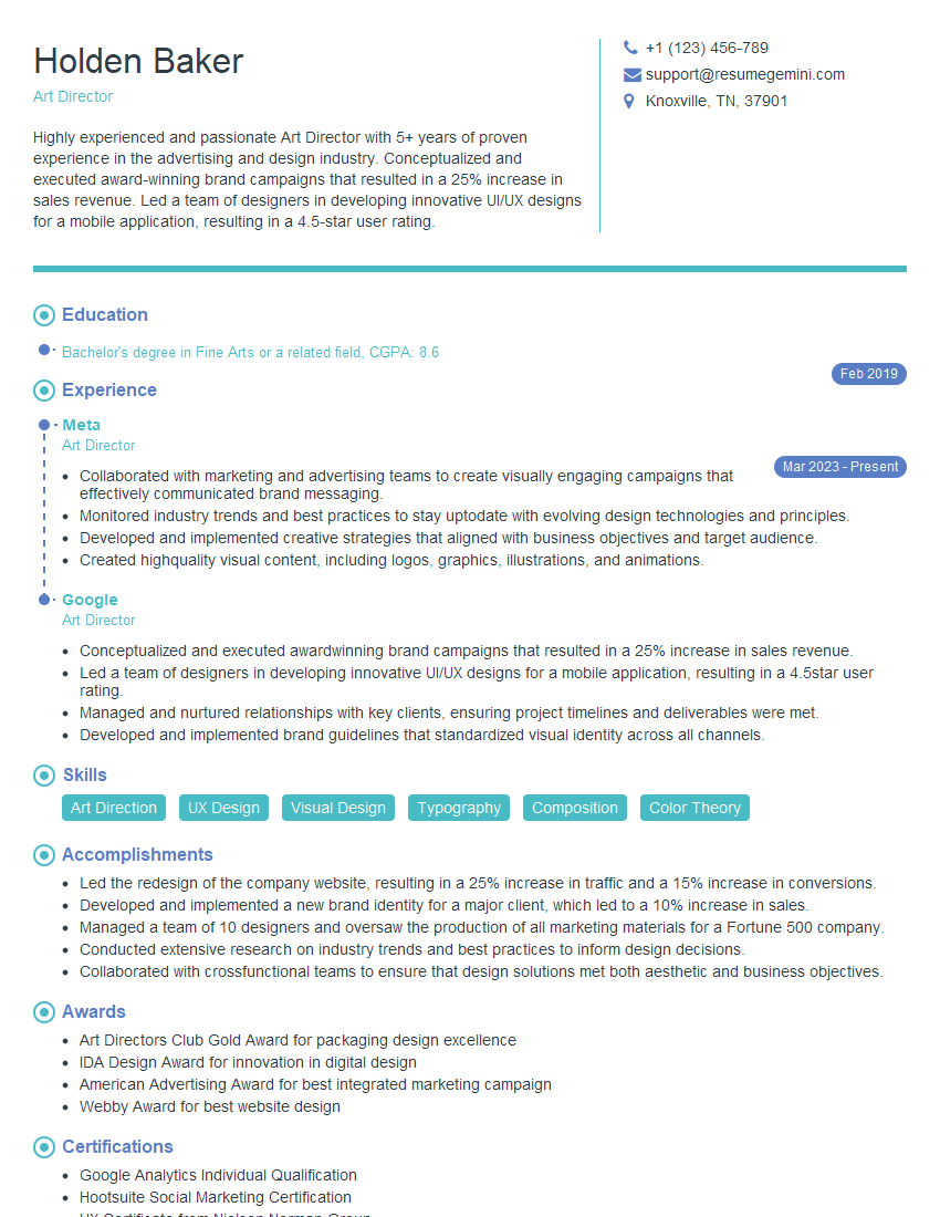
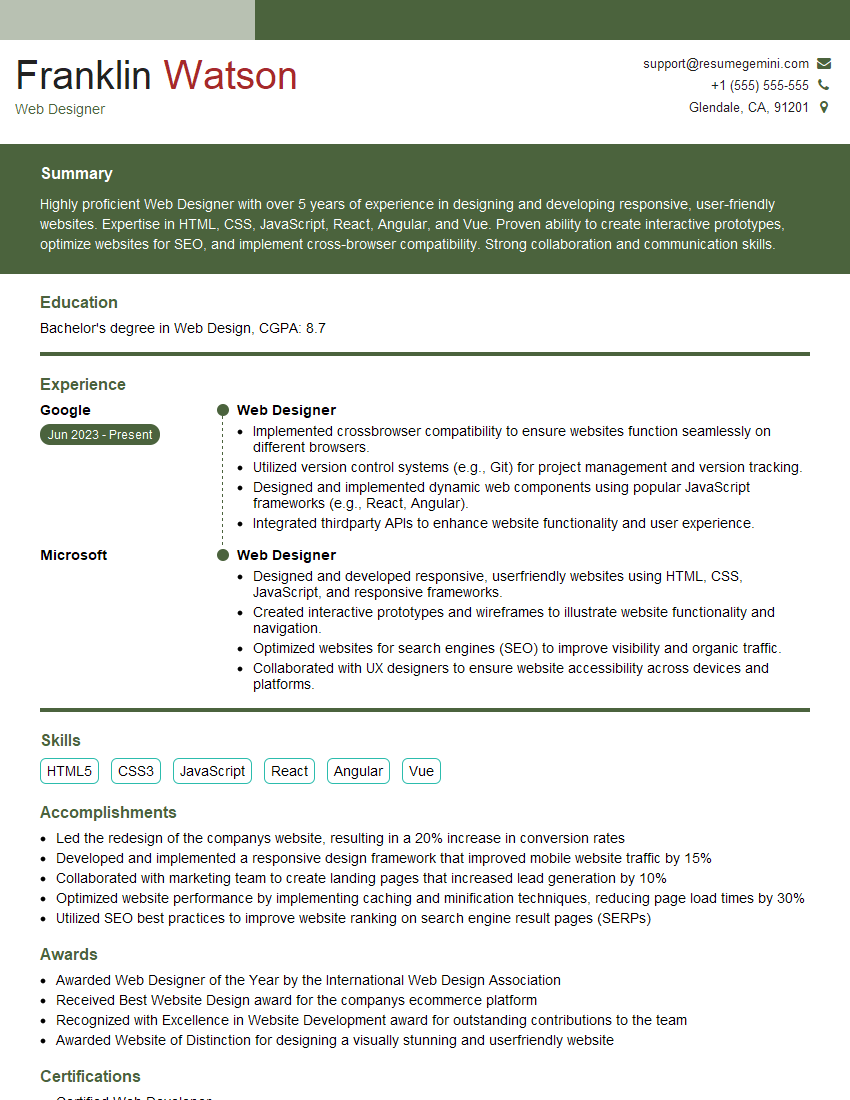
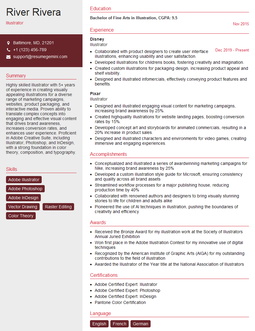
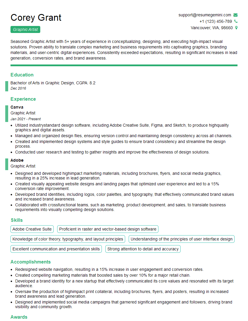
Mastering Photoshop and Graphic Design opens doors to exciting careers in advertising, web design, publishing, and more! To maximize your job prospects, create a resume that showcases your skills effectively and is optimized for Applicant Tracking Systems (ATS). ResumeGemini is a trusted resource that can help you build a professional and impactful resume. Examples of resumes tailored to Photoshop and Graphic Design professionals are available to guide you. Take the next step towards your dream career – build your best resume today!
Explore more articles
Users Rating of Our Blogs
Share Your Experience
We value your feedback! Please rate our content and share your thoughts (optional).
What Readers Say About Our Blog
Hello,
We found issues with your domain’s email setup that may be sending your messages to spam or blocking them completely. InboxShield Mini shows you how to fix it in minutes — no tech skills required.
Scan your domain now for details: https://inboxshield-mini.com/
— Adam @ InboxShield Mini
Reply STOP to unsubscribe
Hi, are you owner of interviewgemini.com? What if I told you I could help you find extra time in your schedule, reconnect with leads you didn’t even realize you missed, and bring in more “I want to work with you” conversations, without increasing your ad spend or hiring a full-time employee?
All with a flexible, budget-friendly service that could easily pay for itself. Sounds good?
Would it be nice to jump on a quick 10-minute call so I can show you exactly how we make this work?
Best,
Hapei
Marketing Director
Hey, I know you’re the owner of interviewgemini.com. I’ll be quick.
Fundraising for your business is tough and time-consuming. We make it easier by guaranteeing two private investor meetings each month, for six months. No demos, no pitch events – just direct introductions to active investors matched to your startup.
If youR17;re raising, this could help you build real momentum. Want me to send more info?
Hi, I represent an SEO company that specialises in getting you AI citations and higher rankings on Google. I’d like to offer you a 100% free SEO audit for your website. Would you be interested?
Hi, I represent an SEO company that specialises in getting you AI citations and higher rankings on Google. I’d like to offer you a 100% free SEO audit for your website. Would you be interested?
good
