Are you ready to stand out in your next interview? Understanding and preparing for Photoshop and InDesign interview questions is a game-changer. In this blog, we’ve compiled key questions and expert advice to help you showcase your skills with confidence and precision. Let’s get started on your journey to acing the interview.
Questions Asked in Photoshop and InDesign Interview
Q 1. Explain the difference between raster and vector graphics.
Raster and vector graphics represent images fundamentally differently. Think of it like this: raster is like a mosaic, made of tiny squares called pixels, while vector is like a blueprint, composed of mathematical equations defining lines and curves.
- Raster Graphics (e.g., JPEG, PNG, TIFF): These are resolution-dependent. They are made up of a grid of pixels, and enlarging them results in pixelation – a blurry, jagged appearance. They are best for photorealistic images where subtle color gradations are crucial.
- Vector Graphics (e.g., SVG, AI, EPS): These are resolution-independent. They use mathematical formulas to define shapes, so they can be scaled to any size without losing quality. They are ideal for logos, illustrations, and typography where crisp lines and sharp edges are essential.
For example, a photograph would be best represented as a raster image, while a company logo would be better as a vector graphic to ensure it looks crisp on everything from a business card to a billboard.
Q 2. What are the advantages and disadvantages of using Photoshop vs. InDesign for a specific project?
The choice between Photoshop and InDesign depends heavily on the project. Photoshop excels at image manipulation and raster-based work, while InDesign is a page layout application designed for complex documents.
- Photoshop Advantages: Powerful tools for photo editing, retouching, painting, and creating raster-based graphics. Ideal for single images, complex photo manipulations, and creating assets for InDesign.
- Photoshop Disadvantages: Not designed for multi-page layouts, text handling can be cumbersome, and managing multiple pages can be inefficient.
- InDesign Advantages: Excellent for multi-page layouts, text management, and precise control over typography. Ideal for brochures, magazines, posters, and other documents with text and images.
- InDesign Disadvantages: Limited image editing capabilities compared to Photoshop; not the best choice for extensive photo manipulation or raster-based artwork.
For instance, creating a brochure would be handled primarily in InDesign for the layout and text flow, while Photoshop would be used to prepare and retouch images before placing them within InDesign.
Q 3. Describe your experience with color management and profiles (CMYK, RGB, etc.).
Color management is crucial for consistent color reproduction across different devices and output methods. RGB (Red, Green, Blue) is the color model used for screens, while CMYK (Cyan, Magenta, Yellow, Key/Black) is the standard for print. Color profiles are like dictionaries that translate colors between these models.
- RGB: Used for digital displays, it produces a wide range of vibrant colors.
- CMYK: Used for printing, it’s a subtractive color model where inks are layered to create colors. The range of colors is smaller than RGB.
My experience includes working with various color profiles, ensuring accurate color conversion from RGB to CMYK for print projects, and establishing consistent color palettes across different designs. I regularly use the color management features in Photoshop and InDesign to avoid color shifts and ensure accurate reproduction of my client’s brand colors. A common mistake is to only set color profiles in one program but not the other, leading to a mismatch between the digital and the printed product. Using a dedicated color management system is often the best approach for large projects.
Q 4. How do you handle high-resolution images in Photoshop for web and print?
Handling high-resolution images requires a strategic approach to balance quality and file size. For web use, images need to be optimized for fast loading times, while print requires high resolution for sharp details.
- Web: High-resolution images are downsampled (reduced in size) to a resolution appropriate for the screen (typically 72dpi). File formats like JPEG (for photographs) or PNG (for images with sharp lines and text) are used, with compression levels adjusted to balance quality and file size.
- Print: High-resolution images (typically 300dpi or higher) are required for sharp prints. Larger file sizes are acceptable for print because load times are not a major factor.
A common workflow involves saving separate versions of images: one optimized for web and another for print. For example, a 3000×2000 pixel image for print would be downsampled to 1000×667 for web use before being uploaded to a website.
Q 5. What are your preferred methods for optimizing images for web use?
Optimizing images for web use focuses on reducing file size without significantly impacting visual quality. My preferred methods include:
- Choosing the right file format: JPEG for photographs, PNG for images with transparency or sharp lines.
- Lossy compression (JPEG): Reduces file size by discarding some image data. The level of compression needs careful balancing to maintain acceptable image quality.
- Lossless compression (PNG): Compresses the image without losing data, ideal for images with sharp edges or text.
- Image resizing: Reducing the image dimensions to the smallest size needed for the website.
- Using image optimization tools: Many tools can automatically compress and optimize images for web use.
For example, I might use a tool like TinyPNG to compress a PNG, or save a JPEG image at a lower quality setting (e.g. 70%) in Photoshop to reduce file size without significantly reducing visual clarity for web use. The objective is always to find the best balance between file size and visual fidelity.
Q 6. Explain your workflow for creating a multi-page brochure in InDesign.
My workflow for creating a multi-page brochure in InDesign is methodical and ensures efficiency and consistency.
- Planning and Setup: I start by gathering all necessary content (text, images), defining the brochure’s dimensions, and creating a style guide for typography and visuals.
- Master Pages: I create master pages to define the layout for headers, footers, page numbers, and any repeating elements across all pages. This helps maintain consistency.
- Content Creation/Placement: I import and organize text and images, ensuring high-resolution images are used. I incorporate the established styles defined earlier.
- Text Formatting: I use paragraph and character styles for text consistency across the document. Styles are far easier to update if design changes are required.
- Image Placement and Editing: Images are placed into the document, adjusting size and position as necessary. Minor image editing is done in Photoshop and imported into InDesign.
- Review and Refinement: I carefully review the entire brochure for errors, inconsistencies, and readability issues. This often involves client review and feedback integration.
- Export/Packaging: Finally, the brochure is exported as a PDF or other suitable file format, prepared for print or online distribution.
This structured approach ensures a professional and consistent end product.
Q 7. How do you manage styles and master pages in InDesign for consistency?
Consistency is paramount in InDesign, and styles and master pages are the cornerstone of achieving it.
- Master Pages: These are templates applied to pages, defining elements like headers, footers, page numbers, and background elements. Changes made to the master page will automatically update across all linked pages. This is great for things like page numbering and company logos.
- Styles: Paragraph and character styles control text formatting, ensuring consistency in font, size, spacing, and other attributes. This means that updating one style will update every instance of that style in the entire document.
By using master pages effectively, changes can be implemented across the entire publication with a few clicks, saving significant time and effort. The power of styles lies in the ability to make global changes to the entire document at once. For example, you can change the body copy font from Times New Roman to Arial simply by modifying the paragraph style.
Q 8. Describe your experience with creating and using custom brushes in Photoshop.
Creating custom brushes in Photoshop opens a world of creative possibilities, allowing you to achieve unique textures and effects impossible with pre-set brushes. I’ve extensively used this feature for everything from mimicking realistic textures like fur or fabric to designing stylized elements for logos and illustrations.
The process involves selecting the brush tool, clicking the brush preset picker, and choosing ‘Create New Brush’. Then, you can define the brush tip shape using a selection from your existing artwork, a custom shape, or even a photographic element. This allows for incredible flexibility. For instance, I once created a custom brush from a scanned watercolor wash to quickly add realistic watercolor effects to my digital paintings. You can further customize your brush’s dynamics, adjusting parameters like size jitter, angle jitter, and opacity for natural variations. I often use this to create variations in line weight for hand-drawn illustrations, replicating the effects of varying pen pressure.
Beyond simply creating the brush tip shape, the real power lies in tweaking the brush dynamics in the Brush Settings panel. Here, you can control aspects like Shape Dynamics (Size Jitter, Angle Jitter, Roundness Jitter), Scattering (Scatter, Count), and Texture, which adds surface texture to the brushstrokes. Experimentation is key – I often spend time experimenting with different settings to achieve the desired effect. I find that understanding how these settings interact is crucial for creating effective and nuanced custom brushes.
Q 9. How do you effectively use layers and layer masks in Photoshop?
Layers and layer masks are fundamental to non-destructive image editing in Photoshop. Think of layers as transparent sheets stacked on top of each other, each containing a different element of your image. Layer masks, on the other hand, act like stencils, revealing or concealing portions of a layer without permanently altering the layer itself. This is crucial for maintaining flexibility and control throughout the editing process.
I use layers to organize complex projects. For example, when retouching a portrait, I might have separate layers for skin retouching, hair adjustments, background changes, and color grading. This allows me to easily adjust individual elements without affecting others. For example, if I need to tweak the color balance of the skin, I can do it without affecting the hair or background.
Layer masks are incredibly powerful for blending and masking. Instead of using the eraser tool which deletes pixels permanently, I use layer masks to selectively hide parts of a layer. A black mask hides, white reveals, and shades of grey create varying degrees of transparency. I frequently use this when adding textures or complex elements to an image. Say I’m adding a grunge texture to a photograph; I’ll use a layer mask to subtly blend it into specific areas, rather than covering the whole image, allowing the underlying image to show through in places.
Q 10. Explain the difference between Smart Objects and regular layers in Photoshop.
The key difference between Smart Objects and regular layers lies in their editability and scalability. Regular layers are rasterized, meaning they are made up of pixels. Once you’ve made edits, those changes are permanent. Smart Objects, however, are essentially containers for images and vector data that maintain their original quality even after transformations and edits.
Think of a Smart Object as a high-resolution placeholder. You can scale it up or down without losing quality – unlike a regular layer, which would become pixelated when enlarged. This is especially useful when working with high-resolution images or logos which need to be used at multiple sizes in a project. I always use Smart Objects when placing logos or images that I might need to resize later, preserving the integrity of the original file. This allows for non-destructive editing, saving time and preventing image degradation.
Furthermore, edits to the original Smart Object file are automatically reflected in all instances of that Smart Object throughout the Photoshop document. This is extremely time-saving and efficient for projects with many elements that share the same base asset. For instance, if I’m using the same logo in various sizes across a design, only one change is needed to update every instance – eliminating the need for making changes to each individual logo separately.
Q 11. How do you create and utilize linked files in InDesign?
Linked files in InDesign are crucial for efficient workflow and maintaining version control. They act as placeholders for external files, such as images or PDFs, allowing you to update those files externally, and the changes will be automatically reflected in your InDesign document. This avoids embedding large files within the InDesign document itself, keeping the file size manageable and allowing for easier updates.
Creating a linked file is simple: In the InDesign document, use the Place command (File > Place) and select your image or PDF. Instead of embedding the file, you’ll place it as a link. InDesign will display a link icon indicating that it is a linked file, not an embedded one. In the Links panel (Window > Links), you can see all your linked files, their status, and their paths. You can update linked files by right-clicking the file in the Links panel and selecting ‘Update Link’.
The benefits are significant. Imagine a brochure with many photographs. If you need to replace one image, you only need to update the linked file rather than replacing it within the InDesign document. This saves considerable time and effort, especially for large projects. The Links panel also provides alerts if linked files are missing or have been moved, ensuring that everything is correctly linked and that you can maintain consistency in your files.
Q 12. Describe your experience with pre-flighting and preparing files for print.
Preflighting and preparing files for print is a critical step ensuring a smooth and successful print job. It involves a thorough check of your files for potential errors that could lead to problems during printing, such as incorrect color profiles, missing fonts, or low-resolution images. I approach preflighting systematically, utilizing both InDesign’s built-in preflight capabilities and external tools where necessary.
In InDesign, I use the preflight feature (Package command or the preflight panel) to identify any issues that might affect the print quality. This typically includes checking for missing fonts, overset text, low-resolution images, and color management issues. I also meticulously review the document for any potential errors, such as incorrect bleed settings, incorrect color spaces, or missing linked files. I ensure my images are in a high resolution (at least 300 dpi) and that the color space is CMYK, tailored to the specific print requirements.
Beyond InDesign’s built-in preflight, I often use external tools to conduct a more comprehensive check. This is particularly useful when working with complex files or when specific print requirements need additional verification. These tools often provide more in-depth analyses of the document, which are invaluable for complex projects that require stringent quality checks.
Q 13. How do you troubleshoot common printing issues?
Troubleshooting printing issues involves a methodical approach. I start by identifying the nature of the problem – is it a color issue, a registration problem, or a general image quality problem? Then I systematically work through potential causes.
Common issues include incorrect color profiles (leading to mismatched colors), low-resolution images (resulting in blurry output), incorrect bleed settings (causing white borders), and missing or corrupt fonts (leading to font substitution). I address these problems by reviewing the preflight report, checking the color profiles used, ensuring image resolutions meet print requirements, verifying bleed settings, and confirming all fonts are embedded or available on the print server.
For example, if colors are off, I check the color profile assigned to the document and ensure it matches the printer’s profile. If images appear blurry, I examine their resolution and, if necessary, replace them with higher-resolution images. If the print has registration problems (colors misaligned), I check the printer’s calibration and settings. A combination of careful preparation and systematic troubleshooting is crucial in achieving high-quality print results.
Q 14. What are your preferred techniques for image retouching and manipulation?
My image retouching and manipulation techniques focus on non-destructive workflows that preserve image detail and quality. I favor using tools like the Healing Brush, Clone Stamp, Patch Tool, and the Spot Healing Brush for removing blemishes and imperfections. I avoid aggressive sharpening or over-processing, aiming for natural-looking results. Instead, I focus on subtle adjustments and refinements.
For more complex manipulations, I frequently use adjustment layers such as curves, levels, and color balance to make global adjustments to brightness, contrast, and color. This allows me to easily tweak and refine the image without permanently altering the underlying pixels. Masking is also integral to my process, allowing me to target specific areas for adjustments, ensuring a precise and controlled edit.
Frequency separation, a technique that separates the image into its texture and color components, is very useful for retouching portraits. This technique allows for subtle adjustments to skin tones and texture without losing detail. I always prioritize maintaining a realistic outcome. My approach always balances technical skill with artistic judgment. The goal is always to enhance the image, not to create an artificial look.
Q 15. How familiar are you with Adobe Bridge and its functionalities?
Adobe Bridge is my indispensable asset for managing and pre-processing assets. Think of it as the central hub for all your creative projects. It allows for efficient browsing, organizing, and batch processing of images, videos, and even documents. I use it daily to locate specific files quickly through its powerful metadata search functionality. For instance, I can search for all images shot with a specific camera on a particular date. Beyond searching, Bridge lets me batch rename files, apply metadata keywords for better organization, and even create contact sheets – a time saver when presenting options to clients. Its integration with Photoshop and InDesign makes the workflow seamless; I can directly open assets in either application from within Bridge without disrupting my rhythm.
Another key functionality I regularly leverage is the ability to create collections, essentially custom folders that can group assets from different locations without physically moving the files. This is vital for managing large-scale projects. For example, while working on a marketing campaign, I might create a collection containing only the images suitable for social media, regardless of their physical location on my hard drive.
Career Expert Tips:
- Ace those interviews! Prepare effectively by reviewing the Top 50 Most Common Interview Questions on ResumeGemini.
- Navigate your job search with confidence! Explore a wide range of Career Tips on ResumeGemini. Learn about common challenges and recommendations to overcome them.
- Craft the perfect resume! Master the Art of Resume Writing with ResumeGemini’s guide. Showcase your unique qualifications and achievements effectively.
- Don’t miss out on holiday savings! Build your dream resume with ResumeGemini’s ATS optimized templates.
Q 16. Describe your experience with typography and using different fonts in InDesign.
Typography is the cornerstone of effective design, and my experience with fonts in InDesign is extensive. I have a deep understanding of kerning (adjusting space between individual letters), tracking (adjusting space between all letters in a selection), and leading (space between lines of text). These subtle adjustments significantly impact readability and the overall aesthetic. I’m proficient in selecting appropriate fonts based on the project’s mood and purpose; a serif font like Garamond would be ideal for a classic, elegant publication, while a sans-serif font like Helvetica is better suited for a modern, clean design.
Beyond basic font selection, I leverage InDesign’s advanced typographic controls, such as OpenType features (allowing access to stylistic alternates and ligatures), to add character and refinement to the text. I often work with multilingual documents and have experience working with various scripts, making sure each font handles these languages correctly and consistently. For example, ensuring proper support for glyphs specific to certain languages and correctly managing text direction in right-to-left scripts. My experience goes beyond just the aesthetics; I deeply understand font hinting and anti-aliasing techniques, which are crucial for maintaining sharp text across various resolutions and display devices.
Q 17. How do you create and manage tables in InDesign?
Creating and managing tables in InDesign is straightforward but requires attention to detail for a professional outcome. I typically begin by using the Table > Insert Table command to specify the number of rows and columns. InDesign offers great flexibility; I can easily add or delete rows and columns as needed. I frequently use the table styles panel to create consistent formatting for various table elements like headers, cells, and footers. This ensures uniformity and consistency across the document. This makes mass updates to multiple tables much easier.
For complex tables, I often use the cell options to fine-tune the alignment of text and other content within individual cells. One common scenario is aligning numbers to the right and text to the left within a single column. InDesign also allows you to control cell padding and spacing to ensure proper visual hierarchy. Importantly, I always check and adjust table cell dimensions to accommodate text length to prevent text wrapping and ensure clarity. This is especially crucial when dealing with a lot of data.
Q 18. Explain your process for creating interactive PDFs.
Creating interactive PDFs is a powerful way to engage readers. My process begins within InDesign, where I utilize interactive elements like buttons, hyperlinks, and form fields. Buttons can trigger actions like opening external URLs or navigating to specific pages within the PDF. Hyperlinks provide direct links to websites, internal pages, or even other documents. Form fields allow for data input from the reader. These elements are created using InDesign’s interactive tools, and carefully positioning and formatting these elements is essential for good UX.
Once the interactive elements are in place within InDesign, I export the document as an interactive PDF using InDesign’s export options. During export, I carefully consider accessibility and optimize the PDF size to ensure efficient viewing and download times. I meticulously test the interactive features to ensure all hyperlinks and buttons function correctly and the user experience is seamless. Any issues found during testing are rectified before final delivery, guaranteeing a polished and professional end product.
Q 19. What are some advanced features in Photoshop you have used?
My Photoshop expertise extends far beyond basic image editing. I frequently use advanced features like Camera Raw for non-destructive raw image editing, providing precise control over color, exposure, and sharpness. This allows for significant improvements without modifying the original files. Another frequently used feature is smart objects, which allow for non-destructive editing and scaling of layers without loss of quality – ideal for logos or elements that might need resizing multiple times. I use layer masks extensively to selectively apply effects, providing precise control and preventing unwanted modifications.
Beyond that, I am proficient in using advanced selection tools, such as the refine edge tool, for creating highly accurate selections, particularly useful for complex images or when isolating objects with fine details for compositing or retouching. Furthermore, I use actions to automate repetitive tasks, boosting my efficiency considerably. Imagine applying a specific color correction and retouching workflow to hundreds of images; actions make this incredibly efficient. Finally, I utilize Photoshop’s advanced blending modes to create unique effects and seamlessly integrate elements into composite images.
Q 20. What are some advanced features in InDesign you have used?
In addition to the standard features, I frequently utilize InDesign’s advanced functionalities. Master Pages are invaluable for creating consistent page layouts, ensuring uniformity across a document. For instance, a master page can contain running headers, footers, and page numbers, saving considerable time and effort. This consistency is critical for maintaining a professional appearance, especially in multi-page documents like brochures or books.
I’m also adept at using the InDesign scripting capabilities (using Javascript or ExtendScript) for automating complex tasks, such as generating tables with data from external sources or performing batch operations on text styles. For example, I might write a script to automatically format a large amount of data into a series of tables. Advanced features like creating and managing styles are critical for maintaining consistency, whether it is paragraph or character styles for text or object styles for graphics. This drastically reduces the time spent applying formatting.
Q 21. How do you handle client feedback and revisions effectively?
Handling client feedback and revisions efficiently is crucial. My approach is collaborative and organized. I begin by setting clear communication channels and expectations from the start of the project. When receiving feedback, I meticulously track all changes using InDesign’s version history feature, which allows for comparison of revisions. This prevents accidental loss of earlier edits or confusion about updates. I use a consistent system to annotate and organize feedback, whether through marked-up PDFs or a detailed list outlining each change needed.
For clarity, I use visual aids, such as color-coded highlights or annotations on PDFs, to visually represent the changes requested. Before implementing these changes, I always confirm with the client to ensure our understanding is aligned to avoid any further miscommunications. Each revision is carefully tested before being resubmitted, ensuring every change functions as expected and maintains the document’s overall integrity. This process ensures efficient iteration and client satisfaction.
Q 22. Describe your experience with using plugins in Photoshop or InDesign.
Plugins significantly extend the capabilities of Photoshop and InDesign, offering specialized tools and functionalities not built into the core software. I’ve extensively used plugins for tasks ranging from automating repetitive actions to adding creative effects. For instance, in Photoshop, I frequently utilize plugins for advanced retouching (like Topaz DeNoise AI for noise reduction), creating stunning effects (like Alien Skin Blow Up for high-quality image upscaling), and streamlining workflows (like Automate Actions for batch processing). In InDesign, I rely on plugins for tasks such as generating barcodes, creating complex tables, and improving PDF accessibility. Choosing the right plugin involves considering factors such as compatibility with my software versions, reviews from other users, and whether it addresses a specific design challenge efficiently. A key part of my workflow is evaluating plugins’ performance and reliability before integrating them into my regular processes. This involves testing them thoroughly on various projects to ensure seamless integration and compatibility. For example, before using a plugin for high-volume image processing in Photoshop, I’ll rigorously test it on a small sample of images to check for unexpected behaviors or errors before applying it to the entire project.
Q 23. How do you ensure color consistency across different devices and outputs?
Maintaining color consistency across different devices and outputs is crucial for ensuring brand integrity and visual accuracy. My approach involves a multi-faceted strategy starting with color management in my software. Both Photoshop and InDesign allow for the creation and use of color profiles (like Adobe RGB or sRGB) which ensures accurate color representation across various devices. For print projects, I meticulously use a CMYK color space and specify the precise paper type (and therefore paper’s color profile) that the print will utilize. For digital projects, I work with RGB color profiles (such as sRGB for web viewing) and ensure my images are prepared with the intended color profile embedded. I also create and meticulously utilize custom color palettes, saving these color definitions in both Photoshop and InDesign for a seamless color workflow. Moreover, I always proof my work across multiple devices (desktops, laptops, tablets, smartphones) and under various lighting conditions before finalizing to catch any discrepancies in color rendition. Soft proofing within InDesign and Photoshop is crucial, previewing how the design will appear before actual printing or distribution.
Q 24. What are your preferred methods for exporting files from Photoshop and InDesign?
My preferred export methods depend on the final destination of the file. For web graphics from Photoshop, I typically export as PNGs for lossless compression and transparency support, or JPEGs for smaller file sizes when transparency isn’t required. For print-ready files from InDesign, I always export as high-resolution PDFs/X-1a, which preserves all the formatting and color information vital for commercial printing. For vector graphics from either application, I’ll export as AI (Adobe Illustrator) or EPS (Encapsulated PostScript) files, maintaining scalability without loss of quality. Before exporting, I always perform a thorough quality check, reviewing the document to ensure all elements are correctly placed, colors are accurate, and the resolution matches the intended use. For example, I would use a higher resolution for print than for web. I also check for embedded fonts to avoid potential problems on other systems.
Q 25. Describe a time you had to solve a complex design problem.
I once faced a challenging design project where I had to create a visually appealing and informative infographic for a scientific report with a limited color palette, complex data sets, and very specific layout requirements. The challenge was to represent complex scientific data clearly and engagingly while adhering to the strict brand guidelines. My approach involved breaking down the problem into smaller, manageable tasks. First, I meticulously organized the data into logical sections and created a detailed wireframe to plan the visual hierarchy. Then, I utilized InDesign’s features for creating custom charts and graphs, incorporating them seamlessly into the layout. The limited color palette required me to make strategic color choices that emphasized key information while maintaining a visually consistent presentation. Finally, I constantly iterated on the design based on feedback from the client and internal reviews, incorporating revisions to refine both the visual appeal and the informational clarity. The result was an infographic that effectively conveyed the complex scientific data in a clear and engaging way, receiving high praise for its clarity, design, and overall impact.
Q 26. How do you stay updated on the latest design trends and software updates?
Staying current in the design field is crucial. I subscribe to several design publications (both print and online), follow leading designers and industry influencers on social media platforms like Behance and Instagram, and actively participate in online design communities. Attending design conferences and workshops also provide invaluable insights and networking opportunities. Additionally, I regularly check the Adobe website for updates and tutorials on Photoshop and InDesign, ensuring I’m leveraging the latest features and functionalities. I find that consistently engaging with these different sources helps me anticipate trends and develop a broad understanding of the evolving design landscape.
Q 27. Explain your experience working with different file formats (e.g., PSD, AI, EPS, PDF).
I have extensive experience working with a range of file formats, understanding their strengths and limitations. PSD (Photoshop Document) is my primary format for image editing and manipulation, preserving layers and editing history. AI (Adobe Illustrator) and EPS (Encapsulated PostScript) are invaluable for vector graphics, ensuring scalability and sharp output irrespective of size. PDFs are essential for final deliverables, offering great compatibility and versatility in different contexts; PDF/X-1a being specifically for print-ready files. I also frequently work with JPEGs and PNGs for web graphics, balancing file size and quality. Understanding how these different formats interact and the best practices for handling them is essential for seamless collaboration and project completion. For instance, I know to avoid unnecessary flattening of layers when saving PSD files to allow for easy later modifications. Similarly, I know the importance of embedding fonts in PDFs destined for clients who may not have the same fonts installed.
Q 28. Describe your experience collaborating with other designers or team members.
Collaboration is integral to my design process. I’ve worked extensively with teams of designers, writers, and developers. My approach prioritizes clear communication, establishing a shared understanding of project goals and timelines from the outset. I leverage version control systems like Adobe Creative Cloud Libraries to efficiently share assets and maintain consistency across projects. I’m also adept at providing and receiving constructive feedback, ensuring that the final product reflects a synthesis of diverse perspectives. For example, during a recent project, working with a team of three, I actively solicited feedback on early design drafts utilizing InDesign’s annotation features, using comments to explain revisions and track progress efficiently. This collaborative approach not only fosters creativity but also ensures a high-quality final result that meets the requirements and expectations of all stakeholders.
Key Topics to Learn for Photoshop and InDesign Interview
- Photoshop: Image Manipulation & Retouching: Mastering layer management, blending modes, adjustment layers, and retouching techniques for print and web. Understand the practical application in creating polished visuals for marketing materials.
- Photoshop: Vector vs. Raster Graphics: Know the differences, advantages, and disadvantages of each. Understand when to use each type for optimal results and file size management.
- InDesign: Page Layout & Design Principles: Demonstrate proficiency in creating professional layouts, utilizing master pages, styles, and text frames. Apply principles of typography, color theory, and visual hierarchy.
- InDesign: Working with Images and Graphics: Understand how to efficiently import, place, and edit images within InDesign. Be prepared to discuss image resolution and its impact on print quality.
- Both Programs: Workflow & File Management: Discuss efficient workflows for handling large projects, organizing files, and collaborating with team members. Demonstrate an understanding of file formats and their uses (e.g., PSD, TIFF, PDF, AI).
- Problem-Solving & Troubleshooting: Be ready to discuss how you approach technical challenges, such as resolving image compatibility issues or fixing layout problems. Highlight your analytical and problem-solving skills.
- Color Management: Understand color modes (CMYK, RGB), color profiles, and how to ensure consistent color across different devices and outputs.
Next Steps
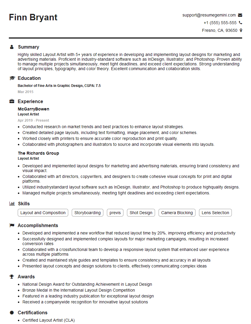
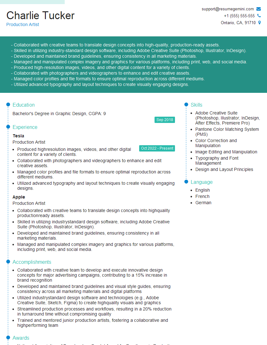
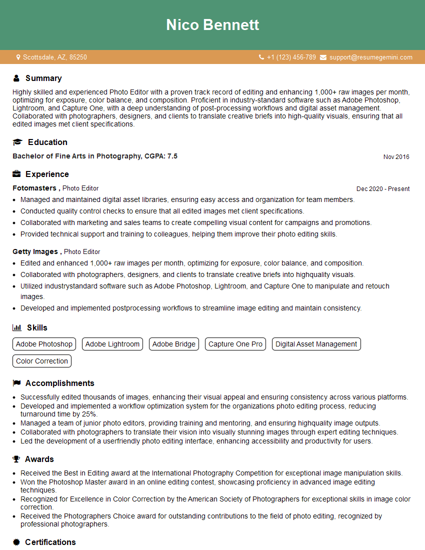
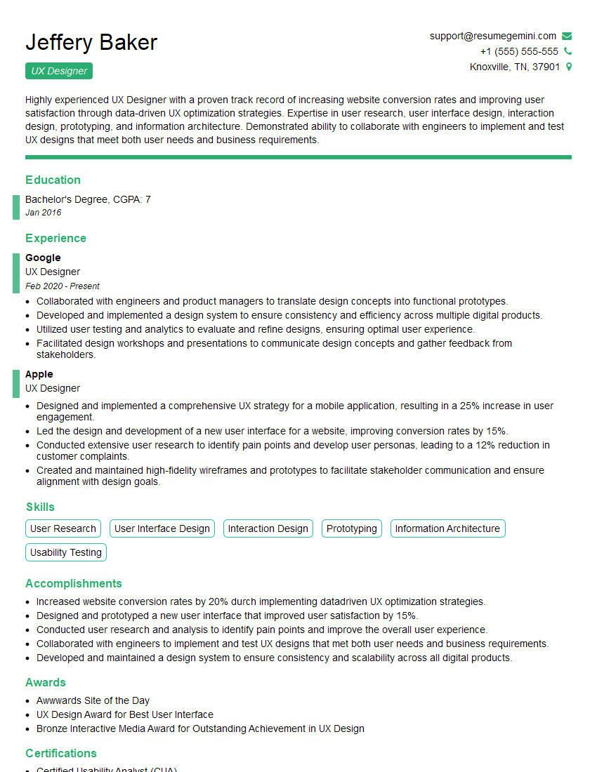
Mastering Photoshop and InDesign opens doors to exciting careers in graphic design, marketing, publishing, and more! A strong portfolio is essential, but a compelling resume is your first impression. Creating an ATS-friendly resume is crucial for getting your application noticed by recruiters. To significantly enhance your job prospects, consider leveraging ResumeGemini to build a professional and effective resume tailored to highlight your Photoshop and InDesign skills. Examples of resumes specifically designed for Photoshop and InDesign professionals are available to help you get started.
Explore more articles
Users Rating of Our Blogs
Share Your Experience
We value your feedback! Please rate our content and share your thoughts (optional).
What Readers Say About Our Blog
Hello,
We found issues with your domain’s email setup that may be sending your messages to spam or blocking them completely. InboxShield Mini shows you how to fix it in minutes — no tech skills required.
Scan your domain now for details: https://inboxshield-mini.com/
— Adam @ InboxShield Mini
Reply STOP to unsubscribe
Hi, are you owner of interviewgemini.com? What if I told you I could help you find extra time in your schedule, reconnect with leads you didn’t even realize you missed, and bring in more “I want to work with you” conversations, without increasing your ad spend or hiring a full-time employee?
All with a flexible, budget-friendly service that could easily pay for itself. Sounds good?
Would it be nice to jump on a quick 10-minute call so I can show you exactly how we make this work?
Best,
Hapei
Marketing Director
Hey, I know you’re the owner of interviewgemini.com. I’ll be quick.
Fundraising for your business is tough and time-consuming. We make it easier by guaranteeing two private investor meetings each month, for six months. No demos, no pitch events – just direct introductions to active investors matched to your startup.
If youR17;re raising, this could help you build real momentum. Want me to send more info?
Hi, I represent an SEO company that specialises in getting you AI citations and higher rankings on Google. I’d like to offer you a 100% free SEO audit for your website. Would you be interested?
Hi, I represent an SEO company that specialises in getting you AI citations and higher rankings on Google. I’d like to offer you a 100% free SEO audit for your website. Would you be interested?
good
