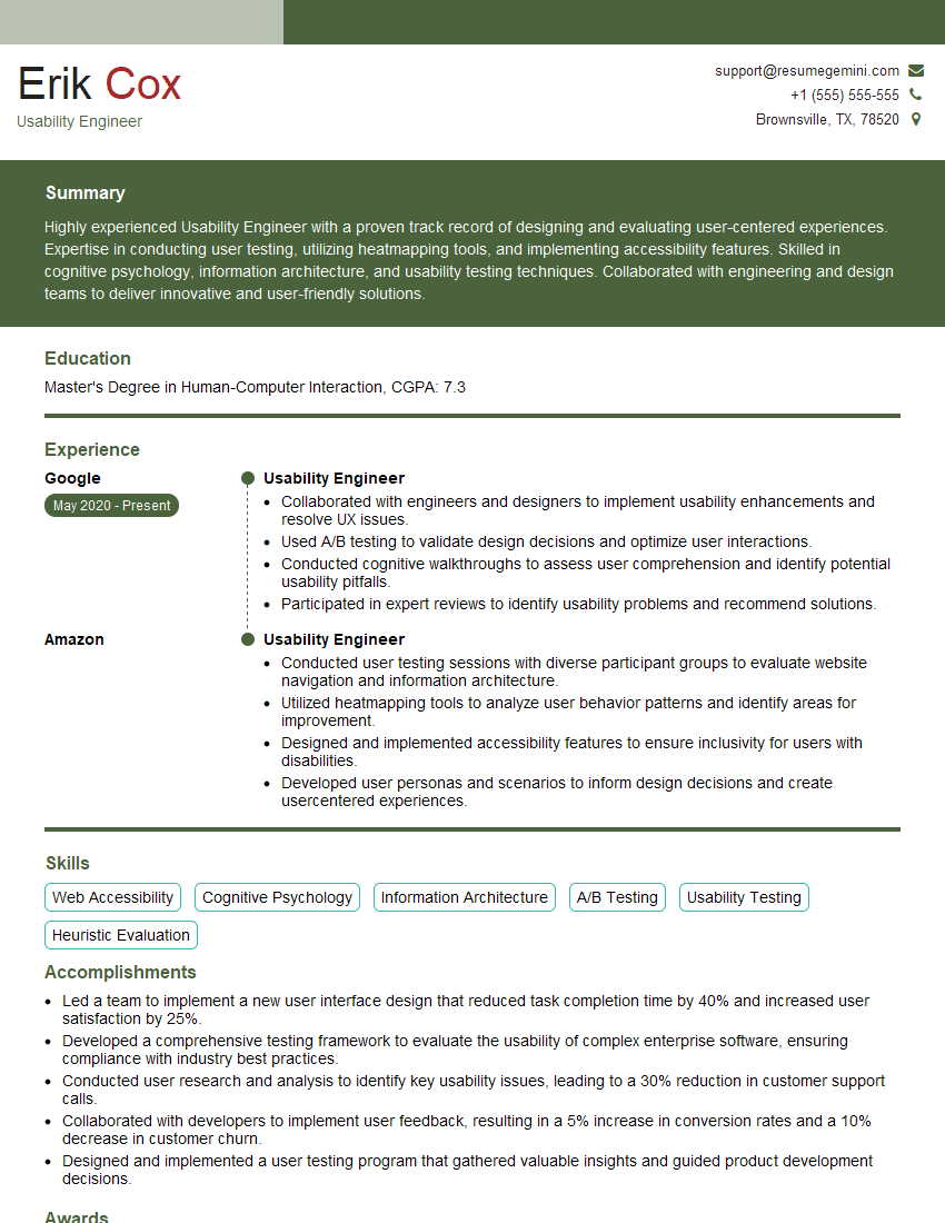
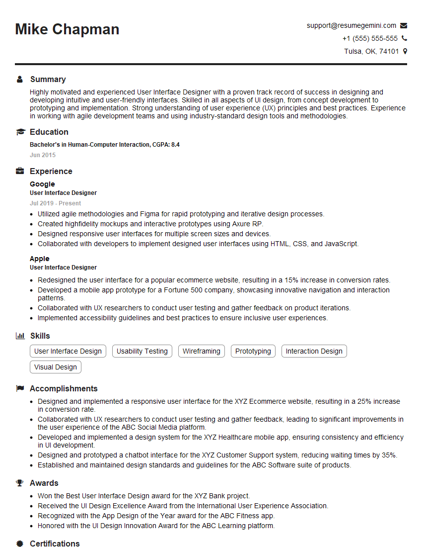
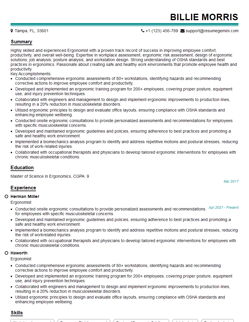
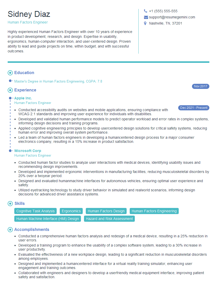
Unlock your full potential by mastering the most common User Interface (UI) Design and Ergonomics interview questions. This blog offers a deep dive into the critical topics, ensuring you’re not only prepared to answer but to excel. With these insights, you’ll approach your interview with clarity and confidence.
Questions Asked in User Interface (UI) Design and Ergonomics Interview
Q 1. Explain the difference between UI and UX design.
UI (User Interface) design focuses on the look and feel of a product, encompassing all visual elements and interactions a user encounters. Think of it as the skin of the product – the buttons, colors, fonts, images, and overall aesthetic. UX (User Experience) design, on the other hand, is a broader concept that encompasses the entire user journey. It considers the user’s overall satisfaction and ease of use, including aspects like usability, accessibility, and even the emotional response to the product. UI is a subset of UX.
Analogy: Imagine a car. The UI is the dashboard – the steering wheel, buttons, speedometer, etc. The UX is the entire driving experience – how easy it is to start the car, how comfortable the seats are, how intuitive the navigation system is, and the overall feeling of satisfaction after the drive. A beautiful dashboard (great UI) won’t necessarily mean a great driving experience (great UX) if the car is unreliable or difficult to handle.
Q 2. Describe your process for conducting user research.
My user research process is iterative and involves several key stages:
- Understanding the Project Goals: Before starting research, I need to clearly understand the project’s objectives and target audience. What problem are we trying to solve?
- Defining Research Questions: Based on the project goals, I formulate specific research questions to guide the process. For example, “How do users currently solve this problem?” or “What are their pain points with existing solutions?”
- Choosing Research Methods: I select appropriate methods based on the research questions and available resources. This could involve:
- User Interviews: One-on-one conversations to gain in-depth insights.
- Surveys: Gathering quantitative data from a larger audience.
- Usability Testing: Observing users interacting with prototypes to identify usability issues.
- A/B Testing: Comparing different design options to see which performs better.
- Card Sorting: Understanding how users categorize information.
- Data Analysis and Synthesis: Once the data is collected, I analyze it to identify patterns, trends, and insights. I use qualitative data analysis techniques like thematic analysis for interviews and quantitative methods like statistical analysis for surveys.
- Creating User Personas: Based on the research findings, I create user personas – representative profiles of the target users to guide design decisions.
- Iterative Design: The research process isn’t linear. Findings from each stage inform the next, leading to an iterative design process.
For example, in a recent project for an e-commerce website, we conducted user interviews to understand their shopping habits and pain points, followed by usability testing to identify navigation issues on the prototype. This iterative approach allowed us to refine the design based on real user feedback.
Q 3. How do you ensure accessibility in your UI designs?
Ensuring accessibility is paramount. My approach involves following WCAG (Web Content Accessibility Guidelines) and adhering to best practices. This encompasses several key areas:
- Alternative Text for Images: Providing descriptive alt text for all images so screen readers can convey the information to visually impaired users.

- Keyboard Navigation: Designing interfaces that are fully navigable using only a keyboard, essential for users with motor impairments.
- Sufficient Color Contrast: Ensuring enough contrast between text and background colors for readability, especially for users with low vision. Tools like WebAIM’s color contrast checker are invaluable.
- Captions and Transcripts: Providing captions for videos and transcripts for audio content to benefit hearing-impaired users.
- Semantic HTML: Using appropriate HTML elements to structure content logically, making it easier for assistive technologies to interpret.
- ARIA Attributes: Employing ARIA (Accessible Rich Internet Applications) attributes to enhance the accessibility of complex interactive elements.
- Testing with Assistive Technologies: Regularly testing the design with screen readers and other assistive technologies to identify and fix accessibility issues.
I also believe in consulting with accessibility experts throughout the design process to ensure a truly inclusive experience.
Q 4. What are some common usability heuristics?
Usability heuristics are general principles that guide the design of user-friendly interfaces. Nielsen’s 10 heuristics are widely recognized:
- Visibility of system status: The system should always keep users informed about what is going on, through appropriate feedback within reasonable time.
- Match between system and the real world: The system should speak the users’ language, with words, phrases and concepts familiar to the user, rather than system-oriented terms. Follow real-world conventions, making information appear in a natural and logical order.
- User control and freedom: Users often choose system functions by mistake and will need a clearly marked “emergency exit” to leave the unwanted state without having to go through an extended dialogue. Support undo and redo.
- Consistency and standards: Users should not have to wonder whether different words, situations, or actions mean the same thing. Follow platform conventions.
- Error prevention: Even better than good error messages is a careful design which prevents a problem from occurring in the first place. Either eliminate error-prone conditions or check for them and present users with a confirmation option before they commit to the action.
- Recognition rather than recall: Minimize the user’s memory load by making objects, actions, and options visible. The user should not have to remember information from one part of the dialogue to another. Instructions for use of the system should be visible or easily retrievable whenever appropriate.
- Flexibility and efficiency of use: Accelerators — unseen by the novice user — may often speed up the interaction for the expert user such that the system can cater to both inexperienced and experienced users. Allow users to tailor frequent actions.
- Aesthetic and minimalist design: Dialogues should not contain information which is irrelevant or rarely needed. Every extra unit of information in a dialogue competes with the relevant units of information and diminishes their relative visibility.
- Help users recognize, diagnose, and recover from errors: Error messages should be expressed in plain language (no codes), precisely indicate the problem, and constructively suggest a solution.
- Help and documentation: Even though it is better if the system can be used without documentation, it may be necessary to provide help and documentation. Any such information should be easy to search, focused on the user’s task, list concrete steps to be carried out, and not be too large.
Applying these heuristics ensures that the UI is intuitive, efficient, and error-tolerant.
Q 5. Explain the importance of wireframing and prototyping.
Wireframing and prototyping are crucial stages in the UI design process. They help bridge the gap between initial concepts and the final product.
- Wireframing: A low-fidelity representation of the interface, focusing on structure and functionality rather than visual details. It’s like a blueprint of the UI, outlining the placement of elements and the flow of information. Tools like Balsamiq or Figma are commonly used.
- Prototyping: A more advanced representation, offering a more interactive and realistic preview of the final product. Prototypes can simulate user interactions, allowing for early testing and feedback. Higher-fidelity prototypes may include visual design elements, while low-fidelity prototypes focus more on functionality. Tools like InVision, Adobe XD, or Figma are used to create interactive prototypes.
Importance:
- Early Feedback: Wireframes and prototypes allow for early testing and feedback, identifying usability issues before significant resources are invested in the final design.
- Improved Communication: They serve as a common language for designers, developers, and stakeholders, ensuring everyone is on the same page.
- Reduced Development Costs: Identifying and resolving issues early in the process reduces costly redesigns later on.
- Enhanced User Experience: By iteratively testing and refining the design based on user feedback, wireframing and prototyping lead to a more user-centered and ultimately more enjoyable user experience.
Q 6. How do you measure the success of a UI design?
Measuring the success of a UI design involves a combination of quantitative and qualitative metrics. It’s not just about aesthetics; it’s about whether the design achieves its intended goals.
- Quantitative Metrics: These provide measurable data:
- Task Completion Rate: The percentage of users who successfully complete a specific task.
- Error Rate: The number of errors users make while interacting with the interface.
- Time on Task: The amount of time users take to complete a task.
- Conversion Rate: In e-commerce, the percentage of users who complete a desired action (e.g., making a purchase).
- Bounce Rate: In web design, the percentage of users who leave the website after viewing only one page.
- Qualitative Metrics: These provide insights into user experience:
- User Feedback: Through surveys, interviews, or usability testing, gathering subjective opinions on the ease of use, satisfaction, and overall experience.
- Usability Testing Observations: Observing users’ interactions to identify areas of frustration or confusion.
- Heatmaps and Clickmaps: Visual representations of user interaction patterns to identify areas of high and low engagement.
A successful UI design balances both quantitative and qualitative data. For instance, a high task completion rate and positive user feedback indicate a well-designed and effective interface.
Q 7. Describe your experience with A/B testing.
A/B testing is a crucial method for evaluating and optimizing UI designs. It involves creating two versions (A and B) of a design element and presenting them to different groups of users. By tracking key metrics, we can determine which version performs better.
My Experience: I have extensive experience conducting A/B tests on various design elements, such as button styles, call-to-action placement, and navigation menus. For example, in a recent project for a SaaS platform, we tested two different versions of the signup form. Version A used a single-column layout, while Version B used a two-column layout. By tracking the conversion rate (percentage of users completing the signup process), we determined that Version B had a significantly higher conversion rate. This allowed us to make data-driven design decisions, improving the overall user experience and achieving business goals.
Process:
- Hypothesis Formulation: Start with a clear hypothesis about what changes might improve performance.
- Design Variations: Create distinct variations of the design element to test.
- Target Audience Segmentation: Divide users into different groups (A and B) to ensure a fair comparison.
- Data Collection: Collect data on key metrics (conversion rates, click-through rates, etc.).
- Statistical Analysis: Analyze the data using statistical methods to determine if the differences are statistically significant.
- Iteration: Based on the results, refine the design and repeat the process.
A/B testing is an iterative process. It’s not a one-time event, but a continuous effort to improve and optimize UI design based on user behavior.
Q 8. What are some common UI design patterns?
UI design patterns are reusable solutions to common design problems. They’re essentially pre-built templates or structures that streamline the design process and ensure consistency. Think of them as blueprints for effective user interfaces. Using established patterns helps designers create intuitive and predictable experiences, reducing the cognitive load on the user.
- Navigation Patterns: These include mega menus, breadcrumbs, sidebars, and tabs, all designed to help users navigate a website or application efficiently. For example, a breadcrumb trail (e.g., Home > Products > Clothing > Shirts) clearly shows a user’s location within a website’s hierarchy.
- Form Patterns: These patterns address how information is gathered from users, focusing on clarity and ease of completion. Examples include multi-step forms, progress indicators, and inline validation, which provide feedback to the user as they fill out the form.
- Layout Patterns: These dictate the arrangement of content on a page. Common examples include the sidebar layout (content with a side navigation menu), grid layout (content organized in a grid), and card layout (information presented in individual cards).
- Interaction Patterns: These patterns focus on user interactions with elements. Examples include modals (pop-up boxes), accordions (collapsible sections), and tooltips (small pop-up descriptions).
Choosing the right pattern depends on the context and user needs. A poorly implemented pattern can be as harmful as not using one at all.
Q 9. How do you handle design feedback and criticism?
Handling design feedback is crucial for creating effective UI. I approach it as a collaborative process, not a critique. I actively listen to feedback, separating constructive criticism from subjective opinions. My process involves:
- Active Listening: I take detailed notes, ask clarifying questions, and ensure I fully understand the perspective.
- Empathy: I try to understand the reasoning behind the feedback, even if I don’t initially agree. What problem are they trying to solve?
- Prioritization: Not all feedback is equal. I prioritize feedback based on its impact on usability and the overall user experience.
- Iteration & Testing: I incorporate feasible feedback, creating prototypes or mockups to test solutions. This allows for further refinement based on user testing results.
- Communication: I clearly communicate the changes implemented, and explain why certain suggestions were or weren’t adopted. Transparency is key.
For example, if feedback suggests a button is too small, I might test several button size variations using A/B testing to see which performs best in terms of click-through rates. Data guides my decisions.
Q 10. Explain your understanding of responsive design.
Responsive design ensures a website or application adapts seamlessly to different screen sizes and devices (desktops, tablets, smartphones). It prioritizes flexibility and optimal viewing experience across all platforms. The key is using flexible layouts and CSS media queries.
Instead of creating separate designs for each device, a responsive design uses techniques like:
- Fluid Grids: Using percentages instead of fixed pixel widths allows elements to resize proportionally based on the screen size.
- Flexible Images: Images scale proportionally to avoid distortion and maintain aspect ratio.
- Media Queries: CSS rules that apply different styles based on screen size, orientation, or other device characteristics (
@media (max-width: 768px) { ... }). This allows for specific styling adjustments for different breakpoints (screen size thresholds).
Responsive design enhances user experience by making websites accessible and usable on any device, leading to increased engagement and satisfaction. Imagine trying to navigate a website designed only for desktop on a small phone screen – it would be frustrating and unusable. Responsive design avoids this.
Q 11. How do you incorporate user feedback into the design process?
User feedback is the cornerstone of iterative design. My approach involves various methods to gather and analyze feedback throughout the design process:
- User Interviews: Direct conversations with users to understand their needs, pain points, and expectations.
- Usability Testing: Observing users interacting with prototypes to identify usability issues and areas for improvement.
- Surveys & Questionnaires: Collecting quantitative data to understand user preferences and satisfaction.
- A/B Testing: Comparing different design variations to see which performs better.
- Heatmaps & Analytics: Analyzing user behavior data to identify areas of focus and areas that need improvement.
I analyze the feedback, identify patterns and trends, and use this information to inform design decisions. For instance, if usability testing reveals that users struggle with a particular feature, I would redesign that feature based on the feedback.
Q 12. What are some key principles of visual design?
Visual design principles are the foundation of aesthetically pleasing and effective UI. They guide the arrangement and presentation of visual elements to enhance usability and communication.
- Hierarchy: Establishing a clear visual hierarchy through size, color, contrast, and typography guides the user’s eye and highlights important information. The most important elements should stand out.
- Balance: Creating a sense of equilibrium in the design, avoiding an overly cluttered or uneven feel. Symmetrical or asymmetrical balance can be used, depending on the desired aesthetic.
- Contrast: Using sufficient contrast between elements makes the design easily readable and visually appealing. This improves accessibility as well.
- Unity/Consistency: Maintaining consistent use of fonts, colors, spacing, and other design elements creates a cohesive and professional look and feel.
- Color Theory: Understanding color psychology and how colors evoke emotions is important. Color choices should align with the brand and user experience goals.
- Whitespace (Negative Space): Strategic use of empty space improves readability and reduces visual clutter. It allows the eye to rest and prevents information overload.
Imagine a website with clashing colors, illegible fonts, and crowded content – it would be unpleasant and difficult to navigate. Visual design principles prevent such scenarios.
Q 13. Describe your experience with design systems.
Design systems are a collection of reusable components, guidelines, and documentation that create a consistent design language across multiple products or platforms. They’re crucial for maintaining brand consistency, improving efficiency, and scaling design efforts. My experience involves:
- Component Libraries: Developing and maintaining libraries of reusable UI components (buttons, forms, etc.) to ensure consistency and reduce design redundancy.
- Style Guides: Creating comprehensive style guides that define typography, color palettes, spacing, and other visual elements.
- Pattern Libraries: Documenting common UI patterns and their usage guidelines for consistent application across projects.
- Collaboration: Working with developers and other designers to integrate the design system into the development workflow.
A well-defined design system streamlines the design and development process, improves collaboration, and ensures a unified user experience across all products. It’s like having a style manual for your digital products, ensuring consistent quality and brand identity.
Q 14. How do you prioritize features in a design sprint?
Prioritizing features during a design sprint requires a structured approach. The MoSCoW method is frequently used:
- Must have: Essential features without which the product would be unusable or significantly impaired.
- Should have: Important features that enhance the core functionality but aren’t critical for basic usability.
- Could have: Desirable features that could be included if time allows but are not essential.
- Won’t have: Features that are deferred for future releases due to constraints.
Other approaches involve user story mapping or using a prioritization matrix based on factors such as user value and development effort. I usually involve the team in the prioritization process to foster shared understanding and commitment. A clear prioritization scheme ensures that the most valuable features are developed first, maximizing impact within the time constraints of a sprint.
Q 15. What are some common ergonomic considerations for UI design?
Ergonomic UI design prioritizes user comfort and prevents strain during interaction. It’s about creating interfaces that are naturally intuitive and minimize physical discomfort. Key considerations include:
- Visual Clarity: Using sufficient contrast between text and background, avoiding cluttered layouts, and employing clear visual hierarchies to guide the user’s eye. For example, using a larger font size for headings and a clear call to action button.
- Accessibility: Designing for users with disabilities, including those with visual impairments (providing sufficient color contrast and alt text for images), motor impairments (allowing for keyboard navigation and sufficient target sizes for interactive elements), and cognitive impairments (using simple language and clear instructions).
- Layout and Navigation: Organizing content logically, using consistent navigation patterns (e.g., placing menus in predictable locations), and minimizing the need for excessive scrolling or clicking. Think of the familiar hamburger menu—it’s effective for minimizing screen clutter but can sometimes hide important information.
- Input Methods: Considering the ease of use of different input methods like touchscreens, mice, and keyboards. This involves appropriate target sizes for touch interactions and clear feedback mechanisms to confirm user actions.
- Posture and Physical Comfort: Designing interfaces that encourage good posture and minimize the need for awkward hand or body positions. This is particularly relevant for larger screens or interfaces that require prolonged use.
For instance, a poorly designed e-commerce website with tiny buttons and low contrast text could lead to user frustration and even eye strain. Conversely, a well-designed interface prioritizes clear navigation, large, easily clickable buttons, and sufficient contrast, making the shopping experience smooth and enjoyable.
Career Expert Tips:
- Ace those interviews! Prepare effectively by reviewing the Top 50 Most Common Interview Questions on ResumeGemini.
- Navigate your job search with confidence! Explore a wide range of Career Tips on ResumeGemini. Learn about common challenges and recommendations to overcome them.
- Craft the perfect resume! Master the Art of Resume Writing with ResumeGemini’s guide. Showcase your unique qualifications and achievements effectively.
- Don’t miss out on holiday savings! Build your dream resume with ResumeGemini’s ATS optimized templates.
Q 16. Explain the importance of color theory in UI design.
Color theory is crucial for creating visually appealing and effective UIs. It impacts not only aesthetics but also usability, guiding the user’s attention and conveying meaning.
- Color Psychology: Different colors evoke different emotions and associations. For example, blue often suggests calmness and trustworthiness, while red can represent urgency or excitement. Understanding this allows designers to use color strategically to achieve specific goals.
- Color Contrast: Sufficient contrast between text and background is essential for readability, particularly for users with visual impairments. Tools like WebAIM’s color contrast checker can help ensure accessibility guidelines are met.
- Color Schemes and Palettes: Using a consistent color palette creates a unified and professional look. Popular approaches include monochromatic schemes (variations of a single color), complementary schemes (colors opposite each other on the color wheel), and analogous schemes (colors adjacent on the color wheel).
- Color Hierarchy: Using color to highlight important elements and guide the user’s attention. For example, using a brighter color for call-to-action buttons or using color-coding to categorize information.
Imagine a website using jarring color combinations—it would be visually unappealing and difficult to navigate. Conversely, a site with a well-chosen color palette and effective color hierarchy guides users effortlessly through the information, creating a positive experience.
Q 17. How do you create a consistent user experience across multiple platforms?
Maintaining consistency across platforms (web, mobile, desktop) requires a well-defined design system. This involves:
- Component-Based Design: Breaking down the UI into reusable components (buttons, navigation bars, forms) with consistent styles and behaviors. This ensures a unified look and feel across platforms.
- Style Guides and Design Systems: Creating comprehensive documentation that outlines the visual styles, typography, and interaction patterns for all components. Tools like Figma and Sketch allow for efficient creation and maintenance of these systems.
- Responsive Design: Designing interfaces that adapt to different screen sizes and orientations. This typically involves using flexible layouts and media queries in CSS.
- Platform-Specific Considerations: Adapting the design to match the specific conventions and user expectations of each platform. For example, iOS and Android have different design guidelines for navigation and UI elements.
Think of a successful brand like Spotify. Its UI across its desktop, mobile, and web applications maintains a consistent look and feel, with recognizable elements and navigation patterns, even while adapting to the specific constraints and capabilities of each platform.
Q 18. Describe your experience with different prototyping tools.
I’m proficient in several prototyping tools, each with its own strengths and weaknesses. My experience includes:
- Figma: A powerful collaborative tool for UI design and prototyping, excellent for creating high-fidelity prototypes and design systems. I particularly appreciate its real-time collaboration features and extensive plugin ecosystem.
- Adobe XD: Another strong contender for UI prototyping, known for its intuitive interface and strong integration with other Adobe Creative Suite applications. I’ve used it to create interactive prototypes with animations and micro-interactions.
- Sketch: Primarily a vector-based design tool, but also capable of prototyping. It’s widely used for app design and offers a robust set of features for creating clean and polished designs.
- InVision: More focused on prototyping and collaboration, InVision excels at creating interactive prototypes and conducting user testing. I’ve used it to gather user feedback and iterate on design solutions.
My choice of tool depends on the project’s specific requirements and the level of fidelity needed in the prototype. For instance, for quick iterative design, I might use Figma’s prototyping capabilities, whereas for high-fidelity prototypes with complex interactions, I might choose Adobe XD or InVision.
Q 19. How do you ensure your designs are visually appealing and user-friendly?
Balancing visual appeal and user-friendliness is a core principle of my design process. This involves:
- User-Centered Design: Prioritizing user needs and feedback throughout the design process. This includes conducting user research, creating user personas, and testing prototypes with real users.
- Visual Hierarchy: Guiding the user’s eye to the most important information using visual cues like size, color, and contrast. This ensures that key elements stand out and are easily noticed.
- White Space (Negative Space): Using whitespace effectively to create visual breathing room and prevent clutter. This improves readability and makes the interface feel less overwhelming.
- Typography: Choosing appropriate fonts and font sizes to ensure readability and create a consistent visual style. A well-chosen typeface can greatly enhance the aesthetic appeal of the interface.
- Accessibility Guidelines: Adhering to accessibility guidelines (like WCAG) to ensure the design is usable by people with disabilities.
For example, I recently redesigned a website for a non-profit. By using a clean layout, high-contrast colors, and clear calls to action, I managed to significantly improve the usability and make it more accessible for all users while maintaining a visually appealing and professional look.
Q 20. Explain your approach to designing for different user demographics.
Designing for diverse demographics requires considering various factors like age, cultural background, technical proficiency, and accessibility needs. My approach involves:
- User Research: Conducting thorough user research to understand the needs and preferences of different user groups. This could involve surveys, interviews, and usability testing.
- Persona Development: Creating detailed user personas that represent different demographic groups. This helps to focus design decisions and ensure that the design meets the needs of each group.
- Localization and Internationalization: Adapting the design for different languages and cultures. This involves translating text and adapting visual elements to resonate with different cultural contexts.
- Accessibility Considerations: Designing interfaces that are accessible to users with disabilities, including those with visual, auditory, motor, or cognitive impairments.
- Iterative Testing: Testing the design with users from different demographics to identify potential usability issues and refine the design accordingly.
For instance, when designing a financial app, I would consider the different needs of younger users (who might prefer a more modern and interactive interface) and older users (who might need larger fonts and simpler navigation). By considering these differences in the design process, I can create a more inclusive and user-friendly experience for everyone.
Q 21. Describe your experience with Agile development methodologies.
I have extensive experience working within Agile development methodologies, specifically Scrum. I understand and embrace the iterative nature of Agile, focusing on:
- Sprint Planning: Participating actively in sprint planning sessions to define tasks and deliverables for each sprint.
- Daily Scrum Meetings: Attending daily stand-up meetings to track progress and identify and resolve roadblocks.
- Sprint Reviews: Presenting design work and gathering feedback from stakeholders during sprint reviews.
- Sprint Retrospectives: Participating in retrospectives to identify areas for improvement in the design process and team collaboration.
- User Story Mapping: Collaborating with developers and product owners to create user story maps that visualize the user journey and prioritize features.
My experience working in Agile environments has honed my ability to adapt to changing requirements, collaborate effectively with developers, and deliver high-quality designs within short iterations. This iterative approach allows for continuous improvement and user feedback incorporation, resulting in more effective and user-friendly products.
Q 22. How do you handle conflicting design requirements?
Conflicting design requirements are a common challenge. My approach involves a structured process to prioritize and reconcile these differences. First, I meticulously document all requirements, identifying stakeholders and their priorities. Then, I facilitate a collaborative discussion, using tools like a priority matrix, to understand the underlying needs and potential trade-offs. For example, if a client wants both a visually stunning design and incredibly fast loading times, we might need to compromise on certain visual elements to prioritize performance, or explore alternative technologies to achieve both. The key is open communication and a data-driven approach, using usability testing and analytics to inform our decisions and ensure we’re meeting the most critical user needs.
Ultimately, the goal is to find a solution that satisfies the most important requirements while minimizing compromises. This might involve iterative design, where we test different options and gather feedback before making final decisions. The process is not about simply choosing one requirement over another, but about finding a synergistic solution that balances various needs.
Q 23. What are some common metrics used to evaluate UI design effectiveness?
Evaluating UI design effectiveness requires a multi-faceted approach, combining quantitative and qualitative metrics. Key quantitative metrics include:
- Task completion rate: What percentage of users successfully completed their intended tasks?
- Error rate: How often did users make mistakes while interacting with the interface?
- Time on task: How long did it take users to complete tasks? Shorter times generally indicate better usability.
- Conversion rate: (Relevant for e-commerce or lead generation) How many users completed the desired action (e.g., purchase, sign-up)?
- Bounce rate: (Relevant for websites) What percentage of users left the site after viewing only one page?
Qualitative metrics are equally important and provide context to the quantitative data. These often involve:
- User feedback: Surveys, interviews, and usability testing sessions provide valuable insights into user experience.
- Heatmaps and clickstream analysis: Visualizations that show where users are clicking and how they are navigating the interface. This reveals areas of confusion or underutilization.
- Qualitative surveys: Open-ended questions allow users to express their thoughts and feelings about the design.
By combining both quantitative and qualitative data, we gain a comprehensive understanding of the UI’s effectiveness and areas for improvement.
Q 24. How do you stay up-to-date with the latest UI/UX trends?
Staying current in the rapidly evolving world of UI/UX requires a proactive and multi-pronged strategy. I regularly:
- Follow leading industry blogs and publications: Websites and publications dedicated to design, technology, and usability are invaluable resources for staying informed about trends and best practices.
- Attend conferences and workshops: These events provide opportunities to network with other professionals, learn from experts, and see the latest advancements in action.
- Engage with online communities: Participating in forums and online groups allows for continuous learning and the exchange of ideas with other designers.
- Experiment with new tools and technologies: Keeping abreast of the latest design software and tools can improve workflow and enhance design capabilities.
- Analyze successful designs: Studying successful interfaces and identifying their design principles provides valuable insights.
This combination of passive learning (reading articles) and active engagement (attending conferences, experimenting with tools) keeps my skills sharp and ensures I can leverage the best practices in my designs.
Q 25. Describe a time you had to iterate on a design due to user feedback.
During a recent project for a healthcare app, initial user testing revealed significant difficulty in navigating the medication scheduling feature. Users found the interface cluttered and the process confusing. The initial design used a complex calendar system with overlapping visual elements.
Based on this feedback, we iterated on the design, simplifying the calendar view and incorporating clear visual cues. We replaced the overlapping elements with a more streamlined, step-by-step process. We also conducted A/B testing with different versions of the redesigned feature, comparing task completion rates and error rates. This iterative process, guided by user feedback and data analysis, ultimately led to a significant improvement in user satisfaction and task completion rates. The final design was significantly more intuitive and easier to use, resulting in a much more positive user experience.
Q 26. What is your experience with data visualization in UI design?
I have extensive experience with data visualization in UI design. My approach centers on clarity, accuracy, and accessibility. I understand that effective data visualization isn’t just about creating aesthetically pleasing charts; it’s about communicating complex information in a way that’s easily understood and actionable by the user. I’m proficient in selecting appropriate chart types depending on the data and the intended message (e.g., bar charts for comparisons, line charts for trends, scatter plots for correlations). I pay close attention to details such as axis labeling, legends, and color palettes to ensure readability and avoid misinterpretations. For example, when visualizing financial data, I ensure that the scale is appropriate and that the visual representation avoids creating a misleading impression. Accessibility is a key consideration, ensuring that visualizations are usable for people with disabilities, such as color blindness. I use techniques such as sufficient color contrast and clear alternative text for images.
Q 27. Explain your understanding of cognitive load and how it impacts UI design.
Cognitive load refers to the amount of mental effort required to perform a task. In UI design, minimizing cognitive load is crucial for creating user-friendly interfaces. High cognitive load can lead to frustration, errors, and a negative user experience. Factors that contribute to high cognitive load include:
- Information overload: Presenting too much information at once.
- Complex navigation: A confusing or unintuitive site structure.
- Poor visual hierarchy: Failing to prioritize important information.
- Inconsistent design patterns: Using different design elements inconsistently throughout the interface.
To minimize cognitive load, designers should prioritize clarity, simplicity, and consistency. This includes using clear visual cues, simplifying navigation, and organizing information in a logical and intuitive way. For instance, using clear headings, concise labels, and grouping related information together can significantly reduce cognitive load. Employing visual cues such as color-coding or icons can also aid in quick understanding and improve overall usability. A well-designed interface guides the user effortlessly, requiring minimal mental effort to navigate and achieve their goals.
Q 28. How do you balance aesthetics and functionality in your designs?
Balancing aesthetics and functionality is paramount in UI design. They are not mutually exclusive; instead, they should work synergistically to create a positive user experience. A beautiful design that is difficult to use is ultimately ineffective. Similarly, a highly functional design that is visually unappealing might discourage users.
My approach involves prioritizing functionality first. I start by understanding the user’s needs and the tasks they will be performing. Once the core functionality is defined, I then focus on the visual design. This involves selecting a color palette, typography, and imagery that are both aesthetically pleasing and appropriate for the brand and target audience. I use design principles such as visual hierarchy, proximity, and alignment to ensure that the design is both beautiful and easy to navigate. For example, I might use whitespace strategically to create visual breathing room and improve readability. I frequently conduct usability testing to ensure that the design is both beautiful and effective. This iterative approach allows me to refine the design, making adjustments to ensure both functionality and aesthetics work together seamlessly.
Key Topics to Learn for User Interface (UI) Design and Ergonomics Interview
- User-Centered Design Principles: Understanding and applying principles like usability, accessibility, and user experience (UX) to design intuitive and inclusive interfaces.
- Information Architecture: Organizing and structuring information effectively to ensure easy navigation and findability within a digital product. Practical application: Designing a website’s navigation menu or creating a logical file structure for a software application.
- Interaction Design: Designing the way users interact with a product, considering elements like controls, feedback mechanisms, and overall flow. Practical application: Designing intuitive form fields or creating a clear and engaging onboarding process.
- Visual Design & Aesthetics: Applying design principles like typography, color theory, and layout to create visually appealing and consistent interfaces. Practical application: Creating a mood board or style guide for a project.
- Accessibility Standards (WCAG): Understanding and implementing accessibility guidelines to ensure usability for people with disabilities. Practical application: Designing interfaces that are screen reader compatible or provide alternative text for images.
- Usability Testing & Evaluation: Methods for assessing the usability of a design, gathering user feedback, and iterating on designs based on findings. Practical application: Conducting user interviews or A/B testing different design options.
- Ergonomics in UI Design: Considering the physical comfort and well-being of users while interacting with digital interfaces, focusing on factors like screen size, posture, and input methods. Practical application: Designing a mobile app that minimizes eye strain or a website layout that reduces scrolling.
- Prototyping and Wireframing: Creating low-fidelity and high-fidelity prototypes to test and refine designs before development. Practical application: Building interactive wireframes to test navigation or using prototyping tools to simulate user interactions.
- Design Systems and Component Libraries: Understanding and implementing design systems to ensure consistency and efficiency across multiple projects. Practical application: Contributing to or maintaining a design system for a company’s digital products.
Next Steps
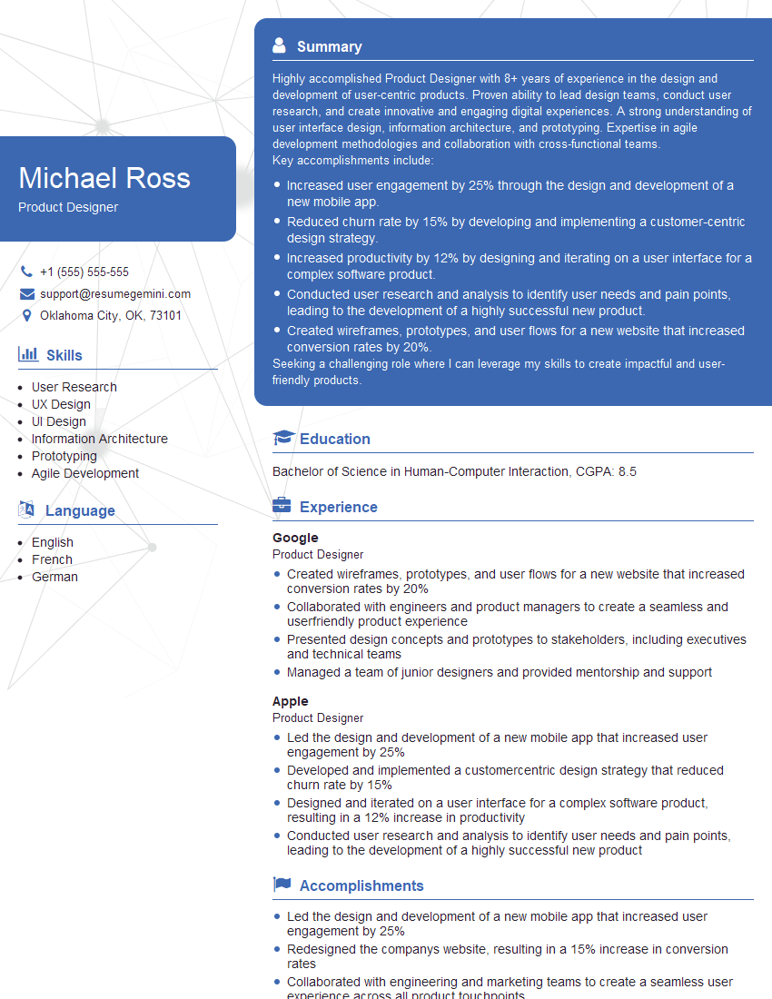
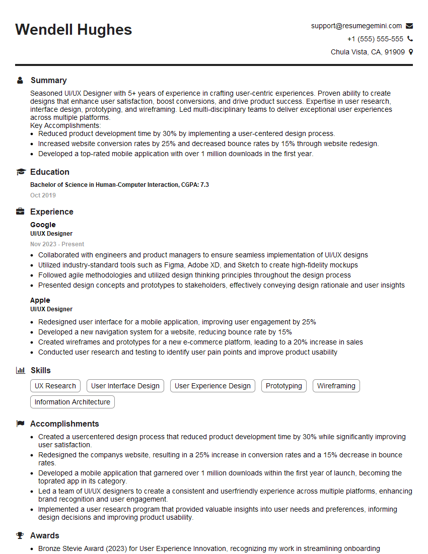
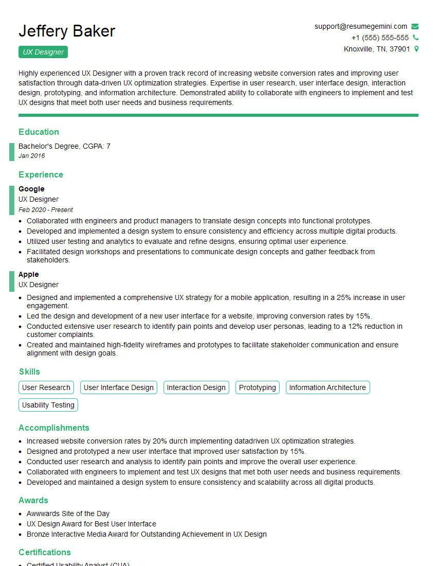
Mastering User Interface (UI) Design and Ergonomics is crucial for career advancement in today’s technology-driven world. A strong understanding of these principles will set you apart and open doors to exciting opportunities. To maximize your job prospects, crafting an ATS-friendly resume is essential. ResumeGemini is a trusted resource that can help you build a professional and impactful resume. ResumeGemini offers examples of resumes tailored to User Interface (UI) Design and Ergonomics, providing you with the perfect starting point for showcasing your skills and experience.
Explore more articles
Users Rating of Our Blogs
Share Your Experience
We value your feedback! Please rate our content and share your thoughts (optional).
What Readers Say About Our Blog
Hello,
We found issues with your domain’s email setup that may be sending your messages to spam or blocking them completely. InboxShield Mini shows you how to fix it in minutes — no tech skills required.
Scan your domain now for details: https://inboxshield-mini.com/
— Adam @ InboxShield Mini
Reply STOP to unsubscribe
Hi, are you owner of interviewgemini.com? What if I told you I could help you find extra time in your schedule, reconnect with leads you didn’t even realize you missed, and bring in more “I want to work with you” conversations, without increasing your ad spend or hiring a full-time employee?
All with a flexible, budget-friendly service that could easily pay for itself. Sounds good?
Would it be nice to jump on a quick 10-minute call so I can show you exactly how we make this work?
Best,
Hapei
Marketing Director
Hey, I know you’re the owner of interviewgemini.com. I’ll be quick.
Fundraising for your business is tough and time-consuming. We make it easier by guaranteeing two private investor meetings each month, for six months. No demos, no pitch events – just direct introductions to active investors matched to your startup.
If youR17;re raising, this could help you build real momentum. Want me to send more info?
Hi, I represent an SEO company that specialises in getting you AI citations and higher rankings on Google. I’d like to offer you a 100% free SEO audit for your website. Would you be interested?
Hi, I represent an SEO company that specialises in getting you AI citations and higher rankings on Google. I’d like to offer you a 100% free SEO audit for your website. Would you be interested?
good
