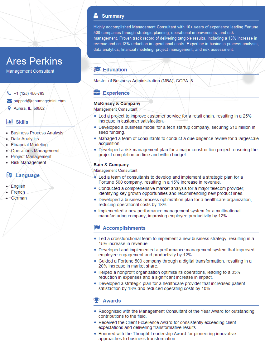
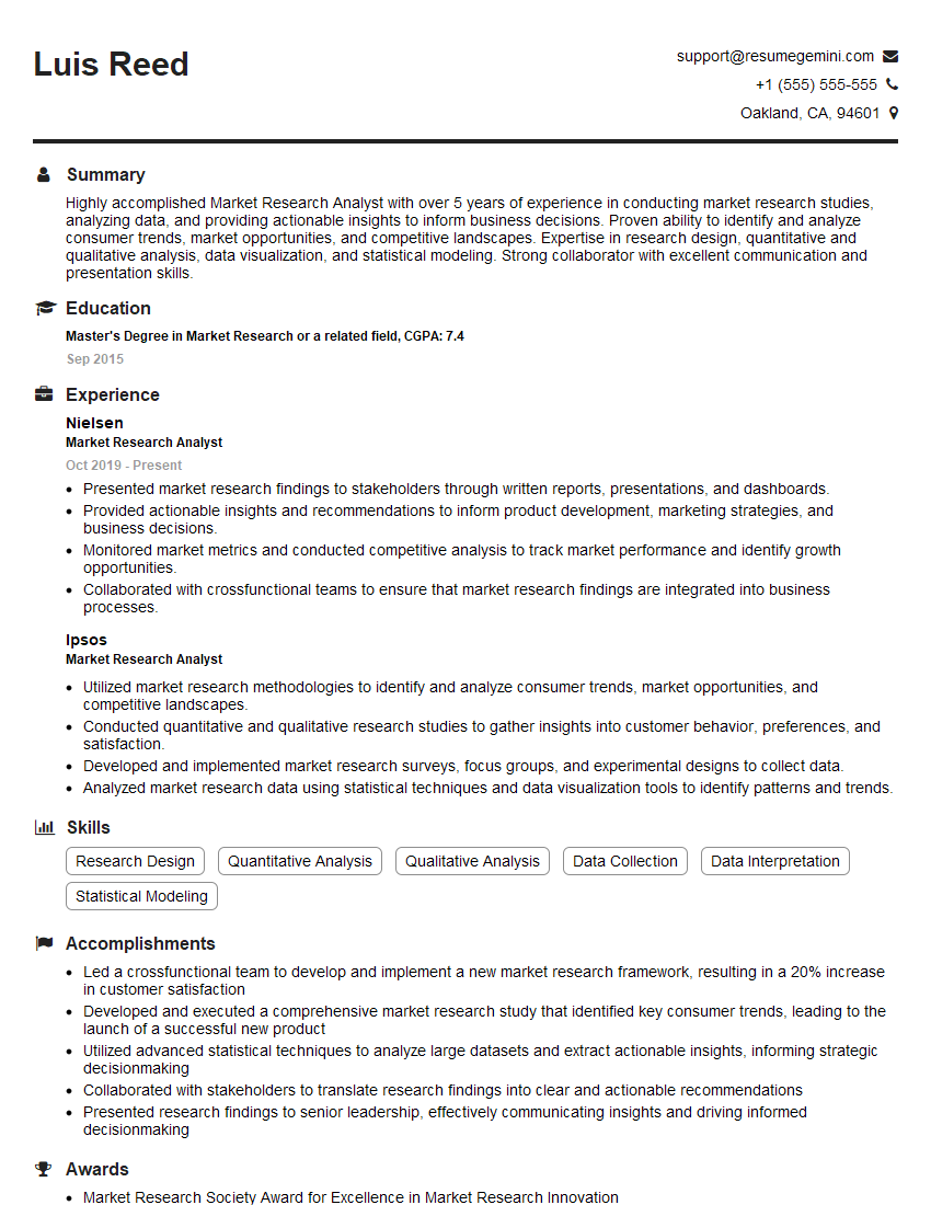
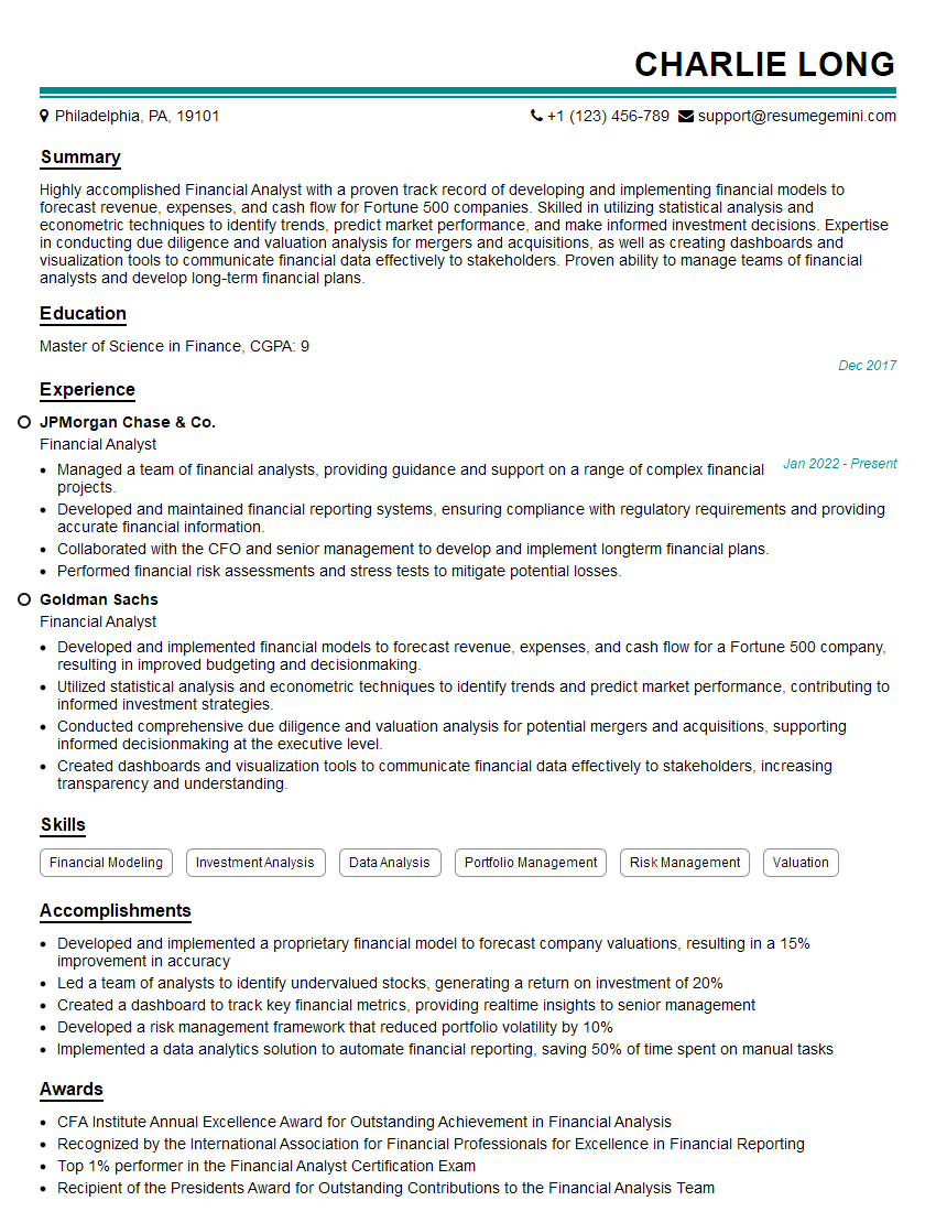
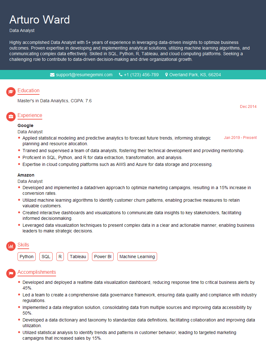
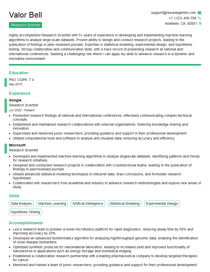
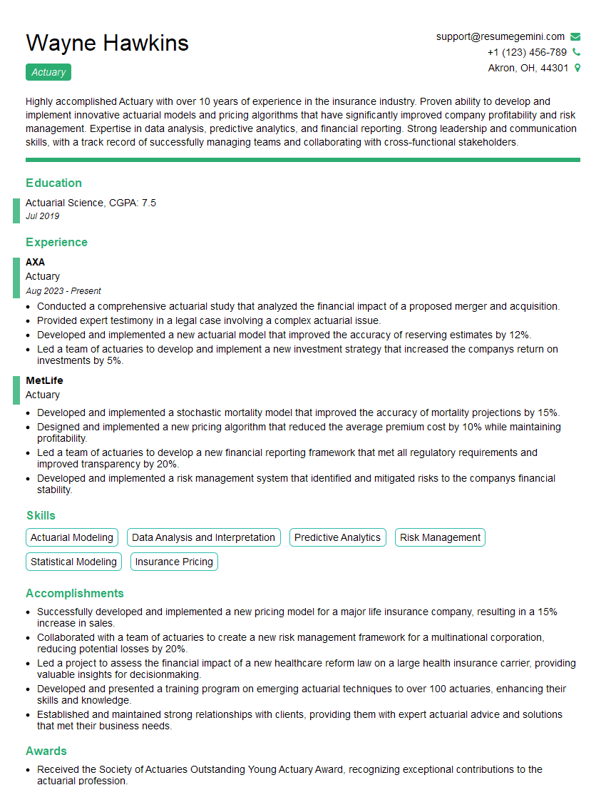
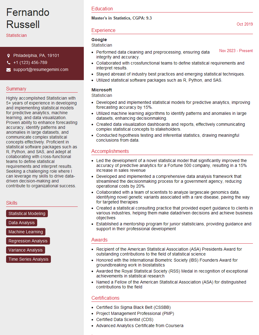
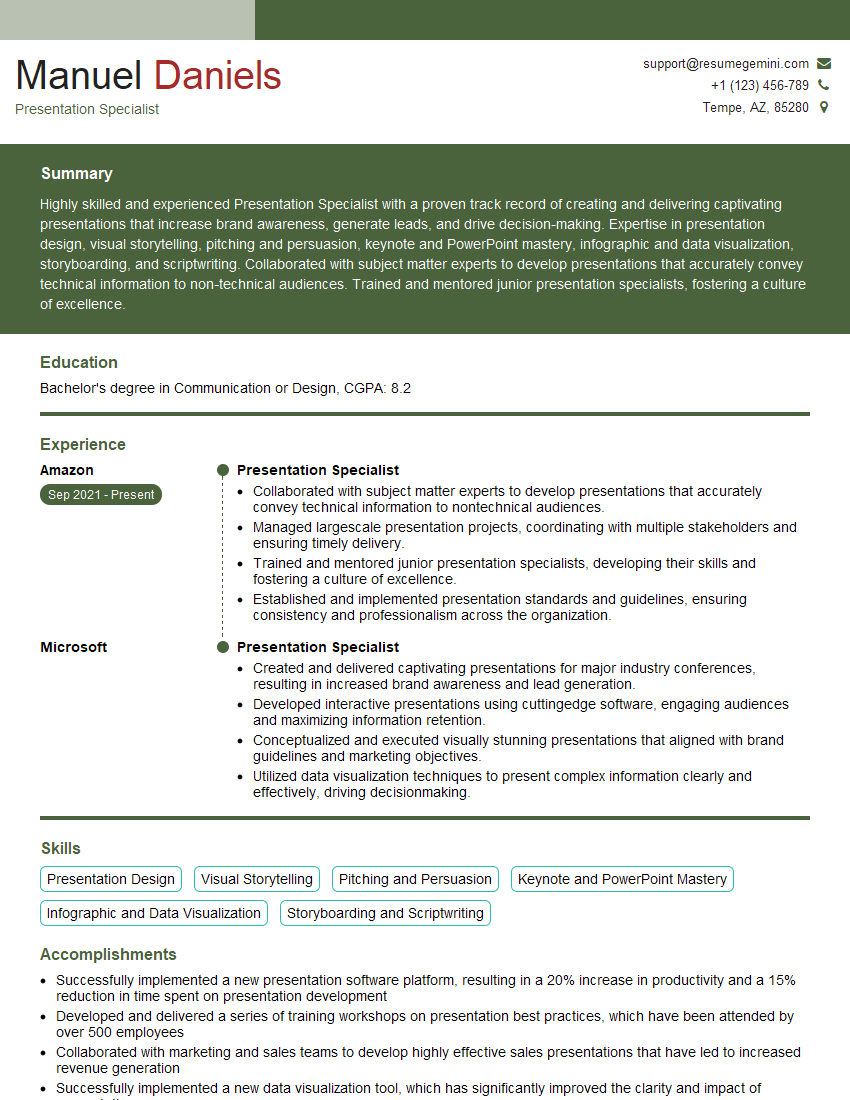
Every successful interview starts with knowing what to expect. In this blog, we’ll take you through the top Experience with report writing and presentation interview questions, breaking them down with expert tips to help you deliver impactful answers. Step into your next interview fully prepared and ready to succeed.
Questions Asked in Experience with report writing and presentation Interview
Q 1. Describe your experience creating compelling data visualizations.
Creating compelling data visualizations is about more than just charts and graphs; it’s about effectively communicating insights. My approach focuses on understanding the story the data tells and selecting the visualization type that best accentuates that narrative. I avoid overwhelming the audience with too much information by prioritizing clarity and simplicity. For example, if I’m presenting sales figures across different regions, a simple bar chart might suffice. But if I’m showing trends over time, a line chart would be more appropriate. I also consider using interactive elements, such as tooltips or drill-downs, to allow the audience to explore the data at their own pace. In one project, I used a heatmap to highlight the correlation between customer demographics and product preferences, which revealed previously unseen patterns that directly informed marketing strategies. Another example was using a treemap to effectively represent a company’s hierarchical organizational structure and its budget allocation to each department. The key is to choose the right visualization for the data and the audience, ensuring it’s easily understood and impactful.
Q 2. What software are you proficient in for report writing and presentations?
My proficiency spans a range of software for report writing and presentations. I’m highly skilled in Microsoft Excel and Power BI for data manipulation, analysis, and creating interactive dashboards. For report writing, I utilize Microsoft Word and LaTeX for generating professional-looking documents, and I’m proficient in using Google Docs and Slides for collaborative work. For creating compelling presentations, I leverage Microsoft PowerPoint and Google Slides, incorporating animation and transitions strategically to maintain audience engagement. I’m also familiar with data visualization tools like Tableau, which allows for the creation of sophisticated and visually appealing dashboards. Finally, I’m comfortable working with R and Python for advanced data analysis and creating custom visualizations. This diverse skillset allows me to adapt to different project requirements and client preferences.
Q 3. How do you tailor a report to a specific audience?
Tailoring a report to a specific audience is crucial for effective communication. It involves understanding their level of technical expertise, their interests, and what they need to know. For example, a technical report for a data science team will include far more detailed analysis and technical jargon than a summary report for senior management. The latter focuses on high-level findings and implications, while the former delves into the statistical methods and underlying assumptions. I also adapt the visual presentation, using different chart types and complexity levels depending on the audience’s technical understanding. I always ensure the language is clear, concise, and free of jargon where possible. Furthermore, I structure the report to highlight the most relevant information for each audience. For instance, a marketing team might primarily be interested in customer acquisition costs and campaign ROI, while the finance team is more concerned with revenue projections and financial performance indicators.
Q 4. Explain your process for structuring a complex report.
Structuring a complex report involves a methodical approach. I typically start with a clear outline, defining the report’s objectives and scope. This usually involves a detailed executive summary outlining the key findings upfront. Then, I break down the report into logical sections and subsections, each focusing on a specific aspect of the analysis. This might involve a methodology section explaining the data collection and analytical techniques used, a results section presenting the findings, and a discussion section interpreting the findings and drawing conclusions. I also incorporate clear headings, subheadings, and visuals to enhance readability and guide the reader through the report. Think of it as building a house—you need a strong foundation (executive summary), well-defined rooms (sections), and clear pathways (headings and visuals) to connect them logically. Finally, I ensure a strong conclusion summarizing the main points and recommendations.
Q 5. How do you ensure data accuracy and integrity in your reports?
Data accuracy and integrity are paramount. My process begins with meticulous data validation and cleaning. I scrutinize the data for inconsistencies, outliers, and errors using various techniques. For instance, I might use data profiling tools to identify missing values, inconsistent data types, or unusual patterns. I also document the data sources and cleaning procedures meticulously to ensure transparency and traceability. Throughout the analysis, I perform regular checks to verify calculations and ensure the results are consistent with the data. Where appropriate, I use statistical methods to quantify uncertainty and identify potential biases. Finally, I always review my findings with a critical eye and cross-reference them with other data sources whenever possible. This multi-layered approach helps ensure that the data presented is reliable and accurate, forming the basis for sound conclusions and recommendations.
Q 6. Describe a time you had to overcome a challenge in creating a presentation.
In one project, I was tasked with presenting complex financial data to a non-technical audience. My initial presentation, packed with dense charts and jargon, was met with confusion. The challenge was to simplify the information without sacrificing its integrity. To overcome this, I completely restructured the presentation. I replaced complex charts with simpler visuals like bar charts and focused on explaining the key takeaways in plain English. I also incorporated relevant analogies and real-world examples to make the data more relatable. I incorporated storytelling techniques into the narrative, guiding the audience through a clear journey from the problem to the solution. The result was a vastly improved presentation that was well-received and understood by the audience. The key takeaway was the importance of understanding your audience and adapting your communication style accordingly. Sometimes, less is more.
Q 7. How do you handle feedback on your reports and presentations?
I view feedback as an invaluable opportunity for improvement. I actively solicit feedback on my reports and presentations and treat it as a collaborative process. I listen carefully to all feedback, asking clarifying questions when needed. I then analyze the feedback to identify areas for improvement, considering both the constructive criticism and the praise. Based on this analysis, I revise my work, incorporating improvements to the content, structure, visuals, and overall clarity. I believe that the iterative process of feedback and revision is essential for refining a report or presentation to its full potential. I appreciate the opportunity to learn and grow from each feedback session, constantly striving to enhance the quality and impact of my work.
Q 8. What metrics do you use to measure the success of a report or presentation?
Measuring the success of a report or presentation goes beyond simply completing the task. It involves assessing its impact and effectiveness in achieving its intended goals. I use a multi-faceted approach, considering both quantitative and qualitative metrics.
- Quantitative Metrics: These involve measurable data points. For instance, if the report aims to increase sales, I’d track sales figures before and after the report’s distribution. For a presentation, I might measure audience engagement through post-presentation surveys gauging comprehension and satisfaction (using a Likert scale, for example). Other quantitative metrics include the number of downloads for a report, the number of questions asked during a presentation, or website traffic increase from links in the report.
- Qualitative Metrics: These focus on subjective feedback. I use methods like post-presentation surveys with open-ended questions to gather audience opinions on clarity, relevance, and usefulness. For reports, I might analyze email feedback, comments from stakeholders, or observe changes in organizational behavior as a result of the report’s recommendations.
- Goal Alignment: Crucially, all metrics should directly relate to the specific objectives of the report or presentation. A well-defined goal allows for targeted measurement and prevents measuring irrelevant data.
For example, in a recent project involving a financial report for potential investors, we tracked not only the number of downloads but also the number of subsequent follow-up meetings scheduled, clearly demonstrating the report’s effectiveness in driving investor interest.
Q 9. How do you incorporate visual aids effectively in presentations?
Visual aids are crucial for effective presentations, enhancing audience engagement and understanding. My approach emphasizes simplicity, clarity, and relevance. I avoid overwhelming the audience with excessive visuals.
- Choosing the Right Visual: The type of visual should match the information being conveyed. Charts and graphs are ideal for numerical data, while images and videos can illustrate concepts and stories. I carefully consider the audience’s technical proficiency when selecting visuals. Complicated charts might be avoided for a less technical audience.
- Visual Design: Visually appealing slides are key. I prioritize readability using clear fonts, appropriate colors, and consistent branding. Charts and graphs must be easy to interpret, using clear labels and legends. I typically utilize the principle of visual hierarchy to guide the viewer’s attention.
- Strategic Placement: Visual aids should support, not replace, the verbal narrative. They shouldn’t be cluttered, overly detailed, or distracting. I use animation sparingly to maintain focus on the key points.
- Accessibility: I also ensure accessibility by using sufficient color contrast, providing alternative text for images for visually impaired audiences, and keeping animations subtle.
For instance, instead of overwhelming an audience with a dense table of financial figures, I might use a visually engaging bar chart highlighting key trends, making the information more digestible and memorable.
Q 10. Explain your understanding of different presentation styles (e.g., formal, informal).
Presentation styles vary significantly depending on the audience, context, and objective. Understanding this nuance is critical for effective communication.
- Formal Presentations: These are often characterized by a structured format, professional attire, and a formal tone. They typically involve a pre-prepared script, detailed data, and a focus on professionalism. Examples include presentations to senior management, investors, or at academic conferences.
- Informal Presentations: These are more relaxed and conversational, prioritizing audience engagement and interaction. The tone is less formal, and the structure might be more flexible. Examples include team meetings, brainstorming sessions, or internal presentations to colleagues.
- Adapting Style: I adjust my style depending on the situation. For a formal presentation, I meticulously plan the content, rehearse thoroughly, and pay close attention to my delivery. For an informal presentation, I adopt a more conversational style, encouraging audience participation and addressing questions openly.
For example, a presentation to the board of directors requires a formal style emphasizing accuracy and professionalism, while a presentation at a team meeting can be more informal and interactive, focusing on collaborative problem-solving.
Q 11. Describe your approach to designing effective data tables and charts.
Effective data visualization is key to communicating complex information concisely. My approach focuses on clarity, accuracy, and visual appeal.
- Data Table Design: For tables, I prioritize clear headings, consistent formatting, and concise labeling. I use appropriate data types, avoiding unnecessary decimal places. I employ visual cues like color-coding or highlighting to draw attention to important data points. I might also consider breaking down large tables into smaller, more manageable sections.
- Chart Selection: The choice of chart depends heavily on the data and the message. Bar charts are suitable for comparing categories, line charts for showing trends over time, and pie charts for showing proportions. I always choose the chart type that most effectively communicates the key insights. I avoid using multiple chart types in a single visual unless absolutely necessary.
- Visual Consistency: Visual consistency is essential. I use a consistent color scheme, font style, and labeling convention throughout my reports and presentations. This improves readability and understanding.
- Data Accuracy: Accuracy is paramount. All data must be meticulously checked and validated. I always include data sources and methodology to ensure transparency.
For instance, if presenting sales figures across different regions, a well-designed bar chart instantly reveals regional performance differences, far more efficiently than a dense data table.
Q 12. How do you handle conflicting data sources when creating a report?
Conflicting data sources are a common challenge in report writing. My approach involves a systematic process to identify, analyze, and resolve discrepancies.
- Data Source Validation: I first assess the credibility and reliability of each data source. This includes checking the source’s reputation, methodology, and potential biases. I look for potential inconsistencies in data collection methods.
- Data Reconciliation: If discrepancies exist, I analyze the data to understand the nature and magnitude of the differences. This often involves looking for potential errors in data entry, measurement, or aggregation.
- Triangulation: Whenever possible, I use multiple data sources to corroborate findings. This helps to identify outliers and build a more robust understanding of the data.
- Transparency and Disclosure: If conflicts cannot be resolved or reconciled, I clearly document the inconsistencies and explain the methods used to handle them. Transparency is key to maintaining credibility.
For example, if one source shows a significant increase in customer satisfaction while another shows a decrease, I would investigate both sources to identify potential biases or methodological issues. If the discrepancy remains unresolved, I would present both datasets transparently, highlighting the differences and their potential implications.
Q 13. How do you prioritize information when creating concise reports?
Prioritizing information in concise reports is crucial for effective communication. My approach involves a structured process that emphasizes clarity and impact.
- Define Objectives: I start by clearly defining the report’s objectives. This helps to identify the most relevant information to include.
- Audience Analysis: I consider my audience’s needs and knowledge base. This ensures the report’s information is tailored to their understanding and interests.
- Key Findings First: I present the most crucial findings upfront. This allows readers to quickly grasp the report’s main conclusions, even if they don’t read the entire document.
- Data Visualization: I use charts and graphs to present key data visually, making complex information easier to understand.
- Concise Language: I use clear and concise language, avoiding jargon or technical terms that the audience may not understand.
For instance, in a report summarizing quarterly performance, I’d prioritize highlighting key performance indicators (KPIs) like revenue growth and customer acquisition cost, relegating more detailed information to appendices.
Q 14. What is your experience with storytelling in presentations?
Storytelling is a powerful tool for engaging audiences and making presentations memorable. I leverage narrative structure to make data more relatable and impactful.
- Structure: I use a narrative structure – beginning with a compelling introduction that hooks the audience, developing the story with supporting data, and concluding with a clear takeaway message.
- Character Development: I might even assign characters – even if they’re just data points – to create a relatable story. For example, presenting the journey of a customer from initial engagement to ultimate purchase.
- Emotional Connection: I aim to create an emotional connection with the audience by showcasing how the data impacts people and processes. Using real-life examples or case studies can strengthen this impact.
- Conflict and Resolution: A good story often involves conflict and resolution. I present challenges and then show how the presented information addresses those challenges.
For instance, in a presentation on customer retention, I might tell the story of a particular customer segment who were initially disengaged but were successfully re-engaged using a specific strategy. This approach makes the data more relatable and persuasive than simply presenting statistical results.
Q 15. How do you ensure your reports are easy to understand for non-technical audiences?
Ensuring reports are accessible to non-technical audiences requires a shift in perspective from technical jargon to clear, concise language. I achieve this through several key strategies. First, I avoid technical terms whenever possible, opting instead for plain English equivalents. If a technical term is unavoidable, I define it clearly within the text. Second, I utilize visuals extensively – charts, graphs, and infographics – to communicate complex data in a readily digestible format. A well-designed chart can often convey information far more effectively than a lengthy paragraph of technical detail. Third, I structure the report logically, using clear headings, subheadings, and bullet points to guide the reader. This helps to break down large chunks of information into manageable segments. Finally, I always keep the target audience in mind throughout the writing process, regularly asking myself, “Would a non-technical person understand this?” For instance, instead of saying “The algorithm exhibited a 15% reduction in latency,” I might say “The system is now 15% faster.”
For example, in a report on website traffic, instead of using terms like “bounce rate” or “conversion rate,” I would explain them clearly within the report and illustrate them with easy-to-understand charts that visually show the improvement in numbers.
Career Expert Tips:
- Ace those interviews! Prepare effectively by reviewing the Top 50 Most Common Interview Questions on ResumeGemini.
- Navigate your job search with confidence! Explore a wide range of Career Tips on ResumeGemini. Learn about common challenges and recommendations to overcome them.
- Craft the perfect resume! Master the Art of Resume Writing with ResumeGemini’s guide. Showcase your unique qualifications and achievements effectively.
- Don’t miss out on holiday savings! Build your dream resume with ResumeGemini’s ATS optimized templates.
Q 16. What are some common pitfalls to avoid when creating reports?
Common pitfalls in report writing often stem from a lack of planning and focus on the audience’s needs. One major pitfall is neglecting to define the purpose and scope of the report upfront. This leads to rambling, disorganized reports that fail to convey a clear message. Another common mistake is including too much detail, overwhelming the reader with unnecessary information. Reports should be concise and focused, highlighting only the most important findings and recommendations. Poor data visualization is another frequent problem; poorly designed charts and graphs can obscure rather than clarify data. Finally, neglecting proofreading and editing can severely damage credibility and leave the impression of carelessness. A professional report should always be polished and free of errors in grammar, spelling, and punctuation.
- Example: A report on sales performance that lacks a clear objective and includes irrelevant data will be confusing and ineffective.
- Example: A report with numerous typos and grammatical errors will appear unprofessional and cast doubt on the reliability of the data presented.
Q 17. How do you incorporate feedback from stakeholders into your reports?
Incorporating stakeholder feedback is crucial for creating reports that meet their needs and expectations. I typically gather feedback through various channels, including formal reviews, informal discussions, and surveys. I actively solicit feedback at multiple stages of the report creation process—during the planning phase to ensure alignment on objectives, during the drafting phase to ensure clarity and accuracy, and after the report is finalized to identify areas for improvement. I meticulously document all feedback received and systematically incorporate relevant suggestions into the report. I also maintain open communication throughout the process, addressing any concerns or questions promptly and transparently. For instance, if a stakeholder suggests a different chart type for a particular data set, I would research the feasibility and incorporate the suggestion if it provides better clarity and understanding.
I treat feedback not as criticism, but as an opportunity to enhance the quality and effectiveness of my reports. Each piece of feedback helps me refine my approach and improve the final product.
Q 18. Describe your process for proofreading and editing reports and presentations.
My proofreading and editing process is rigorous and multi-stage. I employ a combination of automated tools and manual checks. After completing the first draft, I use grammar and spell-check tools to identify obvious errors. Then, I perform a thorough manual review, focusing on clarity, consistency, and flow. I often read the report aloud to catch awkward phrasing and inconsistencies. Finally, a colleague or trusted second reader reviews the report to offer a fresh perspective and identify any remaining errors or areas for improvement. This approach ensures that the final report is accurate, well-written, and professional. For presentations, I pay close attention to the visual elements, ensuring that the slides are visually appealing, easy to read, and free of typographical errors. I also rehearse my presentation multiple times to refine the delivery and ensure a smooth presentation.
For instance, I might use tools like Grammarly to identify grammar and style errors and a separate style guide to maintain consistency in formatting and terminology.
Q 19. How do you manage your time effectively when creating multiple reports simultaneously?
Managing multiple reports simultaneously requires effective time management and prioritization skills. I use project management tools, such as Trello or Asana, to track deadlines, tasks, and progress on each report. I break down larger projects into smaller, manageable tasks, assigning deadlines and allocating specific time blocks for each. I prioritize tasks based on urgency and importance, using methods like the Eisenhower Matrix (urgent/important). I also communicate regularly with stakeholders to ensure alignment on priorities and manage expectations. Furthermore, I schedule dedicated blocks of time for focused work, minimizing interruptions. This allows me to maintain focus and efficiency while working on multiple reports concurrently.
For example, if I have three reports due – one in a week, one in two weeks, and one in a month – I will prioritize the one due in a week, allocating more time to that project while still making progress on the other two.
Q 20. How familiar are you with accessibility guidelines for reports and presentations?
I am very familiar with accessibility guidelines for reports and presentations, including WCAG (Web Content Accessibility Guidelines) and Section 508 standards. These guidelines ensure that reports are accessible to people with disabilities. I ensure that reports are formatted using clear and consistent headings, sufficient color contrast for readability, alternative text descriptions for images, and appropriate font sizes. For presentations, I use clear and concise language, avoid distracting animations, and provide transcripts or captions for audio and video content. Furthermore, I ensure that documents are created in accessible formats such as PDF/UA. Adhering to these guidelines ensures that the information is available to everyone, regardless of their abilities.
For example, I make sure that the color contrast between the text and background is sufficient for those with visual impairments, and provide alt text descriptions for all images in my reports.
Q 21. What tools or techniques do you use for conducting effective audience analysis?
Effective audience analysis is essential for creating impactful reports and presentations. My process involves several steps: First, I clearly define the target audience, identifying their demographics, level of technical expertise, and their interests and needs. Next, I gather information about the audience through various channels such as surveys, interviews, and existing documentation. I also consider the context of the report – the purpose, the decision-making process, and the desired outcome. Based on this information, I tailor the content, tone, and style of the report to resonate with the audience. This approach allows me to effectively communicate complex information and ensure that my reports are not only informative but also engaging and persuasive.
For instance, when preparing a report for a technical audience, I can include detailed technical specifications and data, while for a non-technical audience, I would prioritize clear explanations and visuals.
Q 22. How do you ensure your presentations are engaging and hold the audience’s attention?
Engaging presentations hinge on understanding your audience and crafting a narrative that resonates with them. It’s not just about delivering information; it’s about storytelling. I achieve this through several key strategies:
- Strong Opening: I always start with a hook – a compelling statistic, a relevant anecdote, or a thought-provoking question – to immediately grab attention and set the stage. For example, instead of starting a presentation on sales performance by saying ‘Sales were good this quarter,’ I might begin with ‘We exceeded our quarterly sales target by 15%, exceeding all predictions.’ This immediately creates interest and sets a positive tone.
- Visual Storytelling: I use visuals – charts, graphs, images, and videos – sparingly but effectively to illustrate key points and break up text-heavy slides. Overloading slides with information is detrimental to engagement. I favor visually appealing templates and ensure all visuals are high-quality and relevant.
- Interactive Elements: Incorporating interactive elements like polls, quizzes, or Q&A sessions keeps the audience actively involved. This helps maintain focus and encourages participation.
- Clear and Concise Messaging: I focus on delivering clear, concise messages, avoiding jargon and technical terms unless absolutely necessary. Each slide should have a single, clear message, reinforcing the overall narrative.
- Passion and Enthusiasm: My genuine passion for the subject matter is contagious. I modulate my tone and pace, and use body language to create a connection with the audience, ensuring my enthusiasm translates into theirs.
Essentially, I aim to create an experience, not just a presentation. By carefully considering each element—from the opening hook to the final takeaway—I ensure the audience leaves engaged, informed, and inspired.
Q 23. Describe your experience working with different presentation formats (e.g., PowerPoint, Keynote).
I’m proficient in various presentation software, including PowerPoint, Keynote, and Google Slides. My choice depends on the specific needs of the project and the audience’s preferences. While PowerPoint remains the industry standard and offers extensive features, Keynote’s user-friendly interface and animation capabilities are ideal for creating visually compelling presentations, particularly for presentations with a strong focus on design and visual storytelling. Google Slides excels in collaboration, allowing multiple people to work on a presentation simultaneously, which is invaluable for team projects.
In each case, my focus is on consistency. Whether using PowerPoint’s master slides or Keynote’s themes, I maintain a consistent brand identity and visual style throughout, ensuring a professional and polished final product. I’ve even created custom templates that incorporate our company branding for seamless project delivery.
Q 24. How do you adapt your communication style to different audiences?
Adapting communication style is crucial for effective presentation delivery. I analyze my audience beforehand to tailor my approach. Factors I consider include:
- Audience Knowledge: For a technical audience, I can incorporate technical jargon and detailed explanations. For a non-technical audience, I simplify complex concepts using analogies and avoid overly technical language.
- Audience Size and Setting: A presentation to a large audience in a conference hall requires a different approach than a small, informal meeting. I adjust my volume, pacing, and use of visual aids accordingly.
- Audience Expectations: Understanding the reason for the presentation – is it to inform, persuade, or inspire? – helps determine the appropriate tone and style.
For example, when presenting financial results to senior executives, I focus on key performance indicators (KPIs) and strategic implications, using concise language and impactful visuals. When presenting the same data to a broader team, I provide more context and detail to ensure everyone understands the findings.
Q 25. What is your preferred method for gathering feedback after a presentation?
Gathering post-presentation feedback is crucial for continuous improvement. My preferred methods are a combination of:
- Formal Surveys: I use short, targeted online surveys to collect quantitative and qualitative feedback on content, delivery, and overall effectiveness. This allows for scalable data collection and analysis.
- Informal Feedback Sessions: I allocate time after the presentation for informal Q&A and discussions. This allows for immediate clarification of any doubts and gathering spontaneous feedback.
- One-on-One Conversations: I often schedule brief one-on-one conversations with key stakeholders to gain deeper insights into their perspectives and address specific concerns.
By combining these methods, I obtain a comprehensive view of the presentation’s impact and identify areas for improvement in future presentations.
Q 26. How do you use data analysis to support the findings in your reports?
Data analysis is fundamental to creating credible and insightful reports. I use various analytical techniques to support the findings, depending on the data type and research question. This often involves:
- Descriptive Statistics: Calculating measures of central tendency (mean, median, mode), variability (standard deviation, range), and frequency distributions to summarize key data features.
- Inferential Statistics: Employing techniques like hypothesis testing, regression analysis, and ANOVA to draw conclusions about the population based on sample data.
- Data Visualization: Using charts and graphs to present complex data in a clear, concise, and visually appealing manner. This helps illustrate patterns, trends, and relationships that may not be apparent from raw data.
- Data Cleaning and Preprocessing: Ensuring data accuracy and consistency is a crucial first step. This involves handling missing values, identifying outliers, and transforming variables as necessary.
For instance, in a report on customer churn, I’d use regression analysis to identify factors driving churn and visualize these relationships using charts. This allows me to offer data-driven recommendations for reducing churn.
Q 27. Explain your experience with creating executive summaries for complex reports.
Crafting concise and effective executive summaries for complex reports is a skill honed through experience. My approach involves:
- Understanding the Audience: Knowing the executive’s time constraints and priorities helps tailor the summary’s content and focus.
- Highlighting Key Findings: I summarize the most significant findings, omitting unnecessary details. This ensures the executive quickly grasps the report’s essence.
- Using Clear and Concise Language: I avoid jargon and technical terms, using straightforward language that is easily understood. Active voice and strong verbs are key.
- Presenting Recommendations: The summary includes clear, actionable recommendations based on the report’s findings.
- Structuring for Readability: I use bullet points, headings, and subheadings to organize the information logically and improve readability.
The goal is to provide a clear and concise overview of the entire report, making it easy for busy executives to grasp the key insights and make informed decisions.
Q 28. Describe a situation where you had to revise a report or presentation based on new information.
In a recent project analyzing market trends for a new product launch, we had initially presented a report predicting moderate growth based on existing data. However, just before the presentation to the board, we received updated market research indicating a significant shift in consumer preferences, suggesting a much higher potential market share.
This required a complete overhaul of the report and presentation. We immediately updated our data analysis, recalculated projections, and revised the slides to reflect the new information. The key changes included revising market size estimates, updating revenue projections, and altering our go-to-market strategy recommendations. We clearly highlighted the new data and its impact in the presentation, explaining the reasons for the revised projections transparently. The board appreciated our responsiveness and the updated, more optimistic outlook, which ultimately influenced the product launch strategy.
Key Topics to Learn for Experience with Report Writing and Presentation Interviews
- Data Analysis & Interpretation: Understanding how to extract key insights from raw data and present them clearly and concisely. This includes choosing appropriate charts and graphs to effectively communicate your findings.
- Report Structure & Formatting: Mastering the art of structuring reports logically, using headings, subheadings, and clear language to guide the reader. Familiarity with different report styles (e.g., formal, informal) is crucial.
- Audience Analysis & Communication: Tailoring your report and presentation style to your specific audience. Knowing how to present complex information in a way that is easily understood by both technical and non-technical audiences.
- Visual Communication: Creating compelling visuals (charts, graphs, images) that enhance understanding and engagement. Learning principles of effective visual design is key.
- Storytelling & Narrative: Framing your data and findings within a compelling narrative. This involves identifying the key message and presenting the information in a logical and engaging sequence.
- Presentation Skills: Practicing effective delivery techniques, including clear articulation, confident body language, and managing Q&A sessions. This includes preparing for both in-person and virtual presentations.
- Software Proficiency: Demonstrating familiarity with relevant software such as Microsoft PowerPoint, Google Slides, or data visualization tools. Highlighting your proficiency in specific software used in your previous roles.
- Problem-Solving & Critical Thinking: Showcasing your ability to identify problems, analyze data to find solutions, and communicate those solutions effectively in your reports and presentations.
Next Steps
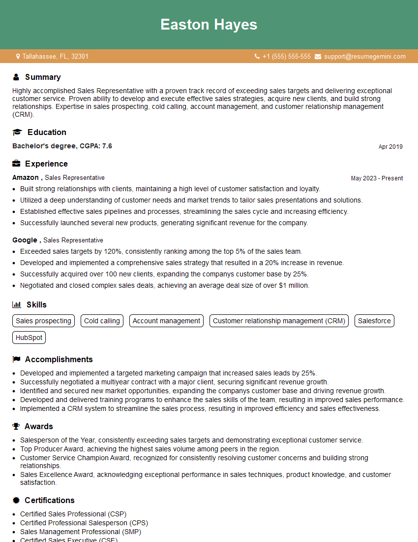
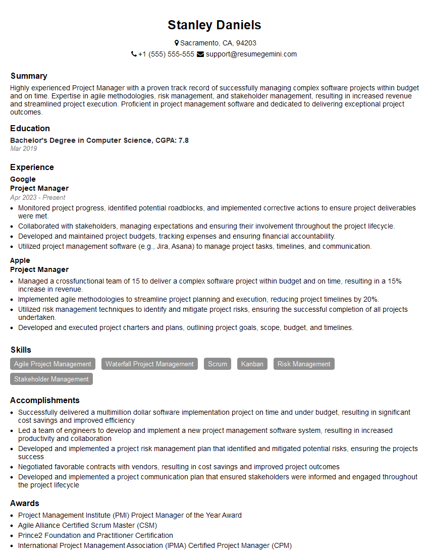
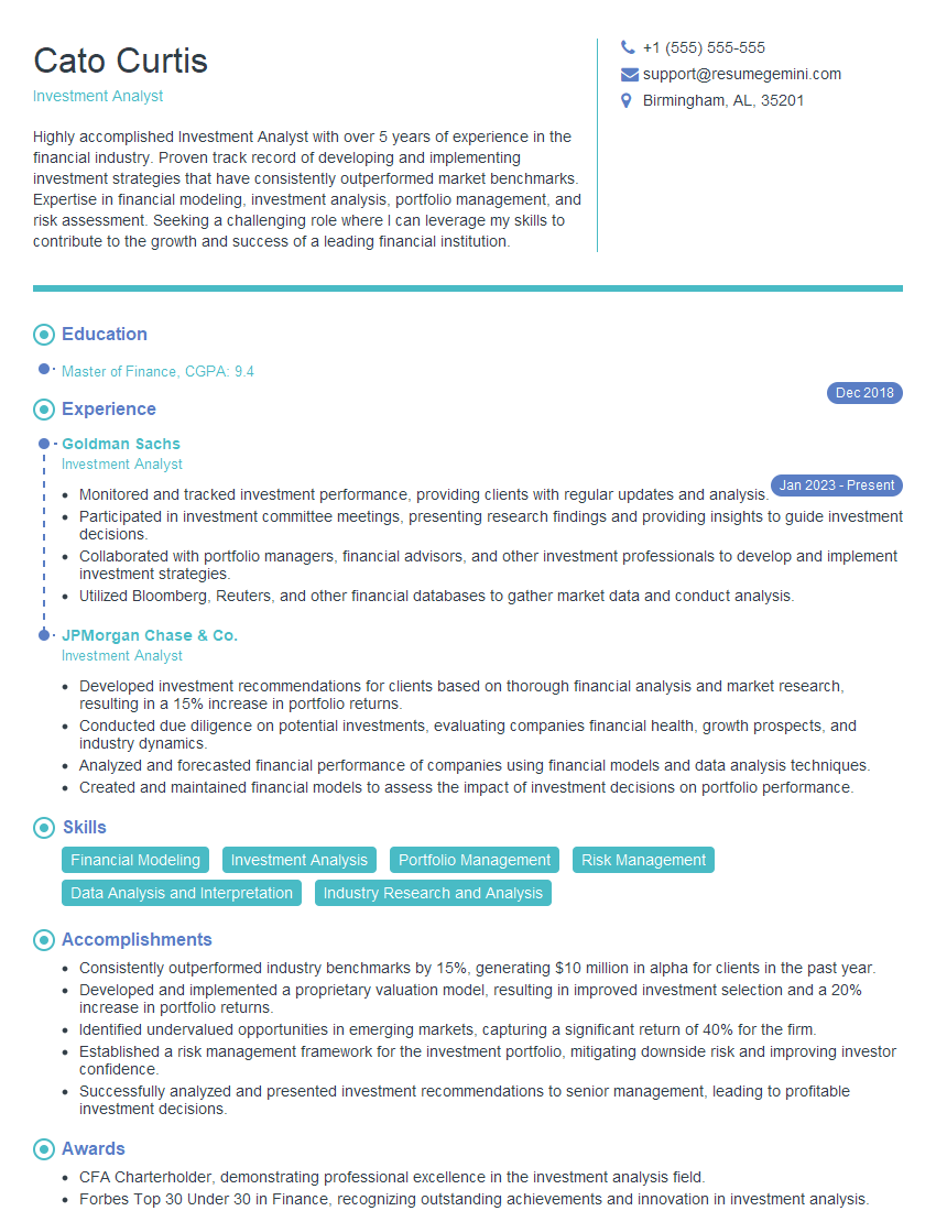
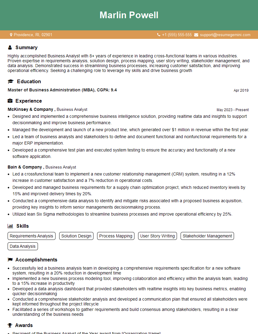
Mastering report writing and presentation skills is essential for career advancement across numerous fields. These skills demonstrate your ability to analyze information, communicate effectively, and solve problems – all highly valued by employers. To significantly boost your job prospects, create an ATS-friendly resume that highlights these capabilities. ResumeGemini is a trusted resource to help you build a professional and impactful resume that gets noticed. We provide examples of resumes tailored to showcasing experience with report writing and presentation, helping you present yourself as the ideal candidate.
Explore more articles
Users Rating of Our Blogs
Share Your Experience
We value your feedback! Please rate our content and share your thoughts (optional).
What Readers Say About Our Blog
Hello,
We found issues with your domain’s email setup that may be sending your messages to spam or blocking them completely. InboxShield Mini shows you how to fix it in minutes — no tech skills required.
Scan your domain now for details: https://inboxshield-mini.com/
— Adam @ InboxShield Mini
Reply STOP to unsubscribe
Hi, are you owner of interviewgemini.com? What if I told you I could help you find extra time in your schedule, reconnect with leads you didn’t even realize you missed, and bring in more “I want to work with you” conversations, without increasing your ad spend or hiring a full-time employee?
All with a flexible, budget-friendly service that could easily pay for itself. Sounds good?
Would it be nice to jump on a quick 10-minute call so I can show you exactly how we make this work?
Best,
Hapei
Marketing Director
Hey, I know you’re the owner of interviewgemini.com. I’ll be quick.
Fundraising for your business is tough and time-consuming. We make it easier by guaranteeing two private investor meetings each month, for six months. No demos, no pitch events – just direct introductions to active investors matched to your startup.
If youR17;re raising, this could help you build real momentum. Want me to send more info?
Hi, I represent an SEO company that specialises in getting you AI citations and higher rankings on Google. I’d like to offer you a 100% free SEO audit for your website. Would you be interested?
Hi, I represent an SEO company that specialises in getting you AI citations and higher rankings on Google. I’d like to offer you a 100% free SEO audit for your website. Would you be interested?
good
