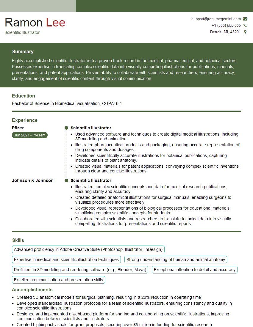
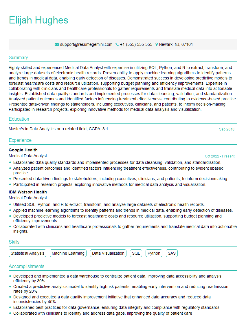
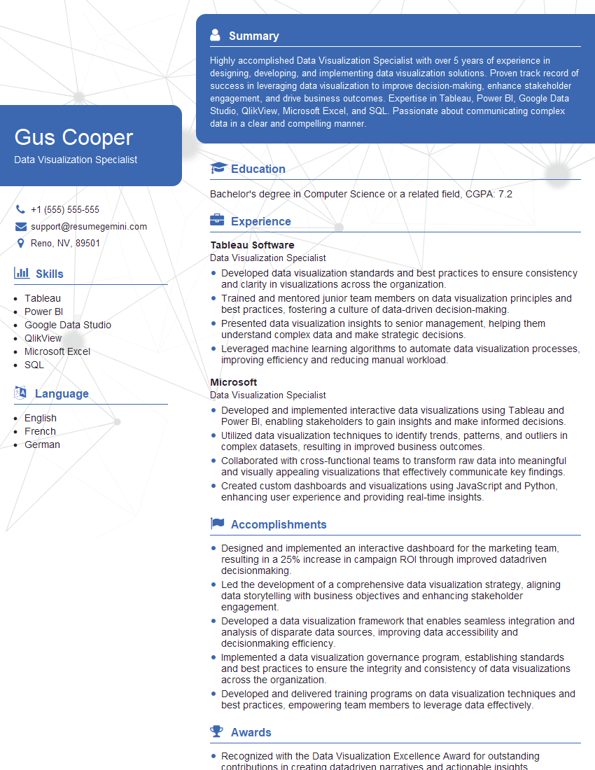
The thought of an interview can be nerve-wracking, but the right preparation can make all the difference. Explore this comprehensive guide to Ability to interpret scientific data and translate it into visual representations interview questions and gain the confidence you need to showcase your abilities and secure the role.
Questions Asked in Ability to interpret scientific data and translate it into visual representations Interview
Q 1. Explain the difference between a bar chart and a scatter plot, and when you would use each.
Bar charts and scatter plots are both powerful visualization tools, but they serve different purposes. A bar chart displays the distribution of categorical data, showing the frequency or magnitude of each category using bars of varying heights. Think of comparing the sales figures of different product lines – each product line is a category, and the bar’s height represents its sales.
In contrast, a scatter plot illustrates the relationship between two numerical variables. Each point on the plot represents a data point, with its horizontal and vertical positions determined by the values of the two variables. For instance, you might use a scatter plot to visualize the correlation between hours of study and exam scores; each point would represent a student, with its x-coordinate representing study hours and its y-coordinate representing the exam score.
You’d use a bar chart when you want to compare distinct categories, highlighting differences in magnitude or frequency. A scatter plot, on the other hand, is ideal for exploring the correlation or trend between two continuous variables.
Q 2. Describe your experience with different data visualization tools (e.g., Tableau, R, Python).
My experience with data visualization tools is extensive. I’m proficient in using Tableau for its intuitive drag-and-drop interface and powerful interactive features, particularly useful for creating dashboards and presenting findings to non-technical audiences. I frequently use R, leveraging packages like ggplot2 for creating highly customizable and publication-quality visualizations. Its strength lies in statistical analysis and the ability to generate complex plots directly from statistical models. Furthermore, I utilize Python with libraries like matplotlib and seaborn for creating static and interactive visualizations, benefiting from Python’s versatility and its integration with various data processing tools.
For instance, in a recent project analyzing climate data, I used R’s ggplot2 to create a time-series plot showing temperature changes over several decades. This required significant data manipulation and statistical analysis, which R handled elegantly. For presenting the key findings to stakeholders, I then used Tableau to create an interactive dashboard allowing users to explore the data further.
Q 3. How do you handle outliers in your data visualizations?
Outliers—data points significantly different from the rest—require careful consideration. Ignoring them can mislead the audience. My approach involves a multi-step process: First, I identify outliers using techniques like box plots or Z-score calculations. Then, I investigate the reason for their presence. Are they genuine data points, or are they errors (data entry mistakes, faulty equipment)?
If they are genuine outliers resulting from a real phenomenon, I might highlight them in the visualization using different colors or symbols, adding a note explaining their presence. This ensures transparency and prevents misinterpretations. However, if they are errors, I might remove them after proper documentation. Simply removing them without explanation is unacceptable. The choice depends heavily on the context and the nature of the data.
For example, in a study on human height, an outlier representing a height of 8 feet could be a data entry error and should be investigated and corrected. However, an outlier in a study on rare genetic mutations would be crucial and should be retained and clearly indicated.
Q 4. How do you choose an appropriate scale for your visualizations?
Choosing the right scale is crucial for accurate representation. I usually start by examining the range and distribution of my data. For linear scales, I ensure the minimum and maximum values are clearly visible and that the increments are logical and easy to interpret. For example, when presenting financial data, a linear scale with increments of 1,000 or 10,000 might be appropriate.
If the data is heavily skewed, a logarithmic scale might be more suitable. This compresses the range of larger values while expanding the range of smaller values, revealing patterns that might be hidden on a linear scale. Logarithmic scales are often useful when dealing with data spanning several orders of magnitude, such as population growth or earthquake magnitudes.
The key is to choose a scale that accurately represents the data and is easily understood by the audience. I avoid scales that artificially distort the data or make it difficult to interpret the relationships between different data points.
Q 5. What are some common pitfalls to avoid when creating scientific visualizations?
Several common pitfalls can undermine the effectiveness of scientific visualizations. One major issue is misleading axis scales—manipulating scales to exaggerate or diminish trends. Another is chartjunk—unnecessary ornamentation that clutters the visualization and distracts from the data. Overusing 3D effects can also hinder clarity and interpretation.
Furthermore, lack of context is a significant problem. Without proper labels, legends, titles, and clear descriptions, the visualization becomes meaningless. Finally, choosing the wrong type of chart for the data can lead to inaccurate or misleading interpretations. For example, using a pie chart for a large number of categories is impractical and difficult to interpret.
I always strive to create clean, simple, and accurate visualizations, ensuring the data is represented truthfully and is easy to understand for the target audience.
Q 6. How do you ensure your visualizations are accessible to a diverse audience?
Accessibility is paramount. I ensure visualizations are understandable by a diverse audience through several strategies. I use clear and concise labels, avoiding jargon. I choose color palettes considering color blindness, ensuring sufficient contrast between elements. For example, I avoid using red and green together as they can be difficult to distinguish for individuals with red-green color blindness.
I also provide alternative text descriptions for images, crucial for visually impaired individuals using screen readers. I ensure adequate font sizes and clear visual hierarchy, making information easy to scan and interpret. Finally, I consider the cultural context, avoiding symbols or color associations that might be misinterpreted in different cultures.
Interactive visualizations with tooltips and zooming capabilities can greatly enhance accessibility, enabling users to explore the data at their own pace and level of detail.
Q 7. Describe your process for interpreting complex scientific datasets.
Interpreting complex datasets involves a systematic approach. It starts with a thorough understanding of the data’s structure, variables, and the questions I aim to answer. I then perform exploratory data analysis (EDA) using statistical summaries, visualizations, and data manipulation techniques to identify patterns, trends, and outliers.
I often employ dimensionality reduction techniques, such as principal component analysis (PCA), to visualize high-dimensional data in lower dimensions. I also utilize clustering algorithms to identify groups or clusters within the data. Throughout this process, I continuously refine my understanding of the data, formulating hypotheses and testing them using statistical methods.
Finally, I document my findings clearly, communicating both the results and the underlying methodology to ensure reproducibility and transparency. The process is iterative, with findings leading to new questions and further investigation. For example, in a genomics study, I might use PCA to visualize the relationship between different gene expressions and then apply clustering to identify distinct subpopulations.
Q 8. How do you communicate uncertainty in your data visualizations?
Communicating uncertainty in data visualizations is crucial for honest and transparent data representation. We avoid misleading viewers by explicitly showing the variability inherent in the data. This is achieved through several methods.
- Error bars: These visually represent the variability around a point estimate (e.g., mean, median). For instance, in a line chart showing average temperatures over time, error bars could show the standard deviation or confidence interval for each temperature measurement.
- Box plots: These elegantly display the distribution of data, including median, quartiles, and outliers, immediately conveying the spread and skewness.
- Density plots: These smooth histograms provide a visual representation of the data’s probability distribution, showcasing the concentration and spread of the data points. This is particularly useful for continuous variables.
- Transparency: Using lighter colors or semi-transparent markers for data points can help visualize the density of points in an area, providing an intuitive sense of uncertainty or confidence in the data.
- Confidence intervals/regions: In regression analysis, for example, a confidence band around a trend line shows the uncertainty range around the model’s prediction, allowing the viewer to understand how much confidence we should have in the projected values.
For example, if I’m visualizing survey results, I would not simply present the average response, but also the confidence interval to reflect the sampling error and the potential range of the true population average.
Q 9. Explain your experience with different chart types (e.g., line charts, pie charts, histograms).
I’m proficient in a variety of chart types, each chosen based on the data type and the message I aim to communicate.
- Line charts: Excellent for showing trends over time or visualizing relationships between continuous variables. For example, visualizing stock prices over a year.
- Pie charts: Best for showing proportions of a whole. However, they become less effective with many categories. A good use would be showing the market share of different brands.
- Histograms: Ideal for displaying the distribution of a single numerical variable. This helps identify patterns such as skewness, modality, and outliers. For instance, visualizing the distribution of ages in a population.
- Bar charts: Excellent for comparing different categories or groups. For example, illustrating sales figures across different regions.
- Scatter plots: Used to explore the relationship between two numerical variables. The pattern of points can reveal correlations or clusters. For instance, showing the relationship between height and weight.
- Heatmaps: Representing data using color intensity to show relationships within matrices. Excellent for correlational matrices or showing patterns in geographical data.
The choice of chart type directly impacts how effectively the information is conveyed, and I carefully consider the strengths and weaknesses of each before making a selection.
Q 10. How do you determine the appropriate level of detail for your visualizations?
Determining the appropriate level of detail is crucial for effective visualization. Too much detail can overwhelm the audience, while too little can obscure important findings. My approach is guided by the audience and the purpose of the visualization.
- Audience expertise: A visualization for expert scientists will include more detailed information than one intended for a general audience.
- Key message: I focus on highlighting the most important aspects of the data relevant to the central message or question.
- Data complexity: Simple datasets may benefit from less detail, whereas complex datasets require careful consideration of how to simplify without losing critical information.
- Interactive elements: For complex data, interactive visualizations allow users to explore detail at their own pace through zooming, filtering, or drilling down.
For example, a presentation to a board of directors will emphasize high-level trends, using minimal detail, while a technical report for researchers will provide detailed charts and tables with comprehensive error estimations.
Q 11. How do you ensure your visualizations are accurate and truthful?
Accuracy and truthfulness are paramount. I meticulously check my work at every step.
- Data verification: I rigorously verify the accuracy of the source data before any analysis or visualization.
- Data cleaning: I address outliers and missing values appropriately, ensuring they don’t distort the visualization. I clearly document the handling of missing data, and how it may affect interpretations.
- Appropriate scaling: Axes are clearly labeled and scaled appropriately to avoid misleading impressions.
- Transparency: All relevant information, such as data sources, methodologies, and limitations, are clearly documented within or alongside the visualization.
- Peer review: Whenever possible, I seek feedback from colleagues to ensure accuracy and avoid potential biases.
Manipulating data or presenting it in a misleading way is unethical and undermines trust. My visualizations strive to present the data honestly and accurately, allowing the audience to draw their own conclusions.
Q 12. How do you select the most effective visual representation for a given dataset?
Selecting the most effective visual representation depends on several factors, primarily the type of data and the story I need to tell.
- Data type: Categorical data might be best represented with bar charts or pie charts, while continuous data might be shown with line charts, scatter plots, or histograms.
- Message: The visualization should highlight the key findings and support the narrative. If I want to show a trend over time, a line chart is appropriate; if I want to compare different groups, a bar chart would be better.
- Audience: The complexity of the visualization should be appropriate for the audience’s level of understanding.
- Software capabilities: I use software that allows me to create a wide range of visualizations (e.g., R, Tableau, Python’s Matplotlib/Seaborn).
I often explore several options before settling on the most effective one. For example, if comparing sales across regions, a bar chart might be simplest, while a map with color-coded regions might offer a more intuitive visual narrative.
Q 13. Describe your experience with statistical software packages (e.g., SPSS, SAS).
I have extensive experience with various statistical software packages, including SPSS, SAS, R, and Python (with libraries like pandas, NumPy, and Matplotlib). My proficiency extends beyond simple data entry and descriptive statistics; I’m adept at performing complex statistical analyses and generating publication-quality visualizations.
- SPSS: I’ve used SPSS for statistical analysis, especially for survey data and complex statistical models.
- SAS: My expertise in SAS includes data management, statistical modeling, and report generation, often applied to large datasets.
- R: R is my preferred tool for creating customized visualizations and performing advanced statistical analyses. Its flexibility and open-source nature are invaluable.
- Python: Python, with its versatile libraries, is an excellent alternative for data manipulation, analysis and sophisticated visualization creation.
The choice of software depends on the project’s specific requirements and the type of analysis needed. My skills allow me to adapt seamlessly to different environments and leverage the strengths of each platform to optimize my workflow.
Q 14. How do you handle missing data when creating visualizations?
Missing data is a common challenge in data analysis. I handle it transparently and appropriately, avoiding methods that could introduce bias. My approach involves a multi-step process:
- Identifying and understanding missingness: I first identify the extent and pattern of missing data (e.g., missing completely at random (MCAR), missing at random (MAR), missing not at random (MNAR)). This helps determine the best approach.
- Imputation (if appropriate): Depending on the pattern and amount of missing data, I may use imputation techniques such as mean/median imputation, multiple imputation, or k-nearest neighbor imputation. I carefully consider the implications of each method and use it cautiously, always acknowledging the limitations.
- Exclusion: In some cases, particularly with a small dataset and a high proportion of missing values, excluding incomplete cases might be necessary, while ensuring it is justifiable and doesn’t introduce bias.
- Visualization: I clearly indicate missing data in the visualization using techniques such as graying out, using a distinct symbol, or labelling the absence of data appropriately. I never hide or misrepresent the presence of missing values.
It’s crucial to clearly document how missing data was handled. This transparency allows the audience to understand and critically assess the implications of the missing data on the interpretation of the results.
Q 15. How do you present your findings to a non-technical audience?
Communicating scientific findings to a non-technical audience requires translating complex data into easily understandable concepts. I focus on storytelling, using analogies and avoiding jargon. For instance, instead of saying ‘the p-value was less than 0.05,’ I might explain, ‘Our results are statistically significant; the chance of these findings occurring by random chance is less than 5%. This means our hypothesis is likely correct.’ I utilize visuals extensively – charts, graphs, and infographics are far more accessible than tables filled with numbers. I also prioritize simplicity, focusing on the key takeaways and avoiding unnecessary detail. I often structure my presentation with a clear narrative arc: introducing the problem, explaining the methodology, highlighting the key results, and discussing the implications. Finally, I always leave time for questions and actively encourage audience participation to ensure comprehension.
Career Expert Tips:
- Ace those interviews! Prepare effectively by reviewing the Top 50 Most Common Interview Questions on ResumeGemini.
- Navigate your job search with confidence! Explore a wide range of Career Tips on ResumeGemini. Learn about common challenges and recommendations to overcome them.
- Craft the perfect resume! Master the Art of Resume Writing with ResumeGemini’s guide. Showcase your unique qualifications and achievements effectively.
- Don’t miss out on holiday savings! Build your dream resume with ResumeGemini’s ATS optimized templates.
Q 16. Explain your process for identifying trends and patterns in scientific data.
Identifying trends and patterns starts with data exploration and cleaning. I begin by visualizing the data using various techniques like scatter plots, histograms, and box plots to get a sense of its distribution. Then, I employ statistical methods such as regression analysis (linear, logistic, or polynomial), clustering techniques (k-means, hierarchical), and time series analysis depending on the nature of the data. For instance, if I am studying the relationship between two variables, I might use correlation analysis and scatter plots. If I have time-series data, I might use moving averages or exponential smoothing to identify trends. For complex datasets, I leverage data mining tools and programming languages like R or Python with libraries like Pandas and Scikit-learn. Crucially, I always consider the context of the data and possible confounding factors. I iterate through this process, refining my analysis and visualizations until I have a clear and concise understanding of the underlying trends.
Q 17. How do you use color effectively in your visualizations?
Effective color usage is crucial for creating clear and impactful visualizations. I follow established guidelines, considering color blindness and accessibility. I use color strategically to highlight key information, encode data values (e.g., using a color gradient to represent magnitude), and distinguish different categories. For example, I might use a sequential color scheme (e.g., light to dark blue) for representing continuous data, or a categorical color scheme (e.g., distinct colors for different groups) to show distinct categories. I avoid using too many colors, sticking to a limited palette for improved readability. I also ensure sufficient contrast between colors to make the visualization accessible to people with color vision deficiencies. Tools like ColorBrewer help me choose effective and accessible color palettes.
Q 18. How do you create interactive visualizations?
Interactive visualizations significantly enhance understanding and engagement. I use tools like Tableau, D3.js, or Plotly to create visualizations that allow users to explore the data dynamically. For example, I might incorporate interactive elements like zoom capabilities, tooltips displaying detailed information, and filtering options to subset the data. In a geographical context, I might use interactive maps that allow users to drill down into specific regions or time periods. The level of interactivity depends on the audience and the complexity of the data. A simple visualization might only require tooltips, while a more complex one might include multiple interactive elements and controls. // Example using D3.js (conceptual): d3.select('#myChart').selectAll('circle').on('mouseover', function(d){ ... }); This snippet shows how to add mouseover interactivity to circles in a D3 chart.
Q 19. How do you ensure your visualizations are aesthetically pleasing?
Aesthetically pleasing visualizations are essential for effective communication. I prioritize clarity, simplicity, and consistency in design. I use appropriate fonts, avoid cluttered layouts, and ensure a clean visual hierarchy. I pay attention to details like axis labels, legends, and titles, ensuring they are clear and informative. I utilize whitespace effectively to avoid visual overload. My goal is to create visualizations that are both informative and visually appealing, guiding the viewer’s eye through the data in a logical and intuitive manner. Inspiration often comes from design principles and examples of effective data visualization from established sources.
Q 20. What are some common ethical considerations when creating scientific visualizations?
Ethical considerations are paramount in scientific visualization. Data manipulation must be transparent and justifiable. I avoid cherry-picking data or using misleading scales or axes. The visualization must accurately reflect the underlying data; any transformations or aggregations should be clearly explained. Proper attribution of data sources is crucial. Context is critical – visualizations should not be presented out of context or without sufficient explanation. Accessibility for people with disabilities (e.g., color blindness) is vital, and potential biases inherent in the data or its representation must be acknowledged and discussed. Finally, I ensure that the visualizations are not used to manipulate or misrepresent findings.
Q 21. Describe a time you had to explain complex scientific data to a non-specialist.
I once had to explain complex genomic data to a board of non-scientists. The data involved gene expression changes following exposure to a specific toxin. Instead of overwhelming them with technical terms like ‘microarray analysis’ or ‘differential gene expression,’ I started with an analogy: ‘Imagine your body’s cells as a factory, and each gene is a machine. Exposure to the toxin is like switching some machines on and off. The data shows which machines – genes – are most affected.’ I then used a simplified heatmap with clear color coding to show the increase or decrease in gene activity, focusing on only the most significant changes. I avoided technical jargon, using simple language and focusing on the story – the impact of the toxin on cellular function. Their questions helped me further refine my explanation, ensuring they understood the implications without getting lost in the technicalities.
Q 22. How do you integrate data from multiple sources into a single visualization?
Integrating data from multiple sources into a single visualization requires a systematic approach. First, I ensure data compatibility. This involves checking data types, units, and formats. Discrepancies need to be addressed through cleaning and transformation. I might use scripting languages like Python with libraries such as Pandas to standardize and merge datasets. Then, I choose the appropriate visualization type based on the data and the message I want to convey. For example, if I’m comparing trends across different datasets, an overlaid line chart would be effective. If I’m showing proportions, a stacked bar chart would be better. Finally, I use a visualization tool, like Tableau or D3.js, to create the unified visualization. This often involves mapping data fields to chart elements and fine-tuning aesthetics for clarity.
Example: Imagine I’m analyzing sales data from different regions. One dataset might have sales figures by month, while another has marketing spend by quarter. After cleaning and converting data to a consistent format, I’d use Pandas to merge the datasets based on the date. Then, I’d use Tableau to create a combined chart showing sales and marketing spend over time, allowing for easy comparison of their relationship.
Q 23. How do you assess the effectiveness of your visualizations?
Assessing visualization effectiveness is crucial. My approach is multifaceted. First, I conduct user testing. This involves showing my visualizations to the intended audience and observing their understanding and interpretation. I gather feedback through questionnaires and direct observation, noting any confusion or misinterpretations. Second, I use analytical metrics. For example, if the visualization aims to show a correlation, I’d check if the visualization accurately reflects the statistical correlation coefficient. If it’s about showing a change over time, I’d evaluate whether the trends depicted accurately represent the underlying data. Finally, I consider the overall impact. Did the visualization successfully communicate the key findings? Did it lead to new insights or actions?
Example: I recently created a dashboard visualizing customer churn. User testing revealed that the initial color scheme was confusing. Based on feedback, I adjusted the color palette, resulting in improved comprehension.
Q 24. What metrics do you use to evaluate the quality of your data visualizations?
Evaluating data visualization quality involves several key metrics. Accuracy is paramount: the visualization must accurately reflect the underlying data. Clarity is crucial; the visualization must be easily understood and interpreted. Completeness ensures all relevant data is presented. Efficiency means the visualization conveys information concisely and effectively. Aesthetic appeal, while subjective, plays a significant role in engagement. Think of it like a good story – the narrative is clear, compelling, and easy to follow. Finally, Accessibility ensures the visualization is usable for everyone, including those with disabilities. This involves considering color contrast and alternative text descriptions.
Q 25. How do you maintain the integrity of your data throughout the visualization process?
Maintaining data integrity throughout the visualization process is a priority. I start by meticulously documenting data sources and transformations. This includes keeping a record of any cleaning, filtering, or aggregation steps. I also use version control for my data and code to track changes. This allows me to revert to earlier versions if needed. I employ rigorous data validation techniques, verifying data accuracy at each stage of the process. Furthermore, I make sure to use appropriate data types and formats to avoid data loss or corruption. Regular audits of the data and visualizations are essential to spot and correct any errors.
Example: Using a version control system like Git allows me to track every data change, ensuring that if a problem arises, I can revert to a prior, known-good state.
Q 26. Describe your experience working with large datasets.
I have extensive experience working with large datasets, often exceeding millions of rows. My approach involves leveraging efficient data handling techniques. I typically utilize relational databases (like PostgreSQL or MySQL) or distributed data processing frameworks (like Spark) to manage and analyze such data. I focus on optimized queries and data filtering to avoid performance bottlenecks. I often employ dimensionality reduction techniques (like Principal Component Analysis) to simplify the data while preserving essential information. For visualization, I use tools that are designed for large datasets, such as Tableau or custom solutions based on D3.js which can handle large amounts of data efficiently. Often, sampling techniques are used to create visualizations that are representative of the full dataset without the performance limitations of using the full dataset.
Example: In a recent project involving customer transaction data (hundreds of millions of records), I used Spark to process the data and aggregate key metrics. Then, I used Tableau to create interactive dashboards that allowed users to explore the data efficiently.
Q 27. How do you troubleshoot visualization problems?
Troubleshooting visualization problems involves a systematic approach. First, I carefully review the data to identify potential errors or inconsistencies. Next, I check the code for bugs or logical errors. I often use debugging tools to isolate the problem. If issues persist, I simplify the visualization to pinpoint the source of the problem. I also consult relevant documentation and online resources. If needed, I reach out to colleagues or experts for assistance. Finally, I test thoroughly to ensure the fix resolves the problem without introducing new ones.
Example: I once encountered a strange distortion in a 3D scatter plot. After checking the code and the data multiple times, I realized I had used an incorrect scaling factor for one of the axes. Correcting the scale resolved the problem.
Key Topics to Learn for Ability to interpret scientific data and translate it into visual representations Interview
- Data Cleaning and Preprocessing: Understanding techniques to handle missing data, outliers, and inconsistencies before analysis and visualization.
- Choosing the Right Visualization: Selecting appropriate chart types (bar charts, scatter plots, histograms, etc.) to effectively communicate different data patterns and relationships. This includes understanding the strengths and weaknesses of each visualization type.
- Statistical Analysis Fundamentals: Demonstrating familiarity with descriptive statistics (mean, median, standard deviation) and understanding their relevance in data interpretation and visualization.
- Data Storytelling: Articulating clear and concise narratives from data visualizations, highlighting key insights and trends. This involves understanding your audience and tailoring the presentation accordingly.
- Software Proficiency: Demonstrating practical experience with data visualization tools like Excel, R, Python (Matplotlib, Seaborn), Tableau, or similar software.
- Interpreting Statistical Significance: Understanding p-values, confidence intervals, and their implications for drawing valid conclusions from data.
- Identifying Potential Biases: Recognizing and addressing potential biases in data collection, analysis, and visualization to ensure accurate and objective interpretations.
- Effective Communication of Results: Presenting data visualizations and interpretations clearly and concisely, both verbally and in written reports.
Next Steps
Mastering the ability to interpret scientific data and translate it into compelling visual representations is crucial for career advancement in many scientific and analytical fields. It allows you to communicate complex findings effectively, influencing decisions and driving progress. To maximize your job prospects, create an ATS-friendly resume that highlights your skills and experience in this area. ResumeGemini is a trusted resource that can help you build a professional and impactful resume. Examples of resumes tailored to showcasing expertise in interpreting scientific data and creating visual representations are available, allowing you to craft a document that truly reflects your abilities and experience.
Explore more articles
Users Rating of Our Blogs
Share Your Experience
We value your feedback! Please rate our content and share your thoughts (optional).
What Readers Say About Our Blog
Hello,
We found issues with your domain’s email setup that may be sending your messages to spam or blocking them completely. InboxShield Mini shows you how to fix it in minutes — no tech skills required.
Scan your domain now for details: https://inboxshield-mini.com/
— Adam @ InboxShield Mini
Reply STOP to unsubscribe
Hi, are you owner of interviewgemini.com? What if I told you I could help you find extra time in your schedule, reconnect with leads you didn’t even realize you missed, and bring in more “I want to work with you” conversations, without increasing your ad spend or hiring a full-time employee?
All with a flexible, budget-friendly service that could easily pay for itself. Sounds good?
Would it be nice to jump on a quick 10-minute call so I can show you exactly how we make this work?
Best,
Hapei
Marketing Director
Hey, I know you’re the owner of interviewgemini.com. I’ll be quick.
Fundraising for your business is tough and time-consuming. We make it easier by guaranteeing two private investor meetings each month, for six months. No demos, no pitch events – just direct introductions to active investors matched to your startup.
If youR17;re raising, this could help you build real momentum. Want me to send more info?
Hi, I represent an SEO company that specialises in getting you AI citations and higher rankings on Google. I’d like to offer you a 100% free SEO audit for your website. Would you be interested?
Hi, I represent an SEO company that specialises in getting you AI citations and higher rankings on Google. I’d like to offer you a 100% free SEO audit for your website. Would you be interested?
good
