Interviews are opportunities to demonstrate your expertise, and this guide is here to help you shine. Explore the essential Adobe Creative Suite Expertise interview questions that employers frequently ask, paired with strategies for crafting responses that set you apart from the competition.
Questions Asked in Adobe Creative Suite Expertise Interview
Q 1. Explain your experience with Adobe Photoshop’s layer management.
Layer management in Photoshop is fundamental to efficient and non-destructive editing. Think of layers as transparent sheets stacked on top of each other. Each layer can contain different elements – images, text, shapes – allowing for independent manipulation without affecting others. My experience involves extensive use of layer groups, smart objects, and layer masks to organize complex projects and maintain flexibility.
- Layer Groups: I frequently use layer groups to organize similar elements (e.g., grouping all background elements, all text elements) for easier selection, visibility control, and styling. This makes large projects much more manageable.
- Smart Objects: For images or elements that may need resizing or editing later without losing quality, I always use smart objects. This is crucial for maintaining high resolution during scaling.
- Layer Masks: These are incredibly powerful for non-destructive editing. Instead of erasing parts of a layer, I use layer masks to hide or reveal portions, allowing for easy adjustments and corrections without permanently altering the original image data. For example, I’d use a layer mask to seamlessly blend a person into a different background.
For example, while working on a product advertisement, I used layer groups to separate the product image, text elements, background image, and lighting effects. This organization allowed me to easily adjust individual elements without affecting others, ensuring a clean and efficient workflow.
Q 2. Describe your workflow for retouching images in Photoshop.
My retouching workflow in Photoshop is meticulous and prioritizes non-destructive editing. It typically follows these steps:
- Initial Assessment: I carefully analyze the image, identifying areas requiring retouching, like blemishes, wrinkles, or unwanted objects.
- Layer Organization: I create separate layers for each retouching task. This is essential for maintaining control and flexibility. For example, I might have separate layers for blemish removal, skin smoothing, and color correction.
- Spot Healing & Clone Stamp: I use the spot healing brush for smaller imperfections and the clone stamp tool for more complex areas. The clone stamp requires careful selection of source pixels to maintain realism.
- Frequency Separation: For more advanced skin retouching, I often use frequency separation to edit texture and color separately, allowing for precise smoothing without losing skin details.
- Dodge & Burn: To add depth and dimension, I use the dodge and burn tools to subtly lighten and darken areas, enhancing the three-dimensionality of the image.
- Color Correction & Adjustments: Finally, I utilize adjustment layers like curves, levels, and color balance to refine colors, contrast, and overall image tone.
Throughout the process, I constantly zoom in and out to ensure that the retouching looks natural and blends seamlessly with the rest of the image. The goal is always to enhance, not to create an unrealistic look.
Q 3. How do you optimize images for web and print in Photoshop?
Optimizing images for web and print requires different approaches due to the varying requirements of each medium.
- Web Optimization: For web use, the priority is smaller file sizes for faster loading times. I usually save images as JPEGs for photographs and PNGs for graphics with transparency. I carefully adjust the resolution and compression settings in Photoshop to balance image quality and file size. Using tools like ‘Save for Web (Legacy)’ is crucial for fine-tuning these settings.
- Print Optimization: For print, the focus is on high resolution and color accuracy. I ensure images are saved at a resolution of at least 300 DPI (dots per inch). The color profile should be correctly set (e.g., CMYK) to match the printing process, and it is essential to perform a color proof to ensure accurate reproduction.
For instance, an image intended for a website banner needs to be optimized for smaller screen sizes and faster download speeds, while an image for a print advertisement requires a much higher resolution to maintain quality at larger print sizes.
Q 4. What are your preferred methods for creating vector graphics in Adobe Illustrator?
My preferred methods for creating vector graphics in Illustrator center around using the Pen Tool and shape tools for precision and efficiency. The Pen Tool offers unparalleled control over curves and lines, allowing me to create complex illustrations and logos with smooth, clean lines.
- Pen Tool: This is the cornerstone of Illustrator work. Mastering its use is crucial for creating precise paths and shapes. I utilize it extensively for complex illustrations, logos, and other detailed vector work.
- Shape Tools: For simple shapes, I often use the rectangle, ellipse, and polygon tools, providing a quick way to create basic forms that can then be manipulated further.
- Live Trace: When working with raster images, Illustrator’s Live Trace feature is invaluable for converting them to editable vector graphics. I carefully adjust the settings to achieve the desired level of detail and smoothness.
For example, designing a company logo often involves using the Pen Tool to create intricate curves and details, while creating an infographic may involve combining simpler shapes created with the shape tools.
Q 5. Explain how you would use Illustrator’s Pathfinder tools.
Illustrator’s Pathfinder tools are essential for combining, subtracting, and manipulating shapes to create complex compositions. They are non-destructive, meaning changes can easily be reversed. I use them extensively for creating intricate designs and illustrations.
- Unite: Combines multiple shapes into a single, unified shape.
- Minus Front: Subtracts the topmost shape from the shapes below.
- Intersect: Creates a new shape containing only the overlapping area of selected shapes.
- Exclude: Creates a shape from the area that is not overlapping.
Imagine creating a complex logo with overlapping shapes. The Pathfinder tools allow me to easily combine, subtract, or intersect these shapes to achieve the desired final design. For example, I could use the ‘Minus Front’ tool to cut out a circle from a square to create a unique shape.
Q 6. How do you manage color consistency across different Adobe applications?
Maintaining color consistency across different Adobe applications is crucial for a professional workflow. I achieve this primarily through the use of color profiles and the Adobe Color engine.
- Color Profiles (ICC Profiles): I ensure that all documents are using the same color profile (e.g., sRGB for web, Adobe RGB for photography, CMYK for print) from the start of the design process. This helps ensure consistent color representation across applications.
- Adobe Bridge: This application is helpful in batch-processing and pre-flighting images to ensure they are appropriately color-managed before being used in other Adobe applications.
- Linked Files: Linking files instead of embedding them avoids multiple color adjustments and keeps your design consistent. If you change the original file, the changes will reflect in all other documents.
For example, I’d start a project by creating a color palette in Photoshop and saving it as an Adobe Swatch Exchange (.ASE) file. This palette can then be imported into Illustrator and InDesign, ensuring that colors remain consistent across all applications.
Q 7. Describe your experience with Adobe InDesign’s layout features.
InDesign’s layout features are central to my work in creating professional documents such as brochures, magazines, and books. It allows for precise control over typography, image placement, and overall page design.
- Master Pages: I heavily utilize master pages to create consistent page layouts across a document. This is especially helpful for multi-page publications where maintaining a consistent header, footer, and page numbering is crucial.
- Text & Image Frames: Precise control over text and image placement is paramount. InDesign’s frame tools allow me to create perfectly aligned elements and manage text flow effectively.
- Styles & Paragraph Styles: I use these to maintain consistent formatting throughout the document. This not only ensures a professional appearance but also makes editing much easier. A single style change updates all elements formatted with that style.
- Tables & Grids: InDesign offers powerful tools for creating tables and implementing grids to maintain a structured and organized layout. This is critical for visually appealing and professional-looking documents.
For example, when designing a multi-page brochure, I’d use master pages to create a consistent header and footer. Styles and paragraph styles are used for consistent headings and body text, allowing easy updating should the design require changes.
Q 8. How would you create a multi-page brochure in InDesign?
Creating a multi-page brochure in InDesign is straightforward. Think of it like building with digital pages. First, you define your page size and orientation (e.g., letter, A4, landscape). Then, you set up your master pages, which contain elements like headers, footers, and page numbers that will consistently appear on each page. You then create the individual pages, dragging and dropping text and images from other programs like Photoshop or Illustrator, or directly typing and importing them into InDesign. Each page is its own canvas, and you use InDesign’s powerful layout tools to arrange content—think of it like arranging furniture in a room. To ensure consistency, you can use styles for text and paragraphs, ensuring a unified look across the brochure. For example, you might define a ‘heading 1’ style for all main headings and a ‘body copy’ style for your paragraph text. When ready, you can easily export it to PDF for print or digital distribution.
Example Workflow:
- New Document: File > New > Document. Define page size, number of pages, margins, and columns.
- Master Pages: Create master pages to add consistent elements like headers, footers, and page numbers.
- Content Creation: Add text and images to individual pages, using styles to maintain consistency.
- Layout and Design: Use InDesign’s layout tools to arrange elements effectively.
- Export: File > Export > Adobe PDF (Print). Choose the appropriate settings for print output.
Q 9. Explain your process for preparing files for print in InDesign.
Preparing InDesign files for print is crucial for a high-quality final product. It involves several key steps: ensuring your images are high-resolution (at least 300 DPI), converting all fonts to outlines (to avoid font substitution issues on different systems), checking for overprints (where colors overlap unexpectedly), and creating bleed (extra space around the edges that gets trimmed). I also meticulously check for any spelling or grammatical errors. A preflight check within InDesign is invaluable; it catches potential problems before they reach the printer. I often save a final version as a high-resolution PDF/X-1a compliant file, as this is a widely accepted industry standard for print-ready files. This ensures color accuracy and prevents compatibility issues with printing presses. I’ve learned over the years that this careful preparation saves time and money down the line by avoiding costly reprint errors. In my experience, ignoring these steps can result in unsatisfactory results—like blurry images or incorrect colors.
Q 10. Describe your experience with Adobe After Effects and its keyframing tools.
I’ve been working extensively with After Effects for over [Number] years, using its keyframing tools to create everything from subtle animations to complex motion graphics. After Effects excels at precise animation control. Keyframing allows you to define specific points in time for a property’s value—imagine it as setting checkpoints along a timeline. For example, you might keyframe the position of a layer, making it move across the screen. After Effects also provides various easing options—like ease in and out—which allows for more natural-looking motion. I’m comfortable using keyframes for position, scale, rotation, opacity, and other properties, and combining them to create complex animations. I find using expressions very effective for automatically animating properties, streamlining the keyframing process. For instance, an expression can link one property’s value to another, creating dynamic relationships.
Q 11. How would you create a motion graphic animation in After Effects?
Creating a motion graphic animation in After Effects starts with planning. I begin by sketching out my ideas, storyboarding the sequence of events, and defining the overall look and feel. Then, I import assets—graphics from Illustrator or Photoshop, footage from Premiere Pro, or stock footage—into After Effects. After Effects’ compositing capabilities are invaluable here. The core of the animation process involves keyframing various properties of layers—position, scale, rotation, opacity, etc.—to create the desired motion. I use expressions to automate animations and create complex relationships between layers. For example, I might use an expression to link the opacity of one layer to the position of another, creating a reveal effect. Finally, I render the animation, choosing the appropriate settings for resolution and codec. Think of it as directing a film, but with digital elements, and each layer is a character, object, or background.
Q 12. What are your preferred techniques for compositing in After Effects?
My preferred compositing techniques in After Effects center around using masks, blending modes, and adjustment layers. Masks allow you to isolate specific parts of a layer, enabling precise control over effects and compositing. Blending modes offer various ways to combine layers, creating interesting visual effects. For instance, I often use the ‘screen’ mode to create a glowing effect or ‘multiply’ for a darkening effect. Adjustment layers are my go-to for applying color corrections and other effects non-destructively to multiple layers simultaneously. Think of it as layering transparent sheets of film with different effects, allowing you to modify each one independently. This technique maintains flexibility and allows for easy adjustments and experimentation.
Q 13. Explain your experience with Adobe Premiere Pro’s editing workflow.
My Premiere Pro workflow revolves around a non-linear approach. I start by importing all my video and audio clips, organizing them into bins. I then build a rough cut, focusing on the story’s pacing and flow. Then, I refine the edit, making precise adjustments to timing and transitions. Premiere Pro’s dynamic linking with After Effects allows me to easily send sections of my timeline for motion graphics work without re-importing files, saving time and ensuring consistency. My editing philosophy prioritizes efficient organization to maximize efficiency. I use markers extensively to quickly locate specific points in the timeline, and I often use nested sequences to organize complex segments of the video.
Q 14. How would you edit and color grade video footage in Premiere Pro?
Editing and color grading in Premiere Pro is a two-stage process, but often intertwined. First, I perform the edit, ensuring the overall story is clear and engaging. Then, I move into color grading. Premiere Pro offers powerful color correction tools. I often start with basic adjustments—brightness, contrast, saturation—to establish a foundation. Then, I might use curves or color wheels for more precise adjustments, targeting specific color ranges. I frequently employ Lumetri Color panel to fine-tune the color, ensuring visual consistency and mood. For a professional look, I often create and use LUTs (Look-Up Tables) to quickly apply pre-defined color styles and ensure a consistent look and feel throughout the project, allowing for quick stylistic changes and efficient workflows. Careful color grading dramatically impacts the mood and overall feel of a video. The goal is to enhance the visual narrative and emotional impact of the video, not just simply making the footage look ‘better’.
Q 15. Describe your experience with Adobe Audition and sound editing techniques.
Adobe Audition is my go-to tool for all things audio. My experience spans from basic cleaning and editing to advanced audio restoration and mastering. I’m proficient in techniques like noise reduction, using tools like the spectral frequency display to identify and remove unwanted noise. I also frequently use equalization (EQ) to adjust the frequency balance of audio tracks, making them sound clearer and more balanced. For example, I recently worked on a podcast where background hum was a significant issue. Using Audition’s noise reduction tools, I was able to significantly reduce the hum without affecting the quality of the speech. I also utilize compression to control the dynamic range, ensuring consistent volume levels throughout. This is particularly useful in music editing where you might need to create a more polished, professional-sounding mix. Furthermore, my expertise extends to multi-track editing, allowing me to work with multiple audio sources simultaneously, editing and layering sounds to create complex audio compositions. I’m familiar with various audio formats and understand the importance of choosing the right format for specific purposes, considering factors like file size and audio quality. I’ve worked with everything from WAV and AIFF for high-quality audio to MP3 for efficient file delivery.
Career Expert Tips:
- Ace those interviews! Prepare effectively by reviewing the Top 50 Most Common Interview Questions on ResumeGemini.
- Navigate your job search with confidence! Explore a wide range of Career Tips on ResumeGemini. Learn about common challenges and recommendations to overcome them.
- Craft the perfect resume! Master the Art of Resume Writing with ResumeGemini’s guide. Showcase your unique qualifications and achievements effectively.
- Don’t miss out on holiday savings! Build your dream resume with ResumeGemini’s ATS optimized templates.
Q 16. How familiar are you with Adobe Acrobat Pro and PDF manipulation?
My familiarity with Adobe Acrobat Pro is extensive. I’m highly proficient in manipulating PDFs, going beyond simple editing. I routinely create, edit, and optimize PDFs for various purposes. This includes tasks like redacting sensitive information using the redaction tool – ensuring compliance with privacy regulations. I also frequently merge, split, and organize PDF documents, improving workflow efficiency. Beyond basic editing, I leverage Acrobat’s advanced features for creating interactive forms, adding digital signatures for authentication, and optimizing PDFs for accessibility using features such as tagging and alternative text for images. For instance, I’ve created interactive forms for client contracts, enabling easy data entry and streamlining the process. I also know how to use the OCR (Optical Character Recognition) function to make scanned documents searchable and editable, saving considerable time and effort. My understanding of PDF security features is also strong; I can set access permissions to control who can view, edit, or print a PDF, protecting confidential information effectively.
Q 17. What are the differences between raster and vector graphics?
The key difference between raster and vector graphics lies in how they represent images. Raster graphics, such as JPEGs and PNGs, are composed of a grid of pixels. Each pixel holds a specific color value. Think of it like a mosaic; zooming in reveals individual tiles (pixels). This makes raster graphics lose quality when scaled up (they become pixelated), while scaling down can result in acceptable quality, though sometimes it may require processing. Vector graphics, on the other hand, are made up of mathematical equations that define shapes, lines, and curves. Programs like Adobe Illustrator use this system. Think of vector graphics as blueprints or outlines. Because they are mathematical descriptions, vector graphics can be scaled to any size without losing quality. This makes them ideal for logos, illustrations, and typography where sharp lines and crisp details are crucial. For example, a logo designed in vector format will look perfectly sharp on a business card, a billboard, or a website, while a raster version of the same logo would appear pixelated when enlarged.
Q 18. Explain the concept of color modes (RGB, CMYK).
Color modes define how colors are represented in digital images. RGB (Red, Green, Blue) is an additive color model used for screens (monitors, TVs, and phones). It works by combining red, green, and blue light in varying intensities to create a wide range of colors. CMYK (Cyan, Magenta, Yellow, Key – black) is a subtractive color model used for print. It works by subtracting colors from white light to achieve different hues. The key difference lies in how colors are produced: RGB adds light, while CMYK subtracts it. This means an RGB image designed for a screen will look different when printed directly, as printers can’t reproduce the full spectrum of RGB colors. Proper color management, using color profiles, is crucial to ensure consistency across different media.
Q 19. How do you handle color correction and color profiles?
Color correction and color profiles are essential for ensuring consistent color reproduction across different devices and output methods. Color correction involves adjusting the colors in an image to achieve a desired look, often fixing issues like color casts or improving overall vibrancy. I utilize tools like Adobe Camera Raw and Photoshop’s adjustment layers for this. For example, I might use curves adjustments to fine-tune contrast and color balance. Color profiles, on the other hand, are sets of data that define a particular color space (e.g., sRGB, Adobe RGB). They provide a standard reference for how colors should be interpreted and displayed. Using appropriate color profiles is crucial for maintaining color accuracy when transferring images between different devices or printing. I ensure that my images are consistently using the correct color profile based on their intended output, whether it’s for web use (sRGB) or print (CMYK). Failure to manage color profiles can result in significant color shifts between the screen preview and the final print output.
Q 20. What is your experience with creating interactive PDFs?
I have considerable experience in creating interactive PDFs. This involves using Acrobat Pro’s tools to add interactive elements such as buttons, links, form fields, and multimedia content. For instance, I’ve created interactive training manuals with embedded videos and interactive quizzes. I’ve also designed interactive forms for data collection, streamlining data entry and reducing manual input errors. This process includes understanding user experience principles to ensure the interactive elements are intuitive and easy to navigate. The key aspects involve creating a logical structure and intuitive navigation, ensuring accessibility for users with disabilities, and testing the interactivity across different PDF readers. Careful planning is essential; I usually start by outlining the desired functionality and user flow before building the interactive components. This ensures a smooth and user-friendly experience.
Q 21. Explain your proficiency with Adobe Bridge for asset management.
Adobe Bridge is an indispensable asset management tool for me. It allows me to efficiently browse, organize, and preview my files, regardless of format. This is particularly helpful when working on large projects with numerous files. I use Bridge to create and manage keywords, rating systems, and custom metadata for my assets, making it easier to search and find specific files. For example, I might tag images with keywords like “product shot,” “lifestyle,” or “close-up” to easily locate them during the post-production process. Bridge’s batch processing capabilities are also extremely useful, enabling me to apply edits or convert files in bulk, saving significant time and effort. Furthermore, I use Bridge to generate contact sheets and previews for client presentations. Its robust search functionality makes file location a breeze, allowing me to quickly find and retrieve specific assets, no matter how many I’m dealing with. It also supports integration with other Adobe Creative Suite applications, significantly streamlining the workflow.
Q 22. How do you ensure design consistency across multiple projects?
Maintaining design consistency across multiple projects is crucial for brand recognition and user experience. It involves establishing a clear style guide and adhering to it rigorously. Think of it like building with LEGOs – each brick needs to fit perfectly with the others to create a cohesive structure.
- Style Guides: I create comprehensive style guides that detail everything from color palettes (using Adobe Color for inspiration and organization) and typography (specifying fonts, sizes, and weights within InDesign or Photoshop) to image styles (consistency in filters, effects, and image resolutions) and spacing/layout rules. These guides serve as the single source of truth for all projects.
- Centralized Assets: Adobe Creative Cloud Libraries are invaluable for this. I store approved logos, color swatches, fonts, and graphic elements within libraries, making them easily accessible across all projects and ensuring everyone is using the same assets. This prevents inconsistencies arising from using slightly different versions of the same logo or font.
- Templates: For repetitive design tasks, I create robust templates in InDesign or Photoshop. These pre-defined layouts and styles enforce consistency from the start, reducing the risk of manual errors and ensuring uniformity across various deliverables.
- Version Control: Using version control systems like Adobe Creative Cloud’s collaborative features, allows tracking changes and facilitates review processes, ensuring that everyone is working with the latest approved versions of the design assets and maintaining consistency over time.
Q 23. Describe a challenging design project and how you overcame it.
One challenging project involved designing a complex interactive infographic for a scientific publication. The challenge was balancing visual appeal with the need to accurately represent intricate data. The initial approach focused on a highly stylized visual representation, but it proved too dense and difficult to understand.
To overcome this, I adopted a more iterative and user-centered design approach. I created several low-fidelity prototypes using Adobe XD to test different layouts and visual hierarchies with the client and subject matter experts. We conducted usability testing to identify areas where users struggled to grasp the information. This feedback helped me refine the design, simplifying the visuals and enhancing the clarity of data presentation. Ultimately, we moved towards a cleaner, more modular design, leveraging Adobe Illustrator for precise vector graphics and Adobe After Effects for subtle animation to guide the user through the data. The final infographic was not only visually appealing but also highly effective in conveying complex information clearly.
Q 24. How do you stay up-to-date with the latest Adobe Creative Suite updates?
Staying current with Adobe Creative Suite updates is crucial for maximizing productivity and leveraging new features. I utilize several strategies:
- Adobe’s Official Channels: I regularly check the Adobe website, blogs, and social media channels for announcements of new releases and feature updates. These sources provide detailed information on what’s new and often include tutorials.
- Adobe Creative Cloud App: The Creative Cloud app itself notifies me about updates available for each individual application. It simplifies the update process and ensures my software is always current.
- Industry Blogs and Publications: I follow industry blogs and publications that specialize in graphic design and Adobe software. These often provide in-depth reviews and analyses of new features, highlighting practical applications.
- Online Courses and Tutorials: Platforms like LinkedIn Learning, Udemy, and YouTube offer courses that explore new features and updates. This hands-on learning is essential for mastering new tools and techniques quickly.
- Participating in Online Communities: Engaging with online communities and forums dedicated to Adobe software allows me to learn from others’ experiences, troubleshoot issues, and gain insights into best practices.
Q 25. What are some of your favorite plugins or extensions for the Adobe Creative Suite?
My favorite plugins and extensions often depend on the specific project, but some standouts include:
- For Photoshop: Camera Raw for powerful raw image editing, and RNI Films for adding unique film emulations to images. These help me achieve specific stylistic looks and enhance image quality.
- For Illustrator: Astute Graphics Plugins offer a range of time-saving tools for precise vector manipulation, simplifying complex tasks.
- For InDesign: Typografiska helps maintain consistent typography across the document by automatically applying specified typographic rules. This ensures high-quality output in terms of readability.
Choosing plugins depends heavily on workflow and project needs. I always assess the reputation and reliability of a plugin before integrating it into my workflow.
Q 26. Explain your experience with using Adobe Creative Cloud Libraries.
Adobe Creative Cloud Libraries are a game-changer for collaborative projects and maintaining design consistency. I use them extensively to centralize and organize assets across multiple projects. Imagine them as a shared, organized toolbox containing all the crucial design elements.
- Centralized Asset Management: I store approved logos, fonts, color palettes, and graphic elements in Libraries, making them instantly accessible to team members working on different aspects of a project. This ensures everyone is working with the same approved versions, preventing inconsistencies.
- Version Control: Libraries allow for version control, so I can easily revert to previous versions of assets if needed. This is crucial for managing changes and preventing accidental overwrites.
- Collaboration: Team members can easily access and contribute to shared Libraries, fostering efficient collaboration and ensuring that everyone is on the same page.
- Easy Access: Libraries integrate seamlessly with other Creative Cloud applications, so accessing and applying assets is incredibly straightforward.
Q 27. Describe your experience with exporting files in various formats.
Exporting files in the correct format is crucial for ensuring compatibility and print quality. My experience covers a wide range of formats:
- For print: I typically use high-resolution PDFs (
.pdf) for print-ready files, ensuring CMYK color mode and appropriate bleed settings for professional printing. For image assets, high-resolution JPEGs (.jpg) or TIFFs (.tiff) are frequently used. - For web: I optimize images for web use by saving them as JPEGs (
.jpg) or PNGs (.png), adjusting resolution and compression to balance image quality and file size. For vector graphics, scalable SVGs (.svg) are ideal. - For video: I export videos in formats like MP4 (
.mp4) for general use, and potentially other formats like MOV (.mov) depending on the specific needs of the project or platform. - For specific applications: Sometimes, other formats like EPS (
.eps) for vector graphics in applications other than Adobe Illustrator might be necessary, or AI (.ai) for preserving edits in Illustrator.
I always consider the intended use and target platform when choosing a file format to ensure optimal results.
Q 28. How do you collaborate effectively with others using Adobe Creative Cloud applications?
Effective collaboration using Adobe Creative Cloud applications is crucial for successful project delivery. I leverage various features to facilitate seamless teamwork:
- Creative Cloud Libraries: As previously mentioned, shared libraries are fundamental for centralizing assets and ensuring everyone is working with the same versions. This eliminates confusion and inconsistencies.
- Adobe XD Collaboration Features: For user interface and user experience (UI/UX) design, Adobe XD’s collaborative features allow multiple designers to work on the same project simultaneously, providing real-time feedback and reducing version control issues. Using the review feature and comments helps streamline feedback loops.
- Cloud Document Storage: Storing files in the cloud enables easy access and sharing for all team members, regardless of their location. Everyone can always access the latest versions of files.
- Regular Communication and Check-ins: While technology streamlines collaboration, clear communication is vital. I schedule regular check-ins with team members to discuss progress, address issues, and ensure everyone is aligned with project goals.
- Version Control and Comments: Utilizing version control within the Creative Cloud apps, along with comment features, creates a record of changes, feedback, and approvals. This transparency and traceability greatly enhance project management and collaboration.
Key Topics to Learn for Adobe Creative Suite Expertise Interview
- Core Principles of Design: Understanding fundamental design principles like composition, typography, color theory, and visual hierarchy is crucial for demonstrating a strong design foundation, regardless of the specific Adobe application used.
- Photoshop Mastery: Demonstrate proficiency in image manipulation, retouching, layer management, masking, and blending modes. Be prepared to discuss practical applications like creating marketing materials or enhancing product photography.
- Illustrator Expertise: Showcase your ability to create vector graphics, utilize tools for shape manipulation, and understand the advantages of vector-based artwork for scalability and print applications. Consider examples of logo design or illustration work.
- InDesign Proficiency: Highlight your experience in page layout, typography management, and working with master pages and styles for efficient document creation. Be ready to discuss projects like brochures, flyers, or multi-page publications.
- Workflow Optimization: Discuss your understanding of efficient workflows, file management strategies, and best practices for collaboration within the Creative Suite. This demonstrates a practical, professional approach.
- Advanced Techniques: Depending on the role, be prepared to discuss advanced techniques like actions, scripting (for automation), or using plugins to enhance your workflow and creative output.
- Problem-Solving & Creative Thinking: Prepare examples demonstrating your ability to solve design problems creatively and efficiently, considering client needs and design constraints.
Next Steps
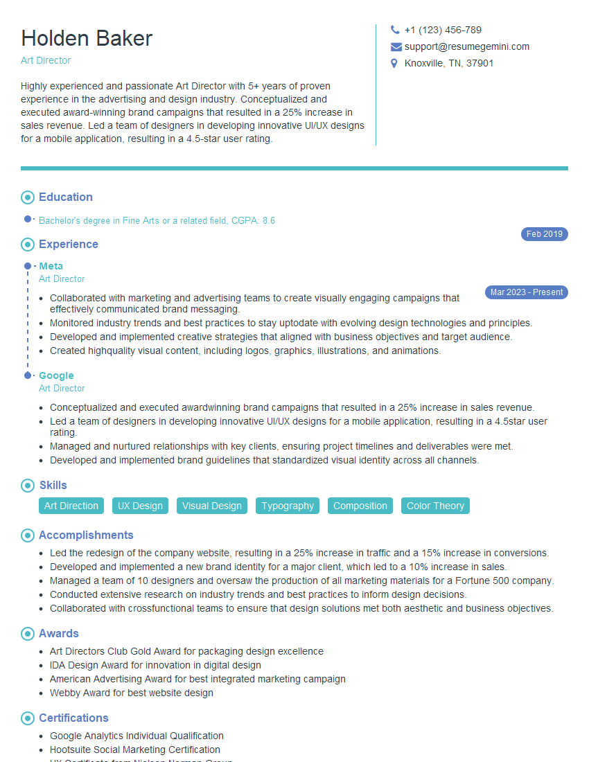
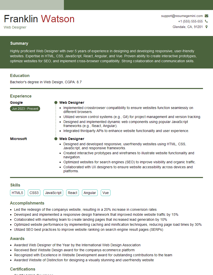
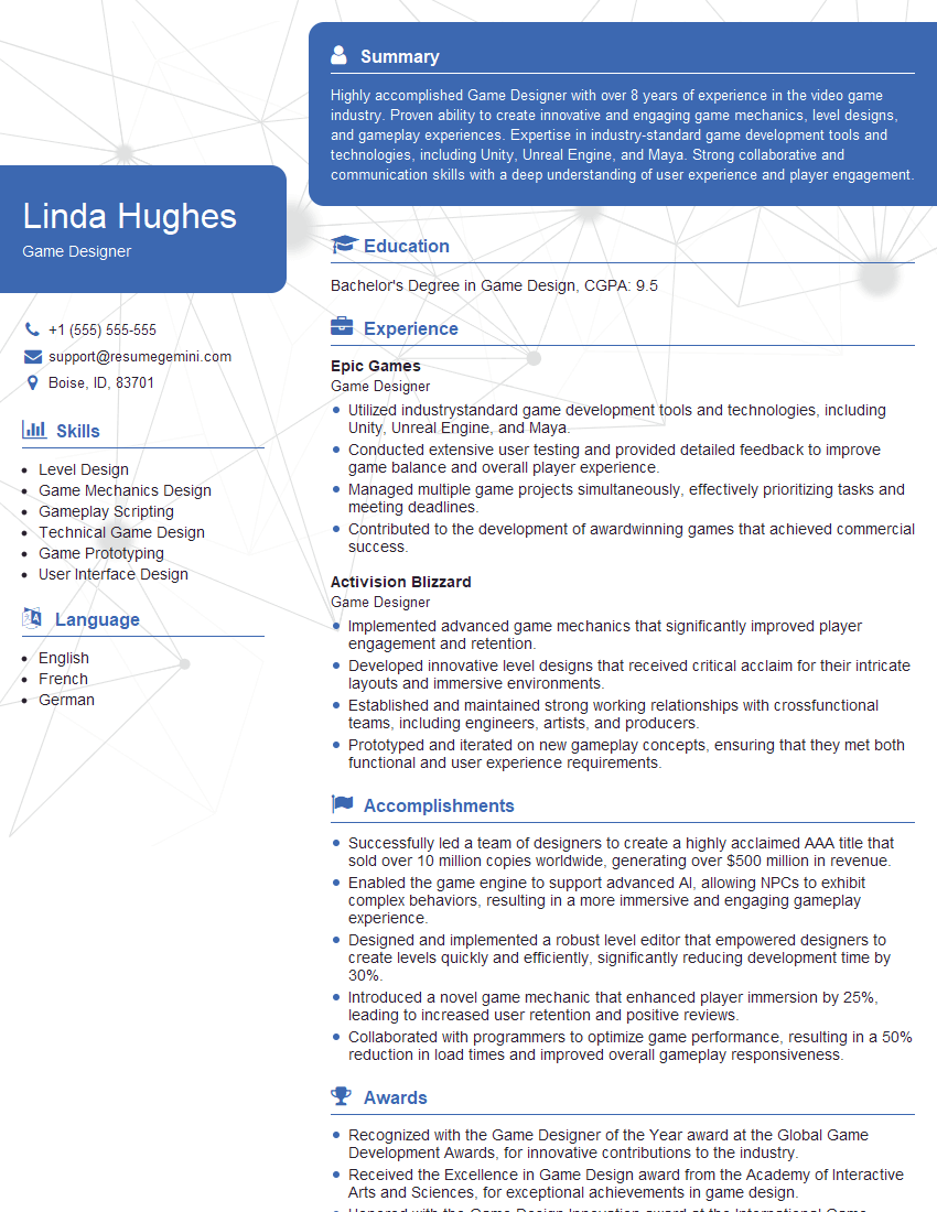
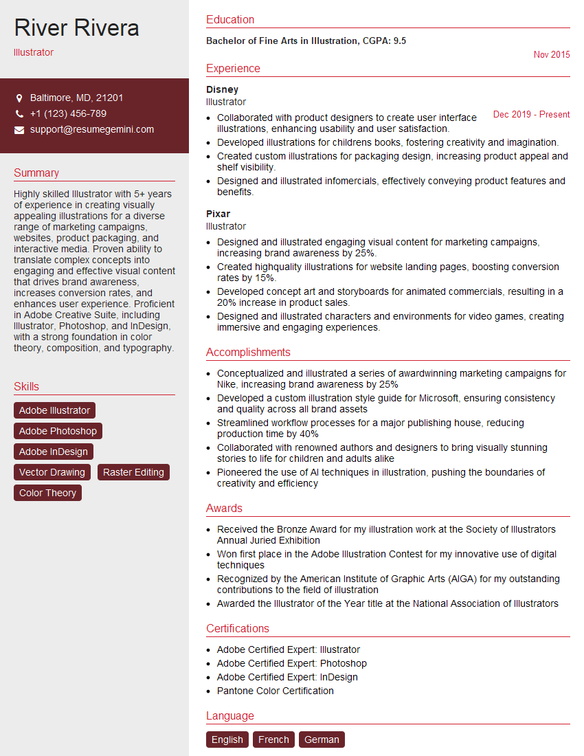
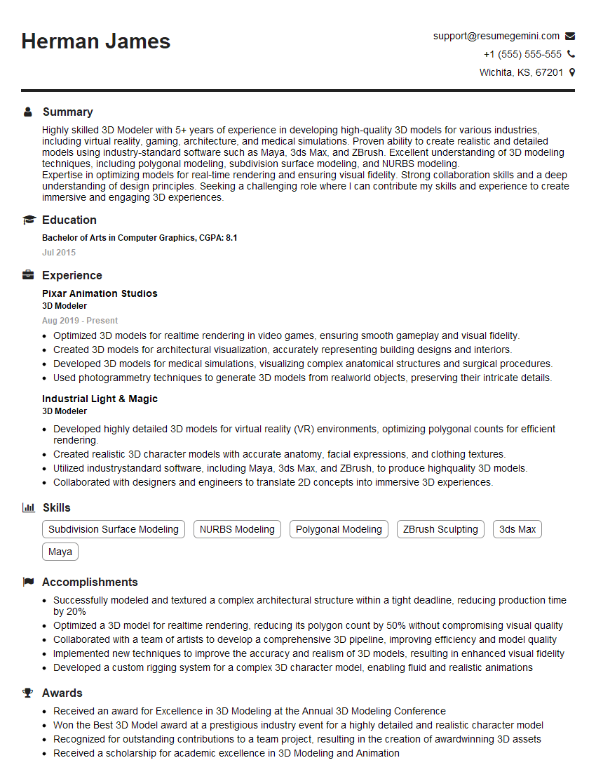
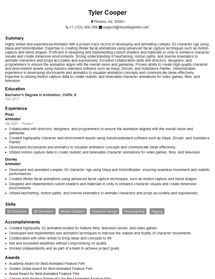
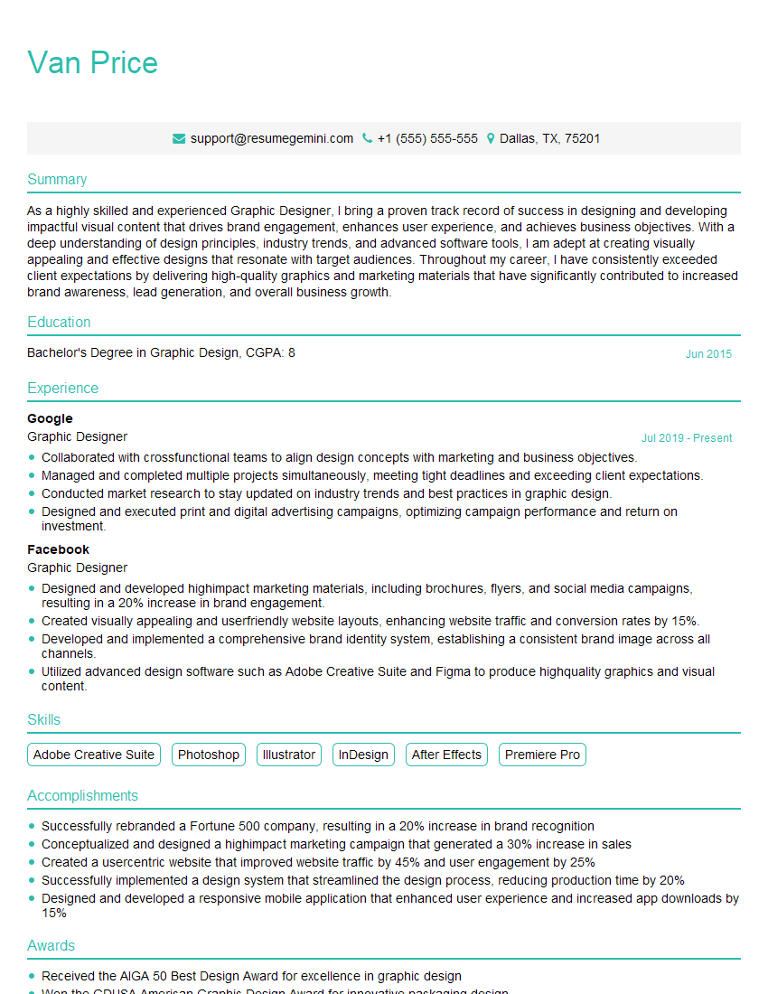
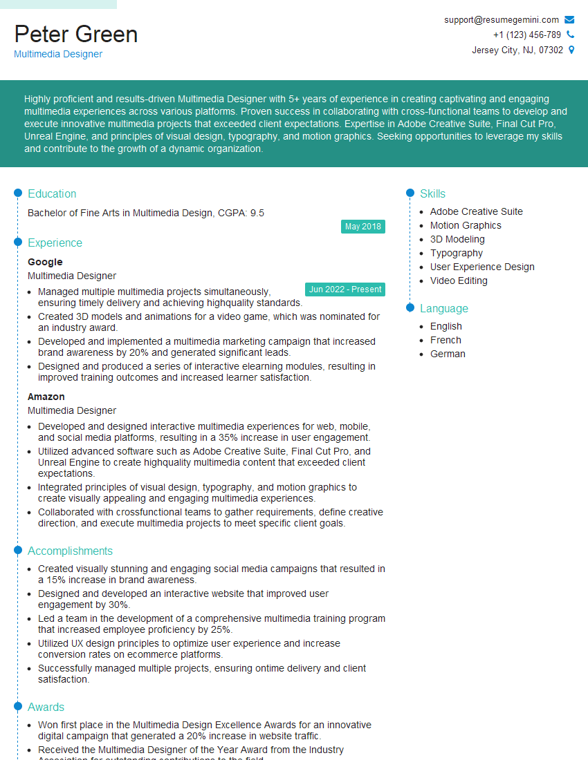
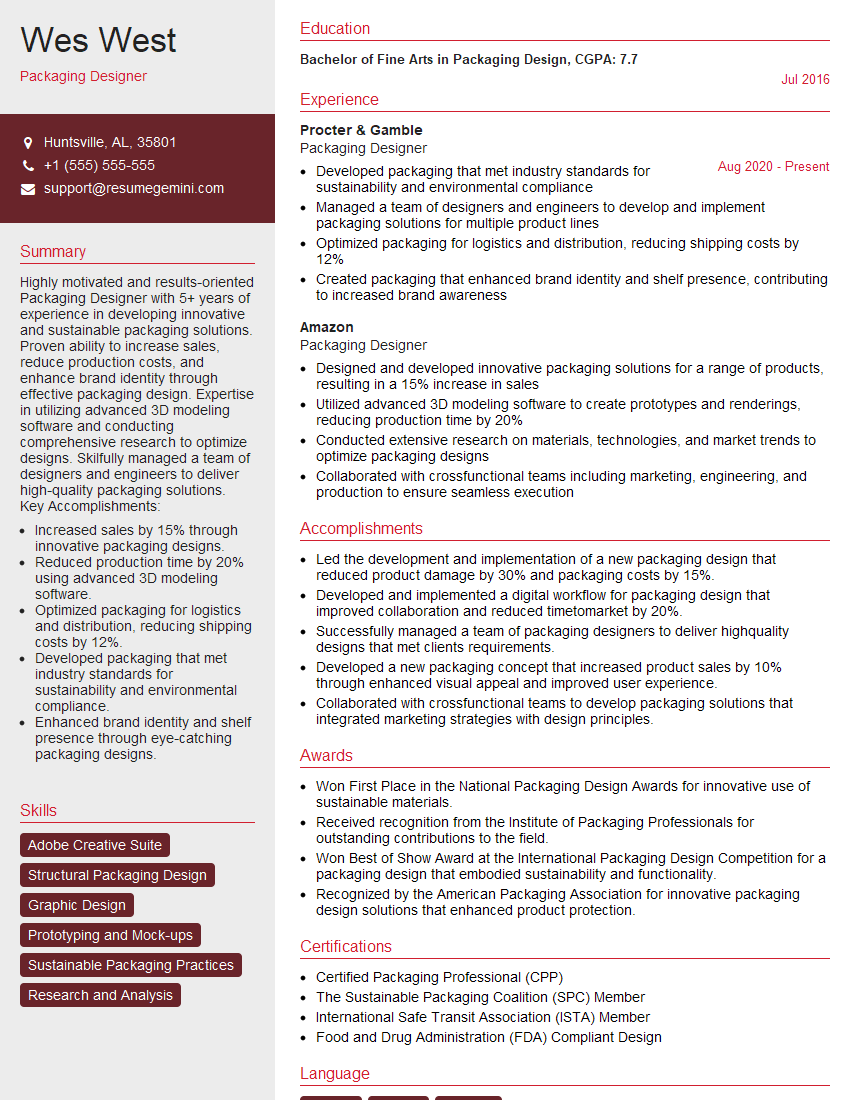
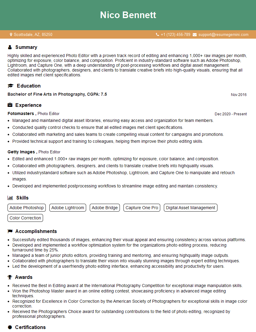
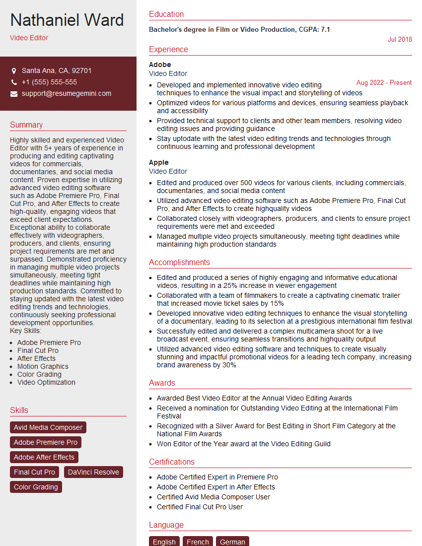
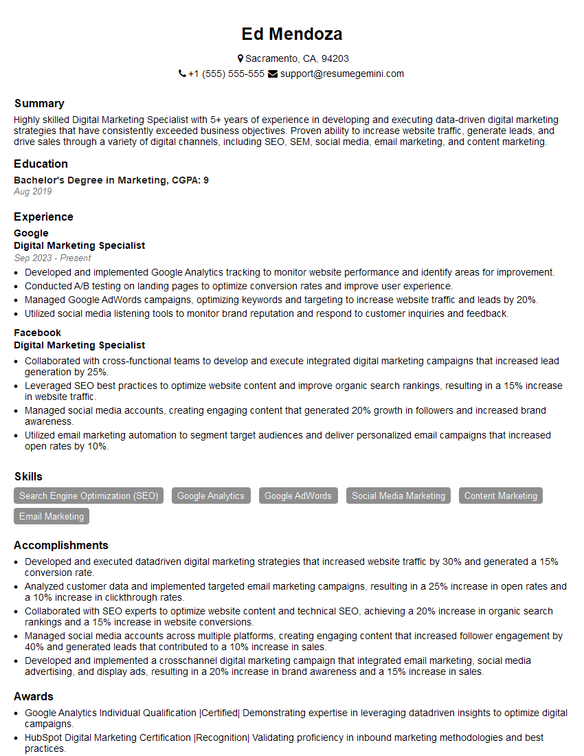
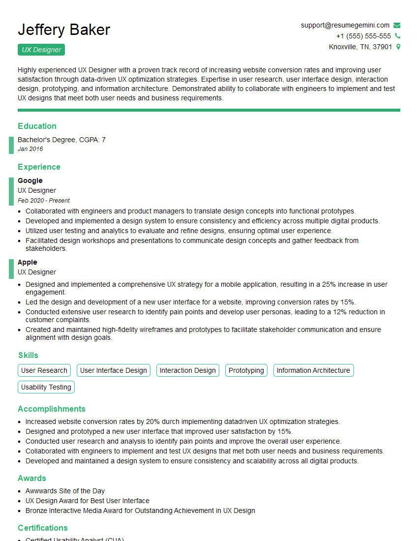
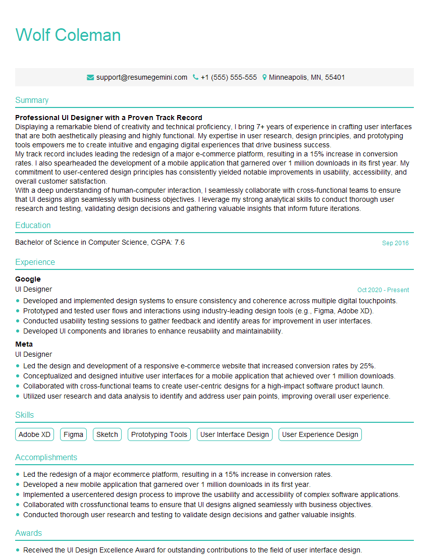
Mastering the Adobe Creative Suite opens doors to exciting career opportunities in design, marketing, and publishing. A strong portfolio is essential, but your resume is your first impression. Building an ATS-friendly resume significantly increases your chances of getting your application noticed. ResumeGemini is a trusted resource to help you craft a professional and impactful resume that highlights your Adobe Creative Suite expertise. Examples of resumes tailored to Adobe Creative Suite expertise are available to guide you in building your own compelling application. Invest time in creating a resume that truly represents your skills and experience – it’s your key to unlocking your dream job.
Explore more articles
Users Rating of Our Blogs
Share Your Experience
We value your feedback! Please rate our content and share your thoughts (optional).
What Readers Say About Our Blog
Hello,
We found issues with your domain’s email setup that may be sending your messages to spam or blocking them completely. InboxShield Mini shows you how to fix it in minutes — no tech skills required.
Scan your domain now for details: https://inboxshield-mini.com/
— Adam @ InboxShield Mini
Reply STOP to unsubscribe
Hi, are you owner of interviewgemini.com? What if I told you I could help you find extra time in your schedule, reconnect with leads you didn’t even realize you missed, and bring in more “I want to work with you” conversations, without increasing your ad spend or hiring a full-time employee?
All with a flexible, budget-friendly service that could easily pay for itself. Sounds good?
Would it be nice to jump on a quick 10-minute call so I can show you exactly how we make this work?
Best,
Hapei
Marketing Director
Hey, I know you’re the owner of interviewgemini.com. I’ll be quick.
Fundraising for your business is tough and time-consuming. We make it easier by guaranteeing two private investor meetings each month, for six months. No demos, no pitch events – just direct introductions to active investors matched to your startup.
If youR17;re raising, this could help you build real momentum. Want me to send more info?
Hi, I represent an SEO company that specialises in getting you AI citations and higher rankings on Google. I’d like to offer you a 100% free SEO audit for your website. Would you be interested?
Hi, I represent an SEO company that specialises in getting you AI citations and higher rankings on Google. I’d like to offer you a 100% free SEO audit for your website. Would you be interested?
good
