Preparation is the key to success in any interview. In this post, we’ll explore crucial Adobe Creative Suite (Photoshop, Illustrator, InDesign, After Effects, Premiere Pro) interview questions and equip you with strategies to craft impactful answers. Whether you’re a beginner or a pro, these tips will elevate your preparation.
Questions Asked in Adobe Creative Suite (Photoshop, Illustrator, InDesign, After Effects, Premiere Pro) Interview
Q 1. Explain the difference between raster and vector graphics.
Raster and vector graphics are fundamentally different ways of representing images digitally. Think of it like this: raster graphics are like a mosaic – made up of tiny squares called pixels. Vector graphics, on the other hand, are like blueprints – made up of mathematical equations that define lines, curves, and shapes.
- Raster Graphics (e.g., JPEG, PNG, TIFF): These are resolution-dependent. Zooming in makes the pixels blurry because you’re essentially enlarging those individual squares. They are great for photographic images where subtle color gradations are important.
- Vector Graphics (e.g., SVG, AI): These are resolution-independent. You can scale them to any size without losing quality because the computer redraws the image based on its mathematical definition. They are ideal for logos, illustrations, and designs where sharp lines and scalability are crucial.
For instance, a photograph would be best represented as a raster graphic, while a company logo should always be a vector graphic to ensure it looks crisp on a business card, a billboard, or a website.
Q 2. Describe your experience with Photoshop’s layer masking techniques.
Layer masking in Photoshop is one of my most frequently used tools. It allows for non-destructive editing, meaning you can make changes without permanently altering the original image. I use it extensively for compositing, retouching, and isolating specific areas of an image.
My workflow typically involves creating a layer mask (either by clicking the mask icon or using keyboard shortcuts like Cmd/Ctrl+Alt+G), then using a brush with varying opacity and hardness to paint on the mask. Black hides the underlying layer, white reveals it, and shades of gray create transparency. I often utilize quick mask mode (Q key) for more precise selections before applying a mask.
For example, let’s say I’m compositing a person into a landscape. I’d create a layer mask on the person’s layer and carefully paint around the edges to seamlessly blend them into the background, avoiding the harsh edges that a simple cut-out would create. I might even use multiple masks on different layers for refined control over specific areas.
Q 3. How do you optimize images for web use in Photoshop?
Optimizing images for web use in Photoshop involves reducing file size without significantly compromising quality. This is crucial for faster loading times and improved user experience. My approach focuses on these key steps:
- Choosing the right file format: JPEG is ideal for photographic images due to its compression capabilities. PNG is better for images with sharp lines, text, or transparent backgrounds. WebP offers superior compression but isn’t universally supported by all browsers.
- Reducing image dimensions: Ensure the image dimensions are appropriate for their intended use on the web. Avoid unnecessarily large images. I often use the ‘Save for Web (Legacy)’ feature (File > Export > Save for Web (Legacy)) which allows for precise control over the size and file type.
- Compressing the image: Within ‘Save for Web (Legacy)’, I adjust the quality settings for JPEG (or the equivalent for other formats) to find a balance between file size and visual quality. Lower quality settings lead to smaller files but potentially visible artifacts.
- Using Lossless compression when needed: For images with text or sharp lines, PNG-8 (with a limited color palette) or PNG-24 (for full-color images) are usually preferred, as they offer lossless compression.
For example, when preparing images for a website, I might reduce a high-resolution image from 3000×2000 pixels to 1200×800 pixels while saving it as a JPEG with a quality setting around 70%, finding that sweet spot between visual fidelity and file size.
Q 4. What are the advantages of using Smart Objects in Photoshop?
Smart Objects in Photoshop are incredibly powerful because they allow you to edit non-destructively at multiple levels. Think of them as containers that hold image data, whether it’s a raster image, a vector shape, or even another Photoshop file.
- Non-destructive editing: Changes made to a Smart Object are applied non-destructively to the original image. This means you can always revert to the previous versions without losing your work.
- Scalability without loss of quality: Vector Smart Objects can be scaled to any size without loss of quality unlike raster layers.
- Layer effects and adjustments applied non-destructively: Layer styles and adjustments applied to a Smart Object are not ‘baked in’. They remain editable.
- Reusability: Once you’ve created a Smart Object, you can reuse it throughout your project or even in other projects.
For example, if I’m designing a website banner and I need to reuse the same logo several times, I’d make the logo a Smart Object. This way, if I decide to redesign the logo later, I only need to change it in one place, and the changes will automatically reflect in all instances where the Smart Object is used.
Q 5. Explain your workflow for creating a complex illustration in Illustrator.
My workflow for creating a complex illustration in Illustrator typically involves these stages:
- Planning and Sketching: I start with a rough sketch to define the composition and key elements of the illustration. I might use a pencil and paper initially, and then bring it into Illustrator to trace over.
- Creating Basic Shapes: Using Illustrator’s shape tools (rectangles, ellipses, polygons), I build up the core forms of my illustration. I prefer to use simple shapes and combine them using the Pathfinder panel, rather than starting with complex, detailed drawings.
- Using the Pen Tool: For intricate curves and lines, I’ll use the Pen Tool (P), which offers precise control. Mastering the Pen tool is crucial for creating clean, professional vector art.
- Applying Color and Effects: Once the shapes are in place, I add colors, gradients, and effects using the Appearance panel. I prefer using gradients to add depth and realism to my illustrations.
- Organizing Layers: Effective layering is key to managing complex illustrations. I group related elements and name layers clearly for easier editing.
- Refining Details: Finally, I refine details, add textures and shadows to enhance the illustration’s overall look and feel.
A recent project involved creating a complex character illustration with intricate clothing and accessories. I used this workflow, starting with basic shapes for the body, then adding layers for clothing, hair, accessories and facial features. By using this layered approach I could easily edit elements without affecting other components of the illustration.
Q 6. How do you manage and organize layers in Illustrator?
Managing layers in Illustrator is essential for creating complex and well-organized artwork. My approach to layer management emphasizes clarity, efficiency and non-destructive workflows:
- Naming Conventions: I use descriptive names for each layer (e.g., ‘Character_Hair’, ‘Background_Sky’, ‘Logo_Text’). This makes it incredibly easy to find specific layers later.
- Grouping and Sub-layers: I group related objects together into layers and sub-layers to maintain a clear hierarchical structure. This reduces clutter and improves workflow.
- Color-coding: Assigning different colors to layers (optional) can improve visual organization. This is helpful for quickly identifying groups of related elements.
- Layer Styles: Using layer styles saves space and makes it easy to apply consistent styles to multiple objects.
- Layer effects: Layer effects (like Drop Shadow, Inner Glow) are applied non-destructively and kept in the appearance panel for easy editing.
For example, in a multi-page brochure design, I’d have a layer for each page, then sub-layers for sections within each page (e.g., header, body copy, images). This keeps everything organized and allows for efficient editing and updates.
Q 7. Describe your experience with Illustrator’s Pathfinder panel.
The Pathfinder panel in Illustrator is an invaluable tool for combining and manipulating shapes. It allows for non-destructive Boolean operations on shapes, providing a wide range of possibilities for creating complex illustrations.
- Unite: Combines multiple shapes into a single, unified shape.
- Minus Front: Subtracts the topmost shape from the shape below.
- Intersect: Keeps only the overlapping area of selected shapes.
- Exclude: Retains areas of shapes that *don’t* overlap.
- Add: Adds multiple paths together to create a new path.
I use the Pathfinder panel extensively for creating logos, icons, and illustrations where precise shape manipulation is needed. For example, to create a complex logo with overlapping shapes, I might use a combination of the ‘Minus Front’, ‘Intersect’ and ‘Unite’ options to achieve the desired outcome, all while maintaining the original shapes in case I want to modify them later.
Q 8. How do you create and edit type in Illustrator?
Creating and editing type in Illustrator is straightforward but offers a powerful range of options. You can use the Type tool (T) to create text boxes, which can be manipulated in many ways. You can choose from a vast array of fonts, adjust font size, kerning (space between individual letters), tracking (space between all letters in a selection), leading (space between lines), and more.
Think of it like a word processor, but with significantly more graphic design control. For example, you might create a logo and need to perfectly adjust the spacing between the letters; Illustrator provides the precision tools for this. You can also work with paragraph text, applying different styles to various sections. After creating your text, you can convert it to outlines (Type > Create Outlines) to edit individual letters as shapes; this is very helpful for creating logos or more complex typographic designs. I often use this to refine a logo until it’s pixel-perfect and ready for various applications.
Beyond basic text manipulation, you can also utilize advanced features like warping text on a path, creating text along a curved line for instance, or manipulating individual glyphs for a unique look. This allows for creative freedom that goes far beyond simple word processing.
Q 9. Explain the use of different color modes (RGB, CMYK) in Illustrator.
Illustrator uses two primary color modes: RGB (Red, Green, Blue) and CMYK (Cyan, Magenta, Yellow, Key/Black).
- RGB: This is an additive color model used for screens. It’s the standard for displaying images on monitors, TVs, and other electronic devices. Mixing all three colors at maximum intensity produces white light; absence of all colors produces black. Think of a computer screen: the pixels are emitting light.
- CMYK: This is a subtractive color model used for printing. It works by subtracting colors from white paper. Cyan, magenta, yellow, and black inks are used to create a wide range of colors. For example, mixing cyan and magenta creates blue.
The choice of color mode depends on the final output of your artwork. For web graphics or digital displays, RGB is always the better choice. For print projects like brochures, posters, or business cards, you’ll need to use CMYK to accurately represent the colors during printing. If I’m designing a logo for print and web, I usually create it in RGB and then convert it to CMYK before sending to print, allowing for proofing and checking for potential issues in color reproduction. Ignoring this can lead to significant differences between the screen and the printed version.
Q 10. Describe your experience with InDesign’s master pages and styles.
Master pages and styles in InDesign are fundamental for maintaining consistency and efficiency in multi-page documents. Master pages act as templates for your document, allowing you to create a consistent layout across all pages. Think of it as a blueprint; you define elements like headers, footers, page numbers, and basic layout elements on the master page. Then, when you create new pages, they automatically inherit those elements. This is hugely efficient when designing publications like brochures or books, as it saves a tremendous amount of time.
Styles, on the other hand, allow you to define consistent formatting for text and objects. You can create paragraph styles for body text, headings, captions, etc., defining font, size, spacing, and other attributes. Similarly, you can create object styles for graphics, images, and text boxes, specifying position, size, color, and more. By modifying a style, all instances of that style in the document update automatically. This is vital for ensuring consistency throughout the whole document and reducing editing time significantly. I frequently use this when working on large documents where the overall look and feel of the text and objects needs to remain the same; updating is much simpler with styles.
Q 11. How do you create and manage styles in InDesign?
Creating and managing styles in InDesign is done through the Styles panel (Window > Styles). To create a new paragraph or character style, simply click the ‘New Style’ button at the bottom of the panel and define its parameters. You can also base new styles on existing ones, inheriting and modifying certain settings. This ‘inheritance’ feature is excellent for creating style variations.
The Styles panel allows you to easily rename, modify, delete, or organize styles. You can group similar styles for better organization, and you can even load and save style sets. I regularly employ style sets in InDesign; if I’m working on similar documents, I can reuse my existing styles for increased efficiency. It’s all about creating consistency and efficiency – two cornerstones of professional document design.
Q 12. Explain your process for setting up bleeds and margins in InDesign.
Setting up bleeds and margins in InDesign is crucial for professional printing. Bleeds are the areas of your design that extend beyond the final trim size of your document. This is important because printers often trim documents slightly, and without bleeds, you could end up with white edges on your final product. Margins are the space between your design elements and the edge of the trimmed page. They provide white space for readability and aesthetic balance.
In InDesign, you set these in the Document Setup dialog box (File > Document Setup). You specify the page size, margins (top, bottom, inside, outside), and bleed (usually 0.125 inches or 3mm). I usually encourage clients to request bleed for their projects because it’s crucial to eliminate the risk of unpleasant white margins. Then, when designing the page, you extend the design elements into the bleed areas. Understanding the relationship between bleeds, margins, and the printable area is fundamental to preparing documents for professional print.
Q 13. How do you work with linked files in InDesign?
Working with linked files in InDesign is a highly efficient way to manage large, complex documents, particularly when dealing with high-resolution images. Instead of embedding images directly into the InDesign file (which significantly increases file size), you link them. This means the image remains a separate file, and InDesign only stores a reference to its location.
This approach has several advantages. First, file sizes are dramatically smaller, leading to faster loading and editing times. Second, if the original image needs to be modified, you only need to update the original file – InDesign will automatically reflect those changes. However, careful file management is essential. If you move or rename a linked image, InDesign will display a link error. I always meticulously organize my files and keep backups to avoid these issues. Using a well-structured folder system is an excellent habit for efficient work with linked files.
Q 14. Describe your experience with After Effects’ keyframing techniques.
After Effects’ keyframing is a cornerstone of animation and visual effects. Keyframes define the state of a property at a specific point in time. You can then use After Effects to interpolate (smoothly transition) between those keyframes. This allows you to create motion, change properties over time, and much more.
For example, you might keyframe the position of a layer to create a simple movement. You’d set a keyframe at the start with the layer at point A, then a keyframe later in the timeline at point B. After Effects calculates the smooth transition between those two points. This can range from simple movements to much more complex animations involving color changes, opacity adjustments, rotation, scaling and other properties. I routinely use keyframing in After Effects, whether creating simple animated text, complex motion graphics, or intricate visual effects; it forms the base of my animation work.
Beyond basic keyframing, After Effects offers various easing functions to customize the speed and smoothness of transitions, giving you fine-grained control over the feel and look of the animation. Understanding these nuances is key to creating polished and professional animations.
Q 15. Explain how you would create a simple animation in After Effects.
Creating a simple animation in After Effects often involves using keyframes to manipulate properties over time. Think of it like drawing a series of frames in a flipbook – each frame slightly different from the last. After Effects makes this process incredibly efficient.
Let’s say we want to animate a simple square moving across the screen. First, you’d create a square shape using the Shape tool. Then, you’d select the square’s position property in the timeline. At the beginning of your timeline (frame 0), the position is set to where you initially place the square. Then, you’d move to a later frame (e.g., frame 30) and change the position property, moving the square to its new location. After Effects automatically creates keyframes. When you play the animation, you’ll see the square smoothly move between these two positions. This is called linear interpolation by default. However you can adjust the speed and path of the animation by using the interpolation modes like ease in and ease out to create more natural looking movement.
For more complex animations, you could add rotation, scaling, or opacity keyframes to the square to create more dynamic motion. You could also use expressions for more complex or automated changes to properties. For instance, if you want the square to continuously loop around the screen using simple expressions, that’s achievable.
Career Expert Tips:
- Ace those interviews! Prepare effectively by reviewing the Top 50 Most Common Interview Questions on ResumeGemini.
- Navigate your job search with confidence! Explore a wide range of Career Tips on ResumeGemini. Learn about common challenges and recommendations to overcome them.
- Craft the perfect resume! Master the Art of Resume Writing with ResumeGemini’s guide. Showcase your unique qualifications and achievements effectively.
- Don’t miss out on holiday savings! Build your dream resume with ResumeGemini’s ATS optimized templates.
Q 16. What are some common compositing techniques in After Effects?
Compositing in After Effects is the art of layering and combining multiple video and image elements to create a single, cohesive image. It’s like building a layered cake – each layer contributes to the overall visual effect. Several techniques are vital for effective compositing:
- Track Matting: This technique uses a mask to isolate specific portions of a layer. This is great for removing a green screen background or isolating a specific element from a photograph.
- Blending Modes: Different blending modes (like Multiply, Screen, Overlay, etc.) control how the pixels of one layer interact with those below, allowing for creative effects like lighting interactions or color adjustments.
- Adjustment Layers: These layers let you apply color corrections, effects, or filters to multiple layers simultaneously without affecting individual layer properties. This is incredibly efficient when editing multiple clips or images.
- Pre-compositions: This allows grouping several layers into a single composition that you can nest in other compositions. It’s like creating sub-assemblies or modules to improve the workflow and organization of complex scenes.
- Roto-scoping: Manually cutting around an element frame by frame to extract or remove it from footage. Excellent for complex animations and object removal.
Imagine creating a science fiction scene – you might composite a spaceship (rendered in a 3D application), a city skyline (from a stock video), and some glowing effects all together using these techniques to create a visually stunning and believable shot.
Q 17. How do you manage and organize compositions in After Effects?
Organization is key in After Effects, especially with complex projects. I use a combination of techniques to maintain a clear and efficient workflow:
- Folder Structure: I organize my compositions using folders within the Project panel. This helps group related elements – for instance, a folder for character animation, another for background elements, and another for special effects.
- Naming Conventions: Clear and consistent naming is paramount. I use a system like
shot_001_character_animorbg_element_cityscapeto immediately understand the content and purpose of each layer or composition. The better your names are, the easier everything is to find and edit. - Pre-compositions: As mentioned earlier, pre-compositions are essential for organizing complex elements. They act as modular building blocks, keeping the main timeline less cluttered. They’re your friends.
- Color Coding: Color-coding layers can aid in quick visual identification of specific elements (e.g., blue for characters, green for backgrounds). This is very helpful in large compositions.
- Comments: Adding comments to layers, compositions and even keyframes explains the purpose and intention behind certain elements which makes revisions and collaboration easier.
A well-organized project dramatically reduces editing time and frustration, making the overall workflow significantly smoother, especially when working on large scale projects or collaborative efforts.
Q 18. Describe your experience with Premiere Pro’s editing workflow.
My Premiere Pro editing workflow is built around efficiency and non-destructive editing. I usually start with a detailed review and organization of the raw footage, creating a project folder, and organizing the clips for easy access. This often includes adding descriptive metadata to each clip.
Next, I create a rough assembly cut, focusing on the narrative flow and pacing. I utilize the rough cut to determine the actual length and structure of the video. Then, I move onto a more refined cut, making adjustments to the timing, transitions, and adding basic effects where necessary.
Throughout the editing process, I avoid destructive edits whenever possible. I use adjustment layers and effects that are easily modified later on. This prevents having to redo any work later on. Finally, I export various versions of the project, optimized for different platforms and resolutions to cover all necessary needs.
The ability to quickly locate and organize specific clips is essential. I leverage Premiere Pro’s powerful search functionality and keyword tagging to locate specific clips or assets instantly during the editing and refining phases of my workflow.
Q 19. Explain your process for color correction and grading in Premiere Pro.
Color correction and grading in Premiere Pro is crucial for enhancing the visual quality and mood of a video. Color correction aims to fix inconsistencies and inaccuracies in the footage, while color grading is about creatively adjusting the colors to create a specific look or feel.
I typically start with color correction using the Lumetri Color panel. I begin by adjusting the white balance, ensuring consistent color temperature throughout the video. Then I fine-tune the exposure, contrast, highlights, and shadows to improve the overall image quality.
After the correction phase, I proceed with color grading, using tools like the Lumetri Color panel’s color wheels and curves. I might create a cinematic look by adding subtle color saturation adjustments or create a more vibrant look by using color matching. Sometimes I will use a LUT (look-up table) to apply a pre-determined color style. I always preview the changes in multiple formats or displays to ensure accuracy and consistency of the color.
For specific looks, I’ll often create adjustment layers in Premiere Pro that allow me to apply color grading to specific parts of the video while maintaining the integrity of other sections of the video. This is highly useful when creating stylistic diversity within a single clip or across the entire project.
Q 20. How do you work with audio in Premiere Pro?
Audio is just as important as video in a professional production. In Premiere Pro, I handle audio with a focus on clarity, balance, and emotional impact. My process typically involves these steps:
- Synchronization: Ensuring all audio tracks are perfectly synchronized with the video. I use Premiere Pro’s audio alignment tools to seamlessly match the audio with video.
- Cleaning: Removing any unwanted background noise, pops, or clicks using noise reduction effects.
- Level Adjustment: Adjusting the audio levels to achieve a consistent and balanced sound. This usually requires careful level matching between dialogue and other audio elements.
- EQ & Compression: Applying equalization (EQ) to adjust the frequency balance, and compression to control the dynamic range, giving more presence and clarity to the sound.
- Effects: Adding effects like reverb, delay, or other audio effects to enhance the ambiance or create a specific atmosphere depending on the needs of the video and its intended audience.
- Mixing: Blending multiple audio tracks together carefully to create a well-balanced soundscape. This stage requires critical listening skills and experience.
I often use external audio editing software like Audition for more complex audio tasks before importing into Premiere Pro. A properly handled audio component greatly enhances the professional quality of the final product.
Q 21. What are some common video editing techniques in Premiere Pro?
Premiere Pro offers a wide array of video editing techniques for refining and enhancing video content. Here are some common ones:
- J and L Cuts: These are audio and video transitions used to overlap audio or video from one clip to another for a seamless flow. A J-cut is where the audio from the next clip starts before the video; an L-cut is the opposite.
- Transitions: Utilizing various transitions (cross dissolves, wipes, etc.) to smoothly connect different clips and scenes. This adds to the visual impact of the story telling process.
- Color Correction and Grading: As discussed before, essential for improving visual quality and creating mood.
- Speed Adjustments: Altering the speed of clips to create emphasis or adjust pacing, including slow motion and fast motion.
- Keyframing: Precise control over effects and transitions over time.
- Effects: Applying a wide range of video effects like sharpening, blurring, stabilization, and creative filters to improve image quality and create specific styles.
- Multi-camera Editing: Simultaneously managing and editing footage from multiple cameras, very useful for interviews or live events.
- Titling and Graphics: Adding text, lower thirds, and other graphics to enhance the visual appeal and provide contextual information.
The choice of techniques depends heavily on the specific project requirements. A music video will use drastically different techniques than a corporate presentation video. The key is adapting your skills to achieve the desired result.
Q 22. Describe your experience with exporting video in different formats in Premiere Pro.
Exporting video in Premiere Pro involves understanding the nuances of different codecs and their impact on file size, quality, and compatibility. The Export Settings dialog offers a wealth of options, and choosing the right ones depends heavily on the intended use of the video.
For example, if I’m delivering a video for online platforms like YouTube or Vimeo, I’d typically choose H.264 encoding (MP4 container) as it offers a good balance between file size and quality and is widely compatible. The settings within H.264 are crucial; I’d adjust the bitrate based on the video’s resolution and content complexity – a higher bitrate will result in better quality but a larger file size. For archival purposes or professional broadcast, I might opt for ProRes (for Apple ecosystems) or DNxHD (for wider compatibility), which are uncompressed or losslessly compressed codecs, resulting in larger file sizes but superior image quality. When exporting for mobile devices, I might consider optimizing the resolution and bitrate to reduce file size while retaining acceptable quality. I always test my export settings to ensure compatibility and quality before final delivery.
Consider this scenario: I was recently working on a corporate video for an international client. To ensure compatibility across various devices and platforms, I exported the video in multiple formats: an H.264 MP4 for online distribution, a ProRes 422 file for archival and potential future editing, and a smaller, optimized H.264 MP4 specifically for mobile devices. This multifaceted approach maximized accessibility and quality across the intended platforms.
Q 23. How do you handle large video files in Premiere Pro?
Handling large video files in Premiere Pro efficiently is crucial for smooth workflow. My strategies focus on proxy workflow and leveraging Premiere Pro’s optimization features. A proxy workflow involves creating lower-resolution versions of the footage, which Premiere Pro uses for editing. This significantly speeds up the editing process because the program is working with smaller files. Once the edit is complete, I switch back to the high-resolution originals for rendering the final product. This is like creating a miniature version of a building model to easily test layouts before working on the full-scale construction.
Beyond proxy workflows, I utilize Premiere Pro’s features like Media Cache and render queue effectively. The Media Cache stores previews and rendered sequences, avoiding re-rendering during edits. The render queue allows me to manage and schedule rendering tasks, optimizing performance by avoiding bottlenecks. Additionally, using efficient project organization, choosing appropriate sequence settings (matching the footage resolution), and regularly clearing unused cache files helps maintain performance when dealing with large projects.
Q 24. What are your preferred shortcuts in Photoshop, Illustrator, and InDesign?
My preferred shortcuts across the Adobe Creative Suite significantly boost my productivity. In Photoshop, Ctrl+T (or Cmd+T on Mac) for free transform is indispensable, as are Ctrl+J (Cmd+J) for duplicating layers and Ctrl+Z (Cmd+Z) for undo.
In Illustrator, Ctrl+C (Cmd+C) for copy and Ctrl+V (Cmd+V) for paste are fundamental, alongside Ctrl+Shift+[ (Cmd+Shift+[) and Ctrl+Shift+] (Cmd+Shift+]) to rearrange layers. The Pen Tool shortcut P is equally critical for vector drawing. In InDesign, I frequently use Ctrl+Alt+Shift+V (Cmd+Option+Shift+V) for pasting without formatting, Ctrl+Shift+M (Cmd+Shift+M) to break apart a group, and Ctrl+[ (Cmd+[) and Ctrl+] (Cmd+]) for object layering.
Q 25. Describe a time you had to troubleshoot a complex design issue using the Adobe Creative Suite.
I once encountered a complex issue where a client’s logo, designed in Illustrator, appeared pixelated when incorporated into an InDesign brochure. Initially, I suspected the logo resolution was too low. However, after thorough examination, I discovered the problem stemmed from the logo’s embedding settings in InDesign.
My troubleshooting involved systematically checking several aspects:
- Resolution: Verified the logo’s original resolution in Illustrator was sufficiently high.
- Embedding Options: Experimented with different embedding options within InDesign, such as linking vs. embedding, and exploring various resolution settings within the embedding options.
- Export Settings: Tested exporting the logo as various file formats (PDF, EPS, AI) from Illustrator and observing the results in InDesign.
Ultimately, I solved the issue by correctly linking the high-resolution AI file (instead of embedding it) and carefully setting the linking resolution parameters within InDesign. This ensured the brochure used the Illustrator file’s vector data, eliminating pixelation and preserving the logo’s crispness.
Q 26. How do you stay updated with the latest features and updates in the Adobe Creative Suite?
Staying updated with the Adobe Creative Suite is crucial. I use a multi-pronged approach:
- Adobe’s Official Channels: I regularly check the Adobe website and their blogs for feature announcements, tutorials, and release notes. Adobe regularly sends out email newsletters with updates, which is a valuable resource.
- Online Tutorials and Communities: Platforms like YouTube, Skillshare, and LinkedIn Learning are fantastic sources for discovering new features and techniques and gaining insights from other professionals. Engaging in online forums and communities allows for knowledge sharing and troubleshooting assistance.
- Adobe Creative Cloud Desktop App: The Creative Cloud application automatically notifies me of updates, which I install to benefit from the latest enhancements and bug fixes.
This proactive approach ensures I am aware of new functionalities and workflow improvements, allowing me to continually refine my skills and enhance my design process.
Q 27. What is your preferred method for creating and maintaining consistency in design across different projects?
Maintaining design consistency across projects is paramount. My preferred method involves creating and meticulously adhering to style guides. These guides encompass elements like:
- Brand Colors: Precise color codes (HEX, CMYK, RGB) for consistent brand representation across all platforms and formats.
- Typography: Specified fonts, sizes, and weights for headings, body text, and other elements.
- Logo Usage: Clear guidelines on logo placement, sizing, and minimum clearance areas.
- Image Styles: Defining standards for image quality, sizing, and style (e.g., filters, effects).
I use these style guides as a reference throughout my projects, ensuring that every visual element aligns with the established brand guidelines. Additionally, I utilize tools such as asset libraries (within Creative Cloud) to ensure that the correct branding assets are used and maintained consistently across various projects.
Q 28. Describe your experience working with design systems or style guides
My experience with design systems and style guides is extensive. I’ve worked on projects where comprehensive design systems were already in place, and others where I was tasked with creating them from scratch. When a design system exists, I thoroughly familiarize myself with its specifications and adhere to them rigorously. This ensures seamless integration and consistent visual identity across different touchpoints.
When developing a new design system, my process includes:
- Needs Assessment: Defining the system’s scope and target audience, determining the core design principles, and identifying the brand’s visual identity.
- Component Creation: Designing reusable UI components (buttons, text fields, icons) that are consistent and modular.
- Style Guide Documentation: Documenting all aspects of the design system, including color palettes, typography, spacing grids, and component usage examples.
- Implementation and Maintenance: Implementing the design system across various platforms and ensuring its ongoing maintenance and updates.
Using design systems dramatically improves efficiency, consistency, and scalability in design projects, making them easier to maintain and adapt over time. It’s like having a well-organized toolbox filled with pre-made components, ensuring efficient and consistent construction every time.
Key Topics to Learn for Adobe Creative Suite (Photoshop, Illustrator, InDesign, After Effects, Premiere Pro) Interview
- Photoshop:
- Layer management, blending modes, and masking techniques.
- Practical application: Retouching images for print or web, creating compelling visual compositions.
- Advanced topics: Actions, automation, and using Photoshop for web design.
- Illustrator:
- Vector graphics, path manipulation, and using the pen tool effectively.
- Practical application: Creating logos, illustrations, and scalable graphics for various media.
- Advanced topics: Working with complex shapes, creating patterns and brushes, and preparing artwork for print.
- InDesign:
- Master pages, text formatting, and creating multi-page layouts.
- Practical application: Designing brochures, magazines, books, and other print publications.
- Advanced topics: Working with styles, creating interactive PDFs, and preflighting documents for print.
- After Effects:
- Keyframing, compositing, and working with layers and effects.
- Practical application: Creating motion graphics, visual effects, and animated titles.
- Advanced topics: Rotoscoping, tracking, and 3D compositing.
- Premiere Pro:
- Video editing techniques, audio mixing, and color correction.
- Practical application: Creating video projects for various platforms, from short social media clips to feature-length films.
- Advanced topics: Advanced editing techniques, using plugins, and exporting for different platforms.
- Workflow and Collaboration:
- Understanding file formats and their applications across different Adobe applications.
- Efficient file organization and project management.
- Collaboration techniques and best practices for team projects.
Next Steps
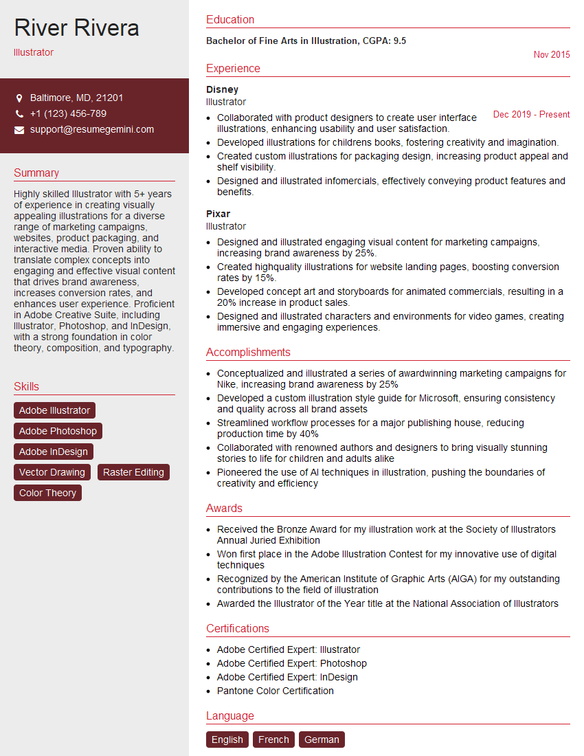
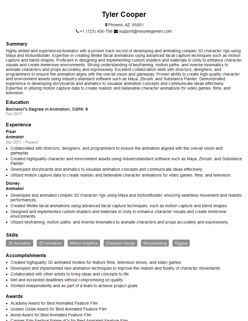
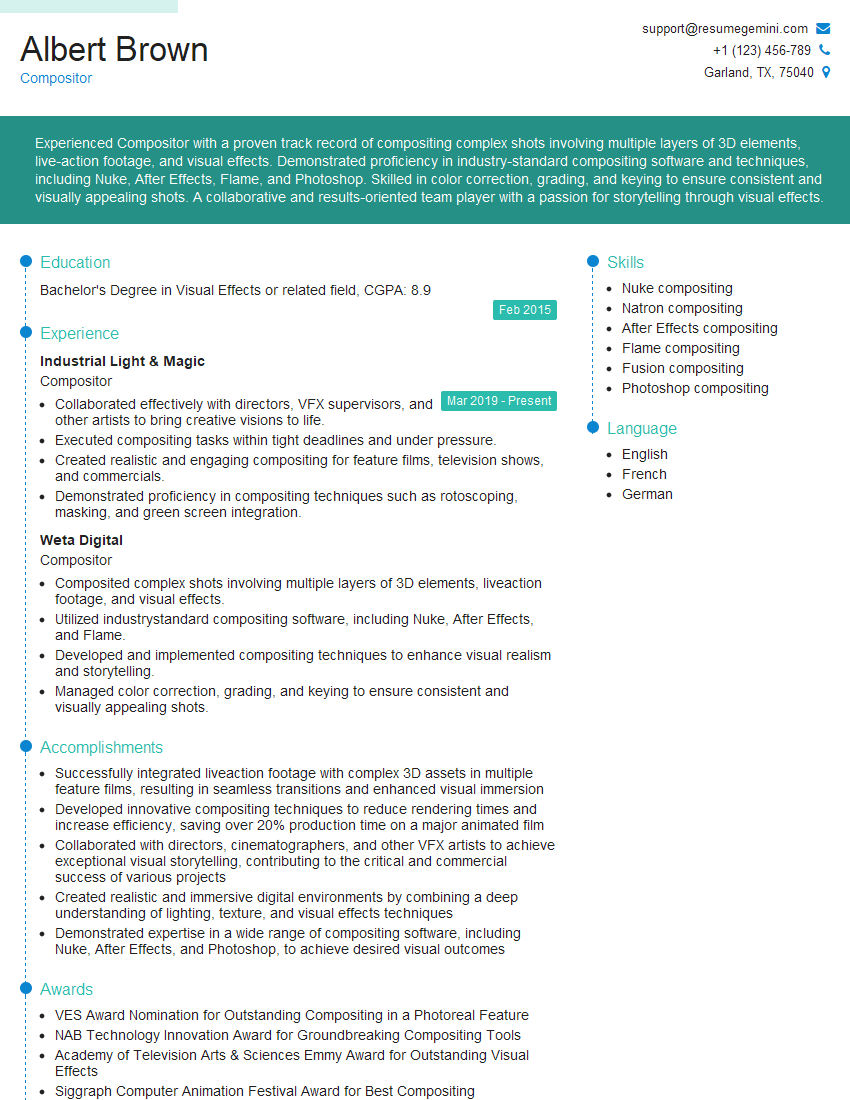
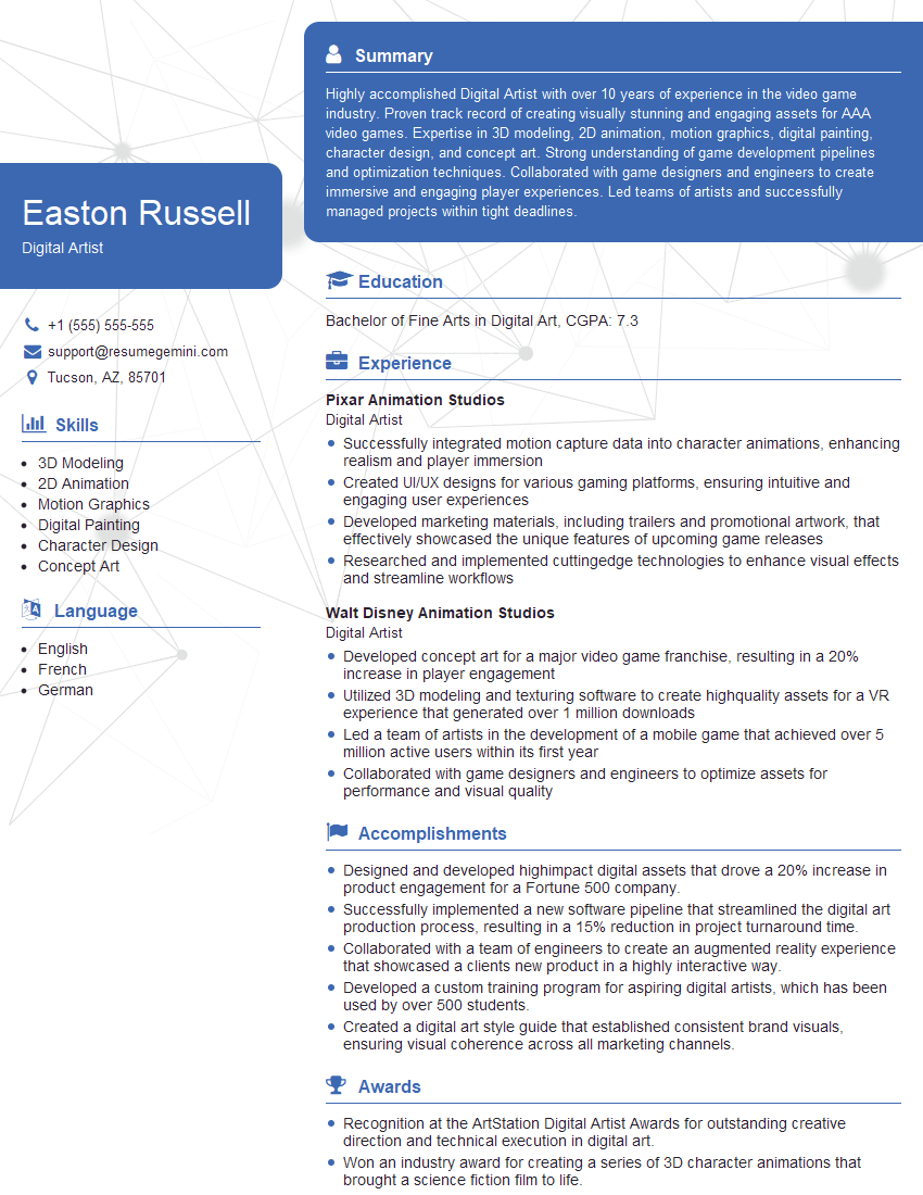
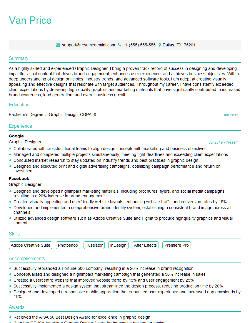
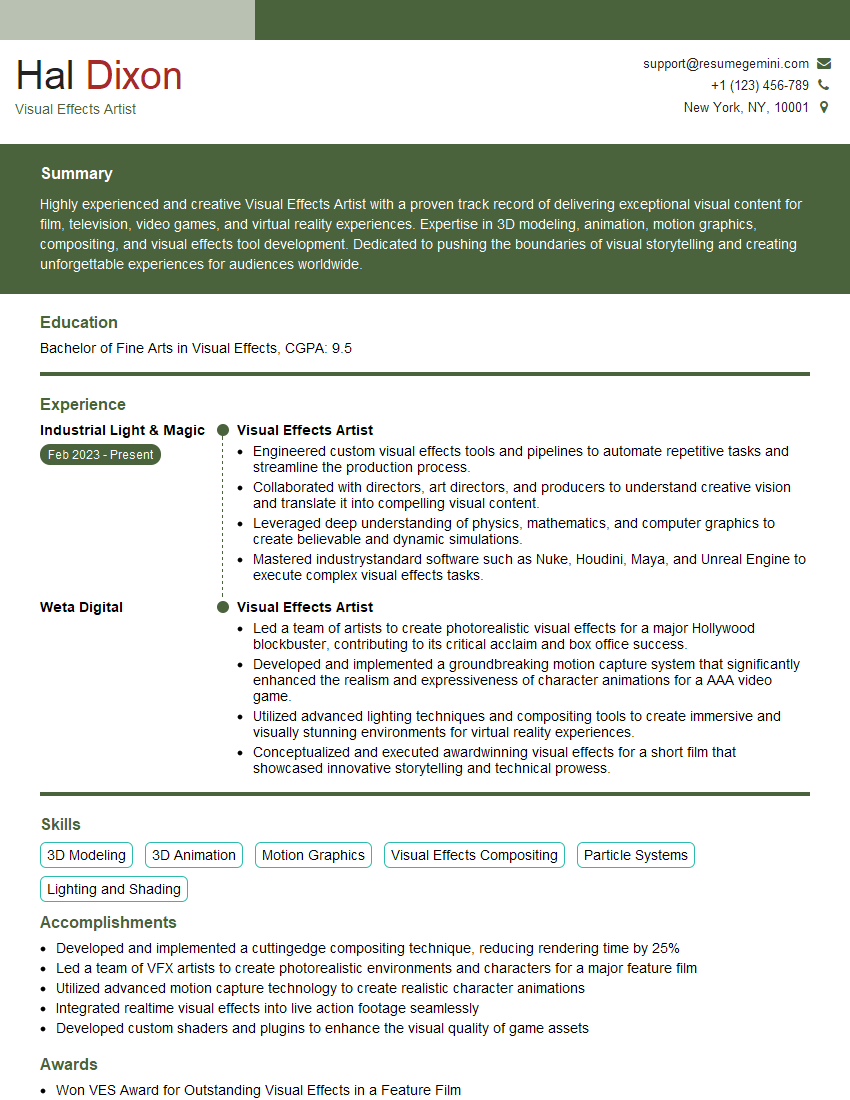
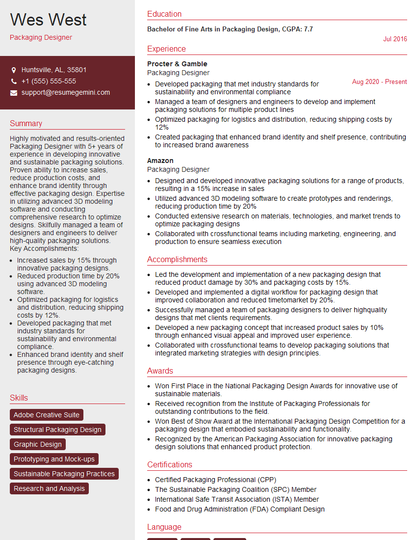
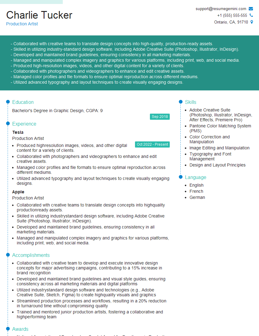
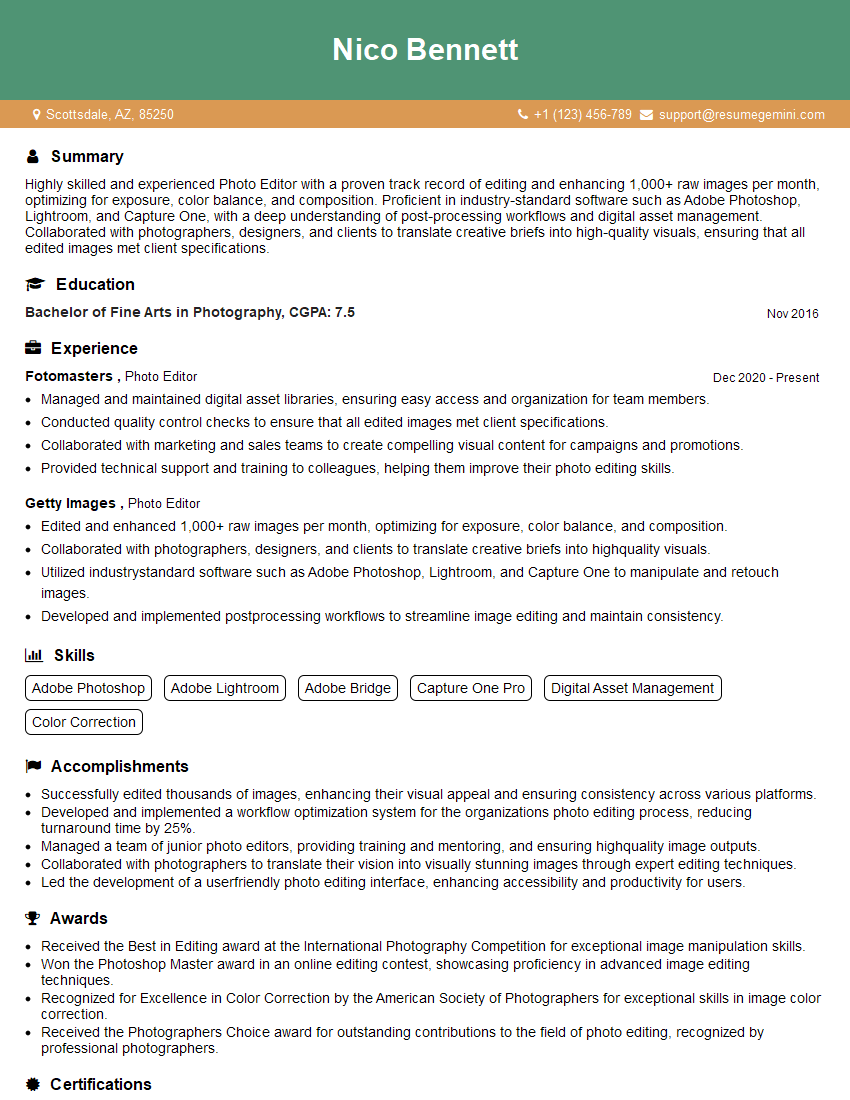
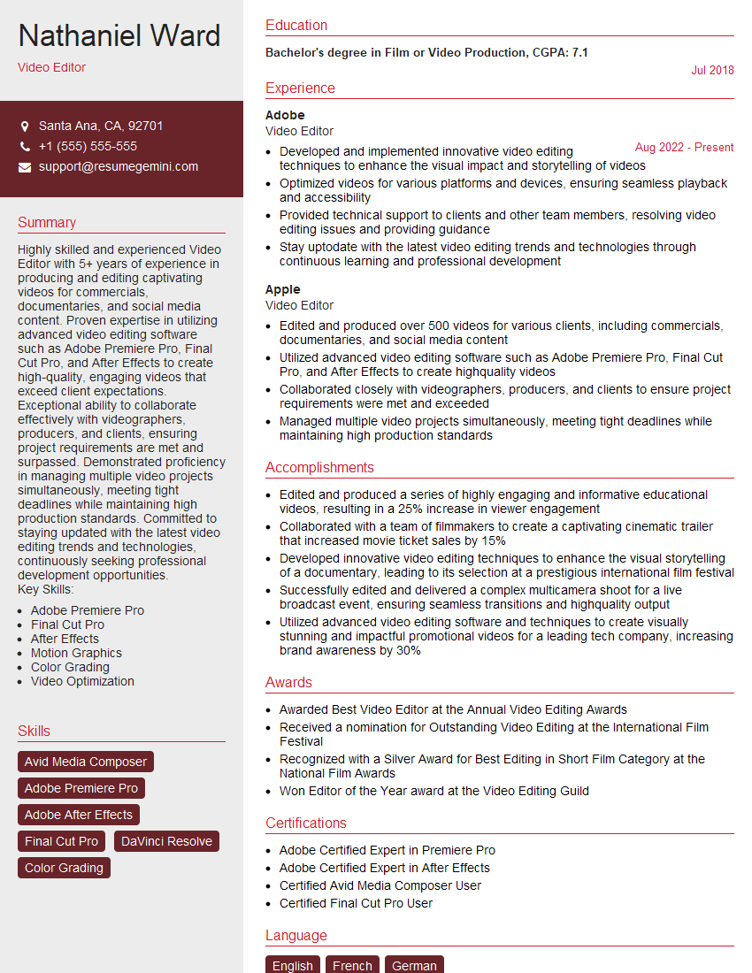
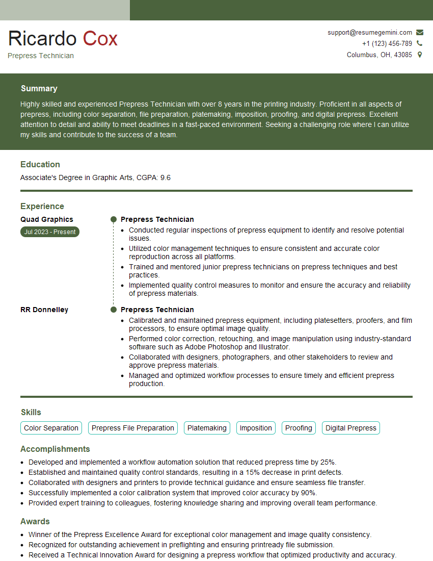
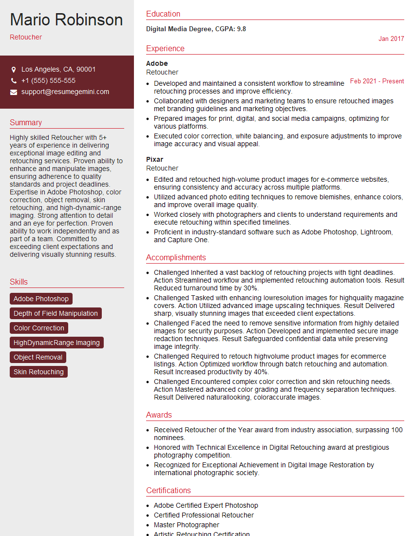
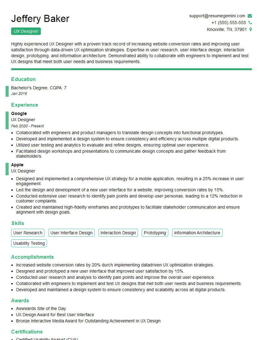
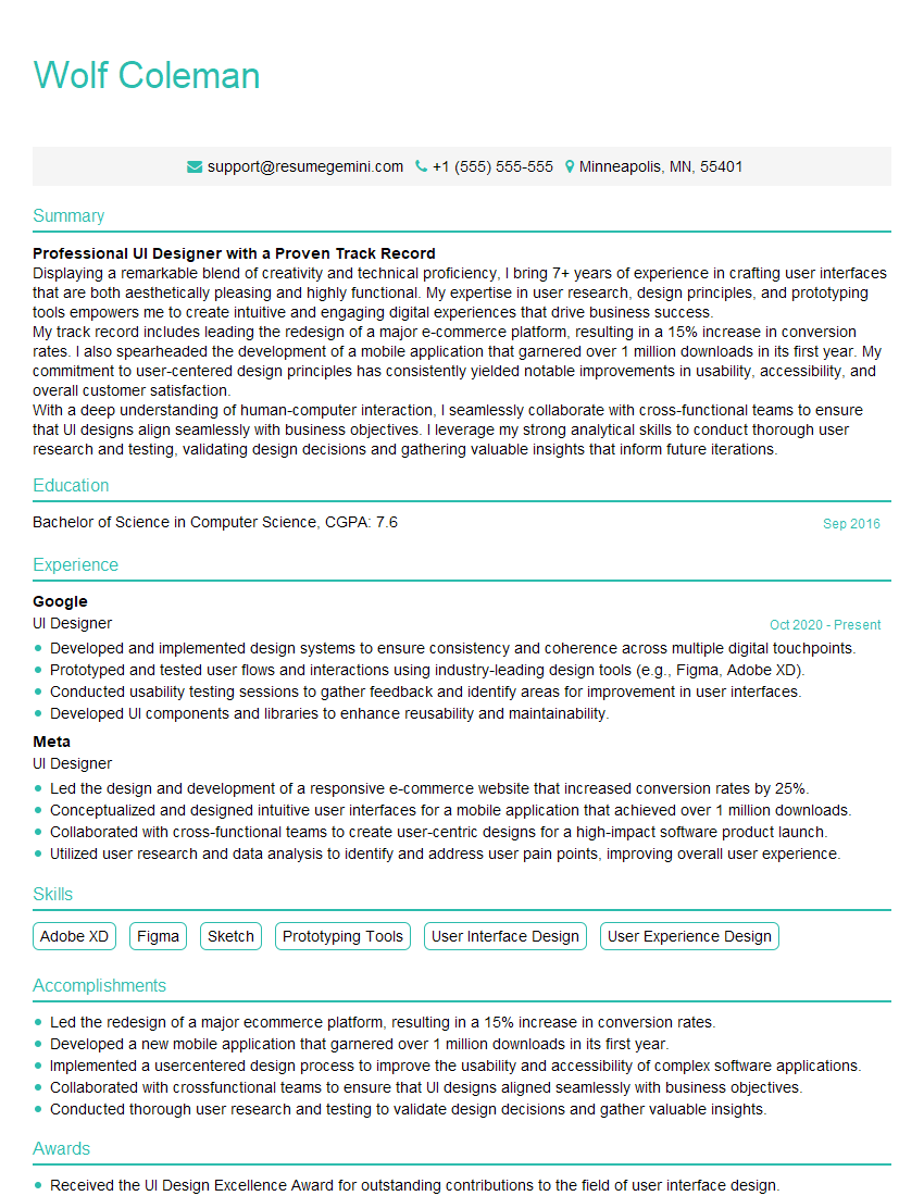
Mastering the Adobe Creative Suite is crucial for career advancement in design, video production, and related fields. A strong portfolio showcases your skills, but a well-crafted resume is the key to opening doors. Building an ATS-friendly resume significantly increases your chances of getting your application noticed. ResumeGemini is a trusted resource to help you create a professional and impactful resume. Examples of resumes tailored to Adobe Creative Suite expertise are available to help you get started.
Explore more articles
Users Rating of Our Blogs
Share Your Experience
We value your feedback! Please rate our content and share your thoughts (optional).
What Readers Say About Our Blog
Hello,
We found issues with your domain’s email setup that may be sending your messages to spam or blocking them completely. InboxShield Mini shows you how to fix it in minutes — no tech skills required.
Scan your domain now for details: https://inboxshield-mini.com/
— Adam @ InboxShield Mini
Reply STOP to unsubscribe
Hi, are you owner of interviewgemini.com? What if I told you I could help you find extra time in your schedule, reconnect with leads you didn’t even realize you missed, and bring in more “I want to work with you” conversations, without increasing your ad spend or hiring a full-time employee?
All with a flexible, budget-friendly service that could easily pay for itself. Sounds good?
Would it be nice to jump on a quick 10-minute call so I can show you exactly how we make this work?
Best,
Hapei
Marketing Director
Hey, I know you’re the owner of interviewgemini.com. I’ll be quick.
Fundraising for your business is tough and time-consuming. We make it easier by guaranteeing two private investor meetings each month, for six months. No demos, no pitch events – just direct introductions to active investors matched to your startup.
If youR17;re raising, this could help you build real momentum. Want me to send more info?
Hi, I represent an SEO company that specialises in getting you AI citations and higher rankings on Google. I’d like to offer you a 100% free SEO audit for your website. Would you be interested?
Hi, I represent an SEO company that specialises in getting you AI citations and higher rankings on Google. I’d like to offer you a 100% free SEO audit for your website. Would you be interested?
good
