Every successful interview starts with knowing what to expect. In this blog, we’ll take you through the top Advanced proficiency in Adobe Creative Suite (Photoshop, Illustrator, InDesign) interview questions, breaking them down with expert tips to help you deliver impactful answers. Step into your next interview fully prepared and ready to succeed.
Questions Asked in Advanced proficiency in Adobe Creative Suite (Photoshop, Illustrator, InDesign) Interview
Q 1. Explain your workflow for creating a high-resolution image in Photoshop.
My workflow for creating a high-resolution image in Photoshop begins with careful planning. I determine the final dimensions and resolution needed, ensuring it’s sufficiently high for the intended use (e.g., large-format print, billboard). I then work in a non-destructive manner, utilizing layers extensively. This allows me to make adjustments without permanently altering the image data. For example, if I’m retouching a portrait, I’ll create separate layers for skin smoothing, blemish removal, and color correction. This modular approach simplifies edits and allows for easy experimentation. Once the image is fully edited, I’ll save a layered PSD file for future modifications and then export a high-resolution JPEG or TIFF file for final use, optimizing the settings (quality, compression) for the specific output medium. Think of it like building with LEGOs – each layer is a separate brick, and you can easily rearrange or replace them without affecting the rest of the structure.
A typical workflow might look like this:
- Planning & Setup: Determine dimensions and resolution, create a new document with appropriate settings.
- Image Import & Layering: Import source images, create layers for each element (background, subject, etc.).
- Non-destructive Editing: Use adjustment layers (Brightness/Contrast, Curves, Levels) and layer masks for targeted edits.
- Refinement & Detailing: Utilize tools like the Healing Brush, Clone Stamp, and Spot Healing Brush for retouching.
- Saving & Exporting: Save as a layered PSD, then export as a high-resolution JPEG or TIFF for final output.
Q 2. Describe your experience using Photoshop’s layer styles and adjustment layers.
Photoshop’s layer styles and adjustment layers are indispensable tools in my arsenal. Layer styles (like drop shadows, bevels, and embossing) add depth and visual interest to elements without requiring complex manual techniques. For example, I might use a subtle drop shadow to give a text layer a sense of realism or a gradient overlay to create a shiny button effect. These are incredibly efficient for creating consistent visual styles across a design project. Adjustment layers, on the other hand, allow me to make global color and tonal corrections without directly altering the image pixels themselves. This is non-destructive editing at its finest. I frequently use adjustment layers like Curves and Levels to fine-tune brightness, contrast, and color balance. For instance, to correct an image that’s slightly overexposed, I’ll create a Levels adjustment layer and subtly adjust the highlights. This allows me to maintain flexibility; I can easily modify or delete the adjustment layer later if needed, or mask it to affect only certain areas.
Think of it this way: layer styles are like makeup – enhancing the features of an existing image, while adjustment layers are like lighting – changing the overall mood and appearance without fundamentally changing the base image.
Q 3. How do you optimize images for web and print in Photoshop?
Optimizing images for web and print requires different strategies. For web, the priority is file size to ensure fast loading times. I’d typically save images as JPEGs for photos and PNGs for graphics with transparency. I’ll use Photoshop’s “Save for Web (Legacy)” feature to fine-tune compression settings while maintaining acceptable image quality. For example, a slightly lower quality JPEG setting (around 70-80%) often results in a significant file size reduction without a drastic loss of visual detail. In contrast, print optimization prioritizes high resolution and color accuracy. I’ll save images as TIFF or high-quality JPEGs at the highest possible resolution, ensuring the image is at least 300 DPI (dots per inch) for professional printing. I’d also pay close attention to color profiles, using a consistent color space throughout the design process (such as Adobe RGB or sRGB) and making sure the final file is properly color-managed for the intended printing method.
In essence, web optimization focuses on file size, while print optimization focuses on resolution and color accuracy.
Q 4. What are the advantages of using smart objects in Photoshop?
Smart Objects are one of Photoshop’s most powerful features. They allow you to embed images, text, or entire other Photoshop files into your document as editable objects. The key advantage is non-destructive scaling. If I place a logo as a Smart Object, I can resize it without losing quality; the image scales without pixelation. This is critical for maintaining the integrity of high-resolution images. Moreover, edits made to the original Smart Object automatically update across all instances within the document. If I need to change the logo, I just edit the original Smart Object, and the change reflects everywhere. This is invaluable for branding consistency and efficient workflow. Smart Objects also allow for filters to be applied non-destructively, which means you can easily adjust or remove them later without affecting the original image data.
Imagine it like using a symbol in a CAD program – you only need to edit the master symbol, and all instances update simultaneously. This streamlines the process significantly.
Q 5. Explain your process for creating vector graphics in Illustrator.
My process for creating vector graphics in Illustrator starts with a clear concept and planning. I define the purpose of the graphic and the desired outcome. I begin by sketching out my ideas, either digitally or traditionally. Once I have a solid concept, I use Illustrator’s drawing tools to create the vector shapes. I prefer working with paths and points over raster-based tools, as this ensures scalability and crispness. I utilize tools like the Pen Tool for precise path creation and the Shape Builder Tool for combining and modifying shapes efficiently. I ensure that all paths are closed and cleanly constructed to avoid issues during scaling or printing. Color and style are applied thoughtfully, considering brand guidelines and the overall design aesthetic. I’ll often use the Appearance panel to layer different effects, for example, adding a gradient to a shape, followed by a stroke, and then finally a drop shadow. The final artwork is saved in AI (Adobe Illustrator) format for maximum editability and also as SVG or EPS for compatibility with other software and sharing.
I approach vector creation like sculpting with clay; each path is a precise movement, building up the final form with careful attention to detail and structural integrity.
Q 6. How do you manage color consistency across different projects in Illustrator?
Maintaining color consistency across different projects in Illustrator is paramount. My approach involves utilizing color palettes and spot colors. I create and save custom color palettes, typically in a Pantone or other specific color system, to ensure brand consistency and maintain the same color throughout multiple projects. This allows easy access to the exact color values rather than relying on estimated visual matches. For projects requiring precise color reproduction, particularly in print, I use spot colors. Spot colors are defined separately from the CMYK or RGB color model and are better suited for accurate printing as they are pre-mixed inks rather than printer-generated approximations. Utilizing color management profiles is also important for consistency. I work in a consistent color space (such as CMYK for print or RGB for screen) and ensure proper profile embedding for consistent representation across various systems.
Consistent color usage provides professionalism and reduces errors, especially when dealing with multiple projects or design elements that must work seamlessly together.
Q 7. Describe your experience using Illustrator’s Pathfinder panel.
Illustrator’s Pathfinder panel is a powerhouse for manipulating vector shapes. It offers a range of functions for combining, subtracting, intersecting, and dividing shapes in creative ways. I use it extensively to create complex designs from simpler components. For example, I might use the “Unite” function to merge several overlapping shapes into a single shape, or the “Minus Front” function to subtract a shape from another, creating intricate cutouts. The Pathfinder panel’s capabilities are crucial for simplifying complex illustrations and creating intricate designs efficiently. It’s especially useful for creating logos, icons, and illustrations that demand precise shape manipulation. Understanding the nuances of each function – Unite, Minus Front, Intersect, Exclude, etc. – is critical for maximizing its efficiency. The ability to use these functions in combination enables the creation of almost limitless designs.
Think of it as a digital version of a surgeon’s tools, allowing the precise manipulation of shapes to achieve a desired outcome.
Q 8. How do you create and edit complex shapes in Illustrator?
Creating and editing complex shapes in Illustrator is a cornerstone of vector-based design. It leverages the power of paths, allowing for precise control and scalability without loss of quality. You can create shapes using various tools, including the Pen Tool (the most versatile), the Shape tools (Rectangle, Ellipse, Polygon, etc.), and the freeform tools (Pencil, Brush).
For complex shapes, the Pen Tool is king. It lets you create precise anchor points and Bézier curves to shape your designs. Think of anchor points as pins holding a rubber band – you can adjust their direction handles to curve the lines between them. Combining basic shapes with the Pathfinder panel (Unite, Minus Front, Intersect, Exclude) allows you to create intricate designs by combining, subtracting, or intersecting shapes.
For example, imagine creating a stylized leaf: I would start by using the Pen Tool to draw the outer shape. Then, I might add internal shapes using the Ellipse Tool for veins and the Pathfinder panel to subtract them from the main leaf shape for a realistic effect. The ability to edit individual anchor points allows me to refine the curves and create a perfectly balanced design. Finally, the ability to expand appearance allows me to convert complex effects into editable shapes.
Q 9. Explain your workflow for designing a multi-page document in InDesign.
My workflow for designing a multi-page InDesign document prioritizes organization and efficiency. It begins with planning – outlining the content, determining the page size, and visualizing the overall structure. This prevents mid-project adjustments and ensures consistency.
I always start by setting up Master Pages. These act as templates for consistent elements across the document, like headers, footers, and page numbers. This saves considerable time and ensures a professional, unified look.
Next, I create styles for text and paragraphs, maintaining consistency in typography throughout the document. This involves defining character styles (for individual character formatting like font, size, and color) and paragraph styles (for paragraph formatting like indentation, spacing, and alignment). This way, changes to a style are reflected automatically across all instances.
Then I begin populating the pages, carefully placing text and images using text boxes and frames, always mindful of the established styles and master pages. I frequently save my work, using versions to track changes or revert if necessary. Finally, I thoroughly proofread the entire document before exporting.
For instance, when working on a brochure, I would create a master page with a consistent header and footer. Then, I would set up paragraph styles for headings, body text, and captions, ensuring font sizes and alignment are consistent. This streamlined process allows for quick and efficient adjustments and guarantees a professional finish.
Q 10. How do you manage styles and master pages in InDesign?
Managing styles and master pages in InDesign is crucial for maintaining consistency and efficiency. Master pages act as templates for recurring elements across your document, like headers, footers, page numbers, and running designs. Styles (paragraph and character styles) are crucial for controlling text formatting. They allow you to apply consistent formatting to text across multiple pages without manual adjustments.
I create master pages first, setting up any consistent elements. Then, I define paragraph styles for body text, headings, captions, etc. Character styles control specific character attributes like font, size, and color, often used within paragraph styles for more nuanced control.
Consider a magazine layout: I would create a master page for the left and right pages, each with differing headers and footers. Then I’d create paragraph styles for headlines, subheadings, body text, and captions. This ensures consistent styling and a professional feel, allowing for easy updates throughout the document. For instance, changing the body text font from Times New Roman to Garamond would only require editing one style, updating every instance across the document automatically.
Q 11. Describe your experience with InDesign’s preflight feature.
InDesign’s preflight feature is a lifesaver for ensuring that your document is ready for print or digital distribution. Preflight checks identify potential issues before they become costly problems. This includes problems like missing fonts, incorrect color spaces, low-resolution images, and overset text.
My workflow involves running a preflight check before any final export. I customize the preflight profile to include the checks relevant to my output method, ensuring all necessary elements are validated. This might include checking for embedded fonts, checking for image resolution, and verifying color profiles. The report generated helps me address any issues quickly, saving time and preventing costly reprints or online errors.
For example, I once caught a missing font during preflight, preventing a costly reprint of a marketing brochure. By addressing the font issue before sending the file to the printer, I avoided delays and wasted resources. Preflight allows for a thorough check, acting as quality assurance before final output.
Q 12. How do you create and manage tables in InDesign?
Creating and managing tables in InDesign is straightforward yet powerful. You can create tables using the Table menu or the Table tool. Once created, the table can be customized extensively. You can easily adjust column width, add or delete rows and columns, and apply cell styles for consistent formatting.
My approach involves creating a table with the appropriate number of rows and columns. Then, I apply table styles and cell styles to maintain consistency in appearance. Cell styles allow for precise control of cell formatting (font, color, alignment). I use the Table options to adjust cell spacing, borders, and padding, ensuring a clean and professional look. Complex tables benefit from the use of styles. Changes to a style update all instances instantly.
For instance, designing a price list requires a well-structured table. By using styles, I can easily change the overall font, formatting or borders for all items. This saves significant time and effort, allowing for efficient adjustments and a professional presentation.
Q 13. How do you export files from InDesign for different output methods?
Exporting files from InDesign depends heavily on the intended output method. For print, I typically export as a PDF/X-1a compliant PDF, ensuring color management and font embedding for consistent results. For online use, I often use interactive PDFs, or export as JPEGs or PNGs for web integration. Sometimes, exporting as individual images or using InDesign’s export to HTML is necessary.
When exporting for print, I always select the appropriate PDF/X standard (PDF/X-1a or PDF/X-4) to ensure color accuracy and font embedding. For web use, the choice depends on the context. JPEGs are efficient for photographic images, while PNGs are better for graphics with sharp edges and transparency. High-resolution images are usually necessary. The export settings must be optimized for each format.
For example, preparing a brochure for print requires a PDF/X-1a export with embedded fonts and proper color profiles to ensure accurate reproduction. In contrast, exporting images for a website involves optimizing the file size and resolution to ensure quick loading and visual appeal.
Q 14. Compare and contrast the use of Photoshop, Illustrator, and InDesign.
Photoshop, Illustrator, and InDesign are all powerful Adobe Creative Suite applications, but they serve distinct purposes. Photoshop excels at raster-based image editing, focusing on pixel-level manipulation and photo retouching. Illustrator is a vector-based graphics editor, ideal for creating scalable logos, illustrations, and artwork. InDesign is a page layout application, best for designing multi-page documents like brochures, magazines, and books.
Think of it this way: Photoshop is for painting, Illustrator is for drawing, and InDesign is for assembling. Photoshop works with pixels, making it suitable for photographic images and textures. Illustrator works with vectors, creating scalable graphics without losing quality. InDesign combines text and images, organizing them into polished layouts for print or digital media.
Often, these programs work together. I might create an illustration in Illustrator, retouch a photo in Photoshop, and then bring both into InDesign to create a visually stunning brochure. The synergy between these applications empowers comprehensive creative solutions. For example, I would design a logo in Illustrator, refine it in Photoshop for color correction, and then use it in InDesign to build a brand identity presentation.
Q 15. Describe a time you had to troubleshoot a complex design issue in Adobe Creative Suite.
One challenging project involved creating a complex infographic with intricate illustrations and layered typography in Adobe Illustrator. The client requested a last-minute change involving a significant restructuring of the layout, impacting the intricate linking of interactive elements. Troubleshooting involved carefully analyzing the Illustrator file structure. I used the Layers panel meticulously to identify which elements were causing conflicts. The problem stemmed from improperly nested groups and overlapping objects which were hindering the interactive functionality. My solution involved ungrouping problematic elements, reorganizing layers logically (grouping related elements), and using Illustrator’s Pathfinder tools to carefully clean up overlapping paths. I then meticulously re-established the interactive links using hyperlinks and buttons, thoroughly testing each connection to ensure accuracy. This meticulous approach, combined with a deep understanding of Illustrator’s layer management and Pathfinder capabilities, allowed me to efficiently resolve the issue and deliver the project on time.
Career Expert Tips:
- Ace those interviews! Prepare effectively by reviewing the Top 50 Most Common Interview Questions on ResumeGemini.
- Navigate your job search with confidence! Explore a wide range of Career Tips on ResumeGemini. Learn about common challenges and recommendations to overcome them.
- Craft the perfect resume! Master the Art of Resume Writing with ResumeGemini’s guide. Showcase your unique qualifications and achievements effectively.
- Don’t miss out on holiday savings! Build your dream resume with ResumeGemini’s ATS optimized templates.
Q 16. How do you handle color management in your design workflow?
Color management is paramount for consistency across different output devices. My workflow begins with setting up my Adobe applications (Photoshop, Illustrator, InDesign) to use a consistent color profile, typically Adobe RGB (1998) for design and sRGB for web. I always work in a color-managed workspace, ensuring that all images imported are correctly profiled. For print projects, I meticulously convert my files to the specified CMYK profile provided by the print shop, using soft proofing features to preview how the colors will appear on press. I carefully manage color adjustments using non-destructive editing techniques, like adjustment layers in Photoshop, to maintain maximum flexibility and control. Think of it like using a recipe – you wouldn’t throw all your ingredients together at once! This layered approach helps prevent irreversible color changes and ensures consistent results regardless of the file’s journey from design to print or web.
Q 17. Explain your experience with using plugins and extensions in Adobe Creative Suite.
Plugins and extensions significantly enhance productivity and expand creative possibilities within the Adobe Creative Suite. I have extensive experience using various plugins. For example, in Photoshop, I frequently use plugins for noise reduction (e.g., Topaz Denoise AI), advanced sharpening, and batch processing. In Illustrator, plugins for creating custom brushes and automating repetitive tasks have been invaluable. I carefully vet any new plugins, prioritizing reputable developers to avoid compatibility issues or security risks. My approach is to integrate plugins strategically, focusing on those that address specific workflow bottlenecks or add functionality unavailable natively. It’s like having a toolbox – you choose the right tools for the job, rather than using every tool available.
Q 18. How do you ensure your designs are accessible?
Accessible design is crucial. My process involves considering users with disabilities from the outset of a project. This begins with using sufficient color contrast, checked using tools like WebAIM’s contrast checker. I always ensure that alternative text is provided for all images, describing the content meaningfully for screen readers. In InDesign, I pay close attention to document structure and navigation using features like tagged PDF creation. For interactive elements, I ensure proper keyboard navigation and focus indicators are implemented. It’s about designing inclusively – making sure everyone can interact with and understand your design. Thinking of these elements as part of the design process, rather than an afterthought, is critical.
Q 19. What are some best practices for file organization in Adobe Creative Suite?
Organized files are the backbone of an efficient workflow. My system relies on a clear folder structure, typically mirroring the project’s name and containing subfolders for different file types (e.g., ‘Images’, ‘Vectors’, ‘Final Files’). I use descriptive file names, avoiding special characters and sticking to a consistent naming convention. I always save multiple versions of my files (e.g., using ‘v1’, ‘v2’, etc. in the filenames), enabling easy revision tracking. Regularly backing up all project files to a cloud storage or external hard drive is crucial. Think of it as spring cleaning your digital space – a little effort up front makes everything easier in the long run, preventing stress and lost work.
Q 20. How do you work collaboratively on design projects using Adobe Creative Suite?
Collaboration is key. I’ve extensively used Adobe Creative Cloud Libraries to share design assets and maintain consistency across team members. For larger projects, we leverage Adobe Experience Manager Assets for managing larger file volumes and ensuring version control. Utilizing cloud-based platforms allows for real-time collaboration and feedback. Tools such as shared comments in Photoshop and InDesign enable efficient communication and issue resolution. Clear communication and well-defined roles are equally important – it’s a team effort, and good communication is the glue.
Q 21. Describe your experience with version control and design assets.
Version control is crucial. I utilize a combination of techniques. For smaller projects, the simple naming convention (e.g., ‘FileName_v1.psd’) is sufficient. For larger projects, where multiple team members are working on the same files, integrating Adobe Creative Cloud Libraries, or even a dedicated version control system like Git (with tools like Git LFS for handling large binary files) helps to track changes efficiently and revert to earlier versions if needed. This helps avoid conflicts and ensures that the design evolution is clearly documented, like having a time-lapse of your design’s journey.
Q 22. How familiar are you with Adobe Creative Cloud Libraries?
Adobe Creative Cloud Libraries are a fantastic cloud-based asset management system integrated into the Creative Suite. Think of it as your personal, always-accessible design resource library. I utilize it extensively to store and share my frequently used assets—graphics, colors, character styles, and even entire vector objects. This eliminates redundant work and ensures consistency across projects. For example, if I create a specific logo style in Illustrator, I can save it to my library, making it instantly available in Photoshop, InDesign, or even other applications like After Effects, maintaining brand consistency across all deliverables.
Beyond personal use, Libraries are collaborative tools. I’ve used them in team projects to share approved brand assets and templates, preventing version control issues and ensuring everyone uses the same up-to-date elements. It’s like a shared, centralized design toolbox for seamless teamwork.
Q 23. What are some time-saving shortcuts you use in Adobe Creative Suite?
Time-saving shortcuts are crucial for efficiency. In Photoshop, I constantly use Ctrl+J (or Cmd+J on Mac) to duplicate layers, Ctrl+T (Cmd+T) for free transform, and Alt+click (Option+click) to sample colors directly from the canvas. These are muscle memory actions.
In Illustrator, Ctrl+C and Ctrl+V are always my go-to, but I also leverage the Alt+click (Option+click) tool to create perfect copies of objects and pathways. To quickly select objects, I often use the [ and ] keys to adjust the stroke weight without navigating menus. In InDesign, I rely on Ctrl+Alt+V (Cmd+Option+V) for pasting without formatting to maintain control over text and graphics I’m placing into documents.
Beyond these, I use keyboard shortcuts for virtually every commonly performed function. I find the time saved adds up considerably over the course of a project or even a day’s work. It lets me focus on the creative process, not the technical steps.
Q 24. How do you stay up-to-date with the latest Adobe Creative Suite features and updates?
Staying updated is paramount in this field. I regularly consult Adobe’s website and its dedicated blog, focusing on new feature releases and tutorials. I also subscribe to industry newsletters and follow key influencers and Adobe experts on social media platforms like Twitter and LinkedIn. Attending webinars and online workshops hosted by Adobe or certified training centers is essential for hands-on learning and networking. I find that trying out new features immediately in personal projects, even if only small ones, allows for quick familiarization and application in real-world tasks.
Furthermore, actively participating in online design communities and forums helps me stay abreast of best practices and troubleshoot issues. This combined approach ensures that I am not only aware of updates but adept at applying them effectively.
Q 25. Describe your experience with print production and prepress processes.
My experience with print production and prepress is extensive. I’ve worked on numerous projects, from brochures and magazines to books and packaging, involving tasks from file preparation to proof approvals. This includes preparing high-resolution files with appropriate color profiles (CMYK), creating bleed and trim marks, ensuring proper font embedding, and generating various PDF versions for different printing processes. I understand the importance of color management, resolution requirements, and the specifications unique to different printing techniques (offset, digital, etc.).
I’m familiar with preflighting software and actively conduct thorough checks to catch potential issues before sending files to print. This includes checking for missing fonts, images, and ensuring color consistency. Effective communication with print vendors is also key. I regularly consult with them to ensure the files meet their specifications and get feedback to refine the files accordingly, minimizing costly mistakes.
Q 26. Explain your understanding of CMYK and RGB color spaces.
RGB and CMYK are two distinct color models. RGB (Red, Green, Blue) is an additive color model used for screens. It mixes light to create colors; adding all three at full intensity produces white. Conversely, CMYK (Cyan, Magenta, Yellow, Key/Black) is a subtractive model used for printing. It works by subtracting light from white; combining all four at full intensity results in black, though often a black ink is added for richer blacks.
Understanding the difference is critical to avoid color discrepancies. Images designed for screens in RGB will appear different when printed in CMYK. Therefore, accurate color management is vital. This often involves converting RGB images to CMYK and carefully managing the color profile (such as using color profiles like Adobe RGB or sRGB when working with images for print.) A significant color shift might also necessitate adjustments to specific colors before sending a file to print.
Q 27. How do you create and utilize custom brushes in Photoshop?
Creating custom brushes in Photoshop is a powerful way to personalize your workflow and enhance your artistic style. To create one, I typically start by creating a shape or texture, either manually painting it or importing a vector graphic. Next, I go to the Brushes panel (Window > Brushes), select the shape, and edit its properties. These properties include shape dynamics (for varying size and angle), scattering (randomness in brushstrokes), and texture (adding surface details).
For instance, I might create a custom brush from a high-resolution scanned texture to create a realistic watercolor effect. I adjust its properties to control the spacing and randomness of the strokes, creating natural-looking watercolor washes. I’ve even built brushes from images of grass or foliage to create custom textural effects when painting landscapes.
The possibilities are endless. By creating custom brushes that closely match my creative needs or a style, I not only improve efficiency but also have greater creative control over my workflow. These custom brushes are then saved and reused in future projects.
Q 28. Describe your experience using Illustrator’s Live Paint features.
Illustrator’s Live Paint features are fantastic for creating and editing vector artwork, especially illustrations with complex color areas. Think of Live Paint as a digital version of painting directly onto vector shapes. It lets you easily fill in shapes with colors, create smooth transitions, and edit vector artwork in a more intuitive, painterly way.
For example, I’ve used Live Paint to create complex illustrations for children’s books. I create basic shapes to represent different elements. I then use the Live Paint Bucket tool to easily fill each shape with the desired color. The feature’s ability to seamlessly blend colors at the edges of shapes helps in creating organic and realistic looking illustrations. The Live Paint selection tool lets you select portions of a painting and modify their fill or stroke attributes, facilitating easy edits and refinement.
I find Live Paint especially useful when working with illustrations that require a lot of color blending or modifications. The combination of vector precision and the feel of digital painting significantly improves my workflow when creating illustrations with many intricate elements.
Key Topics to Learn for Advanced Proficiency in Adobe Creative Suite (Photoshop, Illustrator, InDesign) Interview
- Photoshop: Mastering advanced layer techniques (adjustment layers, masks, blending modes), high-resolution image editing, retouching, and advanced color correction workflows.
- Photoshop: Practical application: Demonstrate your ability to efficiently retouch product images for e-commerce, create compelling visual assets for marketing campaigns, or manipulate images for print media, addressing specific client requirements and deadlines.
- Illustrator: Deep understanding of vector graphics, creation and manipulation of complex illustrations, typography mastery (including kerning, tracking, and advanced text effects), and working with complex design systems.
- Illustrator: Practical application: Showcase your skills in creating scalable logos, icons, and illustrations for various platforms, designing print-ready artwork, or developing brand guidelines ensuring consistency.
- InDesign: Advanced page layout techniques, master pagination, working with styles and master pages, creating interactive PDFs, and prepress preparation for print production.
- InDesign: Practical application: Explain your experience in designing brochures, magazines, books, or other complex publications, including effective use of grids, typography, and image placement for optimal readability and visual impact.
- Cross-Application Workflow: Demonstrate a seamless workflow between Photoshop, Illustrator, and InDesign; prepare assets created in Photoshop and Illustrator for optimal use within InDesign projects. Discuss file formats and compatibility issues.
- Color Management: Explain your understanding of color profiles (CMYK, RGB, etc.), color spaces, and how to ensure color accuracy across different platforms and outputs.
- File Optimization & Export: Showcase your expertise in preparing files for various outputs (web, print, etc.), including appropriate resolution, file formats (JPEG, PNG, TIFF, PDF), and compression techniques for optimal file size and quality.
- Problem-Solving & Creative Thinking: Be prepared to discuss how you approach design challenges, overcome technical obstacles, and present creative solutions to meet client briefs efficiently and effectively.
Next Steps
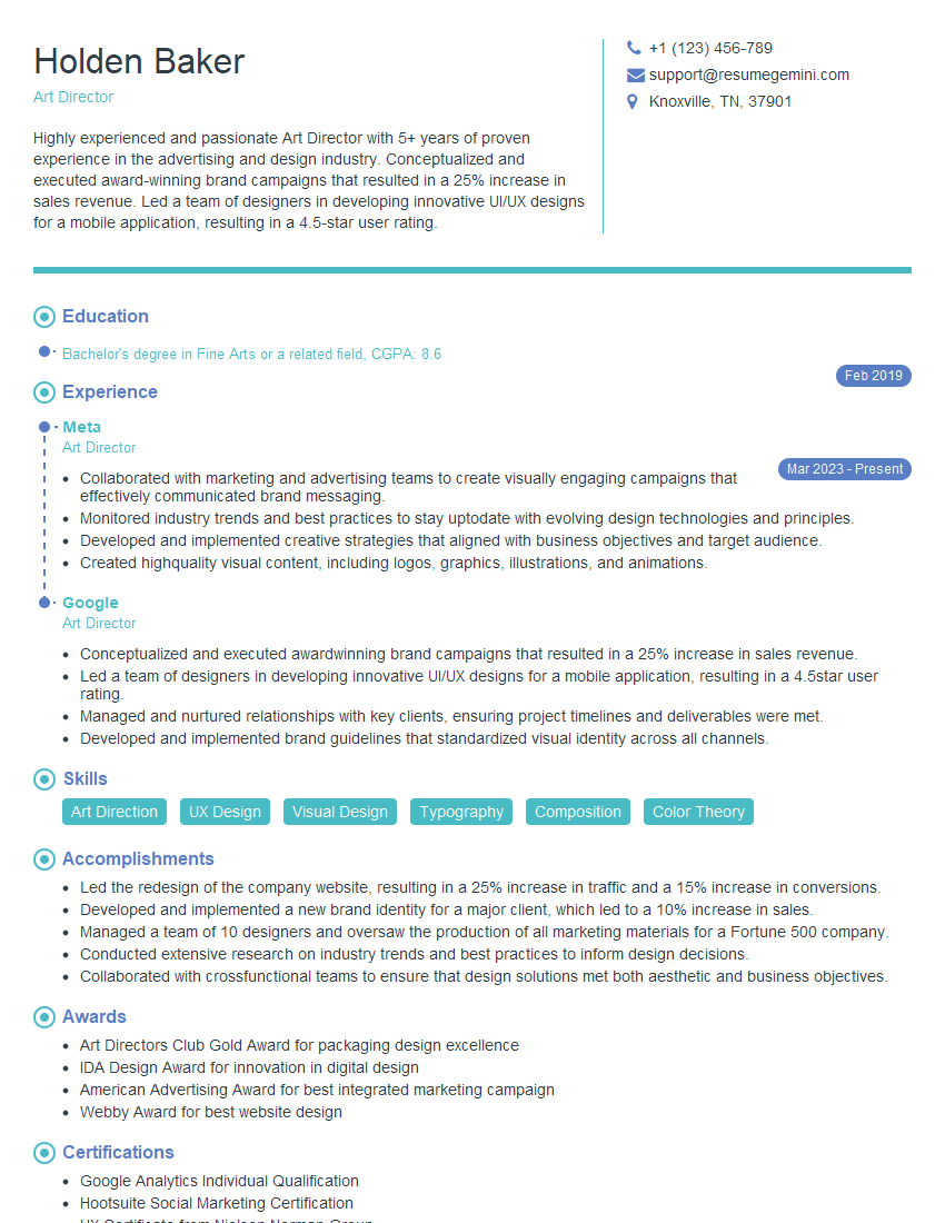
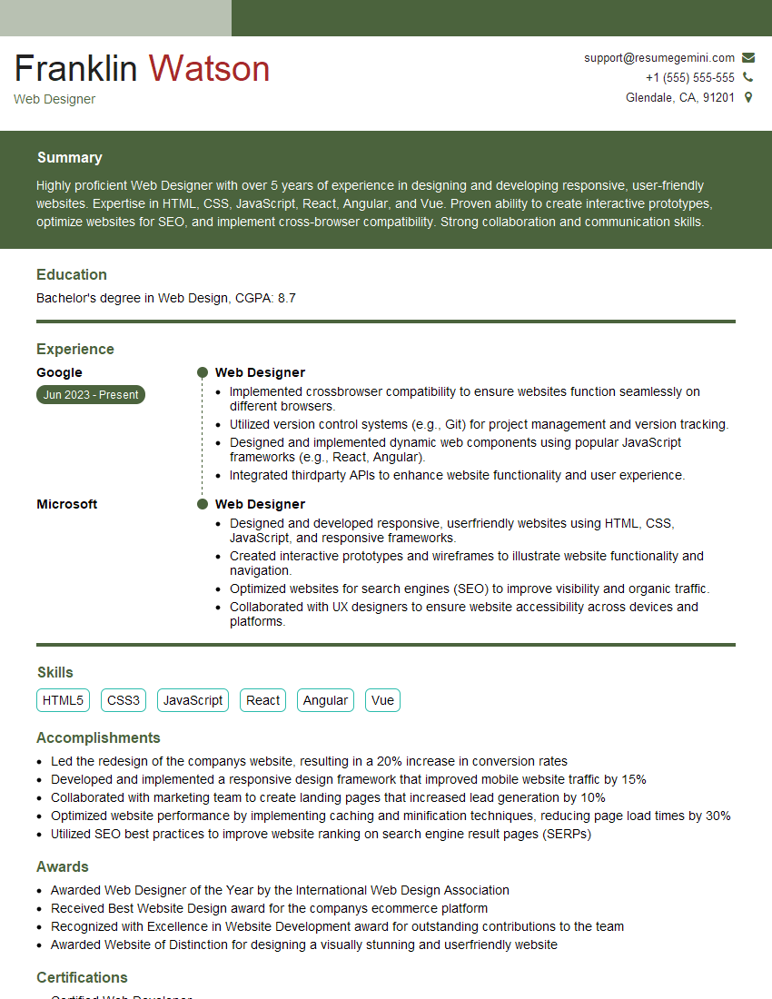
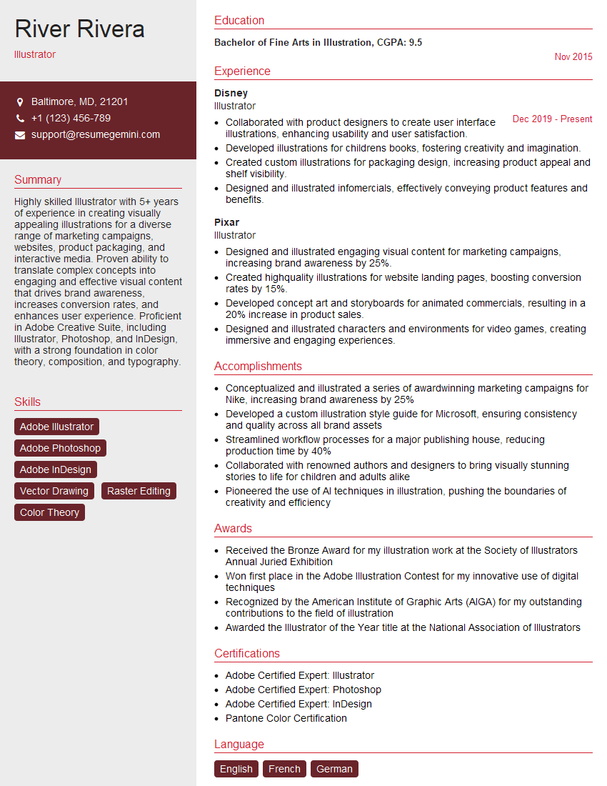
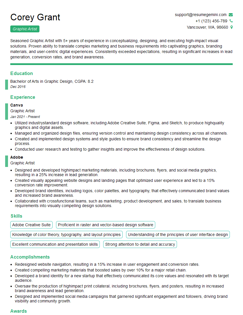
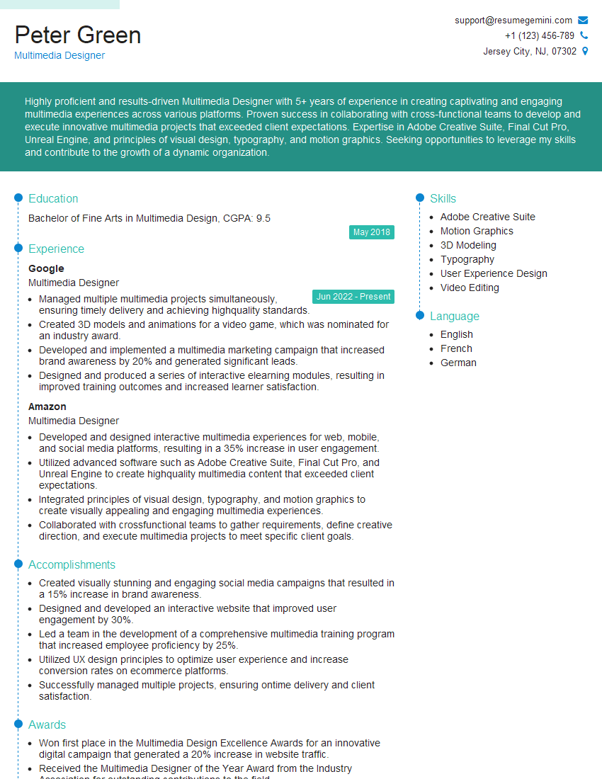
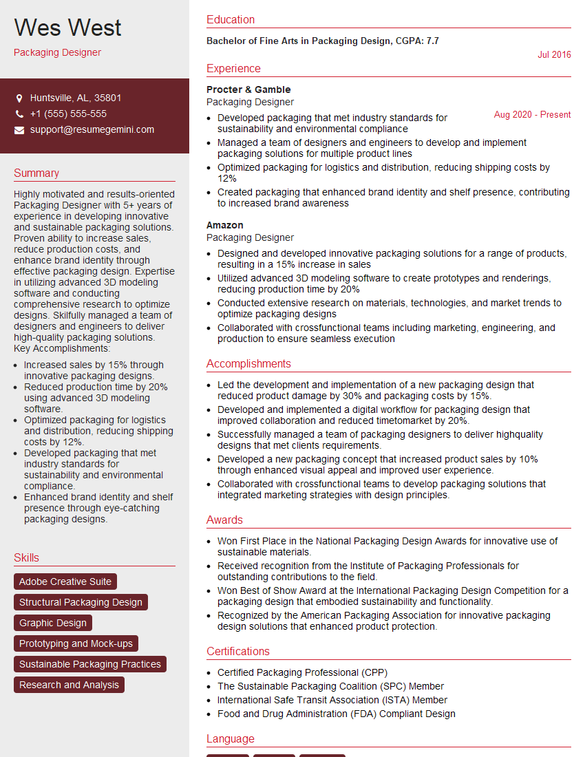
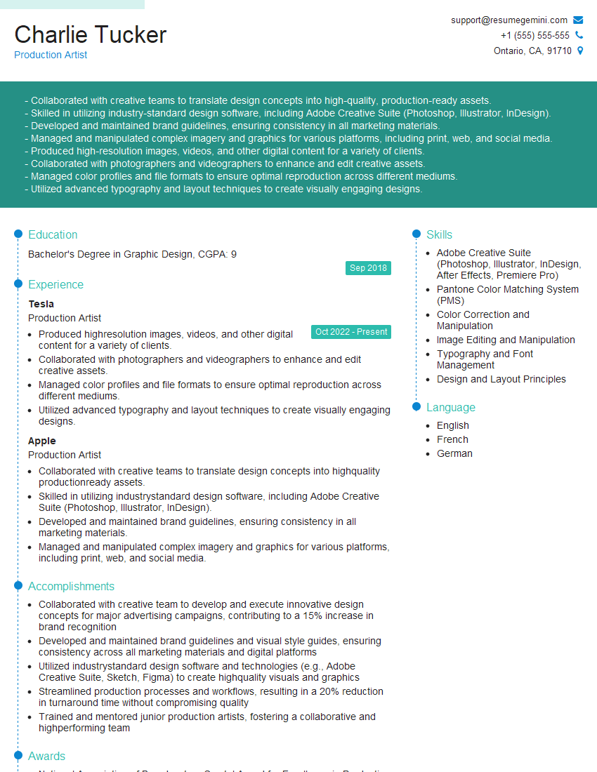
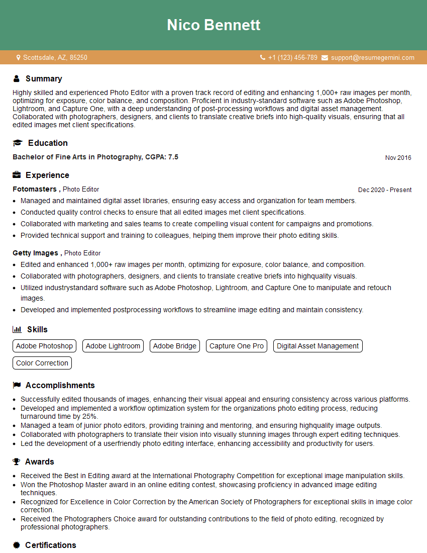
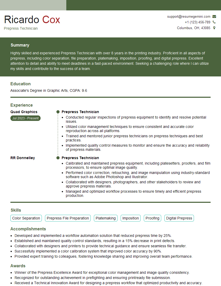
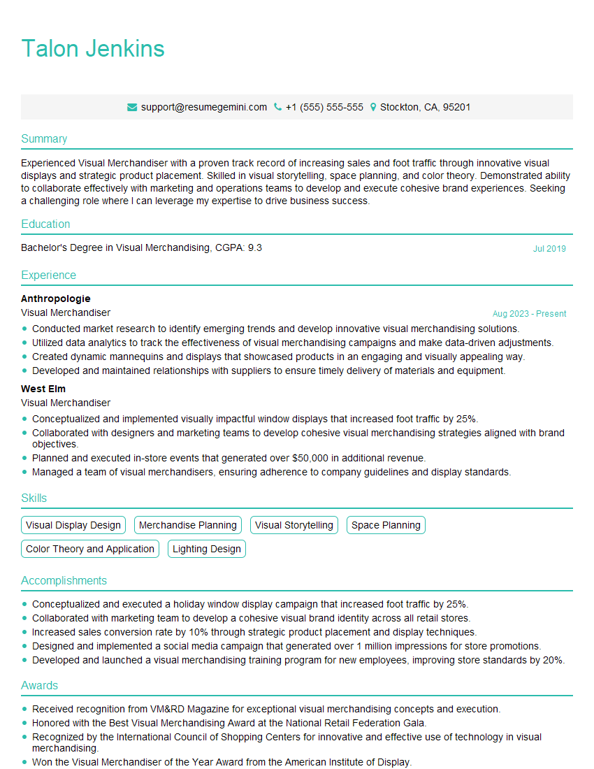
Mastering advanced proficiency in Adobe Creative Suite is crucial for career advancement in design and related fields. It opens doors to higher-paying roles and more challenging, rewarding projects. To maximize your job prospects, create an ATS-friendly resume that highlights your skills and experience effectively. ResumeGemini is a trusted resource that can help you build a professional and impactful resume tailored to your specific skillset. Examples of resumes tailored to Advanced proficiency in Adobe Creative Suite (Photoshop, Illustrator, InDesign) are available to guide you.
Explore more articles
Users Rating of Our Blogs
Share Your Experience
We value your feedback! Please rate our content and share your thoughts (optional).
What Readers Say About Our Blog
Hello,
We found issues with your domain’s email setup that may be sending your messages to spam or blocking them completely. InboxShield Mini shows you how to fix it in minutes — no tech skills required.
Scan your domain now for details: https://inboxshield-mini.com/
— Adam @ InboxShield Mini
Reply STOP to unsubscribe
Hi, are you owner of interviewgemini.com? What if I told you I could help you find extra time in your schedule, reconnect with leads you didn’t even realize you missed, and bring in more “I want to work with you” conversations, without increasing your ad spend or hiring a full-time employee?
All with a flexible, budget-friendly service that could easily pay for itself. Sounds good?
Would it be nice to jump on a quick 10-minute call so I can show you exactly how we make this work?
Best,
Hapei
Marketing Director
Hey, I know you’re the owner of interviewgemini.com. I’ll be quick.
Fundraising for your business is tough and time-consuming. We make it easier by guaranteeing two private investor meetings each month, for six months. No demos, no pitch events – just direct introductions to active investors matched to your startup.
If youR17;re raising, this could help you build real momentum. Want me to send more info?
Hi, I represent an SEO company that specialises in getting you AI citations and higher rankings on Google. I’d like to offer you a 100% free SEO audit for your website. Would you be interested?
Hi, I represent an SEO company that specialises in getting you AI citations and higher rankings on Google. I’d like to offer you a 100% free SEO audit for your website. Would you be interested?
good
