The thought of an interview can be nerve-wracking, but the right preparation can make all the difference. Explore this comprehensive guide to Color Harmonization and Coordination interview questions and gain the confidence you need to showcase your abilities and secure the role.
Questions Asked in Color Harmonization and Coordination Interview
Q 1. Explain the difference between complementary, analogous, and triadic color schemes.
Color schemes are fundamental to design harmony. Let’s differentiate between three popular types: complementary, analogous, and triadic.
- Complementary: This scheme uses colors directly opposite each other on the color wheel. Think red and green, or blue and orange. The high contrast creates a vibrant and energetic feel, ideal for attracting attention. For example, a Christmas card might effectively use red and green. However, using too much of each can be jarring, so balance is key.
- Analogous: This scheme uses colors that are adjacent to each other on the color wheel. For example, blue, blue-green, and green create a calm and harmonious feel. It’s often used in nature-inspired designs, because it mimics the subtle color gradations found in landscapes. Think of a serene ocean scene with its varying shades of blue and green.
- Triadic: This scheme uses three colors equally spaced on the color wheel, forming an equilateral triangle. For example, red, yellow, and blue (the primary colors) create a bright and lively scheme. The challenge lies in balancing the colors to prevent one from overwhelming the others. Consider a children’s toy design or a vibrant piece of modern art utilizing a triadic scheme.
Understanding these schemes helps you choose palettes appropriate to the project’s mood and purpose.
Q 2. Describe how you would use the color wheel to create a harmonious palette for a logo design.
Creating a harmonious logo palette with a color wheel involves several steps. First, identify the brand’s personality and target audience. This will guide your color choices. For example, a tech company might opt for a modern and sleek feel, while a bakery might lean towards warm and inviting colors.
Next, choose a base color that reflects the brand’s essence. Let’s say we’re designing a logo for a sustainable energy company. We might choose a calming green as our base color.
Then, using the color wheel, we explore different color harmony options. An analogous scheme using shades of green, blue-green, and blue could represent growth and environmental consciousness. Alternatively, a complementary scheme using green and its opposite, red-violet (a deep reddish-purple), could create a bolder, more memorable logo, perhaps symbolizing energy and innovation. The key is to test different combinations and evaluate how each combination feels visually and emotionally.
Finally, consider the color’s practical implications. Will the logo be used online and in print? Maintaining consistency across media is crucial, so testing colors against different backgrounds and in various formats is essential. The goal is to create a logo that not only looks great but also reflects the brand’s identity effectively.
Q 3. What are some common color psychology principles you consider when selecting colors for a project?
Color psychology is a crucial aspect of design. Certain colors evoke specific emotional responses. For example:
- Red: Energy, excitement, passion, urgency. A website using red might be trying to encourage immediate action.
- Blue: Trust, calmness, security, reliability. Banks often use blue to project a sense of security.
- Green: Nature, growth, freshness, harmony. Eco-friendly companies naturally gravitate towards green.
- Yellow: Happiness, optimism, creativity, attention-grabbing. Often used in signage and promotions for its visibility.
- Purple: Luxury, royalty, creativity, mystery. It’s frequently used in beauty and high-end products.
However, it’s essential to avoid generalizations and cultural context is important. For instance, white might symbolize purity in some cultures, while in others it represents mourning. Therefore, thorough research and consideration of the target audience’s cultural background is critical.
Q 4. How do you ensure color consistency across different mediums (print, web, etc.)?
Maintaining color consistency across print and web is vital. Differences in color rendering are common due to variations in color spaces (e.g., RGB for web, CMYK for print). The solution is to use a standardized color system.
The best approach is to use a spot color system where specific Pantone colors are specified. Pantone provides a consistent reference across different mediums ensuring accurate color reproduction. When RGB or CMYK is used, it’s best to create a detailed color profile specifying the exact values for each color. Using color management software helps ensure the values translate effectively. A skilled designer also understands how to adjust the colors for optimal reproduction depending on the type of paper, screen resolution, and printing method. Consistent monitoring and quality assurance are important to prevent discrepancies.
Q 5. What are some tools or software you use for color selection and management?
Several tools aid in color selection and management. Some of my favorites include:
- Adobe Color (formerly Kuler): This online tool helps explore different color harmonies and palettes. It also allows you to save and organize your palettes for future projects.
- Pantone Connect: A digital version of the Pantone color system, useful for accessing and managing Pantone colors for precise color reproduction.
- Adobe Photoshop and Illustrator: These industry-standard programs offer advanced color management tools, including color profiles, swatches, and color adjustments.
- Coolors: An online tool that allows you to generate random palettes and offers various color harmony options. It’s great for brainstorming and quick color exploration.
Choosing the right tool depends on the specific needs of the project. For simple tasks, an online tool might suffice, while larger projects might benefit from professional software.
Q 6. How would you handle a client who insists on a color combination you believe is aesthetically unappealing?
Handling a client’s insistence on an aesthetically unappealing color combination requires tact and professionalism. I would first try to understand the client’s reasoning behind their choice. Is there a specific emotional connection or brand association they have with these colors?
Then, I would present alternative options that incorporate aspects of their desired colors while improving the overall aesthetics. I would explain the reasons behind my suggestions, using principles of color theory and color psychology, illustrating how the revised palette could better achieve the desired outcome. For instance, I might show how adjusting the saturation or adding another color that acts as a bridge between their chosen colors can create a more harmonious result. I might even show examples of successful projects using similar but more refined color choices. Finally, if compromise is impossible, it’s important to document everything clearly and explain the potential risks of using the client’s initial choice.
Q 7. Explain the concept of color temperature and its impact on design.
Color temperature refers to the warmth or coolness of a color, often described as ranging from warm (reds, oranges, yellows) to cool (blues, greens, purples). This is analogous to the temperature of light, where warmer light is yellowish and cooler light is bluish.
In design, color temperature significantly influences the mood and feel of a project. Warm colors are generally associated with feelings of comfort, energy, and excitement, while cool colors tend to evoke feelings of calmness, serenity, and sophistication. A website using warm colors might feel welcoming and inviting, while one using cool colors may seem more professional and trustworthy. Understanding and skillfully utilizing color temperature is crucial to setting the appropriate tone and achieving the desired impact in a design.
Q 8. Describe your experience with Pantone Matching System (PMS).
The Pantone Matching System (PMS) is a standardized color reproduction system. It’s essentially a universally recognized color language, using a numbered system to identify specific colors. My experience with PMS involves extensive use in print design projects. I’ve relied on PMS to ensure consistent color reproduction across various printing methods and substrates. For example, if a client requires a specific shade of Pantone 186 C (a vibrant reddish-pink), I’ll specify that exact PMS number to the printer. This eliminates guesswork and ensures that the final product accurately reflects the design intent. I’m adept at translating PMS colors to RGB or CMYK values for digital and print applications, handling any potential discrepancies to minimize color drift. I’ve also worked with Pantone’s extended gamut libraries to achieve greater color vibrancy in print, pushing the boundaries of traditional color spaces.
Q 9. How do you approach creating a color palette for a website that is accessible to people with visual impairments?
Creating accessible color palettes for websites requires careful consideration of color contrast ratios. I use tools like WebAIM’s contrast checker to ensure sufficient contrast between text and background colors, adhering to WCAG (Web Content Accessibility Guidelines) standards. For visual impairments like color blindness, I focus on employing a limited color palette, prioritizing colors that are easily distinguishable to individuals with various types of color vision deficiency. For example, using a strong contrast between blue and yellow is generally more effective than shades of green and brown. I’d avoid overly saturated colors and favor clear, distinct hues. Additionally, semantic HTML is crucial; using proper headings, labels, and alternative text for images ensures accessibility beyond color choices. Ultimately, user testing with individuals having visual impairments is invaluable in refining the color scheme.
Q 10. Discuss the importance of color contrast in design.
Color contrast is paramount in design because it impacts readability, usability, and the overall visual hierarchy. Sufficient contrast ensures that text and other important elements are easily visible and legible, regardless of the background color or lighting conditions. Poor contrast can lead to strain on the eyes and even hinder accessibility for people with visual impairments. Think of it like this: Imagine trying to read black text on a dark gray background – it’s extremely difficult! Contrast dictates the visual weight of elements; highly contrasting elements draw the eye more readily. I utilize contrast checkers to ensure that my color choices meet WCAG guidelines, which recommend a minimum contrast ratio for text. For instance, a good contrast between dark text and light backgrounds helps ensure readability in all situations, including low-light environments. Proper contrast creates a clean, uncluttered, and user-friendly design.
Q 11. Explain how you would create a mood board using color as a primary element.
Creating a mood board centered on color involves a systematic approach. First, I define the project’s core mood or feeling – is it playful, sophisticated, calming, etc.? Then, I gather color inspiration from various sources: nature, fashion, art, even existing branding materials. I start by selecting a dominant color that embodies the desired mood; this acts as an anchor for the rest of the palette. Next, I select supporting colors using color harmony principles (complementary, analogous, triadic, etc.). I might use a color wheel to visualize these relationships. The next step is creating physical or digital samples of those colors. These could be fabric swatches, paint chips, or digital color squares. I arrange these on a board or document, adding images, textures, and typography samples that align with the selected color scheme. The final mood board showcases not only the color palette but also a holistic visual representation of the project’s overall aesthetic.
Q 12. How would you adapt a color palette to suit different target demographics?
Adapting a color palette for different demographics involves understanding the cultural and psychological associations linked to colors. For instance, red might symbolize passion and energy in some cultures but misfortune in others. Similarly, color preferences often vary across age groups. Younger audiences might respond well to brighter, bolder palettes, while older demographics might prefer more muted and sophisticated options. I conduct thorough market research to understand the preferences of the specific target audience. This might include surveys, focus groups, and competitor analysis. Based on the research, I’ll adjust the color palette’s saturation, lightness, and hue to resonate effectively with the intended demographic. For example, a campaign targeting young adults might use vibrant neons, while a campaign aiming at senior citizens would benefit from a calmer palette with muted tones.
Q 13. Describe your understanding of color modes (CMYK, RGB, LAB).
Understanding color modes is crucial for accurate color reproduction. RGB (Red, Green, Blue) is an additive color model used for screen displays. Light is emitted to create color; mixing all three at full intensity results in white. CMYK (Cyan, Magenta, Yellow, Key/Black) is a subtractive color model used in printing. Ink is applied to a surface, subtracting light to produce color; mixing all four creates black. LAB (L*a*b*) is a device-independent color space that attempts to represent all perceivable colors. ‘L’ represents lightness, ‘a’ represents the green-red axis, and ‘b’ represents the blue-yellow axis. LAB is useful for color correction and accurate cross-device comparisons. Knowing which mode is appropriate is critical; a color designed in RGB will appear differently when printed using CMYK without proper color profile management.
Q 14. Explain how you would troubleshoot a color mismatch between a design and its final print output.
Troubleshooting color mismatches between design and print involves a systematic approach. First, I’d verify the color profiles used in the design software and the printer. Inconsistent profiles are a common cause of discrepancies. Next, I’d check the color mode: ensuring the design is in CMYK for print, and that any necessary color conversions (e.g., from RGB to CMYK) were handled using appropriate color management tools. I’d examine the paper stock used for printing, as different paper types absorb ink differently, influencing the final color. Furthermore, I’d verify the printer’s calibration and ensure it’s properly maintained. Finally, I’d consider factors like ink density and overprinting, as these can significantly impact the color output. A color calibration test print, comparing design and output, is essential. If discrepancies persist, I would consult with the printing facility to identify and address any potential machine-related issues.
Q 15. How do you stay up-to-date with current color trends?
Staying current with color trends requires a multi-faceted approach. I regularly consult leading color forecasting websites and publications like Pantone’s Color of the Year announcements and publications by trend forecasting agencies like WGSN. These resources provide insights into upcoming palettes and the cultural influences shaping them. I also actively participate in online design communities and follow influential designers and artists on social media platforms like Behance and Instagram, observing their work and noting prevailing color palettes. Attending design conferences and workshops is also crucial for networking and learning about new developments firsthand. Finally, I analyze the color choices of successful brands across various industries, paying attention to how they adapt to evolving consumer preferences.
Career Expert Tips:
- Ace those interviews! Prepare effectively by reviewing the Top 50 Most Common Interview Questions on ResumeGemini.
- Navigate your job search with confidence! Explore a wide range of Career Tips on ResumeGemini. Learn about common challenges and recommendations to overcome them.
- Craft the perfect resume! Master the Art of Resume Writing with ResumeGemini’s guide. Showcase your unique qualifications and achievements effectively.
- Don’t miss out on holiday savings! Build your dream resume with ResumeGemini’s ATS optimized templates.
Q 16. How familiar are you with color management profiles (ICC profiles)?
I’m very familiar with ICC (International Color Consortium) profiles. They are essential for ensuring color accuracy across different devices and workflows. An ICC profile is a standardized set of data that describes the color characteristics of a specific device, such as a monitor, printer, or scanner. Without ICC profiles, the same color might appear drastically different on different devices. For example, a vibrant red designed on a calibrated monitor might print as a dull maroon on an uncalibrated printer. My workflow always incorporates the use of ICC profiles to guarantee color consistency from design to final output, preventing costly reprints or inaccurate representations of the brand’s identity.
Q 17. Describe your process for creating a color style guide for a brand.
Creating a brand’s color style guide is a meticulous process. It begins with a deep understanding of the brand’s identity, values, and target audience. I collaborate closely with the client to define the brand’s personality and desired emotional response. Next, I research and propose several initial color palettes, keeping in mind considerations like accessibility (color blindness), cultural associations, and the brand’s industry. We then refine the palettes, exploring different color harmonies like analogous, complementary, or triadic schemes. The final style guide typically includes:
- Primary Colors: The core colors representing the brand.
- Secondary Colors: Supporting colors used for accents and variations.
- Color Codes: Precise HEX, RGB, and CMYK values for consistency.
- Usage Guidelines: Recommendations for color application in different contexts (web, print, etc.).
- Examples: Visual demonstrations showing correct color application.
This meticulous approach ensures consistency across all brand communications.
Q 18. Explain how you would use color to create a sense of hierarchy in a design.
Color is a powerful tool for establishing visual hierarchy. By using variations in saturation, brightness, and value, I can guide the viewer’s eye to the most important elements. For instance, a saturated primary color might be used for headlines or call-to-action buttons, while a less saturated version of the same color could be used for supporting text. Similarly, a darker shade can be used for important sections and lighter shades for secondary information. Consider a website: A high-contrast color for the main navigation menu makes it immediately noticeable while a muted color palette for background sections avoids distraction.
Q 19. How would you use color to evoke specific emotions or feelings in a design?
Evoking specific emotions with color is a fundamental aspect of design psychology. Warm colors like reds and oranges generally convey energy, excitement, or even anger, while cool colors such as blues and greens often suggest calmness, trust, or serenity. For example, a website for a spa might utilize calming blues and greens to create a sense of tranquility, while a website for a sports brand might use energetic reds and oranges to promote excitement. Using muted tones can convey sophistication and luxury. Understanding these associations is vital for effectively communicating the desired message and feeling.
Q 20. Describe a time you had to resolve a conflict regarding color choices in a project.
In a recent project for a tech startup, a conflict arose regarding the main brand color. The client initially favored a bright, almost neon green, which, while trendy, I felt clashed with the brand’s image of sophisticated technology. I presented data on color psychology, showing how the chosen green could be perceived as immature or unprofessional. I then proposed alternative colors within the same family, offering muted greens and teal options that retained a modern feel but were more aligned with their target market. By presenting my arguments with supporting evidence and exploring viable alternatives, I helped the client understand my concerns and ultimately led to a collaborative decision on a more appropriate color palette.
Q 21. What is your understanding of the Munsell color system?
The Munsell color system is a highly regarded color space organized around three color dimensions: hue, value (lightness/darkness), and chroma (saturation/intensity). Unlike RGB or CMYK which are device-dependent, Munsell is device-independent and based on human perception. It’s represented by a three-dimensional color solid, with hues arranged in a circle, value on a vertical axis, and chroma radiating outwards from the central neutral axis. Understanding Munsell is critical because it provides a consistent and objective way to communicate color specifications regardless of the medium. This ensures color accuracy across different printing methods or digital displays and is frequently used in fields demanding precision like paint manufacturing and art restoration.
Q 22. How do you handle clients with limited understanding of color theory?
Working with clients who lack a deep understanding of color theory requires a collaborative and educational approach. I begin by establishing a shared understanding of their goals and brand identity. Instead of diving into technical terms like ‘analogous’ or ‘complementary,’ I use visual aids and relatable analogies. For example, I might show them different color palettes and ask them which evokes the feeling they want to convey – calm and serene, energetic and exciting, or sophisticated and elegant. I guide them through the options, explaining the psychological impact of different colors without overwhelming them with theory. We often start with mood boards and gradually refine the palette based on their preferences and feedback, creating a visually pleasing result while keeping their preferences central to the process. Ultimately, my aim is to empower them to make informed decisions about their brand’s visual identity, even with limited prior knowledge of color theory.
Q 23. Explain the impact of lighting on perceived color.
Lighting has a profound effect on how colors appear. Different light sources—incandescent, fluorescent, LED, natural daylight—emit different spectrums of light, causing colors to shift dramatically. For instance, a color that appears vibrant under natural sunlight might look muted under incandescent lighting. This is because color perception is dependent on the light reflecting off an object and how our eyes interpret that reflected light. Warm lighting (incandescent) tends to make colors appear warmer and richer, while cool lighting (fluorescent) can make them appear cooler and less saturated. Therefore, it is critical to account for lighting conditions during the design process and specify the lighting under which the colors should be viewed. For example, when designing for print, we might need to specify the light source used for proofing to ensure accurate color reproduction. Similarly, in digital design, we would carefully consider the different screen types and their corresponding light profiles to ensure consistency across platforms. This is often handled through specifying color profiles such as sRGB or Adobe RGB.
Q 24. How would you create a color palette that is both visually appealing and brand-consistent?
Creating a visually appealing and brand-consistent color palette involves a multi-step process. First, I meticulously research the brand’s identity, mission, and target audience. Understanding the brand’s personality is key—is it playful and energetic, or sophisticated and minimalist? Then, I explore different color palettes using tools like Adobe Color or Coolors, employing techniques such as complementary, analogous, triadic, or tetradic harmonies depending on the desired effect. I always consider accessibility by ensuring sufficient contrast between text and background colors. For example, using a color contrast checker is essential to meet WCAG guidelines. Once a few potential palettes are identified, we test them on different mockups, considering how they appear in various applications (website, print materials, social media). Client feedback is incorporated throughout this iterative process, ensuring the final palette aligns perfectly with their vision while remaining both visually engaging and consistent with their brand identity. For example, a playful brand might use a vibrant analogous palette, while a luxury brand might prefer a sophisticated monochromatic scheme with a single accent color.
Q 25. How would you adapt a color palette for different screen sizes or resolutions?
Adapting a color palette for different screen sizes and resolutions requires careful consideration of how colors render across various devices. The problem lies in how pixels are rendered at different resolutions. Lower resolution screens may not be able to accurately display subtle color variations, resulting in a loss of detail or color shifts. Higher resolution screens, on the other hand, can display more detail. To mitigate this, we ensure the color palette is designed in a way that maintains visual harmony and brand consistency across various resolutions. We might simplify complex gradients or patterns to prevent them from appearing pixelated or distorted at lower resolutions. We utilize color profiles like sRGB, which is a widely supported standard across most devices, ensuring a relatively consistent color experience. Testing the design on different screen sizes and devices throughout the process is crucial in identifying and addressing any issues related to color rendition and scale.
Q 26. Describe your experience with color proofing.
Color proofing is a critical stage in any design process, ensuring the final product matches the intended colors. My experience involves working with both physical and digital proofing methods. For print projects, I utilize calibrated monitors and color management software to create accurate soft proofs, followed by hard proofs printed on the same type of paper and with the same printing method as the final product. I meticulously compare the soft and hard proofs to identify any discrepancies. For digital projects, I test the design across different browsers, devices, and operating systems to ensure color consistency. This often includes using specific color profiles (like sRGB or Adobe RGB) and performing comparative checks across multiple displays. I document all proofing steps, ensuring traceability and accountability for color accuracy. Any color deviations are addressed collaboratively with the client and the printing/development team, making adjustments as needed until the final result meets the required specifications.
Q 27. Explain how color can affect the perceived size and weight of objects in a design.
Color significantly impacts the perceived size and weight of objects in design. Warm colors (reds, oranges, yellows) tend to appear larger and heavier than cool colors (blues, greens, purples). This is partly due to the way our eyes process these colors. Warm colors tend to advance visually, making objects appear closer and hence larger. Conversely, cool colors recede, creating a sense of distance and making objects appear smaller and lighter. For example, using a warm color for a button can make it appear more prominent and engaging, while using a cool color might make it seem less obtrusive. Understanding this principle allows me to strategically manipulate the perceived size and weight of design elements, influencing user interaction and creating a balanced visual hierarchy. For instance, using a darker, warmer color for a call-to-action button can draw attention, while using a lighter, cooler color for background elements can make the overall design feel less cluttered.
Q 28. What are some examples of how you have successfully used color to improve the usability of a design?
In a recent project for an e-commerce website, I used color strategically to improve usability. The original design had a cluttered layout with poorly defined call-to-actions. By implementing a color hierarchy, using a vibrant color for the primary call-to-action (Add to Cart) and a less saturated color for secondary actions, I improved the visual clarity and guided users towards completing the desired actions. Similarly, I used color coding to group related items, making it easier for users to navigate the product categories. This approach resulted in a significant increase in user engagement and conversion rates, demonstrating the power of thoughtful color implementation. In another project, for a data visualization dashboard, I utilized color effectively to represent different data points, using a colorblind-friendly palette and ensuring sufficient contrast to improve accessibility and data comprehension. Consistent application of color principles significantly improved the usability and effectiveness of both projects.
Key Topics to Learn for Color Harmonization and Coordination Interview
- Color Theory Fundamentals: Understanding the color wheel, primary, secondary, and tertiary colors, color temperature (warm vs. cool), and color relationships (complementary, analogous, triadic, etc.). Practical application: Explaining your choices in a design project based on these principles.
- Color Psychology and Perception: How different colors evoke emotions and associations; the impact of color on branding and user experience. Practical application: Analyzing a design’s success or failure based on its color palette and its intended audience.
- Color Harmonization Techniques: Mastering various color harmony rules and applying them to diverse design contexts (e.g., website design, graphic design, interior design). Practical application: Demonstrating your proficiency in creating harmonious color palettes using different software or tools.
- Color Contrast and Accessibility: Ensuring sufficient contrast for readability and accessibility compliance (WCAG guidelines). Practical application: Evaluating a design for color contrast issues and proposing solutions.
- Color Systems and Models (RGB, CMYK, LAB): Understanding the differences and applications of various color models. Practical application: Converting colors between different systems for print and digital media.
- Advanced Techniques: Exploring concepts like color gradients, tints, shades, tones, and saturation to create visually appealing and impactful designs. Practical application: Showing how subtle adjustments in color can significantly impact the overall design.
- Case Studies and Portfolio Review: Preparing examples from your past work showcasing your mastery of color harmony and coordination. Practical application: Articulating your design decisions and the rationale behind your color choices.
Next Steps
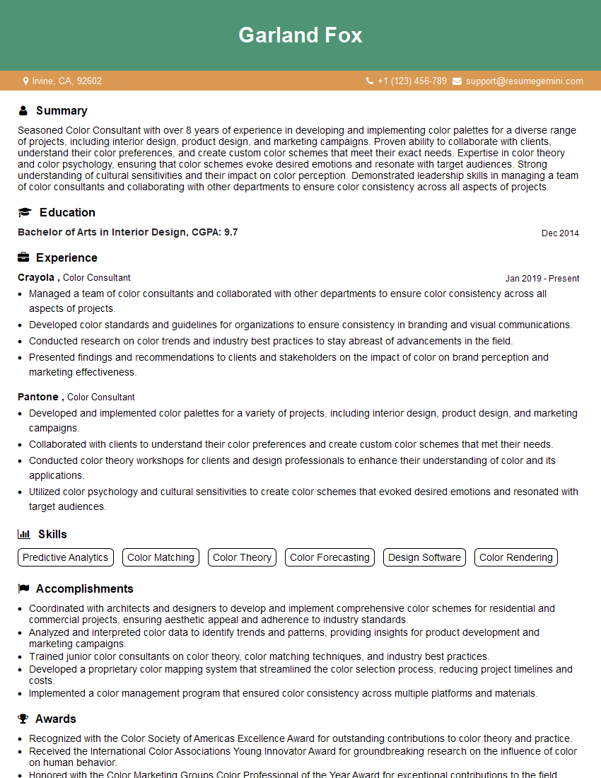
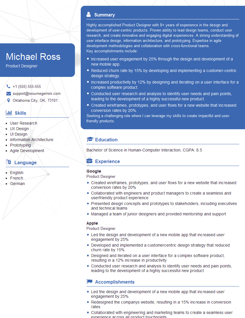
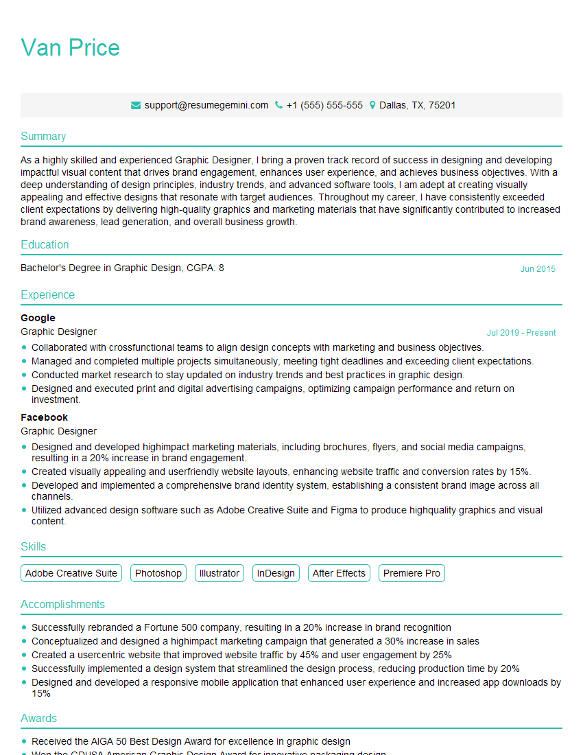
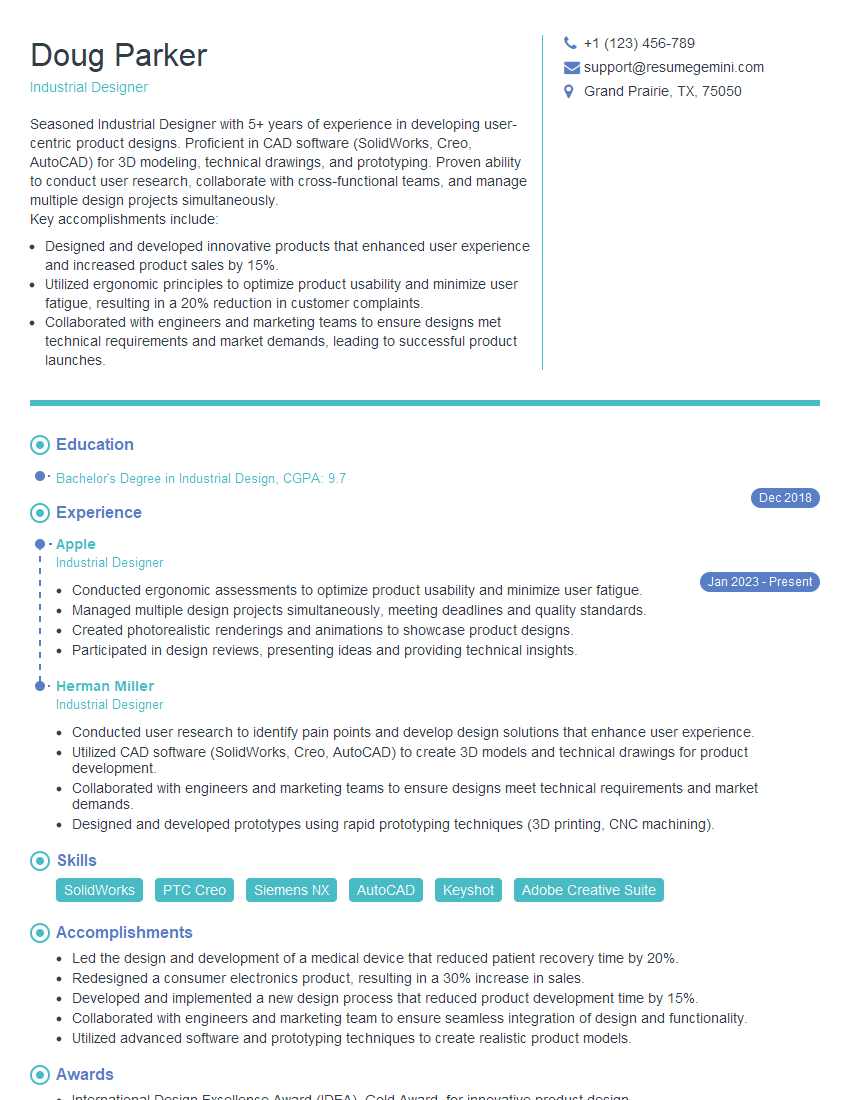
Mastering color harmonization and coordination is crucial for career advancement in design, marketing, and many creative fields. A strong understanding of these principles demonstrates your ability to create visually appealing and effective designs that resonate with the target audience. To maximize your job prospects, invest time in crafting an ATS-friendly resume that highlights your skills and experience effectively. ResumeGemini is a trusted resource that can help you build a professional and impactful resume. Examples of resumes tailored to Color Harmonization and Coordination roles are available to guide you.
Explore more articles
Users Rating of Our Blogs
Share Your Experience
We value your feedback! Please rate our content and share your thoughts (optional).
What Readers Say About Our Blog
Hello,
we currently offer a complimentary backlink and URL indexing test for search engine optimization professionals.
You can get complimentary indexing credits to test how link discovery works in practice.
No credit card is required and there is no recurring fee.
You can find details here:
https://wikipedia-backlinks.com/indexing/
Regards
NICE RESPONSE TO Q & A
hi
The aim of this message is regarding an unclaimed deposit of a deceased nationale that bears the same name as you. You are not relate to him as there are millions of people answering the names across around the world. But i will use my position to influence the release of the deposit to you for our mutual benefit.
Respond for full details and how to claim the deposit. This is 100% risk free. Send hello to my email id: [email protected]
Luka Chachibaialuka
Hey interviewgemini.com, just wanted to follow up on my last email.
We just launched Call the Monster, an parenting app that lets you summon friendly ‘monsters’ kids actually listen to.
We’re also running a giveaway for everyone who downloads the app. Since it’s brand new, there aren’t many users yet, which means you’ve got a much better chance of winning some great prizes.
You can check it out here: https://bit.ly/callamonsterapp
Or follow us on Instagram: https://www.instagram.com/callamonsterapp
Thanks,
Ryan
CEO – Call the Monster App
Hey interviewgemini.com, I saw your website and love your approach.
I just want this to look like spam email, but want to share something important to you. We just launched Call the Monster, a parenting app that lets you summon friendly ‘monsters’ kids actually listen to.
Parents are loving it for calming chaos before bedtime. Thought you might want to try it: https://bit.ly/callamonsterapp or just follow our fun monster lore on Instagram: https://www.instagram.com/callamonsterapp
Thanks,
Ryan
CEO – Call A Monster APP
To the interviewgemini.com Owner.
Dear interviewgemini.com Webmaster!
Hi interviewgemini.com Webmaster!
Dear interviewgemini.com Webmaster!
excellent
Hello,
We found issues with your domain’s email setup that may be sending your messages to spam or blocking them completely. InboxShield Mini shows you how to fix it in minutes — no tech skills required.
Scan your domain now for details: https://inboxshield-mini.com/
— Adam @ InboxShield Mini
Reply STOP to unsubscribe
Hi, are you owner of interviewgemini.com? What if I told you I could help you find extra time in your schedule, reconnect with leads you didn’t even realize you missed, and bring in more “I want to work with you” conversations, without increasing your ad spend or hiring a full-time employee?
All with a flexible, budget-friendly service that could easily pay for itself. Sounds good?
Would it be nice to jump on a quick 10-minute call so I can show you exactly how we make this work?
Best,
Hapei
Marketing Director
Hey, I know you’re the owner of interviewgemini.com. I’ll be quick.
Fundraising for your business is tough and time-consuming. We make it easier by guaranteeing two private investor meetings each month, for six months. No demos, no pitch events – just direct introductions to active investors matched to your startup.
If youR17;re raising, this could help you build real momentum. Want me to send more info?
Hi, I represent an SEO company that specialises in getting you AI citations and higher rankings on Google. I’d like to offer you a 100% free SEO audit for your website. Would you be interested?
Hi, I represent an SEO company that specialises in getting you AI citations and higher rankings on Google. I’d like to offer you a 100% free SEO audit for your website. Would you be interested?
good
