Every successful interview starts with knowing what to expect. In this blog, we’ll take you through the top Fluency in Adobe Creative Suite interview questions, breaking them down with expert tips to help you deliver impactful answers. Step into your next interview fully prepared and ready to succeed.
Questions Asked in Fluency in Adobe Creative Suite Interview
Q 1. Explain your experience with Adobe Photoshop’s layer management and blending modes.
Layer management and blending modes are fundamental to Photoshop’s power. Think of layers as transparent sheets stacked on top of each other. Each layer contains its own image elements, allowing for non-destructive editing – meaning you can always go back and change something without affecting other parts of your image. Blending modes control how the pixels on one layer interact with the pixels on the layer below.
For example, I might use several layers to create a complex photo manipulation. One layer for the background, one for the subject, and separate layers for adjustments like lighting or color grading. I would use blending modes like ‘Multiply’ to darken a layer, ‘Screen’ to lighten it, or ‘Overlay’ for a more dramatic effect.
- Real-world example: Imagine retouching a portrait. I’d place the portrait on its own layer, then create additional layers for removing blemishes (using the Healing Brush on its own layer), adding highlights (using a layer with a soft white brush and Screen blending mode), and adjusting the overall color balance (using adjustment layers like Curves or Color Balance).
- Advanced technique: I frequently employ layer masks to selectively apply edits to parts of a layer. This allows for precision and control, avoiding harsh edges and maintaining a natural look.
Q 2. Describe your workflow for creating a responsive web design in Adobe Dreamweaver.
My Dreamweaver workflow for responsive web design centers around building a fluid grid system. I start by creating a basic HTML structure with semantic tags. Then, I leverage CSS media queries to tailor the layout to different screen sizes. Instead of fixed widths, I use percentages and viewport units (vw, vh) to ensure elements scale proportionally. I also utilize Dreamweaver’s live view to see how my changes affect the design in real-time across various devices.
Example: For a three-column layout, I’d use flexbox or grid in CSS to dynamically distribute the columns. A media query, like @media (max-width: 768px) { /* CSS for smaller screens */ }, would allow me to adjust the column arrangement, perhaps stacking them vertically on smaller screens. Dreamweaver’s integration with CSS preprocessors like Sass or Less isn’t as robust as other editors but the core functionality of coding and previewing remains very useful.
Problem-solving: Responsive design often involves debugging layout issues across various browsers and devices. Browser developer tools are my best friend for identifying and fixing these issues. I constantly test on different devices (or use emulators) to ensure cross-browser compatibility and optimal user experience.
Q 3. How do you optimize images for web and print in Adobe Photoshop?
Optimizing images for web and print requires different approaches. For web, the focus is on smaller file sizes to ensure fast loading times. For print, the focus is on high resolution and color accuracy.
- Web Optimization: I typically use the ‘Save for Web (Legacy)’ feature in Photoshop. This allows me to select the appropriate file format (JPEG for photographs, PNG for graphics with transparency), adjust the compression level, and preview the file size and quality before saving. I also resize images to their final dimensions, avoiding unnecessary scaling by the browser.
- Print Optimization: For print, I make sure the image resolution is at least 300 DPI (dots per inch). I also use a color profile (such as CMYK) suitable for the printing press. The ‘Save As’ option allows me to choose these settings and maintain high-quality print output. I avoid excessive sharpening for print which can cause artifacts.
Example: A high-resolution image for print would be saved as a CMYK TIFF or PSD at 300 DPI, while the same image for web would be saved as a JPEG at a significantly smaller size (perhaps 72 DPI) with acceptable quality settings.
Q 4. What are your preferred methods for creating vector graphics in Adobe Illustrator?
My preferred methods for creating vector graphics in Illustrator revolve around using the Pen Tool for precise shapes and the Shape Builder Tool for combining and modifying shapes. I also rely heavily on the Pathfinder panel for complex shape manipulations, and the Appearance panel to layer effects for visual richness and control.
Example: To create a complex logo, I might start by sketching it out. Then, I would use the Pen Tool to carefully trace the outlines, creating individual vector paths. After that I might use the Shape Builder Tool to merge shapes and create a cohesive visual entity. The Pathfinder panel is my go-to tool for cutting, subtracting, and adding shapes. Finally, the Appearance panel allows for applying gradients, strokes, and other visual effects.
Advanced technique: I utilize Illustrator’s live trace feature for converting raster images (like photographs) into vector graphics, a valuable time saver when working with existing imagery. But it’s important to thoroughly refine the output of live trace, manually adjusting its details for a clean vector output.
Q 5. Explain your experience with Adobe InDesign’s typography and layout features.
InDesign’s typography and layout features are crucial for creating professional-looking publications. I leverage InDesign’s powerful typographic controls to achieve precise text formatting, including kerning, tracking, leading, and hyphenation. Its layout tools—master pages, frames, and tables—ensure consistency and efficient content organization.
Example: Designing a multi-page brochure involves creating master pages for consistent headers and footers. I might utilize nested styles to ensure consistency in headings and body text throughout the document. I would use text frames to carefully position text within the layout and utilize tables for arranging data effectively and consistently. I use paragraph styles to create design consistency and speed up my workflow.
Problem-solving: Ensuring optimal readability and visual hierarchy is paramount. I carefully select fonts, adjust leading and kerning for optimal spacing, and employ visual elements to guide the reader’s eye through the content. My approach is iterative, and I continuously evaluate the design to ensure it effectively conveys the intended message.
Q 6. How do you use Adobe After Effects for motion graphics?
After Effects is my tool for bringing motion to graphics. I use keyframes extensively to animate almost everything, from simple text animations to complex 3D scenes. I use expressions to create dynamic and interactive animations controlled by parameters such as time or other layer properties. Pre-compositions help in organizing complex scenes into manageable chunks, and masking helps to isolate elements and control their visibility and interactions.
Example: To create a logo animation, I’d import the logo as a vector graphic and use keyframes to control its position, scale, and opacity. I might add subtle effects like glows or shadows. For more complex animations, I frequently leverage expressions which use JavaScript-like syntax to automate tasks or create dynamic visual effects. For instance, an expression could link the movement of one layer to the position of another.
Problem-solving: Working with After Effects often involves troubleshooting performance issues, particularly in complex projects. Optimizing compositions, using pre-compositions effectively, and employing efficient rendering techniques are key to maintaining smooth performance.
Q 7. Describe your experience with Adobe Premiere Pro’s video editing workflow.
My Premiere Pro workflow typically begins with importing footage and audio, organizing them into bins for easy management. I then build a rough cut, arranging clips to create the desired sequence. Next, I refine the edit, adjusting cuts, adding transitions, and incorporating effects. Finally, I export the video in the appropriate format and resolution.
Example: Editing a corporate video might involve assembling interview clips, B-roll footage, and animated graphics. I’d use Premiere Pro’s audio tools to balance audio levels, add music, and incorporate sound effects. Color correction and grading are also key parts of my post-production process to ensure a cohesive visual style.
Advanced technique: I frequently use nested sequences to manage complex projects. This involves creating smaller sequences within a larger one, organizing and streamlining the editing process. This improves efficiency and maintainability, particularly for longer or more complex projects. Dynamic linking helps in efficient editing between different software, facilitating streamlined workflows.
Q 8. How do you manage color consistency across different Adobe Creative Suite applications?
Maintaining color consistency across Adobe Creative Suite applications is crucial for a professional and polished final product. Think of it like painting a mural – you wouldn’t want one section to be drastically different in color from another! The key is to establish a central color profile and stick to it.
- Color Profiles: Begin by choosing a specific color profile (e.g., sRGB for web, Adobe RGB for print) and setting it as your default in each application (Photoshop, Illustrator, InDesign). This ensures that colors are interpreted consistently.
- Using Color Libraries: Create and save color palettes in one application (like Adobe Color) and import them into your other projects. This guarantees consistency throughout your workflow. For example, I might create a palette for a client’s branding in Photoshop and then easily import it into Illustrator for logo creation and InDesign for brochures.
- Converting Color Spaces: When moving between RGB (for screens) and CMYK (for print), ensure you’re using a proper color management system (CMS) within each application. This helps predict how colors will translate. Never convert directly between RGB and CMYK multiple times, as this can lead to severe color shifts.
- Proofing: Always use soft proofing in Photoshop and InDesign to preview how your design will appear in the target color space. This allows for adjustments before final output.
By carefully managing color profiles and utilizing color libraries, I ensure a visually harmonious project across all Adobe Creative Suite applications.
Q 9. What are your preferred shortcuts in Adobe Photoshop and Illustrator?
My preferred shortcuts are deeply ingrained in my workflow, making me much more efficient. I’ve found that consistent use of these dramatically boosts productivity. Here are a few examples:
- Photoshop:
Ctrl+J (Cmd+J)(Duplicate Layer),Ctrl+T (Cmd+T)(Free Transform),Ctrl+S (Cmd+S)(Save),Ctrl+Z (Cmd+Z)(Undo). These are my absolute essentials, used constantly throughout any project. - Illustrator:
V(Selection Tool),A(Direct Selection Tool),P(Pen Tool),Ctrl+C (Cmd+C)(Copy),Ctrl+V (Cmd+V)(Paste),Ctrl+D (Cmd+D)(Repeat last transformation).
Beyond these, I extensively use layer organization, keyboard shortcuts for brush selection, and layer masking features to streamline my workflow. My approach is centered on mastering the keyboard rather than the mouse, maximizing speed and precision.
Q 10. Explain your understanding of CMYK and RGB color models.
Understanding CMYK and RGB color models is fundamental for any graphic designer. They are fundamentally different ways of producing colors, tailored to different output mediums.
- RGB (Red, Green, Blue): This additive color model is used for screens (monitors, TVs, phones). It works by combining varying intensities of red, green, and blue light to create a spectrum of colors. Think of it like shining different colored spotlights on a white wall – adding more light results in brighter colors.
- CMYK (Cyan, Magenta, Yellow, Key/Black): This subtractive color model is used for printing. It works by subtracting colors from white light using cyan, magenta, yellow, and black inks. This is analogous to starting with a white canvas and layering different paints on top – the more you add, the darker the color becomes.
The key difference lies in how color is produced: additive (light) for screens, subtractive (ink) for print. A design looking vibrant on screen might appear dull in print due to this difference. Proper color management accounts for this shift to ensure accurate results.
Q 11. How do you troubleshoot common issues in Adobe Creative Suite applications?
Troubleshooting issues in Adobe Creative Suite is a routine part of my workflow. My approach is systematic and focuses on identifying the root cause efficiently.
- Restart Applications/Computer: The simplest solution often works. A quick restart can clear temporary files and memory issues.
- Update Software: Outdated software versions often have bugs. Keeping applications and drivers updated mitigates many potential problems.
- Check Preferences: Sometimes incorrect settings or preferences can cause issues. Resetting or adjusting these can resolve problems. For example, I once had a performance issue in Photoshop that was solved by adjusting the scratch disk location in the preferences.
- Review Document Settings: In cases of corrupted files, I will try to save the file in a different format or version. Sometimes simple errors in document settings can cause unexpected behavior.
- Consult Adobe Support & Community Forums: For more complex issues, searching for error messages or seeking advice in community forums can provide valuable solutions.
I meticulously document my troubleshooting process, creating a record of solutions to resolve recurring issues more efficiently in the future. A methodical, step-by-step approach minimizes downtime and keeps projects on track.
Q 12. Describe your experience using Adobe Bridge for asset management.
Adobe Bridge is an invaluable tool for efficient asset management. It’s my centralized hub for organizing, previewing, and accessing design assets.
- Metadata Management: I use Bridge to add keywords, captions, and other metadata to my files. This allows for quick searching and filtering of assets based on specific characteristics. For instance, I might tag images by client, project, and even color palettes, making future retrieval effortless.
- File Organization: I utilize Bridge’s folder structure to maintain a well-organized archive of my assets. A clear structure prevents the chaos of scattered files and streamlines workflow significantly.
- Batch Processing: Bridge enables me to perform batch operations on multiple files simultaneously, such as resizing images or converting file formats. This saves considerable time on repetitive tasks.
- Previewing Assets: The ability to preview images and other files directly within Bridge without opening individual programs is immensely helpful during the selection process.
Using Bridge effectively turns asset management from a time-consuming task into an efficient, productive process. It’s an essential part of my workflow that prevents lost files and allows me to quickly locate the perfect asset when needed.
Q 13. How do you collaborate effectively using Adobe Creative Cloud libraries?
Adobe Creative Cloud Libraries are a game-changer for collaboration. They provide a centralized location for storing and sharing design assets, ensuring consistency and efficiency across teams.
- Sharing Assets: I use libraries to share color palettes, graphic elements, and fonts across multiple projects and team members. This consistency is crucial for maintaining brand identity and a unified visual style.
- Version Control: Libraries offer basic version history, allowing for rollback to previous versions if needed. This is especially helpful when multiple users are contributing to a shared asset.
- Real-time Updates: Changes made to assets in the library are reflected instantly for all users with access. This fosters real-time collaboration and eliminates the issue of working with outdated assets.
- Organized Collaboration: Libraries provide a structured way to manage shared assets, avoiding confusion and streamlining workflow. I often use them to set up a shared library for specific projects and team members, allowing controlled access to necessary assets.
Creative Cloud Libraries are integral to my collaborative workflow, removing communication barriers and making design handoffs seamless and efficient.
Q 14. How would you handle a design project with conflicting client requirements?
Handling conflicting client requirements requires a diplomatic yet decisive approach. It’s crucial to manage expectations effectively and ensure all parties understand the design process and its limitations.
- Active Listening & Clarification: Begin by listening carefully to each requirement, asking clarifying questions to ensure complete understanding. Often, apparent conflicts stem from miscommunication.
- Prioritization & Compromise: Discuss the feasibility of each requirement, outlining potential compromises or alternative solutions. This might involve prioritizing certain features or proposing a phased approach to implementation.
- Visual Presentation: Create mood boards or mockups demonstrating the potential outcomes of different options, allowing the client to visualize the impact of their choices.
- Documentation & Agreement: Document all decisions, compromises, and agreed-upon features to avoid future misunderstandings. This could involve a formal agreement or design brief amendment.
- Professional Communication: Maintain open and transparent communication throughout the process. A calm, professional approach can diffuse tensions and achieve a mutually acceptable outcome.
Ultimately, resolving conflicting client requirements involves balancing design vision with the client’s needs and expectations. A collaborative and communicative strategy leads to the best results.
Q 15. Explain your approach to creating a user-friendly website using Adobe XD.
Creating a user-friendly website in Adobe XD starts with understanding user needs and behavior. My approach is iterative, focusing on user research, wireframing, prototyping, and testing. I begin by conducting thorough user research to define target audiences, their goals, and pain points. This informs the site’s structure and navigation. Then, I create low-fidelity wireframes to establish the basic layout and information architecture, ensuring a clear and intuitive flow. These are then iterated upon, incorporating user feedback, before moving to high-fidelity mockups. I leverage XD’s prototyping features to create interactive prototypes, allowing for user testing and identification of usability issues early in the process. This iterative process of design, testing, and refinement ensures the final product is user-friendly and meets the needs of its intended audience. For example, I recently designed a website for a local bakery. Through user testing, I discovered the original navigation was confusing, so I redesigned it, simplifying the menu and improving the search functionality. The resulting website saw a significant increase in user engagement.
Career Expert Tips:
- Ace those interviews! Prepare effectively by reviewing the Top 50 Most Common Interview Questions on ResumeGemini.
- Navigate your job search with confidence! Explore a wide range of Career Tips on ResumeGemini. Learn about common challenges and recommendations to overcome them.
- Craft the perfect resume! Master the Art of Resume Writing with ResumeGemini’s guide. Showcase your unique qualifications and achievements effectively.
- Don’t miss out on holiday savings! Build your dream resume with ResumeGemini’s ATS optimized templates.
Q 16. What are your experience using Adobe Audition in audio editing?
My experience with Adobe Audition is extensive. I’m proficient in all aspects of audio editing, from basic cleanup to advanced sound design. I’m comfortable with noise reduction, equalization, compression, and mastering techniques. I frequently use Audition’s multitrack editing capabilities for podcast production and voice-over work. I also utilize its spectral editing features for cleaning up audio artifacts and enhancing dialogue clarity. For example, in a recent project involving a documentary, I used Audition to remove background noise, restore faded audio, and add subtle equalization to make the dialogue clearer and more impactful. The ability to work with various audio formats and integrate with other Adobe Creative Suite applications is invaluable in my workflow.
Q 17. How do you ensure your designs are accessible to users with disabilities?
Accessibility is paramount in my design process. I adhere to WCAG (Web Content Accessibility Guidelines) to ensure my designs are usable by people with disabilities. This involves careful consideration of color contrast, ensuring sufficient color difference between text and background for users with visual impairments. I also provide alternative text for all images, allowing screen readers to convey image content to visually impaired users. Keyboard navigation is another critical element, and I meticulously test for smooth and logical keyboard interactions. Captions and transcripts are provided for video and audio content. Furthermore, I utilize semantic HTML in the design process. For example, I use appropriate heading tags (, , etc.) to establish page structure and make content easier for assistive technology to interpret. This focus on accessibility ensures that everyone can access and enjoy my designs.
Q 18. Describe your experience with Adobe Animate for creating animations.
My experience with Adobe Animate extends to creating both 2D and motion graphics animations. I’m proficient in using various animation techniques, including frame-by-frame animation, tweening, and motion scripting. I’ve created explainer videos, interactive banners, and character animations using Animate. I understand the principles of animation, such as timing, spacing, and anticipation, which contribute to creating compelling and engaging animations. A recent project involved creating an animated explainer video for a complex software solution. Using Animate, I broke down the complex process into easily digestible animated sequences, significantly improving user understanding. The ability to export animations in various formats, such as GIF, video, and SWF, enhances versatility and compatibility with different platforms.
Q 19. How familiar are you with the use of actions and scripts in Adobe Creative Suite?
I’m highly familiar with actions and scripts in Adobe Creative Suite. I understand how to automate repetitive tasks and extend the capabilities of the applications using JavaScript, ExtendScript, and other scripting languages. This allows me to streamline workflows, improve efficiency, and create custom tools tailored to specific needs. For instance, I’ve written scripts to automate image resizing and batch processing, saving significant time in large-scale projects. I’ve also used actions to create custom palettes and shortcuts for frequently used tasks. Understanding scripting enhances my ability to solve complex design problems efficiently and consistently, reducing the time spent on repetitive tasks, and enabling me to focus on creative problem-solving.
Q 20. How would you create a visually compelling infographic using Adobe Illustrator and InDesign?
Creating a visually compelling infographic involves a collaborative effort between Illustrator and InDesign. In Illustrator, I’d create the individual graphic elements – icons, charts, and illustrations – focusing on clean lines, vibrant colors, and a consistent style. Illustrator’s vector-based nature ensures scalability without loss of quality. Then, InDesign is used for layout and typography. I’d strategically arrange the elements, ensuring a clear and logical flow of information. InDesign’s powerful typography controls would be used to create legible and aesthetically pleasing text. I would utilize InDesign’s master pages to maintain consistency throughout the infographic. Choosing a visually appealing color palette and font pairings are crucial for cohesiveness. For example, for a client highlighting sustainable practices, I would choose earthy tones and a clean, modern font. The final infographic will be exported in high-resolution formats for print and web use.
Q 21. What is your approach to designing for different screen sizes and resolutions?
Designing for different screen sizes and resolutions requires a responsive design approach. I leverage Adobe XD’s artboards to create different versions of the design for various devices (desktops, tablets, and smartphones). I utilize flexible layouts and scalable graphics that adapt seamlessly to different screen sizes. I avoid fixed pixel dimensions and instead use percentages and relative units, allowing the content to reflow and resize gracefully. I also test the design on different devices and browsers to ensure optimal viewing across all platforms. Using media queries in the final code ensures different styles are applied based on screen size and orientation. This responsive approach guarantees a consistent and user-friendly experience regardless of the device being used. This methodology ensures that the content is accessible, readable, and enjoyable across all screen sizes.
Q 22. How do you stay up-to-date with the latest trends and features in Adobe Creative Suite?
Staying current in the ever-evolving world of Adobe Creative Suite requires a multi-pronged approach. I actively participate in several key strategies:
- Adobe’s Official Channels: I regularly visit the Adobe website, specifically their blogs and tutorials, for updates on new features, tips, and tricks across all applications. They often release videos and written guides that walk you through new functionalities.
- Industry Blogs and Publications: I follow influential blogs and publications like Creative Bloq, Design Shack, and others that cover design trends and software updates. These offer insightful analyses and practical examples of how new features are being used in professional projects.
- Online Courses and Workshops: Platforms like LinkedIn Learning, Skillshare, and Udemy provide excellent training opportunities. I consistently look for courses focusing on new features and advanced techniques within specific Adobe applications. For example, recently I completed a course on utilizing the new neural filters in Photoshop.
- Adobe MAX Conference (and other events): Whenever possible, I attend Adobe MAX or other relevant industry conferences. These events offer invaluable first-hand experience with the latest updates and opportunities to network with other professionals.
- Community Engagement: Active participation in online forums and communities like Reddit’s r/photoshop or r/illustrator helps me stay abreast of user experiences and creative solutions. It’s a great place to learn problem-solving techniques and see what other designers are doing.
This combination ensures I’m not only aware of new features but also understand how best to integrate them into my workflow efficiently.
Q 23. Describe your experience working with vector and raster graphics.
My experience encompasses both vector and raster graphics, understanding their distinct advantages and applications.
Raster graphics (like JPEGs and PNGs) are made of pixels arranged in a grid. They are ideal for photo editing and creating images with photorealistic detail. In Photoshop, I frequently leverage tools like the healing brush, clone stamp, and adjustment layers to manipulate raster images, achieving results like retouching product photos for e-commerce or enhancing the color and contrast of landscape photography for print.
Vector graphics (like AI and SVG files), on the other hand, are composed of paths and mathematical equations. This makes them infinitely scalable without loss of quality, perfect for logos, illustrations, and typography. In Illustrator, I utilize the pen tool, shape tools, and pathfinder to create scalable logos, icons, and illustrations. For example, I recently designed a logo for a startup using Illustrator, ensuring it remained crisp and clear at any size, from a business card to a billboard.
I often use both in tandem. For example, I might create a vector illustration in Illustrator, then import it into Photoshop to add texture or photorealistic elements. Understanding their strengths and weaknesses allows for a more flexible and efficient design process.
Q 24. What’s your process for creating print-ready files in Adobe InDesign?
Creating print-ready files in InDesign requires a meticulous approach to ensure accurate color reproduction and proper document setup. My process is as follows:
- Document Setup: I begin by carefully setting up the document, specifying the correct dimensions, bleed, margins, and resolution based on the print specifications. Understanding bleed (the extra area beyond the trim) is crucial to avoid white edges in the final printed piece.
- Image Placement and Resolution: I only use high-resolution images (typically 300 DPI) suitable for print. I carefully embed or link images, ensuring they are optimized for print and don’t cause any file size issues.
- Color Management: I work in CMYK color mode for print, avoiding RGB, which is designed for screens. Using color profiles and managing color consistency is key. I always check for color consistency throughout the document to prevent unexpected shifts during printing.
- Fonts: I embed or outline fonts, ensuring the final print will render correctly. This prevents font substitution issues at the printer.
- Pre-flight and Packaging: Before exporting, I use InDesign’s pre-flight feature to check for any errors, such as missing fonts or images. I package the files to include all necessary components, making it easy for the printer to access everything.
- Export: I export the file as a high-resolution PDF/X-1a, a format universally accepted by professional printers. This ensures compatibility and maintains the integrity of my design.
This step-by-step process guarantees a smooth workflow and eliminates potential issues during printing, minimizing the chance of costly reprints.
Q 25. How would you design a logo using Adobe Illustrator?
Designing a logo in Illustrator involves a creative process guided by strategic thinking. My approach involves several key stages:
- Concept and Research: I begin by understanding the client’s brand, target audience, and industry. Thorough research helps shape the logo’s overall direction and aesthetic. I often sketch initial concepts on paper before transitioning to digital.
- Sketching and Refinement: Using Illustrator’s pen tool, I create the logo’s initial shapes and forms, building the core design. I iterate on the design, experimenting with various shapes, colors, and typography. The goal is to create a simple yet memorable visual.
- Color Palette: I carefully select a color palette that aligns with the brand’s identity and target audience. Color plays a significant role in conveying emotion and meaning.
- Typography: Font selection is crucial. I select fonts that are legible, scalable, and reflect the brand’s personality. I often experiment with different font weights and styles.
- Refinement and Vector Optimization: Once a final design is selected, I refine every aspect, ensuring crisp lines, accurate kerning (letter spacing), and proper alignment. The vector nature of Illustrator makes it easy to scale without any quality loss.
- Export: Finally, I export the logo in various formats—like SVG, AI, EPS, and PNG—to meet the client’s needs.
This structured process ensures a professional, well-crafted logo that effectively represents the brand.
Q 26. Describe your experience using Adobe Acrobat Pro for PDF manipulation.
Adobe Acrobat Pro is an indispensable tool for PDF manipulation, and I utilize its features extensively. My experience ranges from:
- PDF Creation and Editing: I frequently create PDFs from various sources—InDesign, Illustrator, Photoshop—and use Acrobat Pro to edit them directly. This involves tasks such as adding or removing text, images, and annotations.
- Form Creation and Management: I design interactive PDF forms using Acrobat Pro, incorporating fillable fields, checkboxes, and digital signatures. This is particularly useful for creating online forms and questionnaires.
- PDF Optimization: I compress and reduce file sizes to ensure efficient sharing and storage. I utilize Acrobat Pro’s compression options to balance file size and image quality.
- Security and Protection: I use Acrobat Pro’s security features to protect sensitive documents through password protection, encryption, and digital signatures. For instance, client contracts are often secured with restricted access and digital signatures for authenticity.
- Accessibility: I ensure PDF documents are accessible to individuals with disabilities by incorporating features like tagged PDFs and alternative text for images. This aligns with WCAG guidelines for accessibility.
The versatility of Acrobat Pro allows for streamlined PDF management, simplifying document workflows and enhancing security.
Q 27. How do you handle file formats and compatibility across different programs?
Handling file formats and compatibility across different Creative Suite applications is crucial for smooth workflows. My strategy centers around:
- Understanding File Formats: I possess a deep understanding of various file formats like PSD (Photoshop), AI (Illustrator), INDD (InDesign), EPS, SVG, TIFF, JPEG, and PNG. I select the most appropriate format based on the application and intended use.
- Working with Embedded vs. Linked Files: I understand the implications of embedding versus linking files. Embedding creates larger file sizes but ensures all necessary elements are included, while linking keeps the file size smaller but requires managing linked files carefully.
- Color Modes: I consistently check and adjust color modes (RGB for screen, CMYK for print) to maintain color accuracy across applications. For instance, converting a RGB image to CMYK before exporting to print can be essential.
- Using Compatibility-Focused Formats: When transferring files between applications or sharing with others, I prioritize formats known for cross-platform compatibility, such as PDF or SVG.
- Version Control: Using version control systems like Git helps to manage different versions of files and prevents conflicts, particularly when working on collaborative projects.
Careful attention to these aspects minimizes compatibility issues, improving efficiency and ensuring a consistent final product.
Q 28. Explain your experience with creating interactive PDFs in Adobe Acrobat Pro.
Creating interactive PDFs in Acrobat Pro opens up possibilities for engaging and dynamic documents. My experience covers various aspects:
- Interactive Forms: I build forms with features beyond simple fillable fields; this includes adding buttons, drop-down menus, and calculated fields for complex interactions. For example, I created a comprehensive interactive survey with branching logic that adjusted based on user input.
- Multimedia Integration: I integrate audio, video, and animations into PDFs to enhance user engagement. This makes the documents more dynamic and informative. For a client, I created an interactive product catalog with embedded videos showcasing the products.
- Navigation and Structure: I design clear navigation structures within interactive PDFs using bookmarks, hyperlinks, and interactive table of contents to ensure users can easily access different sections.
- 3D Model Integration: I can embed 3D models into PDFs, allowing users to view and interact with them within the document. This is particularly useful for showcasing architectural designs or product models.
- Accessibility Features: I ensure that interactive elements are accessible to users with disabilities, providing alternative text for any non-text elements. This is crucial for inclusivity.
These capabilities allow me to create sophisticated interactive PDFs that improve user engagement and knowledge retention, moving beyond the limitations of static documents.
Key Topics to Learn for Fluency in Adobe Creative Suite Interview
- Design Principles: Understanding core design concepts like typography, color theory, composition, and visual hierarchy. Apply these principles to create visually appealing and effective designs.
- Photoshop Mastery: Image retouching, manipulation, compositing, and preparing assets for various media (web, print). Be prepared to discuss your workflow and problem-solving techniques for complex image editing tasks.
- Illustrator Expertise: Vector graphics creation, logo design, illustration, and working with different file formats. Showcase your understanding of vector-based workflows and their advantages.
- InDesign Proficiency: Layout design for print and digital publications, mastering text and image placement, styles and templates for efficient workflow. Explain your approach to creating professional-looking documents.
- Workflow Optimization: Discuss your methods for efficient file management, asset organization, and collaboration within the Creative Suite ecosystem. Highlight your use of Actions, Styles, and Libraries.
- Adobe Bridge & Asset Management: Demonstrating proficiency in organizing and managing large volumes of assets efficiently using Adobe Bridge or similar tools.
- Problem-Solving & Adaptability: Be ready to discuss how you approach creative challenges, troubleshoot technical issues, and adapt your workflow to meet project requirements.
- Software Updates and New Features: Stay current with the latest features and updates within the Adobe Creative Suite. Demonstrate your commitment to continuous learning.
Next Steps
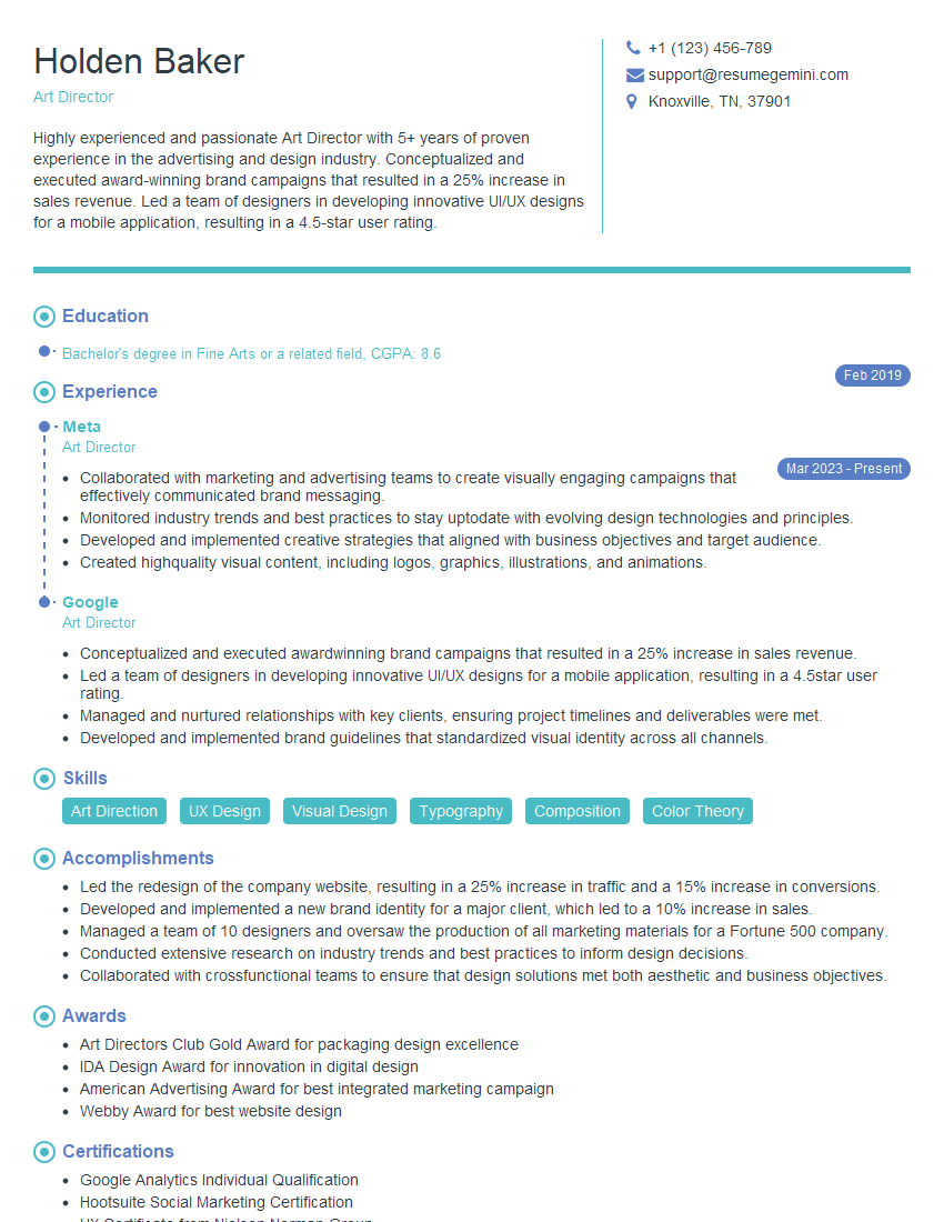
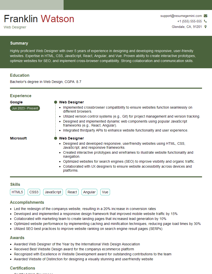
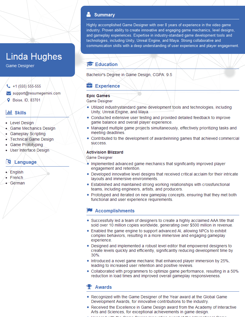
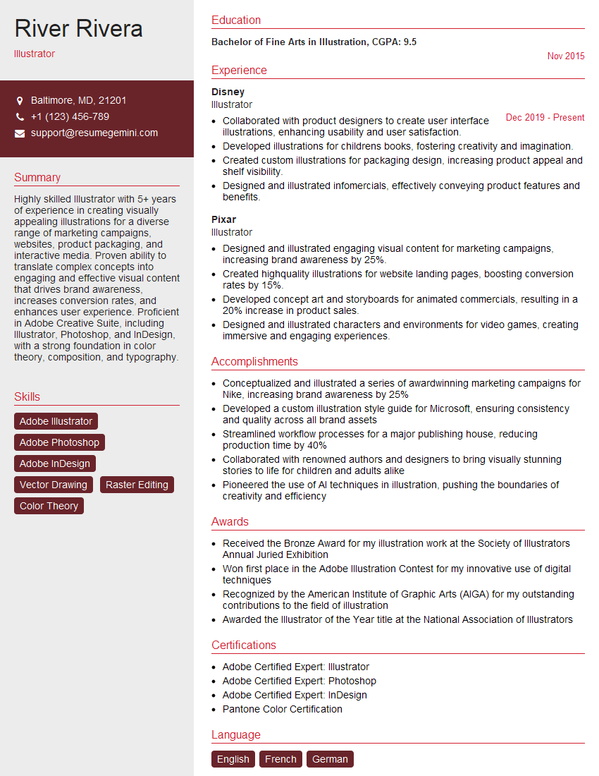
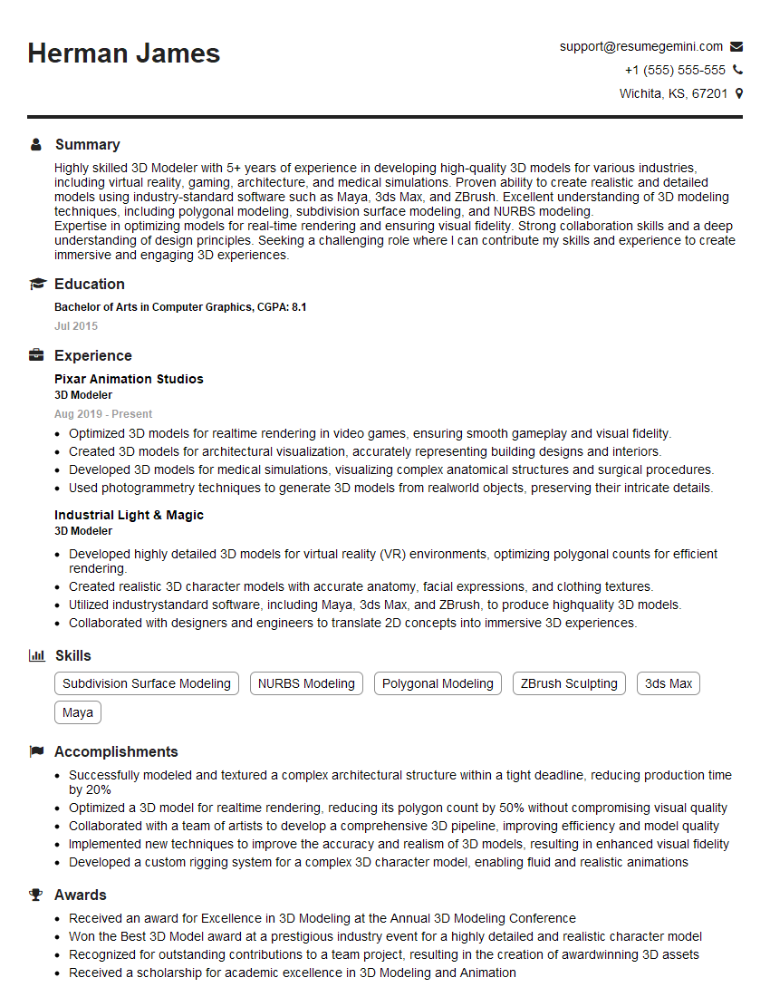
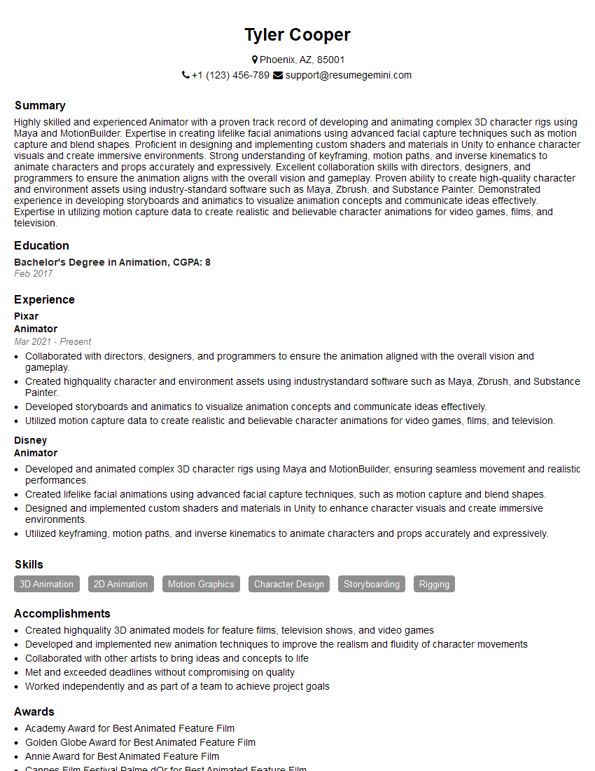
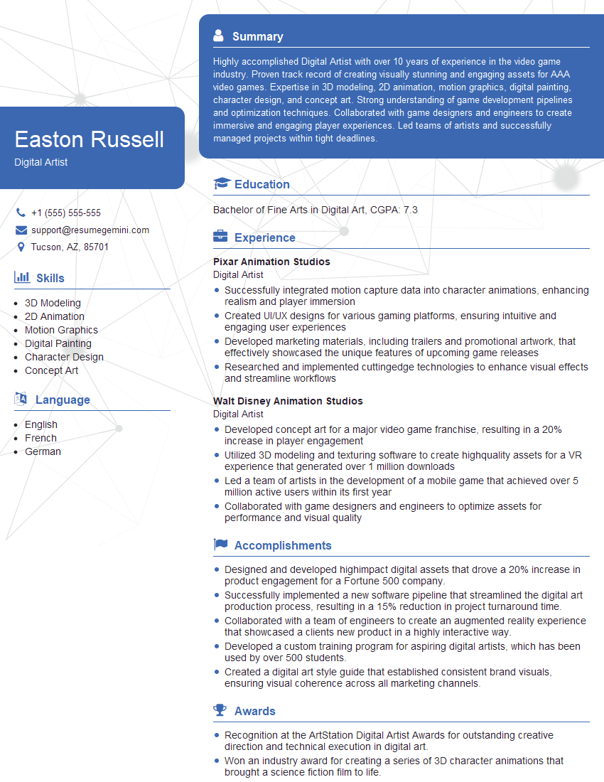
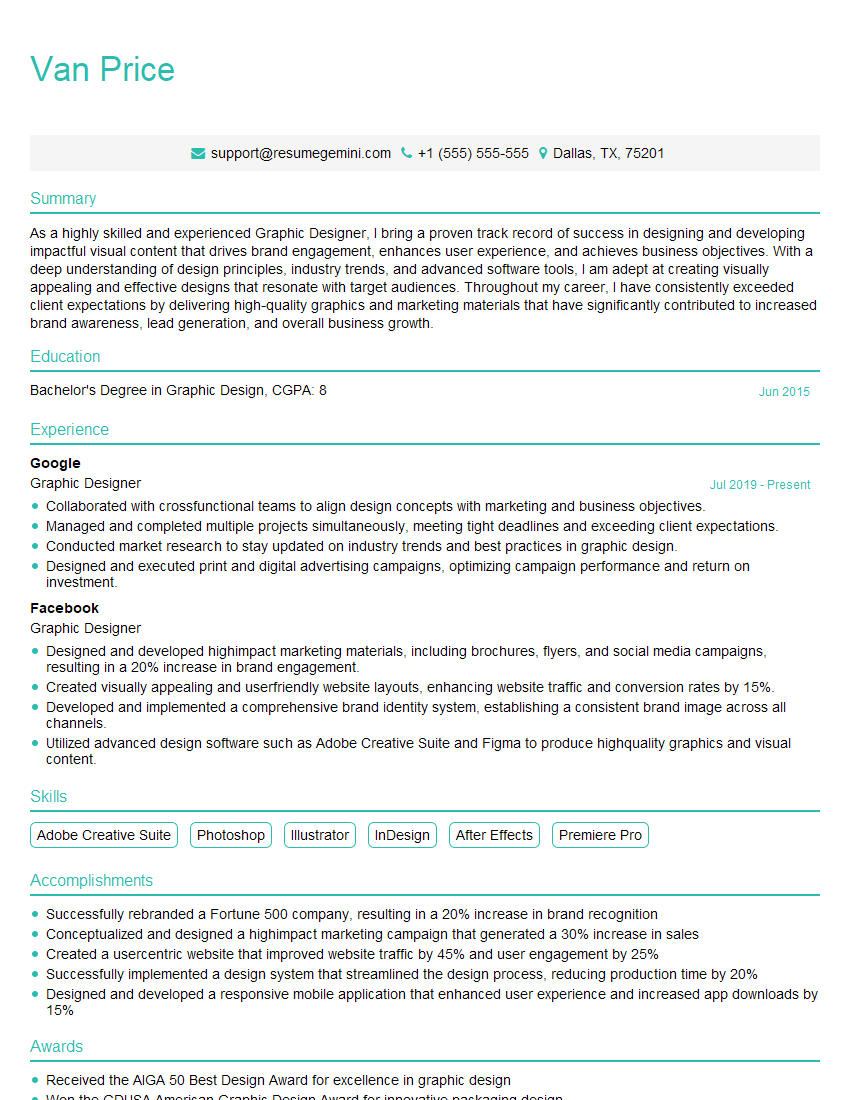
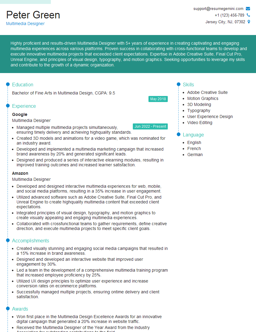
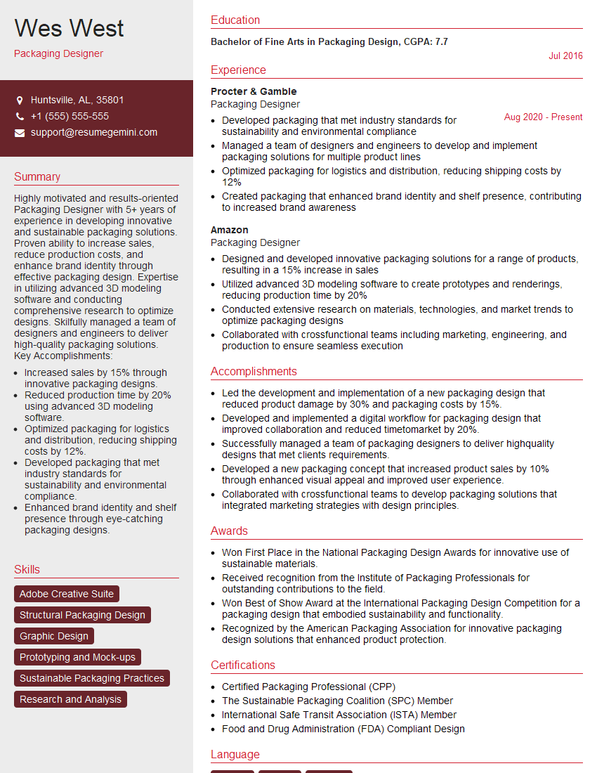
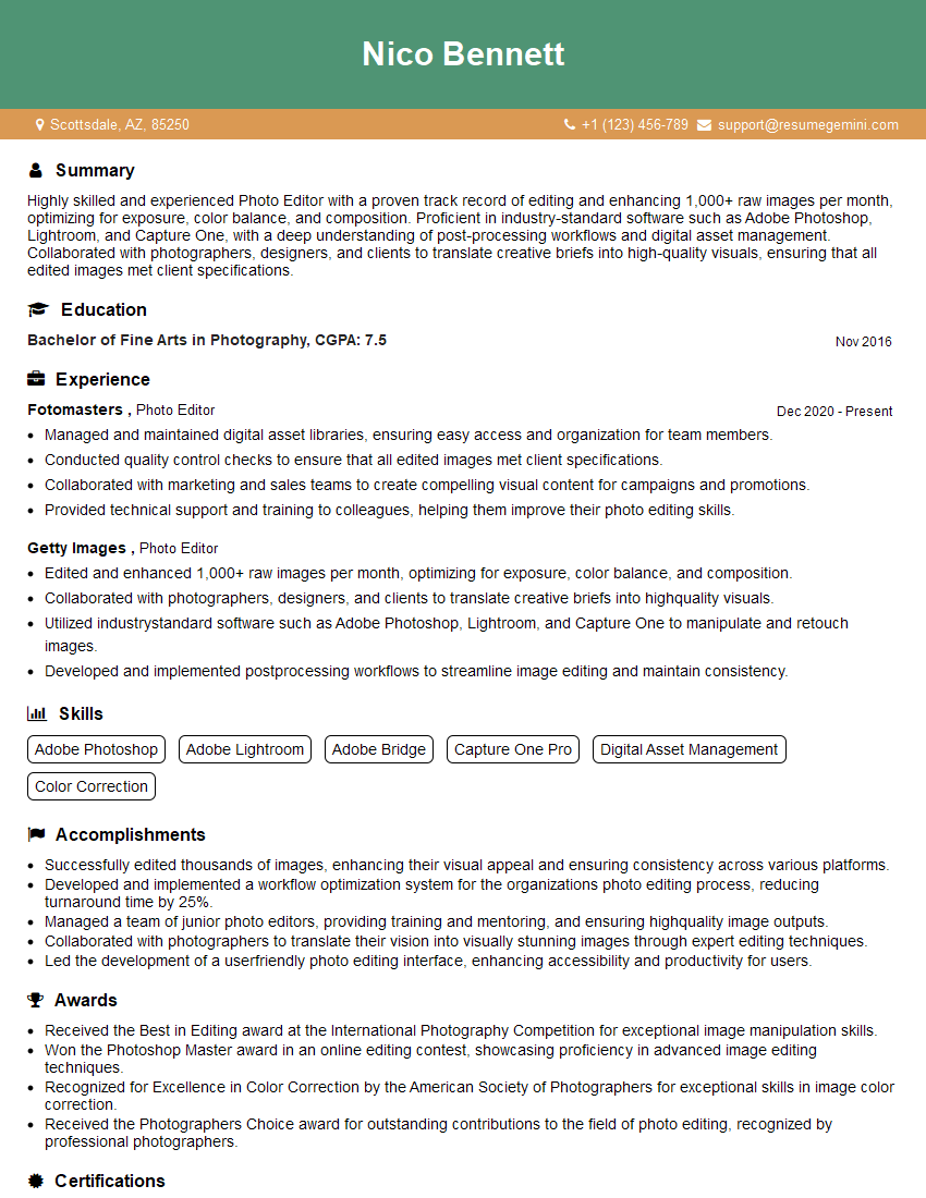
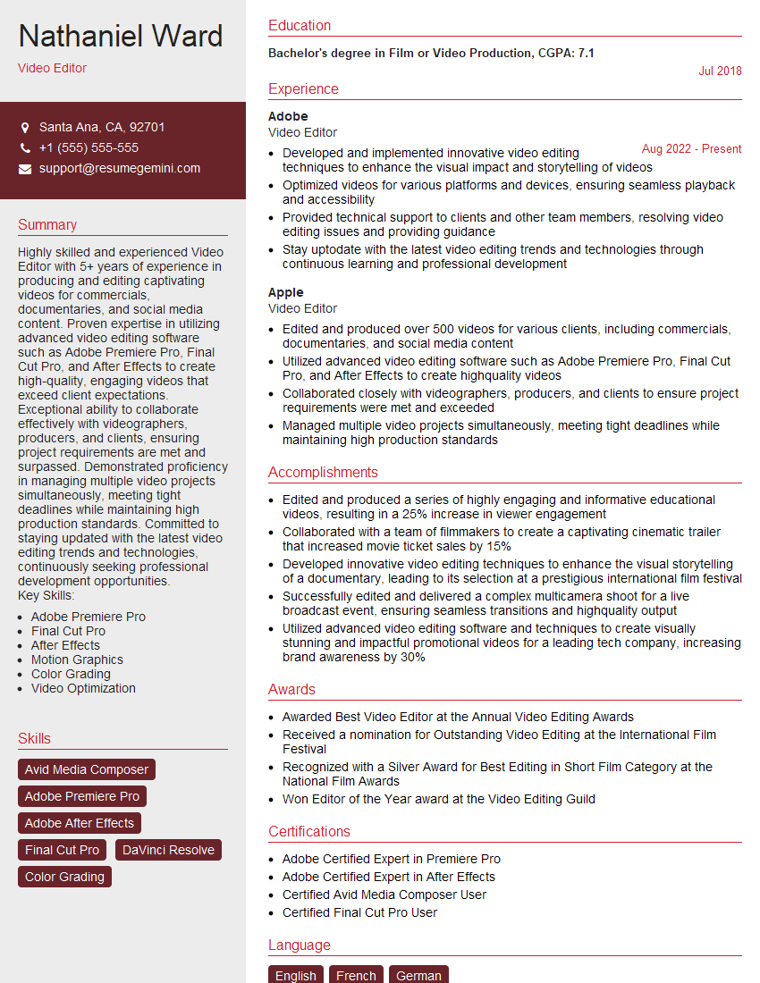
Mastering the Adobe Creative Suite opens doors to exciting career opportunities in design, marketing, and publishing. A strong command of these tools significantly boosts your employability and allows you to tackle complex projects with confidence. To maximize your job prospects, creating a well-structured, ATS-friendly resume is crucial. ResumeGemini is a trusted resource to help you build a professional and impactful resume that highlights your Adobe Creative Suite skills. Examples of resumes tailored to Fluency in Adobe Creative Suite are available to help guide you.
Explore more articles
Users Rating of Our Blogs
Share Your Experience
We value your feedback! Please rate our content and share your thoughts (optional).
What Readers Say About Our Blog
Hello,
We found issues with your domain’s email setup that may be sending your messages to spam or blocking them completely. InboxShield Mini shows you how to fix it in minutes — no tech skills required.
Scan your domain now for details: https://inboxshield-mini.com/
— Adam @ InboxShield Mini
Reply STOP to unsubscribe
Hi, are you owner of interviewgemini.com? What if I told you I could help you find extra time in your schedule, reconnect with leads you didn’t even realize you missed, and bring in more “I want to work with you” conversations, without increasing your ad spend or hiring a full-time employee?
All with a flexible, budget-friendly service that could easily pay for itself. Sounds good?
Would it be nice to jump on a quick 10-minute call so I can show you exactly how we make this work?
Best,
Hapei
Marketing Director
Hey, I know you’re the owner of interviewgemini.com. I’ll be quick.
Fundraising for your business is tough and time-consuming. We make it easier by guaranteeing two private investor meetings each month, for six months. No demos, no pitch events – just direct introductions to active investors matched to your startup.
If youR17;re raising, this could help you build real momentum. Want me to send more info?
Hi, I represent an SEO company that specialises in getting you AI citations and higher rankings on Google. I’d like to offer you a 100% free SEO audit for your website. Would you be interested?
Hi, I represent an SEO company that specialises in getting you AI citations and higher rankings on Google. I’d like to offer you a 100% free SEO audit for your website. Would you be interested?
good
