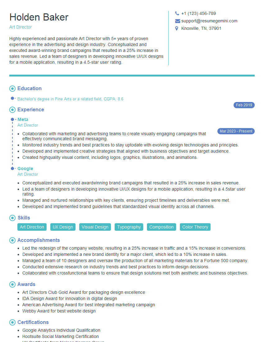
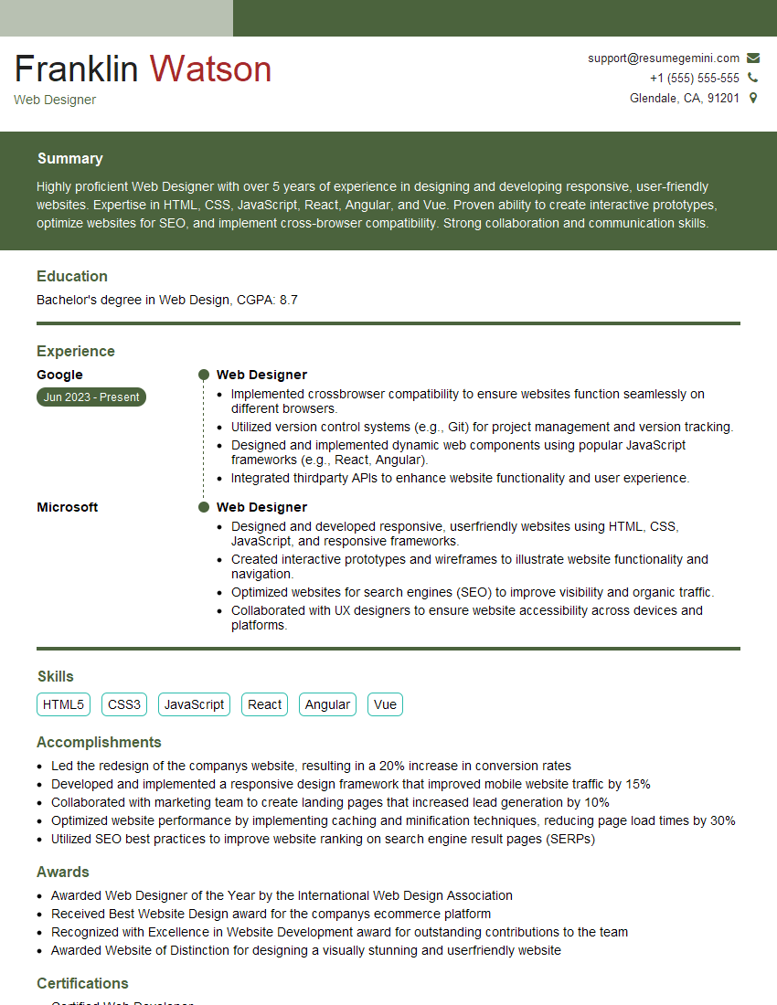
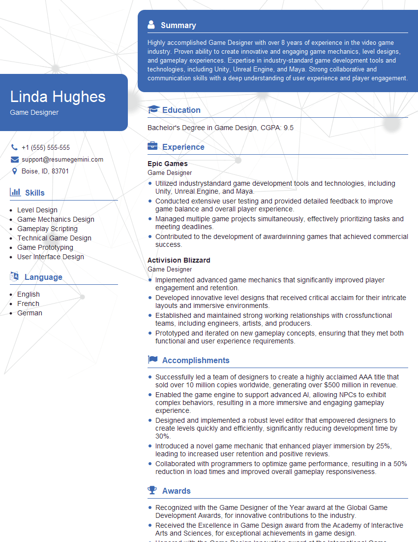
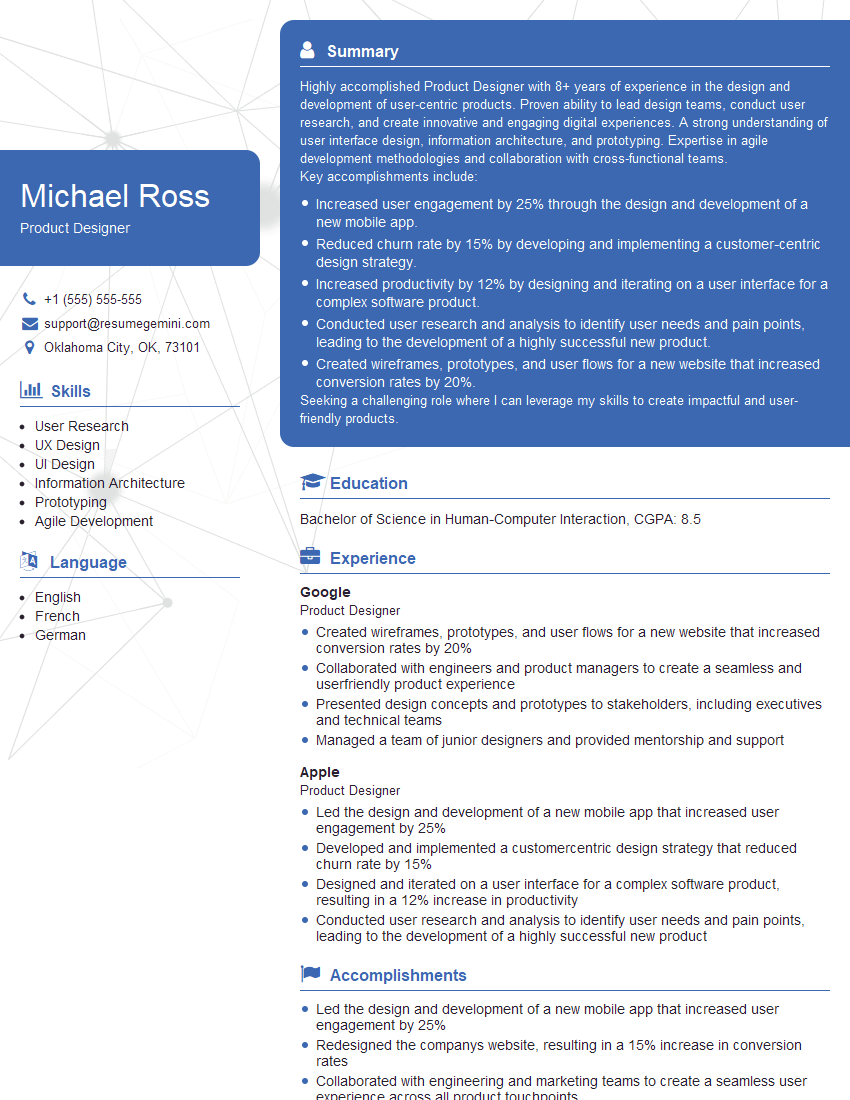
Are you ready to stand out in your next interview? Understanding and preparing for Knowledge of Design Principles and Aesthetics interview questions is a game-changer. In this blog, we’ve compiled key questions and expert advice to help you showcase your skills with confidence and precision. Let’s get started on your journey to acing the interview.
Questions Asked in Knowledge of Design Principles and Aesthetics Interview
Q 1. Explain the difference between UI and UX design.
UI (User Interface) and UX (User Experience) design are often confused, but they are distinct yet interconnected disciplines. Think of it like this: UI is the what and UX is the why and how.
UI design focuses on the visual aspects of a product – the look and feel. It encompasses elements like buttons, typography, color palettes, images, and overall layout. A UI designer ensures the interface is aesthetically pleasing, easy to navigate, and consistent with the brand. They’re concerned with the tangible, interactive elements a user sees and interacts with. For example, designing the layout of a website, choosing the font and colors, and ensuring button placement is intuitive is all UI design.
UX design, on the other hand, is broader. It encompasses the entire user journey, from initial interaction to achieving their goal. A UX designer considers the user’s needs, motivations, and pain points to create a satisfying and efficient experience. This includes user research, information architecture, usability testing, and interaction design. A well-designed UX ensures the user can easily accomplish their tasks and enjoys the process. For example, designing the workflow of an app to make booking a flight easier or improving the search function to get quicker results is all UX design.
In short, good UI makes a product look good, while good UX makes a product work well and provides a positive overall experience. Ideally, both are seamlessly integrated to create a truly exceptional product.
Q 2. Describe your understanding of Gestalt principles.
Gestalt principles are rules of human perception that describe how we visually organize elements into groups or unified wholes. They are incredibly useful in design because they explain how our brains naturally perceive information. Understanding these principles allows designers to create visually appealing and intuitive interfaces.
- Proximity: Elements placed close together are perceived as a group. Think of a list of bullet points – the proximity of each bullet to its text automatically connects them.
- Similarity: Similar elements (color, shape, size) are perceived as related. A row of identically sized and colored buttons clearly indicates they belong together.
- Closure: We tend to complete incomplete shapes or figures. Think of the well-known FedEx logo, where the negative space between the ‘E’ and ‘x’ creates an arrow.
- Continuity: The eye follows lines and curves smoothly. A visual path created by strategically aligned elements guides the user’s attention.
- Figure/Ground: We perceive objects (figures) against a background (ground). Proper figure-ground relationships are crucial for making certain elements stand out while keeping the rest clear and uncluttered.
By applying Gestalt principles, designers can create interfaces that are naturally intuitive and easy for users to understand, requiring less cognitive effort to comprehend the information presented.
Q 3. How do you apply the principles of visual hierarchy in your designs?
Visual hierarchy guides the user’s eye through the design, emphasizing important information while de-emphasizing less crucial details. It’s about controlling the order in which users see and process information.
I apply visual hierarchy using several techniques:
- Size: Larger elements automatically draw more attention than smaller ones. A prominent headline is a classic example.
- Color: Bold or contrasting colors immediately grab the eye. Think of a bright red ‘Sale’ button on a website.
- Contrast: Differences in brightness, saturation, or hue create visual separation and hierarchy. Using a dark text on a light background is high contrast and more readable.
- Spacing/Whitespace: Strategic use of white space separates elements, creating visual breathing room and emphasizing certain sections.
- Typography: Different font sizes, weights, and styles (headings vs. body text) establish visual order. For instance, using a large, bold font for titles and a smaller, lighter font for paragraphs.
- Position: Elements placed higher or closer to the center tend to be noticed first. For example, the main call to action is often located prominently on a webpage.
I use these techniques thoughtfully. The hierarchy should always reflect the content’s importance and user flow. For example, the most crucial information or call to action will dominate the visual space while other aspects gracefully support and enhance user experience.
Q 4. What are your favorite design tools and why?
My favorite design tools are Figma, Adobe XD, and Sketch. My choice often depends on the specific project, but all three offer robust features for various design needs.
- Figma: I love Figma’s collaborative capabilities – multiple designers can work simultaneously on the same file, making teamwork efficient. Its vector editing tools are excellent, and the prototyping features are highly advanced.
- Adobe XD: XD excels at creating high-fidelity prototypes and interactive simulations, essential for testing usability. Its integration with other Adobe Creative Suite applications is also a big plus.
- Sketch: Sketch is known for its clean interface and its speed. It’s fantastic for creating pixel-perfect designs, and its plugin ecosystem provides additional functionality.
The choice of tool depends on the project’s scale, team dynamics, and desired level of interactivity in the prototyping phase. I believe proficiency in multiple tools gives me a broader range of design options.
Q 5. Explain the concept of user-centered design.
User-centered design (UCD) is a design philosophy that prioritizes the needs, wants, and limitations of the end-user at every stage of the design process. It’s not about designing what you think is best, but what best serves the user. It’s all about empathy.
Key aspects of UCD include:
- User research: Understanding who your users are, what they need, and how they behave.
- Iteration and prototyping: Creating and testing multiple design iterations based on user feedback.
- Usability testing: Observing real users interacting with the design to identify areas for improvement.
- Accessibility: Designing for users with disabilities, ensuring inclusivity.
A truly user-centered design results in a product that is intuitive, efficient, enjoyable, and accessible to a wide range of users. For instance, designing a website with large fonts and sufficient contrast to make it usable for people with low vision, or ensuring the navigation is logical and easily understood by everyone, exemplifies a user-centric approach.
Q 6. How do you conduct user research to inform your design decisions?
User research is critical to inform my design decisions. I employ various methods depending on the project’s needs and resources:
- User interviews: Directly talking to users to understand their experiences, needs, and frustrations.
- Surveys: Gathering quantitative and qualitative data from a larger sample of users.
- Usability testing: Observing users interacting with a prototype and gathering feedback on their experience.
- A/B testing: Comparing different design options to determine which performs better.
- Card sorting: Understanding how users categorize information and organize content.
- Persona development: Creating fictional but representative user profiles to guide design choices.
The data collected informs my design decisions, guiding me towards creating solutions that directly address user needs and pain points. For example, user interviews might reveal that users find a particular feature confusing. This informs me to redesign that feature to be more intuitive and improve user satisfaction.
Q 7. Describe your design process from ideation to final product.
My design process is iterative and user-centric, typically following these stages:
- Empathize: Understanding the user and their needs through research methods (user interviews, surveys, etc.).
- Define: Clearly defining the problem and the project goals.
- Ideate: Brainstorming and generating a variety of design solutions.
- Prototype: Creating low-fidelity and high-fidelity prototypes to test and iterate on designs. This might involve wireframing, mockups, and interactive prototypes.
- Test: Conducting usability testing with real users to gather feedback and identify areas for improvement.
- Iterate: Refining the design based on user feedback, repeating the prototype and test phases as needed.
- Implement: Working with developers to bring the design to life.
- Launch and Evaluate: After launch, monitor user behavior and gather feedback to inform further improvements.
This process is not strictly linear; it’s fluid and adaptable to the project’s specific challenges and discoveries made during user research and testing. The key is consistent iteration and a commitment to user feedback throughout the entire lifecycle.
Q 8. How do you handle design critiques and feedback?
Design critique is invaluable for growth. I approach it as a collaborative process, not a personal attack. I actively listen to feedback, asking clarifying questions to fully understand the concerns. I then categorize feedback into constructive criticism focusing on the design’s strengths and weaknesses and suggestions for improvement. I document everything, even seemingly minor points, as they can highlight blind spots. For example, if feedback points to a confusing user flow, I’d analyze user journeys and potentially conduct usability testing to validate the feedback and identify solutions. I don’t take feedback personally; instead, I see it as an opportunity to refine my work and deliver a better product. Ultimately, my goal is to use the critique to improve the design, even if it means significant revisions. If I disagree with a point, I’ll respectfully explain my rationale and explore a compromise, always prioritizing the end user’s experience.
Q 9. How do you balance aesthetics and functionality in your designs?
Balancing aesthetics and functionality is crucial for successful design. It’s not about choosing one over the other; rather, it’s about integrating them seamlessly. Think of it like building a beautiful house that’s also comfortable and functional. A stunning facade is useless if the plumbing is faulty. I start by clearly defining the project’s functionality – its purpose and user needs. I then explore design solutions that fulfill those needs while adhering to established aesthetic principles like balance, proportion, and visual hierarchy. For instance, while designing a website, I’d ensure intuitive navigation (functionality) while employing a pleasing color palette and typography (aesthetics). User testing plays a significant role here. By observing users interacting with the design, I can identify any conflicts between aesthetics and usability, iterating until both aspects are optimally integrated. For example, an aesthetically pleasing button that is too small or poorly placed can compromise functionality and user experience. The process is iterative; it involves continuous testing and refinement to achieve a harmonious balance.
Q 10. Explain the importance of accessibility in design.
Accessibility is paramount in design; it ensures everyone can use and enjoy a product or service, regardless of their abilities. This includes considering users with visual, auditory, motor, cognitive, and neurological disabilities. Designing for accessibility isn’t just ethical; it’s good business, expanding the potential user base. In practice, this involves adhering to WCAG (Web Content Accessibility Guidelines) or similar standards. This includes providing alternative text for images (for visually impaired users), ensuring sufficient color contrast (for readability), using keyboard navigation (for motor-impaired users), and creating clear and concise content (for cognitive accessibility). For instance, providing captions and transcripts for videos enhances accessibility for the hearing-impaired. Building accessible designs requires empathy, understanding diverse needs, and utilizing appropriate assistive technologies during the design process. It’s not an afterthought but an integral part of the design process from the outset.
Q 11. How do you ensure consistency and brand identity across different design projects?
Maintaining consistency and brand identity is fundamental for building a strong brand image. It involves establishing a clear style guide that dictates visual elements such as logo usage, color palettes, typography, imagery style, and overall tone. This style guide becomes the central reference point for all design projects. For example, a consistent color palette across all marketing materials instantly reinforces brand recognition. I use design systems, which are collections of reusable components and patterns, to streamline the process and ensure consistency. Using a design system allows multiple designers to collaborate seamlessly while adhering to a unified visual language. This also ensures that the brand’s personality and values remain consistent across different platforms and touchpoints. Regular reviews of the style guide and design system are vital to adapt to evolving brand strategies and maintain consistency over time. Without a clearly defined style guide and consistent implementation, brand recognition can suffer, leading to a diluted and less impactful brand presence.
Q 12. Describe your experience with responsive design.
Responsive design is my bread and butter. It involves creating websites and applications that adapt seamlessly to different screen sizes and devices (desktops, tablets, smartphones). This is achieved primarily through flexible layouts, fluid grids, and media queries. <meta name="viewport" content="width=device-width, initial-scale=1.0"> This meta tag is crucial for setting the viewport, allowing the website to adjust to the device’s screen size. I utilize CSS media queries to apply different styles based on screen dimensions. For example, @media (max-width: 768px) { /* styles for tablets and smaller screens */ } I also prioritize mobile-first design, designing for smaller screens first and then scaling up. This ensures a fundamental level of usability on all devices. I leverage frameworks like Bootstrap or Tailwind CSS to expedite the responsive design process, providing pre-built components and utilities that adapt to different screen sizes. My focus is always on ensuring a consistent and optimized user experience across all platforms, regardless of screen resolution or device.
Q 13. How do you stay up-to-date with current design trends?
Staying current in design requires continuous learning. I actively follow leading design blogs, publications, and online communities like Dribbble and Behance, observing emerging trends and best practices. I attend industry conferences and webinars, networking with other designers and learning from experts. I participate in online courses and workshops to deepen my knowledge in specific areas. Exploring case studies of successful design projects helps me understand how design principles are applied in real-world scenarios. Experimenting with new tools and technologies keeps my skills sharp and allows me to incorporate innovative solutions into my work. Following influential designers on social media and subscribing to design newsletters are also great ways to stay informed about new trends and techniques. It’s a proactive approach; it’s about continuously seeking knowledge and adapting to the ever-evolving landscape of design.
Q 14. What are some common design patterns you’ve used?
I’ve extensively used various design patterns, adapting them to specific project needs. Common patterns include card layouts (for displaying information concisely), navigation drawers (for mobile menus), and accordions (for expanding and collapsing content). I’ve also used modal windows (for displaying dialog boxes), progress indicators (for showing task completion), and pagination (for navigating large datasets). My choice of patterns depends on the project’s context and user needs. For instance, a card layout is ideal for displaying product information in an e-commerce website, while an accordion is suitable for displaying frequently asked questions (FAQs). I prefer patterns that promote clarity, consistency, and intuitive user interaction. I often combine several patterns to create a coherent and user-friendly interface. The key is to use patterns thoughtfully, ensuring they align with the overall design and enhance usability, rather than just applying them for the sake of using them.
Q 15. How do you prioritize features in a design project?
Prioritizing features in a design project is crucial for delivering a successful product within constraints. I employ a multi-faceted approach, combining user research, business goals, and technical feasibility. It’s not simply about listing features from most to least important; it’s about understanding their relative value and impact.
- User Needs: I begin by analyzing user research data to understand the most critical user needs and pain points. Features directly addressing these needs get higher priority.
- Business Goals: Alignment with business objectives is paramount. Features that contribute most significantly to key performance indicators (KPIs), such as conversion rates or user engagement, are prioritized. For example, if a key goal is increasing online sales, a streamlined checkout process would take precedence over a less critical feature.
- Technical Feasibility: Prioritizing features based on technical feasibility ensures realistic project timelines and avoids costly delays. Some features might be desirable but require extensive development time or resources, pushing them down the priority list.
- MoSCoW Method: I often utilize the MoSCoW method (Must have, Should have, Could have, Won’t have) to categorize features. This helps visualize the relative importance and facilitates decision-making with stakeholders.
Ultimately, effective prioritization involves iterative refinement. Throughout the project, I continuously re-evaluate priorities based on new data and feedback. This ensures the final product meets the most critical needs while staying within the defined scope and budget.
Career Expert Tips:
- Ace those interviews! Prepare effectively by reviewing the Top 50 Most Common Interview Questions on ResumeGemini.
- Navigate your job search with confidence! Explore a wide range of Career Tips on ResumeGemini. Learn about common challenges and recommendations to overcome them.
- Craft the perfect resume! Master the Art of Resume Writing with ResumeGemini’s guide. Showcase your unique qualifications and achievements effectively.
- Don’t miss out on holiday savings! Build your dream resume with ResumeGemini’s ATS optimized templates.
Q 16. Describe your experience with prototyping and wireframing.
Prototyping and wireframing are integral parts of my design process. They allow for early testing and iteration, reducing costly mistakes later in development. Wireframing focuses on the skeletal structure of the interface, mapping out the information architecture and user flow. I use tools like Balsamiq and Figma for creating low-fidelity wireframes – quick sketches emphasizing functionality over visual polish. This allows for rapid iteration and feedback gathering.
Prototyping takes it a step further. I create interactive prototypes using Figma, Adobe XD, or InVision to simulate the actual user experience. These prototypes can be high-fidelity (close to the final design) or low-fidelity (more basic), depending on the project phase and needs. For example, in a recent e-commerce project, I created a high-fidelity prototype of the checkout process to test the usability and identify potential pain points before investing in development.
My experience includes creating prototypes for various platforms, including web, mobile, and desktop applications. I’m proficient in using different prototyping techniques, such as click-through prototypes, interactive prototypes, and even paper prototypes for quick ideation sessions.
Q 17. How do you measure the success of a design project?
Measuring the success of a design project goes beyond simply launching a product. It involves a holistic evaluation of several key metrics, aligning with both user experience and business goals. I use a combination of quantitative and qualitative data to assess success.
- Quantitative Metrics: These metrics provide numerical data. Examples include: user engagement (time on site, page views), conversion rates (e.g., purchase completion), task completion rates, bounce rates, and customer satisfaction scores (CSAT).
- Qualitative Metrics: These offer insights into the user experience. Examples include: user feedback gathered through surveys, usability testing, and user interviews; analysis of user behavior (heatmaps, scroll depth); and A/B testing results.
For instance, in a recent project redesigning a company website, I tracked conversion rates, user engagement, and gathered feedback through post-launch surveys. The combination of improved conversion rates (20% increase) and positive user feedback indicated a successful project. It’s vital to define success metrics *before* the project begins, ensuring everyone is on the same page and efforts are focused on the most relevant measures.
Q 18. Describe a time you had to make a difficult design decision. How did you approach it?
During a recent redesign of a mobile banking app, I faced a difficult decision regarding the placement of the account balance display. The original design placed it prominently at the top, but usability testing revealed that users often overlooked crucial security features located beneath it. A more prominent balance display could increase user engagement but potentially compromise security awareness.
My approach involved a systematic process:
- Data Analysis: I reviewed the usability testing data, analyzing user behavior patterns and pain points related to both the account balance and security features.
- Stakeholder Collaboration: I discussed the trade-offs with the development team and product manager, weighing the importance of user engagement against security considerations.
- Alternative Solutions: I explored several alternative designs, including subtly highlighting the security features, using visual cues to draw attention to both elements, or reorganizing the layout completely.
- A/B Testing: Ultimately, we decided to conduct A/B testing with two different designs: one prioritizing the balance, the other emphasizing security. This allowed us to collect data-driven insights to make an informed decision.
The A/B test results showed that while a prominent balance increased initial engagement, the version highlighting security resulted in higher overall user satisfaction and fewer reported security incidents. This data-driven approach helped us make a difficult decision that prioritized user safety while maintaining engagement.
Q 19. Explain your understanding of color theory and its application in design.
Color theory is fundamental to design. It impacts how users perceive and interact with a product. Understanding color relationships – hue, saturation, and value (brightness) – is critical for creating effective and aesthetically pleasing designs.
- Hue: The pure color (e.g., red, blue, green).
- Saturation: The intensity or purity of the color (high saturation = vibrant, low saturation = muted).
- Value: The lightness or darkness of the color.
Color psychology plays a significant role. Different colors evoke different emotions and associations. Red might convey urgency or excitement, while blue suggests calmness or trust. I use color palettes strategically to communicate the brand identity and guide user behavior. For example, a call-to-action button might be in a contrasting, vibrant color to draw attention.
I often use color harmonies, such as complementary colors (opposite on the color wheel), analogous colors (adjacent on the color wheel), or triadic colors (equally spaced on the color wheel) to create visually appealing and balanced designs. Accessibility is also a key consideration. I ensure sufficient color contrast to make the design usable for users with visual impairments, adhering to WCAG guidelines.
Q 20. How do you create a user-friendly interface?
Creating a user-friendly interface (UI) requires a deep understanding of user needs, behavior, and cognitive processes. It’s about making the interaction intuitive and efficient. Key principles include:
- Intuitive Navigation: A clear and logical information architecture guides users effortlessly through the interface. Consistent navigation elements (menus, buttons) help users predict where to find information.
- Clear Visual Hierarchy: Using size, color, contrast, and whitespace to draw attention to important elements and guide users’ focus. The most critical information should be easily accessible and visually prominent.
- Effective Feedback: Providing timely and relevant feedback to user actions confirms their input and guides them through the process. This might be visual (e.g., loading indicators), auditory (e.g., confirmation sounds), or haptic (e.g., vibrations on a mobile device).
- Consistency and Standards: Adhering to established design patterns and conventions promotes familiarity and reduces the learning curve. Consistency in typography, spacing, and button styles improves user experience.
- Accessibility: Designing interfaces that are usable by everyone, regardless of their abilities. This involves following accessibility guidelines (like WCAG) to ensure sufficient color contrast, keyboard navigation, and alternative text for images.
Iterative usability testing is essential. Gathering feedback through user testing, A/B testing, and analytics informs design decisions and ensures the interface is truly user-friendly.
Q 21. What is your preferred design style?
My preferred design style is best described as minimalist modern with a focus on usability. While I appreciate and can adapt to various styles, I gravitate towards clean layouts, subtle color palettes, and a focus on functionality. This style prioritizes clarity and efficiency, ensuring the user experience isn’t cluttered or distracting. It allows the content and functionality to take center stage. However, I am always willing to adapt my style to suit the specific needs of the project and brand identity. The key is to create a design that is both aesthetically pleasing and highly functional, delivering a positive user experience.
Q 22. Explain the concept of information architecture.
Information architecture (IA) is the structural design of shared information environments. Think of it as the blueprint for how users navigate and find what they need within a website, app, or any digital space. It’s not just about pretty visuals; it’s about creating a logical and intuitive system for organizing content.
A well-designed IA considers various factors like user needs, content structure, and search capabilities. For example, a website selling clothing might organize its products by category (men’s, women’s, children’s), then further by type (shirts, pants, dresses), and finally by attributes (size, color). This hierarchical structure makes it easy for users to find what they’re looking for.
Poor IA, on the other hand, leads to frustrated users who can’t find what they need. Imagine that same clothing website dumping all its products onto a single page – a chaotic mess! IA ensures a seamless and efficient user experience by organizing information in a way that aligns with user behavior and cognitive processes. Key components include sitemaps, navigation menus, labeling, and search functionality.
Q 23. How do you handle conflicting design requirements from stakeholders?
Conflicting stakeholder requirements are a common challenge in design. My approach is collaborative and data-driven. First, I facilitate a discussion to understand the root of each requirement. Why is this stakeholder prioritizing this feature? What are their goals and concerns? Often, apparent conflicts stem from different perspectives and underlying priorities.
Next, I prioritize requirements based on user research and data. Which features will provide the greatest value to the user? Which are essential for functionality, and which are nice-to-haves? I create user personas and scenarios to illustrate the impact of each design decision. This helps stakeholders visualize the user experience and often reveals areas of common ground.
Finally, I present a prioritized roadmap, clearly explaining trade-offs and compromises. This transparent approach ensures everyone understands the design decisions and builds consensus. Sometimes, iterative prototyping and testing are necessary to address remaining concerns and validate solutions.
Q 24. What are the key considerations when designing for different devices?
Designing for different devices requires a responsive design approach, ensuring the interface adapts seamlessly to various screen sizes and capabilities. Key considerations include:
- Screen Size and Resolution: Content needs to be appropriately sized and scaled to avoid text being too small or images being pixelated. This often involves using flexible layouts and responsive images.
- Input Methods: Consider how users interact with the device (touchscreen, mouse, keyboard). Ensure buttons are large enough for touch interaction and keyboard navigation is smooth.
- Performance and Bandwidth: Optimize images and code to ensure fast loading times, particularly crucial for mobile devices with limited bandwidth.
- Operating Systems: Ensure compatibility with different operating systems (iOS, Android, Windows) and their respective design guidelines.
- Accessibility: Adhere to accessibility guidelines (WCAG) to ensure usability for people with disabilities, regardless of the device.
For example, a website designed for desktops might use a complex multi-column layout. However, for mobile, this might be simplified to a single-column layout for better readability. Responsive design is about prioritizing clarity and functionality across all devices.
Q 25. How do you manage your time effectively during a design project?
Effective time management is critical. I use a combination of techniques, including:
- Project Planning: Thorough planning at the outset, breaking down the project into manageable tasks with clear deadlines.
- Prioritization: Using tools like Eisenhower Matrix (urgent/important) to focus on high-impact tasks first.
- Time Blocking: Allocating specific time slots for particular tasks to maintain focus and avoid multitasking.
- Regular Check-ins: Scheduling regular check-ins with stakeholders to review progress, address roadblocks, and adjust plans as needed.
- Agile Methodology: Employing agile principles allows for flexibility and iterative improvements, making the process more efficient.
I also prioritize minimizing distractions, utilizing productivity tools, and taking short breaks to maintain focus and avoid burnout. Consistent self-reflection helps me continuously improve my time management strategies.
Q 26. Explain your experience with A/B testing.
A/B testing is crucial for validating design decisions and optimizing user experience. I have extensive experience setting up and analyzing A/B tests to compare different design variations. This usually involves using tools like Optimizely or Google Optimize.
For example, in a recent project, we were testing two different button designs – one with a prominent call to action and another with a more subtle approach. We ran an A/B test, splitting traffic equally between the two variations and measuring key metrics like click-through rates and conversion rates. The data showed a significant improvement in conversions with the bolder call to action, guiding subsequent design iterations.
It’s important to have a clear hypothesis before running a test, define appropriate metrics, and ensure a statistically significant sample size for reliable results. The results should inform further design improvements in an iterative process.
Q 27. How do you incorporate user feedback into the design process?
User feedback is essential for iterative design improvement. I actively solicit feedback throughout the design process through various methods:
- Usability Testing: Observing users interacting with the design and gathering qualitative feedback on their experience.
- Surveys: Using online surveys to gather quantitative data on user satisfaction and preferences.
- User Interviews: Conducting in-depth interviews to gain a deeper understanding of user needs and pain points.
- Feedback Forms: Providing feedback forms within the product or website for users to easily share their thoughts.
- Social Media Monitoring: Monitoring social media for user comments and discussions about the product.
I analyze the collected feedback, identifying patterns and trends to pinpoint areas needing improvement. This feedback is then incorporated into subsequent design iterations, ensuring the design better meets user needs. I also use heatmaps and user session recordings to understand user behavior visually.
Q 28. Describe a design project you are particularly proud of and why.
I’m particularly proud of my work on a redesign for a non-profit organization’s website. Their previous website was outdated, confusing, and lacked clear calls to action. The organization’s goal was to increase donations and volunteer sign-ups.
Through extensive user research and stakeholder interviews, I redesigned the website with a clear information architecture, intuitive navigation, and compelling storytelling. I used high-quality visuals and a mobile-first approach to ensure accessibility and engagement across devices. The result was a significant increase in donations and volunteer applications, exceeding their initial expectations.
What makes this project stand out is the positive impact it had on the organization’s ability to achieve their mission. Seeing how good design can directly contribute to a positive social outcome is incredibly rewarding.
Key Topics to Learn for Knowledge of Design Principles and Aesthetics Interview
- Visual Hierarchy: Understanding how to guide the user’s eye through a design using size, color, and placement. Practical application: Designing a website landing page that prioritizes key calls to action.
- Color Theory: Knowledge of color palettes, harmonies, and their impact on mood and perception. Practical application: Selecting appropriate colors for a brand’s logo and marketing materials.
- Typography: Selecting and using fonts effectively to enhance readability and brand identity. Practical application: Designing a user-friendly and visually appealing mobile app interface.
- Layout and Composition: Mastering principles like the rule of thirds, golden ratio, and visual balance to create aesthetically pleasing and functional designs. Practical application: Designing a brochure or magazine spread.
- User Experience (UX) Principles: Applying design principles to create intuitive and user-friendly interfaces. Practical application: Designing a website navigation system that is easy to understand and use.
- Accessibility: Designing for inclusivity, considering users with disabilities. Practical application: Ensuring website designs meet WCAG guidelines.
- Design Thinking Process: Understanding the iterative process of design, from research and ideation to prototyping and testing. Practical application: Solving a design challenge using a human-centered approach.
- Style Guides and Branding: Maintaining design consistency across different platforms and applications. Practical application: Developing a brand style guide for a company.
Next Steps
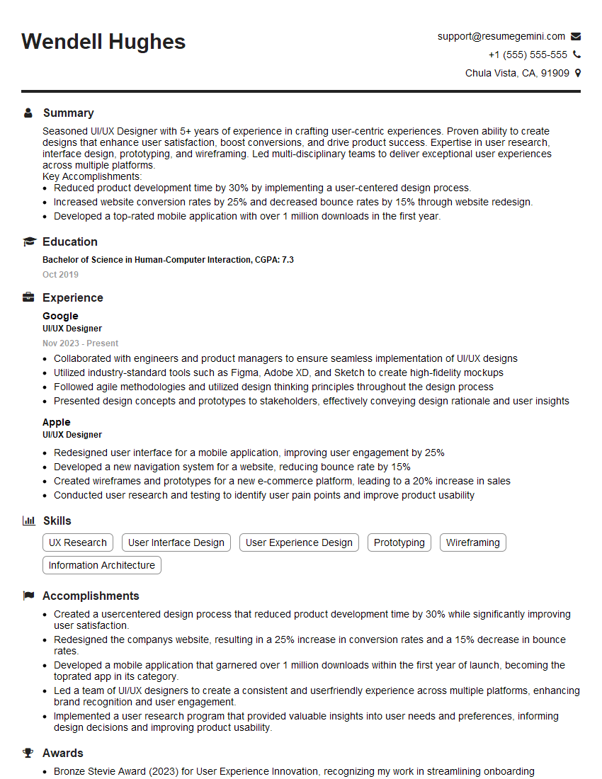
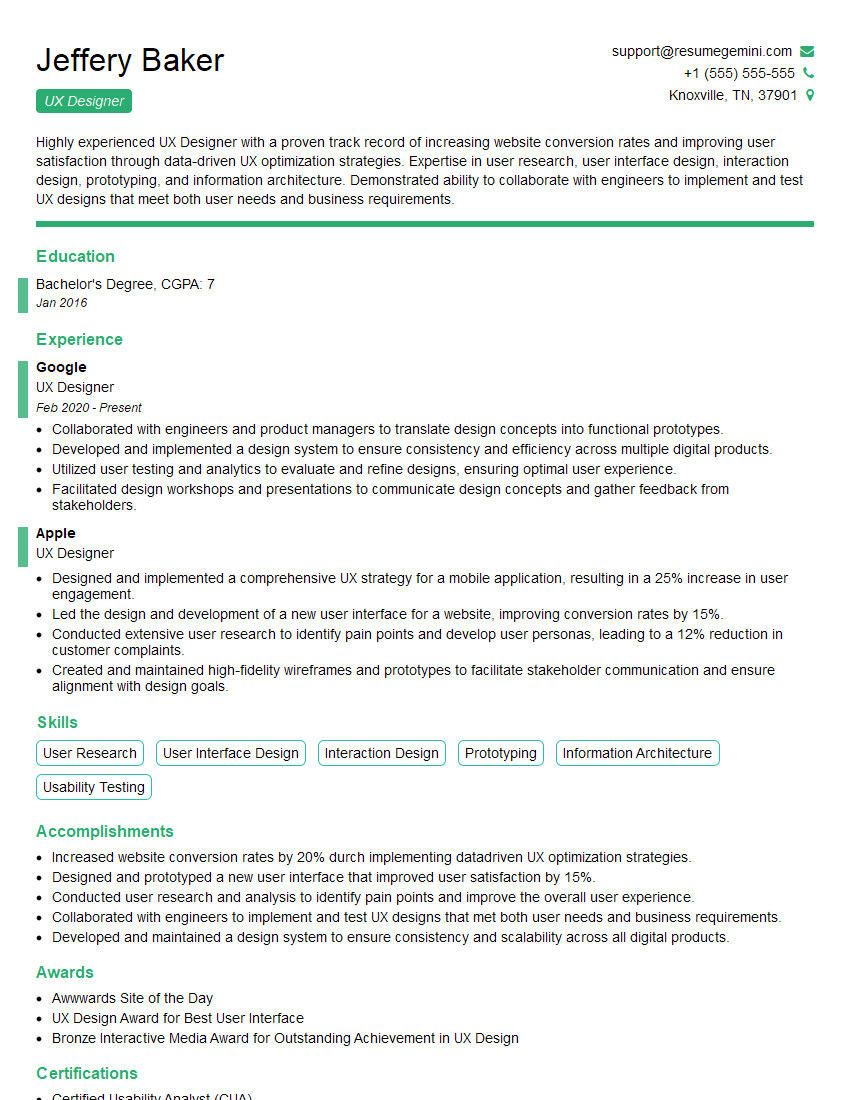
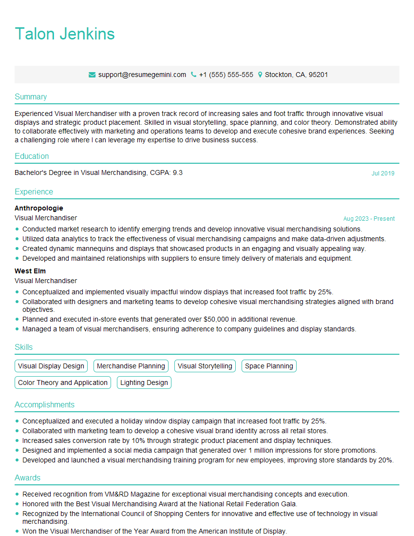
Mastering Knowledge of Design Principles and Aesthetics is crucial for career advancement in design and related fields. A strong understanding of these principles allows you to create effective and impactful designs, leading to greater success in your chosen career path. To significantly boost your job prospects, focus on crafting an ATS-friendly resume that highlights your skills and experience effectively. ResumeGemini is a trusted resource to help you build a professional and compelling resume. We offer examples of resumes tailored to showcasing expertise in Knowledge of Design Principles and Aesthetics to help you get started.
Explore more articles
Users Rating of Our Blogs
Share Your Experience
We value your feedback! Please rate our content and share your thoughts (optional).
What Readers Say About Our Blog
Hello,
We found issues with your domain’s email setup that may be sending your messages to spam or blocking them completely. InboxShield Mini shows you how to fix it in minutes — no tech skills required.
Scan your domain now for details: https://inboxshield-mini.com/
— Adam @ InboxShield Mini
Reply STOP to unsubscribe
Hi, are you owner of interviewgemini.com? What if I told you I could help you find extra time in your schedule, reconnect with leads you didn’t even realize you missed, and bring in more “I want to work with you” conversations, without increasing your ad spend or hiring a full-time employee?
All with a flexible, budget-friendly service that could easily pay for itself. Sounds good?
Would it be nice to jump on a quick 10-minute call so I can show you exactly how we make this work?
Best,
Hapei
Marketing Director
Hey, I know you’re the owner of interviewgemini.com. I’ll be quick.
Fundraising for your business is tough and time-consuming. We make it easier by guaranteeing two private investor meetings each month, for six months. No demos, no pitch events – just direct introductions to active investors matched to your startup.
If youR17;re raising, this could help you build real momentum. Want me to send more info?
Hi, I represent an SEO company that specialises in getting you AI citations and higher rankings on Google. I’d like to offer you a 100% free SEO audit for your website. Would you be interested?
Hi, I represent an SEO company that specialises in getting you AI citations and higher rankings on Google. I’d like to offer you a 100% free SEO audit for your website. Would you be interested?
good
