Every successful interview starts with knowing what to expect. In this blog, we’ll take you through the top Layout principles interview questions, breaking them down with expert tips to help you deliver impactful answers. Step into your next interview fully prepared and ready to succeed.
Questions Asked in Layout principles Interview
Q 1. Explain the difference between UI and UX design, focusing on layout considerations.
UI (User Interface) design focuses on the look and feel of a product, while UX (User Experience) design considers the overall user journey and interaction. Regarding layouts, UI design is concerned with the visual arrangement of elements – buttons, images, text – ensuring aesthetic appeal and intuitive navigation within a specific screen or page. UX design, on the other hand, takes a broader perspective, considering how the layout contributes to the user’s overall experience across multiple screens and interactions. For example, a UI designer might focus on the placement of a call-to-action button for optimal visual impact, while a UX designer would consider the entire flow leading to that button, ensuring it’s logically placed within the user’s journey and contributes to a positive overall experience.
Think of it this way: UI is like decorating a room, focusing on aesthetics and the arrangement of furniture. UX is like designing the entire house, considering flow, functionality, and the user’s experience navigating different rooms and spaces.
Q 2. Describe the principles of Gestalt psychology and how they apply to layout design.
Gestalt psychology principles describe how humans perceive visual information. They’re crucial for effective layout design because they influence how users interpret and understand the arrangement of elements. Key principles include:
- Proximity: Elements placed close together are perceived as a group. This can be used to create visual modules or related sections within a layout.
- Similarity: Similar elements (e.g., same color, shape, size) are perceived as belonging together. This is useful for organizing lists, creating visual consistency, and highlighting relationships between items.
- Closure: Users tend to complete incomplete shapes or patterns. This can be used to create visually interesting and memorable logos or design elements.
- Continuity: The eye naturally follows lines and curves. This guides the user’s attention and can be used to create visual flow and navigation paths.
- Figure/Ground: Elements are perceived as either figures (objects of focus) or ground (background). Proper use of this principle helps highlight important content and create a clear visual hierarchy.
For example, grouping related products on an e-commerce website using proximity and similarity creates a clear and organized shopping experience. Using continuity in the arrangement of navigation elements can guide the user seamlessly through the website.
Q 3. What are some common layout grids (e.g., column-based, modular) and when would you use each?
Several layout grids offer structure and organization.
- Column-based grids: These divide the layout into vertical columns, offering a structured way to organize content. They’re highly versatile and suitable for most websites and applications, promoting readability and consistency. The number of columns depends on the content and screen size. A responsive design might use fewer columns on smaller screens.
- Modular grids: These grids use a repeating module or grid unit as the basic building block. This ensures consistency and visual harmony throughout the layout. They’re particularly useful for complex layouts requiring a high degree of organization and consistency.
- Hierarchical grids: These combine multiple grids to create a layered structure. They are effective for complex layouts that require visual organization at multiple levels.
Choosing the right grid depends on the project’s complexity and content. A simple blog might only need a two-column grid, while a complex e-commerce site might require a modular grid to manage product listings, navigation, and promotional areas effectively. Responsive design principles are crucial for adapting these grids to various screen sizes.
Q 4. How do you balance visual hierarchy and readability in a layout?
Balancing visual hierarchy and readability is crucial. Visual hierarchy guides the user’s eye through the content, directing attention to the most important information first. Readability ensures the text is easily understood. This balance is achieved through:
- Font sizes and weights: Larger, bolder fonts for headings and titles; smaller, lighter fonts for body text.
- Color contrast: Sufficient contrast between text and background improves readability.
- White space: Appropriate spacing between elements improves readability and reduces visual clutter.
- Strategic use of images and graphics: Visually appealing and relevant images can enhance engagement and support the visual hierarchy.
For example, using a larger, bolder heading for a section title establishes its importance. Then, using clear paragraph structure, appropriate line spacing, and consistent font size for body text ensures readability.
Q 5. Explain the importance of white space (negative space) in layout design.
White space (also called negative space) is the empty area around design elements. It’s essential for creating a clean, uncluttered, and visually appealing layout. It improves readability by preventing elements from feeling cramped. It allows users to focus on important content, creates visual breathing room, and enhances the overall aesthetic appeal. White space isn’t necessarily white; it’s simply the unoccupied space within the design.
Imagine a crowded room versus a spacious one. The spacious room feels more comfortable and allows for easier movement and focus. White space in a layout provides the same effect, making it easier for users to navigate and understand the information.
Q 6. Discuss the use of typography in creating effective layouts.
Typography plays a vital role in effective layouts. Careful selection and application of fonts impact readability, brand identity, and overall visual appeal. Key considerations include:
- Font selection: Choosing appropriate fonts that are legible and consistent with the brand’s personality. Consider both the heading and body text fonts, ensuring they complement each other.
- Font size and weight: Using a variety of sizes and weights to create visual hierarchy and emphasize important information.
- Line spacing (leading): Adjusting line spacing to ensure comfortable reading and avoid crowding.
- Letter spacing (tracking): Adjusting letter spacing for improved readability and visual balance.
- Kerning: Adjusting the space between individual letter pairs for improved visual appeal.
Using a well-defined typography system creates a professional and visually consistent layout. Inconsistent or poorly chosen fonts can negatively impact readability and the overall user experience.
Q 7. How do you ensure accessibility in your layout designs?
Accessibility is paramount. Layout designs must cater to users with disabilities. Key considerations include:
- Sufficient color contrast: Ensure sufficient contrast between text and background colors to meet WCAG (Web Content Accessibility Guidelines) standards. This is particularly important for users with low vision.
- Alternative text for images: Provide descriptive alt text for all images, allowing screen readers to convey the image’s content to visually impaired users.
- Keyboard navigation: Ensure all interactive elements are accessible via keyboard navigation, for users who cannot use a mouse.
- Clear visual hierarchy: A well-defined visual hierarchy helps users with cognitive disabilities easily scan and understand the information.
- Responsive design: Ensure the layout adapts to different screen sizes and devices, making it accessible to users with various devices.
Following accessibility guidelines ensures that everyone can use and benefit from the designed interface, regardless of their abilities.
Q 8. How do you design for different screen sizes and devices (responsive design)?
Responsive design ensures your layout adapts seamlessly to different screen sizes and devices. Think of it like a chameleon changing colors to blend in – your website needs to change its appearance to fit the environment (the device). This is achieved primarily through techniques like fluid grids, flexible images, and media queries.
Fluid grids use percentages instead of fixed pixel widths for columns and containers. This allows the layout to expand or contract proportionally with the screen size. For example, a three-column layout might use percentages like 33% for each column, totaling 99% to allow for minor spacing adjustments.
Flexible images utilize the max-width: 100%; CSS property to prevent images from exceeding their container’s width. This ensures images don’t overflow or distort on smaller screens.
Media queries are CSS rules that apply specific styles based on the device’s characteristics, like screen width or orientation. They are the control center, telling the layout how to adjust at different breakpoints (e.g., showing a hamburger menu on smaller screens).
@media (max-width: 768px) { /* Styles for screens 768px wide or less */ .three-column-layout { display: block; /* Stack columns vertically */ } }
By combining these techniques, you create a user experience that's consistent and enjoyable across desktops, tablets, and smartphones. Imagine designing a brochure that can fold up into a smaller pamphlet—responsive design is that same adaptability applied to websites.
Q 9. Describe your process for creating a wireframe and then translating it into a high-fidelity design.
My wireframing process starts with understanding the user needs and content hierarchy. I create low-fidelity wireframes, which are essentially sketches outlining the layout's structure and functionality, often using simple shapes and text placeholders. Think of this as the blueprint of a house, focusing on the placement of rooms and functionality, not the paint color.
This initial wireframe allows for quick iteration and feedback. Once the structure is approved, I move to a high-fidelity mockup, which focuses on visual elements and the overall aesthetic. This involves selecting colors, typography, imagery, and refining the layout's visual appeal. It's like transforming the house blueprint into a detailed architectural rendering—showing the materials, lighting, and overall design.
Tools like Figma, Adobe XD, or Sketch are integral to this process. I often start with low-fidelity wireframes in a simple tool like Balsamiq, allowing for quick sketching and then transition to a more robust tool for high-fidelity designs. This helps maintain flexibility throughout the design process.
Q 10. What are some common layout design mistakes to avoid?
Common layout mistakes include neglecting white space, inconsistent typography, poor visual hierarchy, ignoring accessibility guidelines, and neglecting mobile responsiveness.
- Insufficient White Space: Cramming too much content creates a cluttered and overwhelming experience. Think of white space as the air you need to breathe – it allows the eyes to rest and focus on important elements.
- Inconsistent Typography: Using multiple fonts or inconsistent font sizes confuses the user and weakens brand identity. A consistent font family improves readability and creates a cohesive look and feel.
- Poor Visual Hierarchy: Failure to highlight important information makes the content difficult to understand. Use size, weight, and color contrast to guide the user's attention.
- Accessibility Oversights: Not considering users with disabilities (e.g., color blindness, visual impairments) can create an unusable experience. Ensure sufficient color contrast and provide alt text for images.
- Neglecting Mobile Responsiveness: Failing to optimize for mobile devices results in a frustrating user experience. Responsive design is crucial to ensure your layout is accessible and functional on all screen sizes.
Q 11. Explain the concept of visual flow and how to control it.
Visual flow guides the user's eye through the layout. It's the path your design creates for the user to follow. You want to control this flow to ensure users see the most important information first, and understand the content logically.
This can be achieved through several methods:
- Strategic placement of visual cues: Use elements like arrows, lines, and visual hierarchies to direct the user's gaze.
- Logical order of content: Arrange information in a clear, sequential manner. For example, in a story, you would follow a chronological flow, while in a comparison chart, you might follow a left-to-right comparison.
- Color and contrast: Use color to highlight important elements and create contrast to guide the user's attention.
- White space: Strategic use of white space can create visual separation and improve readability, naturally guiding the eye.
Imagine a winding path in a garden—that's the visual flow. You can create a pleasant and engaging experience by carefully designing that path; otherwise, a user might get lost and frustrated.
Q 12. How do you use color theory to improve the effectiveness of a layout?
Color theory is the foundation of effective visual communication in layout design. Understanding the color wheel—primary, secondary, and tertiary colors—and concepts like hue, saturation, and value (HSV) is crucial. Color impacts mood, perception, and brand identity.
Choosing a color palette: Selecting colors that complement each other is important. You can use analogous colors (adjacent on the color wheel) for a harmonious feel or complementary colors (opposite on the color wheel) for high contrast and visual interest. Consider the psychology of color; blues are often associated with calmness, reds with excitement.
Color contrast: Sufficient contrast ensures readability, particularly for text on backgrounds. Tools like WebAIM's color contrast checker can help ensure accessibility.
Branding consistency: Using consistent brand colors throughout the layout reinforces brand identity and creates a unified user experience.
For example, a website for a spa might use calming blues and greens, while a gaming website might use vibrant, energetic reds and oranges.
Q 13. What are some techniques for creating a visually appealing layout?
Creating visually appealing layouts involves a combination of techniques:
- Rule of thirds: Placing key elements along the imaginary lines that divide an image or layout into thirds creates a more balanced and visually engaging composition.
- White space/Negative space: Effective use of white space prevents the layout from feeling cluttered and allows important elements to breathe.
- Typography: Selecting appropriate fonts and font sizes improves readability and enhances the overall aesthetic. Using headings, subheadings, and body text creates visual hierarchy.
- Imagery: High-quality images and illustrations enhance the visual appeal and communicate information effectively.
- Grid systems: Using a grid system provides structure and consistency to the layout. It ensures that elements are aligned and spaced appropriately.
- Visual balance: Achieving visual balance through symmetry or asymmetry adds harmony and prevents the layout from feeling lopsided.
Think of it like composing a beautiful painting – you need to consider every element, its placement, and how they interact to create a visually stunning piece of work.
Q 14. Explain the concept of visual balance and how to achieve it in a layout.
Visual balance in layout design refers to the distribution of visual weight across the design. It's about creating a sense of equilibrium and stability, preventing the layout from feeling lopsided or uneven. There are two main types:
- Symmetrical balance: This involves creating a mirror image on either side of a central axis. It's formal and creates a sense of order and stability, think of a perfectly balanced scale.
- Asymmetrical balance: This achieves balance through the use of different elements of varying visual weight. It's more dynamic and visually interesting. Imagine balancing a heavy object with several smaller ones on the opposite side.
Achieving visual balance involves considering factors such as size, color, weight, and the placement of elements. Heavier elements (larger images, bold text) need to be counterbalanced by lighter elements or strategically placed to avoid an unbalanced feel.
For example, a website with a large image on one side might be balanced by a column of text on the other, or multiple smaller images. The key is to create a sense of visual equilibrium that is pleasing to the eye and prevents the design from feeling chaotic or unstable.
Q 15. How do you incorporate user feedback into your layout design process?
User feedback is the lifeblood of successful layout design. I integrate it throughout the process, not just at the end. My approach involves several key steps:
- Early Feedback (Conceptual Stage): I present low-fidelity prototypes – sketches or wireframes – to gather initial reactions and identify any major usability issues early on. This prevents investing heavily in designs that might be fundamentally flawed.
- Mid-Stage Feedback (Interactive Prototypes): Once interactive prototypes are ready (using Figma, for example), I conduct usability testing sessions with target users. I observe their interactions, noting where they struggle or become confused. This provides valuable insights into the layout's effectiveness.
- Post-Launch Feedback (A/B Testing & Analytics): After launching the design, I monitor performance using analytics tools to track metrics like click-through rates, bounce rates, and task completion rates. This data informs further iterations and improvements.
- Continuous Feedback Loops: I actively seek feedback through surveys, in-app feedback forms, and user interviews. This continuous feedback loop ensures the design remains relevant and user-friendly over time.
For example, during a recent redesign of an e-commerce website, early user feedback revealed that the search bar was too inconspicuous. By incorporating this feedback early on, we increased the visibility of the search bar, leading to a significant improvement in product discovery and sales.
Career Expert Tips:
- Ace those interviews! Prepare effectively by reviewing the Top 50 Most Common Interview Questions on ResumeGemini.
- Navigate your job search with confidence! Explore a wide range of Career Tips on ResumeGemini. Learn about common challenges and recommendations to overcome them.
- Craft the perfect resume! Master the Art of Resume Writing with ResumeGemini's guide. Showcase your unique qualifications and achievements effectively.
- Don't miss out on holiday savings! Build your dream resume with ResumeGemini's ATS optimized templates.
Q 16. How do you test the usability of your layouts?
Usability testing is crucial. I employ a range of methods to evaluate my layouts:
- Usability Testing Sessions: I observe participants as they complete tasks using the design. This helps identify pain points and areas for improvement. I use a combination of think-aloud protocols and post-task interviews to gather comprehensive insights.
- A/B Testing: I conduct A/B tests to compare different design variations and determine which performs better based on measurable metrics such as conversion rates and time on task.
- Heuristic Evaluation: Experts review the design based on established usability principles (Nielsen's 10 heuristics, for instance), identifying potential issues.
- Eye-Tracking Studies: While more expensive, eye-tracking can reveal exactly where users focus their attention on the layout, highlighting areas that may be underutilized or confusing.
For instance, in a recent project, A/B testing revealed that a redesigned navigation menu, while aesthetically pleasing, led to a decrease in task completion. This highlighted the importance of prioritizing usability over purely aesthetic concerns.
Q 17. Discuss your experience with layout software (e.g., Figma, Sketch, Adobe XD).
I have extensive experience with Figma, Sketch, and Adobe XD. Each tool has its strengths and weaknesses:
- Figma: My preferred tool due to its collaborative features, real-time co-editing, and robust prototyping capabilities. Its vector-based editing provides flexibility and scalability.
- Sketch: Excellent for creating pixel-perfect designs and boasts a strong plugin ecosystem. However, its collaborative features are less robust than Figma's.
- Adobe XD: A strong contender, particularly for its integration with the Adobe Creative Suite. It offers excellent prototyping features, but I find its collaborative capabilities slightly less polished than Figma's.
My expertise extends beyond simply using these tools. I understand how to leverage their specific functionalities to optimize the design workflow and create high-fidelity prototypes that accurately represent the final product.
Q 18. How do you handle conflicting design requirements from stakeholders?
Conflicting design requirements are inevitable. My approach involves:
- Clearly Defined Goals: I begin by establishing clear, measurable, achievable, relevant, and time-bound (SMART) goals for the project. This provides a framework for resolving conflicts.
- Prioritization and Compromise: I work with stakeholders to prioritize competing requirements based on their impact on the overall goals. This often involves finding creative compromises that satisfy most stakeholders' needs.
- Data-Driven Decisions: Whenever possible, I use data (user testing results, analytics) to justify design decisions and resolve disputes. Data provides an objective basis for choosing between competing options.
- Documentation and Communication: I maintain detailed documentation of design decisions and rationale, ensuring transparency and accountability throughout the process. Regular communication with stakeholders is essential to keep everyone informed and manage expectations.
For example, a client may want a visually complex design, while another wants simplicity. I’d use data from user testing to show the impact of complexity on usability, potentially persuading them toward a simpler, more effective solution.
Q 19. Describe a time you had to redesign a layout due to poor performance or user feedback.
I once redesigned the homepage of a news website due to poor performance and negative user feedback. The initial design, while visually appealing, had a complex navigation structure and slow loading times. User testing revealed high bounce rates and low task completion rates.
The redesign focused on:
- Simplified Navigation: We streamlined the navigation menu, making it more intuitive and easier to use.
- Optimized Content: We reduced the number of images and optimized existing images for faster loading times.
- Improved Information Architecture: We reorganized the content to improve findability and reduce the number of clicks required to access information.
Post-redesign, we saw significant improvements in key metrics, including a reduction in bounce rates, an increase in time on site, and a higher conversion rate for subscriptions. This experience reinforced the importance of prioritizing user experience and performance over purely aesthetic considerations.
Q 20. How do you stay up-to-date with the latest trends in layout design?
Staying up-to-date is paramount. My strategies include:
- Following Industry Publications and Blogs: I regularly read design blogs, publications, and newsletters (e.g., A List Apart, Smashing Magazine) to stay informed about the latest trends and best practices.
- Attending Conferences and Workshops: Participating in industry events offers opportunities to learn from leading designers and network with peers.
- Exploring Design Communities: Engaging in online design communities (e.g., Dribbble, Behance) allows me to see what other designers are doing and gain inspiration.
- Experimentation and Prototyping: I regularly experiment with new design tools and techniques, testing them in real-world projects to see how they perform.
For instance, the growing popularity of micro-interactions and voice UI requires constant learning to leverage these trends effectively.
Q 21. Explain the importance of consistency in layout design.
Consistency is the cornerstone of a good user experience. A consistent layout establishes a predictable and intuitive interaction model. Inconsistent layouts confuse users, making it harder to find information and complete tasks.
Consistency encompasses various aspects:
- Visual Consistency: Maintaining consistent typography, color palettes, imagery styles, and spacing creates a unified and cohesive design. This establishes a strong brand identity and improves recognition.
- Interactive Consistency: Buttons, forms, and other interactive elements should behave predictably across the entire interface. Users should know what to expect when they click a button or submit a form.
- Informational Consistency: Maintaining consistent terminology, tone of voice, and data presentation ensures clarity and avoids user confusion.
Think of a well-designed app like a well-organized library. The consistent placement of books on shelves, clear signage, and logical organization make it easy to find the information you need. An inconsistent layout, in contrast, would be chaotic and frustrating to use.
Q 22. What are some examples of successful layout designs you admire and why?
Successful layout designs often prioritize clarity, usability, and visual appeal. I admire the layouts of sites like Mailchimp for their playful use of whitespace and intuitive navigation, creating a user-friendly experience despite complex features. The minimalist approach of Medium's blog post layouts is another example I appreciate; the focus on readability and clear hierarchy makes even long-form content easily digestible. Finally, I find the responsive design and information architecture of many government websites, like the UK's Gov.uk, to be exemplary, showcasing how effective layout can enhance accessibility and comprehension for a diverse audience.
These designs work well because they effectively balance form and function. They prioritize the user experience by making information easy to find and understand, while still being visually engaging. They also demonstrate adaptability, scaling well across different devices and screen sizes.
Q 23. How do you prioritize design elements when creating a layout?
Prioritizing design elements is crucial for creating effective layouts. I typically follow a hierarchical approach, starting with the most critical information. This often involves understanding the user's goals and the key messages that need to be conveyed. For example, a call to action (CTA) button on an e-commerce site should always take visual precedence. Following the CTA, I prioritize elements based on their importance to the user journey and the overall purpose of the page. Content hierarchy is key; using headings, subheadings, and visual cues helps guide users through the information efficiently. I often use a process similar to the 'MoSCoW' method (Must have, Should have, Could have, Won't have) to define priorities early in the process. This ensures the most essential elements are addressed first, and design decisions are grounded in user needs rather than aesthetic preferences alone.
Q 24. Explain the concept of visual weight and how it impacts layout design.
Visual weight refers to the perceived prominence of an element within a design. Think of it like a scale: some elements are 'heavier' and draw more attention than others. This is influenced by factors such as size, color, contrast, and position. A large, brightly colored image will carry more visual weight than a small, muted text block. Strategic use of visual weight is essential for creating balance and guiding the user's eye. For instance, a website's logo often has significant visual weight, placed prominently to establish brand identity. A poorly balanced layout, where one side is visually 'heavier' than the other, can feel unsettling and disorienting to the viewer.
Imagine a seesaw: to balance it, you need to distribute weight evenly. Similarly, in layout design, we must carefully distribute visual weight to ensure a harmonious and aesthetically pleasing composition. I often use grids and design software's alignment tools to help manage visual weight effectively.
Q 25. How do you use visual cues to guide the user's eye through a layout?
Visual cues are essential for directing user attention and guiding them through a layout. These cues work in conjunction with visual weight to create a clear path through the information. Common techniques include:
- Line of sight: Using visual pathways created by lines or other elements to draw the eye towards specific areas.
- Color contrast: Using contrasting colors to highlight important elements.
- Size and scale: Making key elements larger or more prominent to emphasize them.
- Whitespace: Strategic use of whitespace to create visual breathing room and emphasize certain elements by isolating them.
- Directional cues: Arrows, lines, and even subtle gradients can subtly guide the user's gaze.
For example, in a product listing page, I would use larger images and bolder titles for the featured products, contrasting them with smaller images and more subdued styles for less important items. This naturally draws attention to the items I want users to consider first.
Q 26. Describe your process for creating a mobile-first layout.
Mobile-first design means prioritizing the mobile experience first and then scaling up to larger screens. My process typically starts with defining the core content and functionality for the smallest screen size. I focus on creating a simple, intuitive experience that prioritizes essential information. Only after perfecting the mobile layout, do I gradually add features and content as screen sizes increase. This avoids unnecessary complexity on smaller screens and ensures a consistent experience across all devices. I leverage responsive design techniques, like flexible grids and media queries, to adapt the layout based on screen size and orientation.
I often start with wireframing on a mobile device itself to better understand the constraints and opportunities of a smaller screen. This gives me a realistic perspective on how the design will function in the target environment.
Q 27. How do you ensure your layouts are scalable for different content lengths?
Creating scalable layouts requires careful consideration of content variability. Using flexible grids and relative units (percentages instead of fixed pixels) is crucial. This allows the layout to adapt gracefully to different amounts of content. For instance, instead of setting a specific height for a column, I would use percentages or 'vh' (viewport height) units. This ensures the column adjusts appropriately regardless of the amount of text within it. Pagination or infinite scrolling can be employed for very long lists of content. Additionally, I employ techniques such as responsive images that scale automatically, preventing oversized images from disrupting the layout.
This ensures consistent and seamless user experience regardless of the amount of content presented. It's about designing for flexibility and anticipating how the layout will behave under varying conditions.
Q 28. Explain your understanding of the relationship between layout and content strategy.
Layout and content strategy are intrinsically linked. Content strategy defines what information needs to be presented, while layout determines how it's organized and displayed. A strong content strategy provides the foundation for an effective layout. Understanding the target audience, information architecture, and key messages are all essential before even considering the visual aspects of the layout. For example, a blog post focusing on a complex technical topic will require a very different layout than a simple product announcement. The former might benefit from a clear hierarchical structure with ample whitespace, while the latter might prioritize visual impact and conciseness.
In essence, content strategy informs the layout decisions, ensuring that the design effectively supports the communication goals. A poorly designed layout can hinder even the best content, while a well-designed layout can elevate even average content.
Key Topics to Learn for Layout Principles Interview
- Grid Systems: Understanding and applying various grid systems (e.g., 960.gs, Bootstrap grid, CSS Grid) for responsive and structured layouts. Practical application: Designing a multi-column website layout using CSS Grid.
- Responsive Design: Mastering techniques for creating websites that adapt seamlessly to different screen sizes and devices. Practical application: Implementing media queries to adjust layout for various screen resolutions.
- Flexbox and Positioning: Proficiently utilizing Flexbox and different positioning techniques (static, relative, absolute, fixed) for precise element placement and control. Practical application: Creating a complex navigation menu using Flexbox.
- Typography and Visual Hierarchy: Understanding the principles of typography and how to create a clear visual hierarchy to guide the user's eye. Practical application: Designing a visually appealing and easily navigable website page using appropriate font sizes, weights, and styles.
- Whitespace and Negative Space: Effectively using whitespace to improve readability and create a visually balanced design. Practical application: Demonstrating how strategic use of whitespace improves user experience on a webpage.
- Accessibility and Inclusivity: Designing layouts that are accessible to users with disabilities, adhering to WCAG guidelines. Practical application: Implementing ARIA attributes and semantic HTML to enhance accessibility.
- Layout Optimization for Performance: Understanding techniques to optimize layout for optimal loading times and performance. Practical application: Discussing strategies for minimizing HTTP requests and optimizing images for layout elements.
Next Steps
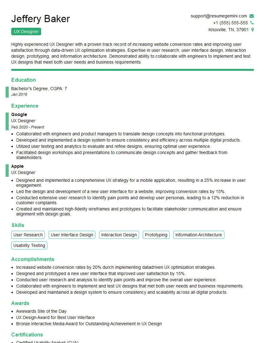
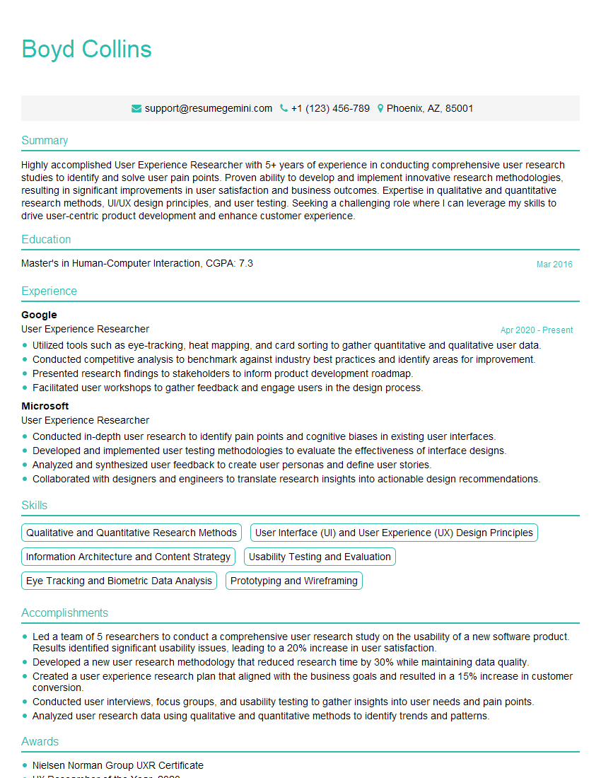
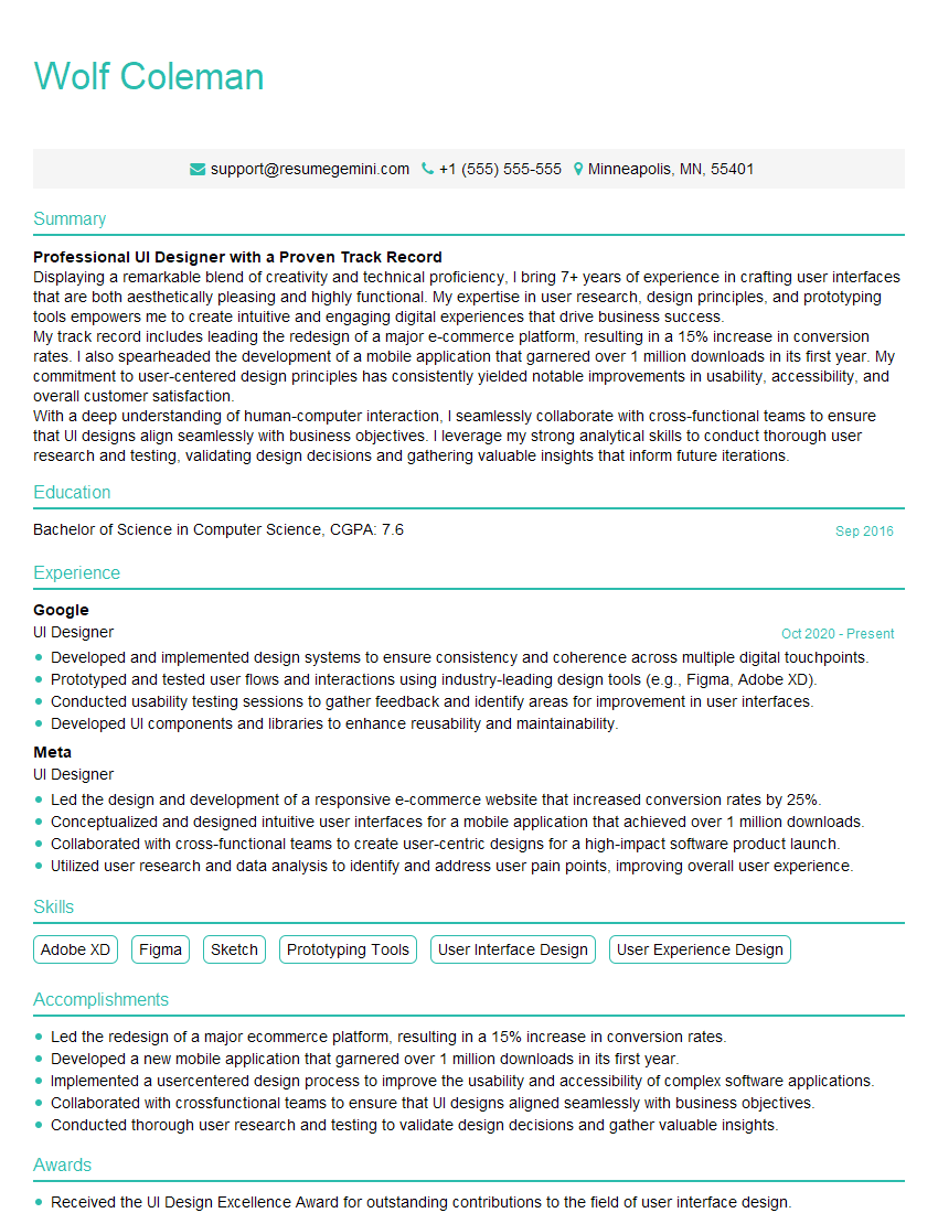
Mastering layout principles is crucial for career advancement in web design and development. A strong understanding of these concepts will significantly improve your ability to create user-friendly, aesthetically pleasing, and performant websites. To maximize your job prospects, focus on creating an ATS-friendly resume that effectively highlights your skills and experience. ResumeGemini is a trusted resource to help you build a professional and impactful resume. Examples of resumes tailored to highlight expertise in layout principles are available to further aid your job search.
Explore more articles
Users Rating of Our Blogs
Share Your Experience
We value your feedback! Please rate our content and share your thoughts (optional).
What Readers Say About Our Blog
Hello,
we currently offer a complimentary backlink and URL indexing test for search engine optimization professionals.
You can get complimentary indexing credits to test how link discovery works in practice.
No credit card is required and there is no recurring fee.
You can find details here:
https://wikipedia-backlinks.com/indexing/
Regards
NICE RESPONSE TO Q & A
hi
The aim of this message is regarding an unclaimed deposit of a deceased nationale that bears the same name as you. You are not relate to him as there are millions of people answering the names across around the world. But i will use my position to influence the release of the deposit to you for our mutual benefit.
Respond for full details and how to claim the deposit. This is 100% risk free. Send hello to my email id: [email protected]
Luka Chachibaialuka
Hey interviewgemini.com, just wanted to follow up on my last email.
We just launched Call the Monster, an parenting app that lets you summon friendly ‘monsters’ kids actually listen to.
We’re also running a giveaway for everyone who downloads the app. Since it’s brand new, there aren’t many users yet, which means you’ve got a much better chance of winning some great prizes.
You can check it out here: https://bit.ly/callamonsterapp
Or follow us on Instagram: https://www.instagram.com/callamonsterapp
Thanks,
Ryan
CEO – Call the Monster App
Hey interviewgemini.com, I saw your website and love your approach.
I just want this to look like spam email, but want to share something important to you. We just launched Call the Monster, a parenting app that lets you summon friendly ‘monsters’ kids actually listen to.
Parents are loving it for calming chaos before bedtime. Thought you might want to try it: https://bit.ly/callamonsterapp or just follow our fun monster lore on Instagram: https://www.instagram.com/callamonsterapp
Thanks,
Ryan
CEO – Call A Monster APP
To the interviewgemini.com Owner.
Dear interviewgemini.com Webmaster!
Hi interviewgemini.com Webmaster!
Dear interviewgemini.com Webmaster!
excellent
Hello,
We found issues with your domain’s email setup that may be sending your messages to spam or blocking them completely. InboxShield Mini shows you how to fix it in minutes — no tech skills required.
Scan your domain now for details: https://inboxshield-mini.com/
— Adam @ InboxShield Mini
Reply STOP to unsubscribe
Hi, are you owner of interviewgemini.com? What if I told you I could help you find extra time in your schedule, reconnect with leads you didn’t even realize you missed, and bring in more “I want to work with you” conversations, without increasing your ad spend or hiring a full-time employee?
All with a flexible, budget-friendly service that could easily pay for itself. Sounds good?
Would it be nice to jump on a quick 10-minute call so I can show you exactly how we make this work?
Best,
Hapei
Marketing Director
Hey, I know you’re the owner of interviewgemini.com. I’ll be quick.
Fundraising for your business is tough and time-consuming. We make it easier by guaranteeing two private investor meetings each month, for six months. No demos, no pitch events – just direct introductions to active investors matched to your startup.
If youR17;re raising, this could help you build real momentum. Want me to send more info?
Hi, I represent an SEO company that specialises in getting you AI citations and higher rankings on Google. I’d like to offer you a 100% free SEO audit for your website. Would you be interested?
Hi, I represent an SEO company that specialises in getting you AI citations and higher rankings on Google. I’d like to offer you a 100% free SEO audit for your website. Would you be interested?
good
