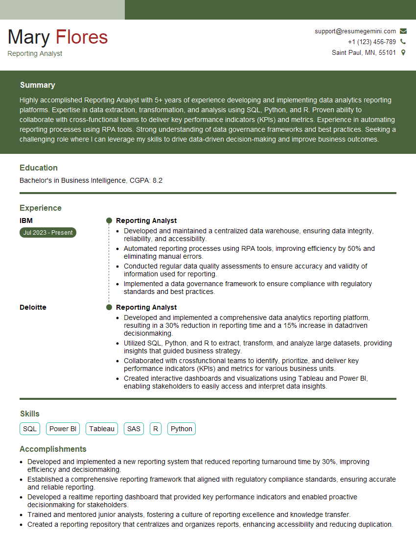
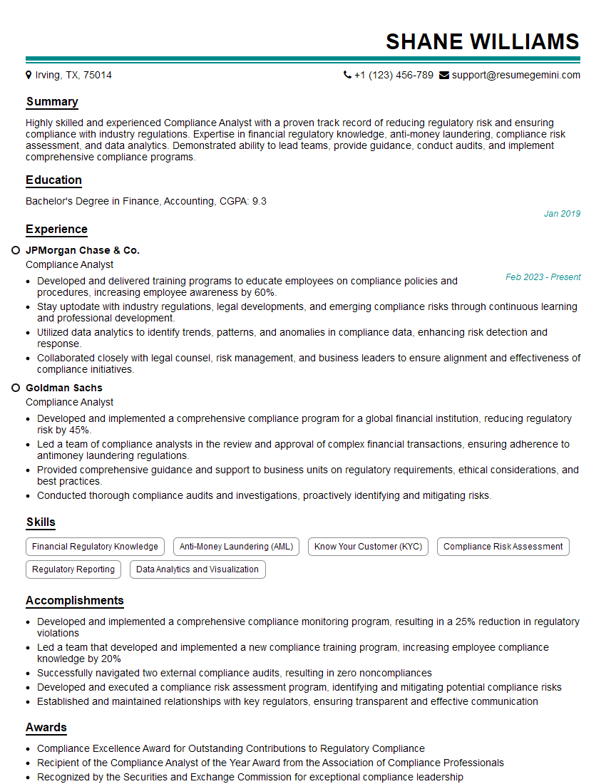
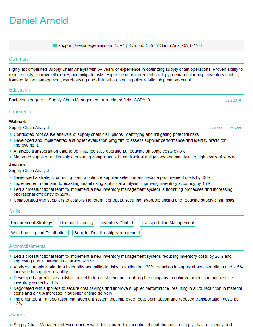
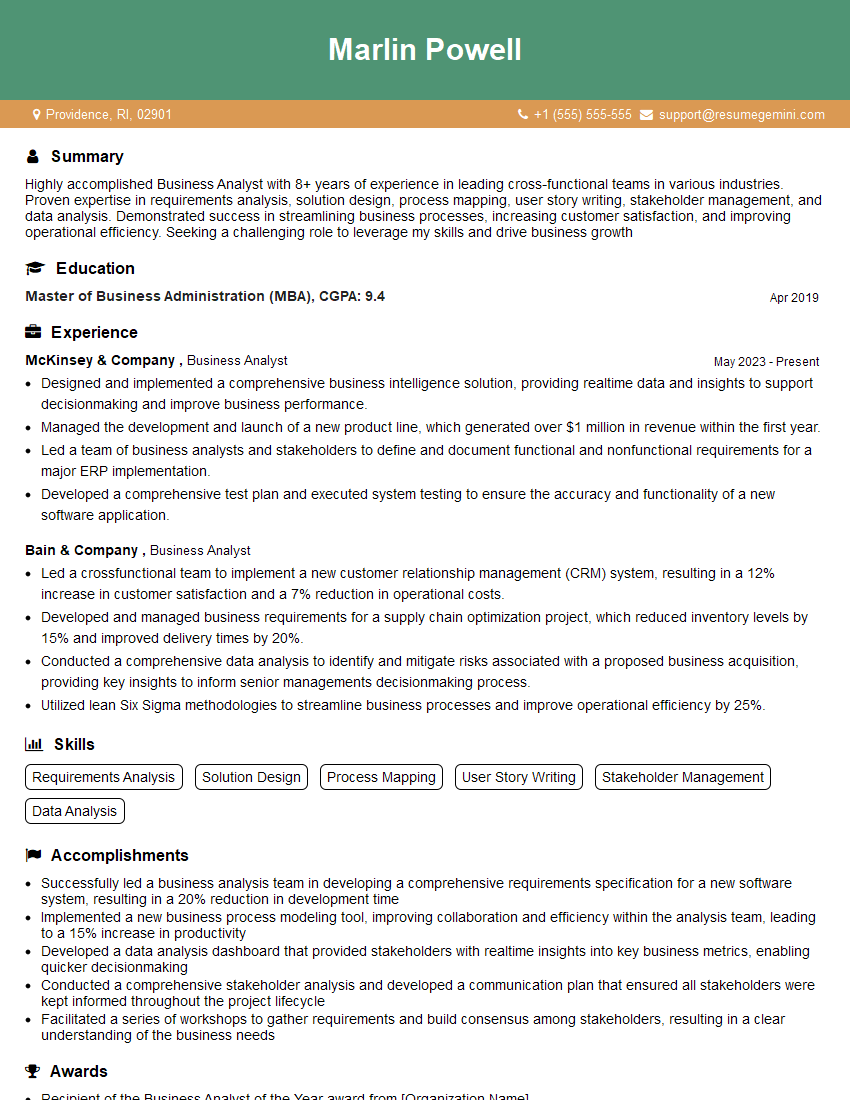
Are you ready to stand out in your next interview? Understanding and preparing for MS Excel and Process Data Analysis interview questions is a game-changer. In this blog, we’ve compiled key questions and expert advice to help you showcase your skills with confidence and precision. Let’s get started on your journey to acing the interview.
Questions Asked in MS Excel and Process Data Analysis Interview
Q 1. Explain the difference between VLOOKUP and INDEX-MATCH.
Both VLOOKUP and INDEX-MATCH are used to find specific data within a table, but they differ significantly in their approach and capabilities. VLOOKUP searches for a value in the first column of a table and returns a value in the same row from a specified column. INDEX-MATCH, on the other hand, offers far greater flexibility. It allows you to look up a value in any column and return a value from any other column, regardless of their order.
Think of VLOOKUP as searching a phone book where you only know the name (first column) and need to find the phone number (a subsequent column). INDEX-MATCH, however, is like having access to a sophisticated database where you can search by name, address, or any other field to find any associated information.
- VLOOKUP limitations: It’s restricted to searching only the first column and looking up values only to the right.
- INDEX-MATCH advantages: It can search any column and return a value from any column. It also handles approximate matches more effectively.
Example: Let’s say you have a table of product IDs and their corresponding prices. VLOOKUP would be suitable if you need to find the price given a product ID (assuming IDs are in the first column). However, if you needed to find the product ID given the price, you’d need INDEX-MATCH, as VLOOKUP can’t search in the second column.
=VLOOKUP(A2,B:C,2,FALSE) 'Finds price in column C based on product ID in column A=INDEX(C:C,MATCH(A2,B:B,0)) 'Finds price in column C based on product ID in column BQ 2. How would you handle missing data in a dataset?
Handling missing data is crucial for accurate data analysis. Ignoring missing values can lead to biased results. My approach involves a multi-step process:
- Identification: First, I identify the extent and pattern of missing data. Excel offers tools like conditional formatting to highlight missing cells. I also investigate why the data is missing; this helps determine the best imputation strategy.
- Imputation (filling in missing values): This is the most critical step. The best approach depends on the context and the nature of the data. Options include:
- Deletion: If the missing data is minimal and random, deleting rows/columns with missing values might be acceptable (though it can cause significant loss of information). This is generally not advised unless it involves only a small percentage of records.
- Mean/Median/Mode imputation: Replacing missing values with the mean (average), median (middle value), or mode (most frequent value) is a simple technique, especially useful for numerical data, but it can distort the distribution if there are many missing values.
- Regression imputation: If there’s a clear relationship between the variable with missing data and other variables, regression analysis can predict missing values more accurately.
- K-Nearest Neighbors (KNN): This advanced technique finds data points similar to those with missing values and uses their values to estimate the missing data. This is more complex but offers higher accuracy.
- Documentation: I meticulously document my data cleaning process, including all imputation methods used, which is essential for transparency and reproducibility of my analysis.
For instance, in analyzing customer survey data, if a significant number of responses are missing for a particular question, simply deleting those rows might eliminate valuable information. Instead, I would either replace missing values with the mode (if the question is categorical) or use regression imputation (if the question is about a numerical variable like age) to get a more accurate representation of the customer base.
Q 3. Describe your experience with pivot tables and their uses.
Pivot tables are a powerful Excel feature I use extensively for data summarization and analysis. They allow you to transform raw data into a concise, interactive summary report.
Uses:
- Data aggregation: Quickly calculate sums, averages, counts, etc., across different dimensions of your data.
- Trend analysis: Identify patterns and trends over time.
- Data filtering and slicing: Easily drill down into specific subsets of your data.
- Cross-tabulation: Create tables showing the relationship between different variables.
Example: Imagine analyzing sales data for different products in different regions. A pivot table can easily summarize total sales for each product in each region, allowing you to quickly identify top-performing products and regions. It also lets you filter the data to analyze sales during a specific time period or for a particular sales representative. This capability saves a significant amount of time compared to manual calculations or complex formulas.
I often use pivot tables to create interactive dashboards that allow stakeholders to explore the data at different levels of granularity. For example, creating a pivot chart alongside the table allows a quick visual representation of the data analysis.
Q 4. What are some common data cleaning techniques you employ?
Data cleaning is a crucial step before any analysis. My techniques include:
- Handling missing values (as discussed above): Choosing the right imputation method is critical.
- Identifying and correcting inconsistencies: This includes standardizing data formats (e.g., dates, currencies), correcting typos, and ensuring consistency in naming conventions.
- Removing duplicates: Duplicate data points can skew results. Excel provides tools to easily identify and remove duplicates based on selected columns.
- Data transformation: This involves converting data into a suitable format for analysis. For instance, I might transform categorical data into numerical data using techniques like one-hot encoding, or transform skewed numerical data using transformations like logarithmic or square root transformations.
- Outlier detection and handling (discussed in the next answer): Identifying and addressing outliers is essential for preventing them from skewing analysis.
For example, when working with customer databases, I often standardize address formats and convert inconsistent date entries into a unified format. Correcting inconsistencies and ensuring uniformity is key to ensuring accuracy and reliability of the analysis.
Q 5. How do you identify and handle outliers in your data?
Outliers are data points that significantly deviate from the rest of the data. They can severely affect the results of statistical analyses. My approach involves:
- Detection: I use various methods to detect outliers, including:
- Visual inspection: Box plots, scatter plots, and histograms can visually highlight outliers.
- Statistical methods: Z-scores or IQR (Interquartile Range) can identify data points that fall outside a certain range.
- Investigation: Once detected, I investigate the cause of outliers. Are they errors in data entry? Are they genuine extreme values?
- Handling: The handling strategy depends on the cause and context. Options include:
- Removal: If outliers are due to errors or are clearly irrelevant, they can be removed.
- Transformation: Techniques like logarithmic or Box-Cox transformations can reduce the influence of outliers.
- Winsorizing or Trimming: Replacing extreme values with less extreme values (Winsorizing) or removing a certain percentage of the most extreme values (Trimming) can mitigate their impact.
- Robust statistical methods: Using statistical methods less sensitive to outliers, like median instead of mean, can also address the issue.
For instance, when analyzing income data, extreme values might represent errors or unique cases (like lottery winners). Removing such outliers without careful consideration might lead to an inaccurate representation of the overall income distribution. Instead, I might choose a robust approach like using the median income rather than the mean income.
Q 6. What are your preferred methods for data visualization?
Data visualization is essential for communicating insights effectively. My preferred methods depend on the type of data and the message I want to convey, but generally include:
- Histograms: For showing the distribution of a single numerical variable.
- Scatter plots: To show the relationship between two numerical variables.
- Box plots: To compare the distribution of a numerical variable across different categories.
- Bar charts/Column charts: For comparing categorical data.
- Line charts: For showing trends over time.
- Heatmaps: For visualizing correlations or other relationships between many variables.
I also utilize interactive dashboards using tools like Power BI or Tableau to allow users to explore data dynamically. I always aim for clarity and simplicity in my visualizations, avoiding unnecessary clutter and ensuring that the key insights are immediately apparent.
For instance, when presenting sales data to management, I might use a combination of bar charts and a line chart to show both the sales performance of each product category and the overall trend over time.
Q 7. Explain the concept of data normalization.
Data normalization is a process of organizing data to reduce redundancy and improve data integrity. It aims to minimize data anomalies and inconsistencies. There are several forms of normalization, but the core concepts are:
- Reducing redundancy: Avoid storing the same information multiple times.
- Improving data integrity: Making sure data is consistent and accurate.
- Simplifying data modification: Changes to data only need to be made in one place.
Example: Imagine a database of customers and their orders. Without normalization, you might have customer information repeated for each order. Normalization would involve separating the customer data into a separate table and linking it to the order table using a unique customer ID. This way, customer information is stored only once, reducing redundancy and ensuring that updates to customer information only need to be made in one place.
Different normalization forms (1NF, 2NF, 3NF, etc.) define different levels of redundancy reduction, achieving progressively higher levels of data integrity. Choosing the right level depends on the complexity of the data and the specific requirements of the application. Proper normalization makes data management significantly easier, less prone to errors, and makes querying and analysis far more efficient.
Q 8. How familiar are you with different types of data (nominal, ordinal, interval, ratio)?
Understanding data types is fundamental to effective analysis. They dictate which statistical methods are appropriate and how we interpret results. Let’s explore the four levels of measurement:
- Nominal: Categorical data with no inherent order. Think of colors (red, blue, green) or types of fruit (apple, banana, orange). We can count occurrences but can’t perform meaningful calculations like averaging.
- Ordinal: Categorical data with a meaningful order. Customer satisfaction ratings (very satisfied, satisfied, neutral, dissatisfied, very dissatisfied) are a prime example. We know the order but the differences between levels aren’t necessarily equal.
- Interval: Numerical data with equal intervals between values but lacking a true zero point. Temperature in Celsius or Fahrenheit is a classic example; 0°C doesn’t mean the absence of temperature. We can calculate means and differences, but ratios are not meaningful (20°C is not twice as hot as 10°C).
- Ratio: Numerical data with equal intervals and a true zero point. Height, weight, income – these all have a meaningful zero. All arithmetic operations are valid (someone weighing 100kg is twice as heavy as someone weighing 50kg).
In Excel, understanding these levels helps in choosing the right chart type and statistical functions. For instance, you wouldn’t calculate the average of nominal data.
Q 9. What statistical methods are you proficient in?
My statistical proficiency encompasses a wide range of methods, tailored to different data types and analytical goals. I’m adept at:
- Descriptive Statistics: Calculating measures of central tendency (mean, median, mode), dispersion (variance, standard deviation), and creating visualizations like histograms and box plots to summarize data.
- Inferential Statistics: Performing hypothesis testing (t-tests, ANOVA, chi-square tests) to draw conclusions about populations based on sample data. I’m comfortable with both parametric and non-parametric methods, choosing the appropriate test based on data characteristics.
- Regression Analysis: Building linear and multiple regression models to understand relationships between variables and make predictions. I can assess model fit and interpret coefficients.
- Correlation Analysis: Determining the strength and direction of relationships between variables using Pearson’s correlation coefficient or other suitable methods.
- Time Series Analysis: Analyzing data collected over time, identifying trends, seasonality, and forecasting future values using methods like moving averages and exponential smoothing.
My experience includes using these methods in Excel, and also utilizing statistical software packages like R or Python for more complex analyses when needed. For example, I recently used multiple regression to model sales performance based on marketing spend, pricing, and seasonality.
Q 10. Describe your experience with Power Query/Get & Transform.
Power Query (Get & Transform in older Excel versions) is an indispensable tool for me. It’s my go-to method for data cleaning, transformation, and preparation. I’ve used it extensively to:
- Import data from various sources: I regularly connect to databases (SQL, Access), web APIs, text files, and cloud storage (SharePoint, OneDrive) to consolidate data from diverse sources.
- Clean and transform data: Power Query allows me to easily handle missing values, remove duplicates, change data types, split columns, pivot/unpivot tables, and apply custom functions to create derived variables – essential steps for reliable analysis.
- Data merging and appending: I frequently use Power Query to join datasets based on common fields, consolidating data from different sources into a unified view.
- Create reusable queries: I design modular queries to streamline my workflow and make data preparation repeatable. This saves significant time and effort when working with frequently updated datasets.
For instance, I recently used Power Query to automate the monthly reporting process by importing sales data from multiple spreadsheets, cleaning inconsistencies, and creating summary tables automatically. This improved efficiency and minimized manual errors.
Q 11. How do you ensure data accuracy and integrity?
Data accuracy and integrity are paramount. My approach is multifaceted:
- Source Verification: I always verify the reliability and provenance of my data sources. Understanding data collection methods and potential biases is crucial.
- Data Validation: I use Excel’s built-in data validation features to enforce data constraints (e.g., ensuring data types, ranges, and formats are correct). This helps prevent incorrect data entry.
- Data Cleaning: I meticulously clean data, handling missing values (imputation or removal), outliers (investigation and appropriate handling), and inconsistencies using Power Query or Excel functions.
- Cross-Validation: Where possible, I cross-reference data with multiple sources to confirm accuracy and identify discrepancies.
- Documentation: I maintain thorough documentation of my data sources, cleaning steps, and transformations. This ensures transparency and facilitates reproducibility.
A recent project involved analyzing customer survey data. I used data validation to check for inconsistencies in responses, identified and removed duplicates, and handled missing values through imputation based on similar respondent profiles. This ensured the reliability of subsequent analysis.
Q 12. Explain your process for analyzing a large dataset.
Analyzing large datasets requires a systematic approach:
- Define Objectives: Clearly define the analytical goals and questions to be answered. This guides the entire process.
- Data Exploration: Use summary statistics, visualizations (histograms, scatter plots, box plots), and data profiling techniques to understand the data’s structure, distribution, and potential issues.
- Data Cleaning and Preparation: Use Power Query or other tools to clean, transform, and prepare the data for analysis. This is often the most time-consuming step.
- Feature Engineering (If Necessary): Create new variables or features from existing ones that might be more informative for the analysis.
- Statistical Analysis: Apply appropriate statistical methods based on the data type and analytical objectives. This might involve regression, classification, clustering, or other techniques.
- Visualization and Interpretation: Present findings using clear and concise visualizations. Communicate results effectively, highlighting key insights and limitations.
For particularly large datasets, I might leverage techniques like data sampling or dimensionality reduction to manage computational resources and improve efficiency. I also consider using specialized tools like R or Python for handling very large datasets exceeding Excel’s capacity.
Q 13. Describe your experience with data validation in Excel.
Data validation in Excel is crucial for maintaining data quality and preventing errors. I use its features to:
- Define data types: Ensure that cells only accept specific data types (e.g., numbers, text, dates) using the ‘Data Validation’ option.
- Set allowed values: Restrict cell entries to a specific list of values or a range of numbers. This is great for dropdowns and preventing typos.
- Specify input messages: Provide helpful instructions or guidance to users when entering data.
- Create error alerts: Display error messages if users input invalid data, preventing data entry errors.
- Use custom formulas for validation: For more complex validation rules, I utilize formulas to check data constraints (e.g., ensuring consistency between related cells).
For instance, in a spreadsheet tracking inventory, I would use data validation to ensure that quantity values are non-negative numbers, preventing negative stock entries. I would also use a list validation to enforce selection from a predefined list of product IDs, preventing incorrect product codes.
Q 14. How would you create a dashboard to track key performance indicators (KPIs)?
Creating a KPI dashboard involves several steps:
- Identify Key Performance Indicators: Determine the most important metrics to track, aligning them with business objectives.
- Choose a Dashboarding Tool: Excel is suitable for simpler dashboards; more complex scenarios might benefit from dedicated BI tools (Power BI, Tableau).
- Data Source Connection: Connect the dashboard to the data source (database, spreadsheet, etc.). Power Query greatly simplifies this step.
- Visualizations: Select appropriate chart types (gauges, bar charts, line charts) to visually represent each KPI. Clear, concise visuals are essential.
- Layout and Design: Arrange the visualizations logically, using color, fonts, and spacing to improve readability and aesthetics.
- Filtering and Interactivity: Add filters and slicers to allow users to interact with the data and drill down into details.
- Regular Updates: Set up automated data refresh mechanisms to ensure the dashboard always displays current information.
For example, a sales dashboard might include KPIs like total revenue, sales growth rate (line chart), sales by region (bar chart), and conversion rate (gauge). Interactive filters could allow users to view data by product category or sales representative.
Q 15. How familiar are you with macros and VBA in Excel?
My proficiency in Excel macros and VBA (Visual Basic for Applications) is extensive. I’ve used them extensively to automate repetitive tasks, build custom functions, and create interactive dashboards. Think of VBA as the programming language that empowers Excel beyond its built-in functionalities. For instance, I’ve used VBA to automate the process of generating monthly reports that involved collating data from multiple sheets, performing complex calculations, and formatting the output according to specific client requirements. This saved countless hours of manual work and drastically reduced the chance of human error. Another example involves creating a custom macro to automatically filter and sort large datasets based on various criteria, streamlining data analysis significantly. My experience ranges from simple macros to complex projects involving user forms and database interactions.
For example, a simple macro to format cells might look like this:
Sub FormatCells()
 Range("A1:B10").NumberFormat = "0.00"
End Sub
This snippet formats cells A1 through B10 to display numbers with two decimal places. More complex projects would involve loops, conditional statements, and interaction with external data sources.
Career Expert Tips:
- Ace those interviews! Prepare effectively by reviewing the Top 50 Most Common Interview Questions on ResumeGemini.
- Navigate your job search with confidence! Explore a wide range of Career Tips on ResumeGemini. Learn about common challenges and recommendations to overcome them.
- Craft the perfect resume! Master the Art of Resume Writing with ResumeGemini’s guide. Showcase your unique qualifications and achievements effectively.
- Don’t miss out on holiday savings! Build your dream resume with ResumeGemini’s ATS optimized templates.
Q 16. What is your experience with different types of charts (bar, line, scatter, etc.)?
I have extensive experience with various chart types in Excel, selecting the most appropriate one depending on the data and the message I want to convey. Choosing the right chart is crucial for effective data visualization. Bar charts are excellent for comparing different categories; line charts effectively show trends over time; scatter plots reveal correlations between two variables; pie charts illustrate proportions of a whole. I’ve used these and others, including area charts, bubble charts, and combo charts, to present data insights clearly and concisely. For example, I might use a line chart to show sales trends over a year, a bar chart to compare sales across different regions, or a scatter plot to investigate the relationship between advertising spend and sales revenue. Beyond the basic charts, I am also familiar with creating more advanced chart types using Pivot Charts and manipulating chart elements for better visual appeal and clarity. I understand the importance of choosing appropriate chart elements like axis labels, legends, and titles to ensure data is easily understood.
Q 17. Explain your process for interpreting data and drawing conclusions.
My data interpretation process is systematic and iterative. It begins with understanding the context and objective of the analysis. What questions are we trying to answer? What insights are we hoping to gain? Next, I explore the data, identifying patterns, trends, and outliers using descriptive statistics and data visualization techniques. I use Excel’s built-in functions (like AVERAGE, STDEV, etc.) to calculate key metrics. Then, I delve into more advanced analysis, potentially employing techniques like regression analysis or hypothesis testing (depending on the data and the research questions) to draw conclusions and support them with evidence. Crucially, I also consider potential biases or limitations in the data and acknowledge the uncertainty inherent in any analysis. It’s not about finding the ‘right’ answer, but rather drawing evidence-based conclusions that are well-supported by the data and presented transparently.
For example, if analyzing sales data, I’d calculate average sales, standard deviation, and look for seasonal trends using line charts. If I needed to understand the influence of advertising spend on sales, I might perform a regression analysis. The process is iterative, meaning I may revisit earlier stages as new insights emerge or further investigation is needed.
Q 18. How do you communicate data insights to non-technical audiences?
Communicating data insights to a non-technical audience requires translating complex information into easily digestible formats. I avoid technical jargon and focus on visual aids such as charts and graphs, keeping the design clean and uncluttered. Storytelling is key; I frame the data within a narrative that is relevant and engaging to the audience. Instead of presenting a list of numbers, I’ll highlight key findings and explain their implications in plain language. I often use analogies and real-world examples to illustrate complex concepts. For example, if presenting financial data, I might compare financial performance to a sports team’s performance, making the information relatable and easier to understand.
Interaction is also important. I often create interactive dashboards that allow the audience to explore the data at their own pace and ask questions. This empowers them to understand the data more thoroughly and participate actively in the discussion.
Q 19. Describe your experience with SQL or other database query languages.
While my primary expertise lies in Excel, I have considerable experience with SQL (Structured Query Language). I’ve used SQL to extract, transform, and load (ETL) data from various databases into Excel for further analysis. This has been especially useful when dealing with large datasets that are difficult to manage directly within Excel. I’m comfortable writing queries to select, filter, join, and aggregate data from relational databases. My SQL skills have enabled me to efficiently clean, prepare, and analyze data from multiple sources. For instance, I’ve used SQL to pull customer data from a database, join it with sales data, and analyze purchasing patterns. This allowed for a much more detailed and accurate understanding of customer behavior than would have been possible using only Excel.
A simple example of an SQL query might be: SELECT * FROM Customers WHERE Country = 'USA'; This selects all data from the ‘Customers’ table where the country is ‘USA’.
Q 20. How do you manage conflicting data sources?
Managing conflicting data sources requires a systematic approach. First, I identify the sources of conflict. Are there discrepancies in data definitions, measurement units, or data entry errors? Then, I investigate the reason for the conflict. Is one source more reliable than the other? Are there differences in data collection methods? Next, I determine the best way to resolve the conflict. This might involve data cleaning, data transformation, or using statistical methods to estimate missing values or resolve inconsistencies. Often, I need to understand the context of each data source and make informed decisions about which data to prioritize or how to reconcile conflicting information. Data quality is paramount; I employ data validation techniques throughout the process to maintain accuracy and consistency.
For example, if two sources report different sales figures for the same product, I would investigate the reasons for the discrepancy. Perhaps one source includes returns, while the other does not. I would then decide how to adjust the data to ensure consistency, clearly documenting my methodology.
Q 21. What is your experience with data mining techniques?
My experience with data mining techniques is focused on practical application within the context of business analysis using Excel and supporting tools. While I haven’t performed extensive, complex data mining projects involving sophisticated algorithms, I regularly employ techniques like data filtering, sorting, and aggregation to discover patterns and insights within datasets. For example, I use pivot tables extensively to summarize and analyze data, identify trends, and create insightful visualizations. I also leverage Excel’s built-in statistical functions to perform basic data mining tasks, such as identifying outliers or clustering similar data points. While I don’t have experience with highly specialized data mining software, my ability to leverage Excel’s capabilities for exploratory data analysis helps me uncover valuable insights within data.
A common example would be using pivot tables to identify the best-selling products or customer segments. This involves aggregating sales data by product or customer group to identify key patterns in sales data.
Q 22. How do you prioritize tasks when analyzing large datasets?
Prioritizing tasks in large dataset analysis is crucial for efficiency and meeting deadlines. I use a multi-pronged approach combining project management techniques with data-driven decisions.
- Understanding the Business Objective: I always start by clearly defining the overall goal of the analysis. This helps me prioritize tasks that directly contribute to achieving that goal. For example, if the objective is to identify the top 5 performing products, tasks related to sales data aggregation and product performance calculations will take precedence over tasks like detailed customer segmentation, which might be important later but not initially.
- Data Dependency Analysis: I map out data dependencies to ensure tasks are tackled in the correct order. Cleaning and transforming data before analysis, for instance, should always come first. Excel’s data validation tools and Power Query are invaluable in this step.
- Prioritization Matrix: I often use a matrix (like Eisenhower Matrix – Urgent/Important) to categorize tasks by urgency and importance. High-impact, high-urgency tasks get immediate attention. Excel itself can be utilized to create such a matrix, visually representing the priorities.
- Iterative Approach: Instead of tackling everything at once, I work iteratively, starting with a Minimum Viable Product (MVP) that addresses core aspects. This allows for quicker insights and prioritization adjustments based on early findings.
Imagine analyzing customer churn data. I’d first prioritize data cleaning and feature engineering (creating relevant variables like average purchase frequency), then build a predictive model focusing on identifying factors strongly correlated with churn, before finally exploring less urgent tasks like detailed customer segmentation based on predicted churn probability.
Q 23. What are some ethical considerations in data analysis?
Ethical considerations in data analysis are paramount. Data privacy, bias mitigation, transparency, and responsible use are central to my work.
- Data Privacy: I strictly adhere to relevant regulations (like GDPR, CCPA) and ensure data anonymity and confidentiality. This includes secure storage, access control, and anonymization techniques where necessary.
- Bias Mitigation: I’m aware of potential biases in data and actively seek to identify and mitigate them. This involves critically evaluating data sources, employing appropriate statistical methods, and ensuring diverse representation in the data.
- Transparency and Reproducibility: My analyses are meticulously documented, including data sources, methods, and assumptions. This ensures transparency and allows for replication of my findings by others. I always maintain a detailed audit trail of all my steps.
- Responsible Use: I consider the potential impact of my analysis. I ensure that findings are not misused or misinterpreted and that they are presented in a way that is accurate, fair and avoids misleading conclusions.
For example, if analyzing loan applications, I’d be mindful of potential biases related to race or gender and would take steps to avoid perpetuating these biases through my analytical techniques. I’d also ensure the model is explained clearly and is not used to discriminate against applicants.
Q 24. Describe a time you had to troubleshoot a complex data problem.
During a project analyzing sales data for a retail client, we encountered a significant discrepancy between reported sales figures and actual inventory movements. The initial data appeared clean, but the aggregation was faulty.
Troubleshooting Steps:
- Data Validation: I started by rigorously validating the data in Excel, using data validation tools to check for inconsistencies, erroneous entries, and unexpected values.
- Data Reconciliation: I compared sales data with inventory data, looking for discrepancies at different levels of granularity (daily, weekly, monthly). This revealed that the error was not random, but focused in certain product categories.
- Root Cause Analysis: This highlighted a problem in the way inventory updates were logged—some transactions were being recorded twice in the inventory system due to a software bug.
- Solution Implementation: I worked with the IT team to identify and fix the bug in the inventory system. The corrected inventory data was then integrated into the analysis, resulting in a far more accurate picture of sales performance.
- Documentation: The entire process, including the issue, its resolution and lessons learned were meticulously documented to prevent future recurrence.
This experience taught me the importance of thorough data validation, consistent data reconciliation, and cross-functional collaboration when tackling complex data problems.
Q 25. How do you ensure the reproducibility of your analyses?
Reproducibility is essential in data analysis. I achieve this by employing several strategies:
- Version Control: I use Git for version control of my code and scripts, allowing me to track changes and revert to earlier versions if needed. I also keep versions of my excel files in a controlled repository.
- Detailed Documentation: My analysis is meticulously documented, including the steps taken, assumptions made, the software and versions used (including Excel and any add-ins), data sources, and any cleaning or transformation processes. This detailed approach goes beyond simply providing comments in code.
- Data Management: I store data in organized and accessible formats. Using cloud-based storage with appropriate permissions, ensuring any files I use are version controlled and accessible if required.
- Automated Processes: Whenever possible, I automate my analyses using scripting languages (like Python with Pandas and libraries like Scikit-learn) so that the same result can be easily replicated.
- Containerization (for complex projects): For more complex projects involving multiple tools and dependencies, I use containerization (Docker) to create a reproducible environment.
This detailed approach ensures that anyone with access to the documentation and data can reproduce my results and verify my conclusions. This is key to building trust and confidence in my work.
Q 26. What software and tools are you proficient in beyond Excel?
Beyond Excel, I’m proficient in several software and tools. My skills encompass:
- Programming Languages: Python (with libraries like Pandas, NumPy, Scikit-learn, Matplotlib, Seaborn), R.
- Data Visualization Tools: Tableau, Power BI.
- Database Management Systems (DBMS): SQL (MySQL, PostgreSQL), experience with NoSQL databases.
- Cloud Computing Platforms: AWS (Amazon Web Services), Google Cloud Platform (GCP).
- Statistical Software: SPSS.
I leverage these tools depending on the specific requirements of the project, choosing the most appropriate tool for the task at hand. For instance, I might use Python for complex data manipulation and modeling, while using Tableau to create interactive visualizations of my findings.
Q 27. What are your strengths and weaknesses as a data analyst?
My strengths lie in my analytical thinking, attention to detail, and problem-solving abilities. I am highly proficient in Excel and other data analysis tools, and I possess a strong ability to translate complex technical concepts into clear, actionable insights. I am also a collaborative team player and thrive in fast-paced environments.
One area where I strive for continuous improvement is my communication skills, particularly in delivering complex technical insights to non-technical audiences. I am actively working to enhance my presentation skills and ability to tailor my communication style to different audiences.
Key Topics to Learn for MS Excel and Process Data Analysis Interview
- Data Cleaning and Transformation: Understanding techniques like handling missing values, outlier detection, data type conversion, and data standardization is crucial. Practical application includes preparing messy datasets for analysis.
- Data Analysis Techniques: Mastering descriptive statistics (mean, median, mode, standard deviation), data visualization (charts, graphs), and basic inferential statistics will be invaluable. Practical application: Identifying trends and patterns in data to support business decisions.
- Excel Functions and Formulas: Become proficient in using essential functions like VLOOKUP, INDEX-MATCH, SUMIF, COUNTIF, and pivot tables. Practical application: Efficiently manipulating and extracting information from large datasets.
- Data Visualization in Excel: Creating clear and effective visualizations (charts, graphs, dashboards) to communicate insights effectively. Practical application: Presenting your analysis in a compelling and understandable manner.
- Data Modeling and Interpretation: Understanding the process of building simple data models and interpreting the results in a meaningful way. Practical application: Drawing actionable conclusions from your analysis.
- Advanced Excel Features (Optional): Explore Power Query (Get & Transform Data), Power Pivot (Data Modeling), and Macros for enhanced data manipulation and analysis. This demonstrates advanced proficiency.
- Problem-Solving Approach: Practice breaking down complex data problems into smaller, manageable steps. Develop the ability to explain your analytical process clearly and concisely.
Next Steps
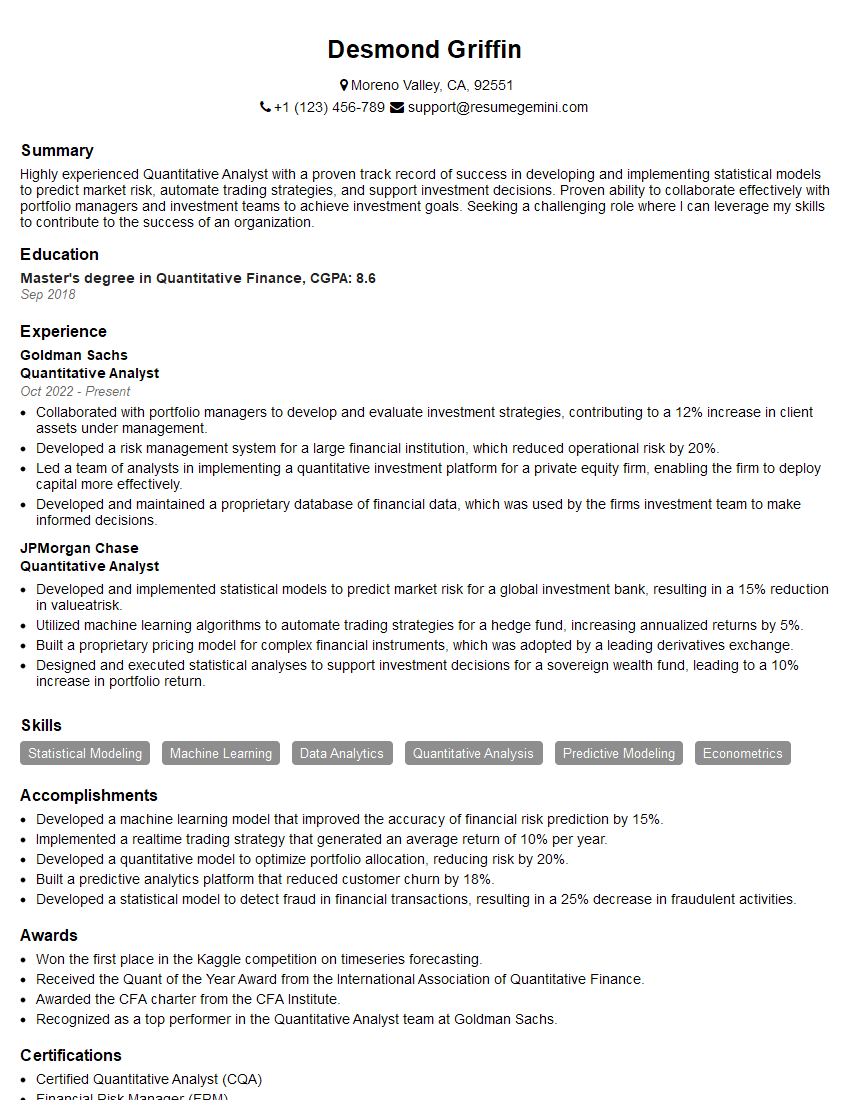
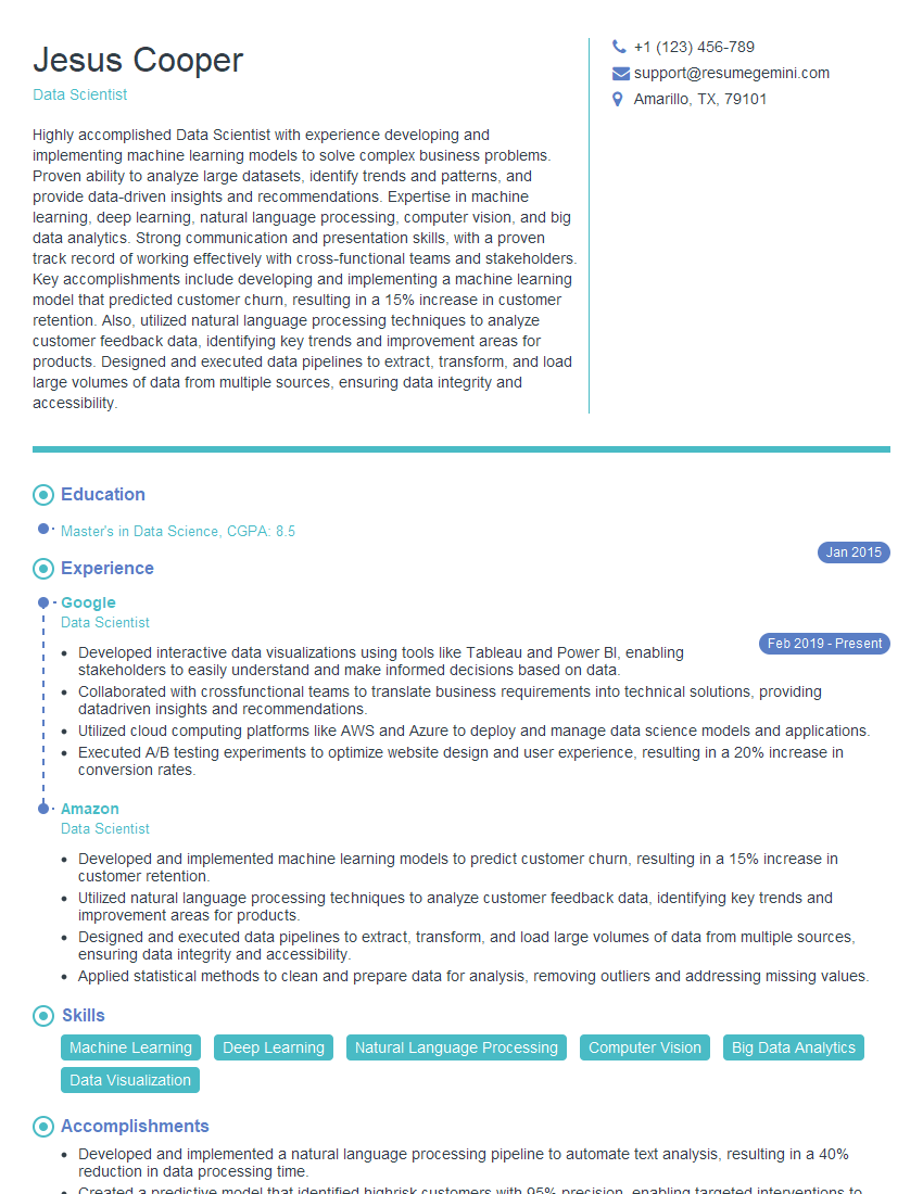
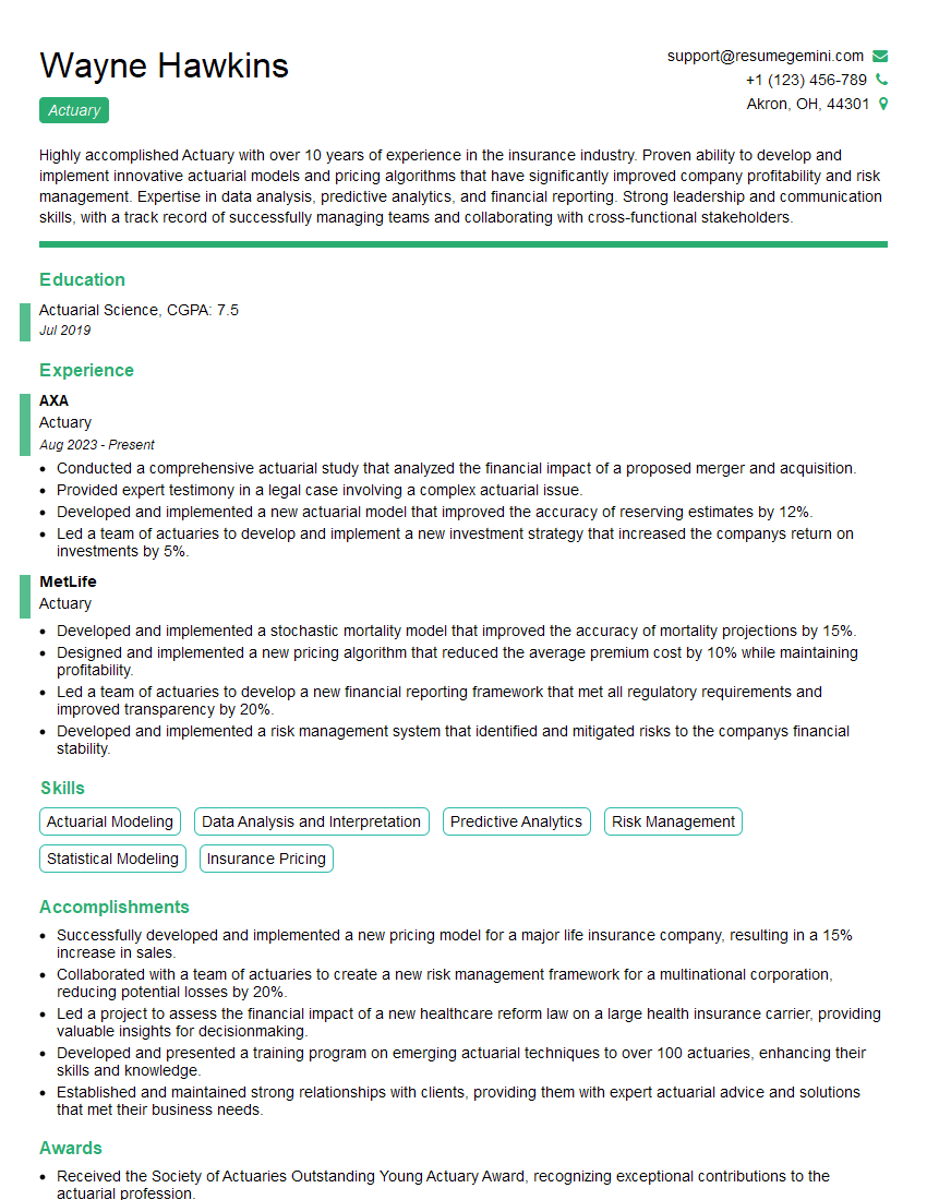
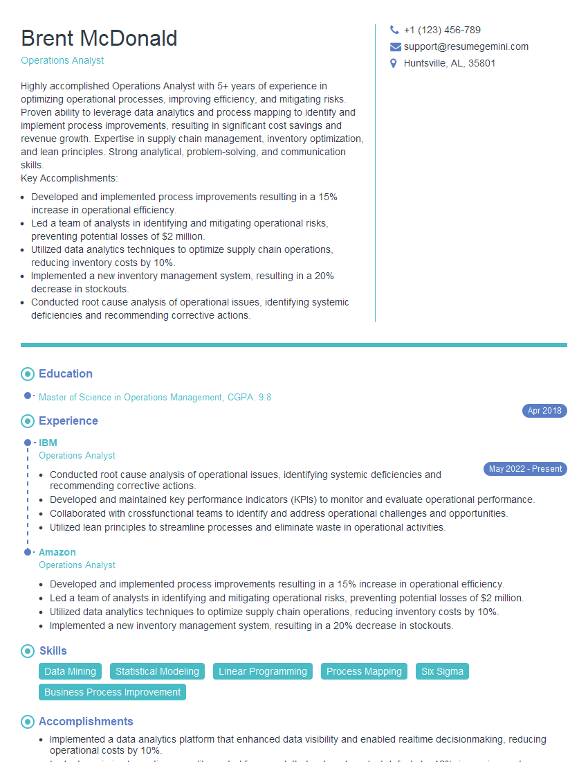
Mastering MS Excel and Process Data Analysis significantly enhances your career prospects across various fields. These skills are highly sought after, opening doors to roles with greater responsibility and earning potential. To maximize your job search success, invest time in crafting an ATS-friendly resume that highlights your analytical abilities and relevant projects. ResumeGemini is a trusted resource to help you build a professional and impactful resume. They provide examples of resumes tailored to MS Excel and Process Data Analysis roles to help guide your efforts. Take the next step towards your dream job – build a compelling resume that showcases your expertise!
Explore more articles
Users Rating of Our Blogs
Share Your Experience
We value your feedback! Please rate our content and share your thoughts (optional).
What Readers Say About Our Blog
Hello,
We found issues with your domain’s email setup that may be sending your messages to spam or blocking them completely. InboxShield Mini shows you how to fix it in minutes — no tech skills required.
Scan your domain now for details: https://inboxshield-mini.com/
— Adam @ InboxShield Mini
Reply STOP to unsubscribe
Hi, are you owner of interviewgemini.com? What if I told you I could help you find extra time in your schedule, reconnect with leads you didn’t even realize you missed, and bring in more “I want to work with you” conversations, without increasing your ad spend or hiring a full-time employee?
All with a flexible, budget-friendly service that could easily pay for itself. Sounds good?
Would it be nice to jump on a quick 10-minute call so I can show you exactly how we make this work?
Best,
Hapei
Marketing Director
Hey, I know you’re the owner of interviewgemini.com. I’ll be quick.
Fundraising for your business is tough and time-consuming. We make it easier by guaranteeing two private investor meetings each month, for six months. No demos, no pitch events – just direct introductions to active investors matched to your startup.
If youR17;re raising, this could help you build real momentum. Want me to send more info?
Hi, I represent an SEO company that specialises in getting you AI citations and higher rankings on Google. I’d like to offer you a 100% free SEO audit for your website. Would you be interested?
Hi, I represent an SEO company that specialises in getting you AI citations and higher rankings on Google. I’d like to offer you a 100% free SEO audit for your website. Would you be interested?
good
