The right preparation can turn an interview into an opportunity to showcase your expertise. This guide to QuarkXPress and InDesign Proficiency interview questions is your ultimate resource, providing key insights and tips to help you ace your responses and stand out as a top candidate.
Questions Asked in QuarkXPress and InDesign Proficiency Interview
Q 1. Explain the difference between InDesign and QuarkXPress.
InDesign and QuarkXPress are both professional page layout applications, but they cater to different workflows and have distinct strengths. Think of it like choosing between a sports car and an SUV – both get you where you need to go, but one excels in speed and precision while the other offers more versatility and cargo space.
InDesign, developed by Adobe, is widely considered the industry standard, known for its robust features, seamless integration with the Adobe Creative Suite, and extensive plugin support. Its strength lies in its flexibility and ease of collaboration, making it ideal for large projects and teams. It’s particularly strong in complex projects involving long documents, intricate layouts, and advanced typography.
QuarkXPress, while still used, has a smaller market share. It’s known for its stability and its powerful features for image handling and color management – some designers still swear by its precision for print work. However, its integration with other software is less seamless, and the learning curve can be steeper than InDesign’s.
In short: InDesign excels in flexibility and collaboration, while QuarkXPress offers strong image and color control, particularly for print-centric workflows. The best choice depends on the specific needs of the project and the designer’s preferences.
Q 2. Describe your experience with master pages in InDesign.
Master pages in InDesign are foundational; they’re like templates for each section of your document. Think of them as blueprints that define the consistent elements across multiple pages, saving time and ensuring uniformity. I extensively use master pages to manage headers, footers, page numbers, running heads, and even column guides.
For example, I might create one master page for the body text with consistent margins and running headers, another for the chapter openings with different text styles and images, and another for the index with specific column structures. This modular approach keeps my documents organized and allows me to make global changes easily – updating a header style on the master page instantly updates it across all linked pages.
I also leverage InDesign’s ability to create multiple master page layers. This allows for flexibility, such as having a master page for even-numbered pages and another for odd-numbered pages without compromising the document’s consistency. It makes managing complex layouts far more efficient.
Q 3. How do you manage styles and style sheets in QuarkXPress?
QuarkXPress’s style sheets are crucial for maintaining consistency. They’re essentially templates for text and paragraph formatting. I organize them hierarchically, creating ‘parent’ styles for broader characteristics (like headings) and ‘child’ styles for more specific variations (like different levels of headings).
For example, I’d create a ‘Heading 1’ style with a specific font size, weight, and spacing, then create ‘Heading 1a’ and ‘Heading 1b’ for slight variations. This nested structure allows for global adjustments – altering the ‘Heading 1’ style automatically updates all its child styles. This hierarchical system reduces the time spent on repetitive tasks and maintains a consistent design.
Furthermore, QuarkXPress’s style sheets allow for powerful character and paragraph style features like applying drop caps, nested styles, and automatic numbering which are crucial for managing the complexity of longer documents, ensuring consistency, and simplifying editing.
Q 4. What are your preferred methods for creating and managing templates?
My preferred method for creating and managing templates involves a combination of techniques, depending on the project’s requirements. For highly repeatable projects, such as newsletters or brochures, I build comprehensive templates in both InDesign and QuarkXPress. These contain predefined styles, master pages, and even placeholder images, ensuring consistency and speeding up the design process.
For less structured projects, I utilize a more modular approach, creating individual style sheets, swatches, and master page elements that I can easily import and combine into new documents. This allows me to quickly adapt to evolving design requirements without starting from scratch. For example, I might have a library of pre-made header and footer templates or a collection of frequently-used paragraph styles. I store these templates in a well-organized file system, categorized by project type and client. Proper file management is key to efficient template reuse.
Q 5. How do you handle image resolution and color management in your workflow?
Image resolution and color management are non-negotiable for high-quality print outputs. My workflow starts with ensuring all images are supplied at the appropriate resolution – generally 300 dpi for print. I always confirm image dimensions and use InDesign’s and QuarkXPress’s built-in tools to verify resolution. Low-resolution images will result in pixelated or blurry prints.
For color management, I use a consistent color profile throughout my workflow, beginning with image editing. I embed color profiles within images and ensure my applications (InDesign, QuarkXPress, and image editors) are using the same color space (such as CMYK for print) to avoid unexpected color shifts during the printing process. Using a color management system helps maintain consistency throughout the workflow, eliminating surprises at the print stage.
Additionally, I always check color conversions for accuracy, using soft proofs to preview how colors will appear in print before sending the files to the printer. This minimizes the risk of costly reprints due to color discrepancies.
Q 6. Describe your experience with preflighting and trapping.
Preflighting and trapping are critical steps in preparing files for print. Preflighting involves checking a document for potential errors that could cause problems during printing, such as missing fonts, low-resolution images, or color profile issues. I meticulously use both InDesign’s and QuarkXPress’s preflight tools, ensuring all aspects of the design are ready for the print process. Think of preflighting as a final quality control checkpoint before sending off your work.
Trapping involves creating slight overlaps between colors to prevent unsightly gaps between adjacent colors during printing. This is particularly important for complex designs with fine details or thin lines. I use InDesign’s and QuarkXPress’s trapping features or rely on professional trapping software to ensure clean and sharp prints, especially in areas prone to misregistration. Proper trapping prevents the visible gaps and ‘white halo’ effects that can ruin a print job.
Q 7. Explain your process for creating and exporting PDFs for print.
Creating and exporting PDFs for print is the final stage, and it’s crucial to get it right. I always start by selecting the appropriate PDF preset in InDesign or QuarkXPress, choosing options specifically designed for print. This ensures the PDF includes all necessary information for a successful print job.
I meticulously select the appropriate PDF/X standard, incorporating compression to reduce file size without compromising quality. I also ensure all fonts are embedded or outlined, preventing font substitution issues at the printing house. Finally, I always perform a final visual inspection of the PDF to make sure everything looks as expected. This meticulous process ensures print-ready files, eliminating delays and costly revisions.
Before sending the file, I clearly communicate with the printer about the specifications, including color profile and trapping instructions. A collaborative approach ensures that my design vision translates faithfully into the final printed piece.
Q 8. How do you work with bleeds and margins?
Bleeds and margins are crucial for professional printing. Margins define the safe area within the page where text and important elements should reside to avoid being cut off during trimming. Bleeds, on the other hand, extend the design beyond the trim line, ensuring that even after trimming, there’s no unsightly white space around the edges.
In both QuarkXPress and InDesign, you define these using the document’s setup options. For example, a typical business card might have 3mm bleeds on all sides and 5mm margins. This means your design elements extend 3mm beyond the intended final size of the card, while text and logos stay within the 5mm margin from the edge. This prevents any part of the design from disappearing after the printer trims the excess.
Think of it like baking a cake: the bleed is the part that hangs over the edge of the pan. You cut it off, and you have a perfectly finished cake without any unbaked dough on the sides. The margin is the area where you’re sure you can put your frosting without it spilling over.
Understanding and correctly setting bleeds and margins is essential to avoid costly reprintings and ensures that your final printed piece looks exactly as intended.
Q 9. What are some common pitfalls to avoid when working with complex layouts?
Complex layouts present several challenges. Overlooking the stacking order of elements (z-order) is a common pitfall; you can accidentally obscure vital elements. Another is relying too heavily on nested frames, which can become extremely difficult to manage and edit. Similarly, inconsistent use of master pages can lead to inconsistencies across the document, creating a disjointed look. Poor use of paragraph and character styles often leads to difficulty with maintaining consistent typography across a large document, and using too many fonts is a common visual mistake.
Another major issue is neglecting to create sufficient guides and layers. This lack of organization significantly slows down the editing process, as it becomes much harder to select and manipulate specific elements without creating unintentional changes elsewhere. Failing to check the output at regular intervals with various views (e.g., print preview, outline view) can reveal issues too late to rectify effectively. Finally, forgetting to save regularly and not using version control can lead to significant setbacks if errors occur. Remember, a well-organized project makes revision and correction a breeze.
Q 10. Describe your experience with color separations.
Color separations involve splitting a full-color image into its constituent CMYK (Cyan, Magenta, Yellow, Key/Black) components. This is essential for professional printing, as it allows each color to be printed separately using different plates. I’ve extensively worked with color separations in both QuarkXPress and InDesign, utilizing their built-in features for creating separation profiles and optimizing output for various printing processes.
In my experience, understanding the printer’s capabilities is vital. Some printers might require specific color profiles or trapping settings. For example, I’ve had to adjust the trapping (overlapping colors slightly) to prevent unintended gaps between colors in a complex design. This ensures clean and accurate color reproduction on the final printed product. I’ve also had to work with spot colors—colors not part of the CMYK model—that require special handling during separation. This could involve using specific Pantone references for consistency.
Q 11. How do you troubleshoot common printing issues?
Troubleshooting printing issues involves systematic investigation. I start by checking the document itself, ensuring all fonts are embedded, the images are high-resolution, and the color mode is correct (CMYK for most print jobs). Next, I examine the printer settings and driver to ensure they match the document’s specifications (like page size, color profile, and output resolution). Common issues include incorrect color profiles, low-resolution images, missing fonts, and problems with printer drivers.
If the problem persists, I’ll then check the preflight checks within InDesign or QuarkXPress. These highlight potential problems like missing fonts, color errors, or links. Sometimes the problem lies outside of the document—like a paper jam, incorrect printer settings or driver issues. If all else fails, I’ll conduct test prints to isolate the source of the issue. I’ve found that creating a small test print often pinpoints the issue much more quickly than tackling the whole document.
Q 12. Explain your experience with imposition and imposition software.
Imposition is the process of arranging pages of a document onto a printing sheet in the correct order for printing and folding. This saves paper and improves efficiency. My experience includes using both the built-in imposition tools in InDesign and dedicated imposition software such as Impostrip or other specialized applications.
The choice between InDesign’s tools and dedicated software depends on the complexity of the job. For simple projects, InDesign’s features suffice. But, for large, complex projects with multiple signatures and specialized folding requirements, dedicated imposition software offers more control and automation. Using such software allows for precise control of page sequence, bleeds, and imposition parameters for optimal print production. I am proficient in understanding the relationship between the imposition sequence and the final folded product, ensuring accurate page order and efficient use of the printing sheet.
Q 13. What are your preferred methods for collaborating on design projects?
Collaboration is key in design. I prefer using cloud-based platforms like Dropbox or Google Drive for sharing files, and communication tools like Slack or Microsoft Teams to facilitate discussions and feedback. Clear communication and version control are paramount; I often use versioning tools within the design application to track changes, along with naming conventions to clearly identify different versions of the document.
For complex projects, we typically have regular check-in meetings where feedback is discussed and issues are addressed proactively. It’s essential for me to have consistent processes for file management, naming, and communication in order to ensure smooth collaboration and avoid conflicts. This allows everyone to stay on the same page throughout the process and ensures a more efficient workflow.
Q 14. How do you ensure design consistency across multiple documents?
Maintaining design consistency across multiple documents relies heavily on creating style guides and using them consistently. In both InDesign and QuarkXPress, creating and applying paragraph and character styles is essential for controlling typography. Similarly, using master pages to define consistent page layouts and headers/footers ensures uniformity across multiple pages within a single document. Using swatches and named colors helps with managing consistent color usage.
Beyond individual documents, creating a broader style guide that dictates fonts, colors, logos, and other stylistic elements ensures consistency across a range of documents. This guide, if properly utilized and maintained, prevents brand dilution. It is effectively a template for all future documents. Then, templates or document setups based on that style guide and ensuring that all team members understand and use it are crucial. This approach ensures a cohesive brand identity across all design outputs.
Q 15. How familiar are you with version control systems for design files?
Version control is crucial for collaborative design projects and managing revisions. I’m proficient with Git, often using it in conjunction with platforms like GitHub or Bitbucket. For design files specifically, I leverage tools like Adobe Creative Cloud Libraries for asset management and sharing, and consider using a system like Git LFS (Large File Storage) to handle the large file sizes associated with QuarkXPress and InDesign files efficiently. This ensures that every change is tracked, allowing for easy rollback to previous versions if necessary. Think of it like having a detailed history of your design project – it’s invaluable for troubleshooting, collaboration, and maintaining file integrity. In a real-world scenario, imagine working on a marketing campaign with multiple designers. Version control allows everyone to contribute while preventing accidental overwrites and ensuring the final product is a cohesive reflection of all the inputs.
Career Expert Tips:
- Ace those interviews! Prepare effectively by reviewing the Top 50 Most Common Interview Questions on ResumeGemini.
- Navigate your job search with confidence! Explore a wide range of Career Tips on ResumeGemini. Learn about common challenges and recommendations to overcome them.
- Craft the perfect resume! Master the Art of Resume Writing with ResumeGemini’s guide. Showcase your unique qualifications and achievements effectively.
- Don’t miss out on holiday savings! Build your dream resume with ResumeGemini’s ATS optimized templates.
Q 16. Describe your experience with creating interactive PDFs.
Creating interactive PDFs is a key skill in my repertoire. I’ve extensively used both InDesign and QuarkXPress to build interactive documents incorporating elements like buttons, hyperlinks, animations, and form fields. For instance, I recently developed an interactive product catalog in InDesign, using hyperlinks to jump to specific pages and buttons to open embedded videos showcasing product demos. I understand the importance of ensuring cross-platform compatibility, testing across various PDF readers to guarantee a consistent user experience. In QuarkXPress, this often involves leveraging their robust scripting capabilities to create more advanced interactions. My approach always emphasizes user experience – intuitive navigation and clear visual cues are paramount for effective interactive documents.
Q 17. How do you optimize images for web and print?
Optimizing images for web and print requires a nuanced understanding of image formats and resolution. For web, I typically use JPEGs for photographs and PNGs for graphics with transparency, compressing them to the smallest file size possible without significant quality loss using tools like Adobe Photoshop or specialized online compressors. For print, the focus shifts to high resolution (at least 300 DPI) to ensure sharp, crisp images. I usually work with TIFF or high-quality JPEGs. The choice depends on the specific requirements of the print job and the printing method. Understanding color profiles (CMYK for print, RGB for web) is also critical to ensure color accuracy. For example, a vibrant logo might need a higher compression ratio for web to keep loading times down without sacrificing visual appeal, while the same logo for print needs to be high-resolution to avoid pixelation when printed at large sizes.
Q 18. Explain your experience with accessibility considerations in design.
Accessibility is a core principle in my design work. I ensure that my designs are usable by individuals with disabilities by following WCAG (Web Content Accessibility Guidelines) principles. This includes using sufficient color contrast, providing alt text for images, creating logical navigation structures, and ensuring keyboard accessibility. For example, when designing a PDF, I make sure that all interactive elements are accessible via the keyboard, and that all content is presented in a clear and understandable way, not just visually. This may involve using heading styles consistently to create a clear document structure or including captions and transcripts for embedded audio or video. In InDesign and QuarkXPress, using built-in accessibility features and checking for accessibility issues through automated tools is an important part of my workflow. It’s about making sure everyone can access and understand the information presented.
Q 19. What are your preferred methods for creating charts and graphs?
I frequently create charts and graphs using a combination of methods. For simple charts, InDesign’s and QuarkXPress’s built-in charting tools suffice. However, for more complex visualizations, I prefer to create the charts in dedicated software like Adobe Illustrator or dedicated charting software, ensuring high precision and customizing the appearance to match the overall design aesthetic. This allows greater control over visual elements such as font styles, colors, and data labels. Once created, I import these charts into InDesign or QuarkXPress as vector graphics, maintaining their quality and editability within the layout.
Q 20. How do you use layers effectively in your workflow?
Layers are fundamental to my workflow. I organize my designs using a logical layer structure – grouping related elements on separate layers to maintain clarity and ensure easy editing. For example, in a multi-page brochure, I might have separate layers for text, images, backgrounds, and special effects. This allows me to easily hide, show, or modify individual elements without affecting others. Think of it as organizing your design like a well-structured building, with different floors (layers) designated for specific functions. Using layer styles and layer effects within both InDesign and QuarkXPress enhances efficiency and design control.
Q 21. Describe your experience with creating custom tools and scripts.
While I haven’t extensively developed custom tools in the sense of building entirely new applications, I’m very comfortable using scripting in both InDesign (using ExtendScript) and QuarkXPress (using AppleScript or their own scripting language) to automate repetitive tasks and extend functionality. For example, I’ve written scripts to automate the process of applying specific styles across multiple pages, or to generate page numbering with custom prefixes. It’s about streamlining my workflow, enhancing efficiency, and freeing up time for more creative tasks. Automation through scripting is a real game-changer for large-scale projects, minimizing errors and saving significant time.
Q 22. How do you handle revisions and feedback from clients?
Handling revisions and client feedback is crucial for successful project delivery. My approach is systematic and collaborative. I begin by setting clear communication channels and expectations upfront. This often involves outlining a revision process, specifying the number of rounds allowed, and defining acceptable turnaround times. I use version control diligently, saving each iteration of the document with clear naming conventions (e.g., ‘ProjectName_v1_Revision1.indd’). This allows for easy comparison and rollback if needed.
When I receive feedback, I meticulously track it, often using a dedicated spreadsheet or the comment features within InDesign/QuarkXPress. I then prioritize changes based on urgency and impact. Before implementing any significant changes, I discuss the implications with the client, ensuring we’re on the same page regarding design choices and feasibility. Finally, I provide a summary of all changes made during the revision process, ensuring transparency and avoiding misunderstandings.
For example, on a recent branding project, the client requested a subtle change in the logo’s typeface. I presented three alternative options, each with pros and cons, before settling on the final choice. This collaborative approach minimized revisions and ensured everyone was satisfied.
Q 23. What are your preferred methods for automating repetitive tasks?
Automating repetitive tasks is key to efficiency in design. In InDesign and QuarkXPress, I utilize Styles (paragraph and character styles) extensively. This allows for consistent formatting across the entire document. A single style update cascades throughout, avoiding tedious manual adjustments. For example, if the client decides to change the body text font, a simple style update is all it takes.
Furthermore, I leverage scripting and automation tools. For instance, InDesign’s scripting capabilities (using ExtendScript, JavaScript) allow me to automate tasks like generating table of contents, cross-references, or exporting files in batch. Similarly, QuarkXPress offers its own scripting language for automating processes. For less complex tasks, I utilize keyboard shortcuts and macros extensively. This dramatically reduces the time spent on repetitive actions.
For instance, I created a script that automatically generates numbered chapter pages with consistent formatting. This eliminated a huge time sink on a recent book design project, allowing me to focus on the creative aspects.
Q 24. Explain your understanding of CMYK and RGB color models.
CMYK and RGB are two fundamental color models used in graphic design and printing. RGB (Red, Green, Blue) is an additive color model used for on-screen displays. It combines different intensities of red, green, and blue light to create a vast range of colors. Think of your computer screen: it uses tiny red, green, and blue pixels to show you images.
CMYK (Cyan, Magenta, Yellow, Key [Black]) is a subtractive color model used in printing. It works by subtracting light from white. Cyan, magenta, and yellow inks are layered on top of white paper; the overlapping creates various colors. Black (Key) is added to deepen shades and improve print quality. The difference is crucial because colors displayed on your screen (RGB) won’t always print exactly the same (CMYK). Therefore, precise color management is needed to ensure accurate reproduction.
Understanding this distinction is vital to prevent unexpected color shifts between digital mockups and final printed materials. I routinely convert RGB images to CMYK for print and always account for color profile differences to ensure the final product matches expectations.
Q 25. Describe your experience with different file formats (e.g., TIFF, EPS, JPG).
Proficient use of various file formats is essential for seamless collaboration and high-quality output. TIFF (Tagged Image File Format) is a high-resolution raster image format suitable for print, offering excellent image quality with lossless compression options. EPS (Encapsulated PostScript) is a vector-based format commonly used for illustrations and logos, ensuring sharp images at any size. JPEG (JPG) is a raster format used for photographs and images optimized for web use, offering various levels of compression.
My experience includes handling these formats extensively in both InDesign and QuarkXPress, understanding their strengths and limitations. For instance, I’d use TIFF for high-quality images in a print brochure but choose JPEG for smaller web graphics to reduce file size. I also utilize other formats like PNG (for transparent images with web use), PDF (for final print-ready files), and AI (Adobe Illustrator files) for vector graphics.
Proper file handling ensures that images are imported at the correct resolution and color mode, avoiding issues such as pixelation or color mismatches. I always check image resolution, color space, and compression settings before incorporating them into design projects.
Q 26. How do you manage fonts effectively in your projects?
Effective font management is crucial for avoiding issues like missing fonts, font conflicts, and ensuring consistent typographic presentation. I use a combination of methods to achieve this. First, I organize my fonts carefully, keeping them in a dedicated folder, and using a font management application to catalog and activate only the necessary fonts for each project. This prevents system slowdowns and prevents font conflicts.
I embed fonts in PDFs intended for clients or print production whenever possible, ensuring the fonts used in the document will render correctly on various systems. However, I am aware of the implications of embedding copyrighted fonts and always respect the licensing terms. For print production, I provide font outlines along with the print-ready files to guarantee accurate representation. I also communicate font choices clearly to clients, offering alternatives if needed.
For example, I once encountered a project where a client’s preferred font caused rendering issues in the final PDF. By having a pre-selected alternative font ready, I ensured a smooth transition and a timely project delivery.
Q 27. Describe your experience with working with variable data publishing.
Variable data publishing (VDP) is a powerful technique for creating personalized documents from a single template. My experience with VDP encompasses creating mail merges, personalized brochures, and customized product catalogs. I’m proficient in using the VDP features within InDesign and QuarkXPress, as well as integrating with external data sources like spreadsheets (CSV, Excel) and databases.
The process generally involves creating a master template with placeholders for personalized data. Then, an external data source is linked to the template, replacing placeholders with corresponding information from each record. This generates a unique output for each recipient, whether it’s a personalized letter, a customized product catalog, or a targeted marketing email.
For a recent project, I created a series of personalized postcards for a real estate agency using InDesign’s VDP functionality and a spreadsheet containing client information. Each postcard included the recipient’s name, address, and a unique property image, significantly enhancing the engagement rate.
Q 28. What are some of your favorite InDesign or QuarkXPress plugins and why?
My favorite plugins enhance workflow efficiency and creative possibilities. In InDesign, I frequently use the Enfocus PitStop Server for preflighting and quality control of PDF files. This ensures consistency and identifies potential issues before they reach the printing stage. The automation features save significant time and effort. It is especially beneficial in large-scale projects.
In QuarkXPress, QXP Essentials, a suite of extensions, is invaluable for productivity. It includes several features like enhanced table functionality, improved image handling, and advanced text manipulation tools. These plugins dramatically speed up repetitive tasks, allowing me to focus on the design aspects.
The choice of plugin depends heavily on the specific project needs and the software being used. But these examples highlight how plugins can dramatically improve workflow and add functionalities that aren’t available within the base software.
Key Topics to Learn for QuarkXPress and InDesign Proficiency Interview
- Page Layout & Design Principles: Understanding grids, typography, color theory, and image placement for effective visual communication in both QuarkXPress and InDesign.
- Mastering Tools & Features: Proficient use of essential tools like text and image manipulation, object creation and manipulation, and layer management in both applications. Practical application: Describe how you’d efficiently create a multi-page brochure, demonstrating your understanding of these tools.
- Workflow Optimization: Streamlining design processes, including importing assets, using styles and templates, and employing efficient shortcuts to enhance productivity. Practical application: Explain your approach to managing a large project with multiple revisions and collaborators.
- Prepress & Print Production: Knowledge of color spaces (CMYK, RGB), image resolution, and file preparation for print output. Practical application: Detail your understanding of preparing files for optimal printing, including considerations for different print methods.
- Advanced Features & Functionality: Explore advanced features such as scripting, automation, and plugins to showcase a deeper understanding and adaptability in both QuarkXPress and InDesign. Practical application: Discuss an instance where you leveraged advanced features to solve a complex design challenge.
- Troubleshooting & Problem-Solving: Demonstrate your ability to identify and resolve common issues related to layout, printing, and file compatibility. Practical application: Describe your process for diagnosing and fixing a layout issue or a corrupted file.
- Version Control & Collaboration: Understanding version control systems and collaborative workflows for efficient teamwork on design projects. Practical application: Explain your experience working on a team project using shared files and version control.
Next Steps
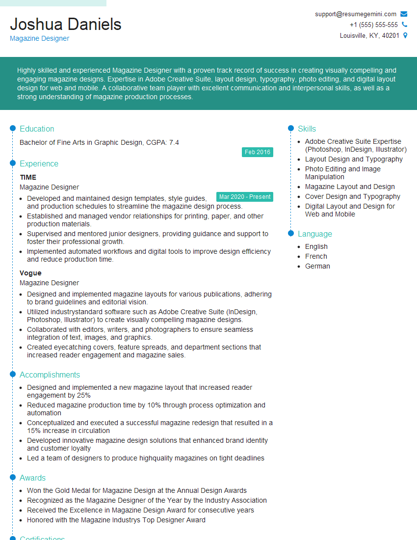
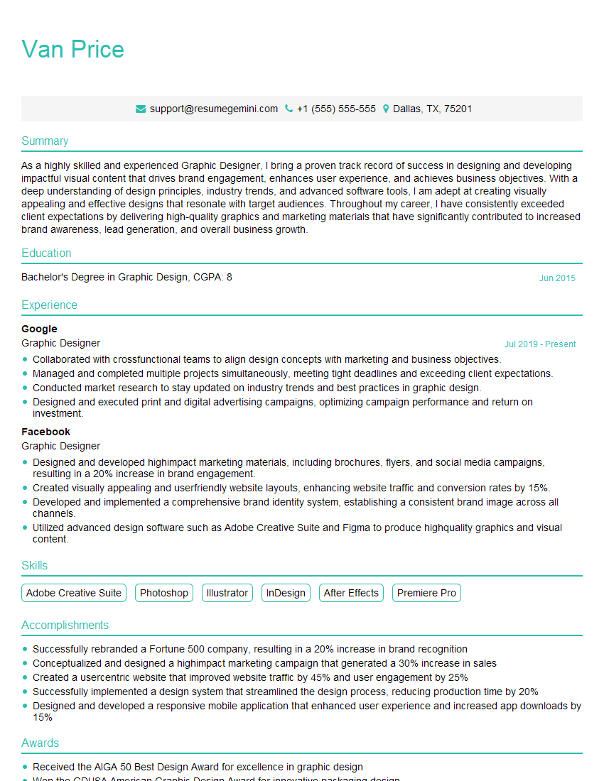
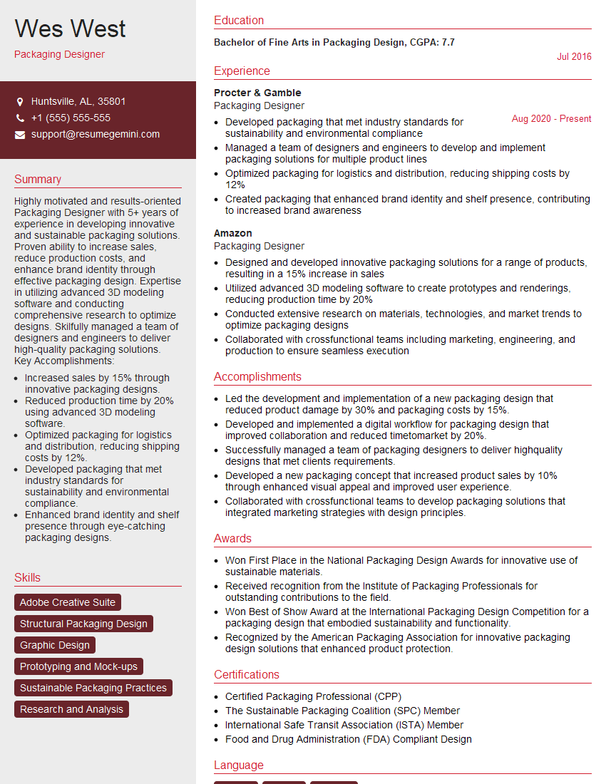
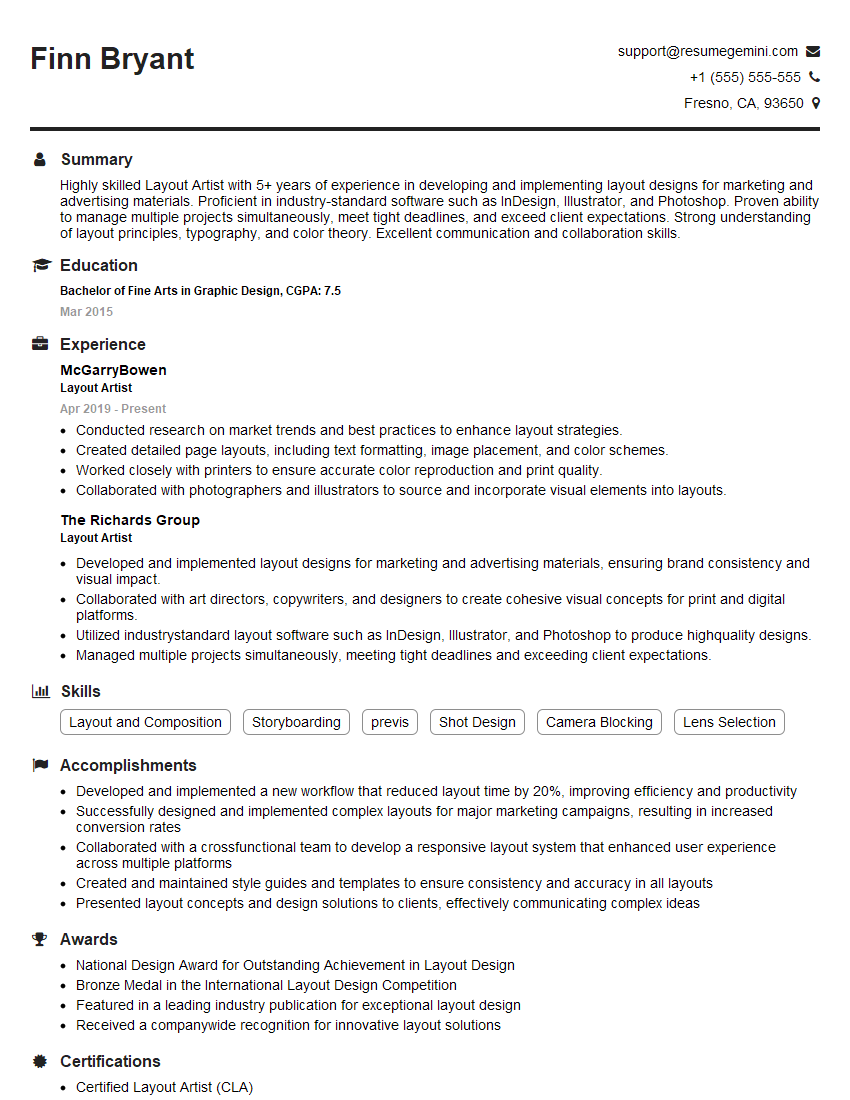
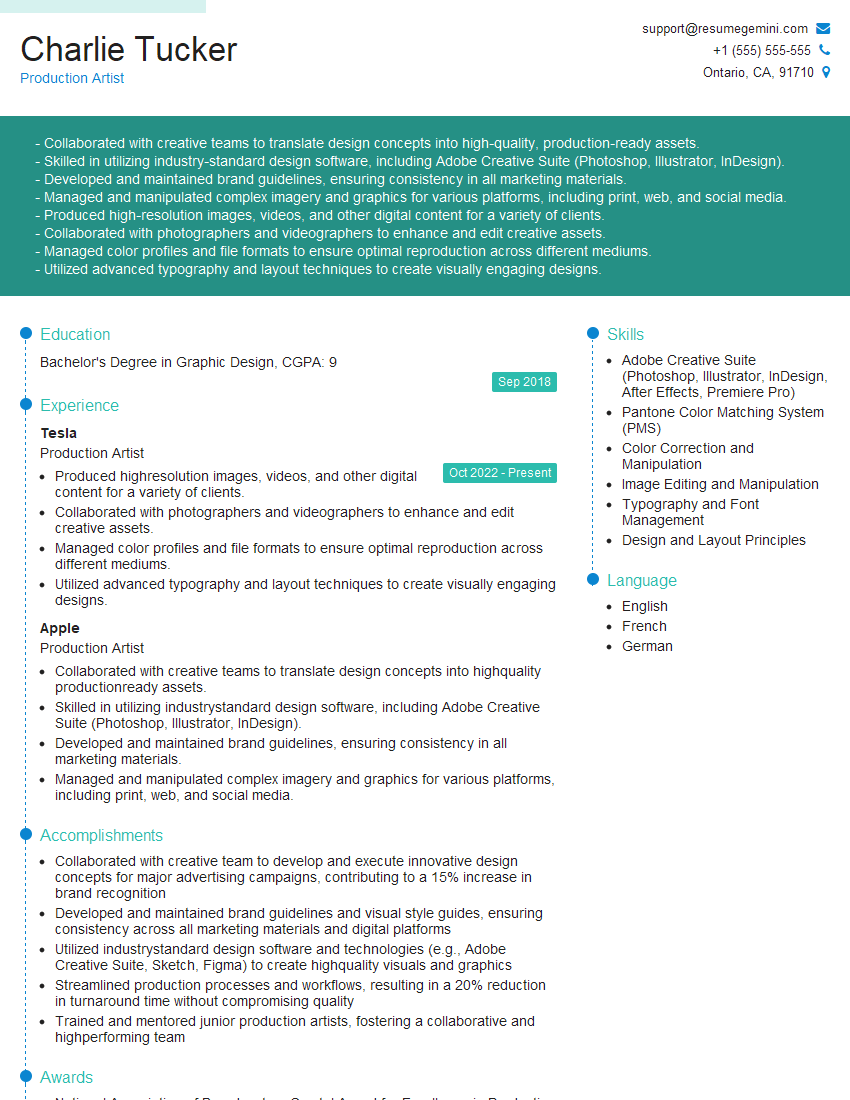
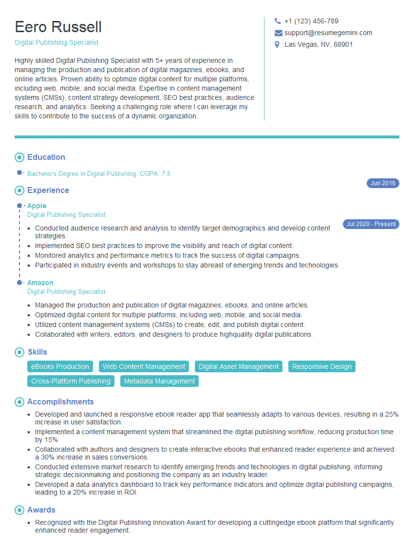
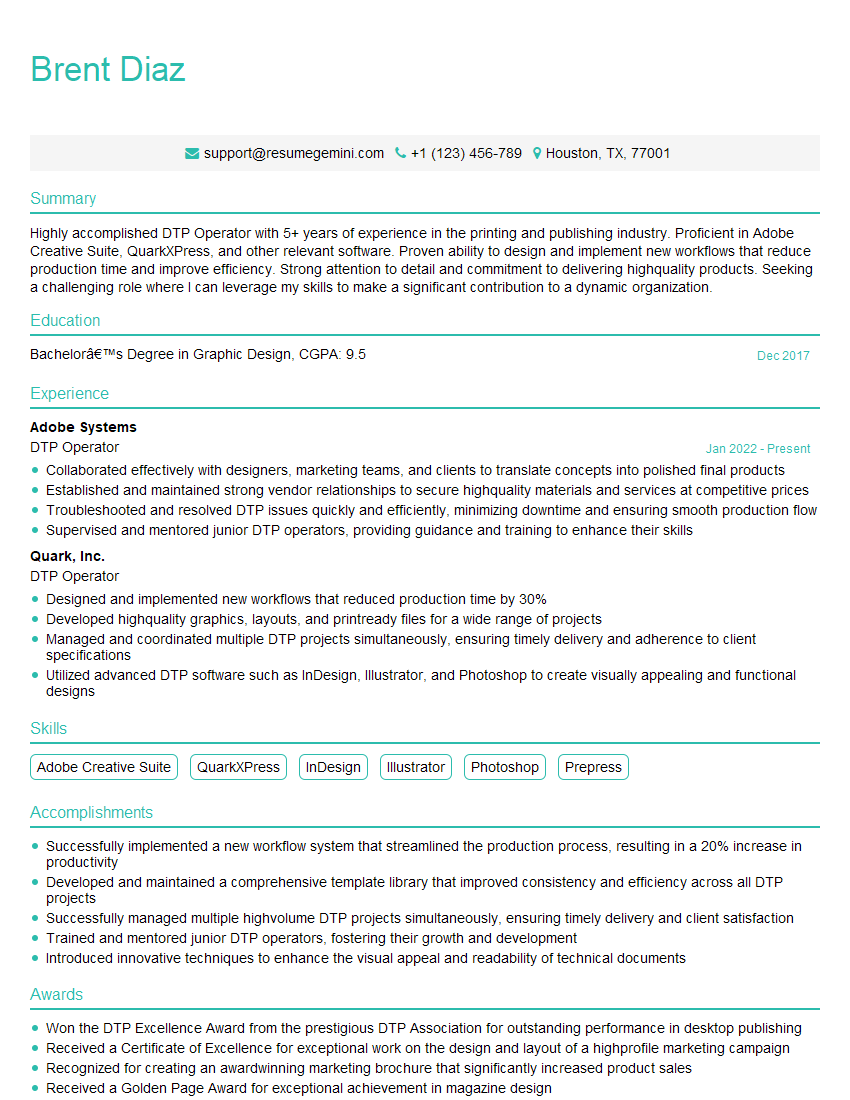
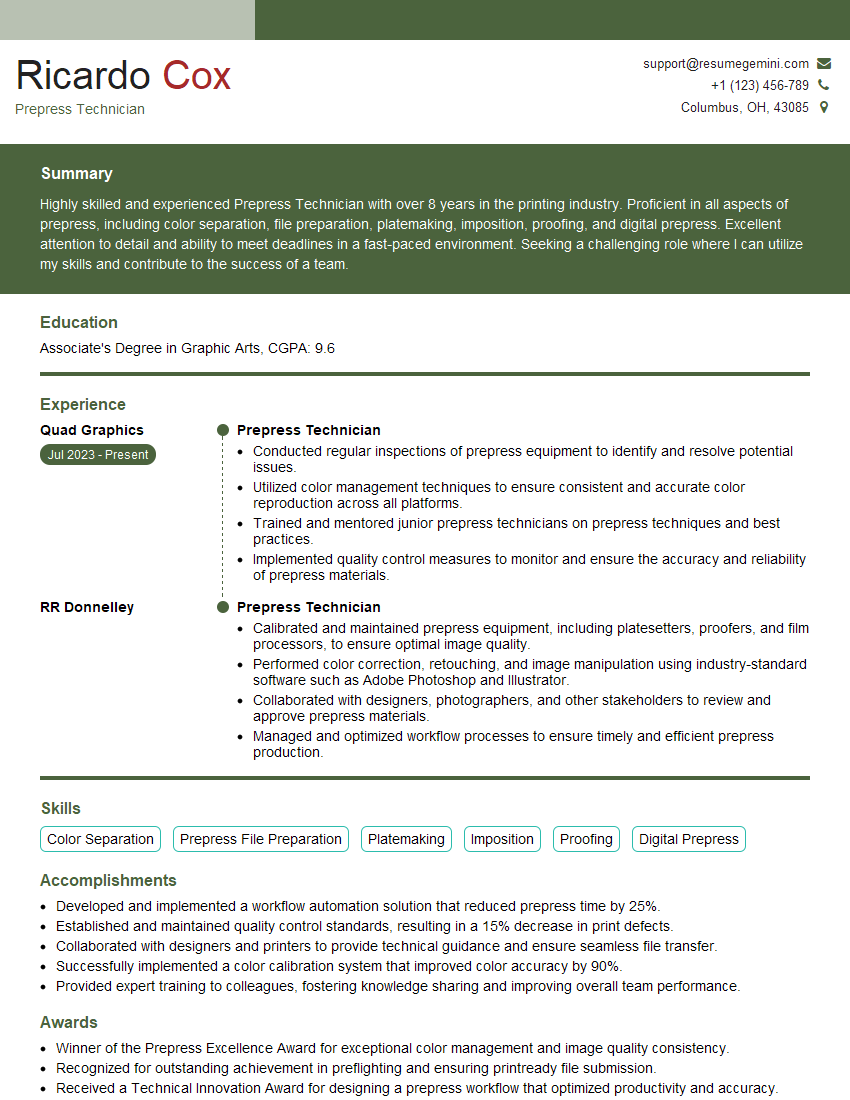
Mastering QuarkXPress and InDesign is crucial for a successful career in graphic design and publishing. These skills are highly sought after, opening doors to exciting opportunities and career advancement. To maximize your job prospects, create an ATS-friendly resume that highlights your expertise. ResumeGemini is a trusted resource to help you build a professional and impactful resume that stands out. We provide examples of resumes tailored to QuarkXPress and InDesign Proficiency to help you showcase your skills effectively. Invest time in crafting a strong resume – it’s your first impression with potential employers.
Explore more articles
Users Rating of Our Blogs
Share Your Experience
We value your feedback! Please rate our content and share your thoughts (optional).
What Readers Say About Our Blog
Hello,
We found issues with your domain’s email setup that may be sending your messages to spam or blocking them completely. InboxShield Mini shows you how to fix it in minutes — no tech skills required.
Scan your domain now for details: https://inboxshield-mini.com/
— Adam @ InboxShield Mini
Reply STOP to unsubscribe
Hi, are you owner of interviewgemini.com? What if I told you I could help you find extra time in your schedule, reconnect with leads you didn’t even realize you missed, and bring in more “I want to work with you” conversations, without increasing your ad spend or hiring a full-time employee?
All with a flexible, budget-friendly service that could easily pay for itself. Sounds good?
Would it be nice to jump on a quick 10-minute call so I can show you exactly how we make this work?
Best,
Hapei
Marketing Director
Hey, I know you’re the owner of interviewgemini.com. I’ll be quick.
Fundraising for your business is tough and time-consuming. We make it easier by guaranteeing two private investor meetings each month, for six months. No demos, no pitch events – just direct introductions to active investors matched to your startup.
If youR17;re raising, this could help you build real momentum. Want me to send more info?
Hi, I represent an SEO company that specialises in getting you AI citations and higher rankings on Google. I’d like to offer you a 100% free SEO audit for your website. Would you be interested?
Hi, I represent an SEO company that specialises in getting you AI citations and higher rankings on Google. I’d like to offer you a 100% free SEO audit for your website. Would you be interested?
good


