The thought of an interview can be nerve-wracking, but the right preparation can make all the difference. Explore this comprehensive guide to Reporting and Communication Software Proficiency (MS Office Suite, Adobe Suite) interview questions and gain the confidence you need to showcase your abilities and secure the role.
Questions Asked in Reporting and Communication Software Proficiency (MS Office Suite, Adobe Suite) Interview
Q 1. Explain your experience with Microsoft Excel’s pivot tables and their applications.
PivotTables in Microsoft Excel are incredibly powerful tools for summarizing and analyzing large datasets. Think of them as dynamic, interactive summaries that allow you to quickly drill down into your data to uncover trends and insights. Instead of manually calculating sums, averages, and counts across different categories, a PivotTable automatically does this for you, and allows for easy reorganization of the data.
For example, imagine you have a sales dataset with information on product sales by region, sales representative, and date. A PivotTable could quickly summarize total sales by region, allowing you to immediately identify your top-performing regions. You could then further drill down to see which sales representatives within those regions are contributing the most. This is done by simply dragging and dropping fields in the PivotTable interface.
Another application is in analyzing customer data. You can use a PivotTable to segment your customers based on demographics, purchase history, or other relevant factors. This can help you identify key customer segments and tailor your marketing strategies accordingly. Furthermore, PivotTables readily support calculations like running totals, percentage of totals and variances which are crucial for many business analyses.
In my previous role, I used PivotTables extensively to analyze marketing campaign performance data. By creating PivotTables based on campaign metrics like click-through rates, conversion rates, and cost per acquisition, I was able to quickly identify high-performing and underperforming campaigns, allowing for data-driven optimization.
Q 2. How proficient are you in creating professional-looking charts and graphs in Excel?
I’m highly proficient in creating professional-looking charts and graphs in Excel. I understand that effective data visualization is crucial for conveying information clearly and concisely. My approach involves carefully selecting the most appropriate chart type for the data being presented, ensuring the chart is visually appealing, and accurately representing the data without misleading the viewer.
I understand the strengths and weaknesses of different chart types. For example, I know that bar charts are best for comparing categories, line charts are ideal for showing trends over time, and pie charts are useful for showing proportions of a whole – but only if there are relatively few slices. I always consider the audience and the message I want to convey when choosing a chart type.
Beyond chart type selection, I pay close attention to detail, such as using clear and concise labels, appropriate colors, and a professional font. I also ensure that the chart is properly scaled and sized to avoid distortions. For instance, I’ve worked on reports where I needed to show small differences in large numbers; choosing the right scale and formatting becomes crucial in correctly interpreting those minute variances.
I often leverage Excel’s built-in chart formatting options and sometimes explore external resources for more advanced charting techniques for maximum impact.
Q 3. Describe your experience using Microsoft PowerPoint for presentations, including animation and transitions.
I have extensive experience using Microsoft PowerPoint to create compelling and engaging presentations. My presentations are more than just bullet points; they tell a story through carefully selected visuals, impactful transitions, and subtle animations that enhance understanding without being distracting. I understand that a successful presentation involves not just the content, but also its delivery. Therefore, I prioritize a visually clean and logically organized structure.
I often incorporate animations to highlight key points and guide the audience’s attention. For example, I might use a subtle fade-in animation to introduce new data points on a chart, or a more dramatic animation to emphasize a crucial finding. My approach to animation is always to enhance the presentation, not overshadow it. Similarly, I carefully select transitions that are smooth and appropriate for the flow of the presentation; I avoid overly flashy or disruptive transitions that might distract the audience.
In one project, I created a presentation to pitch a new marketing strategy to senior management. I used a combination of charts, graphs, and images to illustrate the key points, and I incorporated animations and transitions to make the presentation more dynamic and engaging. The presentation was well-received, and the new marketing strategy was approved.
Q 4. How do you ensure data accuracy and consistency in your reports?
Data accuracy and consistency are paramount in my work. I employ a multi-pronged approach to ensure this. First, I meticulously source data from reliable and validated sources. Second, I rigorously check for inconsistencies and errors during data entry and cleaning. This often involves employing data validation rules within spreadsheets to prevent invalid data from being entered in the first place. Third, I regularly cross-check data from multiple sources to identify any discrepancies.
For instance, if I’m creating a report on sales figures, I wouldn’t just rely on one sales database. I’d cross-reference it with inventory data and payment records. Any discrepancies would trigger a deeper investigation to identify the source of the error and correct it. This process involves not only detecting errors but also understanding their root causes to prevent future occurrences.
I document all data sources and any transformations applied, maintaining a clear audit trail. This is crucial for transparency and allows for easy troubleshooting later. Finally, using version control for my documents, and leveraging the capabilities of cloud based solutions, helps mitigate accidental loss or corruption.
Q 5. What methods do you use to effectively communicate complex data through visualizations?
Communicating complex data effectively through visualizations involves understanding your audience and selecting the right visual tools to tell the story. I use a combination of techniques to achieve this. The key is to simplify complex information and highlight important insights, making it easily digestible for the intended audience. This might involve creating a series of charts rather than one overly complex chart.
Firstly, I choose the most appropriate chart type. Bar charts excel at comparisons; line charts highlight trends; scatter plots show correlations. Secondly, I prioritize clarity by labeling axes clearly, including legends, and using a consistent color scheme. Thirdly, I often use annotations or callouts to highlight key findings or draw attention to specific data points. Lastly, I use storytelling techniques in accompanying narratives to guide the reader through the insights illustrated in the visuals.
For example, if presenting financial data, I might use a series of charts: a bar chart comparing revenue across different quarters, a line chart showing year-over-year growth, and a pie chart illustrating the breakdown of expenses. Each chart focuses on a specific aspect, making the overall data easier to understand.
Q 6. Describe your experience using Microsoft Word for creating professional documents, including formatting and styles.
I’m highly proficient in using Microsoft Word for creating professional documents. I go beyond simply typing text; I leverage Word’s features to produce polished, consistent, and visually appealing documents. This includes mastering styles and templates for ensuring consistency in formatting across a long document or a series of documents.
I use styles extensively to maintain a consistent look and feel throughout the document. This not only improves the visual appeal but also simplifies editing and updating. For instance, defining a ‘Heading 1’ style ensures that all level one headings have the same font, size, and spacing. Similarly, I use templates to establish pre-defined layouts and formatting elements, saving time and ensuring consistency.
My experience extends to advanced formatting techniques like using tables effectively to present structured data, inserting images and captions appropriately, and creating visually engaging layouts using columns and text boxes. I understand how to employ advanced formatting techniques like drop caps, borders, and shading to visually enhance specific sections of a document. These techniques provide visual cues that improve readability and comprehension.
Q 7. How familiar are you with VBA scripting in Excel?
I have intermediate proficiency in VBA scripting in Excel. While I’m not a dedicated VBA developer, I can write macros and scripts to automate repetitive tasks and extend Excel’s functionality. I understand the fundamentals of VBA syntax, object models, and event handling, allowing me to create custom solutions for specific needs.
For example, I’ve written macros to automate data import processes, generate custom reports, and perform complex data manipulations that would be very time-consuming to do manually. One example is automating a monthly report that involved consolidating data from multiple sheets and applying specific formatting; the macro significantly reduced the time required to generate the report.
My approach to VBA scripting is pragmatic: I focus on developing efficient and robust solutions that directly address specific business needs. While I don’t create elaborate applications, I have enough proficiency to effectively leverage VBA for increased productivity in my daily tasks and streamlining repetitive processes.
Q 8. How would you troubleshoot a complex formula error in Excel?
Troubleshooting complex formula errors in Excel requires a systematic approach. Think of it like detective work – you need to gather clues and systematically eliminate possibilities.
Examine the Error Message: Excel provides error messages (like #VALUE!, #REF!, #DIV/0!, #N/A, etc.). Understanding these messages is the first step. For example, #DIV/0! indicates division by zero, while #REF! signifies a broken cell reference.
Check Cell References: Incorrect or broken cell references are a common source of errors. Carefully review each cell reference in your formula, ensuring they point to the correct cells. If you’ve inserted or deleted rows/columns, references might be invalid.
Data Type Mismatch: Ensure the data types in your formula are compatible. Attempting mathematical operations on text values will often result in errors. Use functions like
VALUE()to convert text to numbers if needed.Parentheses and Operator Precedence: Incorrectly placed parentheses can drastically alter the order of operations. Double-check the placement of parentheses to make sure the formula calculates as intended. Excel follows standard mathematical order of operations (PEMDAS/BODMAS).
Evaluate the Formula Step-by-Step: Excel’s Formula Auditing tools are invaluable. Use ‘Evaluate Formula’ (Formulas tab) to step through the formula and see the intermediate results of each part. This helps pinpoint exactly where the error occurs.
Use the ‘Trace Precedents’ and ‘Trace Dependents’ Tools: These tools help visually identify which cells are used in the formula (precedents) and which cells depend on the formula’s result (dependents). This aids in understanding the formula’s flow and identifying potential problems.
Simplify the Formula: Break down a complex formula into smaller, more manageable parts. Test each part separately to isolate the problematic section. This makes debugging much easier.
Check for Hidden Errors: Sometimes, the error might not be directly in the formula itself but in the underlying data. Check for unexpected data types, inconsistencies, or missing values.
Example: Let’s say you have a formula =A1/B1 and you get a #DIV/0! error. Using the ‘Evaluate Formula’ tool, you might discover that cell B1 contains a zero, causing the division by zero error. The solution would be to either correct the data in B1 or add an error-handling function like IFERROR(A1/B1,0) to handle the potential error.
Q 9. Describe your experience using Adobe Photoshop for image editing and manipulation.
My experience with Adobe Photoshop spans several years and encompasses a wide range of image editing and manipulation tasks. I’ve worked extensively with both raster and vector graphics, and I’m proficient in utilizing various tools and techniques for image enhancement, retouching, and compositing.
I’m comfortable working with layers, masks, adjustment layers, and filters to achieve specific creative or corrective effects. For instance, I’ve used Photoshop to retouch product images for e-commerce websites, removing blemishes and inconsistencies to create a polished look. I’ve also used it for creating compelling visual content for social media, combining different images and graphics for greater impact. I’m proficient in color correction, sharpening, resizing, and optimizing images for web or print. A recent project involved creating a series of stylized portraits, using various filters and blending modes to achieve a unique artistic look. This included mastering techniques like masking, dodge and burn tools, and layer adjustments for precise control over the final image.
Beyond basic editing, I am also experienced with advanced features like using actions to automate repetitive tasks, creating custom brushes, and working with raw image files for maximum quality control. I also actively explore and utilize the latest features and updates released by Adobe to remain at the forefront of image editing techniques.
Q 10. How familiar are you with Adobe Illustrator for vector graphics?
I’m very familiar with Adobe Illustrator for creating and manipulating vector graphics. Vector graphics, unlike raster images (like JPEGs), are resolution-independent, meaning they can be scaled to any size without losing quality. This makes them ideal for logos, illustrations, and other graphics that need to be used across various media.
My experience includes creating logos and branding elements, designing illustrations for marketing materials, and preparing vector artwork for print and web. I’m proficient in using the Pen Tool for precise path creation, working with different shapes and type tools, and utilizing color palettes and gradients. I understand the importance of using appropriate vector techniques for optimal file size and print quality. For instance, I understand the difference between outlines and fills and how they impact scalability and file size. I’ve also worked extensively with the Pathfinder panel to create complex shapes from simpler ones.
I often use Illustrator in conjunction with other Adobe Creative Suite applications. For example, I’ll create vector graphics in Illustrator and then import them into InDesign for use in a brochure or into Photoshop for image compositing.
Q 11. Describe your experience using Adobe InDesign for page layout and design.
My experience with Adobe InDesign is centered around page layout and design, particularly for professional publications like brochures, flyers, newsletters, and reports. I’m adept at creating visually appealing and functionally effective documents, ensuring proper formatting, typography, and image placement.
I’m skilled in using master pages to maintain consistency across multiple pages, working with text frames and image frames, and incorporating styles for efficient formatting. I understand the principles of typography and can select appropriate fonts and sizes to enhance readability and visual appeal. Furthermore, I’m proficient in managing color palettes and ensuring color consistency across the document. I’ve handled projects involving multi-page documents, often needing to incorporate complex layouts with various elements like text columns, tables, and images.
My workflow often includes importing assets from other Adobe Creative Suite applications, such as vector graphics from Illustrator and images from Photoshop. I also understand the importance of preparing documents for print, including the use of bleed and color profiles to ensure high-quality output. Recently, I designed a multi-page marketing brochure that required careful attention to detail to maintain brand consistency and visual appeal. This involved using master pages effectively, creating custom styles, and managing the flow of information across various sections.
Q 12. How do you manage large datasets in Excel effectively?
Managing large datasets in Excel efficiently requires a multi-faceted approach focusing on both data organization and utilizing Excel’s features effectively. Think of it like organizing a large library – you need a system to easily find what you need.
Data Cleaning and Preprocessing: Before any analysis, ensure your data is clean and consistent. This includes handling missing values, removing duplicates, and correcting inconsistencies in data types. Using tools like Power Query (Get & Transform Data) can automate and streamline this process.
Data Filtering and Sorting: Excel’s filtering and sorting features are powerful tools for extracting specific information from a large dataset. This allows you to quickly focus on relevant subsets of your data, simplifying analysis.
Pivot Tables and Pivot Charts: Pivot tables are invaluable for summarizing and analyzing large datasets. They allow you to quickly aggregate data, calculate sums, averages, and other statistics, and visually represent your findings in pivot charts.
Data Validation: Use data validation to restrict the types of data entered into your spreadsheet. This helps maintain data integrity and prevents errors.
Named Ranges: Create named ranges for frequently used data sets or cells. This improves readability and simplifies formulas.
External Data Sources: For extremely large datasets, consider using external data sources (like databases) and linking them to your Excel workbook. This keeps your Excel file more manageable.
Data Segmentation: If feasible, break a massive dataset into smaller, more manageable segments for easier processing.
Example: Imagine analyzing sales data for a year. Instead of trying to work with the entire year’s data in one sheet, you could segment it by month, creating a separate sheet or workbook for each month. You can then create pivot tables for each month to analyze trends and make comparisons more easily.
Q 13. How do you ensure data integrity when importing data from various sources into Excel?
Ensuring data integrity when importing data from various sources into Excel is crucial to avoid errors and ensure accurate analysis. It’s like building a house – a strong foundation is essential.
Data Cleaning Before Import: Before importing, clean and standardize your data in its original source whenever possible. This is more efficient than cleaning up in Excel afterwards.
Power Query (Get & Transform Data): Use Power Query to import and transform data. This powerful tool allows you to cleanse, reshape, and merge data from different sources, ensuring consistency before it even enters Excel.
Data Validation: After importing, apply data validation rules to ensure the data conforms to expected formats and constraints. This helps prevent incorrect data entry or updates.
Data Type Consistency: Check data types after importing. Excel sometimes misinterprets data types. Manually correct inconsistencies or use Power Query to perform this operation before import.
Cross-Validation: If possible, compare your imported data to the original source to verify accuracy. Use functions like
COUNTIForSUMIFto check for inconsistencies.Error Handling: Use error-handling functions (like
IFERROR) in formulas to manage potential errors during data calculations. This prevents a single error from cascading through your spreadsheet.Data Transformation and Cleaning: Use functions like
TRIM,CLEAN, andUPPER/LOWERto handle inconsistent formatting issues in text data.
Example: When importing customer data from a CSV file and a database, use Power Query to merge these tables, clean up inconsistencies in addresses and phone numbers, and convert data types to a standardized format before adding them to your Excel sheet. This ensures a consistent and accurate dataset for further analysis.
Q 14. What are some best practices for creating effective data visualizations?
Creating effective data visualizations is about clear communication – translating data into a compelling story that’s easy to understand. Think of it like storytelling; you need to engage your audience and get your message across effectively.
Choose the Right Chart Type: Select the chart type that best suits your data and the message you want to convey. Bar charts are great for comparisons, line charts for trends, and pie charts for proportions.
Keep it Simple and Clean: Avoid clutter. Use clear labels, concise titles, and a consistent color scheme. Too much information can overwhelm the viewer.
Highlight Key Findings: Emphasize the most important insights with visual cues, such as different colors, fonts, or annotations.
Accuracy and Truthfulness: Ensure your visualizations accurately reflect the data. Avoid manipulating the data to create a misleading impression.
Context and Clarity: Provide sufficient context to understand the data. Include units, dates, and other relevant information.
Accessibility: Consider accessibility for viewers with disabilities. Use clear and descriptive labels, and choose color schemes that are easy to distinguish.
Consider Your Audience: Tailor your visualizations to the knowledge level and interests of your audience. Avoid overly technical jargon or complex charts if your audience is not familiar with them.
Example: Instead of presenting a large table of sales figures, a bar chart showing sales by region would be much more effective in quickly communicating regional performance differences. Similarly, a line graph would effectively show sales trends over time.
Q 15. How do you tailor your communication style to different audiences?
Tailoring communication to different audiences is crucial for effective messaging. It involves understanding the audience’s background, knowledge level, and interests, then adapting your language, tone, and content accordingly. Think of it like speaking to a child versus giving a presentation to a board of directors – the approach must be completely different.
- Formal vs. Informal: For a formal audience (e.g., a client presentation), I’d use precise language, avoid slang, and maintain a professional tone. For an informal audience (e.g., colleagues), a more relaxed and conversational style might be appropriate.
- Technical Jargon: I carefully consider the audience’s technical expertise. If they’re not familiar with industry-specific terms, I’ll avoid them or provide clear explanations. Conversely, with a technically proficient audience, I can use jargon to demonstrate my own expertise.
- Visual Aids: The choice of visual aids (charts, graphs, images) also adapts to the audience. A simple bar chart might suffice for a general audience, while a detailed data visualization might be necessary for experts.
- Example: When presenting a marketing report to executive management, I focus on high-level summaries, key performance indicators (KPIs), and overall business impact. But when presenting the same data to the marketing team, I’d include more granular details, discussing individual campaign performance and strategies.
Career Expert Tips:
- Ace those interviews! Prepare effectively by reviewing the Top 50 Most Common Interview Questions on ResumeGemini.
- Navigate your job search with confidence! Explore a wide range of Career Tips on ResumeGemini. Learn about common challenges and recommendations to overcome them.
- Craft the perfect resume! Master the Art of Resume Writing with ResumeGemini’s guide. Showcase your unique qualifications and achievements effectively.
- Don’t miss out on holiday savings! Build your dream resume with ResumeGemini’s ATS optimized templates.
Q 16. Describe your experience using Adobe Acrobat for PDF manipulation.
I’m highly proficient in Adobe Acrobat, utilizing its features for various PDF manipulation tasks. Beyond simply viewing PDFs, I frequently use it for:
- Editing and Annotations: Adding text, highlighting, commenting, and using various annotation tools to review and collaborate on documents.
- Form Creation and Filling: Designing fillable forms, including text fields, checkboxes, and dropdowns, then collecting data efficiently.
- Combining and Splitting Files: Merging multiple PDFs or splitting a single document into smaller parts as needed for distribution or organization.
- Security and Protection: Using password protection and digital signatures to ensure document security and authenticity.
- Redaction: Removing sensitive information while maintaining the integrity of the remaining document, a critical task for data privacy.
- Optical Character Recognition (OCR): Converting scanned images into editable text, making it searchable and reusable. This is invaluable for archiving and repurposing printed materials.
For example, I recently used Acrobat to create an interactive training manual, combining various files, adding interactive elements, and securing it with a password for authorized access only.
Q 17. How do you create interactive elements in PowerPoint presentations?
PowerPoint allows for a variety of interactive elements to enhance engagement and knowledge retention. Here are a few techniques:
- Hyperlinks: Linking slides to other sections of the presentation, external websites, or relevant documents provides easy navigation and access to additional information.
- Animations and Transitions: Carefully chosen animations and transitions add visual interest, emphasizing key points and maintaining audience focus. However, overuse can be distracting, so moderation is crucial.
- Interactive Charts and Graphs: Using charts and graphs with clickable sections that reveal additional data or insights deepens the audience’s understanding.
- Quizzes and Polls: Engaging the audience directly with short quizzes or polls can be highly effective in assessing comprehension and fostering interaction.
- Video and Audio Embedding: Integrating multimedia content adds depth and richness to presentations. This could range from short explanatory videos to embedded audio clips for emphasis.
- Action Buttons: Adding clickable buttons that trigger animations, navigate to other slides, or launch external applications creates interactive elements that boost engagement. This is usually done through shape objects linked to actions.
For instance, I recently created a training presentation where each chart had interactive elements that revealed further data on mouse hover, keeping the initial slides clean and concise.
Q 18. What techniques do you use to optimize images for web use in Photoshop?
Optimizing images for web use in Photoshop is essential for fast loading times and reduced bandwidth consumption. My process involves:
- File Format: Choosing the right format is crucial. JPEG is good for photographs, while PNG is suitable for images with sharp lines and transparency. WebP is a newer option offering excellent compression.
- Resolution: Reducing the resolution (pixels per inch – PPI) to match the intended screen size is vital. High-resolution images are unnecessary for web use and significantly increase file size.
- Compression: Employing lossy compression (JPEG) or lossless compression (PNG) depending on the image type. Finding the right balance between file size and image quality requires careful adjustment.
- Image Size: Resizing the image to its final dimensions in Photoshop before saving ensures that it’s not unnecessarily large.
- Color Mode: Using the sRGB color profile ensures consistent color display across different devices.
For example, when preparing images for a website, I might reduce a 300 PPI image to 72 PPI, compress it as a JPEG at 70-80% quality, achieving a significant reduction in file size without visible loss of quality.
Q 19. How do you use color theory to create effective visual communication?
Color theory plays a vital role in creating effective visual communication. Understanding the color wheel, color harmonies, and the psychological impact of colors allows me to create visually appealing and impactful designs.
- Color Harmonies: Using complementary, analogous, triadic, or split-complementary color schemes creates visually pleasing combinations.
- Color Psychology: Considering the emotions and associations evoked by different colors is key. For example, blue often conveys trust and calmness, while red signifies energy and excitement.
- Contrast: Sufficient contrast between text and background is crucial for readability, especially for accessibility.
- Branding: Consistent use of brand colors reinforces brand identity and recognition.
- Accessibility: Considering color blindness and using sufficient contrast ratios to make the design accessible to everyone is crucial.
For instance, when designing a website, I’d use a calming blue for the background and a contrasting orange for call-to-action buttons, leveraging both color harmony and psychology to create an engaging user experience.
Q 20. Describe your experience using Adobe Premiere Pro or After Effects (if applicable).
While I haven’t used After Effects extensively, my experience with Adobe Premiere Pro is substantial. I use it for video editing tasks such as:
- Video Editing and Assembly: Cutting, trimming, and sequencing video clips to create a coherent narrative.
- Color Correction and Grading: Enhancing the visual appeal of footage by adjusting color balance, contrast, and saturation.
- Audio Editing: Mixing and mastering audio tracks to ensure clear and balanced sound.
- Adding Transitions and Effects: Using various transitions and effects to enhance visual interest and storytelling.
- Exporting and Rendering: Optimizing videos for various platforms and formats (e.g., YouTube, social media).
In a recent project, I used Premiere Pro to edit client testimonial videos, ensuring consistent branding and high-quality output for their website and marketing materials.
Q 21. How familiar are you with creating accessible documents in MS Office?
I’m very familiar with creating accessible documents in MS Office. This involves ensuring that people with disabilities, such as visual or motor impairments, can access and understand the information.
- Alternative Text for Images: Adding descriptive alternative text (alt text) to all images ensures that screen readers can convey the image’s content to visually impaired users.
- Headings and Styles: Using structured headings (H1, H2, H3, etc.) and consistent styles for text improves navigation and readability for screen readers.
- Tables and Data: Creating accessible tables with clear row and column headers and using appropriate formatting.
- Color Contrast: Ensuring adequate contrast between text and background colors to improve readability for users with low vision.
- Check Accessibility Settings: Utilizing the built-in accessibility checkers within MS Office applications to identify and fix potential issues. Word and PowerPoint both have excellent accessibility checkers.
For example, when creating presentations for clients, I consistently ensure all images have descriptive alt text and use sufficient color contrast to meet accessibility guidelines, ensuring inclusivity.
Q 22. How do you handle conflicting data sources when creating reports?
Handling conflicting data sources is crucial for accurate reporting. My approach involves a multi-step process starting with data reconciliation. I first identify the discrepancies by comparing the data sets. This often involves using tools like Excel’s VLOOKUP or MATCH functions, or leveraging database queries if the data is stored in a database like SQL Server or MySQL. For instance, if I’m comparing sales figures from two different systems, I might use a join query to identify entries that don’t match based on a common key such as Order ID.
Next, I investigate the root cause of the conflict. Is it a data entry error? A system glitch? A difference in reporting periods? Once the cause is determined, I work to resolve the conflict. This might involve cleaning up the data, correcting errors, or choosing a primary data source based on its accuracy and reliability. Sometimes, a weighted average of data sources might be appropriate if both are somewhat valid but contain minor discrepancies. Finally, I document the reconciliation process and any decisions made, ensuring transparency and traceability in case of future audits or queries.
For example, if one source shows a higher sales figure due to a known issue with late order processing in one region, I would note this in the report and adjust my analysis accordingly, potentially even highlighting the potential bias in the overall data.
Q 23. How do you present data in a clear, concise and engaging manner?
Presenting data clearly, concisely, and engagingly involves selecting the right visualization and narrative. I start by understanding my audience and the key message I want to convey. Then, I choose appropriate chart types. For instance, bar charts are excellent for comparisons, line charts for trends over time, and pie charts for showing proportions. I avoid overwhelming the audience with too much data; less is often more. I focus on highlighting key findings and insights, using clear and concise labels and titles.
To enhance engagement, I utilize data storytelling. This involves building a narrative around the data, explaining the ‘why’ behind the numbers, and connecting them to the bigger picture. A well-crafted narrative helps the audience to grasp the information more easily and remember it longer. I often use a combination of visuals and text to paint a compelling picture, rather than relying solely on graphs or charts.
For example, instead of simply presenting sales figures, I might show how sales increased due to a successful marketing campaign, correlating data points with the campaign’s timelines and relevant milestones. This transforms raw data into a compelling story.
Q 24. What are your preferred methods for data backup and recovery?
Data backup and recovery are critical for data integrity and business continuity. My preferred methods involve a multi-layered approach. Firstly, I utilize regular automated backups using cloud services such as OneDrive, Google Drive, or dedicated business cloud platforms like Azure or AWS. This provides off-site redundancy and protects against physical damage or theft. The frequency of backups depends on the data sensitivity and volume, ranging from hourly for critical data to daily or weekly for less sensitive information.
Secondly, I employ local backups on an external hard drive or network drive. This offers a quicker recovery point in case of minor issues. I ensure that the backup is tested periodically to confirm its functionality and recoverability. Finally, for very sensitive data, I might implement version control systems and/or specialized database backup tools. These provide granular control and the ability to roll back to previous versions if needed. The specific method depends on the data volume, security requirements, and budgetary constraints of the project.
Q 25. Describe your experience working with macros in Microsoft Word.
I have extensive experience working with macros in Microsoft Word, primarily using VBA (Visual Basic for Applications). Macros automate repetitive tasks, saving time and reducing errors. For example, I’ve created macros to:
- Automatically format documents according to a specific style guide.
- Generate table of contents and indexes.
- Merge data from spreadsheets into Word documents to create personalized letters or reports.
- Insert watermarks or headers/footers with specific branding information.
Here’s a simple example of a VBA macro that inserts the current date into a Word document:
Sub InsertDate()
    Selection.TypeText Text:=Format(Date, "mmmm dd, yyyy")
End Sub
This level of automation enables greater productivity and efficiency in document preparation, especially when dealing with large volumes of documents or repetitive formatting tasks.
Q 26. How do you collaborate effectively on documents using MS Office’s collaborative features?
Collaborating effectively on documents using MS Office’s collaborative features involves leveraging features like co-authoring in real-time, track changes, and comments. Firstly, I encourage the use of co-authoring to ensure multiple users can work simultaneously without overwriting each other’s changes. This is particularly useful for documents that require many revisions and feedback from various stakeholders.
Secondly, I rely heavily on the ‘Track Changes’ feature to monitor all edits made to the document. This enables easy review and discussion of changes, facilitating a clear audit trail of who made what edits and when. Finally, I make extensive use of comments to provide feedback, raise questions, or clarify specific points directly within the document. This ensures that everyone involved is aware of the ongoing discussion and collaborative process.
For example, when working on a large report, I might assign different sections to team members, utilizing co-authoring to allow for concurrent work. We can then track changes, and use comments to discuss specific sections ensuring that the final document is a result of collective input and meets all requirements.
Q 27. How do you ensure brand consistency in your design work using Adobe Suite?
Maintaining brand consistency in design work using Adobe Suite requires a systematic approach. First, I ensure I have access to and understand the brand’s style guide, which outlines specifications for logos, fonts, colors, imagery, and overall design principles. I then use Adobe’s tools to precisely implement these guidelines. In Photoshop, I create assets (e.g., logos, custom shapes) that maintain brand consistency across multiple projects.
In Illustrator, I design vector graphics adhering strictly to the brand’s color palette and fonts. I utilize features like ‘Styles’ and ‘Swatches’ to create reusable elements and ensure consistency throughout the project. In InDesign, I use master pages and linked assets to maintain a consistent design across multiple pages and documents. Using these features guarantees all elements reflect the brand’s visual identity across multiple deliverables.
For example, if I’m creating a marketing brochure, I’ll ensure the logo is always placed according to the style guide’s specifications. I’ll use the exact Pantone colors, and the specified fonts, throughout all the design elements. By utilizing Adobe’s features for color management, style consistency, and asset linking, I ensure the brochure flawlessly reflects the company’s brand.
Q 28. Describe a time you had to quickly learn a new software feature to meet a deadline.
I once had to quickly learn how to use Adobe After Effects to create a short animated explainer video for a client presentation. The deadline was tight, and I had limited prior experience with After Effects. My approach was to break down the task into manageable steps.
Firstly, I utilized online tutorials and the software’s built-in help documentation to grasp the fundamental concepts of animation and After Effects’ interface. I started with simple animations, gradually increasing the complexity as my understanding improved. Secondly, I focused on mastering the specific techniques required for the video, such as creating text animations and basic transitions. I experimented with different effects and techniques, using trial and error to learn by doing.
Finally, I organized my project files meticulously, creating layers and using appropriate naming conventions to ensure easy navigation and efficient workflow. Although challenging, this rapid learning process resulted in a completed explainer video that met the client’s expectations and was delivered on time. It highlighted my ability to learn new software quickly and effectively under pressure, a highly valuable skill in a dynamic work environment.
Key Topics to Learn for Reporting and Communication Software Proficiency (MS Office Suite, Adobe Suite) Interview
- Microsoft Excel: Data analysis, pivot tables, charts and graphs, advanced formulas (VLOOKUP, INDEX/MATCH), data cleaning and manipulation. Practical application: Creating insightful reports from raw data, identifying trends, and presenting findings clearly.
- Microsoft PowerPoint: Effective slide design, storytelling techniques, incorporating data visualizations, creating engaging presentations. Practical application: Presenting complex data in a concise and understandable manner to diverse audiences.
- Microsoft Word: Professional document formatting, advanced features (mail merge, tables of contents), creating compelling reports and proposals. Practical application: Producing polished, error-free documents that communicate information clearly and concisely.
- Adobe Acrobat: PDF creation and manipulation, form creation, digital signatures, document security. Practical application: Preparing and distributing professional documents efficiently and securely.
- Adobe Photoshop (Basic): Image editing, resizing, cropping, basic retouching. Practical application: Enhancing visuals for presentations and reports, creating visually appealing marketing materials.
- Adobe Illustrator (Basic): Vector graphics creation and manipulation, logo design, basic illustration. Practical application: Creating professional-looking graphics for reports, presentations, and marketing materials.
- Data Visualization Best Practices: Choosing the right chart type for different data sets, creating clear and concise visualizations, avoiding misleading representations. Practical application: Effectively communicating insights derived from data analysis.
- Problem-Solving & Troubleshooting: Identifying and resolving issues related to software functionality, data errors, and formatting problems. Practical application: Demonstrating your ability to handle unexpected challenges and maintain efficiency.
Next Steps
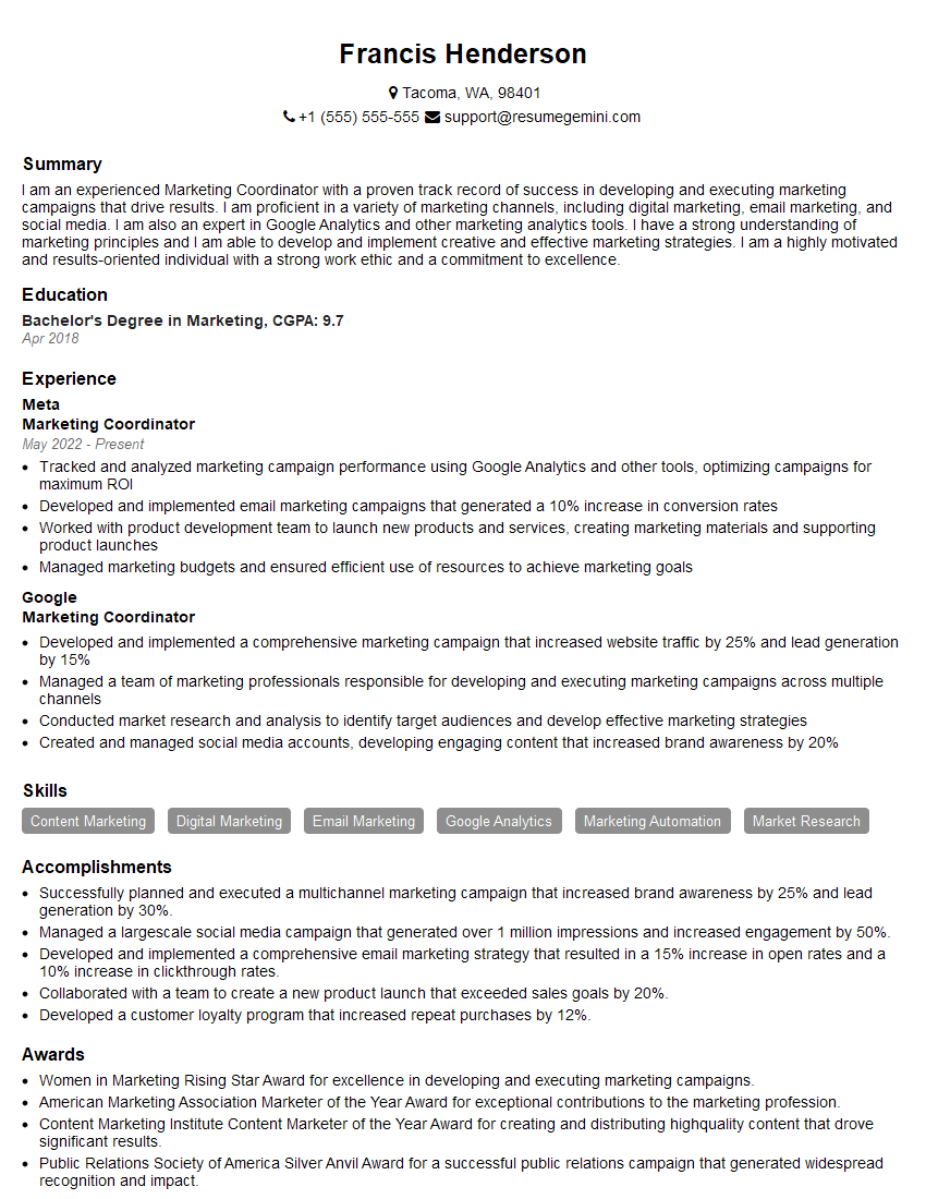
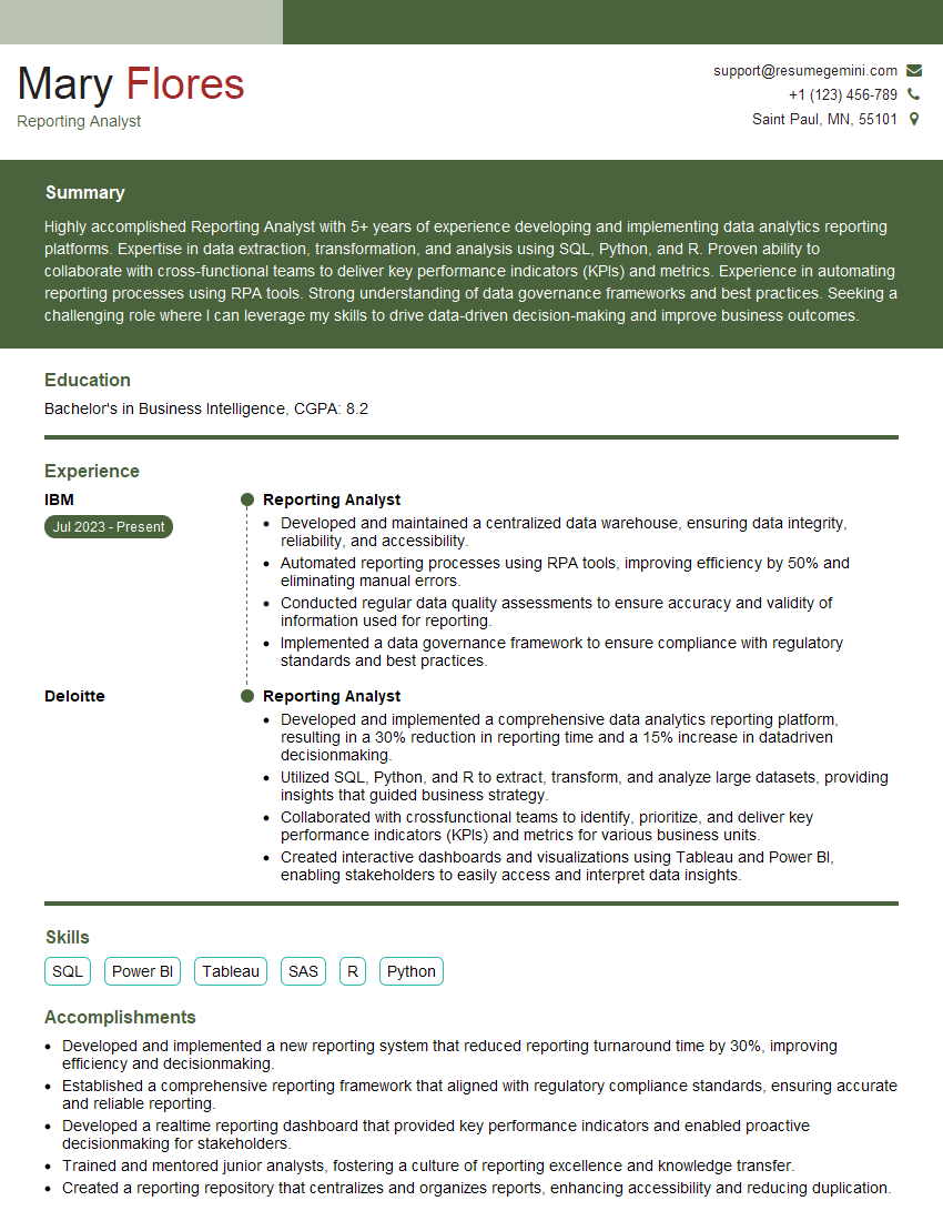
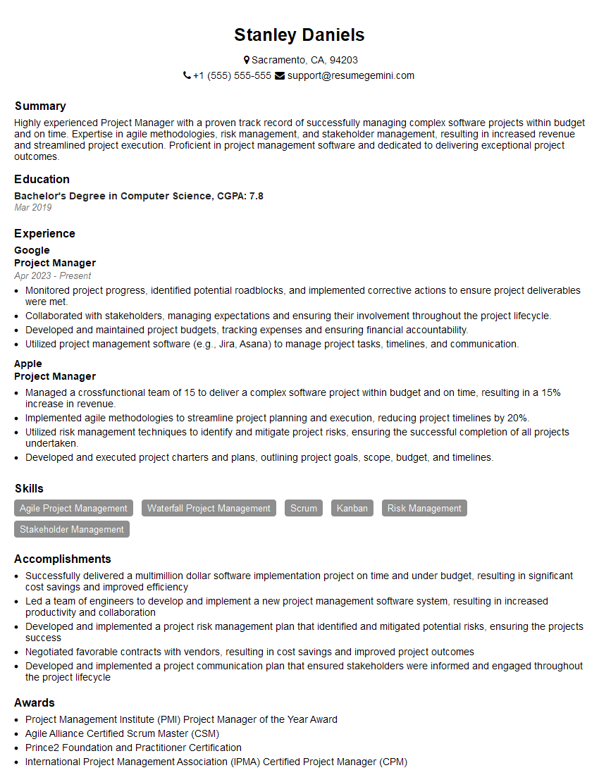
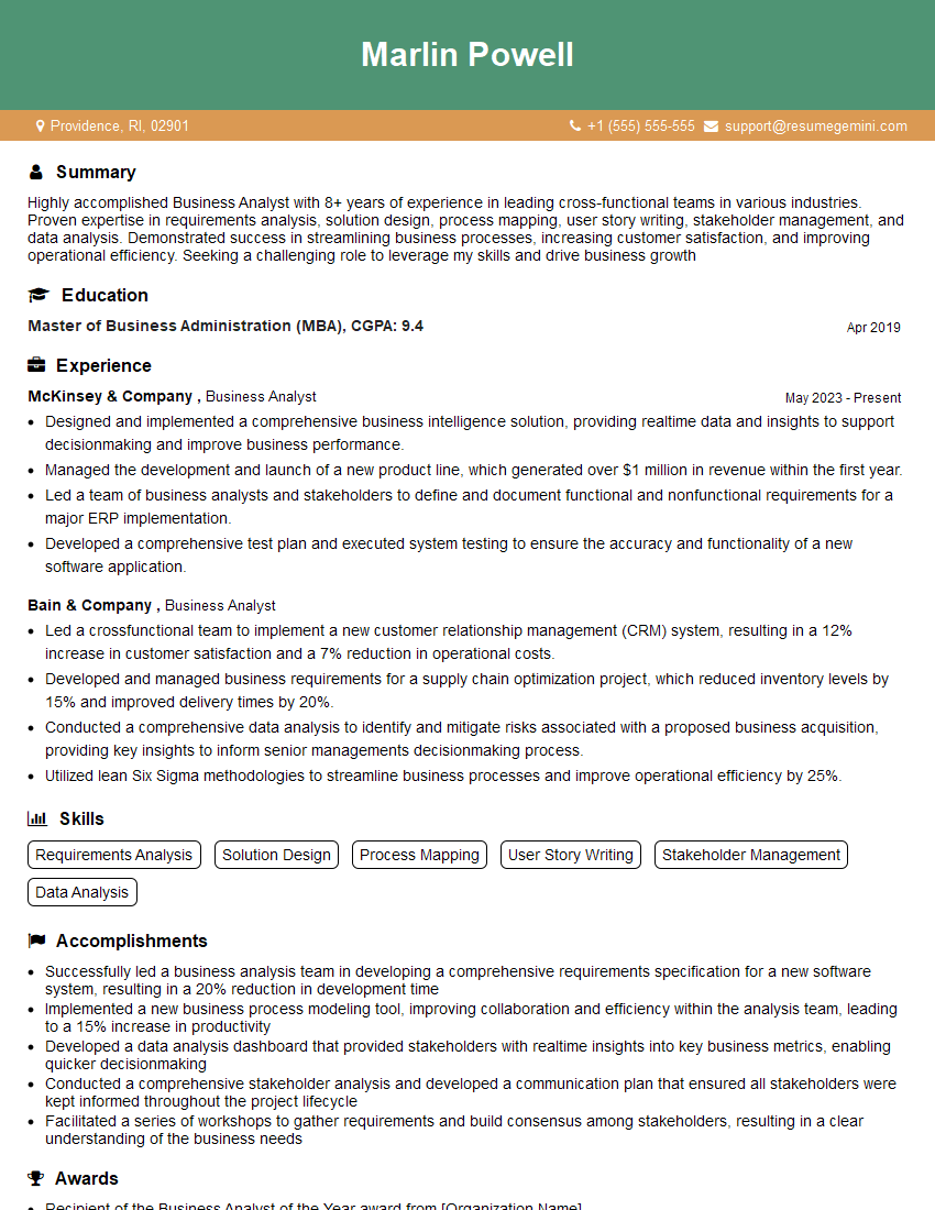
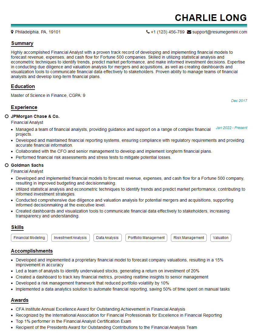
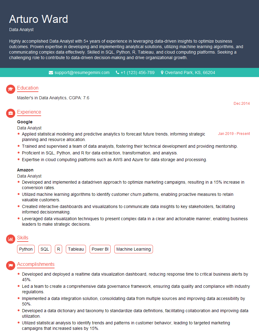
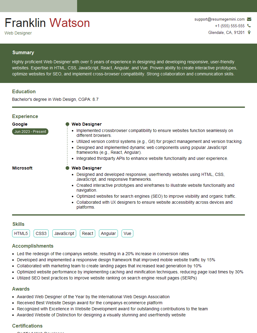
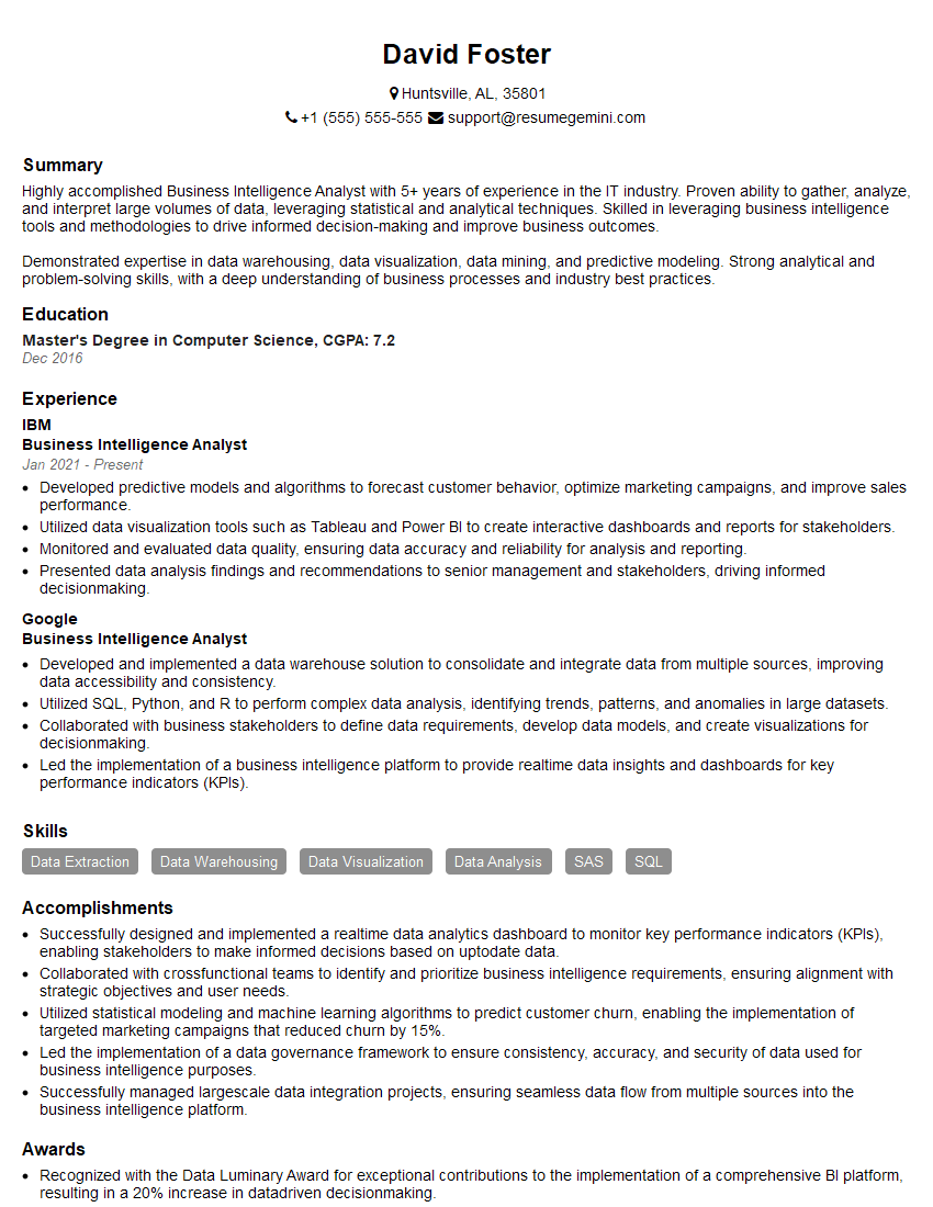
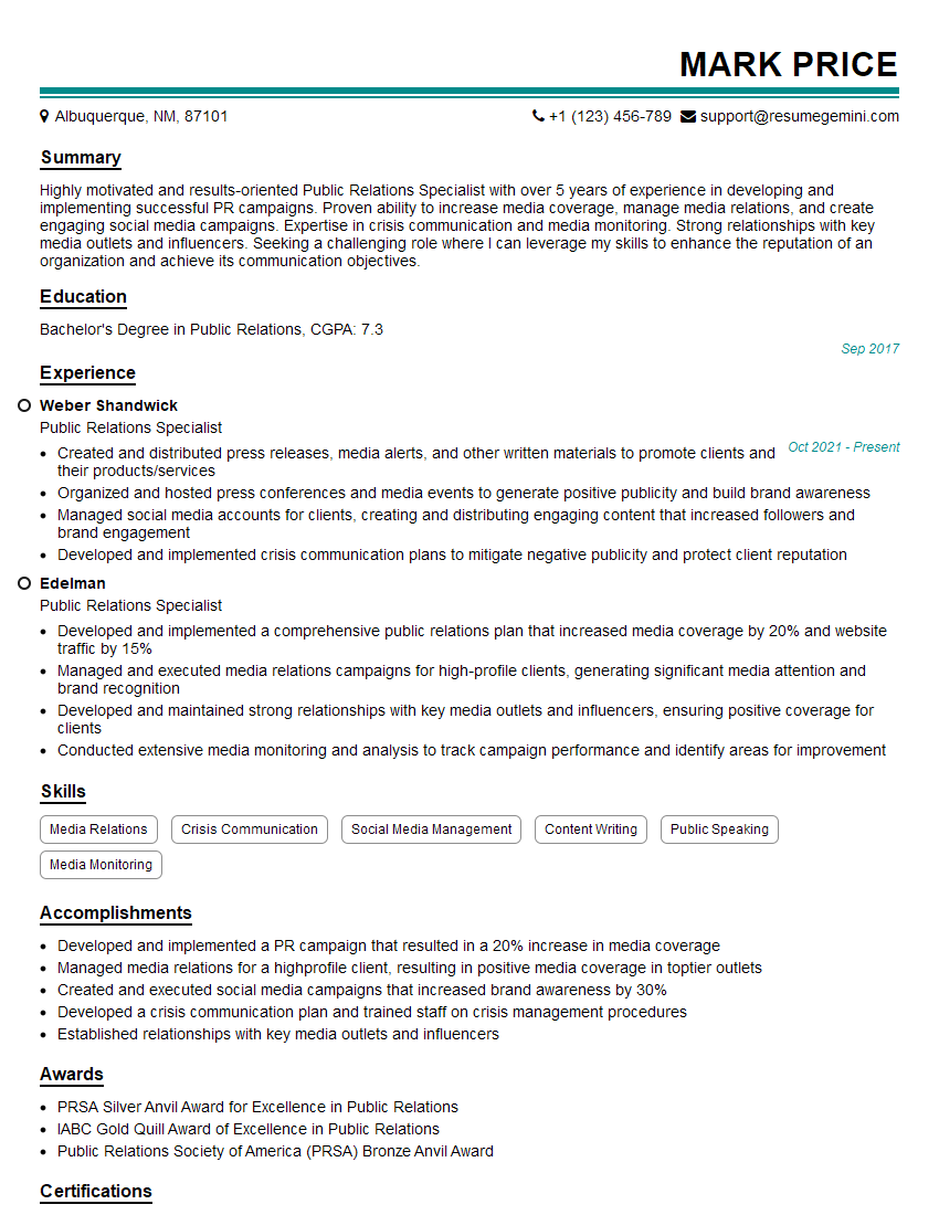
Mastering Reporting and Communication Software Proficiency is crucial for career advancement in virtually any field. Proficiency in these tools demonstrates your ability to analyze data, communicate effectively, and produce high-quality professional documents. To maximize your job prospects, focus on building an ATS-friendly resume that highlights your skills and experience. ResumeGemini is a trusted resource to help you create a professional and impactful resume that stands out from the competition. Examples of resumes tailored to showcasing Reporting and Communication Software Proficiency (MS Office Suite, Adobe Suite) are available to guide you.
Explore more articles
Users Rating of Our Blogs
Share Your Experience
We value your feedback! Please rate our content and share your thoughts (optional).
