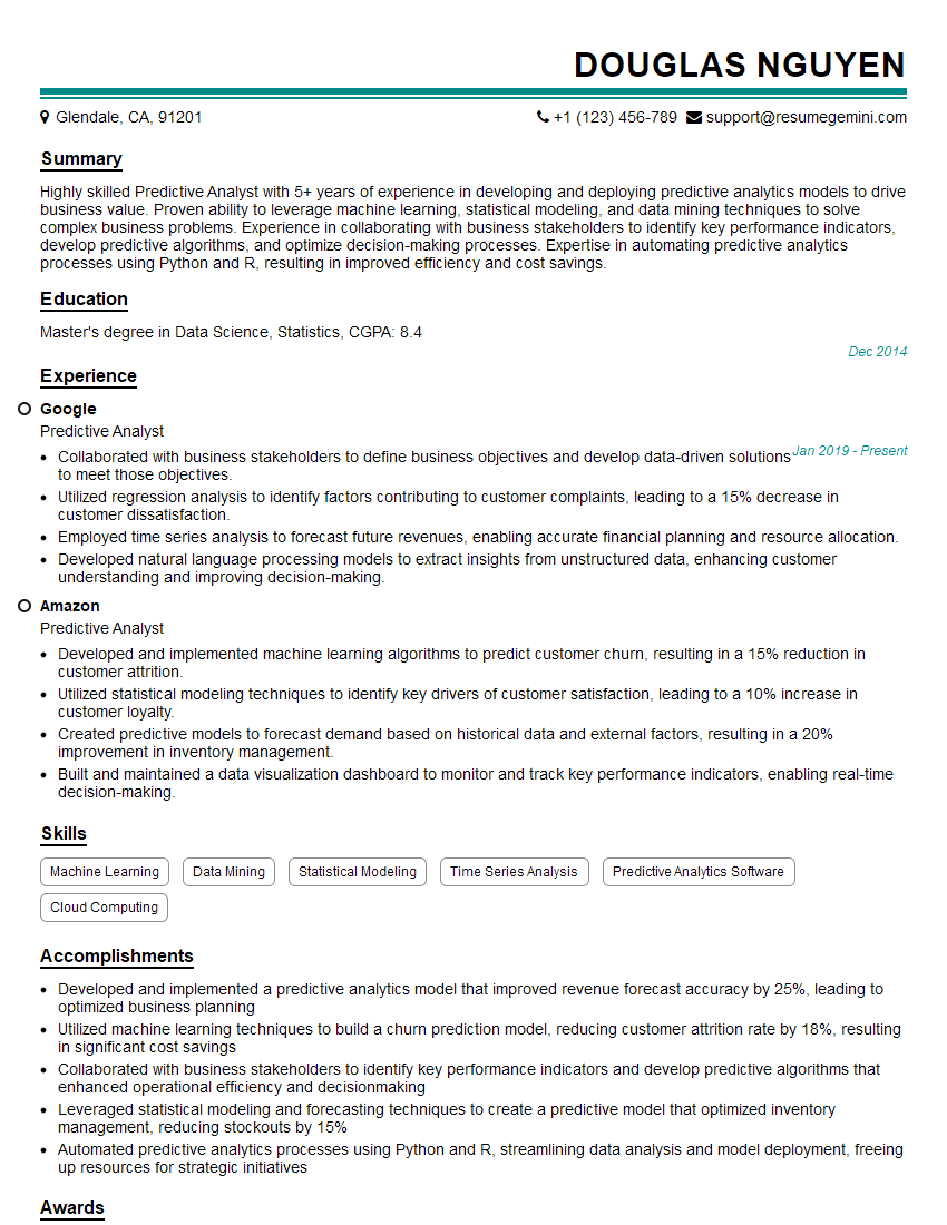
The thought of an interview can be nerve-wracking, but the right preparation can make all the difference. Explore this comprehensive guide to Skill: Data Analysis and Interpretation interview questions and gain the confidence you need to showcase your abilities and secure the role.
Questions Asked in Skill: Data Analysis and Interpretation Interview
Q 1. Explain the difference between correlation and causation.
Correlation and causation are two distinct concepts in statistics. Correlation describes a relationship between two variables: as one changes, the other tends to change as well. Causation, however, implies that one variable directly influences or causes a change in another. A correlation doesn’t automatically mean causation.
Think of it this way: Ice cream sales and crime rates might be correlated – both tend to be higher in the summer. However, this doesn’t mean eating ice cream causes crime. The underlying factor is the summer heat, which influences both ice cream sales and the likelihood of increased crime.
Example: A study might find a strong positive correlation between the number of hours students study and their exam scores. This suggests a relationship, but doesn’t prove that studying *causes* higher scores. Other factors, like prior knowledge or teaching quality, could influence exam results.
To establish causation, you need strong evidence, often from controlled experiments or longitudinal studies that account for confounding factors. Correlation is a starting point for investigation, but it’s never sufficient proof of causation.
Q 2. What are some common data visualization techniques, and when would you use each?
Data visualization is crucial for effectively communicating insights from data. Several techniques exist, each suited for different purposes:
- Bar charts: Ideal for comparing categorical data. For example, showing the sales figures for different product categories.
- Line charts: Excellent for visualizing trends over time. Think of stock prices or website traffic over several months.
- Scatter plots: Useful for examining the relationship between two numerical variables. For instance, plotting height versus weight to explore correlation.
- Histograms: Show the distribution of a single numerical variable, highlighting central tendency and spread. A useful tool for understanding the distribution of customer ages.
- Pie charts: Effectively represent proportions of a whole. For example, showing the market share of various competitors.
- Box plots: Excellent for summarizing the distribution of data, displaying median, quartiles, and outliers. Useful for comparing distributions across different groups.
The choice of visualization depends heavily on the type of data and the message you want to convey. A poorly chosen chart can misrepresent the data or fail to communicate key findings effectively.
Q 3. How do you handle missing data in a dataset?
Missing data is a common problem in data analysis. The best approach depends on the nature and extent of the missing data, as well as the dataset’s characteristics.
- Deletion: Simple but potentially problematic. Listwise deletion removes entire rows with missing values; pairwise deletion only removes cases with missing values for specific analyses. This can introduce bias if the missing data is not random.
- Imputation: Replacing missing values with estimated ones. Methods include mean/median imputation (simple but can distort variance), regression imputation (predicting missing values based on other variables), and k-nearest neighbor imputation (using values from similar data points).
- Model-based imputation: More sophisticated methods, such as multiple imputation, create multiple plausible imputed datasets and combine the results for more robust inferences.
Before choosing a method, it’s vital to understand why the data is missing. Is it missing completely at random (MCAR), missing at random (MAR), or missing not at random (MNAR)? The mechanism of missingness significantly impacts the choice of imputation technique.
For example, in a customer survey, if responses are missing completely at random, simple imputation might be acceptable. But if missingness is related to a variable of interest (e.g., high-income individuals are less likely to answer), more sophisticated techniques like multiple imputation are needed to avoid biased results.
Q 4. Describe your experience with different data cleaning techniques.
Data cleaning is a crucial step before analysis. My experience includes various techniques, including:
- Handling missing values: As discussed previously, I employ appropriate imputation or deletion strategies depending on the data’s characteristics.
- Outlier detection and treatment: I use methods like box plots, scatter plots, and statistical measures (e.g., Z-scores) to identify outliers. Depending on the context, I might remove outliers, transform the data, or investigate potential data entry errors.
- Data transformation: I apply transformations (e.g., log transformation, standardization) to address issues like skewness and non-normality, improving the accuracy and reliability of analysis.
- Data deduplication: I employ various methods to identify and remove duplicate entries, ensuring data integrity.
- Data consistency checks: I verify data consistency across different variables and ensure data types are correct. This often involves scripting or using database tools.
- Error correction: I carefully review data for inconsistencies, errors, and anomalies. This often requires domain knowledge and careful scrutiny of the data source.
In a recent project, I cleaned a large dataset containing customer purchase history. This involved handling missing values using multiple imputation, detecting and addressing outliers that resulted from data entry errors, and transforming some skewed variables for better model performance.
Q 5. What are your preferred statistical software packages and why?
My preferred statistical software packages are R and Python (with libraries like Pandas, NumPy, and Scikit-learn).
R excels in statistical modeling and data visualization. Its extensive package ecosystem offers specialized tools for a wide range of statistical analyses. I find its syntax powerful for statistical tasks, and the community support is excellent.
Python provides a more general-purpose programming environment, making it versatile for data cleaning, preprocessing, and integration with other systems. Libraries like Pandas offer powerful data manipulation capabilities, while Scikit-learn provides a comprehensive collection of machine learning algorithms.
My choice between R and Python depends on the specific project. For highly specialized statistical analyses, R is often my first choice. For projects requiring extensive data manipulation, integration with other systems, or machine learning tasks, Python is preferred.
Q 6. Explain the concept of A/B testing.
A/B testing (also known as split testing) is a randomized experiment used to compare two versions of a variable (A and B) to determine which performs better. This variable could be anything from website design elements to email subject lines.
How it works: Users are randomly assigned to one of two groups (A or B), each exposed to a different version. Key metrics are tracked for both groups, and statistical tests are used to determine if the difference in performance is statistically significant.
Example: A company wants to improve its website’s conversion rate. They create two versions of a landing page (A and B), differing slightly in design or call-to-action. They randomly assign visitors to each version and track the number of conversions (e.g., purchases or sign-ups). A statistical test (like a t-test) is then used to determine whether version B significantly outperforms version A.
A/B testing is crucial for evidence-based decision-making. By systematically comparing different options, companies can optimize their products, services, and marketing campaigns, leading to improved results.
Q 7. How do you identify outliers in a dataset?
Outliers are data points that significantly deviate from the rest of the data. Identifying them is crucial because they can skew results and distort analyses.
Methods for outlier detection include:
- Visual inspection: Scatter plots, box plots, and histograms can visually reveal outliers.
- Statistical measures: Z-scores (number of standard deviations from the mean) and the Interquartile Range (IQR) can identify points that fall outside a specified range.
- Clustering techniques: Algorithms like k-means clustering can identify data points that are far from the centroids of the clusters.
Example: In a dataset of house prices, a single house priced significantly higher than others could be an outlier. This outlier might be due to a data error or represent a unique property with exceptional features.
Once identified, outliers require careful consideration. They shouldn’t be automatically removed unless there is strong evidence they are due to errors. Investigating the cause of outliers is essential to understand if they are genuine data points or reflect issues needing correction.
Q 8. Describe a time you had to interpret complex data to solve a problem.
In a previous role, I was tasked with analyzing customer churn data to identify key contributing factors. The dataset was enormous, encompassing demographic information, purchase history, customer service interactions, and website activity. Initially, the data seemed overwhelming and disparate. To solve this, I employed a multi-step approach. First, I cleaned and pre-processed the data, handling missing values and outliers. Then, I used exploratory data analysis (EDA) techniques, creating visualizations like histograms and scatter plots to understand the distribution of variables and identify potential correlations. This revealed a strong correlation between infrequent website logins and higher churn rates. Further analysis using regression modeling showed that customers who hadn’t logged in for over three months were significantly more likely to churn. This insight led to the development of a targeted retention campaign focusing on re-engaging inactive users, resulting in a 15% reduction in churn within six months.
Q 9. How do you ensure the accuracy and reliability of your data analysis?
Ensuring data accuracy and reliability is paramount. My process involves several key steps. First, I meticulously validate data sources, checking for inconsistencies and biases. This often involves cross-referencing data from multiple sources. Second, I employ rigorous data cleaning techniques, addressing missing values (through imputation or removal) and handling outliers (through transformation or removal, depending on the context and root cause). Third, I perform thorough data validation checks, ensuring data types are correct, values fall within acceptable ranges, and there are no duplicates. Fourth, I utilize appropriate statistical methods to assess data quality and reliability. For example, I might calculate descriptive statistics to understand the distribution of the data and assess its normality. Finally, I document all data processing steps, ensuring transparency and reproducibility of my analysis. This detailed record allows for easy review and debugging, increasing the overall reliability of my findings.
Q 10. What is the central limit theorem, and why is it important?
The Central Limit Theorem (CLT) is a fundamental concept in statistics. It states that the distribution of the sample means of a large number of independent, identically distributed random variables, regardless of their original distribution, will approximate a normal distribution. This is true even if the original data isn’t normally distributed. Think of it like this: if you repeatedly take samples from any population and calculate the average of each sample, the distribution of those averages will resemble a bell curve (normal distribution). The CLT’s importance lies in its ability to justify the use of normal-based statistical tests even when the underlying data is non-normal, as long as the sample size is sufficiently large. This simplifies many statistical analyses and allows us to make inferences about the population based on sample data.
Q 11. Explain the difference between parametric and non-parametric tests.
Parametric and non-parametric tests are two broad categories of statistical tests used to analyze data. Parametric tests assume that the data follows a specific probability distribution, typically a normal distribution. They make assumptions about the population parameters (like mean and standard deviation). Examples include t-tests and ANOVA. Non-parametric tests, on the other hand, do not make assumptions about the data distribution. They are often used when the data is not normally distributed or when the data is ordinal or ranked. Examples include the Mann-Whitney U test and the Kruskal-Wallis test. Choosing between them depends on whether the assumptions of parametric tests are met. If the data meets the assumptions, parametric tests are generally more powerful, meaning they are more likely to detect a significant effect when one exists. If assumptions are violated, non-parametric tests are preferred to avoid inaccurate conclusions.
Q 12. What are some common data distributions, and how do you identify them?
Several common data distributions exist. The most common is the normal distribution, characterized by its bell-shaped curve and symmetry around the mean. Others include the binomial distribution (representing the probability of success in a fixed number of trials), the Poisson distribution (modeling the probability of a given number of events occurring in a fixed interval of time or space), and the uniform distribution (where all values have an equal probability). Identifying the distribution can involve visual inspection of histograms and Q-Q plots (quantile-quantile plots), which compare the data’s quantiles to the quantiles of a theoretical distribution. Statistical tests, like the Shapiro-Wilk test, can also formally test for normality. Knowing the distribution helps in selecting appropriate statistical tests and making accurate inferences. For example, if the data is normally distributed, parametric tests are usually the best choice.
Q 13. How do you determine the appropriate statistical test for a given hypothesis?
Selecting the appropriate statistical test hinges on several factors: the type of data (categorical, continuous, ordinal), the number of groups being compared, the research question (e.g., comparing means, testing for association), and the assumptions about the data distribution. A structured approach is crucial. I typically start by defining the research hypothesis and determining the type of data. Then, based on this information, I consult a statistical test selection flowchart or table, considering the assumptions of each test. For example, to compare means between two groups with normally distributed data, I’d use a t-test; for comparing means across multiple groups with normally distributed data, I’d use ANOVA. If the data is not normally distributed, I’d opt for non-parametric alternatives like the Mann-Whitney U test or the Kruskal-Wallis test. Careful consideration of these factors ensures that the chosen test is appropriate and the results are valid and reliable.
Q 14. Describe your experience with SQL and database querying.
I possess extensive experience with SQL and database querying. I’m proficient in writing complex queries to extract, transform, and load (ETL) data from various relational databases. My skills encompass selecting, joining, filtering, aggregating, and ordering data using SQL commands. I’m familiar with different database systems like MySQL, PostgreSQL, and SQL Server. For example, I’ve used SQL to build data warehouses for reporting and analytics, optimizing queries for performance and scalability. I can write queries to perform aggregations such as SELECT COUNT(*) FROM customers WHERE country = 'USA'; to count US customers or SELECT AVG(sales) FROM orders WHERE date BETWEEN '2023-01-01' AND '2023-12-31'; to calculate average sales for the year. I’m also comfortable working with window functions and subqueries to handle more intricate data manipulation needs. My experience ensures I can efficiently handle large datasets and retrieve precisely the information needed for analysis.
Q 15. How do you interpret regression results?
Interpreting regression results involves understanding the statistical significance of the model and the relationship between the independent and dependent variables. We look at several key aspects:
- R-squared: This value indicates the proportion of variance in the dependent variable explained by the independent variables. A higher R-squared (closer to 1) suggests a better fit, but it’s crucial not to overemphasize it, especially with many independent variables.
- Adjusted R-squared: This is a modified version of R-squared that accounts for the number of predictors in the model. It penalizes the inclusion of irrelevant variables, providing a more accurate representation of the model’s goodness of fit.
- Coefficients: These represent the estimated change in the dependent variable for a one-unit change in the corresponding independent variable, holding all other variables constant. We examine their p-values to assess statistical significance. A low p-value (typically below 0.05) indicates that the coefficient is statistically significant, meaning the variable has a real impact on the dependent variable.
- P-values: These show the probability of observing the obtained results if there were no actual relationship between the variables. Low p-values suggest strong evidence against the null hypothesis (no relationship).
- Standard Error: This measures the accuracy of the coefficient estimates. A smaller standard error indicates a more precise estimate.
- Residual Plots: Examining residual plots (the difference between observed and predicted values) helps identify potential violations of regression assumptions, such as non-linearity or non-constant variance.
Example: In a model predicting house prices (dependent variable) based on size and location (independent variables), a high R-squared and statistically significant coefficients for size and location would suggest that these factors strongly influence house prices. However, a high R-squared with insignificant coefficients for some variables would indicate that those variables are not meaningful predictors.
Career Expert Tips:
- Ace those interviews! Prepare effectively by reviewing the Top 50 Most Common Interview Questions on ResumeGemini.
- Navigate your job search with confidence! Explore a wide range of Career Tips on ResumeGemini. Learn about common challenges and recommendations to overcome them.
- Craft the perfect resume! Master the Art of Resume Writing with ResumeGemini’s guide. Showcase your unique qualifications and achievements effectively.
- Don’t miss out on holiday savings! Build your dream resume with ResumeGemini’s ATS optimized templates.
Q 16. Explain the difference between supervised and unsupervised machine learning.
The core difference between supervised and unsupervised machine learning lies in the nature of the data used for training the models:
- Supervised learning uses labeled data, meaning each data point includes both input features and the corresponding output or target variable. The algorithm learns to map inputs to outputs. Examples include regression (predicting a continuous value) and classification (predicting a categorical value). Think of it like a teacher supervising a student’s learning, providing the correct answers.
- Unsupervised learning uses unlabeled data, meaning only input features are available, and the algorithm must discover patterns and structures within the data without explicit guidance. Examples include clustering (grouping similar data points) and dimensionality reduction (reducing the number of variables while retaining important information). Imagine this as letting a student explore and learn on their own without direct instruction.
In short: Supervised learning predicts outcomes based on labeled examples; unsupervised learning discovers patterns in unlabeled data.
Q 17. What are some common machine learning algorithms, and when would you use each?
Several common machine learning algorithms are used across various applications:
- Linear Regression: Predicts a continuous target variable based on a linear relationship with predictor variables. Used for tasks like predicting house prices or sales forecasting.
- Logistic Regression: Predicts the probability of a binary outcome (e.g., yes/no, success/failure). Commonly used in credit scoring or medical diagnosis.
- Decision Trees: Creates a tree-like model to classify or regress data by recursively partitioning the data based on feature values. Easy to interpret but prone to overfitting.
- Random Forest: An ensemble method that combines multiple decision trees to improve accuracy and reduce overfitting. Robust and widely applicable.
- Support Vector Machines (SVM): Finds an optimal hyperplane to separate data points into different classes. Effective in high-dimensional spaces but can be computationally expensive.
- K-Means Clustering: Groups data points into clusters based on similarity. Used for customer segmentation or image compression.
- K-Nearest Neighbors (KNN): Classifies data points based on the majority class among its k nearest neighbors. Simple but can be computationally expensive for large datasets.
The choice of algorithm depends on the specific problem, data characteristics (size, type, dimensionality), and desired outcome. For instance, linear regression is suitable for predicting continuous values with a linear relationship, while K-means clustering is ideal for exploratory data analysis and grouping similar data points.
Q 18. How do you evaluate the performance of a machine learning model?
Evaluating a machine learning model’s performance depends heavily on the type of task (classification, regression, clustering etc.). Common metrics include:
- Accuracy (Classification): The percentage of correctly classified instances. Simple but can be misleading with imbalanced datasets.
- Precision and Recall (Classification): Precision measures the proportion of correctly predicted positive instances among all instances predicted as positive. Recall measures the proportion of correctly predicted positive instances among all actual positive instances. The F1-score is the harmonic mean of precision and recall, providing a balanced measure.
- ROC curve and AUC (Classification): The ROC curve plots the true positive rate against the false positive rate at various thresholds. The AUC (Area Under the Curve) summarizes the ROC curve’s performance, indicating the model’s ability to distinguish between classes.
- Mean Squared Error (MSE) and Root Mean Squared Error (RMSE) (Regression): Measure the average squared difference between predicted and actual values. RMSE is the square root of MSE and is easier to interpret since it’s in the same units as the dependent variable.
- R-squared (Regression): Indicates the proportion of variance in the dependent variable explained by the model.
- Silhouette Score (Clustering): Measures how similar a data point is to its own cluster compared to other clusters. A higher score indicates better clustering.
The selection of evaluation metrics is problem-specific. For example, in a medical diagnosis setting, high recall is crucial (avoiding false negatives), even if it means sacrificing some precision. Cross-validation techniques like k-fold cross-validation are used to obtain robust and unbiased performance estimates.
Q 19. Describe your experience with data mining techniques.
My experience with data mining techniques encompasses a wide range of approaches used to extract knowledge and patterns from large datasets. This includes:
- Association Rule Mining (Apriori, FP-Growth): Discovering relationships between items in transactional data, like market basket analysis to identify frequently purchased product combinations.
- Clustering (K-means, hierarchical clustering): Grouping similar data points based on their characteristics, for example, segmenting customers based on purchasing behavior.
- Classification (Decision Trees, Naïve Bayes): Building models to predict categorical outcomes, such as predicting customer churn or classifying documents.
- Regression (Linear Regression, Support Vector Regression): Building models to predict continuous outcomes, such as predicting house prices or stock values.
- Anomaly Detection: Identifying unusual data points that deviate significantly from the norm, for instance, detecting fraudulent transactions.
I have utilized these techniques in various projects, such as analyzing customer behavior to improve marketing strategies, predicting equipment failures to optimize maintenance schedules, and identifying patterns in financial data to mitigate risk. My experience includes selecting appropriate algorithms based on dataset characteristics, preprocessing the data, building and evaluating models, and interpreting the results in a meaningful way.
Q 20. How do you handle large datasets?
Handling large datasets efficiently involves a combination of strategies:
- Sampling: Using a representative subset of the data for analysis, especially during exploratory data analysis or model development. This significantly reduces processing time and memory requirements.
- Data partitioning: Dividing the data into smaller, manageable chunks for parallel processing. This is particularly useful when using distributed computing frameworks like Spark or Hadoop.
- Dimensionality reduction: Reducing the number of variables while retaining essential information through techniques like Principal Component Analysis (PCA) or feature selection. This simplifies the data and improves model performance.
- Data aggregation: Summarizing data at a higher level of granularity to reduce the volume of data processed. For example, aggregating daily sales data into monthly summaries.
- Database optimization: Utilizing efficient database systems like relational databases or NoSQL databases optimized for large-scale data management and query processing.
- Cloud computing: Utilizing cloud-based platforms like AWS, Azure, or GCP that offer scalable computing resources and storage solutions for handling large datasets.
The optimal approach depends on the specific characteristics of the dataset and the analytical tasks. For instance, for real-time analysis, sampling might be less suitable, while for offline exploratory analysis, it is a useful strategy.
Q 21. What is data warehousing and how does it relate to data analysis?
A data warehouse is a central repository of integrated data from various sources, designed to support business intelligence (BI) and data analysis. It differs from operational databases, which focus on transactional processing. Data warehouses are designed for analytical querying, often involving complex aggregations and joins across large datasets.
Relationship to Data Analysis: Data warehouses provide the foundation for data analysis by offering a structured, consistent, and readily accessible view of organizational data. Data analysts can leverage the data warehouse to perform various analytical tasks, such as:
- Trend analysis: Identifying patterns and trends over time.
- Comparative analysis: Comparing data across different dimensions.
- Performance monitoring: Tracking key performance indicators (KPIs).
- Predictive modeling: Building models to predict future outcomes.
In essence, the data warehouse provides the ‘what’ and ‘when’, while data analysis provides the ‘why’ and ‘how’ – uncovering insights, making predictions, and driving data-driven decision-making. Without a well-structured data warehouse, performing effective data analysis on large and complex datasets becomes significantly more challenging.
Q 22. Explain the concept of ETL (Extract, Transform, Load).
ETL, or Extract, Transform, Load, is a crucial process in data warehousing and business intelligence. It’s a three-stage process designed to get data from various sources into a data warehouse or other target system for analysis.
- Extract: This initial stage involves pulling data from multiple sources. These sources can be anything from databases (SQL, NoSQL), flat files (CSV, TXT), APIs, or even web scraping. The process focuses on identifying the relevant data and extracting it efficiently. For example, we might extract customer purchase history from a transactional database and website activity data from server logs.
- Transform: This is where the magic happens. Data from different sources rarely comes in a consistent or usable format. The transformation stage involves cleaning, converting, and enriching the data to ensure consistency and accuracy. This includes handling missing values, standardizing data types, merging data from different sources, and potentially performing data aggregation or calculations. A common example is converting date formats from different sources into a single standardized format (e.g., YYYY-MM-DD).
- Load: The final stage is about loading the transformed data into the target system. This could be a data warehouse, data lake, or another database. The loading process needs to be efficient and reliable, minimizing downtime and ensuring data integrity. We might use bulk loading techniques for optimal performance.
Think of it like preparing a delicious meal. Extraction is gathering the ingredients, transformation is chopping, mixing, and preparing them, and loading is serving the final dish.
Q 23. Describe your experience with data visualization tools (e.g., Tableau, Power BI).
I have extensive experience with both Tableau and Power BI, using them for various projects involving exploratory data analysis, dashboard creation, and presentation of findings. In Tableau, I’ve leveraged its powerful visualization capabilities to create interactive dashboards for sales performance analysis, helping stakeholders understand trends and identify areas for improvement. I’m particularly fond of Tableau’s ease of use for complex visualizations and its robust data connectivity options. With Power BI, I’ve worked on projects involving data modeling, creating interactive reports and embedding them into company portals for real-time business monitoring. Power BI’s integration with Microsoft’s ecosystem is a key strength, and its DAX scripting capabilities have enabled me to create complex calculations within my reports.
For example, in one project using Tableau, I visualized customer churn rates by different demographics, identifying key factors contributing to churn. This allowed the marketing team to tailor retention strategies based on specific customer segments. In a Power BI project, I created a dashboard tracking key performance indicators (KPIs) in real-time, making critical business information readily accessible to the executive team.
Q 24. How do you communicate your findings to a non-technical audience?
Communicating complex data analysis to a non-technical audience requires clear and concise storytelling. I avoid technical jargon and instead focus on using clear language, visuals, and analogies. I prioritize highlighting the key findings and their implications in a way that’s easy to understand. For instance, instead of saying “The coefficient of determination (R-squared) is 0.85,” I’d say “Our model explains 85% of the variance in sales, indicating a strong correlation between our marketing efforts and sales performance.”
I often use compelling visuals like charts and graphs to illustrate trends and patterns. I also build narratives around the data, focusing on the story the data tells. Finally, I always aim for an interactive session, encouraging questions and providing clarifying explanations to ensure understanding.
Q 25. What are your strengths and weaknesses as a data analyst?
My strengths lie in my analytical thinking, problem-solving skills, and attention to detail. I’m proficient in various statistical methods and data visualization techniques, and I’m adept at identifying patterns and trends within complex datasets. I also excel at communicating my findings clearly and effectively to both technical and non-technical audiences. My ability to translate data into actionable insights is a key asset.
My weakness, if I had to identify one, is my occasional tendency to delve too deep into the technical details. I’m working on improving my ability to summarize and prioritize key findings more efficiently for different audiences. I actively seek feedback to better tailor my communication style.
Q 26. Tell me about a time you had to work with incomplete or ambiguous data.
In a recent project analyzing website traffic, we encountered significant gaps in our data due to a malfunctioning tracking system. This resulted in incomplete and inconsistent data. To address this, I first identified the extent of the missing data and its potential impact on our analysis. Next, I explored imputation techniques, carefully considering the potential biases each method introduced. I chose a combination of methods, including mean imputation for some variables and regression imputation for others, documenting my choices and the limitations of each approach. Finally, I included a sensitivity analysis in my report to showcase the impact of the missing data on my conclusions, enhancing the transparency of my work.
Q 27. Describe a project where you had to overcome a significant challenge related to data analysis.
During a project analyzing customer satisfaction data, I faced a significant challenge related to data inconsistency. Different departments used different scales and methods for collecting feedback. This resulted in heterogeneous data that was difficult to analyze directly. To overcome this, I developed a standardized scoring system that transformed the diverse data into a comparable format. This involved carefully considering the nuances of each data source and devising a method that retained the essential information while minimizing bias. The resulting analysis provided valuable insights into customer satisfaction and led to actionable recommendations for improvement.
Q 28. What are your career goals in data analysis?
My career goals involve leveraging my data analysis skills to solve complex business problems and drive strategic decision-making. I aspire to become a senior data analyst or a data scientist, contributing to a data-driven culture within an organization. I’m particularly interested in working on projects that have a tangible impact on people’s lives and businesses, and I am eager to continue learning and developing my skills in emerging areas like machine learning and artificial intelligence.
Key Topics to Learn for Skill: Data Analysis and Interpretation Interview
- Descriptive Statistics: Understanding measures of central tendency (mean, median, mode), dispersion (variance, standard deviation), and their applications in summarizing data.
- Inferential Statistics: Applying hypothesis testing, confidence intervals, and regression analysis to draw conclusions from sample data and make predictions.
- Data Visualization: Creating effective charts and graphs (e.g., histograms, scatter plots, box plots) to communicate insights from data clearly and concisely. Consider different chart types and their appropriate uses.
- Data Cleaning and Preprocessing: Handling missing values, outliers, and inconsistencies in datasets to ensure data quality and accuracy. Discuss techniques like imputation and outlier removal.
- Data Wrangling with Tools: Practical experience with tools like SQL, Python (Pandas, NumPy), or R for data manipulation, transformation, and analysis. Be prepared to discuss your proficiency and showcase relevant projects.
- Interpreting Results and Communicating Findings: Clearly and effectively communicating analytical findings to both technical and non-technical audiences. Practice explaining complex concepts simply.
- Statistical Modeling: Understanding and applying various statistical models (linear regression, logistic regression, etc.) to analyze data and draw meaningful conclusions. Focus on model selection and interpretation.
- Problem-Solving Approach: Articulate your systematic approach to tackling data analysis problems, including defining the problem, selecting appropriate methods, and interpreting the results within the context of the business question.
Next Steps
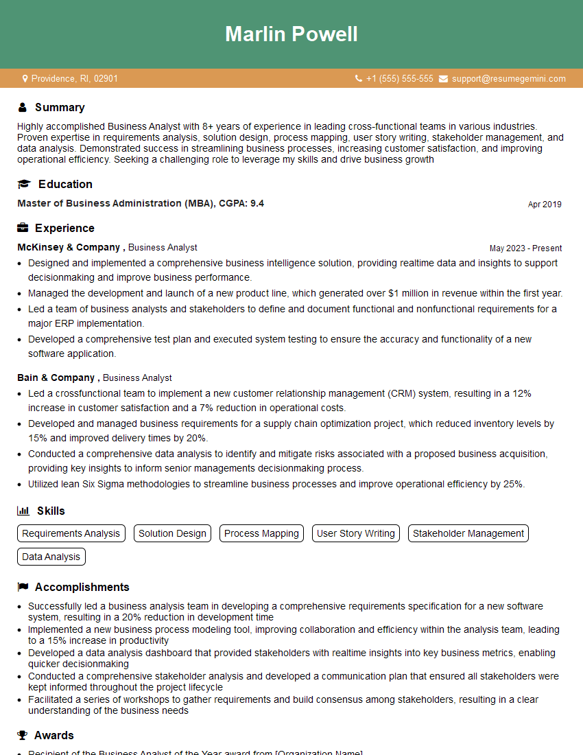
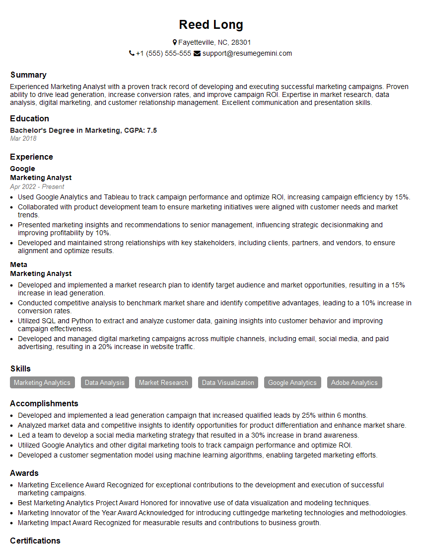
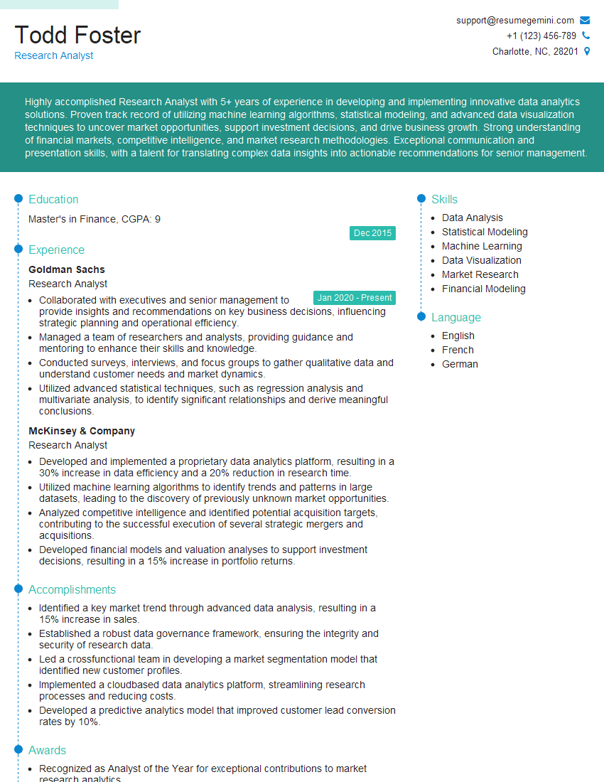
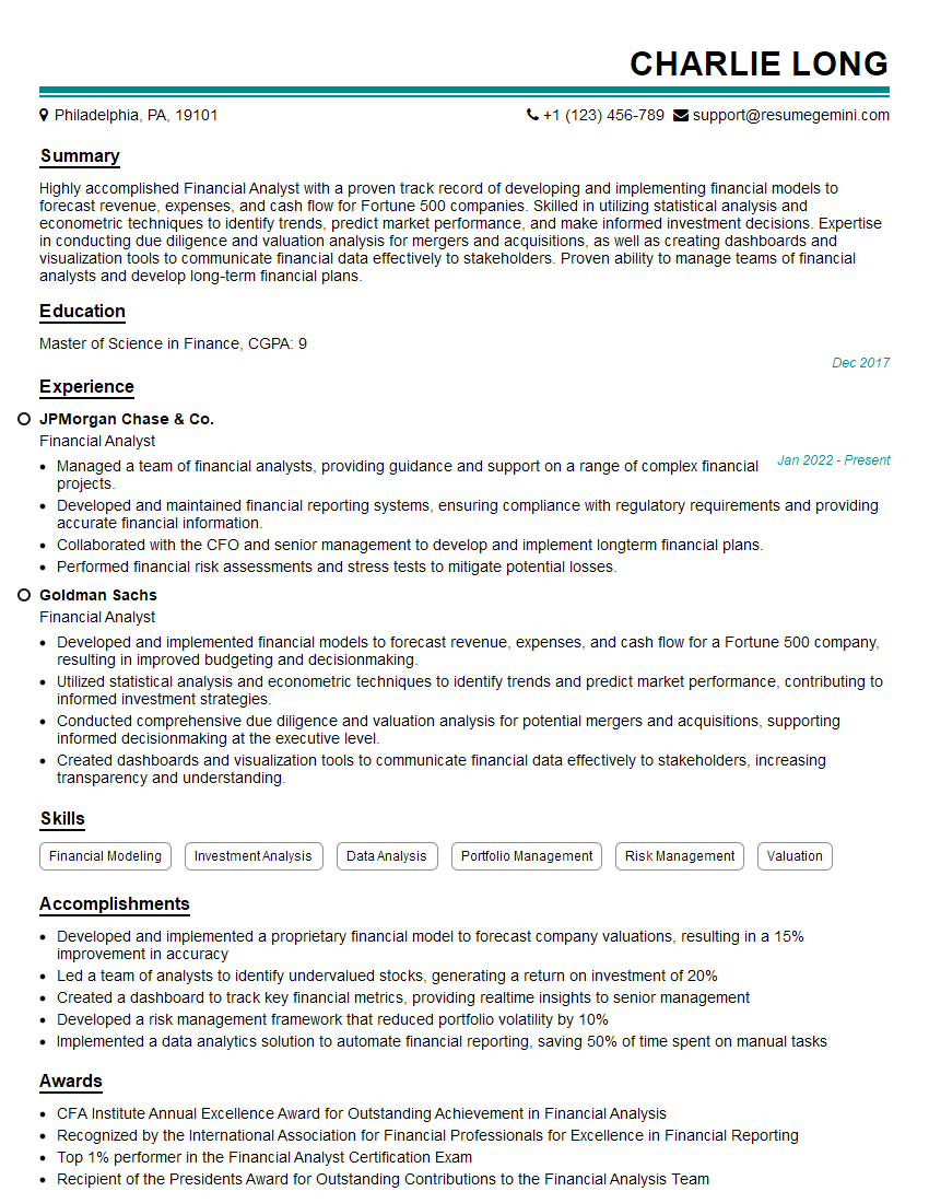
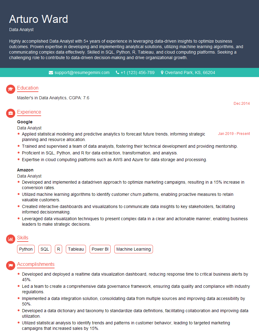
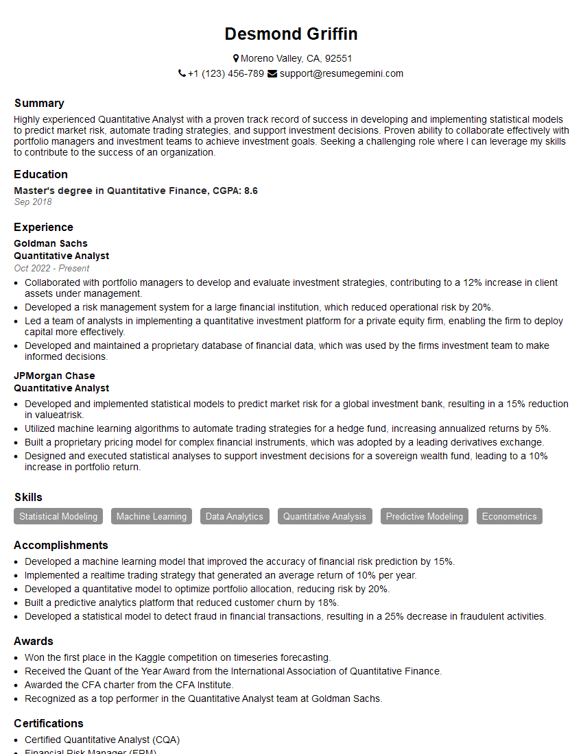
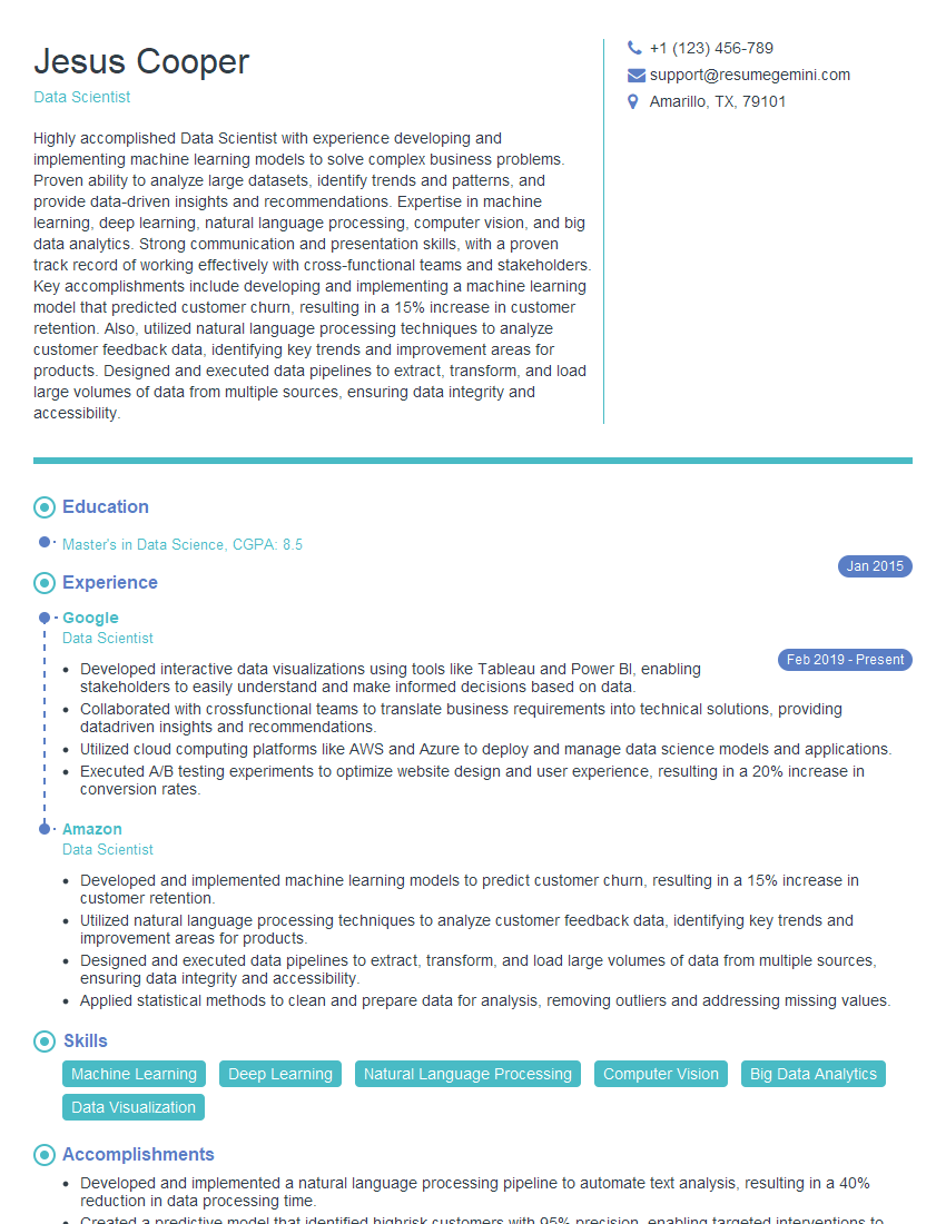
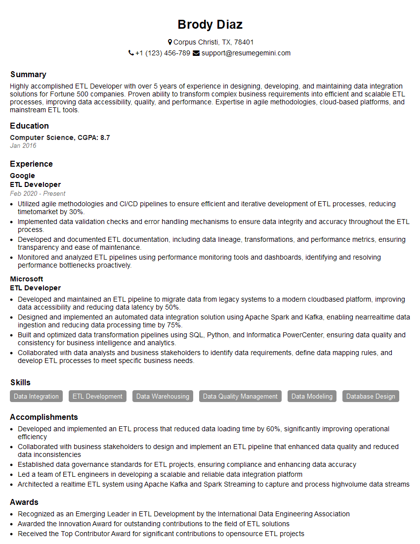
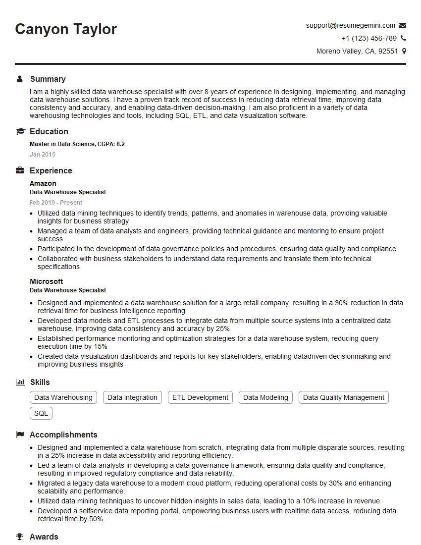
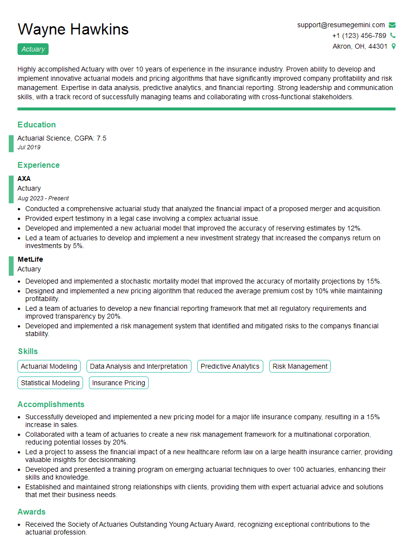
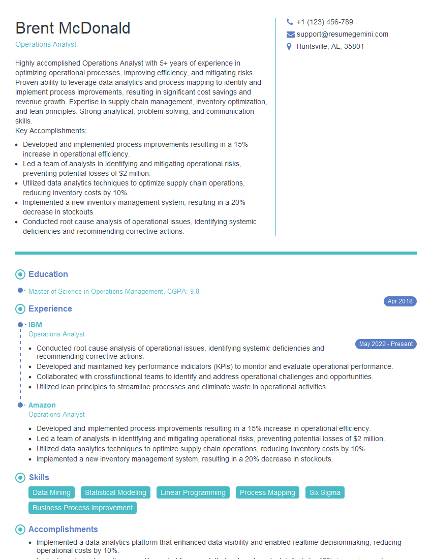
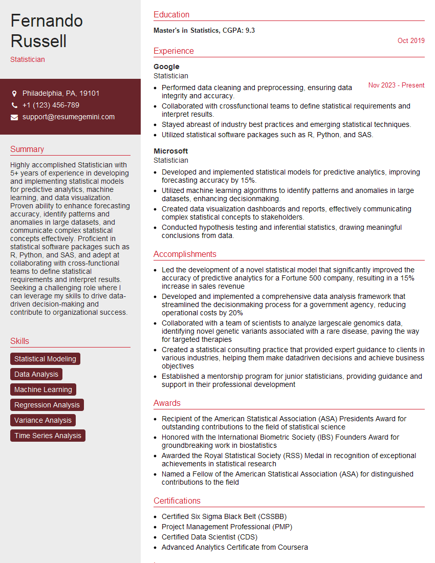
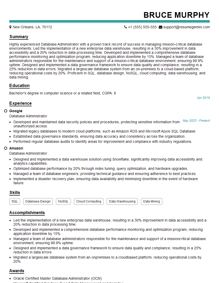
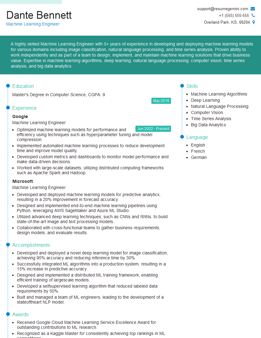
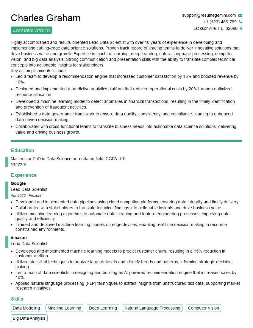
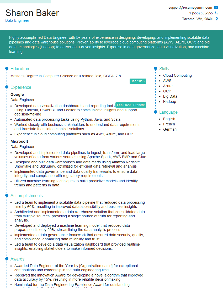
Mastering data analysis and interpretation is crucial for career advancement in today’s data-driven world. It opens doors to exciting roles and allows you to contribute significantly to strategic decision-making. To maximize your job prospects, creating a strong, ATS-friendly resume is essential. ResumeGemini is a trusted resource to help you build a professional and impactful resume that highlights your data analysis skills. Examples of resumes tailored to showcase expertise in Data Analysis and Interpretation are available, helping you present your qualifications effectively.
Explore more articles
Users Rating of Our Blogs
Share Your Experience
We value your feedback! Please rate our content and share your thoughts (optional).
What Readers Say About Our Blog
Hi, I represent an SEO company that specialises in getting you AI citations and higher rankings on Google. I’d like to offer you a 100% free SEO audit for your website. Would you be interested?
good
