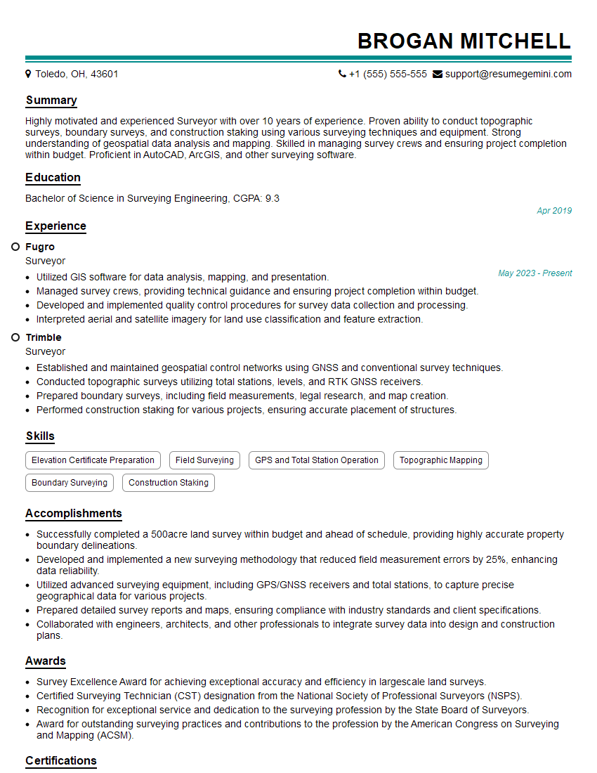
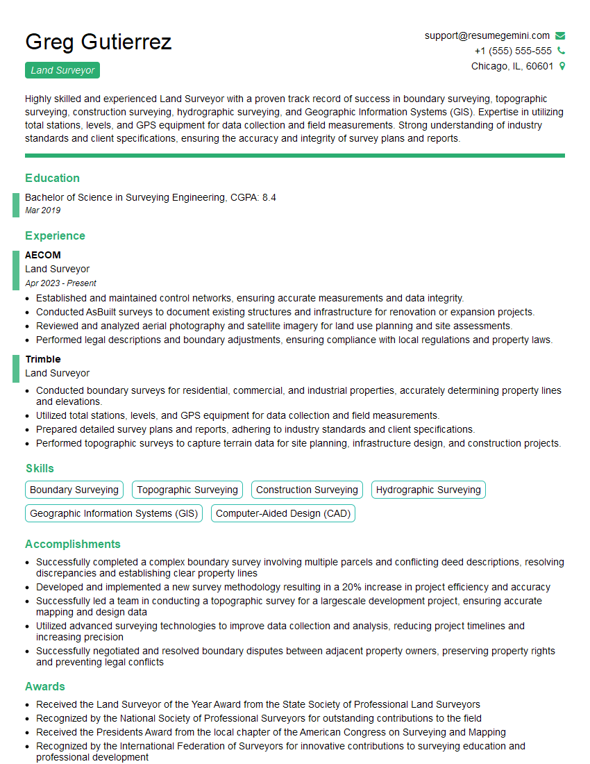
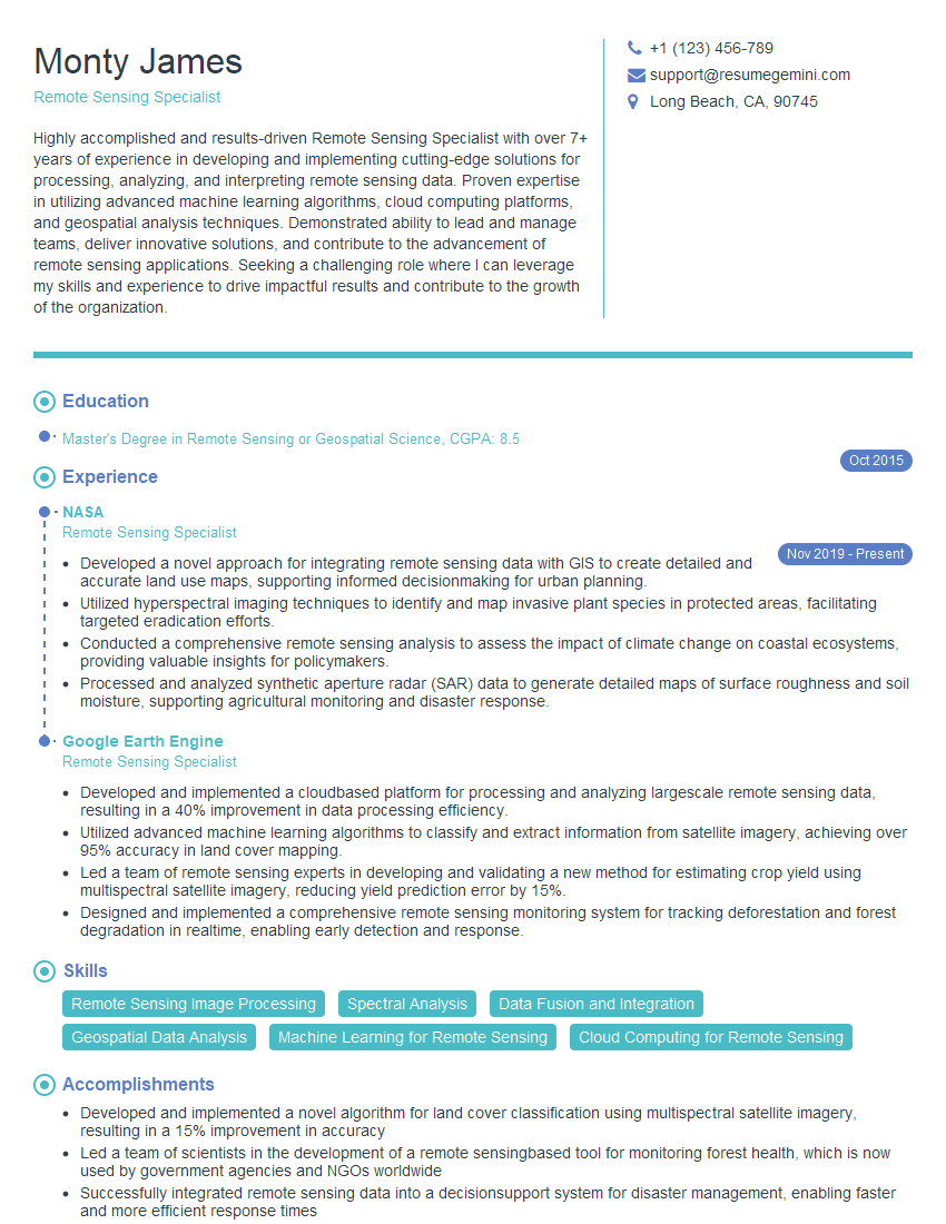
Are you ready to stand out in your next interview? Understanding and preparing for Software Proficiency: AutoCAD, GIS, Excel interview questions is a game-changer. In this blog, we’ve compiled key questions and expert advice to help you showcase your skills with confidence and precision. Let’s get started on your journey to acing the interview.
Questions Asked in Software Proficiency: AutoCAD, GIS, Excel Interview
Q 1. Explain the difference between a raster and vector data model in GIS.
Raster and vector data models are two fundamental ways to represent geographic information in GIS. Think of it like drawing a picture: raster is like a pixelated image, while vector is like using precise lines and shapes.
Raster data stores spatial data as a grid of cells or pixels, each containing a value representing a particular attribute (e.g., elevation, temperature, land cover). Imagine a satellite image; each pixel represents a small area on the ground with a specific color or spectral value. Raster data is excellent for representing continuous phenomena like elevation or imagery. However, it can be less precise when it comes to defining boundaries.
Vector data stores spatial data as points, lines, and polygons. Each feature is defined by its coordinates. For instance, a road would be represented by a line defined by a series of connected points; a building would be a polygon defined by its vertices. Vector data is ideal for representing discrete objects with well-defined boundaries, making it suitable for maps showing roads, buildings, or political boundaries. It’s more precise for representing individual features but can be less efficient for storing continuous data.
In short: Raster is best for continuous data like imagery, while vector is best for discrete objects with well-defined boundaries.
Q 2. Describe your experience using AutoCAD commands for 2D drafting.
My AutoCAD experience in 2D drafting is extensive. I’m proficient in using a wide range of commands, including those for creating and modifying geometry, text annotation, dimensioning, and layer management. For example, I routinely use commands like LINE, ARC, CIRCLE, POLYLINE for creating basic shapes. OFFSET and TRIM are essential for editing and cleaning up drawings. I leverage ARRAY and MIRROR for efficient duplication of objects. I’m comfortable with using the MODIFY tools to adjust objects such as MOVE, SCALE and ROTATE.
Beyond basic drawing, I have a strong understanding of layer management and organization to maintain clean, well-structured drawings. This includes using different linetypes, colors, and lineweights for clarity. I regularly utilize text styles and dimensioning tools for annotating drawings to comply with industry standards. On larger projects, I utilize blocks and external references (xrefs) for efficient management and reuse of components.
In one project, I used AutoCAD to create detailed shop drawings for a construction project. I managed to streamline the process by creating custom linetypes and blocks, which reduced the time required significantly. This improved efficiency enabled me to meet demanding deadlines.
Q 3. How proficient are you with Excel’s pivot tables and their applications?
I’m highly proficient with Excel’s pivot tables. I consider them a powerful tool for summarizing, analyzing, and exploring large datasets. I’ve used them extensively for data aggregation, creating summaries, and generating insightful reports.
I understand how to create pivot tables from scratch, choosing appropriate fields for rows, columns, values, and filters. I’m adept at using calculated fields to derive new metrics and performing data slicing and dicing to uncover trends and patterns. For example, I’ve used pivot tables to analyze sales data across different regions, time periods, and product categories, enabling the identification of best-performing products and underperforming regions.
My skills extend beyond basic pivot table creation; I also use pivot charts to visualize the data effectively, further aiding in analysis and the communication of findings. I’m familiar with using slicers and timelines to interact with the data and extract meaningful information from complex datasets.
Q 4. What are some common data manipulation techniques in Excel?
Excel offers a broad array of data manipulation techniques. Some common ones include:
- Sorting and Filtering: Quickly organizing data by specific criteria.
- Data Cleaning: Removing duplicates, handling missing values, and correcting inconsistencies.
- Text Functions: Extracting, concatenating, converting, and manipulating text strings (e.g.,
LEFT,RIGHT,CONCATENATE,TRIM). - Date and Time Functions: Calculating durations, formatting dates, and extracting date components (e.g.,
YEAR,MONTH,DAY). - Mathematical and Statistical Functions: Performing calculations, aggregations (
SUM,AVERAGE,COUNT), and statistical analysis (e.g.,AVERAGEIF,STDEV). - Lookup Functions: Retrieving data based on matching criteria (
VLOOKUP,HLOOKUP,INDEX,MATCH). - Conditional Formatting: Applying visual cues to highlight data based on specified conditions.
For instance, I recently used VLOOKUP to match product codes from one sheet to a pricing table on another sheet for automatic price updates. This avoided manual data entry and significantly reduced the chance of errors.
Q 5. How do you manage large datasets in Excel or GIS software?
Managing large datasets in Excel or GIS requires strategic approaches. In Excel, exceeding the row limit necessitates breaking down data into multiple worksheets or using database software. Power Query, a data transformation and loading tool, is invaluable for cleaning and transforming large datasets before importing them into Excel. It allows for efficient data import, cleaning, and transformation, improving Excel’s ability to handle larger datasets effectively. For visual representations, consider using summary tables or pivot tables to work with aggregated data rather than the raw, extensive data.
In GIS, handling large datasets involves optimizing data structure, using spatial indexing (like a spatial database), and employing geoprocessing tools to manage and analyze data efficiently. Using appropriate data formats (shapefiles, geodatabases), employing feature classes, and utilizing data compression techniques significantly reduce processing time and improve performance.
For instance, when dealing with a large point cloud dataset from LiDAR, I used geoprocessing tools in ArcGIS Pro to clip the data to the area of interest, and create a subset for analysis, significantly reducing the processing time and storage requirements.
Q 6. Describe your experience with spatial analysis techniques in GIS.
My experience with spatial analysis techniques in GIS is extensive. I’m proficient in using various tools and techniques for analyzing spatial patterns, relationships, and processes. This includes:
- Buffering: Creating zones around features (e.g., determining areas within a certain distance of a river).
- Overlay Analysis: Combining multiple layers to identify spatial relationships (e.g., intersecting land use and soil type layers).
- Proximity Analysis: Measuring distances and finding nearest neighbors.
- Network Analysis: Analyzing networks like roads or pipelines (e.g., finding the shortest route).
- Spatial Statistics: Performing statistical analysis on spatial data (e.g., calculating spatial autocorrelation).
For example, in a recent project, I used overlay analysis to identify areas suitable for a new development by combining layers representing land ownership, zoning regulations, and environmental constraints.
Q 7. Explain your understanding of coordinate systems and projections in GIS.
Coordinate systems and projections are crucial for accurately representing spatial data in GIS. A coordinate system defines the location of points on the Earth’s surface using coordinates (latitude and longitude). These are geodetic coordinate systems, while projected coordinate systems transform the curved surface of the Earth into a flat plane.
A projection is a mathematical transformation that converts 3D coordinates on the Earth’s surface to 2D coordinates on a map. Different projections distort the Earth’s surface in various ways, such as preserving area, shape, or distance. The choice of projection depends on the specific application and the area being mapped. For instance, the Mercator projection preserves direction but distorts area at higher latitudes, while the Albers Equal-Area projection preserves area but distorts shape.
Understanding coordinate systems and projections is crucial for accurate spatial analysis and ensures that measurements and analyses are correctly performed. Choosing the wrong projection can lead to significant errors in distance, area, and shape calculations. Therefore, I always carefully select the appropriate coordinate system and projection based on the project requirements and the geographic extent of the data.
Q 8. How do you ensure data accuracy and integrity in your work?
Data accuracy and integrity are paramount in my work. I employ a multi-faceted approach, starting with rigorous data acquisition and validation. This involves carefully checking source data for errors, inconsistencies, and outliers. I use techniques like data cleaning in Excel to identify and correct these issues, such as using formulas to find duplicates or inconsistencies.
For spatial data in GIS and AutoCAD, I perform geometric checks to ensure that lines connect properly, polygons are closed, and coordinates are accurate. I also leverage built-in tools for data validation within these programs to detect errors. A crucial step is metadata management – documenting the source, date, accuracy, and any limitations of my data. This transparency is key to ensuring the reliability of my work and allows for proper assessment of potential biases or limitations. Furthermore, regular backups and version control are implemented to prevent data loss and enable easy reversion to previous versions if needed.
For example, in a recent project involving land surveying data in AutoCAD, I noticed discrepancies between the field measurements and the digital drawing. By systematically comparing the two, I identified an error in the data entry process and corrected it, preventing inaccuracies in the final plans. This highlights the importance of meticulous verification and cross-checking at every stage of a project.
Q 9. Describe a situation where you had to troubleshoot a problem in AutoCAD.
During a project designing a complex building layout in AutoCAD, I encountered a problem where several layers became unexpectedly frozen. This prevented me from editing specific parts of the drawing. Initially, I tried the basic commands to unfreeze layers, but this didn’t solve the issue. I realized the problem stemmed from a corrupted layer state saved within the drawing file.
My troubleshooting involved several steps. First, I tried using the ‘Purge’ command to remove unused entities, hoping to resolve any conflicts. When that didn’t work, I carefully examined each layer’s properties, using the Layer Properties Manager, and discovered a custom layer state setting had been applied incorrectly, effectively locking certain layers. By resetting the layer states to their defaults and carefully re-applying the necessary modifications, I successfully unlocked the layers and resolved the problem. This experience taught me the importance of understanding AutoCAD’s internal mechanisms and systematically investigating potential causes when encountering unexpected behavior.
Q 10. How would you create a thematic map in GIS using attribute data?
Creating a thematic map in GIS using attribute data involves several key steps. First, you need to identify the attribute data you want to map. This could be anything from population density to land use classifications. Then, you choose an appropriate symbology to represent the attribute data visually. This might be a graduated color ramp for continuous data (like elevation) or unique symbols for categorical data (like land use types). In ArcGIS, for instance, you could use the ‘Symbology’ tab within the layer’s properties to achieve this.
Next, you classify your data. For continuous data, you might use equal intervals, quantiles, or natural breaks (Jenks) classification. Categorical data usually requires assigning unique symbols for each category. Once the classification is completed, you can add labels, a legend, and a title to make the map informative and easily understood. Finally, you can export the map in a desired format (e.g., PDF, JPEG) for presentation or further use. Imagine creating a map displaying population density across a city – using a graduated color scheme, with darker shades representing higher density areas, readily communicates this spatial pattern.
Q 11. What are some common file formats used in AutoCAD and GIS?
AutoCAD and GIS utilize several common file formats, each with its own strengths and weaknesses. In AutoCAD, the primary native format is .dwg (Drawing) and the older .dxf (Drawing Exchange Format) is often used for interoperability between different CAD systems. These files store both geometric data (lines, arcs, etc.) and associated attributes. AutoCAD also supports other formats like .pdf for printing and sharing drawings.
GIS software frequently utilizes .shp (Shapefile) for vector data, which comprises multiple files (.shp, .shx, .dbf) storing geometry, index, and attribute information. For raster data, common formats include .tif (Tagged Image File Format) and .img (Erdas Imagine). Other formats like .geojson and .gml (Geography Markup Language) offer standardized methods for exchanging geographic data, and .gdb (Geodatabase) is a native format in ArcGIS, enabling more complex data management within a single file.
Q 12. Explain your experience using Excel for data analysis and reporting.
My experience with Excel extends beyond basic data entry and formatting. I regularly leverage Excel’s capabilities for data analysis and reporting, including data cleaning, transformation, and visualization. I’m proficient in using various functions (like VLOOKUP, SUMIF, AVERAGEIF) to manipulate and extract meaningful information from datasets. I’ve used pivot tables extensively to summarize and analyze large datasets, identifying trends and patterns that would be difficult to discern manually.
For reporting, I utilize Excel’s charting features to create visually appealing and informative charts and graphs. I also use conditional formatting to highlight critical data points and make complex reports easier to understand. For instance, I recently used Excel to analyze sales data for a business, creating pivot tables to show sales trends by region and product category, generating charts to visualize these trends, and then used conditional formatting to highlight sales figures exceeding targets. This comprehensive report aided in strategic decision-making.
Q 13. How do you handle conflicting data sources in a GIS project?
Handling conflicting data sources in a GIS project requires a systematic approach. The first step is identifying the sources of conflict – this often involves comparing attributes or geometries from different datasets to find discrepancies. It’s crucial to understand the origin, accuracy, and potential biases of each data source. This knowledge helps determine which data source is more reliable or relevant for a specific aspect of the project.
Several strategies can resolve conflicts. Data reconciliation involves comparing conflicting data and choosing the most reliable source or creating a combined dataset by integrating the best parts of multiple sources. Data editing might require manually correcting discrepancies where a clear consensus is not available. Spatial adjustments, such as using geometric operations to align features, can address spatial conflicts. It is often beneficial to document the process and the rationale behind the choices made. Proper conflict resolution is critical for maintaining the integrity and accuracy of the final GIS product.
Q 14. Describe your experience with geoprocessing tools in ArcGIS.
I have extensive experience using geoprocessing tools in ArcGIS, which are essential for automating spatial analysis and data management tasks. I frequently employ tools for tasks such as spatial overlay (intersect, union), proximity analysis (buffering), and data conversion. For example, I’ve used the ‘Intersect’ tool to find the overlapping areas between land parcels and floodplains, enabling risk assessment.
Beyond individual tools, I’m proficient in creating model builders and scripts (using Python) to automate complex workflows. This significantly increases efficiency and reduces the chance of errors in repetitive tasks. A recent project involved processing a large amount of lidar data to generate elevation models, which I streamlined using a model builder incorporating multiple geoprocessing steps, saving considerable time and ensuring consistency. The ability to automate geoprocessing tasks is key to handling large datasets and creating reproducible and robust analyses.
Q 15. What are some best practices for creating effective technical drawings in AutoCAD?
Creating effective technical drawings in AutoCAD hinges on clarity, precision, and adherence to standards. Think of it like writing a clear instruction manual – anyone should be able to understand and build from your drawing. This involves several key practices:
- Layer Management: Organize your drawing using layers for different elements (e.g., walls, doors, annotations). This makes editing and selecting specific elements much easier. Imagine trying to find a specific screw in a pile of unsorted hardware – layers prevent this chaos.
- Lineweights and Linetypes: Use appropriate lineweights to distinguish between different elements (e.g., thicker lines for walls, thinner lines for dimensions). Linetypes (dashed, dotted) further clarify the nature of lines. Think of it like using different fonts in a document for emphasis.
- Text and Dimensioning: Use clear, consistent text styles and dimensioning practices. Avoid ambiguous labels. Always dimension accurately and follow established standards. Imagine trying to build furniture from poorly labeled plans!
- Blocks and Xrefs: Utilize blocks for reusable elements (e.g., doors, windows, symbols) to maintain consistency and save time. External references (Xrefs) allow you to link to other drawings, promoting modularity and efficiency. This is like using pre-fabricated modules in construction.
- Drawing Template: Start with a well-defined drawing template containing pre-set layers, styles, and settings to ensure consistency across all your projects. It’s like setting up your workspace efficiently before you start any task.
- Proper Scaling and Units: Ensure all dimensions and units are correctly specified and consistent throughout the drawing. Mistakes in scaling can lead to costly errors in real-world applications.
Following these best practices ensures your drawings are not only visually appealing but also unambiguous and easy to understand and use.
Career Expert Tips:
- Ace those interviews! Prepare effectively by reviewing the Top 50 Most Common Interview Questions on ResumeGemini.
- Navigate your job search with confidence! Explore a wide range of Career Tips on ResumeGemini. Learn about common challenges and recommendations to overcome them.
- Craft the perfect resume! Master the Art of Resume Writing with ResumeGemini’s guide. Showcase your unique qualifications and achievements effectively.
- Don’t miss out on holiday savings! Build your dream resume with ResumeGemini’s ATS optimized templates.
Q 16. How do you use Excel’s VBA for automating tasks?
Excel’s VBA (Visual Basic for Applications) is a powerful tool for automating repetitive tasks. Imagine you need to process thousands of rows of data weekly – VBA can handle it efficiently. It allows you to write macros – small programs – that automate actions such as data entry, formatting, calculations, and report generation. For instance:
Let’s say you need to format a column to currency and apply conditional formatting based on the values. Instead of doing it manually for each column, you could write a VBA macro like this:
Sub FormatColumn()
  Range("A1:A1000").NumberFormat = "$#,##0.00"
  Range("A1:A1000").FormatConditions.Add Type:=xlCellValue, Operator:=xlGreater, Formula1:=">=1000"
  Range("A1:A1000").FormatConditions(1).Interior.Color = vbGreen
End Sub
This macro formats column A to currency, and highlights cells with values greater than or equal to 1000 in green. You can expand on this to include other tasks such as importing data from external files, generating charts, or emailing reports automatically. This dramatically increases efficiency and reduces the risk of human error.
Q 17. Explain your understanding of spatial referencing in GIS.
Spatial referencing in GIS is the system used to locate geographic features on the Earth’s surface. Think of it as the address of a geographical object. It involves defining the coordinate system and projection used to represent the location of geographic data. Without it, geographic data would be meaningless, like having addresses without a city or country.
There are two key components:
- Coordinate System: Defines the three-dimensional space and the units used to measure distances (e.g., latitude and longitude in a geographic coordinate system, or x, y coordinates in a projected coordinate system). Latitude and longitude are like using a globe, while x, y coordinates are like using a flat map.
- Projection: A mathematical transformation that projects the Earth’s 3D surface onto a 2D plane. Since the Earth is a sphere, representing it on a flat surface involves some distortion. Different projections minimize distortion in different ways (e.g., Mercator projection for navigation, Albers equal-area projection for area calculations). Choosing the right projection is critical for accurate analysis.
Understanding spatial referencing is crucial for ensuring that different datasets can be correctly overlaid and analyzed together. Imagine trying to merge maps from different sources – incorrect spatial referencing would lead to misalignment and inaccurate results.
Q 18. What experience do you have with 3D modeling in AutoCAD?
I possess extensive experience in 3D modeling within AutoCAD, utilizing tools like 3D Solids, Surfaces, and Mesh modeling. I’ve worked on projects ranging from creating simple 3D representations of building components to complex site models involving terrain analysis and volume calculations. For example, I’ve used 3D solids to model buildings for visualization purposes, and created complex surfaces to design roads and landscaping. I’ve also worked on projects requiring mesh modeling to import scanned point cloud data.
My workflow typically involves:
- Defining the scope and objectives: Understanding the requirements of the 3D model.
- Sketching and conceptual design: Creating initial 2D sketches or conceptual models to guide the 3D modeling process.
- Choosing the appropriate modeling technique: Selecting the best method – solids, surfaces, or meshes – based on the project’s requirements.
- Modeling and refinement: Using AutoCAD’s 3D modeling tools to create and refine the model, paying close attention to detail and accuracy.
- Rendering and visualization: Generating realistic renderings or visualizations to communicate the design effectively.
I’m proficient in using rendering tools within AutoCAD, as well as exporting models to external rendering software for enhanced visualizations. This expertise allows me to effectively translate 2D designs into realistic 3D models for better understanding and client communication.
Q 19. How do you interpret spatial data to support decision-making?
Interpreting spatial data to support decision-making involves analyzing geographic patterns and relationships to inform strategic choices. Think of it as using maps to solve real-world problems. This involves several key steps:
- Data Acquisition and Preparation: Gathering relevant spatial data (e.g., demographic data, land cover maps, transportation networks). Ensuring data quality, accuracy, and consistency is crucial.
- Spatial Analysis: Applying appropriate spatial analysis techniques (e.g., overlay analysis, proximity analysis, spatial statistics) to identify patterns, trends, and relationships within the data. For instance, identifying areas with high crime rates and proximity to schools.
- Visualization and Mapping: Creating clear and informative maps, charts, and graphs to visually communicate findings. Data visualization can highlight critical areas or patterns that might be missed otherwise.
- Interpretation and Decision-Making: Analyzing the results of the spatial analysis to identify key insights and inform decisions. For example, determining optimal locations for new services or infrastructure based on population density, accessibility, and other factors.
For example, I used GIS to analyze crime data and population density to identify areas requiring increased police patrols. The analysis revealed clear spatial correlations that informed resource allocation strategies, ultimately leading to a more effective crime prevention strategy.
Q 20. Describe your workflow for creating a map in ArcGIS.
My workflow for creating a map in ArcGIS generally follows these steps:
- Project Setup: Defining the map’s purpose, scale, and extent. Choosing the appropriate coordinate system and projection for accurate data representation.
- Data Acquisition and Import: Gathering and importing relevant spatial data layers (e.g., shapefiles, rasters, CAD files). Data may come from various sources, like online databases or company internal systems.
- Data Management and Preprocessing: Checking for data errors and inconsistencies. Performing necessary data cleaning and preparation such as projection transformation if needed.
- Map Design and Layout: Selecting appropriate basemaps, adding data layers, symbolizing features, and creating a visually appealing and informative map. This involves choosing colors, fonts, and legends that convey information clearly and efficiently.
- Analysis and Visualization (optional): Performing spatial analysis operations (e.g., buffering, overlay analysis) to enhance understanding and create visualizations of analytical results. For example, displaying the population within a certain distance of a facility.
- Map Export and Sharing: Exporting the map in various formats (e.g., PDF, image) or sharing it through ArcGIS Online.
This process is iterative. I may revisit earlier steps as needed, refining the map based on feedback and further analysis. The final map should accurately represent the spatial information while effectively communicating the intended message.
Q 21. Explain your proficiency with different Excel charting tools.
My proficiency with Excel’s charting tools spans a range of chart types, each suited to different data visualization needs. I understand when to use a bar chart (comparing categories), a line chart (showing trends over time), a pie chart (showing proportions), a scatter plot (exploring relationships between variables), and many others like area charts, histograms, box plots etc.
Beyond simply creating charts, I focus on creating effective charts. This involves:
- Data Appropriateness: Choosing the chart type that best represents the data and communicates the intended message. A pie chart is unsuitable for comparing 20 categories, while a scatter plot is inappropriate for showing temporal trends.
- Clear Labeling and Titles: Providing clear, concise labels for axes, data points, and the chart’s title. Ambiguous labels undermine the purpose of visualization.
- Appropriate Formatting: Using colors, fonts, and styles consistently and effectively. Avoiding excessive use of colors or overly decorative elements which detract from the information’s clarity.
- Data Integrity: Ensuring the data used for charting is accurate and up-to-date. Errors in data lead to misleading visualizations.
I regularly use advanced charting features like chart formatting, adding trendlines, error bars, and creating interactive charts for dashboards. This allows for richer insights and facilitates better understanding and decision-making based on the visualized data.
Q 22. How do you ensure the accuracy of your geospatial data?
Ensuring the accuracy of geospatial data is paramount. It’s like building a house – a shaky foundation leads to a shaky structure. My approach involves a multi-pronged strategy focusing on data acquisition, processing, and validation.
- Source Verification: I meticulously check the source of the data. Is it from a reputable organization? What’s its methodology? Understanding the data’s origin helps assess its inherent accuracy. For example, using elevation data from a well-established source like the USGS is far more reliable than an unverified online resource.
- Data Validation: I employ various techniques including visual inspection using GIS software (ArcGIS or QGIS), statistical analysis in Excel (checking for outliers and inconsistencies), and comparison with other known accurate datasets. For instance, I might compare a newly acquired road network dataset against existing data to identify discrepancies.
- Metadata Management: Thorough metadata documentation is critical. This includes information on the data’s projection, coordinate system, accuracy standards, and any limitations. Without this, the data’s reliability is significantly compromised.
- GPS Accuracy Checks: When working with field-collected data, I ensure proper GPS equipment is used and calibrations are performed correctly. This involves understanding the limitations of GPS accuracy and applying appropriate error correction techniques.
By combining these methods, I build confidence in the accuracy and reliability of the geospatial data, ensuring the integrity of any analysis or application built upon it.
Q 23. Describe your experience with data cleaning and preprocessing in GIS.
Data cleaning and preprocessing are fundamental to any GIS project; it’s like preparing ingredients before cooking a gourmet meal. My experience encompasses various techniques:
- Error Detection and Correction: This involves identifying and correcting errors such as spatial inconsistencies (e.g., overlapping polygons), attribute errors (e.g., inconsistent data types), and topological errors (e.g., gaps or slivers). I use ArcGIS’s geoprocessing tools or QGIS’s processing toolbox to automate some of these tasks.
- Data Transformation: I regularly transform data between different coordinate systems and projections using appropriate tools within the GIS software. This ensures compatibility with other datasets and accurate spatial analysis.
- Data Generalization: For simplification and improved performance, especially with large datasets, I use generalization techniques like line simplification or polygon aggregation. This is particularly useful when working with datasets intended for web mapping applications.
- Attribute Cleaning: This includes handling missing values (imputation), correcting spelling errors, and standardizing data formats within Excel or directly within the GIS software’s attribute tables. For instance, I might use Excel’s ‘Find and Replace’ to standardize inconsistent street names.
For example, in a recent project involving land use classification, I had to identify and correct errors in polygon boundaries, ensuring the polygons represented the correct land use categories accurately. I used QGIS’s ‘Snap to Geometry’ tool to improve boundary consistency and its ‘Fix Geometries’ tool to handle topological errors.
Q 24. What is your experience with different GIS software packages (e.g., ArcGIS, QGIS)?
My experience spans both ArcGIS and QGIS, each offering unique strengths. ArcGIS provides a more robust and comprehensive environment for large-scale projects, with advanced spatial analysis tools and a wider range of extensions. QGIS, on the other hand, is a powerful, open-source alternative ideal for smaller projects or those with budget constraints. Its user-friendly interface and extensive plugin library make it very versatile.
In ArcGIS, I’m proficient in using tools for geoprocessing, spatial analysis (overlay analysis, proximity analysis), and data management. In QGIS, I’ve effectively used tools for raster processing, vector analysis, and creating interactive maps. The choice of software depends on project requirements and resource availability.
I’m comfortable working with both, and I can adapt quickly to whichever tool is most suitable for a given task.
Q 25. Explain your understanding of the different types of spatial relationships.
Spatial relationships define how geographic features relate to one another. Understanding these is fundamental to spatial analysis. Here are some key types:
- Containment: One feature is completely enclosed within another (e.g., a city within a county).
- Intersection: Features share a common area (e.g., roads intersecting at an intersection).
- Adjacency: Features share a boundary (e.g., neighboring parcels).
- Proximity: Features are within a specified distance of each other (e.g., buildings within 500 meters of a school).
- Overlap: Features partially cover each other (e.g., overlapping polygons in a land-use map).
These relationships form the basis of many spatial operations in GIS. For example, overlay analysis uses intersection to create new features based on the shared areas of existing features. Proximity analysis is used to identify features near points of interest.
Q 26. How do you use conditional formatting in Excel to highlight important data?
Conditional formatting in Excel is a powerful tool for highlighting crucial data, similar to using color-coded labels to quickly identify items of importance. It allows me to visually emphasize patterns and anomalies easily. For example:
- Highlighting outliers: Using color scales, I can instantly identify values significantly higher or lower than the average, helping in detecting potential errors or unusual trends. For example, highlighting sales figures significantly below the average for a particular region might signal a problem requiring investigation.
- Data range highlighting: I can highlight cells based on value ranges. For example, I might highlight cells in green if sales are above target, yellow if they’re close to the target, and red if they’re below target.
- Duplicate value identification: Conditional formatting helps spot duplicate entries easily, a frequent data quality problem. This is achieved by using a rule to highlight duplicate values in a column or range.
- Icon sets: Using icon sets, I can visualize data changes using simple and visually appealing icons. For example, I might use upward and downward-pointing arrows to visualize increases and decreases in sales.
I frequently use conditional formatting to quickly identify critical information within large datasets, facilitating faster data analysis and better decision-making.
Q 27. What are some common issues you have encountered while working with geospatial data?
Working with geospatial data often presents challenges. Some common issues I’ve encountered include:
- Data inconsistencies: Differences in coordinate systems, projections, and data formats across datasets can lead to significant problems in analysis and map creation. Aligning these requires careful transformations and projections.
- Data errors and inaccuracies: Errors in data acquisition, processing, or digitization can impact the results. Visual inspection and data validation are crucial to identify and correct these.
- Incomplete or missing data: Gaps in data coverage can hamper analysis. Strategies like interpolation or data imputation are sometimes needed to fill these gaps, but careful consideration is required to avoid introducing bias.
- Spatial resolution limitations: The resolution of geospatial data limits the detail that can be represented. Using data with appropriate resolution for the scale of the analysis is vital.
- Data scale mismatch: Analyzing data at different scales can lead to misleading interpretations. Understanding scale relationships and ensuring data compatibility are crucial.
For example, in a recent project, I encountered inconsistencies in address data, requiring significant cleaning and standardization to correctly geocode the addresses. This emphasizes the importance of thorough data preprocessing and quality control throughout the geospatial workflow.
Key Topics to Learn for Software Proficiency: AutoCAD, GIS, Excel Interview
- AutoCAD:
- Drawing creation and manipulation: Understanding layers, blocks, and object properties.
- 2D and 3D modeling techniques: Practical application in architectural, mechanical, or civil engineering contexts.
- AutoCAD commands and shortcuts: Demonstrating efficiency and proficiency.
- Data extraction and reporting: Utilizing AutoCAD features for generating reports and drawings.
- GIS:
- Spatial data handling: Understanding different data formats (shapefiles, geodatabases) and projections.
- Geoprocessing techniques: Experience with spatial analysis tools and workflows.
- Map creation and visualization: Designing effective and informative maps for diverse audiences.
- GIS software proficiency (ArcGIS, QGIS etc.): Highlighting specific software experience and expertise.
- Excel:
- Data analysis and manipulation: Utilizing functions like VLOOKUP, PivotTables, and macros for efficient data processing.
- Data visualization: Creating charts and graphs to effectively communicate insights from data.
- Formula creation and application: Demonstrating understanding of complex formulas and logical functions.
- Data cleaning and preparation: Highlighting skills in handling messy datasets and preparing them for analysis.
- Problem-Solving & Application:
- Describe how you’ve used these software packages to solve real-world problems.
- Showcase projects where you leveraged these skills for significant results.
- Be prepared to discuss your approach to tackling challenges in a technical environment.
Next Steps
Mastering AutoCAD, GIS, and Excel significantly enhances your career prospects in many high-demand fields. A strong command of these tools demonstrates valuable technical skills and problem-solving abilities. To maximize your job search success, creating a professional, ATS-friendly resume is crucial. ResumeGemini is a trusted resource to help you build a compelling resume that showcases your skills effectively. Examples of resumes tailored to highlight proficiency in AutoCAD, GIS, and Excel are available to guide you. Invest the time – it will pay off significantly in landing your dream job!
Explore more articles
Users Rating of Our Blogs
Share Your Experience
We value your feedback! Please rate our content and share your thoughts (optional).
What Readers Say About Our Blog
Hello,
We found issues with your domain’s email setup that may be sending your messages to spam or blocking them completely. InboxShield Mini shows you how to fix it in minutes — no tech skills required.
Scan your domain now for details: https://inboxshield-mini.com/
— Adam @ InboxShield Mini
Reply STOP to unsubscribe
Hi, are you owner of interviewgemini.com? What if I told you I could help you find extra time in your schedule, reconnect with leads you didn’t even realize you missed, and bring in more “I want to work with you” conversations, without increasing your ad spend or hiring a full-time employee?
All with a flexible, budget-friendly service that could easily pay for itself. Sounds good?
Would it be nice to jump on a quick 10-minute call so I can show you exactly how we make this work?
Best,
Hapei
Marketing Director
Hey, I know you’re the owner of interviewgemini.com. I’ll be quick.
Fundraising for your business is tough and time-consuming. We make it easier by guaranteeing two private investor meetings each month, for six months. No demos, no pitch events – just direct introductions to active investors matched to your startup.
If youR17;re raising, this could help you build real momentum. Want me to send more info?
Hi, I represent an SEO company that specialises in getting you AI citations and higher rankings on Google. I’d like to offer you a 100% free SEO audit for your website. Would you be interested?
Hi, I represent an SEO company that specialises in getting you AI citations and higher rankings on Google. I’d like to offer you a 100% free SEO audit for your website. Would you be interested?
good
