Every successful interview starts with knowing what to expect. In this blog, we’ll take you through the top Tattoo Lettering Styles interview questions, breaking them down with expert tips to help you deliver impactful answers. Step into your next interview fully prepared and ready to succeed.
Questions Asked in Tattoo Lettering Styles Interview
Q 1. What are the five most popular lettering styles in tattooing?
Picking just five popular lettering styles in tattooing is tricky, as trends shift, and individual artists develop unique approaches. However, five consistently popular and versatile styles are:
- Traditional: Bold, classic lettering often seen in American Traditional tattoos. Think thick outlines, solid fills, and a slightly uneven, hand-drawn quality that adds character. Example: A bold ‘Sailor Jerry’ style script.
- Script: Elegant and flowing cursive styles, ranging from delicate and whimsical to bold and dramatic. They lend themselves well to personalized messages and names. Example: A flowing italic script for a loved one’s name.
- Sans-serif: Clean, simple, and modern, these styles lack the decorative flourishes of serif fonts. They offer a contemporary feel and are highly legible. Example: A minimalist Helvetica-inspired font for a short, impactful quote.
- Blackletter/Gothic: Intricate and highly stylized, these fonts evoke a medieval or old-world aesthetic. They’re visually striking but require a skilled artist for proper execution. Example: A highly detailed blackletter style for a powerful motto.
- Old English: Similar to Blackletter but often more rounded and less angular. They possess a timeless and slightly more approachable elegance than their Gothic counterparts. Example: A slightly ornate Old English font for a family crest or motto.
These styles represent a diverse range, demonstrating the adaptability and versatility of tattoo lettering.
Q 2. Explain the difference between script and sans-serif lettering in tattoos.
The core difference between script and sans-serif lettering lies in the presence or absence of serifs. Serifs are the small decorative strokes or flourishes found at the ends of letter strokes. Script fonts are always cursive, meaning they’re connected and flowing, often incorporating elaborate swirls and curves. Sans-serif fonts are characterized by their clean lines and lack of serifs, resulting in a modern, minimal look. In tattoos, script offers a more personalized, elegant feel, while sans-serif provides a bolder, cleaner, and often more readable result, especially for longer text.
Think of it like handwriting versus typed text: script mimics flowing handwriting, whereas sans-serif is like clean, printed text. Script is great for names or short, meaningful phrases, while sans-serif works well for longer quotes or words needing high readability.
Q 3. Describe your process for designing custom lettering for a client.
Designing custom lettering starts with a thorough consultation. I discuss the client’s vision, including the desired message, style preferences, and placement on the body. I explore mood boards, image references, and discuss the client’s personality to ensure the lettering style aligns perfectly. I then create several sketches, exploring different fonts, sizes, and orientations. This iterative process involves client feedback at each stage, ensuring the final design meets their expectations perfectly.
Once a sketch is approved, I refine it digitally, ensuring optimal kerning (letter spacing), line weight, and overall balance. I consider the texture and form of the chosen style, and account for any potential distortion from the body’s curves. The final digital design serves as a template for the tattoo itself.
Q 4. How do you adapt lettering styles to different body parts?
Adapting lettering to different body parts requires careful consideration of the skin’s curvature and movement. A style that looks perfect on a flat surface might distort or appear illegible on a curved area like an arm or ribcage. I adjust font size, letter spacing, and even the style itself to optimize readability and aesthetic appeal on the chosen location.
For instance, delicate script might not work well on a heavily muscled area like the biceps, as the movement could distort the lines. In contrast, a bolder, simpler sans-serif style would hold up much better. I always sketch the design directly onto the body part to check for flow and how the curvature will impact the lettering. This helps ensure the tattoo maintains its intended visual appeal.
Q 5. What are some common challenges in tattoo lettering, and how do you overcome them?
Common challenges include skin distortion, uneven healing, and client expectations. Skin stretching, particularly in areas with high movement, can alter the appearance of the tattoo. Uneven healing can lead to inconsistencies in ink saturation or line sharpness. Managing client expectations is vital – some styles require more precision and therefore take longer to complete. Realistic expectations about time, complexity, and potential challenges are key to client satisfaction.
I overcome these through meticulous planning and execution. I use precise stenciling techniques to ensure accurate placement, paying careful attention to body contours. I communicate thoroughly with the client throughout the process, ensuring they understand the healing process and potential variations in the final result. Sometimes, suggesting alternative styles to better suit the chosen location or the client’s skin tone is crucial.
Q 6. How do you ensure proper kerning and spacing in your tattoo lettering?
Proper kerning and spacing are paramount for readability and aesthetic appeal. I achieve this through a combination of digital design and careful hand-adjustment during the stenciling process. In the digital stage, I use design software to fine-tune the spacing between letters and words, taking into account the chosen style and the length of the text. Then, when applying the stencil, I make tiny adjustments to ensure the spacing remains consistent and looks natural on the curved surface of the skin.
I often use optically-corrected spacing, meaning that I adjust spacing not just by equal measurement, but based on how letters visually interact with each other. For example, the space between ‘A’ and ‘V’ will likely be slightly larger than that between ‘V’ and ‘W’ for better visual balance.
Q 7. Explain your understanding of font families and their applications in tattooing.
Font families are groups of fonts that share similar design characteristics. Understanding font families is crucial for selecting appropriate styles in tattooing. A serif family, for instance, might include variations ranging from delicate scripts to bold display fonts, all sharing similar serifs and overall feel. Sans-serif families offer similar versatility, from minimalist geometric styles to more rounded, friendly options.
In tattooing, choosing a font family provides consistency and visual harmony, especially when working on larger projects or combining multiple lettering styles. For example, using several fonts from the same serif family ensures visual cohesion, even if the weights and styles differ. This approach creates a unified and aesthetically pleasing final result, helping avoid a jumbled or disjointed look.
Q 8. What software or tools do you use for designing tattoo lettering?
My design process relies heavily on digital tools. I primarily use Adobe Illustrator for its vector-based capabilities, which are crucial for creating clean, scalable lettering. This allows me to manipulate the designs precisely without losing quality, regardless of size. I also utilize Photoshop for adding textures, experimenting with color palettes, and creating mockups on simulated skin tones. Finally, I often sketch initial concepts traditionally on paper before translating them digitally to refine and perfect the details.
Illustrator’s ability to adjust curves and kerning is invaluable, for example, when creating a flowing script style or ensuring even spacing in a more structured typeface like a bold sans-serif. Photoshop then allows me to see how the design might appear shaded or textured on actual skin, helping prevent surprises during the tattooing process. For example, I’ll experiment with different shading techniques on the digital mock-up to see which best highlights the letterforms and works with the overall design’s style.
Q 9. How do you handle client requests for specific fonts or lettering styles?
Handling client requests for specific fonts is a delicate balance between fulfilling their vision and ensuring the final result is aesthetically pleasing and suitable for a tattoo. I begin by discussing the client’s chosen font. We evaluate its suitability for tattooing – some fonts, while elegant on screen, lack the robustness and readability needed to translate well onto skin. Thin lines and intricate details often blur and fade over time.
If their preferred font is problematic, I present alternative options similar in style but better suited for longevity. I might show them several variations I’ve created, tweaking weights, spacing, and adding elements to improve readability and longevity. For example, instead of a thin, elegant serif font, I might suggest a bolder serif, or a geometric sans-serif which holds up better during the tattooing process and with aging.
This collaborative approach ensures the client feels heard and involved while receiving expert advice that preserves the tattoo’s quality and their satisfaction in the long term. Transparency is key – clients need to understand the potential limitations of various fonts and styles for optimal results.
Q 10. Describe your approach to creating a cohesive design integrating lettering with other elements.
Integrating lettering with other design elements demands careful planning and execution. My approach starts with a thorough understanding of the client’s overall concept and desired aesthetic. I then consider the interplay of different elements – shapes, imagery, and the lettering itself. The goal is to create a harmonious and balanced piece where no single element overwhelms the others.
For instance, if the design includes a floral motif, I might adjust the lettering’s style to complement the curves and flow of the flowers, perhaps choosing a flowing script or a more organic typeface. Conversely, a geometric design might call for a clean, sans-serif typeface to maintain the overall structured feel. I carefully consider the spacing, size, and placement of each element, ensuring that the lettering doesn’t compete with other imagery but enhances the overall composition.
Creating mockups in Photoshop allows me to experiment with color palettes and shading to achieve visual cohesion. This preview allows the client to see exactly how everything interacts and make adjustments before any ink is applied to skin.
Q 11. How do you maintain the legibility of your lettering at various scales?
Maintaining legibility at various scales is fundamental. This involves using vector-based design software (like Illustrator) which allows for infinite scalability without losing sharpness. I also consider the inherent limitations of tattooing – thicker lines generally hold up better over time.
I avoid excessively thin strokes, especially in small-scale lettering, and carefully manage kerning (letter spacing) and tracking (overall word spacing) to improve readability. For smaller designs, bolder typefaces with simpler forms are preferred to prevent blurring. I also consider the client’s skin tone and the placement of the tattoo, as these factors can influence the tattoo’s longevity and appearance. A larger, bolder design, for example, would maintain its legibility on a larger body part significantly better than on a smaller one. A smaller, more delicate design works better on smaller body areas.
Q 12. What are your preferred methods for transferring designs onto skin?
My preferred methods for transferring designs onto skin are stenciling using thermal transfer paper and freehanding, depending on the design complexity and client preference. Thermal transfer paper offers a precise and clean method, especially for intricate designs or large text pieces. The process is simple and leaves a clear, crisp stencil for easy tracing.
Freehanding, on the other hand, allows for more spontaneity and customization during the application process. This approach demands higher levels of skill and precision. I typically use freehand for smaller, simpler designs or for incorporating spontaneous adjustments during the session. Regardless of the method, ensuring a clear and accurate stencil is crucial for a successful tattoo that matches the design.
Q 13. Explain your process for correcting mistakes during the tattooing process.
Mistakes happen, even to the most experienced artists. My approach to correcting mistakes involves quick and strategic action. If I notice a minor flaw during the initial stages of the tattoo process, like an uneven line, I can sometimes use a smaller needle to blend and refine the affected area.
For more significant errors, I assess the severity and discuss the options with the client. Sometimes, minor corrections can be made with strategic shading or color to camouflage the issue. However, more extensive errors might require a touch-up appointment or, in rare cases, a portion of the tattoo may need to be removed and redone. Open communication and honesty are critical in these situations to maintain the client’s trust and achieve the desired results. Prevention, through meticulous planning and execution, is always the best approach.
Q 14. How do you choose the appropriate needle size and technique for different lettering styles?
Needle size and technique selection are paramount for achieving different lettering styles and ensuring the longevity of the tattoo. Thinner needles are better suited for fine linework, delicate scripts, and detailed lettering, while larger needles are used for bolder, more impactful styles or filling in larger areas. The technique itself also varies depending on the desired effect. For example, a liner needle creates clean, sharp lines, while shaders provide a more blended and shaded look.
For a script style, I’d opt for a thinner liner needle and focus on consistent pressure and smooth strokes to achieve that flowing effect. A bold sans-serif, however, might be tattooed using a larger liner needle with less emphasis on delicate curves. The choice of needle size and technique ultimately depends on the style’s characteristics and the client’s preference. Proper needle selection and technique directly impact the tattoo’s aesthetic quality and overall longevity.
Q 15. What are some of the health and safety precautions you take when applying tattoo lettering?
Maintaining a sterile environment and adhering to strict hygiene protocols are paramount when applying tattoo lettering. This begins with proper handwashing and the use of disposable gloves, needles, and tubes. All surfaces are thoroughly disinfected before and after each client. I use only high-quality, sterile inks and ensure that the client’s skin is properly prepared, cleaned, and disinfected before the tattooing process begins. We also meticulously follow bloodborne pathogen safety guidelines to mitigate any potential risks. Aftercare instructions are crucial and are always provided to ensure the client understands how to maintain the healing process and prevent infections.
- Sterile Setup: Every aspect of my tattoo station, from the work surface to the tools, is prepared with meticulous sterility in mind.
- Proper Disposal: Used needles and other sharps are disposed of immediately in designated containers to prevent accidental needlestick injuries.
- Client Consultation: Before beginning any tattoo, I engage in a detailed consultation to assess their health history, allergies, and any potential risk factors.
Career Expert Tips:
- Ace those interviews! Prepare effectively by reviewing the Top 50 Most Common Interview Questions on ResumeGemini.
- Navigate your job search with confidence! Explore a wide range of Career Tips on ResumeGemini. Learn about common challenges and recommendations to overcome them.
- Craft the perfect resume! Master the Art of Resume Writing with ResumeGemini’s guide. Showcase your unique qualifications and achievements effectively.
- Don’t miss out on holiday savings! Build your dream resume with ResumeGemini’s ATS optimized templates.
Q 16. How do you price your tattoo lettering services?
Pricing my tattoo lettering services depends on several factors. The most significant are the size and complexity of the design, the amount of detail involved, and the placement on the body. Larger, more intricate lettering designs naturally require more time and skill, thus commanding a higher price. The font chosen also plays a role, as some styles demand more precision and fine detail than others. I provide detailed quotes to clients, upfront and transparently, outlining all the contributing factors to the final cost. I offer a range of pricing options to make the service accessible to different budgets while maintaining a high standard of quality.
For instance, a small, simple word might be priced differently than a large, elaborate script quote spanning several inches of skin.
Q 17. Describe your experience with different skin types and their impact on tattoo lettering.
Skin type significantly impacts the application and healing of tattoo lettering. Thicker, more resilient skin, like that often found on men, may require slightly more pressure during the tattooing process, while thinner, more sensitive skin, commonly seen on women, needs gentler application. Certain skin types are more prone to scarring or keloid formation, requiring careful consideration and potentially adjusted techniques to minimize such risks. Individuals with darker complexions sometimes require a specialized approach to ensure the proper saturation and longevity of the ink color. I always assess the client’s skin type during the consultation phase and adjust my technique accordingly to optimize the final results and minimize any potential complications.
For example, clients with naturally oily skin might require a more thorough cleansing preparation to ensure proper ink adhesion. Conversely, clients with dry skin need a special approach to minimize irritation during the tattooing process.
Q 18. What are your preferred methods for aftercare instructions for lettering tattoos?
My aftercare instructions are always detailed and provided both verbally and in writing. They emphasize gentle cleaning with unscented antibacterial soap and water, avoiding harsh scrubbing or rubbing. Keeping the area moisturized with a fragrance-free, hypoallergenic lotion is crucial. Clients are instructed to avoid direct sunlight, swimming pools, hot tubs, and strenuous exercise to prevent infection and allow for proper healing. I encourage them to keep the area covered with a clean bandage initially, later transitioning to loose-fitting clothing. I emphasize the importance of regular follow-up, answering any questions or addressing concerns that arise during the healing period. This ensures a positive healing experience and helps achieve optimal results.
- Written Instructions: A detailed sheet outlining the steps of proper aftercare is provided to each client.
- Follow-up Appointment: I encourage a follow-up appointment to assess the healing progress and address any concerns.
- Contact Information: I ensure clients have my contact information readily available to ask questions or report any issues.
Q 19. How do you maintain consistency in your lettering style across multiple sessions?
Maintaining consistency in my lettering style across multiple sessions involves several key strategies. First, I use high-quality stencils created with precision and care, ensuring accurate reproduction of the chosen font and design elements. I also pay close attention to my needle depth and pressure, keeping these as consistent as possible to achieve a uniform look throughout the tattoo. Referring to reference images or a style guide helps to maintain a consistent level of aesthetic appeal. If necessary, I might take high-resolution photographs of previously completed work to serve as a benchmark for consistency, particularly in complex designs. Throughout the process, I take care to work at a steady pace to avoid fatigue, which can lead to inconsistencies in line work or letter spacing.
Q 20. How do you deal with client dissatisfaction regarding their lettering tattoo?
Client satisfaction is my top priority. If a client expresses dissatisfaction with their lettering tattoo, I begin by actively listening to their concerns and understanding the specific aspects they’re unhappy with. Depending on the nature of the issue, I may offer options like minor touch-ups, adjustments to the existing design (within reason), or, in rare cases, a partial or full re-do. My goal is always to find a mutually agreeable solution that restores their satisfaction. Open and honest communication is key to resolving these situations effectively. I handle any complaints professionally and empathetically, keeping in mind that my reputation depends on customer satisfaction.
In severe cases, I might offer a partial refund if I believe my work fell below my usual high standards. Transparency and a willingness to rectify the situation are paramount.
Q 21. Discuss your experience with various color palettes for tattoo lettering.
My experience encompasses a broad spectrum of color palettes for tattoo lettering. Classic black ink remains a timeless and versatile choice, offering clean lines and sharp definition. However, many clients opt for different colors to express individuality or complement their skin tone. Subtle variations of grey create depth and shading effects, while vibrant colors like deep blues, emerald greens, or fiery reds add a striking pop. I’ve also worked with metallic inks, achieving a unique glittery or shimmery effect. The color choices are always discussed with the client to align with their vision and the overall aesthetic of the piece. Knowing which colors work best with different skin tones is crucial to achieving optimal results and ensuring the tattoo ages gracefully. Careful consideration is always given to the longevity of the inks and their potential interaction with the client’s skin.
Q 22. What are the limitations of certain lettering styles for specific locations on the body?
The suitability of a lettering style heavily depends on the body part. Highly detailed script fonts, for instance, might look stunning on a flat area like the back, but become illegible and distorted when applied to a curved surface like the ankle or ribcage. Simple, bold fonts fare better in these locations. Similarly, extremely thin lines in a delicate font might blur or fade prematurely in areas prone to movement and friction, such as the inner wrist or fingers. Conversely, a bold, blocky font could feel overwhelming on a small area like a finger.
- Example: A highly ornate, Old English style font would be a poor choice for a small tattoo on the inside of a finger, but perfect for a large piece on the back.
- Example: A thin, elegant italic script might be beautiful on the forearm, but could become unreadable and smeared on the foot over time.
Before starting any tattoo, I always discuss the client’s chosen lettering style with the placement, carefully explaining the potential limitations and suggesting alternatives if needed. It’s a collaborative process to ensure the final result is both aesthetically pleasing and long-lasting.
Q 23. How do you handle requests for lettering in languages you are not familiar with?
When faced with a language I don’t read, my first step is to ensure the client provides a precise, accurate translation. This is crucial to avoid embarrassing errors! I then verify the translation using multiple online resources and, if necessary, consult with a native speaker. I also meticulously examine the script’s structure and character shapes to understand the letterforms accurately before transferring it to the skin. The aim is to create a visually appealing tattoo that respects the nuances of the language while ensuring its correct representation.
For example, I recently completed a tattoo in Japanese. I made sure to work with a reliable translation service and cross-referenced the script several times to ensure it was accurate before sketching it out and applying it to the client’s skin.
Q 24. How do you balance artistic freedom with client preferences regarding lettering design?
Balancing artistic freedom and client preferences is a delicate act! I begin by actively listening to the client’s vision, understanding their style preferences, and the message they want to convey. Then, I present them with various design options incorporating their requests, while also showcasing my own expertise and creativity. This might involve showing examples of different fonts, suggesting slight modifications, or offering alternative approaches that would enhance readability or overall aesthetics. The goal is to arrive at a design that is both artistically satisfying to me and deeply meaningful to the client. Open and honest communication is key to this process.
I always emphasize that I’m a collaborator, not just an order-taker. It’s about a partnership that culminates in a unique, personalized tattoo.
Q 25. Describe your experience with various shading techniques in tattoo lettering.
Shading in lettering is crucial for depth and visual interest! I use several techniques, depending on the desired effect and the style of the lettering. For a traditional look, I may use solid fills and clean lines. For a more contemporary aesthetic, I incorporate techniques such as stippling (using dots to create shading), gradients (a smooth transition between shades), and even watercolor techniques for a softer feel. The choice of shading technique depends entirely on the style, the client’s preferences, and the overall design of the tattoo.
- Stippling: Creates a textured, almost pointillist effect.
- Gradients: Adds a sense of depth and dimension.
- Watercolor: Provides a soft, flowing look.
I always test different shading styles on practice skin before applying them to a client’s body to refine the process and ensure the desired results.
Q 26. How do you handle copyright issues related to font usage in tattoo lettering?
Copyright is a serious issue that I treat with utmost respect. I do not directly copy copyrighted fonts. Instead, I use copyrighted fonts as inspiration and create my own unique designs based on their structure, styles, and character shapes. This ensures originality while avoiding any legal problems. Moreover, I make it clear to clients that I design the lettering specifically for them, and it is not a direct reproduction of a specific typeface.
This approach protects both myself and my clients. It allows me to use my creativity while ensuring that the design remains unique and legally sound.
Q 27. What are your strategies for managing your time effectively during a tattooing session involving lettering?
Effective time management during a lettering tattoo session involves meticulous planning. I start by carefully analyzing the design, estimating the time needed for stenciling, transferring, and tattooing each letter. This includes considering the complexity of the font, size, and shading techniques. I also factor in breaks for both myself and the client. Prior to the session, I prepare all the necessary materials, ensuring a smooth workflow to prevent delays. I maintain open communication with my client, informing them of the progress and addressing any concerns promptly. This structured approach ensures a comfortable and efficient session.
For example, I’ll often break down a large lettering piece into smaller sections to manage the time effectively and allow for both client and artist breaks.
Q 28. How do you stay updated on the latest trends and developments in tattoo lettering styles?
Staying current in tattoo lettering requires a multi-pronged approach. I regularly attend tattoo conventions, where I can observe the work of other artists, network, and discover new trends. I actively browse tattoo-related magazines, websites, and social media platforms, particularly Instagram and Pinterest, to see the latest styles. Following established tattoo artists on these platforms and studying their techniques and styles keeps me inspired and updated. Participating in online forums and workshops also keeps my knowledge fresh and informs me about new techniques and technologies. It’s an ongoing process to maintain a cutting edge in this ever-evolving field.
Key Topics to Learn for Tattoo Lettering Styles Interview
- Classic Styles: Understanding the history and characteristics of traditional lettering styles like Old English, Gothic, and Script. Practical application: Identifying and replicating these styles from examples.
- Modern Styles: Exploring contemporary adaptations and innovations in tattoo lettering, including hand-drawn, geometric, and custom styles. Practical application: Demonstrating ability to create unique and modern lettering designs.
- Typography Fundamentals: Mastering the principles of kerning, tracking, leading, and letter spacing for optimal readability and aesthetic appeal. Practical application: Analyzing and critiquing lettering examples based on typographic principles.
- Font Selection & Client Consultation: Knowing how to select appropriate fonts based on client preferences and desired aesthetic. Practical application: Discussing the process of collaborating with a client to choose the perfect font for their tattoo.
- Sketching & Design Process: Proficiency in translating initial concepts into detailed sketches, incorporating client feedback, and refining the design. Practical application: Presenting a portfolio showcasing the design process from concept to final product.
- Software Proficiency: Demonstrating competency with relevant software (e.g., Adobe Illustrator, Photoshop) for digital design and refinement of lettering. Practical application: Explaining the workflow and techniques used in creating digital lettering designs.
- Safety & Hygiene Protocols: Understanding and adhering to strict hygiene standards and safety procedures in a tattoo environment. Practical application: Describing procedures for sterile practices and client safety.
- Troubleshooting & Problem-Solving: Ability to identify and resolve design challenges, such as inconsistencies in lettering or adapting designs for difficult body placements. Practical application: Presenting examples of solutions to complex design problems.
Next Steps
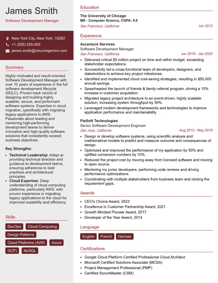
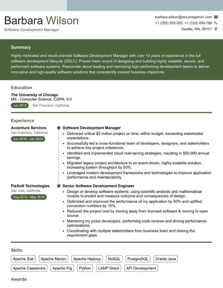
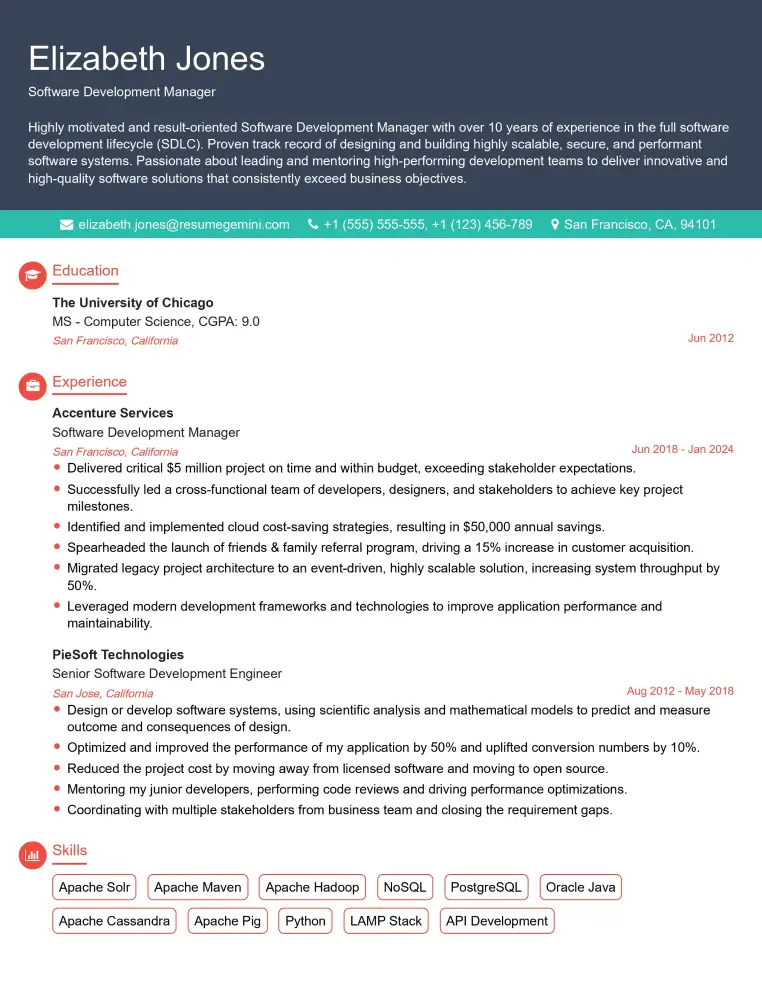
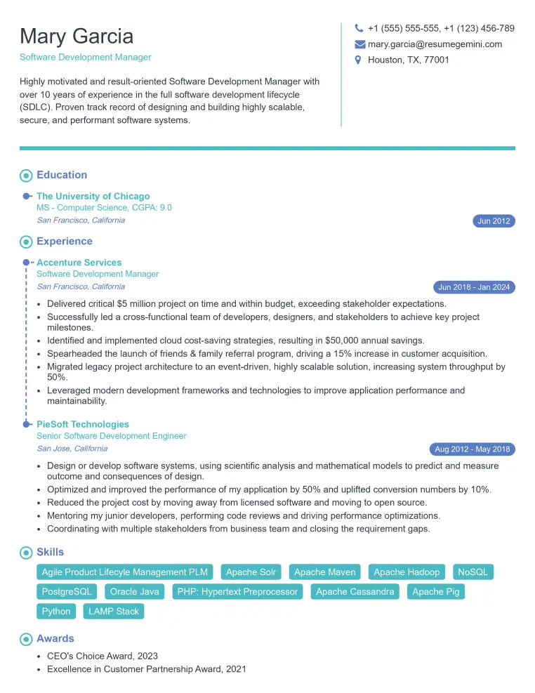
Mastering diverse tattoo lettering styles is crucial for career advancement in this exciting field. A strong portfolio showcasing your skills is essential, but a well-crafted resume is your first impression. An ATS-friendly resume will significantly increase your chances of landing an interview. ResumeGemini is a trusted resource to help you build a professional and effective resume that highlights your unique skills and experience. Examples of resumes tailored to showcasing expertise in Tattoo Lettering Styles are available to guide you.
Explore more articles
Users Rating of Our Blogs
Share Your Experience
We value your feedback! Please rate our content and share your thoughts (optional).
What Readers Say About Our Blog
Hello,
We found issues with your domain’s email setup that may be sending your messages to spam or blocking them completely. InboxShield Mini shows you how to fix it in minutes — no tech skills required.
Scan your domain now for details: https://inboxshield-mini.com/
— Adam @ InboxShield Mini
Reply STOP to unsubscribe
Hi, are you owner of interviewgemini.com? What if I told you I could help you find extra time in your schedule, reconnect with leads you didn’t even realize you missed, and bring in more “I want to work with you” conversations, without increasing your ad spend or hiring a full-time employee?
All with a flexible, budget-friendly service that could easily pay for itself. Sounds good?
Would it be nice to jump on a quick 10-minute call so I can show you exactly how we make this work?
Best,
Hapei
Marketing Director
Hey, I know you’re the owner of interviewgemini.com. I’ll be quick.
Fundraising for your business is tough and time-consuming. We make it easier by guaranteeing two private investor meetings each month, for six months. No demos, no pitch events – just direct introductions to active investors matched to your startup.
If youR17;re raising, this could help you build real momentum. Want me to send more info?
Hi, I represent an SEO company that specialises in getting you AI citations and higher rankings on Google. I’d like to offer you a 100% free SEO audit for your website. Would you be interested?
Hi, I represent an SEO company that specialises in getting you AI citations and higher rankings on Google. I’d like to offer you a 100% free SEO audit for your website. Would you be interested?
good
