Interviews are more than just a Q&A session—they’re a chance to prove your worth. This blog dives into essential Thumbnailing interview questions and expert tips to help you align your answers with what hiring managers are looking for. Start preparing to shine!
Questions Asked in Thumbnailing Interview
Q 1. Explain your process for creating a compelling thumbnail.
Creating a compelling thumbnail is about grabbing attention in a split second. My process is a blend of strategic planning and artistic execution. It starts with a deep understanding of the content itself. What’s the key message? What emotion should it evoke? Then, I brainstorm visual concepts, sketching several ideas before settling on the strongest. This initial phase focuses on clarity and impact – what visual elements will instantly communicate the essence of the video or image? Once I have a strong concept, I move into the design phase, paying close attention to composition, color, and typography. Finally, I iterate and refine based on A/B testing or initial viewer feedback, ensuring the thumbnail is performing as effectively as possible.
- Understanding the Content: Before any design work, I analyze the content’s core message, target audience, and desired outcome.
- Brainstorming & Sketching: I generate multiple thumbnail concepts, sketching quickly to explore various visual possibilities.
- Design & Refinement: I focus on strong composition, color palettes, and typography, using appropriate software.
- Testing & Iteration: I use A/B testing or gather feedback to optimize the thumbnail’s effectiveness.
Q 2. What software are you proficient in for thumbnail creation (e.g., Photoshop, Illustrator, After Effects)?
My proficiency spans several industry-standard software packages. Adobe Photoshop is my go-to for detailed image manipulation, color correction, and retouching. I utilize Adobe Illustrator for creating clean vector graphics and typography, especially when precise scaling is crucial. While I don’t use After Effects extensively for thumbnails themselves, its motion graphics capabilities can inspire creative directions and inform the static design. I am also comfortable using GIMP (a free alternative to Photoshop) for simpler projects or when a less resource-intensive option is preferred. Proficiency in these tools allows me to adapt my workflow to the specific needs of each project and platform.
Q 3. Describe your understanding of color theory and its application in thumbnail design.
Color theory is fundamental to effective thumbnail design. Understanding color harmonies (complementary, analogous, triadic) allows me to create visually appealing and emotionally resonant thumbnails. For instance, using warm colors like reds and oranges can evoke excitement and energy, while cool colors like blues and greens might suggest calmness or tranquility. I consider the psychology of color – how different hues influence viewer perception and association with the content. For example, a thumbnail for a horror movie might use dark, desaturated colors, while a cooking tutorial could employ bright, appetizing tones. Color contrast is crucial for readability and visual hierarchy. The correct application of color helps to instantly convey the tone and subject matter of the content.
I often use color palettes generated from online tools or based on the content’s imagery to ensure consistency and cohesiveness.
Q 4. How do you ensure your thumbnails are optimized for different platforms (e.g., YouTube, Twitter, Instagram)?
Optimization for different platforms requires considering varying aspect ratios and resolutions. YouTube generally favors horizontal thumbnails (1280 x 720 pixels), while Instagram often uses square or vertical formats. Twitter thumbnails are typically smaller. I create source files at a high resolution (e.g., 3000 x 1688 pixels for YouTube), then export optimized versions for each platform, respecting their specific size and format requirements. This ensures the thumbnail looks sharp and clear on any device, regardless of the screen size. Additionally, I compress the files without sacrificing quality to minimize loading times. Each platform has its own best practices, which I carefully follow to maximize visibility and engagement.
Q 5. How do you balance creativity with the need to adhere to platform guidelines and best practices?
Balancing creativity with platform guidelines is a constant exercise in strategic design. I begin by thoroughly researching each platform’s best practices and specifications. This ensures my creative vision doesn’t violate any rules that could hinder visibility (e.g., text size restrictions on YouTube). I then brainstorm concepts within those parameters, leveraging my creative skills to produce eye-catching designs that comply with the guidelines. Think of it as working within a set of constraints; the challenge lies in using these constraints to inform and enhance the creative process rather than limiting it. Sometimes, the most effective thumbnails are the ones that cleverly incorporate the platform’s characteristics into the design itself.
Q 6. How do you incorporate keywords and branding into your thumbnail designs?
Incorporating keywords and branding is crucial for discoverability and brand recognition. Keywords are visually integrated using clear and concise typography. The font choice, style, and size are strategically selected to maximize readability at small sizes. For branding, I use consistent color palettes, fonts, and logos that reinforce the brand’s identity. If the logo isn’t directly incorporated, I strive for a visual style that maintains consistency with other brand assets, creating a sense of familiarity and recognition. The overall goal is to create a thumbnail that is both engaging and easily identifiable with the brand.
Q 7. What are some common mistakes you see in thumbnail design, and how would you avoid them?
Common mistakes I see include blurry or low-resolution images, poor composition, using too much text, or ignoring platform guidelines. Overly cluttered designs or those that don’t accurately represent the content are frequent issues. To avoid these mistakes, I meticulously plan each design, considering the overall composition, using high-quality source images, and ensuring the text is concise and easily readable. I always check the thumbnail’s appearance at various sizes to identify potential issues. Adhering to platform guidelines and testing with A/B testing helps refine the thumbnail’s impact and eliminate ineffective design choices. Ultimately, thorough planning and rigorous quality control are essential to producing effective thumbnails.
Q 8. How do you handle feedback and revisions on your thumbnail designs?
Handling feedback and revisions is crucial for creating effective thumbnails. My approach is iterative and collaborative. I begin by actively listening to the client or team’s feedback, ensuring I understand their concerns and desired changes. I then prioritize the feedback, focusing on the most impactful suggestions first. For example, if feedback points to a confusing visual element, I’ll address that before minor color adjustments. I often create multiple revisions, showcasing different solutions based on the feedback received, and provide detailed explanations for my design choices in each revision. This transparency helps ensure everyone is on the same page and allows for a smooth revision process. I see each revision as an opportunity to refine the design and move closer to the optimal thumbnail.
For instance, if feedback mentions the thumbnail isn’t grabbing attention enough, I might experiment with stronger color contrast, bolder text, or a more dynamic composition in the next revision. Documenting all changes and the reasoning behind them ensures a clear audit trail, making future improvements easier.
Q 9. Explain your approach to A/B testing thumbnails to optimize click-through rates.
A/B testing is essential for optimizing thumbnail click-through rates (CTR). My approach involves creating two or more variations of a thumbnail, each with a different visual element—perhaps a different color palette, text placement, or focal point. These variations are then shown to different segments of the target audience. I use analytics tools to track the CTR for each variation, measuring which performs best. This data-driven approach provides insights into what resonates most effectively with viewers. I don’t rely solely on gut feeling; I let the data guide my design choices.
For example, I might create one version with a bright, bold color scheme and another with a more muted, sophisticated look. By tracking which version receives higher click-through rates, I learn which aesthetic best suits the target audience and content. This process is continuous; I regularly analyze the performance of thumbnails and refine my designs based on ongoing data.
Q 10. Describe your experience with designing thumbnails for different content types (e.g., tutorials, product demos, vlogs).
My experience spans various content types, and each requires a tailored approach. For tutorials, I focus on clarity and instructional cues. I might use arrows, numbers, or visual representations of steps within the thumbnail to convey the tutorial’s nature. Product demos need to showcase the product’s functionality and key benefits. A visually appealing presentation of the product itself is key, combined with impactful text highlighting its advantages. Vlogs require a more personal touch, reflecting the personality and tone of the vlogger. A strong visual representation of the vlogger, perhaps in action, is often critical, accompanied by attention-grabbing text that encapsulates the video’s theme.
For instance, a tutorial thumbnail might showcase a hand pointing to a key element on screen with text like ‘Learn to do X in 5 Easy Steps!’, while a product demo might display the product in use with a benefit highlighted like ‘Boost Your Productivity with Z!’ Finally, a vlog thumbnail featuring the vlogger could contain a headline like ‘My Week in Review: Exciting News!’
Q 11. How do you stay up-to-date with the latest trends and best practices in thumbnail design?
Staying current is paramount in this ever-evolving field. I actively follow industry blogs, online publications, and social media channels dedicated to design and digital marketing. I attend webinars and online courses to learn about the newest design trends, software updates, and best practices. Analyzing successful thumbnails on popular platforms provides valuable insights into what’s working in the market. I also actively participate in online design communities, sharing knowledge and learning from peers. This continuous learning process ensures that my thumbnails remain fresh, engaging, and aligned with current industry standards.
Specifically, I regularly explore platforms like YouTube, Instagram, and TikTok to observe what type of thumbnails are generating the most traction. I analyze the color palettes, composition techniques, and text styles to identify emerging design trends.
Q 12. How do you create visually appealing thumbnails with limited time and resources?
Creating visually appealing thumbnails under time and resource constraints requires a strategic approach. I start by prioritizing the core elements: a strong focal point, clear text, and a consistent brand aesthetic. I leverage readily available resources, such as free stock photos and fonts, efficiently. Using templates can expedite the design process significantly. I focus on simplicity and avoid over-complicating the design. Clean lines, minimal text, and high-contrast colors all contribute to a visually appealing result, even with limited resources.
For example, instead of creating custom illustrations, I might utilize free stock photos and modify them slightly using photo editing software to meet my needs. Similarly, I use readily available fonts and experiment with different color combinations to create impactful visuals.
Q 13. Can you explain your understanding of visual hierarchy and its importance in thumbnail design?
Visual hierarchy is the arrangement of elements in a design to guide the viewer’s eye. In thumbnail design, it dictates which elements are noticed first, second, and so on. A well-structured visual hierarchy ensures the most important information is immediately apparent, leading to better engagement. I employ several techniques to create effective visual hierarchy, including: size (larger elements are more prominent), contrast (bright colors or sharp lines stand out), color (using a dominant color to draw attention), and placement (elements at the center or top tend to be noticed first).
For example, I might place the title of the video in a larger, bolder font at the top of the thumbnail, while using smaller text for any supporting information. Or I might place the most engaging visual element prominently in the center, surrounded by slightly less prominent visuals. Using this approach, even with time constraints, the viewers immediately understand the video’s core message.
Q 14. Describe your experience with creating thumbnails that reflect the content’s tone and style.
Reflecting the content’s tone and style is essential for creating effective thumbnails. My approach involves carefully analyzing the video or content itself. Is it humorous, serious, informative, or exciting? The thumbnail’s visual style must align with this tone. For a humorous video, I might use bright colors, playful fonts, and exaggerated expressions; for a serious documentary, muted tones, clear fonts, and a more professional composition would be appropriate. Color palettes, text styles, and overall visual aesthetics all contribute to conveying the right feeling.
For instance, if a video is a comedic sketch, the thumbnail might feature a funny facial expression or exaggerated pose, whereas a corporate training video might use a more formal and professional image. Consistent branding also plays a large role in maintaining the identity of the content creators.
Q 15. What metrics do you use to assess the effectiveness of your thumbnail designs?
Assessing thumbnail effectiveness goes beyond gut feeling; it requires concrete metrics. I primarily focus on Click-Through Rate (CTR), which directly measures how often a thumbnail entices viewers to click and view the associated content. A high CTR indicates a successful thumbnail. Beyond CTR, I also analyze watch time (for videos) or engagement rate (for other content types). Engagement rate considers likes, shares, comments, and other user interactions, reflecting how captivating the thumbnail is beyond simply attracting clicks. Finally, A/B testing is crucial. I create multiple thumbnail variations and compare their performance using these metrics to identify the most effective design elements.
For example, I recently worked on a client’s YouTube channel. We A/B tested three thumbnail designs – one vibrant and bold, one minimalist and clean, and one with a strong emotional appeal. The bold design had the highest CTR but surprisingly, the emotionally resonant one had the highest watch time, indicating a more engaged audience. This helped us fine-tune our strategy for future thumbnails.
Career Expert Tips:
- Ace those interviews! Prepare effectively by reviewing the Top 50 Most Common Interview Questions on ResumeGemini.
- Navigate your job search with confidence! Explore a wide range of Career Tips on ResumeGemini. Learn about common challenges and recommendations to overcome them.
- Craft the perfect resume! Master the Art of Resume Writing with ResumeGemini’s guide. Showcase your unique qualifications and achievements effectively.
- Don’t miss out on holiday savings! Build your dream resume with ResumeGemini’s ATS optimized templates.
Q 16. How do you ensure your thumbnails are accessible to users with visual impairments?
Accessibility is paramount. For users with visual impairments, I ensure thumbnails are inclusive through alternative text (alt text). This descriptive text provides context for screen readers, allowing visually impaired users to understand the thumbnail’s content. The alt text isn’t just a summary; it’s a concise, compelling description that captures the essence of the image and its relation to the content. I also pay close attention to color contrast, ensuring sufficient difference between text and background to avoid difficulties for users with low vision. Finally, I avoid overly complex visuals that may not translate well for screen readers or users with cognitive impairments, opting for clear and straightforward design choices.
For instance, instead of a busy image with small text, I might create a thumbnail with a clear, dominant image and concise, high-contrast text that describes the content accurately. The alt text would then elaborate on that description, adding context and detail not readily apparent in the visual alone.
Q 17. How do you handle design requests that conflict with your creative vision?
Handling conflicting design requests requires clear communication and compromise. I begin by understanding the client’s rationale behind their requests. Sometimes, their ideas are driven by market trends or specific data they’ve collected. I then present my creative vision, explaining the design principles I’m applying and why I believe they are effective. If a direct conflict arises, I strive to find a middle ground, incorporating aspects of both our ideas to reach a mutually satisfactory design. It’s often a collaborative process of experimentation and iteration. If the client’s requests contradict established best practices or significantly compromise the quality of the thumbnail, I will politely but firmly explain my concerns, offering alternative solutions that still meet their objectives.
For example, a client once insisted on using a cluttered background for a product thumbnail. While it was visually interesting, it detracted from the product itself. I showed them data on the efficacy of clean backgrounds, and we compromised on a slightly more textured background, maintaining a cleaner overall aesthetic while retaining some of the visual appeal they desired. This involved presenting multiple options and data to support my proposal.
Q 18. How do you balance the need for eye-catching visuals with conveying accurate information?
Balancing eye-catching visuals with accurate information is a core challenge in thumbnail design. It’s about creating a visual that is instantly attention-grabbing while simultaneously conveying the true nature of the content. I achieve this by using strong visual cues—bright colors, sharp contrast, and compelling composition—to draw the viewer in. But the visuals must directly relate to the content; a misleading thumbnail is counterproductive. The information conveyed should be accurate and relevant, and the text (if present) must be easily readable and concise. Think of it like a concise, informative advertisement: visually appealing enough to capture attention yet truthful about what is being offered.
For instance, if the content is a tutorial on knitting, the thumbnail shouldn’t showcase unrelated scenes. It should feature knitting needles, yarn, and perhaps the finished product. While the colors can be vibrant to attract attention, the overall visual must be undeniably about knitting. The text could read something like “Learn to Knit in 5 Easy Steps!” – accurate and informative.
Q 19. Explain your understanding of composition and its role in thumbnail design.
Composition is the art of arranging visual elements within a frame to create a balanced and engaging image. In thumbnail design, a well-composed thumbnail is key to grabbing attention. I use various principles: Rule of Thirds (placing key elements off-center for visual interest), leading lines (using lines to guide the viewer’s eye), and visual weight (balancing elements to avoid visual clutter). Understanding these principles allows me to create thumbnails that are not only visually appealing but also lead the viewer’s gaze to the most important information.
For instance, I might use the rule of thirds to position the main subject of the thumbnail off-center, creating a more dynamic and engaging composition. Or I might use leading lines—a road, a fence, or even a person’s gaze—to guide the viewer’s eye toward the call to action or the most important element of the image.
Q 20. How do you create thumbnails that stand out from the competition?
Creating thumbnails that stand out requires understanding the competitive landscape. I begin by analyzing competitors’ thumbnails—identifying trends, common elements, and areas where they lack originality. Then, I identify a unique selling proposition (USP)—what makes the content distinct and valuable. The thumbnail should visually communicate this USP. This often involves experimenting with different styles, colors, and compositions—finding a visual language that is both eye-catching and instantly recognizable as belonging to a specific brand or content creator. Consistent branding, use of unique color schemes, and incorporating unexpected or playful elements can also make a thumbnail stand out.
For instance, if I am creating thumbnails for a cooking channel that already utilizes a lot of bright and colorful imagery, I might opt for a minimalist design with striking typography to create contrast and stand out amidst the visually busy competition. Conversely, in a sea of minimalist designs, a bold and vibrant approach could be effective. Constant analysis of the competitive landscape and testing are key.
Q 21. What are your preferred techniques for creating engaging text overlays on thumbnails?
Engaging text overlays require careful consideration of typography, placement, and readability. I favor clean, modern fonts that are easy to read, even at small sizes. I avoid overly stylized or decorative fonts that could hinder readability. The text should be concise and impactful, conveying essential information without overwhelming the image. I use high-contrast colors to ensure readability against the background image. The placement of text is also crucial; I strategically position it to avoid obscuring important visual elements and to maintain a balanced composition. Finally, I use techniques like drop shadows or outlines to improve the legibility of the text, particularly when the background image is complex or busy.
For instance, instead of using a complex script font, I might opt for a clean sans-serif font like Open Sans or Roboto for readability. The text will be short, punchy, and placed over a less-busy part of the background image. I may then add a drop shadow to the text for enhanced visibility against the background image.
Q 22. How do you ensure your thumbnails are consistent with a brand’s overall style guide?
Maintaining brand consistency in thumbnails is crucial for building a recognizable identity. It’s about translating the brand’s visual language – its colors, typography, imagery style, and overall tone – into miniature, yet impactful representations.
My process begins with a thorough review of the brand’s style guide. This guide acts as a blueprint, outlining approved colors (including hex codes), fonts, logos, and even the preferred image treatment (e.g., photorealistic, illustrative, abstract). I pay close attention to details like the logo placement, color palettes, and the overall mood the brand aims to project.
For example, if I’m working on thumbnails for a tech company known for its minimalist aesthetic and cool blue tones, I’d ensure the thumbnails reflect this by using clean lines, a simple color palette dominated by blues and greys, and sharp, modern imagery. Conversely, a handmade soap company might require warmer colors, rustic textures, and a more organic feel. I always keep a digital copy of the style guide open during the design process to ensure adherence.
Q 23. Describe a time you had to overcome a design challenge while creating a thumbnail.
I once faced a challenge creating thumbnails for a client’s historical documentary series. The client wanted thumbnails that were both visually captivating and historically accurate, which proved difficult with the limited-resolution archival footage available. Many images were grainy, low-resolution, and lacked strong visual elements.
To overcome this, I employed several strategies. First, I meticulously cleaned up the source footage using image editing software, carefully removing scratches, dust, and other imperfections. This was time-consuming but essential. Second, I experimented with color grading to enhance the mood and visual impact without compromising historical accuracy. Third, I incorporated subtle graphic elements—like carefully placed overlays or text treatments—to draw the viewer’s eye to the most important aspects of the image, creating focal points that might have been absent in the original footage. The end result was a set of thumbnails that were both historically respectful and visually compelling, successfully reflecting the content of the documentary.
Q 24. How familiar are you with image compression techniques and their impact on thumbnail quality?
I’m very familiar with image compression techniques and their crucial role in thumbnail creation. The goal is to achieve a balance between maintaining visual quality and minimizing file size for fast loading times. Poorly compressed thumbnails can lead to blurry, pixelated images, negatively impacting click-through rates.
Common formats like JPEG and WebP offer different compression levels. JPEG is widely supported and offers good compression for photographic images, while WebP generally provides better compression with less loss of quality. I usually start with WebP if the platform supports it, and fall back to JPEG if needed. I often use lossy compression, carefully adjusting the compression level to find the optimal point where the image quality remains acceptable for the thumbnail size. For example, a thumbnail that is 120×90 pixels can tolerate much more compression than a larger image without any significant loss in visual appeal. Understanding the platform requirements (size limits, preferred formats) is also critical.
Q 25. Describe your workflow from initial concept to final thumbnail delivery.
My thumbnail workflow is a structured process designed to ensure efficiency and quality. It typically involves these steps:
- Concept and Research: I begin by understanding the content and target audience. I analyze keywords, perform competitive analysis, and explore potential design directions.
- Sketching and Mood Boarding: I create rough sketches and a mood board to explore various visual styles and compositions.
- Software and Design: I use design software like Adobe Photoshop or Figma to create the thumbnail. This involves selecting appropriate images, typography, and color palettes, guided by the brand’s style guide and my initial sketches.
- Testing and Iteration: I regularly check the thumbnail on different devices and screen sizes to ensure consistency and responsiveness. This often involves A/B testing different variations.
- Optimization and Delivery: Finally, I optimize the thumbnail for size and performance using appropriate compression techniques, before delivering the final files in the required format and dimensions.
Q 26. What are your strategies for brainstorming and generating thumbnail ideas?
Generating compelling thumbnail ideas requires a strategic approach. I use a combination of techniques:
- Keyword Research: Analyzing relevant keywords helps me understand what users search for, providing valuable insights into what makes a thumbnail effective.
- Competitive Analysis: Reviewing competitor thumbnails gives me ideas and allows me to identify areas for improvement or differentiation.
- Brainstorming Sessions: I often conduct brainstorming sessions, employing techniques like mind mapping, to generate a wide range of concepts. This can involve sketching, writing down ideas, and creating mood boards.
- Reverse Image Search: Sometimes, I use reverse image search to see how others have visually represented similar content, finding inspiration and generating different design concepts.
The key is to think outside the box and explore unexpected approaches, while maintaining relevance to the content and brand identity.
Q 27. How do you use data and analytics to inform your thumbnail design decisions?
Data and analytics play a vital role in informing my design decisions. I regularly track key metrics to measure the effectiveness of different thumbnail designs. This usually involves A/B testing – creating multiple variations of a thumbnail and analyzing which performs better based on metrics such as click-through rate (CTR), watch time, and conversion rates.
Tools like Google Analytics provide valuable data on user behavior, helping me understand which thumbnails resonate most with the target audience. By analyzing this data, I can identify patterns and trends, enabling me to refine my designs and improve their effectiveness over time. For example, if I find that thumbnails with a particular color scheme consistently outperform others, I’ll incorporate those color choices into future designs. This data-driven approach ensures that my designs are not only visually appealing but also optimized for maximum impact.
Key Topics to Learn for Thumbnailing Interview
- Understanding Design Principles: Explore the core principles of visual communication, including composition, color theory, and typography, as they apply to thumbnail creation.
- Target Audience Analysis: Learn how to tailor thumbnails to specific demographics and platforms to maximize engagement and click-through rates.
- Software Proficiency: Demonstrate familiarity with industry-standard image editing software and tools used for thumbnail creation and optimization (e.g., Photoshop, GIMP).
- Thumbnail Sizing and Formats: Master the technical aspects of creating thumbnails in various sizes and formats optimized for different platforms (e.g., YouTube, social media).
- A/B Testing and Iteration: Discuss strategies for testing different thumbnail designs and iterating based on performance data to continuously improve results.
- Branding and Consistency: Explain how thumbnails contribute to a cohesive brand identity across different channels.
- File Optimization for Web: Understand the importance of compressing images for faster loading times and improved user experience.
- Accessibility Considerations: Discuss how to create inclusive thumbnails that are accessible to users with disabilities.
- Visual Storytelling: Explain your understanding of using visuals to convey a compelling narrative within the constraints of a thumbnail.
- Problem-Solving and Creative Approaches: Be prepared to discuss your approach to creative challenges and how you would overcome obstacles in the thumbnail creation process.
Next Steps
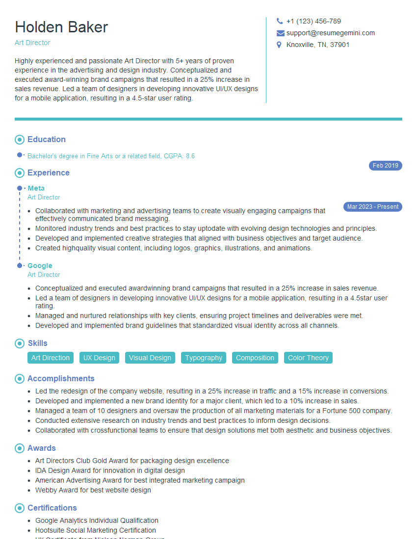
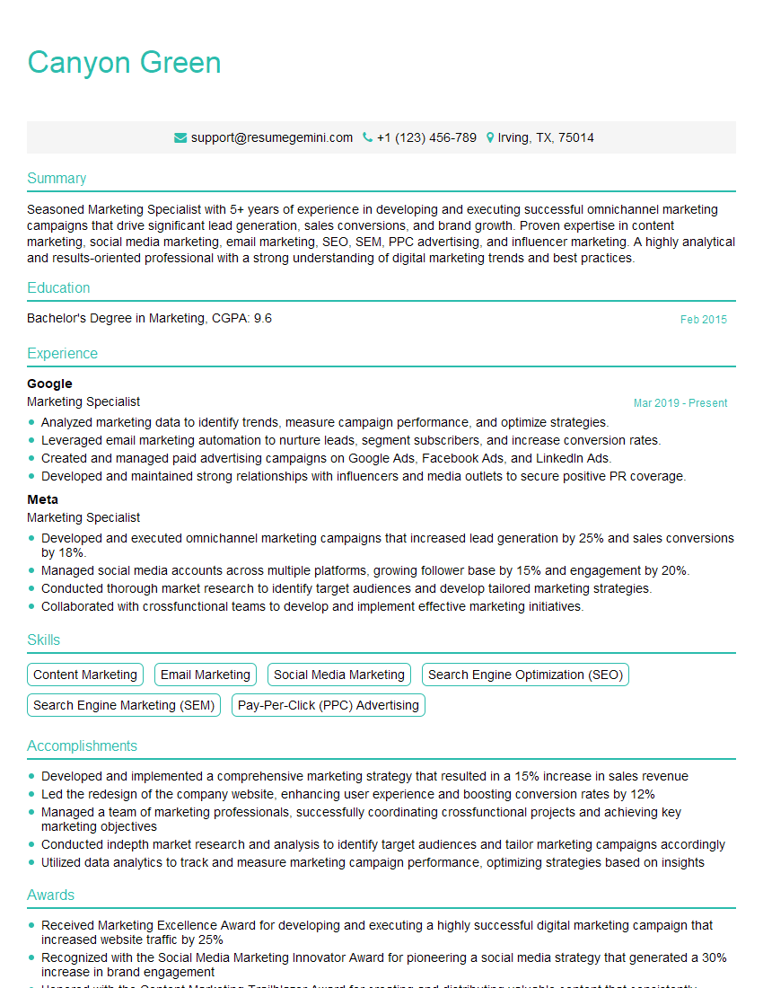
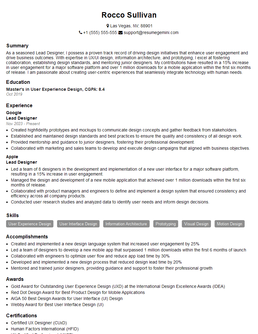
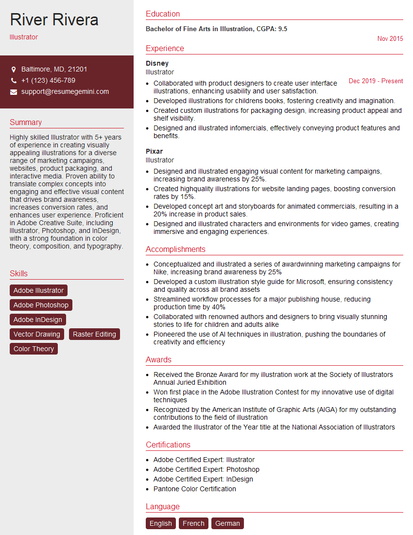
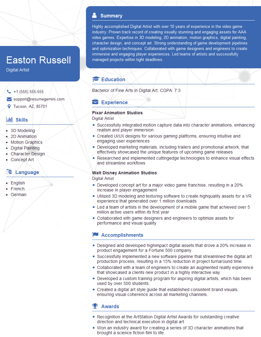
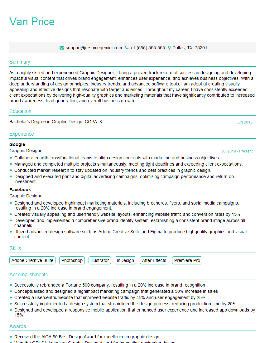
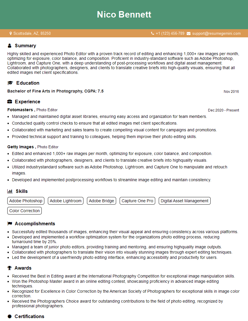
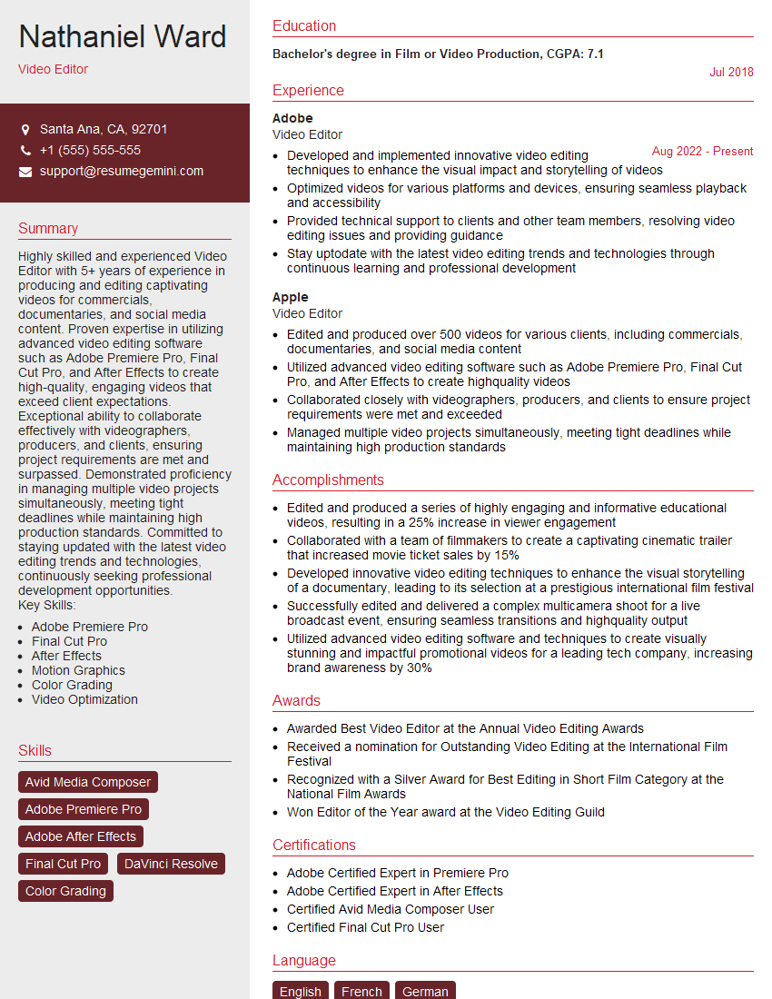
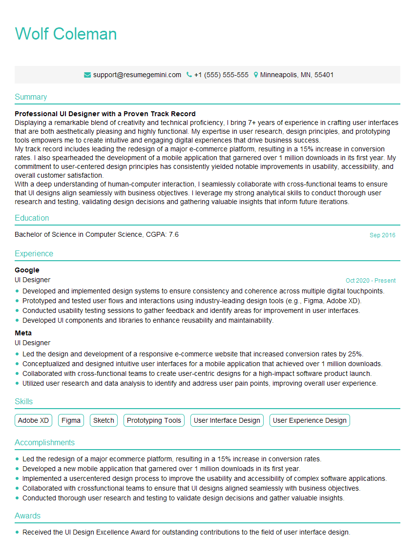
Mastering thumbnailing is crucial for success in today’s visual-driven world, opening doors to exciting opportunities in marketing, social media, and design. A strong portfolio showcasing your skills is essential, but equally important is presenting yourself effectively through a well-crafted resume. An ATS-friendly resume significantly increases your chances of getting noticed by recruiters. We recommend using ResumeGemini to create a professional and impactful resume tailored to the Thumbnailing field. Examples of resumes optimized for this skillset are available to guide you through the process.
Explore more articles
Users Rating of Our Blogs
Share Your Experience
We value your feedback! Please rate our content and share your thoughts (optional).
What Readers Say About Our Blog
good
