Feeling uncertain about what to expect in your upcoming interview? We’ve got you covered! This blog highlights the most important Typesetting and Composition interview questions and provides actionable advice to help you stand out as the ideal candidate. Let’s pave the way for your success.
Questions Asked in Typesetting and Composition Interview
Q 1. Explain the difference between kerning and tracking.
Kerning and tracking both adjust the spacing between characters, but they do so at different levels. Think of it like this: tracking is adjusting the overall spacing of a paragraph, while kerning is fine-tuning the space between individual letter pairs.
Tracking is the global adjustment of space between all characters in a selected block of text. It’s measured in points or em spaces, and increasing tracking makes the text appear more spread out, while decreasing it makes it more condensed. You might use tracking to adjust line length in a justified paragraph, or to create a more open feel in a headline.
Kerning, on the other hand, is the precise adjustment of space between specific pairs of letters. Some letter combinations, like ‘AV’ or ‘To’, naturally have too much or too little space between them. Kerning allows for manual adjustment to improve readability and aesthetics. Sophisticated typesetting software often automatically kerns pairs, but manual adjustments are sometimes necessary for optimal results. For example, the ‘A’ and ‘V’ often need their space reduced for a cleaner look.
In short: tracking affects the whole selection, kerning affects individual letter pairs. A good typesetter understands how to use both effectively.
Q 2. What are widows and orphans in typesetting, and how do you avoid them?
Widows and orphans are typographical terms referring to undesirable line breaks. A widow is a single line of text left stranded at the top of a page or column, while an orphan is a single line of text stranded at the bottom. They disrupt the visual flow and can look unprofessional.
Avoiding them often requires a bit of creative problem-solving. Here are a few strategies:
- Adjusting hyphenation and justification: Carefully controlling hyphenation and allowing for some flexibility in justification can help break up lines to avoid widows and orphans.
- Adding or removing content: Sometimes, adding or deleting a word or two can be enough to eliminate the problem, though this isn’t always possible.
- Rephrasing sentences: Rewriting a sentence to be slightly longer or shorter might redistribute lines perfectly.
- Using the ‘no break’ feature (often denoted as a non-breaking space): This character prevents a line break within a certain phrase (such as a name or number).
- Manually adjusting line breaks: In some cases, this might be necessary, although ideally one should avoid extensive manual intervention in favour of smart typesetting practices.
The best approach is often a combination of these methods. Experienced typesetters develop an intuitive feel for anticipating and preventing widows and orphans even before they appear.
Q 3. Describe your experience with different typesetting software (e.g., InDesign, QuarkXPress).
I have extensive experience with both Adobe InDesign and QuarkXPress, having used them extensively throughout my career for a wide variety of projects, from brochures and books to magazines and annual reports. InDesign is my primary software, thanks to its superior features for complex layouts and workflow integration within the Adobe Creative Suite. It excels at handling extensive projects with linked files, styles and master pages. QuarkXPress, while still a viable option, doesn’t offer the same level of sophisticated features or user-friendliness, though I’m completely comfortable using it as needed.
I’m proficient in leveraging the advanced typographic controls in both programs, including precise kerning, tracking, hyphenation, and the creation and application of paragraph and character styles for ensuring consistency and efficiency. My workflow includes the strategic use of stylesheets in order to ensure design consistency across even the largest projects.
Q 4. What are your preferred methods for ensuring consistent font usage across a document?
Maintaining consistent font usage is crucial for professional-looking documents. My preferred methods involve:
- Using paragraph and character styles: This is by far the most efficient method. Defining specific styles for headings, body text, captions, etc., ensures that font size, weight, and style remain consistent throughout.
- Creating a style guide: A style guide explicitly defines font usage, sizing, and hierarchy for every element in the document. This ensures everyone working on the project adheres to the standards.
- Font management software: Tools like Suitcase Fusion (Adobe) or FontExplorer X provide a centralized management system for fonts. This avoids conflicts and missing fonts.
- Embedding fonts in the final document (where appropriate): Embedding fonts in PDFs ensures that the correct font displays on any system, preventing unexpected substitutions.
By implementing these methods, I can ensure that even the most extensive projects maintain a visually cohesive and professional look and feel. This not only improves the look but greatly speeds up the process.
Q 5. How do you handle complex layouts with multiple columns and images?
Handling complex layouts with multiple columns and images requires a structured approach. I typically employ these strategies:
- Master pages: Creating master pages with pre-defined columns and guides provides a consistent foundation for every page.
- Text boxes and frames: Precisely placed text boxes and image frames allow for complete control over the placement and flow of content.
- Grid systems: Utilizing grid systems ensures consistent alignment and spacing, making it easy to manage complex layouts effectively and producing visually balanced pages. This is especially important with image heavy layouts.
- Use of text wrap features: This feature enables images to sit within the flow of text without disrupting the design. Different options allow for fine-grained control.
- Layer management: Effectively organizing images and text within layers simplifies the editing process, especially for intricate designs.
Through careful planning and the use of these tools, I can manage intricate layouts effectively, resulting in polished and easy-to-navigate documents.
Q 6. Explain your understanding of color management in prepress.
Color management in prepress is critical for ensuring accurate color reproduction in the final printed piece. It involves a series of steps to maintain consistency across different devices and output methods.
My understanding includes:
- Color profiles: Understanding and assigning appropriate color profiles (e.g., sRGB, Adobe RGB, CMYK) to images and documents is fundamental. This ensures that the colors displayed on screen accurately reflect the intended printed colors.
- Color space conversion: Converting from RGB (used on screens) to CMYK (used in printing) requires careful management to avoid color shifts. Software often includes color management tools which allow one to choose conversion settings.
- Proofing: Soft proofs and hard proofs are essential to verify the accuracy of the colors before sending the files to print. A soft proof allows checking colors on screen, while a hard proof provides a printed sample.
- Working with a color calibrated monitor: A properly calibrated monitor is essential for accurate color assessment during design. Regular calibration using professional tools is a crucial step.
By meticulously managing each of these aspects, I can guarantee that the final printed output matches the design intent.
Q 7. Describe your experience with different file formats used in typesetting (e.g., PDF, EPS, TIFF).
I have extensive experience with various file formats used in typesetting. Each serves a specific purpose, and understanding their strengths and limitations is vital.
- PDF (Portable Document Format): The industry standard for final output. It preserves layout, fonts, and images accurately across different platforms and maintains print quality. Different PDF presets (e.g., print, web) allows for flexibility.
- EPS (Encapsulated PostScript): Primarily used for vector graphics, such as logos or illustrations. It maintains high resolution regardless of scaling and offers great flexibility for editing in vector graphic software.
- TIFF (Tagged Image File Format): Suitable for high-resolution raster images (photographs). Allows for lossless compression, preserving image quality for optimal print results.
- JPEG (Joint Photographic Experts Group): While efficient, JPEG compression is lossy and usually not suitable for print purposes, except for low-resolution images like small web graphics.
Choosing the appropriate file format depends on the content and intended use. I always prioritize high-resolution formats for print projects to maintain the highest image quality and avoid pixelation.
Q 8. How do you ensure the accuracy and consistency of your typesetting work?
Accuracy and consistency in typesetting are paramount. I achieve this through a multi-faceted approach. First, I meticulously proofread all content, checking for spelling, grammar, and factual errors before even beginning the typesetting process. This initial check significantly reduces downstream corrections. Second, I utilize style guides and templates rigorously. These documents define consistent formatting rules for everything from headings and body text to captions and footnotes. This ensures uniformity throughout the entire document. Third, I leverage the power of styles in my typesetting software (e.g., InDesign, QuarkXPress). Styles allow me to apply formatting changes globally with a single click, minimizing manual adjustments and guaranteeing consistency. Fourth, I employ automated quality checks within the software, such as spell checkers and hyphenation tools. Finally, a final proofing stage, often with a second pair of eyes, is critical for catching any overlooked errors.
For example, imagine setting a book. A style guide might stipulate a specific font (e.g., Times New Roman), point size (12pt), and leading (14pt) for the body text. By using styles, any change to the body text font size automatically updates every instance across the entire document, preventing inconsistencies.
Q 9. How familiar are you with the principles of typography, such as leading, point size, and x-height?
I’m extremely familiar with typographic principles. Leading refers to the vertical space between lines of text, measured in points. Sufficient leading improves readability by preventing text from appearing cramped. Point size measures the height of type, also in points. A larger point size yields larger characters. X-height refers to the height of lowercase ‘x’ in a given font, and it significantly impacts readability; a larger x-height generally makes text easier to read. Understanding these principles is vital for creating aesthetically pleasing and highly readable documents.
For instance, choosing an appropriate leading is crucial. Too little leading makes the text dense and hard to read, while too much can make it appear sparse and unprofessional. Similarly, choosing the correct point size depends on the context: a large point size might be suitable for headlines, while a smaller point size would be better for body text. The x-height, often overlooked, is a key factor in choosing fonts for readability, especially in body text.
Q 10. What is your process for creating a table of contents?
Creating a table of contents is a systematic process that relies on proper document structuring. First, I ensure all headings and subheadings in the document are properly formatted and styled using consistent heading styles within my typesetting software. This allows the software to automatically generate the table of contents. I then use the software’s built-in functionality to generate the table of contents, which automatically extracts heading information based on the styles applied. I meticulously check the generated table of contents for accuracy, page numbers, and proper hierarchy. If needed, I can manually adjust page numbers if there have been significant layout changes. This ensures the table of contents accurately reflects the structure and pagination of the final document. Finally, the table of contents is formatted to match the overall document’s style, ensuring consistency.
Think of it like building a house. The headings are like the main structural elements, and the table of contents is the blueprint that shows how those elements are connected and where they are located.
Q 11. How do you manage image resolution and compression for print?
Managing image resolution and compression for print is critical for achieving high-quality results. For print, images require high resolution (typically 300 DPI or higher) to avoid pixelation or blurring. I begin by verifying the original image resolution. Images below 300 DPI need to be resampled to a higher resolution. However, over-sharpening can create artifacts. For compression, I use lossy compression (like JPEG) for photographs, balancing file size reduction with image quality. Lossless compression (like PNG) is used for images with sharp lines and text, preserving detail. The key is to find the optimal balance between file size and quality, ensuring the images are sharp and clear without unnecessary bloat which can affect printing speed and costs.
For example, a photograph used for a book cover would be compressed using JPEG to a reasonable size, while a logo would use PNG to avoid any loss of detail. Using tools like Adobe Acrobat Pro allow for precise image compression and quality control.
Q 12. Describe your experience with creating styles and templates in typesetting software.
Creating styles and templates is a core part of my typesetting workflow. I’m proficient in developing styles and templates in InDesign, leveraging their functionality to create consistent and efficient workflows. A template defines the overall structure and layout (page sizes, margins, columns), while styles manage individual elements (paragraphs, headings, lists). I create modular styles to easily adapt to various content requirements. Templates save significant time by providing a pre-defined structure, ensuring consistency across multiple documents or projects. Styles enable global changes—modify a style, and every instance of that style updates instantly, ensuring consistency. I often build styles that include specific typography, paragraph formatting, and even custom objects for consistent visual elements like chapter headings.
Imagine building a website with CSS. The styles are like the CSS rules, providing consistent styling to elements throughout the site. Templates are like pre-built website layouts, giving a solid foundation to start from.
Q 13. How do you troubleshoot common typesetting issues such as font substitution or missing images?
Troubleshooting typesetting issues is a regular part of my work. Font substitution often arises from missing fonts on the system. The solution involves either installing the missing fonts or substituting them with similar fonts while preserving the document’s overall aesthetic. Missing images are usually due to incorrect file paths or corrupted files. I systematically verify file paths, check for file corruption, and replace missing or corrupted files with corrected versions. Other common issues include incorrect hyphenation, widow/orphan control, and unexpected page breaks. These are typically solved through adjustments to style settings, paragraph formatting or manual intervention.
For font issues, my approach starts by identifying the missing font, and then replacing it with a visually similar alternative from a readily available font family. If images are missing, I’ll check file paths, look for backup files and if all else fails contact the client to provide the correct image files.
Q 14. Explain your experience with imposition and printing workflows.
Imposition is the process of arranging pages for printing, and my experience encompasses various techniques depending on the printing method (e.g., sheet-fed, web-fed). I understand imposition schemes for different sheet sizes and binding types. I’m proficient in using imposition software, ensuring correct page order, orientation, and imposition marks (crop marks, color bars, registration marks). My printing workflows involve preparing files according to the printer’s specifications, including color profiles, resolution, and file formats. I collaborate with printers, reviewing proofs and making necessary adjustments to ensure the final printed product aligns with the design intent.
Think of imposition like arranging tiles on a floor. You need to precisely arrange the tiles to ensure the pattern is correct and all the tiles fit together seamlessly. In printing, we ‘arrange’ the pages onto the printing sheet to ensure efficient and accurate printing.
Q 15. What quality control measures do you employ to ensure error-free output?
Quality control in typesetting is paramount to delivering a professional and error-free product. My approach is multi-layered, combining automated checks with meticulous manual review.
Automated Checks: I utilize software like Adobe InDesign’s built-in spell and grammar checkers, as well as pre-flight tools that identify potential issues like missing fonts, incorrect image resolutions, or overset text. These automate the initial detection of many common errors.
Manual Proofreading: This is where my expertise truly comes in. I follow a systematic approach, proofing the document multiple times, each time focusing on a different aspect: first, for spelling and grammar, then for consistency in style and formatting (e.g., consistent use of headings, capitalization, and punctuation), and finally for overall visual appeal and readability. This ensures nothing slips through the cracks.
Comparative Proofing: For complex projects, I often employ comparative proofing, comparing the typeset document against the original manuscript to identify any discrepancies. This step minimizes any potential deviations from the client’s intent.
Client Review & Feedback: Finally, before final output, I always share a proof with the client for their review and approval. This collaboration is crucial to ensuring the final product meets their expectations and specifications.
Think of it like baking a cake; automated checks are like the measuring cups and scales – essential tools, but they don’t guarantee a perfect cake. Manual proofreading is the final taste test and adjustment ensuring perfection.
Career Expert Tips:
- Ace those interviews! Prepare effectively by reviewing the Top 50 Most Common Interview Questions on ResumeGemini.
- Navigate your job search with confidence! Explore a wide range of Career Tips on ResumeGemini. Learn about common challenges and recommendations to overcome them.
- Craft the perfect resume! Master the Art of Resume Writing with ResumeGemini’s guide. Showcase your unique qualifications and achievements effectively.
- Don’t miss out on holiday savings! Build your dream resume with ResumeGemini’s ATS optimized templates.
Q 16. Describe your experience with working under tight deadlines.
Working under tight deadlines is a regular part of my job, and I’ve developed strategies to manage time effectively. I prioritize tasks based on urgency and importance, focusing on the most critical elements first.
For instance, I recently worked on a 300-page textbook with a tight turnaround. I broke down the project into smaller, manageable sections, assigning deadlines to each phase. I utilized project management tools to track progress and allocate my time efficiently. Open communication with the project manager was crucial to ensuring any delays were addressed proactively. I’m comfortable working under pressure while maintaining accuracy and high-quality output.
My experience has taught me the importance of efficient workflow management, and I have excellent time management skills, built on years of experience in the industry.
Q 17. How do you collaborate effectively with other members of a publishing team?
Collaboration is key in publishing. I value open communication and proactive interaction with authors, editors, designers, and printers.
Clear Communication: I regularly attend project meetings, actively participate in discussions, and seek clarification on any ambiguity. I use collaborative platforms to share files and track progress, ensuring everyone is on the same page.
Feedback Incorporation: I’m receptive to feedback and actively incorporate suggestions from other team members, ensuring a cohesive final product. This collaborative approach makes the final product better than any one individual could produce on their own.
Respectful Communication: I maintain a professional and respectful demeanor throughout the process, understanding that a collaborative environment requires mutual respect and understanding.
For example, on a recent project involving a complex layout, I worked closely with the designer to ensure the text flowed seamlessly with the images, optimizing the visual appeal and readability of the publication.
Q 18. What software are you proficient in for proofing and quality assurance?
My proficiency extends across several industry-standard software packages crucial for proofing and quality assurance.
Adobe InDesign: This is my primary tool, providing comprehensive features for typesetting, layout, and pre-flight checks. I utilize its spell checker, grammar checker, and pre-flight tools extensively.Adobe Acrobat Pro: Essential for creating PDFs, Acrobat Pro enables me to perform comprehensive PDF quality assurance, including checking for accessibility, tagging, and print readiness.Microsoft Word(for initial manuscript review): While not a primary typesetting tool, I effectively use Word for initial review of manuscripts, flagging potential issues before they become larger problems in the design phase.
My expertise lies not just in knowing the tools, but in knowing how to leverage their capabilities to optimize workflow and identify even subtle errors.
Q 19. How do you handle revisions and feedback on typesetting projects?
Handling revisions and feedback is a crucial aspect of my workflow. I approach each revision systematically, ensuring that all changes are incorporated accurately and efficiently.
Organized Tracking: I maintain meticulous records of all revisions, using version control and commenting features in the software to track changes made across different iterations. This aids in minimizing errors and maintaining clarity.
Clear Communication: I maintain open communication with the client throughout the revision process, asking for clarification on any ambiguous feedback and providing updates on progress. This fosters transparency and mutual understanding.
Thorough Proofreading: After incorporating all revisions, I thoroughly proofread the entire document, ensuring that all changes have been implemented correctly and that no new errors have been introduced. This final check guarantees a high-quality finished product.
For example, in one instance, a client requested extensive changes to a chapter’s layout after the initial version was approved. I carefully tracked all revisions using InDesign’s commenting tools, ensuring clarity and transparency and enabling me to seamlessly and accurately integrate them into the final product.
Q 20. Explain your experience with different types of paper and their suitability for different printing methods.
Paper selection is critical for achieving the desired print quality and overall aesthetic. My experience encompasses a wide range of paper types and their suitability for various printing methods.
Coated Papers: These papers have a smooth, coated surface, ideal for high-resolution images and vibrant colors. They are commonly used for magazines, brochures, and high-quality books. Offset printing works very well with coated papers.
Uncoated Papers: These papers have a more natural, matte finish, better suited for text-heavy documents. They provide a warmer, less reflective surface, enhancing readability. They are often used for books, stationery, and business documents. They work well with various printing methods including offset and digital printing.
Specialty Papers: These papers include textured papers, recycled papers, and various colored papers, each bringing a unique feel and visual appeal. Consideration needs to be made for the printing method used, as some papers may not be suitable for all printing techniques.
For instance, a glossy magazine would require a high-quality coated paper for optimal image reproduction using offset printing, while a novel might use a less expensive uncoated paper appropriate for digital printing or offset printing depending on the desired level of quality and budget.
Q 21. How familiar are you with the concept of bleed?
Bleed refers to the extra area of an image or design that extends beyond the final trim size of a printed piece. This is crucial to prevent unsightly white borders around the edges after trimming.
Imagine you’re designing a postcard. If the image extends to the edge of the design, it needs to extend slightly beyond the final trim size (bleed). The printer will then trim the excess, ensuring no white borders appear.
The typical bleed allowance is around ⅛ inch (3mm) on all sides. A clear understanding of bleed is essential to avoid costly reprints. I always ensure that all designs, especially those with images extending to the edges, include the appropriate bleed margins in the design files.
Q 22. What are your strategies for optimizing files for different output methods (e.g., print, web)?
Optimizing files for different output methods hinges on understanding the specific requirements of each medium. Print requires high resolution for crisp detail, while web prioritizes smaller file sizes for faster loading. My strategies involve a multi-step process:
Resolution: For print, I use high-resolution images (300 DPI or higher) and ensure fonts are outlined to avoid rendering issues. For web, I optimize images to 72 DPI and use web-friendly formats like JPEG or WebP, balancing quality with file size. I might even use responsive images with different resolutions for various screen sizes.
File Formats: For print, I typically work with PDF/X-1a or PDF/X-4 for guaranteed color consistency. For web, I might use PNG for images with transparency and JPEG for photographs. SVGs are ideal for scalable vector graphics.
Color Spaces: Print usually uses CMYK, while web uses RGB. I carefully manage color profiles to ensure accurate color reproduction across platforms. Converting from RGB to CMYK requires careful consideration, as some colors may not translate perfectly.
Compression: Web images need compression to reduce file size without significant quality loss. I use tools like Adobe Photoshop or dedicated image optimization software to achieve this balance. For print, over-compression should be avoided to prevent artifacts.
Font Embedding: For print, embedding fonts ensures consistent appearance across different systems. For web, choosing web-safe fonts or embedding fonts carefully is crucial to avoid browser inconsistencies. I use services such as Google Fonts to handle this effectively.
For example, I recently worked on a project requiring both a printed brochure and a corresponding webpage. I created high-resolution CMYK images for print and then exported optimized RGB versions for the web, significantly reducing file sizes without compromising visual appeal.
Q 23. Explain your understanding of color profiles and their importance in prepress.
Color profiles are crucial in prepress because they define the relationship between colors on screen and how they’ll appear in the final printed output. They act as a translator, ensuring consistency across different devices and workflows. A color profile is essentially a set of data that describes the color characteristics of a specific device (monitor, printer, scanner). Without proper color management, the colors you see on your screen might differ significantly from the printed result, leading to costly reprints and client dissatisfaction.
In prepress, I use ICC (International Color Consortium) profiles. These profiles standardize color representation. Common profiles include sRGB (web), Adobe RGB (wider gamut for photography), and various printer-specific profiles. It is critical to ensure all components of the workflow – images, software, and output devices – use consistent profiles to avoid color shifts. For example, if my images are in sRGB and the printer expects Adobe RGB, I’ll need to convert the images, using appropriate software such as Adobe Acrobat or dedicated color management tools. Mismatched color profiles can result in dull, oversaturated, or otherwise inaccurate colors in the final product.
Q 24. How do you handle different font encoding standards?
Handling different font encoding standards is essential to prevent text display problems. Encoding dictates how characters are represented numerically, and inconsistencies can lead to garbled text, missing glyphs, or incorrect character substitutions. My approach involves:
Identifying the Encoding: First, I carefully identify the encoding used in the document. Common encodings include UTF-8 (universal and recommended), Windows-1252 (common in older Western European documents), and others like MacRoman or ISO-8859-1. Incorrect identification can lead to immediate problems.
Using Appropriate Software: I use design software that supports a wide range of encodings and provides tools for encoding conversion or verification. Modern software typically offers built-in tools to manage encodings.
Font Selection: The chosen font must support the characters encoded in the text. I carefully vet fonts, ensuring they are compatible with the specified encoding.
Conversion (when needed): If necessary, I carefully convert the encoding to a universally compatible one like UTF-8 to avoid issues during the production process. Incorrect conversion may introduce new characters or cause loss of data.
Preflighting: I utilize preflighting tools to check for encoding errors and ensure all fonts are properly embedded or referenced, and I may conduct visual inspection to verify all characters display correctly in my chosen software.
For instance, I once encountered a document using an outdated encoding scheme resulting in several characters displaying incorrectly. By identifying the encoding and converting the document to UTF-8, and choosing an appropriate font, I resolved the issue, preventing a significant delay in the project timeline.
Q 25. What is your preferred workflow for managing large projects?
For large projects, I rely on a structured workflow that prioritizes organization and collaboration. My preferred workflow involves:
Project Management Software: I use project management software like Asana or Jira to create task lists, assign responsibilities, and track progress. This allows for easy communication, even for distributed teams.
Version Control: I use version control systems like Git to manage document revisions, allowing for easy collaboration and tracking of changes. This allows for collaborative work and rollback if needed.
File Organization: I establish a clear and consistent file naming and folder structure. This ensures that locating files and assets is quick and efficient, reducing time wasted searching.
Style Guides: I use style guides (or create one if it’s missing) to maintain design consistency and ensure a unified brand image throughout the project. Consistency across assets saves time and improves the overall look.
Regular Check-ins: Regular meetings with the team keep everyone updated on progress, allowing for early identification and resolution of any potential issues.
This system allows for efficient teamwork, easy tracking of progress, and minimization of errors, essential for delivering large projects on time and within budget.
Q 26. How do you prioritize tasks to meet deadlines?
Prioritizing tasks to meet deadlines requires a structured approach. I typically use a combination of methods:
Project Timeline: I create a detailed timeline outlining all tasks and their dependencies. This visualization helps me understand critical paths and potential bottlenecks.
Task Dependency Mapping: I identify which tasks must be completed before others can begin. This helps avoid delays caused by unforeseen dependencies.
Prioritization Matrix: I use a prioritization matrix (like Eisenhower Matrix or MoSCoW method) to categorize tasks based on urgency and importance. Urgent and important tasks get immediate attention. This ensures urgent tasks are given appropriate attention.
Time Blocking: I allocate specific time blocks for particular tasks to enhance focus and productivity. This allows for realistic time allocation for each item.
Regular Review: I regularly review the project timeline and adjust priorities as needed to account for unexpected issues or changes in scope. Flexibility is key.
For example, if a client requests an urgent change, I reassess my priorities, shifting resources to meet the new deadline while communicating potential impacts to other tasks. Transparency is key to successful deadline management.
Q 27. Describe your experience using preflighting tools.
Preflighting tools are invaluable in ensuring that files are ready for output. These tools automatically check documents for potential problems that could cause issues during printing or publishing, like missing fonts, color profile inconsistencies, low resolution images, and incorrect bleed settings. My experience encompasses using several preflighting tools, both standalone and those integrated into design software.
I use these tools to identify and correct issues early on, preventing costly errors and delays later in the production process. For example, I recently used a preflighting tool that detected an image with insufficient resolution for print. This allowed me to replace it with a higher-resolution image before sending the file to the printer, saving time and potential reprint costs. Some tools allow customized preflight profiles for specific output requirements.
The automated error detection capabilities of these tools significantly reduce the risk of production problems and increase the overall efficiency and quality of my workflow. A preflight check is now a standard part of my workflow for every project, regardless of size or complexity.
Key Topics to Learn for Your Typesetting and Composition Interview
- Typography Fundamentals: Understanding typefaces (serif, sans-serif, script), kerning, tracking, leading, and their impact on readability and visual appeal. Practical application: Analyzing existing designs and suggesting improvements based on typographic principles.
- Page Layout and Design Principles: Mastering grid systems, whitespace utilization, hierarchy, and balance to create visually engaging and easily navigable layouts. Practical application: Designing a brochure or multi-page document demonstrating effective layout strategies.
- Prepress and Production Workflow: Familiarity with file formats (PDF, EPS, TIFF), color management (CMYK, RGB), image resolution, and the overall process of preparing files for printing. Practical application: Troubleshooting potential prepress issues and ensuring print-ready files.
- Digital Publishing and Workflow: Understanding ebook formats (EPUB, MOBI), digital asset management, and the publishing process for online and digital platforms. Practical application: Preparing a document for different digital platforms while maintaining quality and consistency.
- Software Proficiency: Demonstrating expertise in industry-standard software such as Adobe InDesign, QuarkXPress, or other relevant applications. Practical application: Explain your experience in using specific tools and features to achieve specific design goals.
- Accessibility and Inclusivity: Understanding principles of accessible design, including font choices, color contrast, and alternative text for images. Practical application: Creating documents that are usable and accessible to individuals with disabilities.
Next Steps
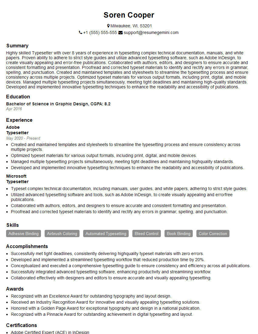
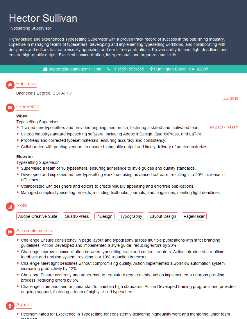
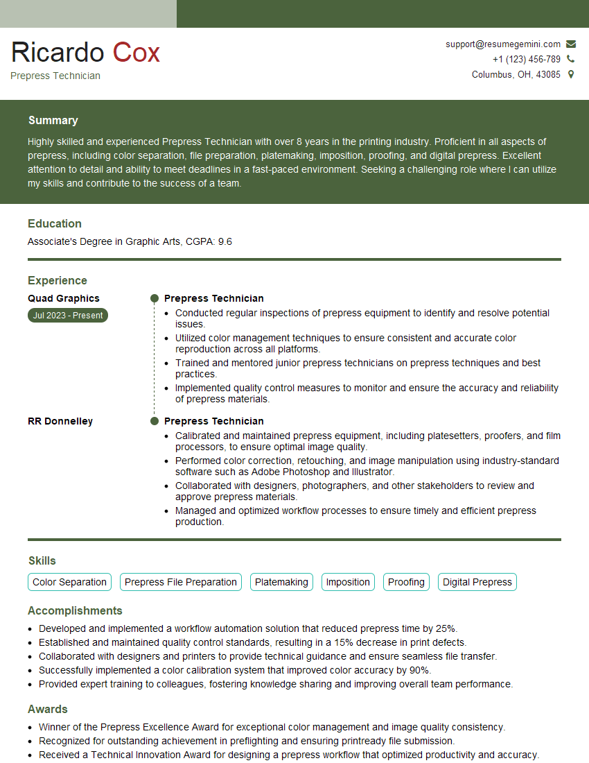
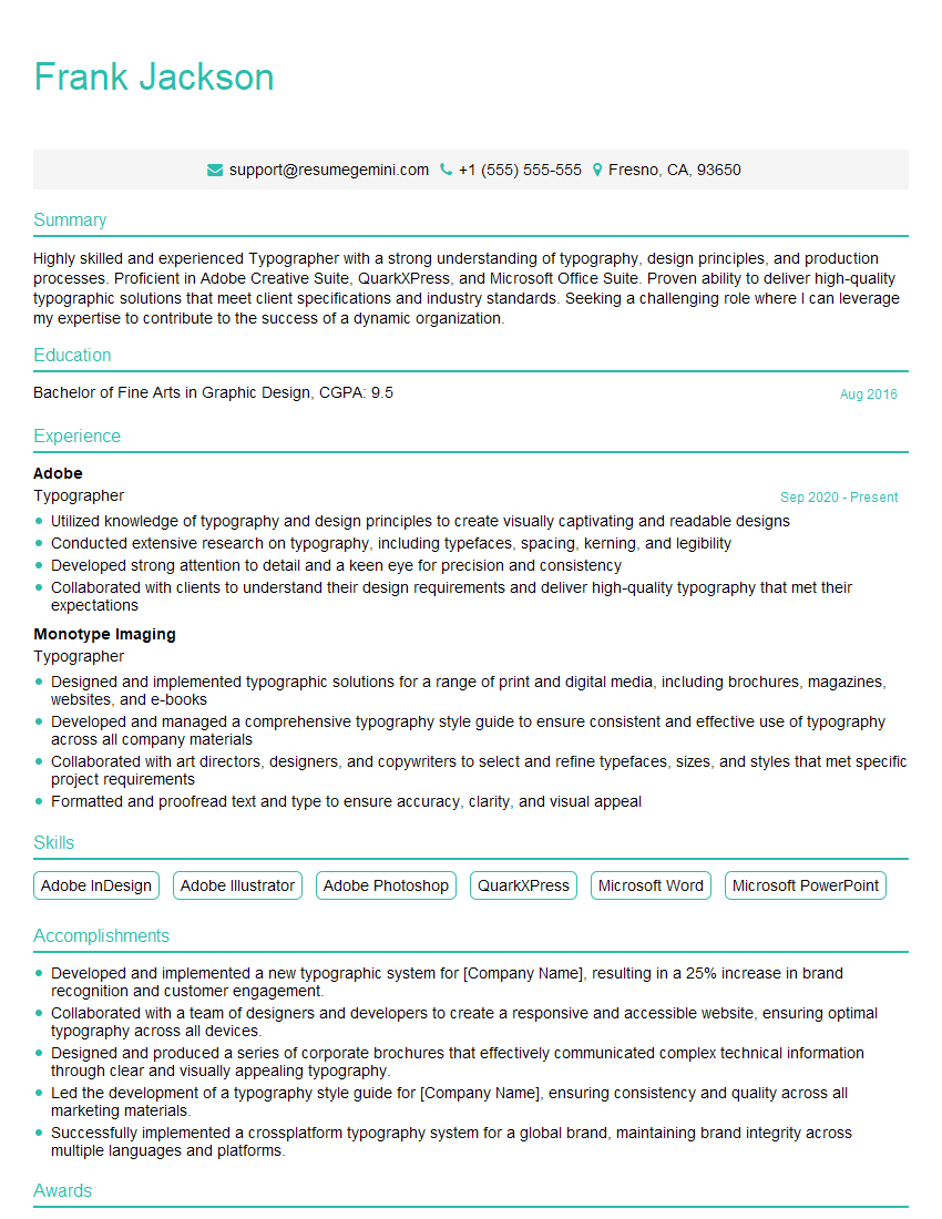
Mastering Typesetting and Composition opens doors to exciting careers in publishing, design, marketing, and more. A strong understanding of these principles is highly valued by employers. To maximize your job prospects, create a resume that showcases your skills effectively and is optimized for Applicant Tracking Systems (ATS). ResumeGemini is a trusted resource to help you build a professional and impactful resume. They offer examples of resumes tailored specifically to Typesetting and Composition roles, ensuring your qualifications shine through.
Explore more articles
Users Rating of Our Blogs
Share Your Experience
We value your feedback! Please rate our content and share your thoughts (optional).
What Readers Say About Our Blog
Hello,
We found issues with your domain’s email setup that may be sending your messages to spam or blocking them completely. InboxShield Mini shows you how to fix it in minutes — no tech skills required.
Scan your domain now for details: https://inboxshield-mini.com/
— Adam @ InboxShield Mini
Reply STOP to unsubscribe
Hi, are you owner of interviewgemini.com? What if I told you I could help you find extra time in your schedule, reconnect with leads you didn’t even realize you missed, and bring in more “I want to work with you” conversations, without increasing your ad spend or hiring a full-time employee?
All with a flexible, budget-friendly service that could easily pay for itself. Sounds good?
Would it be nice to jump on a quick 10-minute call so I can show you exactly how we make this work?
Best,
Hapei
Marketing Director
Hey, I know you’re the owner of interviewgemini.com. I’ll be quick.
Fundraising for your business is tough and time-consuming. We make it easier by guaranteeing two private investor meetings each month, for six months. No demos, no pitch events – just direct introductions to active investors matched to your startup.
If youR17;re raising, this could help you build real momentum. Want me to send more info?
Hi, I represent an SEO company that specialises in getting you AI citations and higher rankings on Google. I’d like to offer you a 100% free SEO audit for your website. Would you be interested?
Hi, I represent an SEO company that specialises in getting you AI citations and higher rankings on Google. I’d like to offer you a 100% free SEO audit for your website. Would you be interested?
good

