Preparation is the key to success in any interview. In this post, we’ll explore crucial Understanding of Visual Hierarchy and Composition interview questions and equip you with strategies to craft impactful answers. Whether you’re a beginner or a pro, these tips will elevate your preparation.
Questions Asked in Understanding of Visual Hierarchy and Composition Interview
Q 1. Explain the concept of visual hierarchy and its importance in design.
Visual hierarchy is the arrangement of elements on a page to guide the viewer’s eye and establish a clear order of importance. Think of it like a roadmap for the user’s attention. It’s crucial because it dictates how easily a user understands and interacts with the design. Without a well-defined visual hierarchy, users can feel lost and overwhelmed, leading to frustration and a lack of engagement. A strong visual hierarchy ensures key information is immediately noticeable, while less important details are still accessible but don’t compete for attention.
For instance, consider a website homepage. A strong visual hierarchy would prioritize the headline, call to action, and key features, making them immediately apparent to the user. Secondary information, like testimonials or blog posts, would be visually less prominent but still easily findable.
Q 2. How do you use Gestalt principles to create effective visual hierarchy?
Gestalt principles are rules of perception that describe how humans group similar elements together. They’re incredibly useful for creating visual hierarchy because they leverage innate human tendencies to organize information. By applying these principles, designers can intuitively guide the viewer’s eye and create a sense of order and flow.
- Proximity: Grouping elements that are close together visually connects them, creating a sense of relatedness. For example, grouping related items in a shopping cart with clear spacing between different items.
- Similarity: Using similar colors, shapes, or sizes makes elements appear to belong together. A grid of product thumbnails all using a consistent size and border would be a good example.
- Closure: We tend to complete incomplete shapes. This can be used to draw attention to a focal point, like using negative space to create an implied shape around an image.
- Continuity: Our eyes tend to follow lines and curves. This can be used to guide the eye through a design, for example, by using a subtle line to connect related elements across the page.
- Figure/Ground: We naturally distinguish between a figure (the focal point) and the ground (the background). Using contrast between the figure and ground is a powerful way to establish visual hierarchy.
Q 3. Describe different techniques for establishing visual hierarchy (e.g., size, color, contrast, placement).
Many techniques contribute to creating a strong visual hierarchy. They often work in conjunction to create a cohesive and effective design:
- Size: Larger elements naturally draw more attention. A large headline is instantly more noticeable than smaller body text.
- Color: Bright, contrasting colors command attention. Using a vibrant call-to-action button against a neutral background is a common example.
- Contrast: Difference in values (light and dark), color, and even texture creates visual separation and emphasis. A white text on a dark background provides strong contrast, making the text highly legible and noticeable.
- Placement: Elements placed higher on the page, or centrally, tend to be perceived as more important. A large logo positioned at the top left of a website is a classic example.
- Whitespace (Negative Space): Strategic use of white space creates breathing room and can isolate key elements, making them stand out more. This is crucial to prevent a cluttered and overwhelming design.
- Typography: Different font weights, sizes, and styles can distinguish headings from body text, creating visual hierarchy.
Q 4. How do you prioritize information based on user needs and goals when designing visual hierarchy?
Prioritizing information based on user needs requires a deep understanding of user research and behavior. Before designing the visual hierarchy, conduct user testing, surveys, or analyze existing user data to identify the primary goals and pain points of your target audience. What information do they need most urgently? What are their typical tasks and workflows?
Once you understand the user’s needs, map the information architecture accordingly. The most crucial information that directly supports the user’s goals should be the most prominent. For example, in an e-commerce site, the ‘Add to Cart’ button should be much more visually prominent than the product description’s fine print.
Q 5. Explain how typography plays a role in creating visual hierarchy.
Typography is a cornerstone of visual hierarchy. Different font styles, weights, and sizes contribute significantly to the overall visual impact. Headings should clearly stand out from body text, guiding users through the information in a logical sequence.
- Font Size: Larger font sizes for headings, smaller sizes for body text.
- Font Weight: Bold or heavier weights for titles and important information; lighter weights for less important details.
- Font Style: Italics can be used to emphasize specific words or phrases but should be used sparingly to avoid overwhelming the design.
- Font Family: Using a mix of serif and sans-serif fonts can create visual distinction, but consistency is critical to maintain readability.
Think of a newspaper layout. The large headline font instantly tells you the most important news, while the body text is easily scannable for detailed information.
Q 6. How do you use whitespace to improve visual hierarchy and readability?
Whitespace, or negative space, is often overlooked but incredibly powerful. It’s the empty space around elements on a page. It acts as visual breathing room, preventing a cluttered look and allowing elements to stand out. By strategically placing whitespace around important elements, you can draw attention to them and improve overall readability.
For example, placing generous space around a call-to-action button allows it to become the focal point and improves its usability. A cluttered page with too many elements competing for attention will be difficult for the user to process, but appropriate use of whitespace can significantly improve the user experience.
Q 7. How do you ensure visual hierarchy remains effective across different screen sizes and devices?
Maintaining effective visual hierarchy across different screen sizes requires a responsive design approach. The key is to use flexible layouts and relative units (percentages rather than fixed pixels) so elements scale proportionally with the screen size. This avoids crucial elements being hidden or overly small on smaller screens.
Fluid grids and responsive images are crucial. You might also consider using different layouts for drastically different screen sizes (e.g., desktop vs. mobile) while ensuring core information remains consistently prioritized. Thorough testing on different devices is essential to ensure the hierarchy remains effective across all platforms.
Q 8. Discuss the relationship between visual hierarchy and user experience (UX).
Visual hierarchy and user experience (UX) are inextricably linked. A well-designed visual hierarchy guides the user’s eye through the interface, ensuring they effortlessly find what they need and understand the information presented. Poor visual hierarchy, on the other hand, leads to confusion, frustration, and ultimately, a negative user experience. Think of it like a well-lit pathway versus a tangled forest – the pathway (good hierarchy) allows for a smooth journey, while the forest (poor hierarchy) makes navigation difficult and time-consuming.
For example, a website with a clear hierarchy will prioritize important elements like the call to action (e.g., ‘Buy Now’ button) using size, color, and placement to make it instantly noticeable. Less crucial elements will be subtly de-emphasized, allowing the user to focus on what matters most. This directly impacts conversion rates, task completion times, and overall user satisfaction.
Q 9. How do you test the effectiveness of your visual hierarchy?
Testing the effectiveness of visual hierarchy involves a multi-faceted approach. It’s not simply about personal opinion; we need quantifiable data.
- Eye-tracking studies: These studies use specialized equipment to monitor where users’ eyes focus on a screen, revealing which elements attract attention and for how long. This provides objective data on the effectiveness of the hierarchy.
- A/B testing: Comparing different versions of a design with varying visual hierarchies helps determine which layout performs better in terms of key metrics like click-through rates, task completion rates, and time on task.
- Usability testing: Observing users interacting with the design and gathering feedback through interviews or surveys provides qualitative insights into their experience and identifies any areas of confusion or frustration stemming from a poorly structured hierarchy.
- Heatmaps: These visual representations show areas of high and low interaction on a page, revealing where users focus their attention. This complements eye-tracking data and provides a quick overview of attention patterns.
By combining these methods, we gain a comprehensive understanding of how users perceive and interact with the design, allowing for data-driven improvements to the visual hierarchy.
Q 10. Describe a time you had to redesign a layout due to poor visual hierarchy.
I once worked on a redesign for a news website whose previous layout suffered from overwhelming information density and inconsistent visual cues. The user couldn’t easily scan for information. The different article types, headlines, and featured stories competed for attention, resulting in a cluttered and confusing experience.
The redesign involved implementing a clear grid system, using different font sizes and weights to establish a clear hierarchy of importance, and employing whitespace strategically to improve readability. Color was used sparingly to highlight key elements and create visual separation between sections. Before the redesign, users struggled to find specific articles; afterward, user testing demonstrated significant improvements in task completion times and user satisfaction. The key was to move from a visually chaotic layout to a streamlined, intuitive design guided by a well-defined visual hierarchy.
Q 11. How do you balance aesthetics and functionality when creating visual hierarchy?
Balancing aesthetics and functionality in visual hierarchy is a crucial aspect of design. Aesthetics are about creating a visually appealing design, while functionality ensures the design effectively guides the user toward their goal. They are not mutually exclusive but rather interdependent.
The key is to prioritize functionality first. The visual hierarchy must effectively guide the user through the interface. Once that functionality is established, aesthetic considerations can be applied without compromising the core usability. Think of it as building a sturdy foundation (functionality) before adding decorative elements (aesthetics). Using a consistent style guide, applying color theory effectively, and choosing appropriate typography are all ways to enhance the aesthetics without sacrificing functionality. The result should be a design that is both beautiful and user-friendly.
Q 12. Explain the difference between visual weight and visual hierarchy.
While closely related, visual weight and visual hierarchy are distinct concepts.
- Visual weight refers to the perceived prominence of an element within a design. Larger elements, darker colors, and bolder fonts typically have more visual weight than smaller, lighter, or thinner elements. It’s about the *relative importance* of individual elements.
- Visual hierarchy, on the other hand, is the arrangement of elements to guide the user’s eye and convey a specific order of importance. It’s about the *overall structure* and the relationship between elements to direct attention.
Visual weight is a tool used to *create* visual hierarchy. By manipulating visual weight – through size, color, contrast, etc. – we establish a clear hierarchy that dictates the order in which users process information.
Q 13. How does color theory contribute to effective visual hierarchy?
Color theory plays a vital role in establishing effective visual hierarchy. Colors have different levels of prominence and can evoke various emotions and associations. Using color strategically allows us to draw attention to important elements and guide the user’s eye.
- Contrast: Using contrasting colors creates a strong visual separation between elements, highlighting key information. For instance, a bright call-to-action button on a neutral background immediately attracts the user’s attention.
- Saturation: Highly saturated colors command more attention than muted ones. Using saturated colors sparingly for important elements helps create visual emphasis.
- Color temperature: Warm colors (reds, oranges, yellows) tend to be more visually prominent than cool colors (blues, greens, purples). This can be used to prioritize certain information based on its importance.
- Color psychology: Considering the emotional and psychological associations of colors can reinforce the desired message. For instance, using green to signify trust and security on a financial website.
Careful consideration of color helps create a harmonious and efficient visual hierarchy, ensuring the information is presented in a logical and aesthetically pleasing manner.
Q 14. How do you use grids and alignment to improve visual hierarchy?
Grids and alignment are fundamental tools for establishing a strong visual hierarchy. They provide a structured framework that helps organize elements and create visual order.
- Grid systems: A grid acts as a skeleton, defining the layout and spacing of elements. By placing important elements in prominent grid positions, we can control the flow of the user’s gaze. A well-structured grid ensures consistency and visual harmony.
- Alignment: Aligning elements vertically and horizontally creates visual balance and reduces visual clutter. Consistent alignment reinforces the hierarchy by grouping related elements and creating visual connections.
For example, aligning headlines to the left and body text to the left creates a clear visual separation and guides the user’s eye through the content in a logical manner. Using a grid to position key elements in prominent areas further enhances this effect.
Employing grids and alignment ensures a visually appealing and intuitive design that effectively communicates the intended hierarchy and improves the overall user experience.
Q 15. What are some common mistakes designers make when creating visual hierarchy?
A common mistake in creating visual hierarchy is a lack of clear focal point. Think of it like a stage play – without a main character, the audience is lost. Designers might overload the page with equally weighted elements, creating visual chaos instead of a guided experience. Other frequent errors include:
- Inconsistent use of size, color, and font: If everything is the same size and color, nothing stands out.
- Ignoring whitespace: Proper spacing is crucial for breathing room and visual separation of elements. Cluttered designs are hard to navigate.
- Poor contrast: Insufficient contrast between text and background makes reading difficult and detracts from the hierarchy.
- Overuse of decorative elements: Too many flashy elements compete for attention, confusing the viewer.
- Ignoring Gestalt principles: Failing to leverage principles of proximity, similarity, and closure weakens visual grouping and hierarchy.
For example, imagine a website with all text in the same size and font. The user would struggle to discern the most important information from secondary details. A well-designed page uses size, color, and weight strategically to emphasize key information.
Career Expert Tips:
- Ace those interviews! Prepare effectively by reviewing the Top 50 Most Common Interview Questions on ResumeGemini.
- Navigate your job search with confidence! Explore a wide range of Career Tips on ResumeGemini. Learn about common challenges and recommendations to overcome them.
- Craft the perfect resume! Master the Art of Resume Writing with ResumeGemini’s guide. Showcase your unique qualifications and achievements effectively.
- Don’t miss out on holiday savings! Build your dream resume with ResumeGemini’s ATS optimized templates.
Q 16. How do you handle conflicting design elements when establishing visual hierarchy?
Conflicting design elements are a major challenge. The key is to prioritize and establish a clear dominance. I use a systematic approach:
- Identify the core message: What is the single most important piece of information I want the user to see?
- Prioritize elements: Rank all design elements according to their importance based on the core message. This might involve a simple numbered list or a more complex card sorting exercise.
- Apply visual weight strategically: Use size, color, contrast, and position to emphasize the most important elements while subtly de-emphasizing conflicting elements. For instance, make the main call to action button larger and brighter than others.
- Use whitespace effectively: Separate conflicting elements with sufficient whitespace to avoid visual clutter and competition.
- Test and iterate: Conduct usability testing to see how users respond to the hierarchy. Adjust based on feedback to ensure the design is effective.
For example, if a website promotes both a product and a blog, I might use a larger hero image for the product and a smaller, less prominent sidebar for the blog. This prioritizes the product while still providing access to the blog for interested users.
Q 17. Describe your process for designing a visually appealing and informative webpage.
My process for designing a webpage involves a careful balance of aesthetics and functionality. I start by:
- Understanding the purpose and target audience: What is the goal of the webpage? Who am I designing it for? This informs all design choices.
- Information architecture: I structure the content logically, grouping related items together. Sitemaps and wireframes help visualize this structure.
- Visual hierarchy planning: I determine the primary and secondary information, establishing a clear visual path for the user’s eye. This often involves sketching several layouts to compare and contrast.
- Choosing a color palette and typography: These elements significantly influence mood and readability. I select options that are both visually appealing and accessible.
- Creating mockups: Using design tools, I build high-fidelity mockups, paying close attention to details like spacing, alignment, and imagery.
- Usability testing: I test the design with real users to identify areas for improvement. Eye-tracking studies can help visualize the effectiveness of the visual hierarchy.
- Iteration and refinement: Based on testing feedback, I refine the design to optimize user experience.
For example, I designed a landing page for a SaaS product. By carefully considering the target audience and the sales funnel, I was able to establish a clear visual hierarchy that guided users toward the desired call-to-action, leading to a significant increase in conversions.
Q 18. How do you use visual hierarchy to guide the user’s eye through a complex interface?
Guiding users through a complex interface requires a well-defined visual path. I utilize several techniques:
- Progressive disclosure: Reveal information gradually, starting with the most crucial elements. Think of it like peeling an onion, layer by layer.
- Clear visual cues: Use arrows, lines, and other visual cues to guide the user’s gaze through the interface. This could be an animation that subtly points to the next element.
- Strategic use of whitespace: Create visual breathing room to separate different sections and avoid overwhelming the user.
- Color coding: Use color to group related elements and highlight important sections. This needs to be used cautiously and with sufficient contrast for accessibility.
- Visual chunking: Break down complex information into smaller, digestible chunks to improve readability and comprehension.
For instance, in a multi-step form, I might use numbered steps to visually indicate progress and highlight the current step. This helps maintain context and prevents user frustration.
Q 19. How do you incorporate user feedback into your visual hierarchy designs?
User feedback is essential. I use several methods to incorporate it into my visual hierarchy designs:
- Usability testing: Observing users interacting with the design reveals areas of confusion or frustration. Heatmaps and eye-tracking data can pinpoint areas where the visual hierarchy fails to guide the user.
- A/B testing: Testing different versions of the design with different visual hierarchies allows me to compare their effectiveness in achieving design goals.
- Surveys and questionnaires: These gather qualitative data on user perceptions and preferences.
- Analyzing website analytics: Tracking metrics such as bounce rate, click-through rates, and time spent on page helps determine whether the visual hierarchy is leading users where they need to go.
For example, if user testing reveals that a particular section is consistently overlooked, I might adjust its size, color, or position to increase its prominence in the visual hierarchy.
Q 20. Explain the concept of visual flow and how it relates to visual hierarchy.
Visual flow is the path the user’s eye naturally follows when viewing a design. It’s intrinsically linked to visual hierarchy because it dictates how users perceive and interact with different elements. A well-designed visual flow ensures users naturally encounter the most important information first. They are two sides of the same coin: hierarchy dictates *what* gets seen first, and flow dictates *how* the eye moves through the design.
Consider a website with a clear hierarchy. The main headline is largest and boldest; this attracts the eye first, establishing the visual flow. The subsequent elements – subheadings, images, and body text – are then arranged to guide the user’s eye through the content in a logical and pleasing manner. This deliberate arrangement maximizes engagement and understanding.
Q 21. How do you create a sense of depth and dimension using visual hierarchy?
Creating depth and dimension is about simulating a three-dimensional space on a two-dimensional screen. Visual hierarchy plays a crucial role:
- Layering: Overlapping elements create a sense of depth. Elements placed in front appear closer, while those behind appear further away.
- Perspective: Using size variation can mimic perspective. Smaller objects appear further away, while larger ones seem closer.
- Shadows and highlights: Adding shadows and highlights to elements gives them a three-dimensional appearance and guides the eye to understand the spatial relationships.
- Color saturation and brightness: Brighter and more saturated colors often appear closer, while less saturated colors recede.
- Blurring: Blurring elements in the background creates a sense of depth of field, mimicking the way our eyes focus on certain objects while others become softer.
For example, a website showcasing products might place a large, high-resolution image of the main product in the foreground. The background might feature smaller, slightly blurred images of related products, creating a sense of depth and context.
Q 22. How do you ensure accessibility in your designs while maintaining a strong visual hierarchy?
Accessibility and visual hierarchy are not mutually exclusive; in fact, a well-executed visual hierarchy significantly enhances accessibility. We achieve this by prioritizing clear visual cues that guide users, regardless of their abilities. For example, users with visual impairments might rely on screen readers, which interpret visual elements based on their order and semantic meaning (headings, lists, etc.).
To ensure accessibility, I use a multi-pronged approach:
- Semantic HTML: I use appropriate HTML tags (
<h1>to<h6>for headings,<p>for paragraphs,<ul>and<ol>for lists) to structure content logically. This establishes a strong semantic hierarchy that screen readers can easily interpret, creating a parallel visual and accessible hierarchy. - Sufficient Color Contrast: I ensure sufficient color contrast between text and background using tools like WebAIM’s contrast checker. This benefits users with low vision.
- Clear Visual Cues: Size, weight, and spacing are crucial. Larger, bolder headings are easily distinguishable, and ample white space improves readability for everyone.
- Alternative Text (alt text): All images must include descriptive alt text, providing context for screen reader users.
- Keyboard Navigation: I make sure that all interactive elements are easily navigable using a keyboard, allowing users who cannot use a mouse to interact effectively.
By carefully combining these techniques, I create a visual hierarchy that is both visually appealing and fully accessible.
Q 23. What are your favorite tools or software for creating and testing visual hierarchy?
My toolkit for visual hierarchy design and testing involves a mix of software and techniques. For creation, I rely heavily on Figma and Adobe XD for their robust design capabilities, allowing for precise control over size, spacing, color, and typography. I appreciate their ability to create and manage design systems, which are critical for consistency in visual hierarchy across multiple projects and screens.
For testing, I don’t just rely on my own judgment. I use a combination of methods:
- Usability testing: Observing real users interacting with the design provides invaluable insights into whether the hierarchy is intuitive and effective. I often conduct eye-tracking studies to see where users focus their attention.
- A/B testing: I might test different versions of a design with varying visual hierarchies to see which performs better in terms of user engagement and task completion.
- Accessibility audit tools: Tools like WAVE and Lighthouse provide automated checks for accessibility issues related to color contrast, keyboard navigation, and semantic HTML, helping to ensure the visual hierarchy doesn’t unintentionally hinder accessibility.
These combined methods ensure I create designs that are not only visually appealing but also user-friendly and accessible.
Q 24. Describe your understanding of the rule of thirds and its application to visual hierarchy.
The rule of thirds is a compositional guideline suggesting that an image should be imagined as divided into nine equal parts by two equally-spaced horizontal lines and two equally-spaced vertical lines, and that important compositional elements should be placed along these lines or their intersections. It’s a powerful tool for guiding the eye and creating visual interest, but its application to visual hierarchy is subtle.
In visual hierarchy, the rule of thirds helps in strategically placing focal points. Instead of centering everything, aligning key elements along these lines creates a more dynamic and engaging composition. For example, the most important call-to-action might be placed at a rule-of-thirds intersection, drawing the user’s immediate attention. Secondary elements can be positioned along the other lines, creating a natural flow of the user’s gaze. However, it’s not a rigid rule; it’s a guideline to enhance, not dictate, the visual hierarchy.
For instance, in a website layout, the main headline might be placed at one intersection, while a secondary call to action, perhaps for a less prominent offer, could be situated along another line. This method avoids a static, centered layout, offering a more visually pleasing and balanced design that subtly directs the user’s attention according to priority.
Q 25. How do you use contrast to highlight important elements in a design?
Contrast is fundamental to highlighting important elements. It’s about creating visual differences that make certain elements stand out from their surroundings. I use several types of contrast to achieve this:
- Color contrast: Using colors with sufficient contrast (e.g., dark text on a light background) ensures readability and makes important elements pop. I use tools to ensure the contrast meets WCAG guidelines for accessibility.
- Size contrast: Larger text or images naturally draw more attention. Headings are typically larger than body text, and call-to-action buttons are often bigger than surrounding elements.
- Weight contrast: Bold or heavier fonts can emphasize critical information, creating visual weight that directs the user’s eye.
- Space contrast: Using white space strategically isolates important elements, giving them visual breathing room. This makes them stand out more effectively.
For example, in an e-commerce website, the “Add to Cart” button might be a significantly larger and bolder color than the product description. This highlights the key conversion point, guiding the user towards completing a purchase. A visually appealing design combined with a clear hierarchy is key here.
Q 26. How does visual hierarchy differ across different cultures or contexts?
Visual hierarchy isn’t universally interpreted. Cultural and contextual factors significantly influence how users perceive and interact with visual cues. For example:
- Reading direction: In Western cultures, we read from left to right and top to bottom. Therefore, top-left positioning often denotes primary importance. In some Middle Eastern and East Asian cultures, reading direction is right-to-left or top-to-bottom, so the visual hierarchy needs to adapt to these conventions.
- Symbolism and imagery: Symbols and colors carry different meanings in various cultures. What’s considered positive or attention-grabbing in one culture might be negative or ignored in another. For example, the color red might represent luck and celebration in some cultures, while representing danger or warning in others. This influences how I choose colors and icons in my designs.
- Layout preferences: Western designs often prioritize linearity and grid systems. Some cultures might prefer more fluid or asymmetrical layouts. This needs to be considered for an effective user experience.
Therefore, I always conduct thorough research on the target audience’s cultural background and preferences before designing a visual hierarchy. This ensures the design is not only visually appealing but also culturally sensitive and effective in communicating the intended message.
Q 27. Explain the importance of visual hierarchy in branding and marketing materials.
Visual hierarchy is absolutely crucial for effective branding and marketing. It dictates how a message is received and processed, impacting brand perception and recall. A well-structured visual hierarchy ensures that:
- Key messages are prominent: The most important information – the brand name, tagline, or call-to-action – is immediately apparent. This ensures the message is quickly understood.
- Brand identity is consistent: Consistent use of typography, color palettes, and imagery reinforces brand recognition and builds familiarity.
- Information is easily digestible: Clear visual cues guide the user through the content in a logical order, improving comprehension and engagement. Users are less likely to be overwhelmed and more likely to interact with the material.
- Conversions are maximized: In marketing materials, a clear hierarchy guides the user towards desired actions, such as making a purchase or signing up for a newsletter. A clear call-to-action is key here.
For example, a marketing email with a cluttered layout and unclear hierarchy is likely to be ignored, whereas a well-organized email with a prominent call to action will have higher conversion rates.
Q 28. Discuss the role of visual hierarchy in creating a consistent brand identity.
Visual hierarchy is the backbone of a consistent brand identity. A well-defined hierarchy ensures that all brand assets – websites, logos, marketing materials, packaging – share a visual language and communicate the same message. This consistency builds brand recognition and trust.
To achieve this consistency, I focus on:
- Establishing a visual style guide: This document details the brand’s typography, color palette, imagery style, and visual hierarchy rules. It acts as a bible for all design assets.
- Creating a modular design system: This involves breaking down design elements into reusable components (buttons, headings, etc.) that maintain consistency in size, spacing, and style across all platforms.
- Prioritizing brand elements: The logo, brand colors, and typography should always have visual dominance, ensuring they remain recognizable.
- Maintaining a clear information architecture: The way information is presented and organized across different assets should follow the same principles, providing a consistent and predictable user experience.
Imagine a global brand like Coca-Cola. Their logo, color scheme, and font are instantly recognizable across all marketing materials. This consistent visual hierarchy ensures brand unity and reinforces their global identity. The design system ensures consistency across everything from their website to a vending machine sticker.
Key Topics to Learn for Understanding of Visual Hierarchy and Composition Interview
- Principles of Visual Hierarchy: Understanding how to guide the viewer’s eye through a design using size, color, contrast, and placement.
- Compositional Techniques: Mastering techniques like the rule of thirds, golden ratio, and leading lines to create balanced and engaging compositions.
- Gestalt Principles: Applying principles like proximity, similarity, closure, and continuity to create visual unity and improve understanding.
- Typography and Visual Hierarchy: Understanding how font size, weight, and style contribute to establishing visual hierarchy and readability.
- Color Theory and its Impact: Using color effectively to create visual interest, guide attention, and evoke specific emotions.
- Whitespace and Negative Space: Understanding the importance of strategic use of whitespace to improve readability and create visual breathing room.
- Practical Application in Design Software: Demonstrating proficiency in using design software (e.g., Photoshop, Illustrator, Figma) to implement these principles.
- Analyzing Existing Designs: Critically evaluating existing designs and identifying successful (and unsuccessful) applications of visual hierarchy and composition.
- Problem-Solving Scenarios: Preparing to discuss how you would approach design challenges and apply your understanding of visual hierarchy to solve them.
- Communicating Design Decisions: Articulating your design choices and justifying your approach based on established principles.
Next Steps
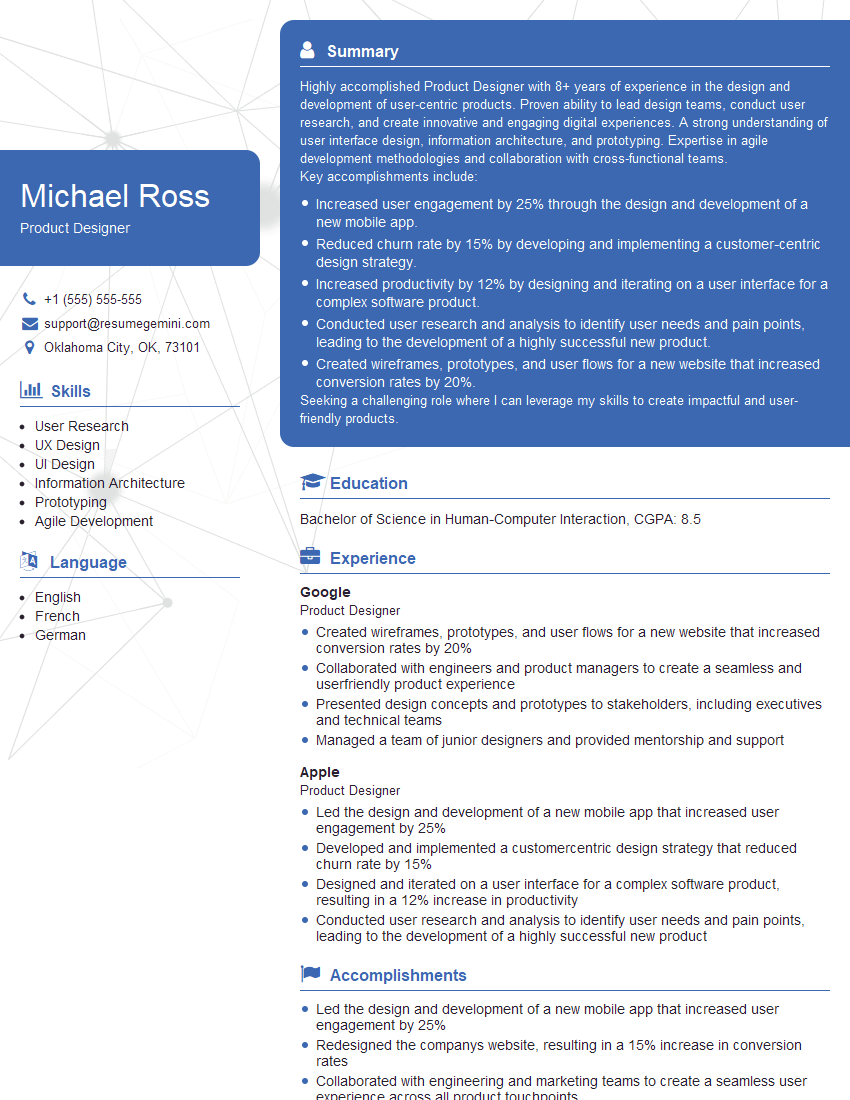
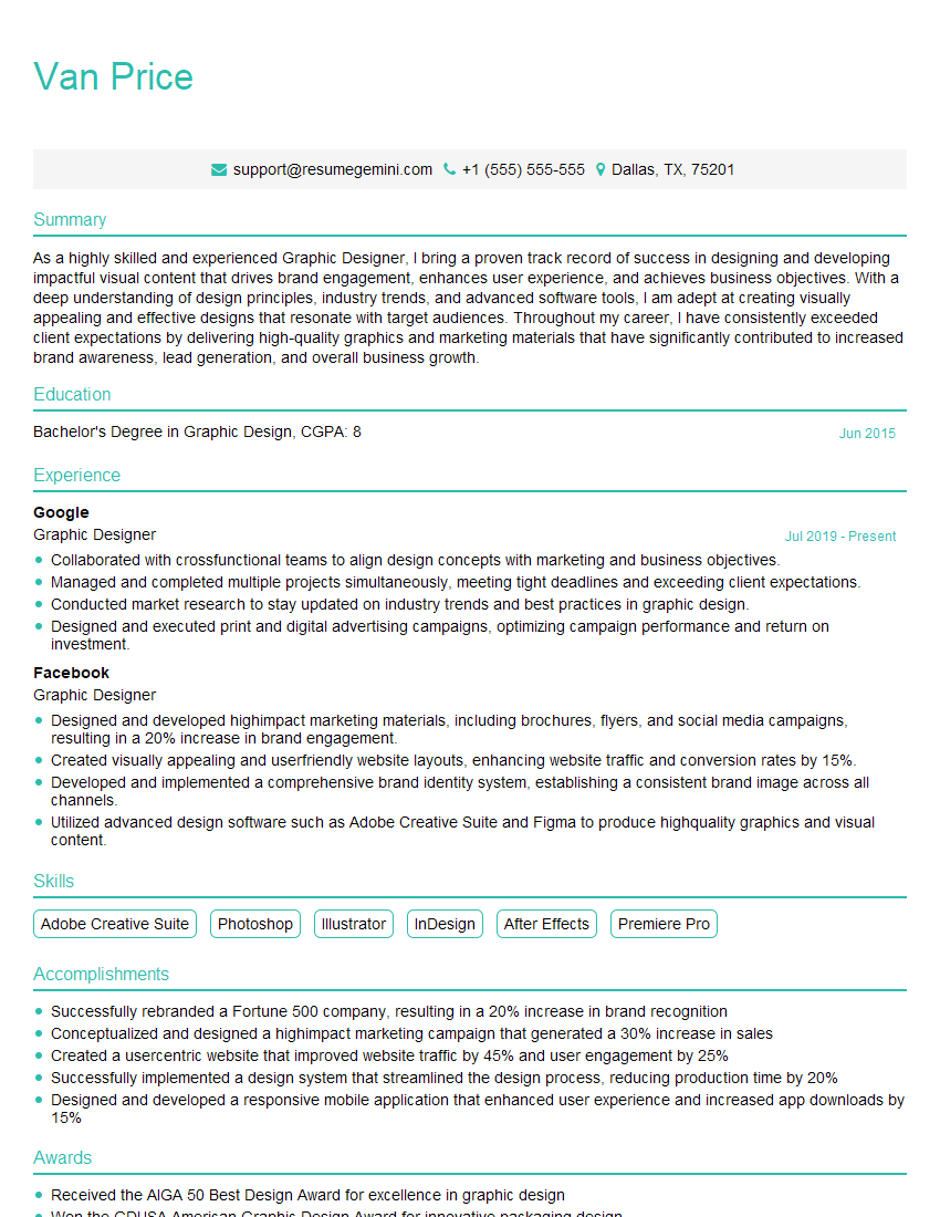
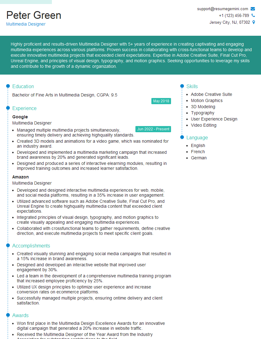
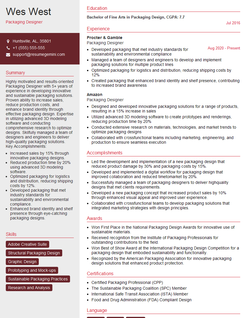
Mastering visual hierarchy and composition is crucial for success in design-related roles, allowing you to create effective and engaging visuals that communicate clearly and achieve specific goals. A strong understanding of these principles will significantly enhance your portfolio and make you a more competitive candidate. To further boost your job prospects, focus on creating an ATS-friendly resume that highlights your skills and experience effectively. ResumeGemini is a trusted resource that can help you build a professional and impactful resume. Examples of resumes tailored to showcasing expertise in Understanding of Visual Hierarchy and Composition are available through ResumeGemini to help you create a winning application.
Explore more articles
Users Rating of Our Blogs
Share Your Experience
We value your feedback! Please rate our content and share your thoughts (optional).
What Readers Say About Our Blog
Hello,
we currently offer a complimentary backlink and URL indexing test for search engine optimization professionals.
You can get complimentary indexing credits to test how link discovery works in practice.
No credit card is required and there is no recurring fee.
You can find details here:
https://wikipedia-backlinks.com/indexing/
Regards
NICE RESPONSE TO Q & A
hi
The aim of this message is regarding an unclaimed deposit of a deceased nationale that bears the same name as you. You are not relate to him as there are millions of people answering the names across around the world. But i will use my position to influence the release of the deposit to you for our mutual benefit.
Respond for full details and how to claim the deposit. This is 100% risk free. Send hello to my email id: [email protected]
Luka Chachibaialuka
Hey interviewgemini.com, just wanted to follow up on my last email.
We just launched Call the Monster, an parenting app that lets you summon friendly ‘monsters’ kids actually listen to.
We’re also running a giveaway for everyone who downloads the app. Since it’s brand new, there aren’t many users yet, which means you’ve got a much better chance of winning some great prizes.
You can check it out here: https://bit.ly/callamonsterapp
Or follow us on Instagram: https://www.instagram.com/callamonsterapp
Thanks,
Ryan
CEO – Call the Monster App
Hey interviewgemini.com, I saw your website and love your approach.
I just want this to look like spam email, but want to share something important to you. We just launched Call the Monster, a parenting app that lets you summon friendly ‘monsters’ kids actually listen to.
Parents are loving it for calming chaos before bedtime. Thought you might want to try it: https://bit.ly/callamonsterapp or just follow our fun monster lore on Instagram: https://www.instagram.com/callamonsterapp
Thanks,
Ryan
CEO – Call A Monster APP
To the interviewgemini.com Owner.
Dear interviewgemini.com Webmaster!
Hi interviewgemini.com Webmaster!
Dear interviewgemini.com Webmaster!
excellent
Hello,
We found issues with your domain’s email setup that may be sending your messages to spam or blocking them completely. InboxShield Mini shows you how to fix it in minutes — no tech skills required.
Scan your domain now for details: https://inboxshield-mini.com/
— Adam @ InboxShield Mini
Reply STOP to unsubscribe
Hi, are you owner of interviewgemini.com? What if I told you I could help you find extra time in your schedule, reconnect with leads you didn’t even realize you missed, and bring in more “I want to work with you” conversations, without increasing your ad spend or hiring a full-time employee?
All with a flexible, budget-friendly service that could easily pay for itself. Sounds good?
Would it be nice to jump on a quick 10-minute call so I can show you exactly how we make this work?
Best,
Hapei
Marketing Director
Hey, I know you’re the owner of interviewgemini.com. I’ll be quick.
Fundraising for your business is tough and time-consuming. We make it easier by guaranteeing two private investor meetings each month, for six months. No demos, no pitch events – just direct introductions to active investors matched to your startup.
If youR17;re raising, this could help you build real momentum. Want me to send more info?
Hi, I represent an SEO company that specialises in getting you AI citations and higher rankings on Google. I’d like to offer you a 100% free SEO audit for your website. Would you be interested?
Hi, I represent an SEO company that specialises in getting you AI citations and higher rankings on Google. I’d like to offer you a 100% free SEO audit for your website. Would you be interested?
good
