Interviews are opportunities to demonstrate your expertise, and this guide is here to help you shine. Explore the essential Visual Cueing interview questions that employers frequently ask, paired with strategies for crafting responses that set you apart from the competition.
Questions Asked in Visual Cueing Interview
Q 1. Explain the principles of Gestalt psychology and how they apply to visual cueing.
Gestalt psychology is a school of thought emphasizing our tendency to perceive patterns and wholes rather than individual parts. These principles are crucial in visual cueing because they explain how users naturally interpret visual information. Think about how quickly you can recognize a face, despite the complexity of its individual features; that’s Gestalt at work.
- Proximity: Elements placed close together are perceived as a group. For example, grouping related menu items closely together makes the interface clearer.
- Similarity: Similar elements are perceived as belonging together. Using the same color or style for similar buttons creates visual consistency and clarity.
- Closure: Our minds tend to complete incomplete shapes. This is often used in logos, where a partially hidden image is still easily recognizable.
- Continuity: We tend to perceive continuous lines or patterns, even if they’re interrupted. This is helpful in guiding users’ eyes along a path within an interface.
- Figure/Ground: We naturally separate elements into figures (objects of focus) and ground (the background). Effective visual cueing ensures the important information (the figure) stands out clearly from the background.
Applying Gestalt principles ensures visual cues are intuitive and easily understood, leading to a more user-friendly experience. For instance, a website using inconsistent button styles (violating similarity) will be confusing; while a well-organized page with grouped elements (proximity) will feel clean and simple.
Q 2. Describe different types of visual cues and their effectiveness in various contexts.
Visual cues come in various forms, each with its strengths and weaknesses depending on the context. Some key types include:
- Color: Using color to highlight important information or differentiate elements (e.g., red for errors, green for success). However, be mindful of color blindness.
- Size: Larger elements naturally draw more attention (e.g., prominent call-to-action buttons). Be cautious not to overuse this, as it can lead to visual clutter.
- Shape: Distinctive shapes can categorize information and improve recognition (e.g., using icons representing different functions).
- Space/Whitespace: Strategic use of white space creates visual breathing room, improving readability and reducing visual clutter. It helps to separate elements and make them more distinct.
- Typography: Bold text, italics, and different font sizes are used to emphasize and differentiate textual information (e.g., headings, subheadings, body text).
- Motion/Animation: Subtle animations can attract attention and guide users through a process (e.g., loading indicators). Avoid excessive animation that can be distracting.
- Icons: Universally understood symbols representing actions or information, adding a layer of quick comprehension.
For example, a navigation menu might use color-coding for categories, size for highlighting active items, and spacing to create visual separation. A dashboard could leverage size and color to showcase key metrics, using motion to indicate updates. The effectiveness depends on the specific needs of the user interface and the target audience.
Q 3. How do you ensure visual cues are accessible to users with disabilities?
Accessibility is paramount. Visual cues must be perceivable and understandable by users with disabilities, especially those with visual impairments. Here’s how to ensure accessibility:
- Alternative Text for Images: Provide descriptive alt text for all images so screen readers can convey their meaning to visually impaired users.
- Color Contrast: Use sufficient color contrast between foreground and background elements to ensure readability for users with low vision.
- Keyboard Navigation: Ensure all interactive elements are accessible via keyboard navigation for users who cannot use a mouse.
- Sufficient Size and Spacing: Use large enough text and adequate spacing between elements to make the interface easier to see and read.
- Avoid Relying Solely on Color: Don’t rely on color alone to convey information; use additional cues like shape or text labels.
- Follow WCAG Guidelines: Adhere to Web Content Accessibility Guidelines (WCAG) to meet established accessibility standards.
For instance, instead of only using red to indicate an error, include clear error messages and use a different shape or icon to draw attention.
Q 4. What are some common pitfalls to avoid when designing visual cues?
Several pitfalls can hinder the effectiveness of visual cues. Common mistakes to avoid include:
- Overuse of Cues: Too many cues can lead to visual clutter and confusion, making it harder to focus on important information. Prioritize and use cues sparingly.
- Inconsistent Use of Cues: Maintaining consistency in the way cues are used is crucial. Inconsistency makes the interface confusing and unpredictable.
- Poor Color Choices: Using inappropriate or inaccessible color combinations can make the interface difficult for some users to understand and navigate.
- Ignoring Context: Visual cues should always be relevant to the context. A cue that works well in one section might be inappropriate or misleading in another.
- Lack of User Testing: Failing to test visual cues with real users can lead to designs that are ineffective or confusing.
- Ignoring Cultural Differences: Certain colors or symbols may have different meanings in different cultures. Always consider global accessibility.
For example, using multiple flashing animations creates distraction instead of guiding the user. Inconsistent button styles lead to uncertainty of user interaction.
Q 5. Explain the concept of visual hierarchy and its importance in effective communication.
Visual hierarchy refers to the arrangement of elements to emphasize their relative importance. It’s essentially creating a visual order that guides the user’s eye and attention. Effective visual hierarchy is crucial for clear communication because it directs users to the most important information first.
Think of a newspaper headline – it’s larger and bolder than the body text. This is a clear visual hierarchy. In design, we use various techniques to establish hierarchy:
- Size: Larger elements are more prominent.
- Color: Brighter colors or contrasting colors draw attention.
- Font Weight: Bold text is more impactful than regular text.
- Position: Elements placed higher on the page or at the center tend to be noticed first.
- Whitespace: Strategically using whitespace separates elements, making them more visually distinct.
A well-structured visual hierarchy ensures users easily find what they need and understand the information’s importance. A poorly designed hierarchy leads to confusion and frustration.
Q 6. How do you conduct user testing to evaluate the effectiveness of visual cues?
Evaluating visual cues requires rigorous user testing to ensure effectiveness. Here’s a step-by-step approach:
- Define Objectives: Clearly outline what you want to measure. For example, how quickly users find a specific piece of information or how well they understand a particular cue.
- Recruit Participants: Recruit a diverse group of participants representative of your target audience.
- Develop Tasks: Create realistic tasks that require users to interact with the visual cues.
- Conduct Testing: Observe participants as they complete the tasks, noting any difficulties or misunderstandings.
- Gather Data: Collect quantitative data (e.g., task completion time, error rates) and qualitative data (e.g., user feedback, observations).
- Analyze Results: Analyze the data to identify areas where the visual cues are effective and areas needing improvement.
- Iterate: Based on the analysis, refine the design and retest until the visual cues are effective.
Using eye-tracking technology can provide insights into where users focus their attention, revealing if cues are working as intended. Think-aloud protocols during testing offer valuable qualitative insights into user thought processes.
Q 7. Discuss the role of color theory in visual cueing.
Color theory plays a vital role in effective visual cueing. Understanding color relationships (hue, saturation, brightness) and their psychological impact is crucial for creating effective and accessible designs.
- Color Psychology: Colors evoke emotions and associations. For instance, red is often used to indicate danger or urgency, while green signifies safety or approval. Cultural considerations are important here.
- Color Contrast: Sufficient contrast between colors is essential for readability and accessibility, particularly for users with low vision or color blindness.
- Color Harmony: Using colors that complement each other creates a visually pleasing and harmonious design. Understanding color wheels helps in creating effective color palettes.
- Color Accessibility: Employ color contrast checkers and guidelines to ensure your color choices meet accessibility standards for users with color vision deficiencies.
For example, a warning message might use a high-contrast combination of red and white for immediate attention. A calming website might opt for a muted blue and green palette. A well-designed color scheme enhances the overall user experience by ensuring visual cues are clear and effective.
Q 8. How do you balance aesthetics with functionality when designing visual cues?
Balancing aesthetics and functionality in visual cue design is crucial for creating effective and engaging user experiences. Think of it like building a bridge: it needs to be both beautiful and strong. A purely aesthetic design might look stunning but fail to communicate information effectively, while a purely functional design might be effective but unpleasant to use. The key is to find a harmonious blend.
My approach involves iterative design and user testing. I start by defining the core functionality – what information needs to be conveyed and how? Then, I explore different aesthetic options, considering factors like color palettes, typography, and imagery, always keeping in mind the target audience and the overall design language. Throughout the process, I conduct usability testing to evaluate the effectiveness and appeal of the cues, making adjustments as needed. For example, I might test different icon designs to see which is most easily understood and remembered.
A good example is a website’s navigation menu. It needs to be visually appealing – maybe with a clean, modern design – but also instantly understandable and easy to use. The menu items should be clearly labeled, appropriately spaced, and potentially use visual icons to reinforce meaning.
Q 9. Describe your process for designing clear and concise visual cues for complex information.
Designing clear and concise visual cues for complex information requires a structured, systematic approach. I typically follow these steps:
- Information Architecture: First, I thoroughly analyze the information to understand its structure and hierarchy. Complex information needs to be broken down into manageable chunks.
- Visual Hierarchy: I then create a visual hierarchy using size, color, contrast, and positioning to guide the user’s eye to the most important information first. Larger, brighter, and more centrally positioned elements naturally draw more attention.
- Visual Encoding: I select appropriate visual cues to represent different types of information. For example, I might use color-coding to categorize data, icons to represent actions, or different font weights to emphasize headings.
- Progressive Disclosure: For extremely complex information, I use progressive disclosure, revealing details only when the user needs or requests them. This avoids overwhelming the user.
- User Testing: Throughout the process, I conduct iterative user testing to ensure the cues are easily understood and effectively guide users. This involves observing users interacting with the design and gathering feedback.
Consider a dashboard showing stock market data. Critical information like current price and percentage change would be highlighted using color and size. Secondary data, such as volume, would be less prominent. Using charts and graphs can also help to present complex information in a digestible way.
Q 10. How do you ensure consistency in visual cues across different platforms or interfaces?
Consistency is paramount for a positive user experience. Inconsistency confuses users and reduces usability. To ensure consistency across platforms and interfaces, I employ a style guide. This document details all visual cues, including color palettes, typography, iconography, and spacing, with clear examples and usage guidelines.
The style guide acts as a single source of truth for all designers and developers working on the project. It ensures everyone uses the same visual language, preventing discrepancies between different parts of the application or across different platforms (web, mobile, etc.). Regular updates and revisions are crucial to maintain consistency as the project evolves.
For example, a button’s design – shape, color, and hover effect – should be consistent across all screens. If a particular color represents ‘error,’ it should always represent ‘error’ and not something else.
Q 11. Explain the difference between visual cues and visual clutter.
The difference between visual cues and visual clutter lies in their impact on the user experience. Visual cues are intentional design elements that guide the user’s attention and facilitate understanding. Visual clutter, on the other hand, is an accumulation of unnecessary or poorly organized elements that distract and overwhelm the user.
Think of it as the difference between a well-organized pantry and a messy one. In the well-organized pantry, items are clearly labeled and easily accessible (visual cues). In the messy pantry, items are piled haphazardly, making it difficult to find what you need (visual clutter).
Effective visual cues are carefully chosen and strategically placed to support the user’s goals. Clutter is the result of neglecting this strategy. Minimalism and intentional design are key to avoiding clutter.
Q 12. How do you use visual cues to guide user attention and behavior?
Visual cues are powerful tools for guiding user attention and behavior. They can be used to:
- Highlight important information: Using color, size, or animation to draw attention to crucial elements.
- Indicate actions: Buttons, icons, and other interactive elements visually signal what actions are available.
- Provide feedback: Visual cues, such as loading indicators or confirmation messages, let users know what’s happening.
- Guide navigation: Breadcrumbs, progress bars, and visual pathways assist users in navigating complex interfaces.
- Direct user flow: Strategic placement of elements and use of visual lines can subtly influence user behavior, for example guiding the eye through a form.
For example, a prominent call-to-action button with a contrasting color and clear label guides users toward a specific action. A progress bar provides feedback during a long process, managing user expectations and reducing frustration.
Q 13. How do you measure the success of visual cues?
Measuring the success of visual cues involves a multi-faceted approach, combining quantitative and qualitative data. Quantitative metrics might include:
- Task completion rate: How many users successfully complete the task guided by the visual cues?
- Time on task: How long does it take users to complete the task?
- Error rate: How many errors do users make while interacting with the interface?
- Click-through rates (CTR): For interactive elements, how often are they clicked?
Qualitative data, gathered through user testing and feedback, is equally important. This includes observations of user behavior, interviews, and feedback forms. Qualitative data helps to understand *why* users succeed or fail, giving insight into the effectiveness of the cues and potential areas for improvement. By combining both quantitative and qualitative data, a holistic understanding of the success of the visual cues can be achieved.
Q 14. Describe your experience working with different design software for creating visual cues.
Throughout my career, I’ve worked extensively with various design software for creating visual cues. My proficiency spans both vector and raster-based tools. For creating icons and scalable graphics, I primarily use Adobe Illustrator and Sketch. These vector-based tools offer precision and flexibility, allowing for crisp and clean visuals that scale well across different resolutions.
For image editing and manipulation, I’m adept at using Adobe Photoshop. This is especially useful when working with photorealistic elements or requiring advanced image editing capabilities. I also have experience with Figma, a collaborative web-based design tool, which is excellent for prototyping and sharing designs with team members. Finally, I’m comfortable using code-based design tools like CSS and HTML for creating very specific, interactive visual elements.
The choice of software always depends on the project’s specific needs and the desired level of detail and customization.
Q 15. Explain how visual cues can improve user engagement and satisfaction.
Visual cues are essential for guiding users intuitively through an interface. They significantly improve user engagement and satisfaction by reducing cognitive load and enhancing the overall user experience. Think of them as signposts on a journey – they direct users towards desired actions, inform them about the system’s state, and provide feedback on their interactions.
For example, a clear call-to-action button with contrasting colors and compelling text will attract attention and encourage clicks, leading to higher conversion rates. Similarly, subtle animations indicating loading progress or successful form submissions provide feedback, assuring users that their actions are being processed, thus improving their satisfaction. Well-placed icons, tooltips, and progress bars can significantly reduce the need for extensive textual explanations, making the interface more user-friendly and enjoyable.
- Reduced Cognitive Load: Visual cues minimize the effort required for users to understand the interface.
- Improved Efficiency: Users can quickly find information and complete tasks.
- Enhanced Engagement: Visually appealing cues hold users’ attention and encourage interaction.
- Increased Satisfaction: A clear and intuitive interface leads to a more positive user experience.
Career Expert Tips:
- Ace those interviews! Prepare effectively by reviewing the Top 50 Most Common Interview Questions on ResumeGemini.
- Navigate your job search with confidence! Explore a wide range of Career Tips on ResumeGemini. Learn about common challenges and recommendations to overcome them.
- Craft the perfect resume! Master the Art of Resume Writing with ResumeGemini’s guide. Showcase your unique qualifications and achievements effectively.
- Don’t miss out on holiday savings! Build your dream resume with ResumeGemini’s ATS optimized templates.
Q 16. How do you adapt visual cues for different cultural contexts?
Adapting visual cues for different cultural contexts is crucial for successful global product design. What is considered positive or intuitive in one culture might be confusing or even offensive in another. This requires careful consideration of several factors.
- Color Symbolism: Colors carry different meanings across cultures. For instance, red might signify good luck in some cultures and bad luck in others. Thorough research into the cultural connotations of colors is essential.
- Imagery and Iconography: Images and icons should be universally understood or appropriately adapted. A gesture that’s common in one culture might be unknown or misinterpreted in another. Using simple, abstract icons can often be more effective than culturally specific imagery.
- Layout and Reading Direction: Layout should accommodate different reading directions (left-to-right, right-to-left). Button placement, text flow, and overall interface design must respect these cultural differences.
- User Testing: Conducting user testing with individuals from the target cultural groups is crucial to validate design choices and identify any potential issues.
For example, a design using red for a ‘positive’ action might require a different color choice in certain Asian markets where red is associated with warnings or danger.
Q 17. Discuss the importance of A/B testing in visual cue design.
A/B testing is indispensable in visual cue design. It’s a systematic method for comparing different versions of a visual cue to determine which performs better based on measurable metrics. This data-driven approach minimizes guesswork and ensures design decisions are optimized for user engagement and performance.
For example, you could A/B test two versions of a call-to-action button: one with a primary color and another with a secondary color. By tracking click-through rates, you can determine which color is more effective in driving conversions. Similarly, you could test different icon designs or the placement of tooltips. The results from A/B testing offer concrete evidence to guide design improvements and avoid relying on assumptions.
The process typically involves:
- Defining Metrics: Identifying key performance indicators (KPIs) such as click-through rates, conversion rates, task completion times, etc.
- Creating Variations: Developing different versions of the visual cue to test.
- Implementing Testing: Deploying the variations to a representative sample of users.
- Analyzing Results: Evaluating the performance of each variation based on the defined metrics.
- Iterating: Using the results to refine the design and repeat the process.
Q 18. How do you handle feedback from stakeholders during the visual cue design process?
Handling stakeholder feedback during the visual cue design process is crucial for achieving a successful outcome. It involves actively soliciting, analyzing, and incorporating feedback while balancing business objectives with user experience goals.
I typically employ a structured approach:
- Regular Communication: Establish a clear communication plan with stakeholders, including regular meetings and progress updates.
- Presenting Design Rationale: Clearly articulate the design decisions and their underlying rationale, using data and user research to support choices.
- Feedback Sessions: Conduct focused feedback sessions to gather input from stakeholders, ensuring that their perspectives are understood and addressed.
- Prioritizing Feedback: Categorize feedback based on importance and feasibility, prioritizing user needs and business requirements.
- Documenting Decisions: Keep detailed records of feedback received, decisions made, and reasons for those decisions.
It’s important to remember that while stakeholder feedback is valuable, ultimately, the design should prioritize the end-user experience. A collaborative approach where stakeholders understand the design principles and user research findings helps achieve a balanced outcome.
Q 19. Describe your experience with responsive design and its impact on visual cueing.
Responsive design is paramount in visual cueing. It ensures that visual cues adapt seamlessly across various devices and screen sizes, providing a consistent and optimal user experience regardless of the platform. Ignoring responsive design can lead to a fragmented and frustrating user journey.
My experience shows that responsive design requires careful consideration of:
- Fluid Layouts: Using percentage-based widths and flexible grids allows elements to resize proportionally.
- Media Queries: Employing CSS media queries to tailor styles based on screen size, orientation, and device capabilities.
- Adaptive Images: Using responsive images ensures images are appropriately sized and scaled for different devices.
- Touch Optimization: Adjusting tap targets and interaction patterns to be suitable for touchscreens.
For example, a large call-to-action button on a desktop might need to be smaller and more easily tappable on a mobile device. Similarly, complex animations might need to be simplified or removed on low-powered devices to maintain performance. I often utilize frameworks like Bootstrap or Material Design to efficiently manage responsive design elements and ensure visual cues remain clear and effective across devices.
Q 20. What are some best practices for using visual cues in mobile applications?
Visual cues in mobile applications require a slightly different approach than those on desktop interfaces due to the smaller screen size, touch-based interaction, and diverse range of devices.
- Minimize Clutter: Avoid visual overload by keeping the interface clean and uncluttered.
- Large Tap Targets: Ensure interactive elements (buttons, links) are large enough to be easily tapped with fingers.
- Clear Visual Hierarchy: Employ visual cues to create a clear hierarchy of information, guiding users’ attention to the most important elements.
- Haptic Feedback: Consider incorporating subtle haptic feedback to enhance user interaction and provide confirmation.
- Appropriate Animations: Use animations sparingly and only where they enhance usability and not detract from it.
For instance, using subtle animations to indicate loading progress or successful actions on a mobile app reassures users and helps them understand the system’s behavior without causing visual distraction. Also, using clear, easily understandable icons for menu items or actions will speed up user interaction.
Q 21. How do you ensure visual cues are effective across different screen sizes?
Ensuring visual cues remain effective across different screen sizes involves employing responsive design principles and incorporating scalable vector graphics (SVGs) where possible.
Strategies include:
- Relative Units: Using relative units like percentages (%) and ems (em) in CSS allows elements to scale proportionally with the screen size.
- Flexible Grid Systems: Utilizing flexible grid systems provides a structure that adapts to various screen sizes.
- Scalable Vector Graphics (SVGs): SVGs scale without losing quality, making them ideal for icons and other graphic elements.
- Media Queries: Using media queries to apply different styles based on screen size enables targeted adjustments for specific devices.
- Retina Display Support: Providing high-resolution images for devices with high pixel density ensures crisp visuals.
For instance, an icon designed using an SVG will maintain its sharpness and clarity even when scaled up or down on different screen sizes, avoiding pixelation common with raster graphics.
Q 22. Explain the importance of using data to inform visual cue design decisions.
Data is the cornerstone of effective visual cue design. Instead of relying on intuition, we leverage data to understand user behavior and preferences, ensuring cues are not only visually appealing but also highly effective in guiding users towards their goals. For example, A/B testing different visual cues – say, using color versus shape to highlight a call-to-action button – allows us to quantitatively measure which design performs better in terms of click-through rates. Heatmaps and eye-tracking studies can reveal precisely where users focus their attention, revealing areas for improvement in cue placement and salience. This data-driven approach ensures we’re not just guessing, but creating cues that genuinely resonate with the user and achieve the intended outcome.
Q 23. Describe your experience with using analytics to track the effectiveness of visual cues.
In a recent project designing the user interface for a mobile banking app, we implemented several visual cues to improve the user’s navigation and task completion. We used Google Analytics to track key metrics such as the time spent on each page, task completion rates, and error rates. We also integrated a custom event tracking system to monitor specific interactions with the visual cues, such as hover time over elements or click-through rates on buttons highlighted using distinct color cues. The analytics revealed that users were significantly quicker to complete transactions using a new color-coded system for account identification, prompting a complete rollout of this successful design. This continuous monitoring and analysis of user interactions allow for iterative improvements, leading to a more user-friendly and efficient application.
Q 24. How do you incorporate user feedback into the iterative design process for visual cues?
User feedback is vital in the iterative design process of visual cues. We employ a mixed-methods approach, combining quantitative data (e.g., from analytics) with qualitative feedback (e.g., from usability testing and surveys). For example, after deploying a new set of visual cues, we conduct usability tests where users complete tasks while thinking aloud. This verbal feedback reveals their interpretation of the cues, identifying areas of confusion or misunderstanding. Surveys provide broader insights into user preferences and satisfaction. We use this combined data to refine the design, iteratively testing and revising based on user response. This iterative cycle ensures the final design is not only data-driven but also highly user-centered, resulting in an intuitive and enjoyable user experience.
Q 25. Discuss your understanding of visual perception and its impact on design choices.
A deep understanding of visual perception is paramount in visual cue design. Principles like Gestalt psychology (proximity, similarity, closure) inform how we group and organize information visually. For instance, using proximity to group related elements improves scannability. We also consider factors like color contrast and accessibility, ensuring cues are easily discernible by users with diverse visual capabilities. Understanding the limitations of human attention and cognitive load informs how many cues to include and how prominent they should be. Overloading users with too many visual cues can lead to confusion; conversely, too few cues can leave them feeling lost and frustrated. A balanced approach is key, leveraging visual cues effectively to guide users without overwhelming them.
Q 26. Explain how you use visual cues to create a cohesive and intuitive user experience.
Creating a cohesive and intuitive user experience hinges on consistent and meaningful visual cues. We achieve this through a deliberate visual language, establishing a clear visual hierarchy and using consistent styling across the interface. For example, consistently using the same color to indicate interactive elements throughout the application allows users to quickly and easily identify clickable buttons or links. Similarly, consistent use of iconography ensures that users can easily understand the function of different elements. This consistency reduces cognitive load and allows users to focus on the task at hand rather than decoding the visual interface. By carefully coordinating visual cues, we create a seamless and predictable experience.
Q 27. Describe your experience working with cross-functional teams to integrate visual cues into product designs.
Collaborating effectively with cross-functional teams is crucial for integrating visual cues effectively. I typically work closely with product managers, developers, and UX researchers to ensure the visual cues align with the overall product strategy and user needs. For example, during the design of an e-commerce platform, I collaborated with developers to ensure the visual cues for product filtering and sorting were technically feasible and integrated seamlessly into the application’s backend. This close collaboration ensures that the visual design is not only aesthetically pleasing but also technically sound and implemented correctly, which is crucial to avoid design flaws from ever reaching production.
Q 28. What is your preferred methodology for designing and testing visual cues?
My preferred methodology for designing and testing visual cues is an iterative, user-centered approach. This usually begins with user research and competitor analysis to identify best practices and potential challenges. I then create low-fidelity prototypes to explore different design options. These are followed by user testing sessions involving A/B testing to compare different visual cue designs. The feedback gathered is used to refine the design, leading to higher-fidelity prototypes that go through further rounds of testing. Throughout the process, I employ data analysis to measure the effectiveness of the cues, making iterative improvements based on real user behavior and feedback. This cycle repeats until the visual cues are highly effective, user-friendly, and meet the design goals.
Key Topics to Learn for Visual Cueing Interview
- Fundamentals of Visual Cueing: Understanding the core principles and definitions. Explore the different types of visual cues and their impact on communication.
- Practical Application in Design: Analyze how visual cues are used to guide user attention and interaction in various design contexts (e.g., websites, apps, dashboards). Consider examples of effective and ineffective cueing.
- Accessibility and Inclusivity: Learn how to design with visual cues that are accessible to users with disabilities. Explore alternative methods of cueing for users with visual impairments.
- Cognitive Load and Visual Processing: Understand how visual cues affect cognitive load and the user’s ability to process information efficiently. Explore strategies for minimizing cognitive overload.
- A/B Testing and Iteration: Discuss methodologies for testing the effectiveness of different visual cues and iterating on designs based on user feedback and data analysis.
- Color Theory and Visual Hierarchy: Understand how color choices and visual hierarchy influence the effectiveness of visual cues. Explore best practices for creating clear and intuitive visual hierarchies.
- Gestalt Principles and Visual Perception: Apply Gestalt principles (proximity, similarity, closure, etc.) to understand how users perceive and interpret visual cues. Discuss the implications for design decisions.
- Case Studies and Examples: Analyze successful and unsuccessful implementations of visual cueing in real-world applications. Learn from both positive and negative examples.
Next Steps
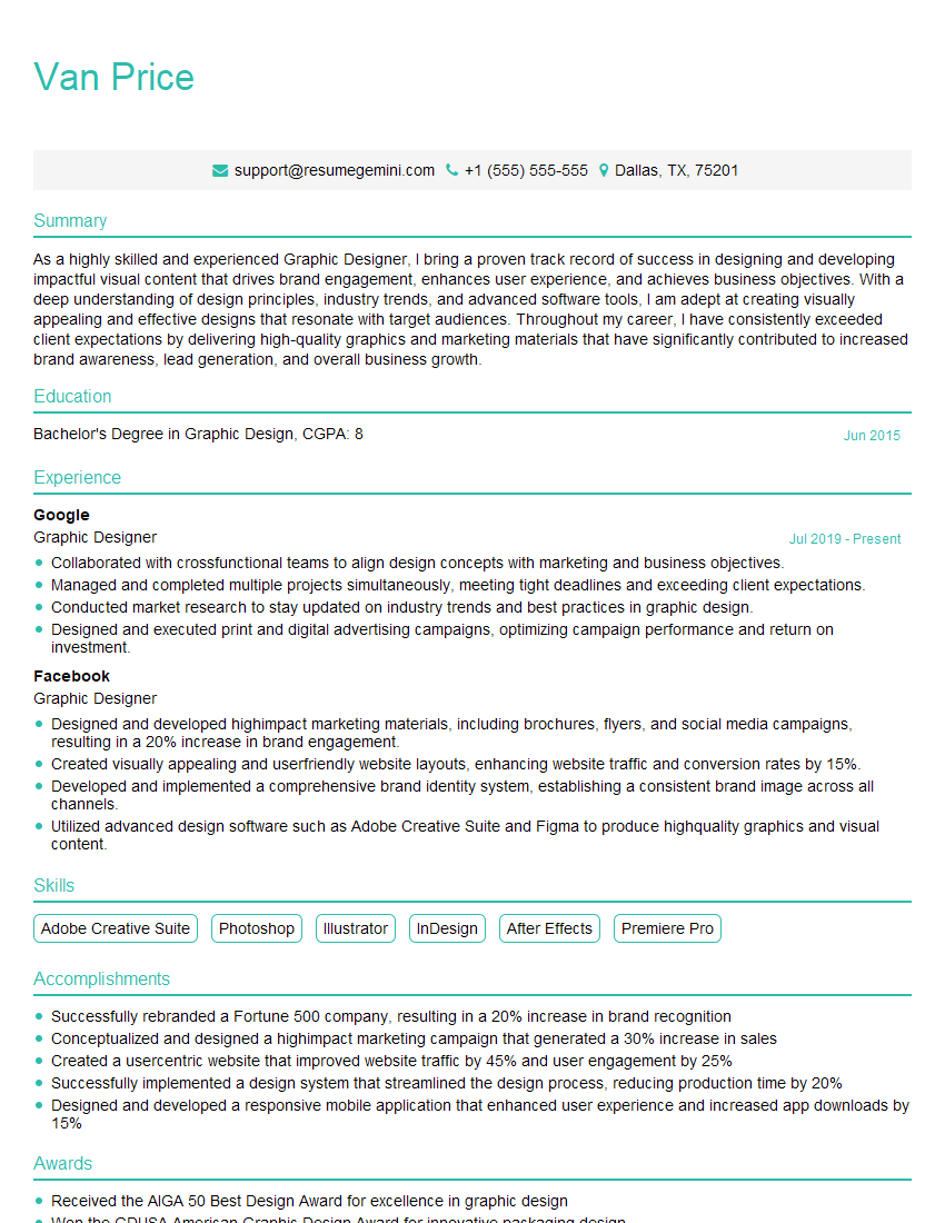
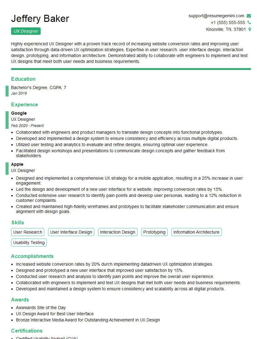
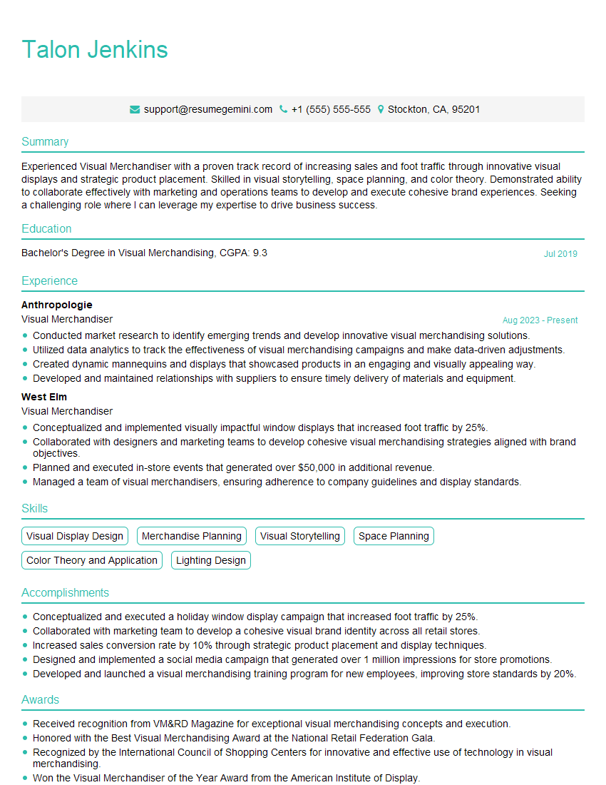
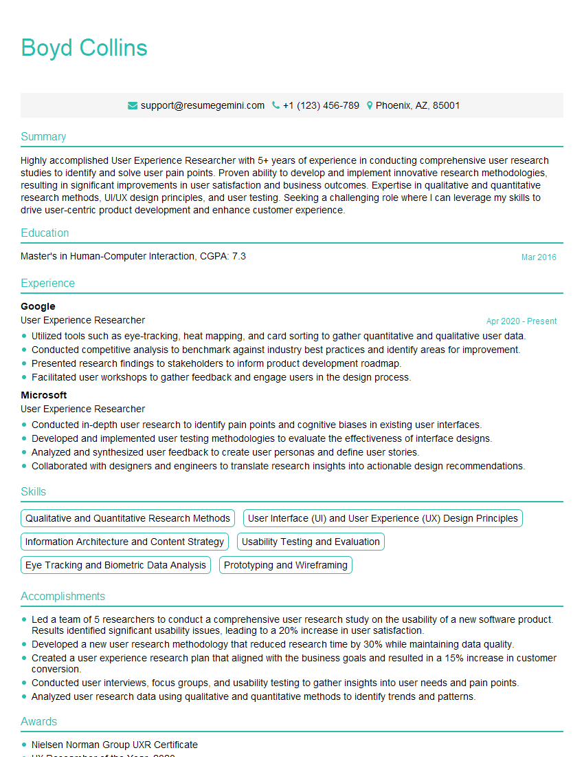
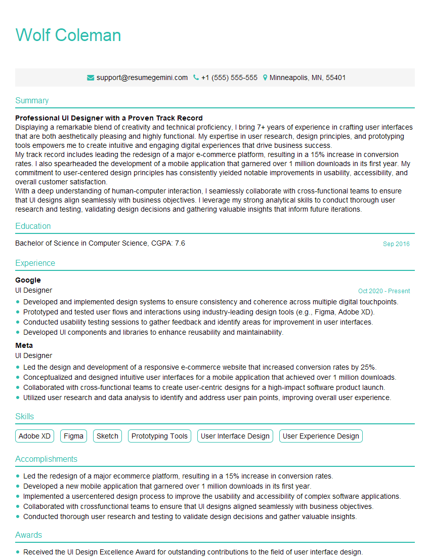
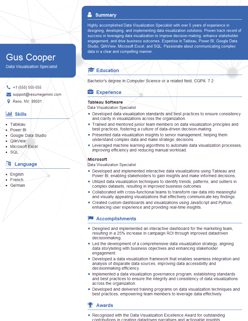
Mastering visual cueing is crucial for success in today’s design-driven job market. A strong understanding of these principles will significantly enhance your ability to create engaging and effective user experiences. To maximize your job prospects, create an ATS-friendly resume that highlights your skills and experience. ResumeGemini is a trusted resource that can help you build a professional resume that showcases your abilities effectively. Examples of resumes tailored to Visual Cueing are provided to help you get started.
Explore more articles
Users Rating of Our Blogs
Share Your Experience
We value your feedback! Please rate our content and share your thoughts (optional).
What Readers Say About Our Blog
Hi, I represent an SEO company that specialises in getting you AI citations and higher rankings on Google. I’d like to offer you a 100% free SEO audit for your website. Would you be interested?
good
